import {
  Dialog,
  DialogTrigger,
  DialogContent,
  DialogHeader,
  DialogTitle,
  DialogDescription,
  DialogBody,
  DialogFooter,
  DialogClose,
} from "@/components/ui/dialog";
import { Button } from "@/components/ui/dialog-utils/button";

const SIZES = [
  { label: "Small", className: "sm:w-100", width: "400px" },
  { label: "Default", className: undefined, width: "600px" },
  { label: "Large", className: "sm:w-200", width: "800px" },
] as const;

export default function DialogSizing() {
  return (
    <div className="flex flex-wrap items-center justify-center gap-3">
      {SIZES.map(({ label, className, width }) => (
        <Dialog key={label}>
          <DialogTrigger render={<Button variant="outline">{label}</Button>} />
          <DialogContent className={className}>
            <DialogHeader>
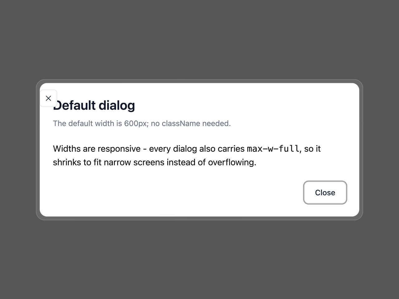
              <DialogTitle>{label} dialog</DialogTitle>
              <DialogDescription>
                {className ? (
                  <>
                    Set on <code>DialogContent</code> with{" "}
                    <code>className="{className}"</code> ({width}).
                  </>
                ) : (
                  <>The default width is {width}; no className needed.</>
                )}
              </DialogDescription>
            </DialogHeader>
            <DialogBody>
              <p>
                Widths are responsive - every dialog also carries{" "}
                <code>max-w-full</code>, so it shrinks to fit narrow screens
                instead of overflowing.
              </p>
            </DialogBody>
            <DialogFooter>
              <DialogClose render={<Button variant="outline">Close</Button>} />
            </DialogFooter>
          </DialogContent>
        </Dialog>
      ))}
    </div>
  );
}