Open-source React UI component library built on Base UI; the official design system of Cal.com.
Installs all 362 components. Without our CLI, run instead.
coss publishes a shadcn registry at coss.com, with 362 components installable through the shadcn CLI.
Copy a prompt for your agent, copy the install command, or open the docs that ship it.
Basic accordion
Accordion with one panel open
Accordion allowing multiple panels open
Controlled accordion
Basic alert
Alert with icon
Alert with icon and action buttons
Info alert
Success alert
Warning alert
Error alert
Alert dialog
Alert dialog with bare footer
Basic autocomplete
Autocomplete with grouped items
Autocomplete with limited number of results
Autocomplete with async items loading
Autocomplete form
Autocomplete form
Pill-shaped autocomplete
Address autocomplete with Google Maps Places API
Disabled autocomplete
Small autocomplete
Large autocomplete
Autocomplete with label
Autocomplete autofilling the input with the highlighted item
Autocomplete auto highlighting the first option
Autocomplete with clear button
Autocomplete with trigger and clear buttons
Avatar with image and fallback
Avatar with notification badge
Rounded avatar with notification badge
Avatar with verified badge
Small overlapping avatar group
Large overlapping avatar group
Fallback-only avatar
Avatars with different sizes
Avatars with different radii
Overlapping avatar group
Avatar with user icon fallback
Avatar with emerald status dot
Avatar with muted status dot
Rounded avatar with top-right emerald status
Basic badge
Large badge
Badge with icon
Badge with link
Badge with count
Full rounded badge (pill)
Badge with number after text
Status badge - Paid
Status badge - Pending
Status badge - Failed
Selectable badge with checkbox
Outline badge
Removable badge
Secondary badge
Destructive badge
Info badge
Success badge
Warning badge
Error badge
Small badge
Breadcrumb with menu example
Breadcrumb with custom separator
Breadcrumb with home icon for home link only
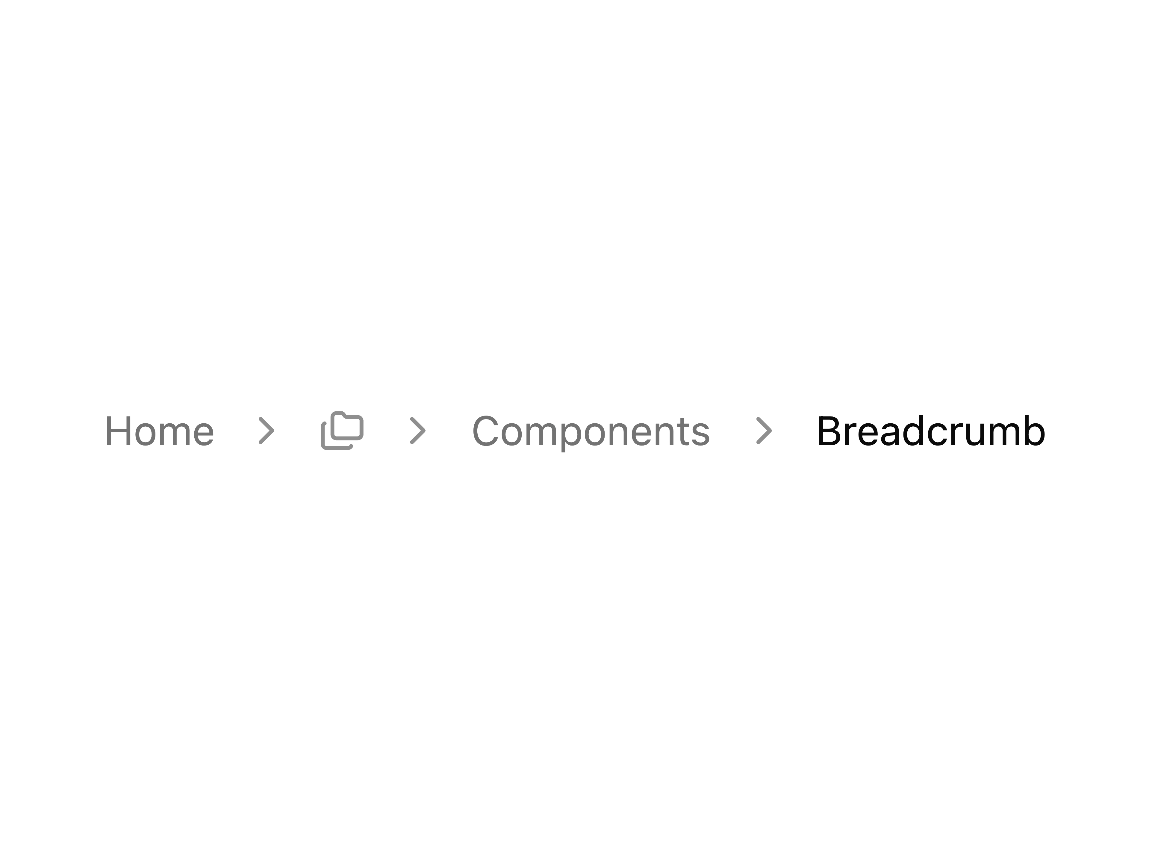
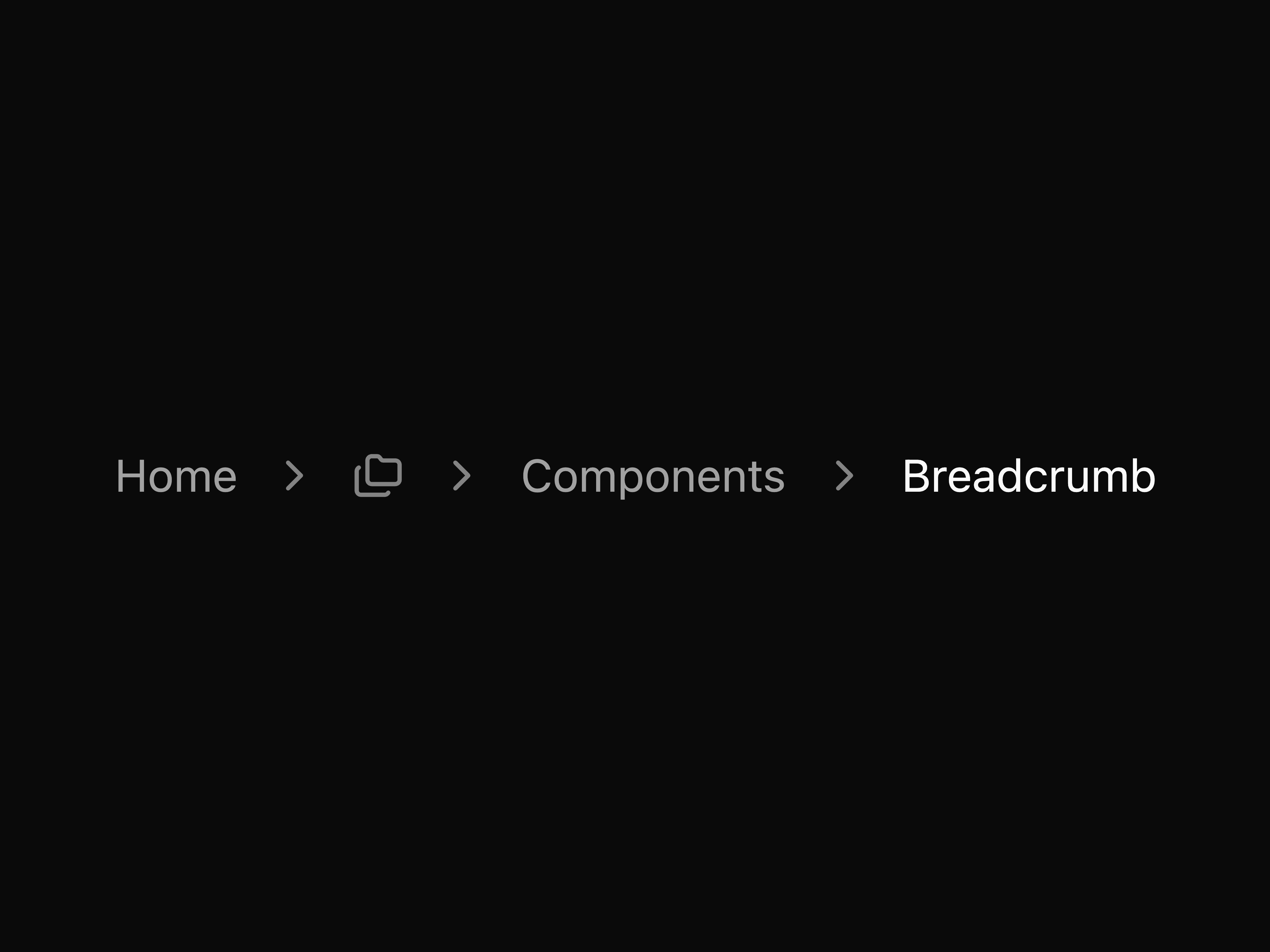
Breadcrumb with folders icon menu
Breadcrumb with icons before text
Breadcrumb with dot separators
Breadcrumb with select dropdown
Default button
Large button
Extra-large button
Disabled button
Icon button
Small icon button
Large icon button
Button with icon
Link rendered as button
Custom loading button with manual Spinner
Expandable show more/less toggle button
Outline button
Back link button with chevron
Card-style button with heading and description
Directional pad control buttons
Outline like button with count
Social login icon buttons
Star button with count badge
Button group with QR code icon and sign in
Button with avatar
Pill-shaped button with rounded-full styling
Secondary button
Button with animated arrow on hover
Button with keyboard shortcut indicator
Button with notification badge
Paired buttons (Cancel/Save)
Button with animated status dot
Icon-only copy button with feedback
Copy button with feedback
Rotating icon button (FAB-style toggle)
Social login buttons (Google, X, GitHub)
Hamburger menu button with animated icon
Destructive button
Download button with progress and cancel action
Button using the built-in loading prop
Destructive outline button
Ghost button
Link button
Extra-small button
Small button
Basic calendar
Calendar with rounded range selection style
Calendar with right-aligned navigation
Calendar with week numbers
Calendar with year-only combobox dropdown
Calendar without arrow navigation (dropdown only)
Calendar with current month button
Calendar with today button
Calendar with date input
Calendar with time input
Calendar with time slots (appointment picker)
Calendar with custom cell size
Calendar with date presets
Range calendar with date presets
Two months calendar
Three months calendar
Pricing calendar with custom day buttons
Calendar with 24-hour autocomplete time input
Calendar with date range selection
Calendar with month/year dropdown navigation
Calendar with custom Select dropdown for month/year
Calendar with Combobox dropdown for month/year
Calendar with disabled dates
Calendar with multiple date selection
Calendar with rounded day buttons
A basic card with header and footer
Card within a frame with header and footer
CardFrame with header action
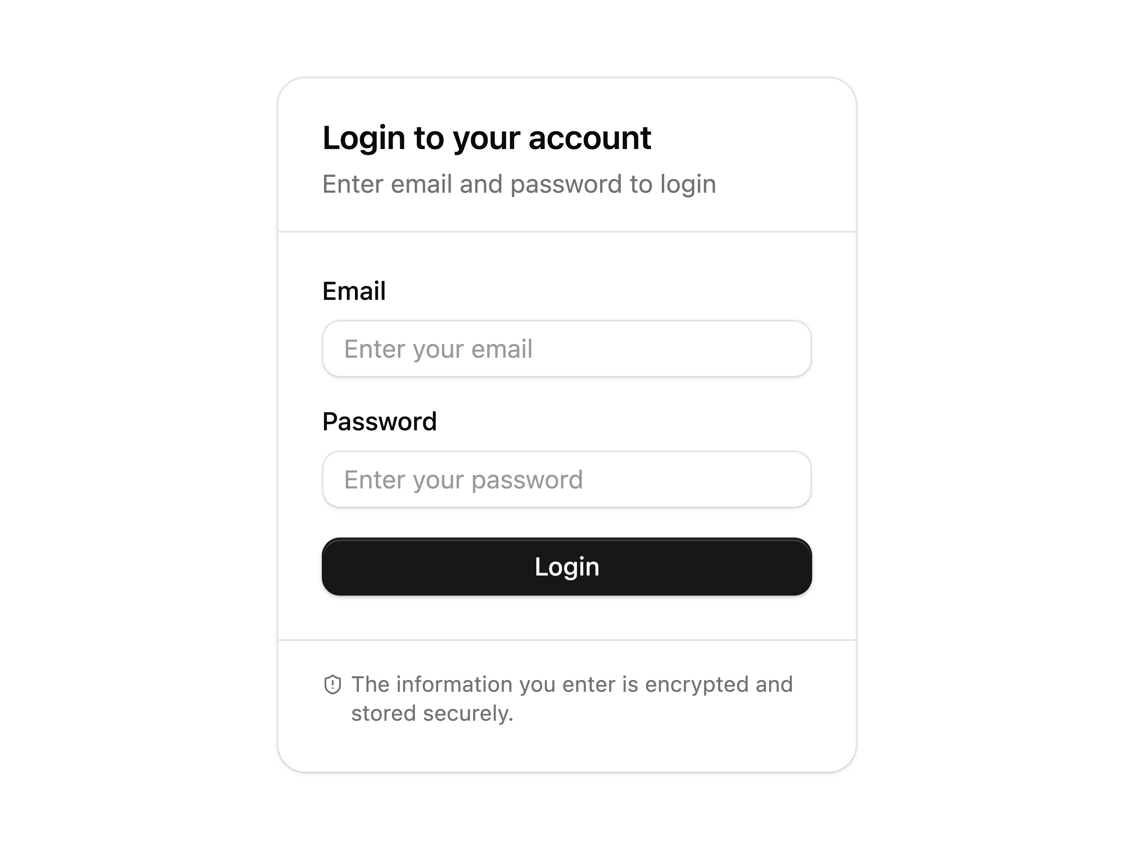
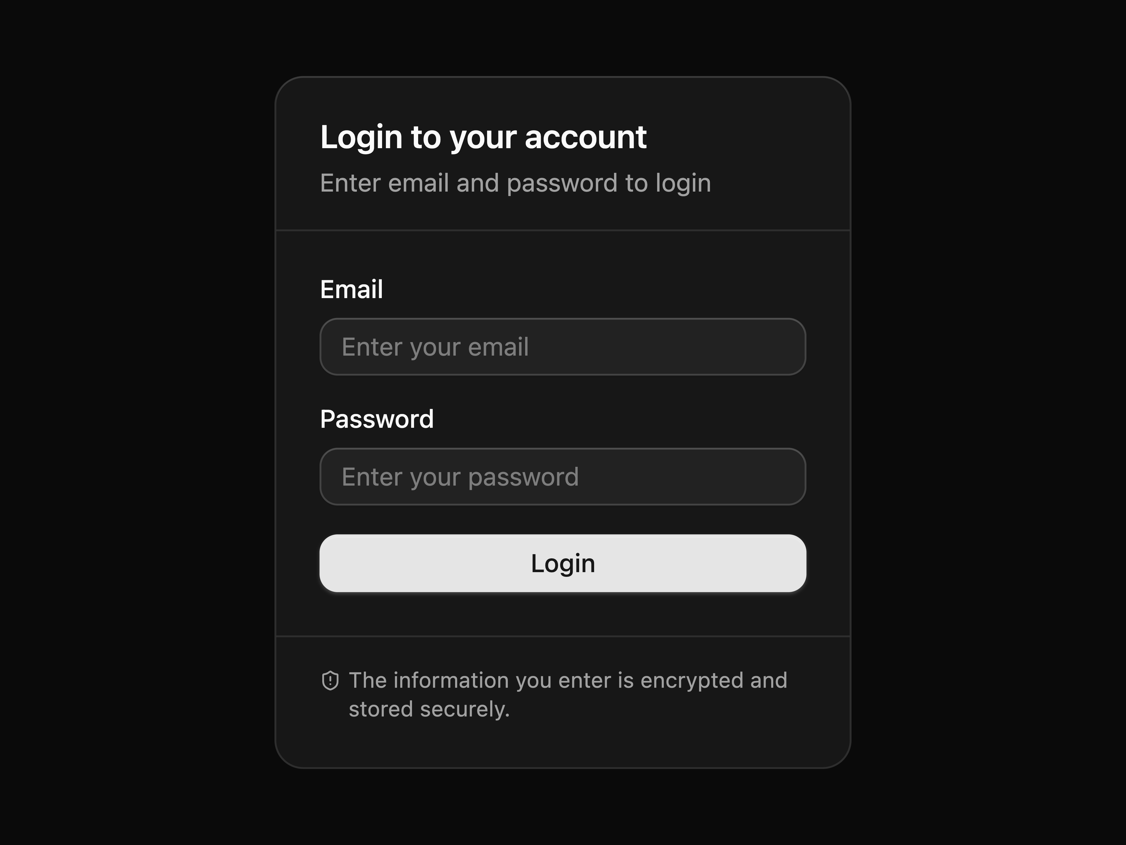
Authentication card with actions
Authentication card with separators
Framed card with footer
Framed card with header
Framed card with header and footer
Framed card with no rounded bottom
Card within a frame and footer
Basic checkbox
Disabled checkbox
Checkbox with description
Card-style checkbox
Checkbox form
Basic checkbox group
Checkbox group with disabled items
Checkbox group with parent checkbox
Nested checkbox group with parent
Checkbox group form
Basic collapsible
Basic combobox
Combobox with input inside popup
Combobox form
Combobox multiple form
Combobox with start addon
Combobox multiple with start addon
Pill-shaped combobox
Timezone combobox
Timezone combobox with search input
Combobox with select trigger
Combobox multiple with stacked chips
Disabled combobox
Combobox multiple with stacked divided chips
Small combobox
Large combobox
Combobox with label
Combobox auto highlighting the first option
Combobox with clear button
Combobox with grouped items
Combobox with multiple selection
Command palette with dialog
Command palette with AI assistant
Basic context menu
Context menu with link items
Nested context menu
Context menu with checkbox items
Context menu with group labels
Context menu with icons
Context menu with radio group
Context menu with switch checkbox items
Basic date picker
Date range picker
Date picker with field and dropdown navigation
Date picker with presets
Date picker with input
Date picker that closes on select
Multiple dates picker
Date picker with select-like trigger
Two months calendar with range date
Dialog with form
Dialog opened from menu
Nested dialogs
Dialog with close confirmation
Dialog with long content
Dialog with bare footer
Simple bottom drawer with close button
Edit profile form with default and bare footer variants
Mobile menu drawer from the left
Responsive edit profile: dialog on desktop, drawer on mobile
Responsive actions menu: menu on desktop, drawer on mobile
Left drawer with swipe area
Bottom drawer without drag bar
Drawer with close button
Inset variant drawers for all four positions
Straight variant drawers for all four positions
Scrollable content with terms and conditions
Nested bottom drawers with centered content
Nested right drawers with inset variant
Bottom drawer with snap points
Empty state with icon and actions
Field with description
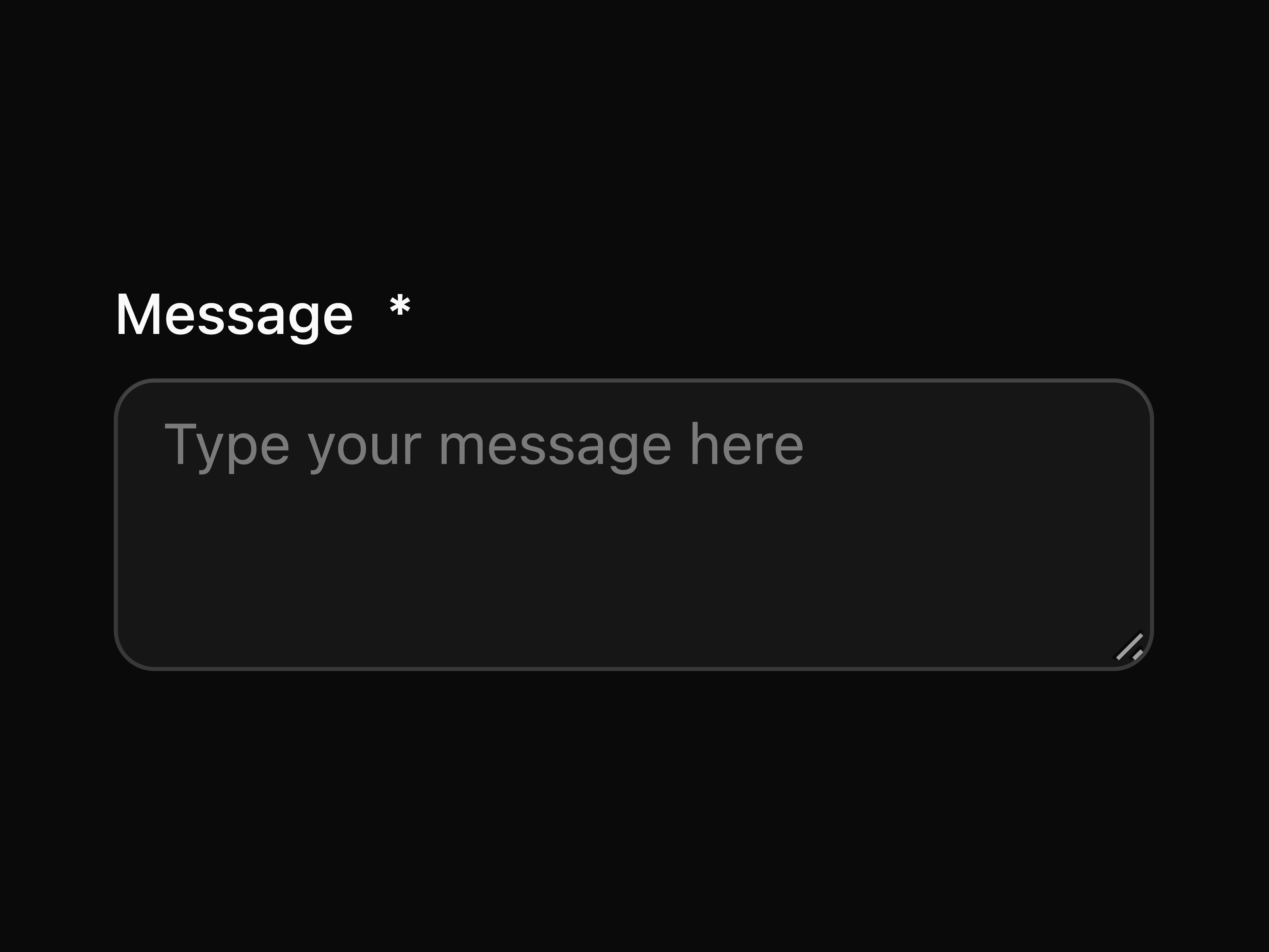
Field with textarea
Field with select
Field with checkbox
Field with checkbox group
Field with radio group
Field with toggle switch
Field with slider
Field with number field
Complete form built with field
Field with required indicator
Field in disabled state
Field showing validation error
Show field validity state
Input group with field
Field with autocomplete
Field with combobox
Field with multiple selection combobox
Fieldset with multiple fields
Input in a form
Form with zod validation
Basic frame
Frame with collapsible content and delete button
Frame with multiple separated panels
Frame with multiple stacked panels
Basic group
Nested groups
Group with popup
Group with input group
Group with menu
Group with select
Group with search
Group with add button and input
Group with input and currency text
Group with select and input
Group with input and select
Group with input
Group with input and text button
Group with two number inputs for range
Group with filter label, combobox multi-select, and remove button
Small group
Large group
Group with disabled button
Group with default button
Group with start text
Group with end text
Vertical group
Basic input
Input group mimicking a URL bar
Input group with keyboard shortcut
Input group with start loading spinner
Input with label and required indicator
Input with optional label
Input with custom border and background
Input group with end loading spinner
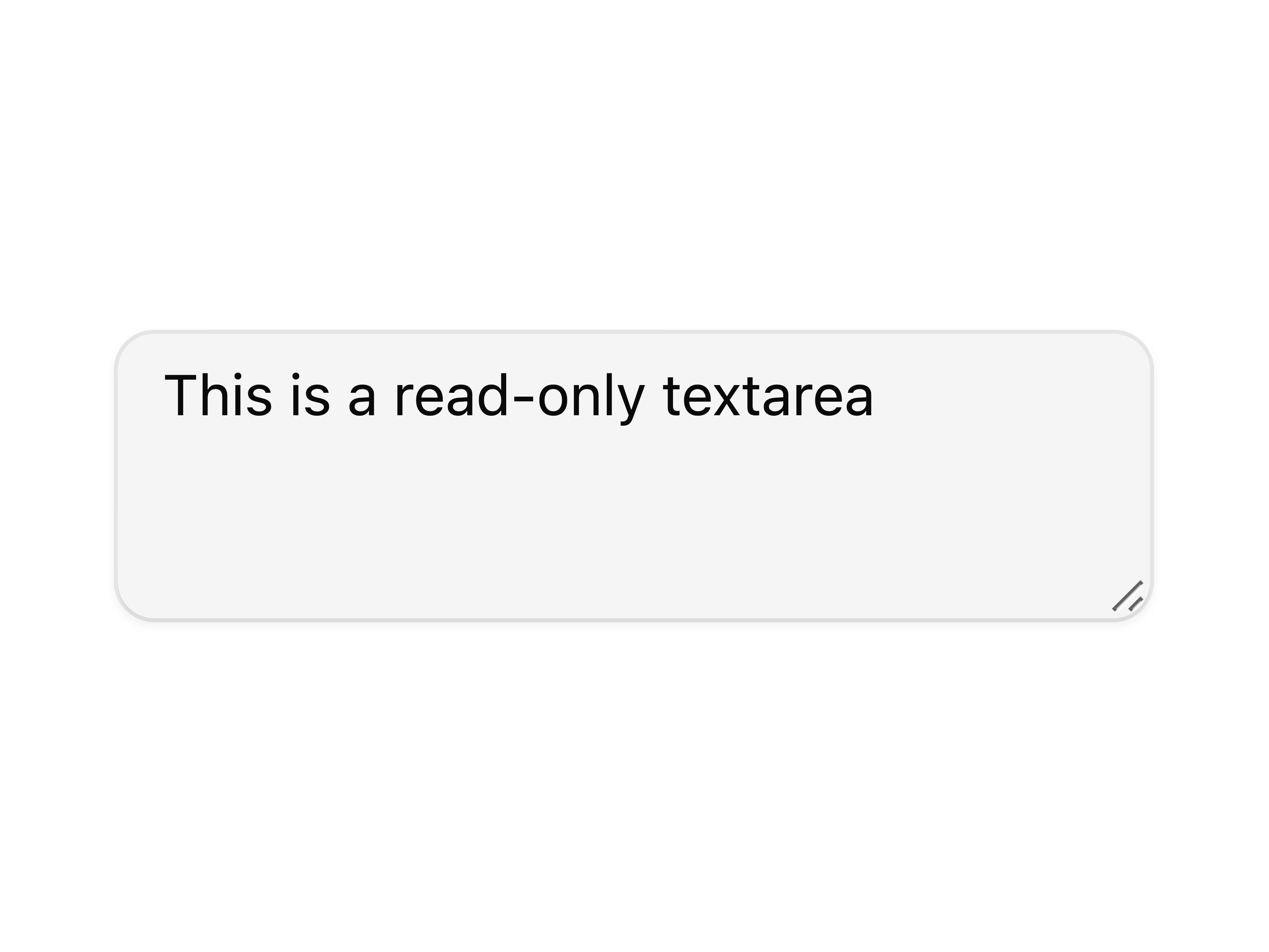
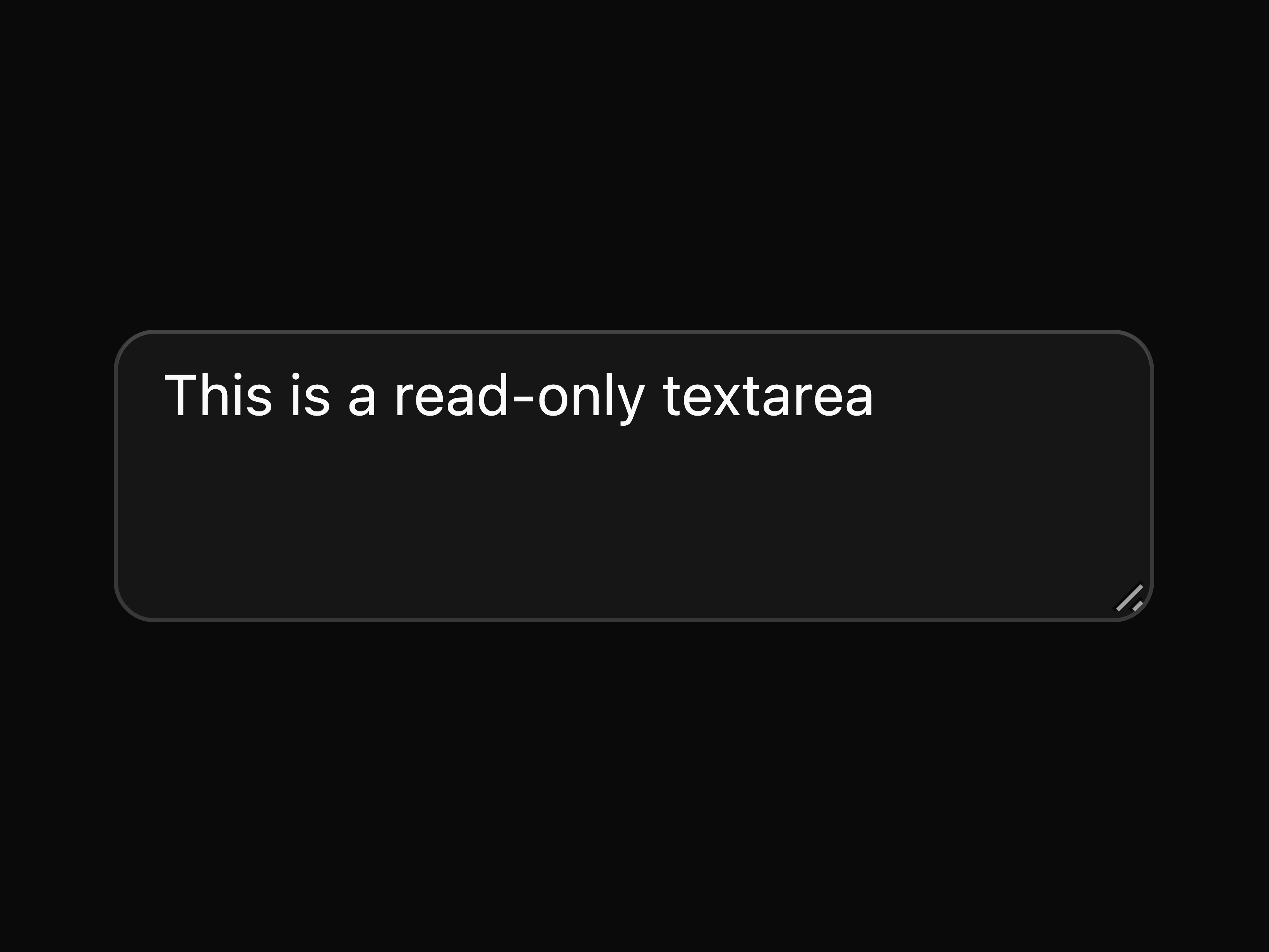
Read-only input
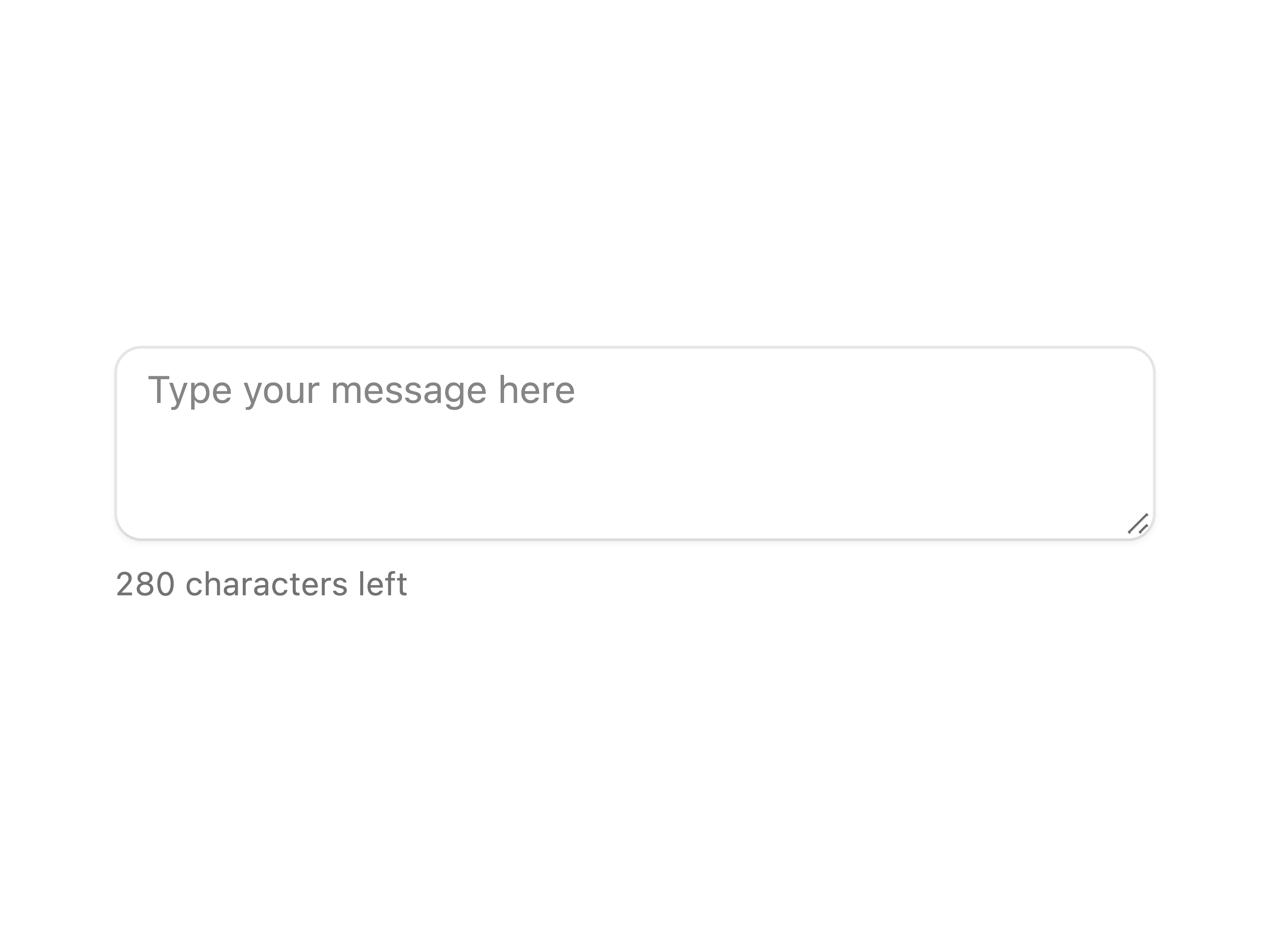
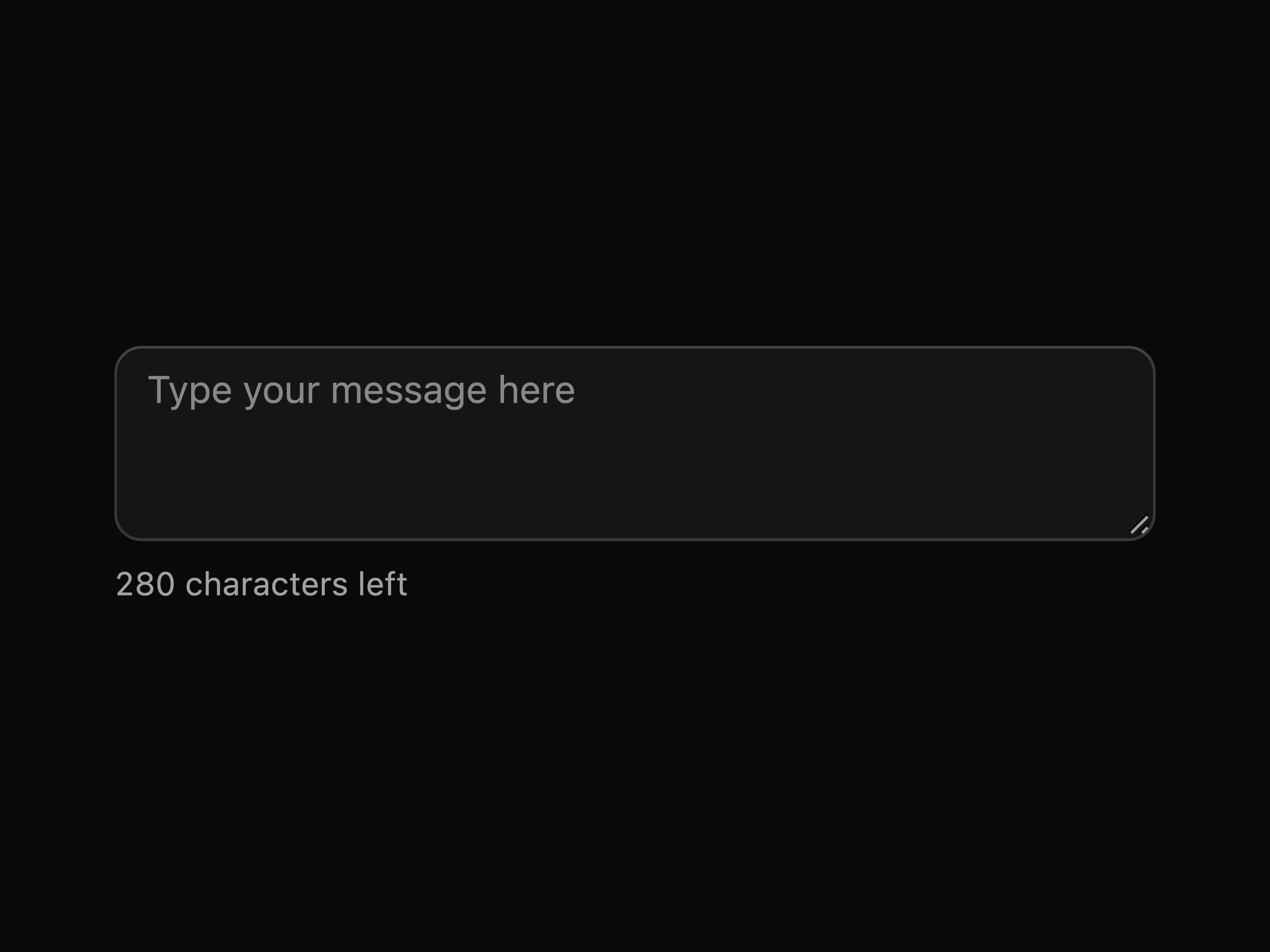
Input with characters remaining counter
Pill-shaped input
Small input
Large input
Disabled input
File input
Input with label
Input with button using Group
Input with start text and end tooltip
Password input with toggle visibility
Basic input group
Input group with badge
Input group with keyboard shortcut
Input group with inner label
Small input group
Large input group
Disabled input group
Input group with loading spinner
Input group with textarea
Input group with badge and menu
Mini editor built with input group and toggle
Input group with end icon
Input group with search icon
Input group with start tooltip
Input group with clear button
Search input group with loader and voice button
Input group with character counter
Password input with strength indicator
Code snippet input with language selector
Message composer with attachment buttons
Chat input with voice and send buttons
Input group with start text
Input group with end text
Input group with start and end text
Input group with number field
Input group with end tooltip
Input group with icon button
Input group with button
Keyboard shortcuts display
Basic menu
Menu with hover
Menu with checkbox
Menu with radio group
Menu with link
Menu with group labels
Nested menu
Menu close on click
Menu with checkbox items as switches
Basic meter
Simple meter
Meter with formatted value
Meter with range
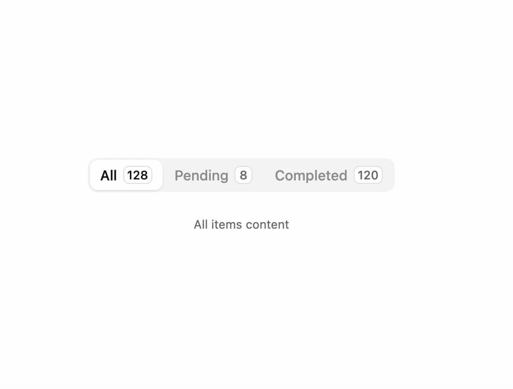
Segmented navigation built with links
Small segmented navigation built with links
Large segmented navigation built with links
Basic number field
Number field in form
Pill-shaped number field
Small number field
Large number field
Disabled number field
Number field with label
Number field with scrub
Number field with range
Number field with formatted value
Number field with step
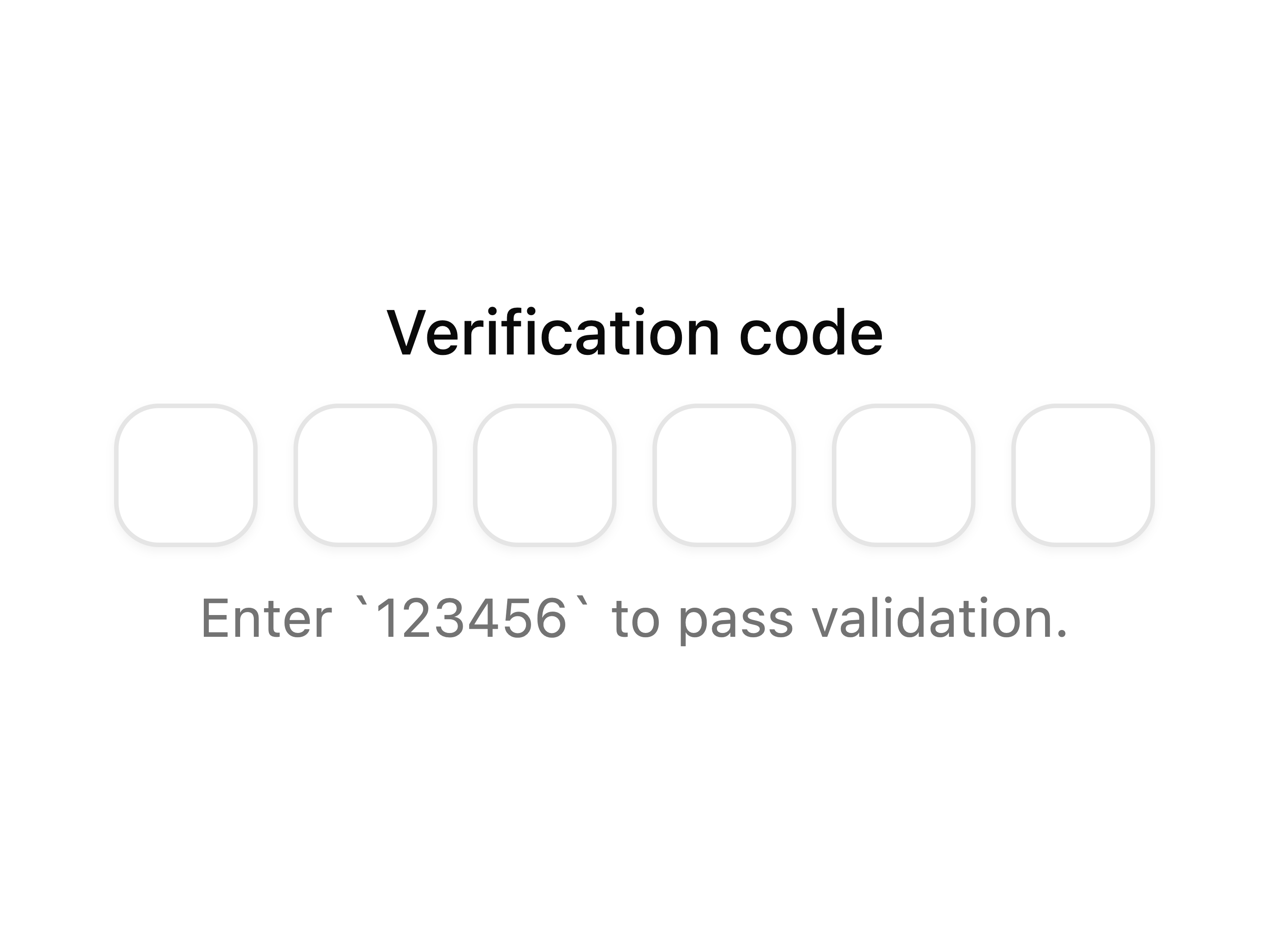
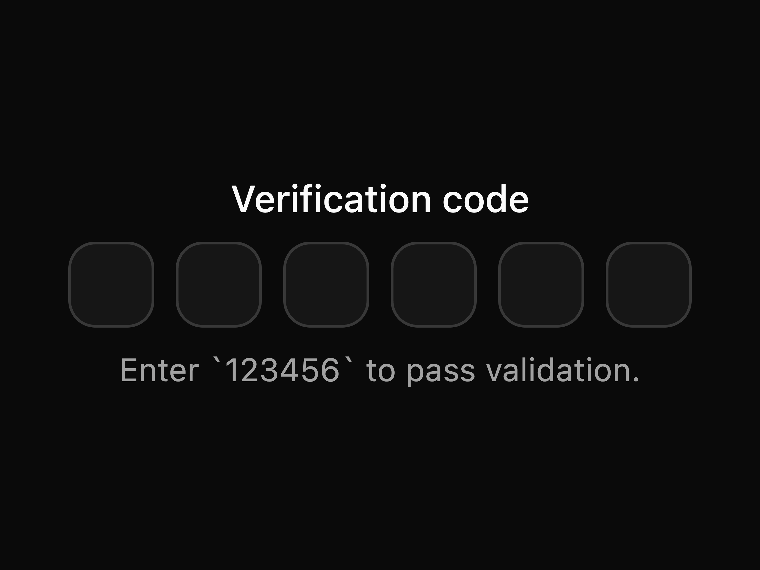
Basic OTP field
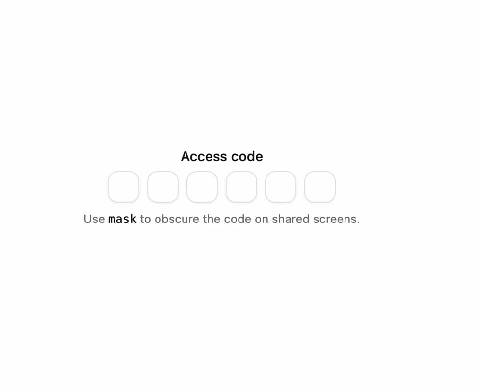
Masked OTP field
Large OTP field
OTP field with separator
OTP field with label
OTP field with custom sanitization
OTP field with auto validation
Alphanumeric OTP field
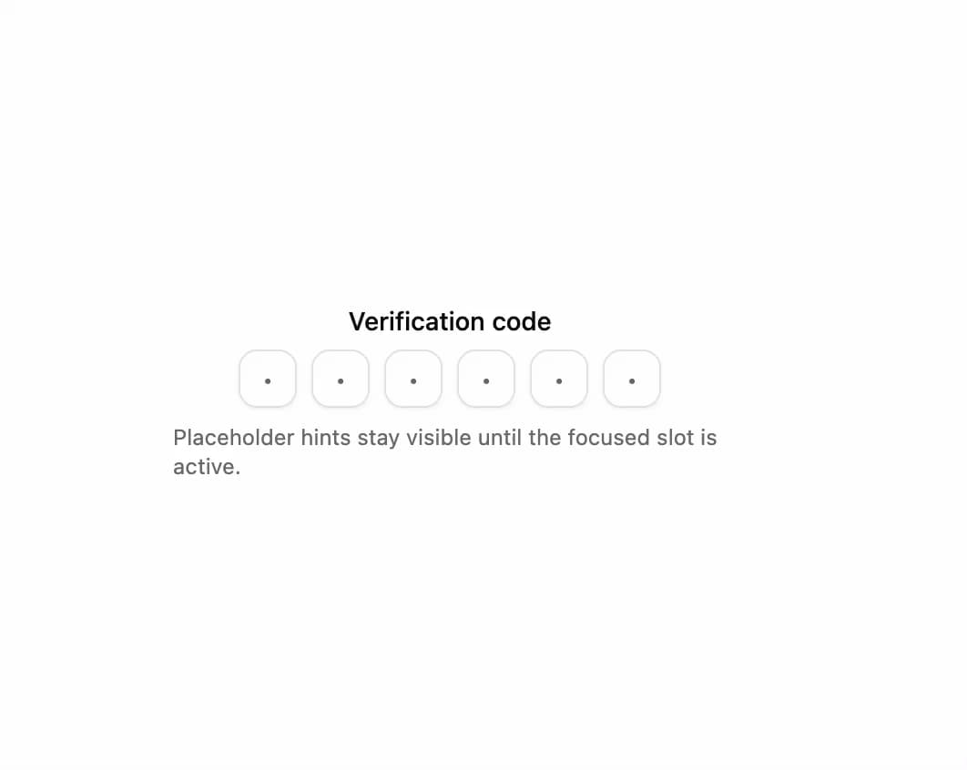
OTP field with placeholder hints
coss.com/ui (formerly Origin UI)
coss.com/ui is the official Cal.com Design System.
This repository contains multiple products and applications that make up the coss.com ecosystem:
apps/www/ - Main coss.com websiteapps/ui/ - coss ui component library and documentationapps/origin/ - Legacy Origin UI components (pre-acquisition)packages/ui/ - Shared UI components packagepackages/typescript-config/ - TypeScript configurationsbiome.json - Shared Biome configuration for linting and formattingEach package/app is 100% TypeScript.
This monorepo contains multiple Next.js applications that are designed to link to each other. For the navigation to work correctly, you must set up environment variables for both local development and production deployments.
For local development, create a .env.local file in each of the app directories with the corresponding variables.
www app
This app needs to know the URLs of the other apps. Create a file at apps/www/.env.local:
# apps/www/.env.local
NEXT_PUBLIC_APP_URL=http://localhost:3000
NEXT_PUBLIC_COSS_UI_URL=http://localhost:4000/ui
ui app
This app needs to know the URLs of the other apps. Create a file at apps/ui/.env.local:
# apps/ui/.env.local
NEXT_PUBLIC_APP_URL=http://localhost:4000/ui
NEXT_PUBLIC_COSS_URL=http://localhost:3000
NEXT_PUBLIC_ORIGIN_URL=http://localhost:4001
origin app
This app needs to know the URLs of the other apps. Create a file at apps/origin/.env.local:
# apps/origin/.env.local
NEXT_PUBLIC_APP_URL=http://localhost:4001/origin
NEXT_PUBLIC_COSS_URL=http://localhost:3000
NEXT_PUBLIC_COSS_UI_URL=http://localhost:4000/ui
[!NOTE] Turborepo is configured to watch for changes in
.env*files, so it will automatically invalidate the cache when these variables change.
This Turborepo has some additional tools already setup for you:
To build all apps and packages:
bun run build
To build a specific app:
bun run build --filter=www
bun run build --filter=ui
bun run build --filter=origin
To develop all apps and packages:
bun run dev
To develop a specific app:
bun run dev --filter=www
bun run dev --filter=ui
bun run dev --filter=origin
coss ui is a collection of beautifully designed, accessible, and composable components for your React apps. Built on top of Base UI and styled with Tailwind CSS, it's designed for you to copy, paste, and own.
We think Base UI is the best foundation for modern web applications. We've taken its powerful, unstyled primitives and given them a design system that's ready to go, right out of the box.
This is the component library we'll be progressively adopting for cal.com. We're building it in the open for anyone who wants to create beautiful, reliable user interfaces.
This repository also includes the Origin UI components as a legacy snapshot. Origin UI was a pre-acquisition collection of Radix-based, shadcn-style components that remains available for use, but with limited support and maintenance. Active development now focuses on the new Particles components built on the coss ui primitives.
We're always looking for contributors to help improve our UI components. Whether it's a bug report, a new feature, or a documentation update, we appreciate your help.
Please see our Contributing Guidelines for more information on how to get involved.
This repository uses a mixed licensing approach. The default license for this project is AGPLv3.0.
apps/origin/ and apps/ui/ directories are licensed under their original MIT licenseFor detailed information, see our Licensing documentation.
Special thanks to:
The packages and primitives its components pull in, counted across the registry.
coss is a component library on 21st.dev by coss with 28 public React components. Every component ships with a live interactive preview and full TSX source — copy the code, install it through the shadcn CLI, or pull it into Cursor or Claude Code over MCP.