"use client";

import {
  AnimatedToastProvider,
  useAnimatedToast,
} from "@/components/ui/animated-toast";

function ToastDemoContent() {
  const { addToast } = useAnimatedToast();

  const showToast = (
    type: "success" | "error" | "warning" | "info" | "default",
  ) => {
    addToast({
      title: `${type.charAt(0).toUpperCase() + type.slice(1)} Toast`,
      message: `This is a ${type} notification message.`,
      type,
      duration: 4000,
    });
  };

  const showToastWithAction = () => {
    addToast({
      title: "Action Required",
      message: "This toast has an action button.",
      type: "info",
      action: {
        label: "Click me",
        onClick: () => alert("Action clicked!"),
      },
    });
  };

  return (
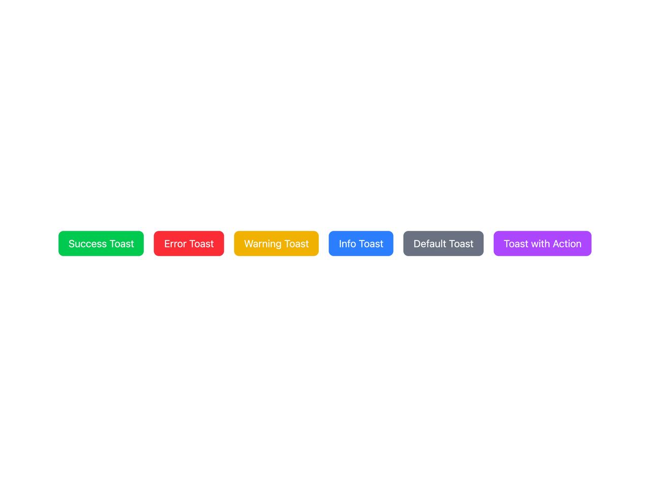
    <div className="flex flex-wrap gap-4">
      <button
        onClick={() => showToast("success")}
        className="rounded-md bg-green-500 px-4 py-2 text-white transition-colors hover:bg-green-600"
      >
        Success Toast
      </button>
      <button
        onClick={() => showToast("error")}
        className="rounded-md bg-red-500 px-4 py-2 text-white transition-colors hover:bg-red-600"
      >
        Error Toast
      </button>
      <button
        onClick={() => showToast("warning")}
        className="rounded-md bg-yellow-500 px-4 py-2 text-white transition-colors hover:bg-yellow-600"
      >
        Warning Toast
      </button>
      <button
        onClick={() => showToast("info")}
        className="rounded-md bg-blue-500 px-4 py-2 text-white transition-colors hover:bg-blue-600"
      >
        Info Toast
      </button>
      <button
        onClick={() => showToast("default")}
        className="rounded-md bg-gray-500 px-4 py-2 text-white transition-colors hover:bg-gray-600"
      >
        Default Toast
      </button>
      <button
        onClick={showToastWithAction}
        className="rounded-md bg-purple-500 px-4 py-2 text-white transition-colors hover:bg-purple-600"
      >
        Toast with Action
      </button>
    </div>
  );
}

export default function AnimatedToastDemo() {
  return (
    <AnimatedToastProvider position="top-right" maxToasts={3}>
      <div className="p-8">
        <ToastDemoContent />
      </div>
    </AnimatedToastProvider>
  );
}