
Extend
13components26.4Kviews67bookmarks
Installs all 39 components. Without our CLI, run instead.
Auto-indexed
Extend contents

Layout Blocks

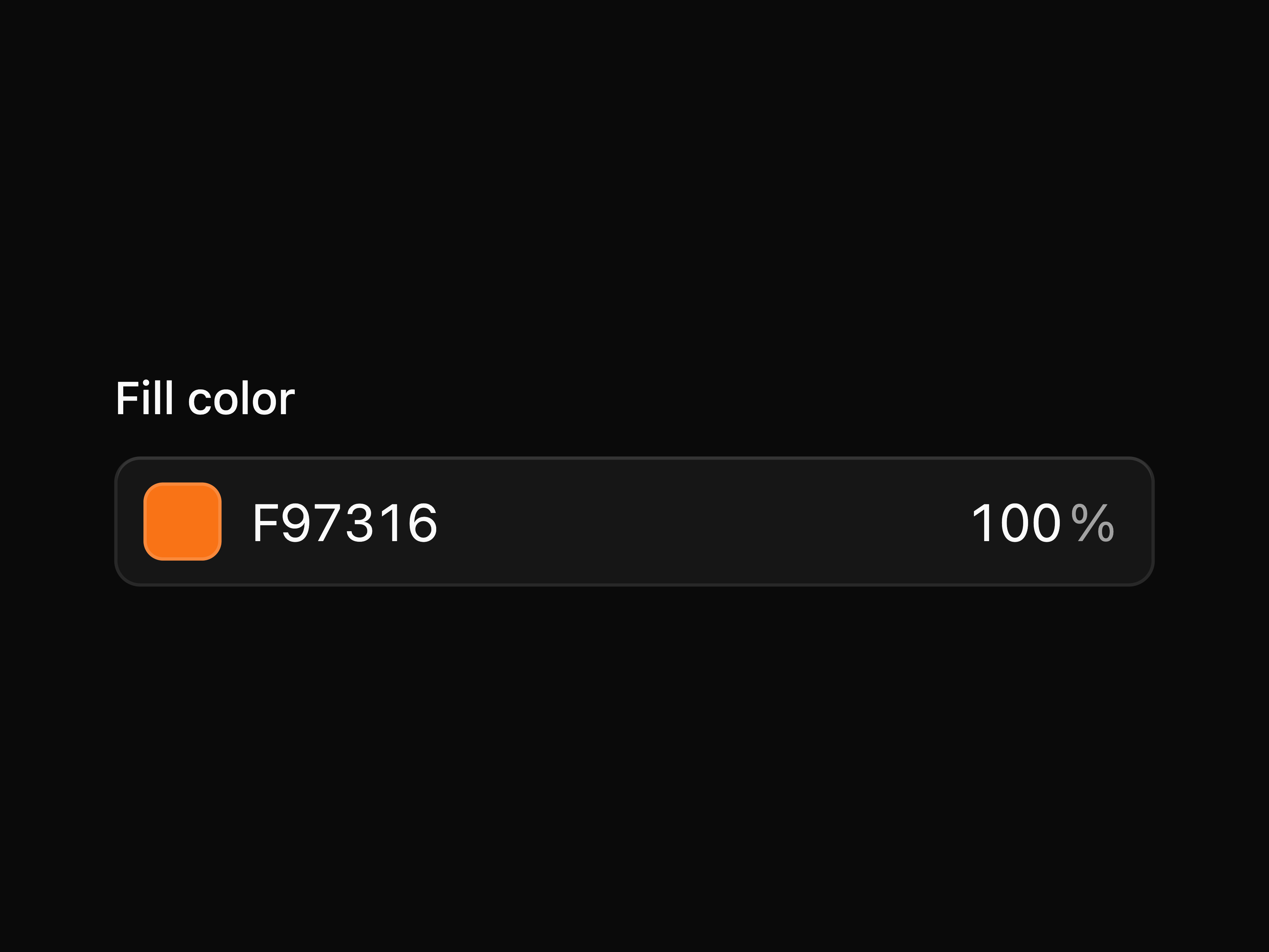
Color Picker
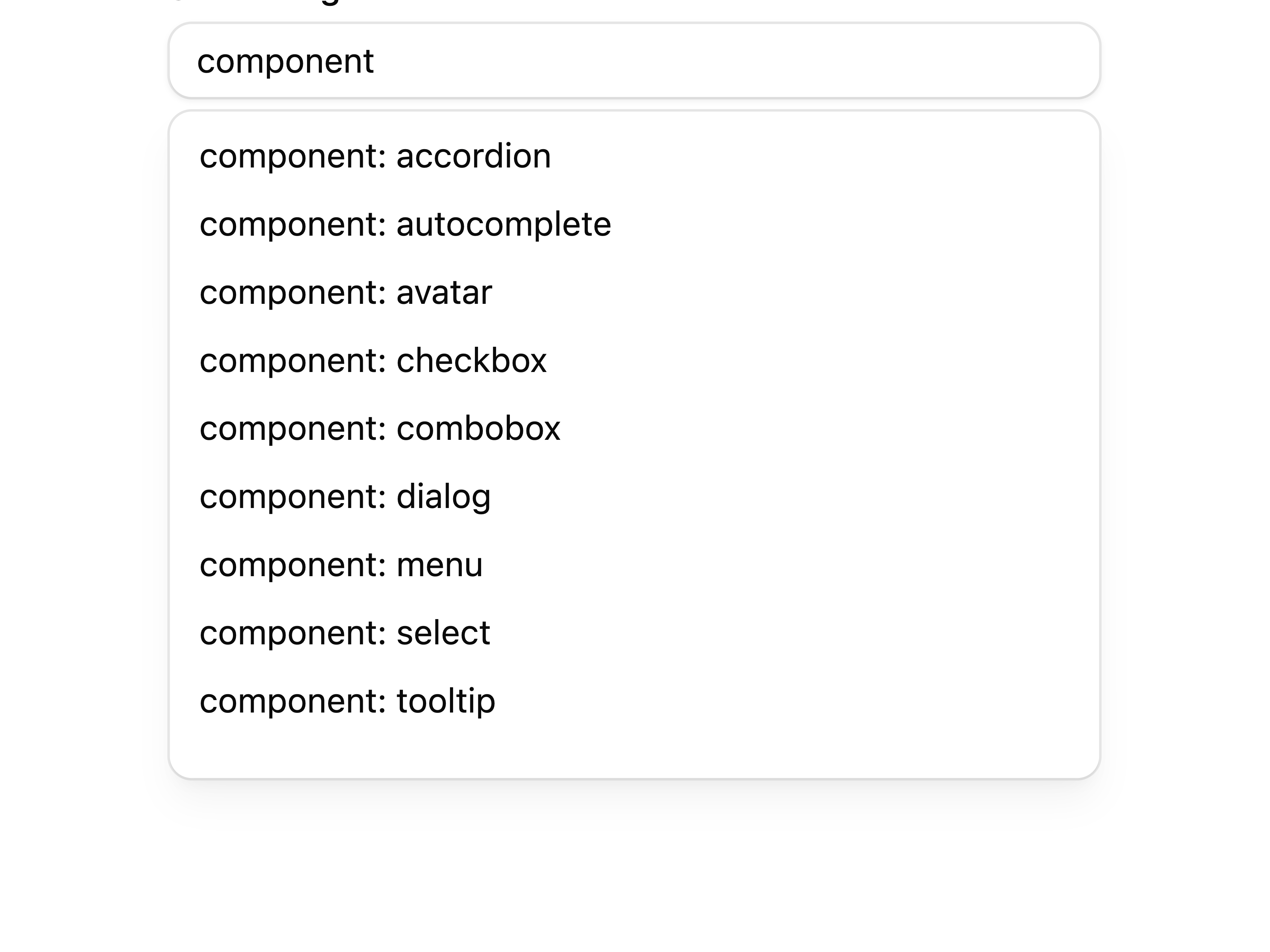
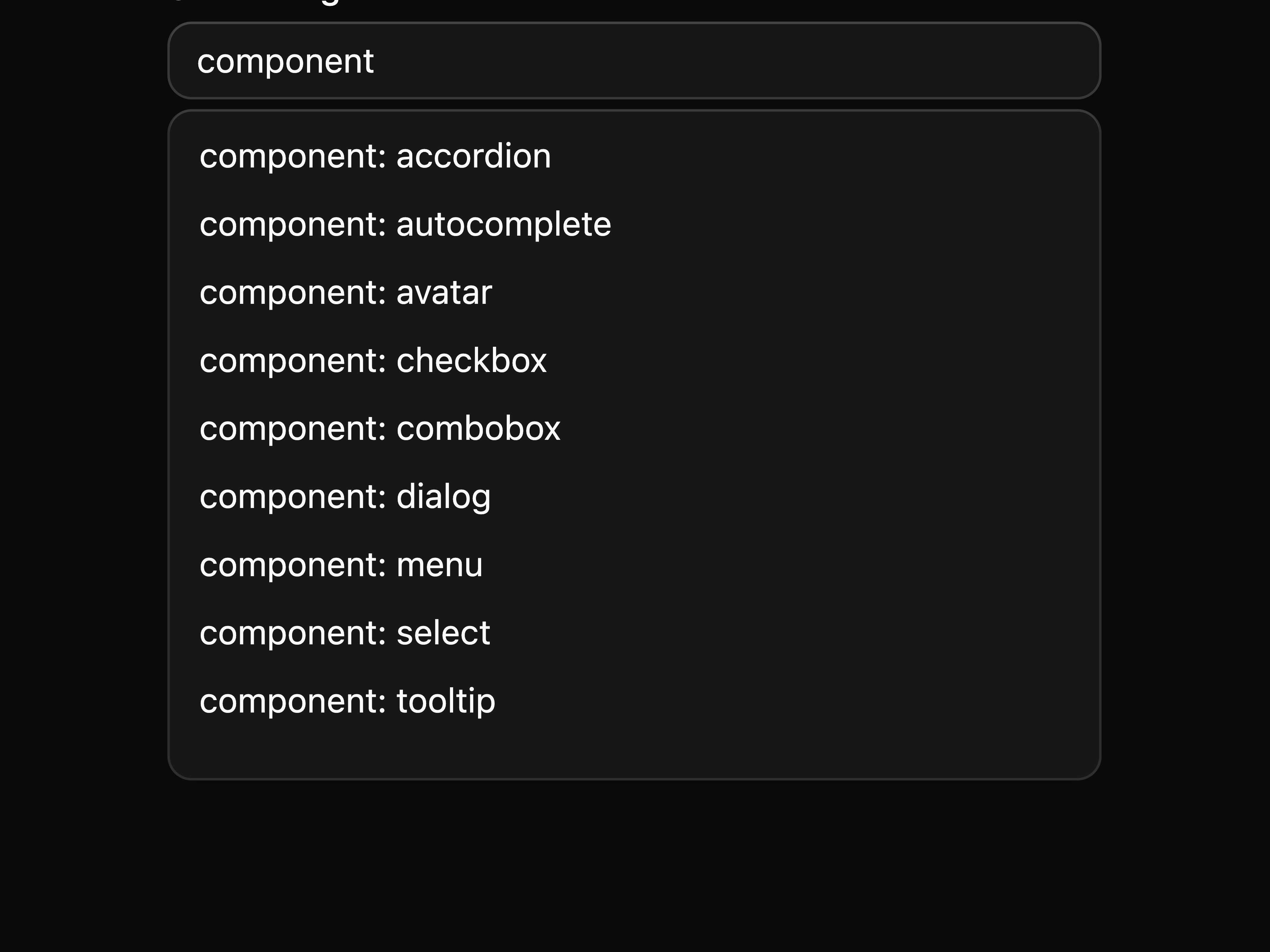
Autocomplete

Command
Dialog

Bounding Box Citations
Tabs

Tooltip

Popover

Separator

Input

Spinner
PDF Viewer
That's all 13 components
About Extend
Extend publishes a shadcn registry at ui.extend.ai, with 39 components installable through the shadcn CLI.
- Components
- 39
- GitHub stars
- 1,599
- Last commit
- Oct 20, 2026
- Repository
- extend-hq/ui
Also in the Extend registry
Copy a prompt for your agent, copy the install command, or open the docs that ship it.
Bounding Box Citations
bounding-box-citations-blockAn extraction citation block linked to source PDF bounding boxes.
1 fileCSV Viewer
csv-viewerA CSV and TSV viewer with parsing, upload, search, zoom, theme-aware grid rendering, and Glide Data Grid.
@glideapps/glide-data-grid@6.0.4-alpha24, @hugeicons/core-free-icons@^4.2.0, @hugeicons/react@^1.1.6, papaparse@^5.5.31 filedocument-controls
document-preview-card
document-scroll-area
Document Splits
document-splitsA split-group review panel for organizing pages into output documents.
@dnd-kit/core@^6.3.1, @dnd-kit/sortable@^10.0.0, @dnd-kit/utilities@^3.2.2, @hugeicons/core-free-icons@^4.2.01 fileDocument Splits
document-splits-blockA split-group review block for organizing PDF pages into output documents.
1 filedocument-toast
Document Viewer Sidebar
document-viewer-sidebarShared thumbnail sidebar behavior for document viewers, including viewer-width responsive overlay and inline modes.
utils1 fileDOCX Editor
docx-editorAn experimental DOCX editor with a Word-style toolbar, page thumbnails, import, export, and live document mutation.
@base-ui/react@^1.4.1, @extend-ai/react-docx@^0.8.2, @hugeicons/core-free-icons@^4.2.0, @hugeicons/react@^1.1.62 filesDOCX Editor
docx-editor-blockA full DOCX editor block with a Word-style toolbar, page thumbnails, and export controls.
1 fileDOCX Viewer
docx-viewerA DOCX viewer with upload, zoom, theme controls, and read-only rendering.
@extend-ai/react-docx@^0.8.2, @hugeicons/core-free-icons@^4.2.0, @hugeicons/react@^1.1.6, @tanstack/react-virtual@^3.13.122 filesE-Signature
A PDF signature review block with field overlays and signing actions.
@hugeicons/core-free-icons@^4.2.0, @hugeicons/react@^1.1.6, pdf-lib@^1.17.1, signature_pad@^5.1.31 fileExcel Editor
excel-editorA full Excel editor block with workbook upload, cell formatting, merge tools, sheets, zoom, and export controls.
1 fileFile System (Finder)
file-systemA macOS Finder-style file browser for flat object-store manifests with icon, list, column, and gallery views.
@hugeicons/core-free-icons@^4.2.0, @hugeicons/react@^1.1.6, @pierre/trees@1.0.0-beta.41 fileFile System (Finder)
file-system-blockA Finder-style file browser block that opens PDF, DOCX, PowerPoint, XLSX, and image files in large viewer dialogs.
1 fileFile Thumbnail
file-thumbnailA compact file preview thumbnail shell for externally generated images, loading states, and fallback states.
1 fileFile Upload
file-uploadA drag-and-drop file upload surface with accepted file type icons and a compact file list.
@hugeicons/core-free-icons@^4.2.0, @hugeicons/react@^1.1.6, border-beam@^1.0.11 fileGroup
A connected control group primitive for buttons, inputs, separators, and text addons.
@base-ui/react@^1.4.1, class-variance-authority@^0.7.11 fileKbd
A keyboard shortcut display primitive.
utils1 fileLayout Blocks
layout-blocks-blockA structured layout review block with confidence cards and PDF region overlays.
1 filePDF Block Resizable Shell
pdf-block-resizable-shellA reusable resizable left document viewer and right review panel shell for PDF-style blocks.
utils1 filePDF Dropzone
pdf-dropzoneA PDF-only upload dropzone that opens the dropped file in the shared PDF viewer.
@hugeicons/core-free-icons@^4.2.01 filepdf-editor
pdf-editor-block
pdf-editor-core
PowerPoint Viewer
pptx-viewerA PowerPoint viewer with slide navigation, zoom, upload, download, custom scroll areas, and virtualized thumbnails.
@extend-ai/react-pptx@0.1.2, @hugeicons/core-free-icons@^4.2.0, @hugeicons/react@^1.1.6, @tanstack/react-virtual@^3.13.121 fileregistry-icon-props
Schema Builder
schema-builderA JSON schema builder with form and JSON views for extraction schemas.
@dnd-kit/core@^6.3.1, @dnd-kit/sortable@^10.0.0, @dnd-kit/utilities@^3.2.2, @hugeicons/core-free-icons@^4.2.01 fileExcel Editor
xlsx-editorAn experimental XLSX editor with formula input, undo and redo, sheet controls, export, and live workbook mutation.
@extend-ai/react-xlsx@0.15.0, @hugeicons/core-free-icons@^4.2.0, @hugeicons/react@^1.1.61 fileExcel Viewer
xlsx-viewerAn XLSX viewer with workbook loading, thumbnails, sheet tabs, upload, zoom, and theme controls.
@extend-ai/react-xlsx@0.15.0, @hugeicons/core-free-icons@^4.2.0, @hugeicons/react@^1.1.61 file




