HomeBookmarks
ComponentryComponentry
Componentry

Componentry

HJby Harsh Jadhav
18components480.9Kviews2.1Kbookmarks

Installs all 57 components. Without our CLI, run instead.

Auto-indexed

Componentry contents

  • Lens Clock

    Lens Clock

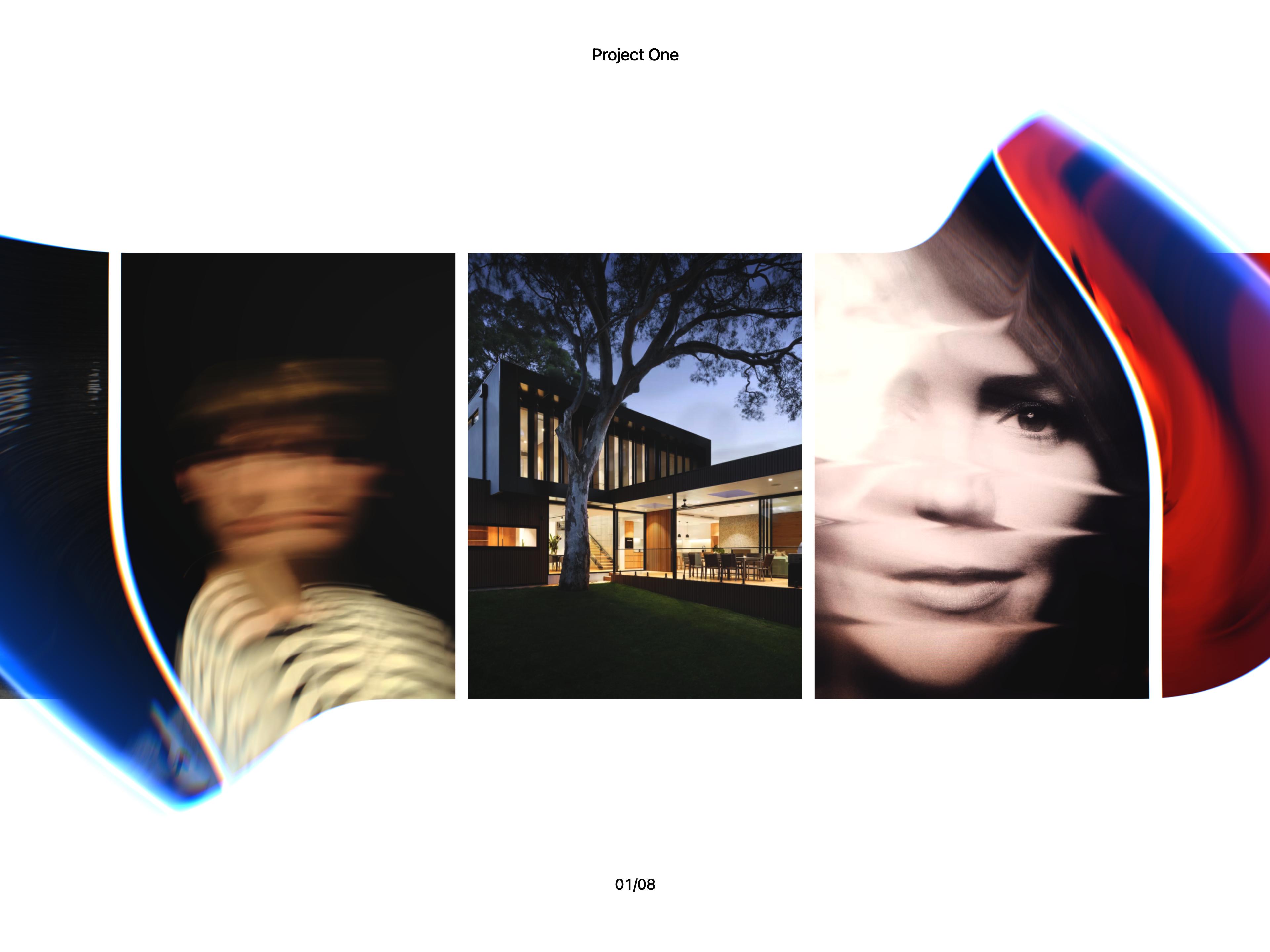
  • Liquid Glass Carousel

    Liquid Glass Carousel

  • Dithered Logo

    Dithered Logo

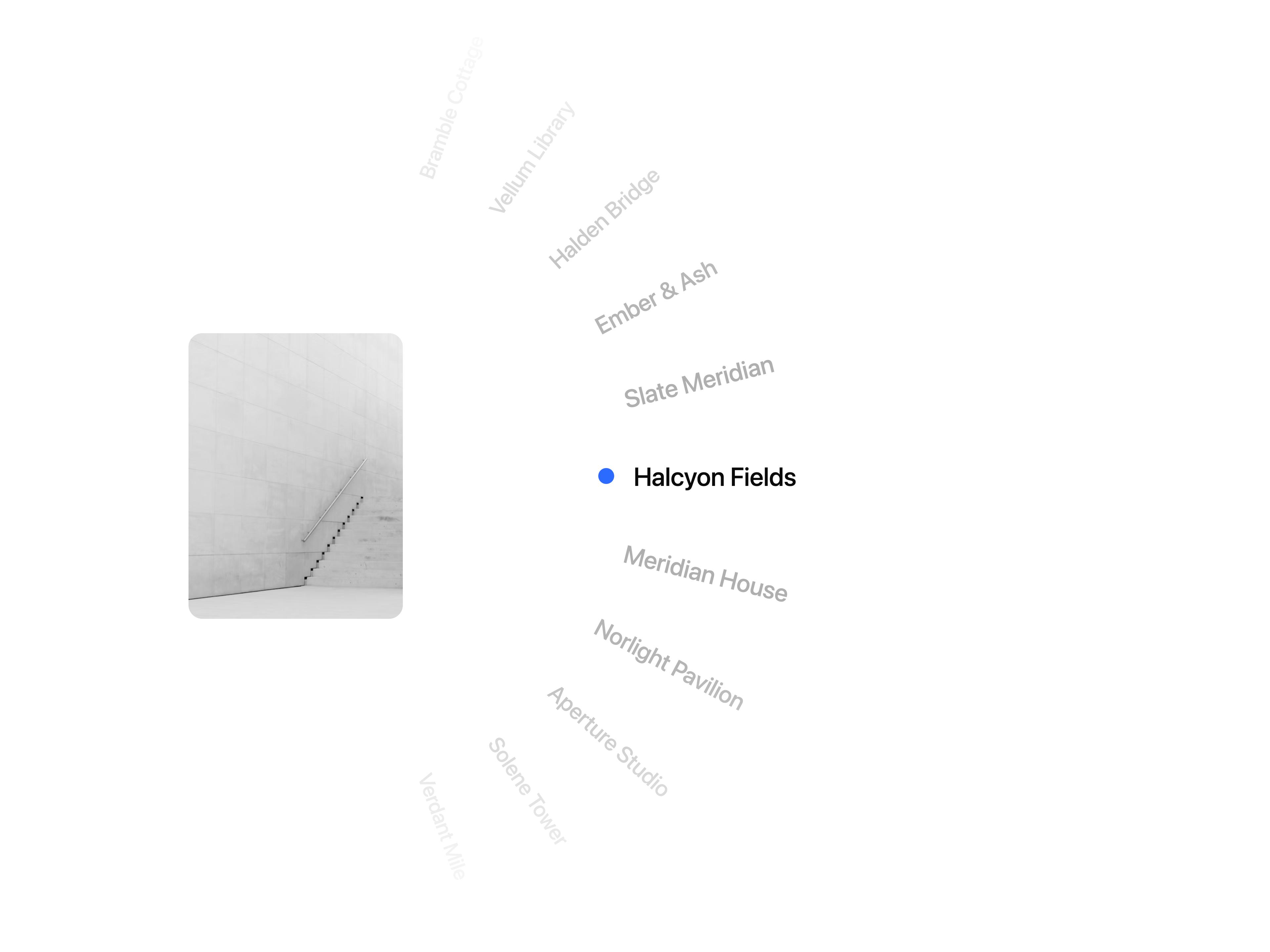
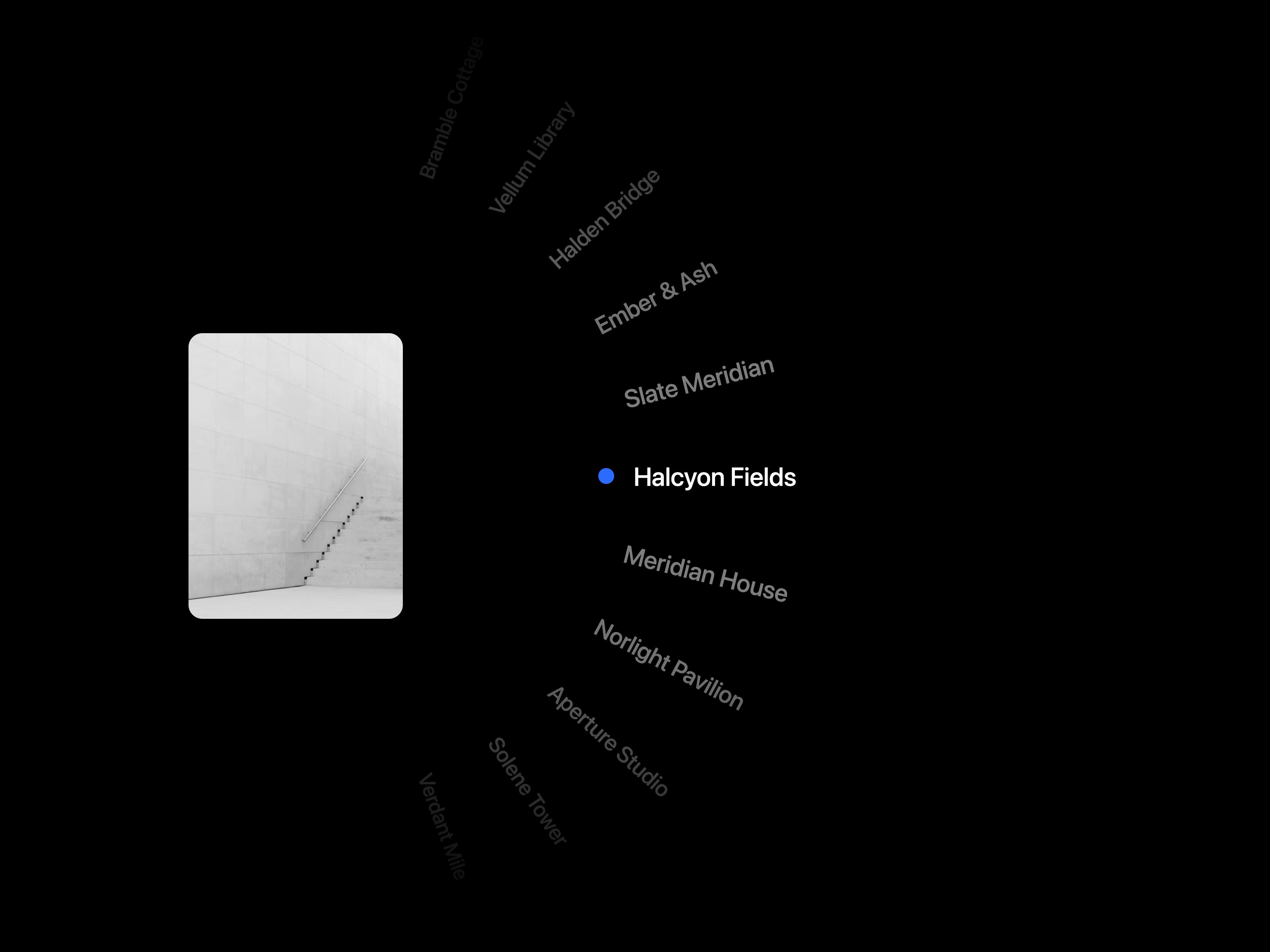
  • Wheel CarouselWheel Carousel

    Wheel Carousel

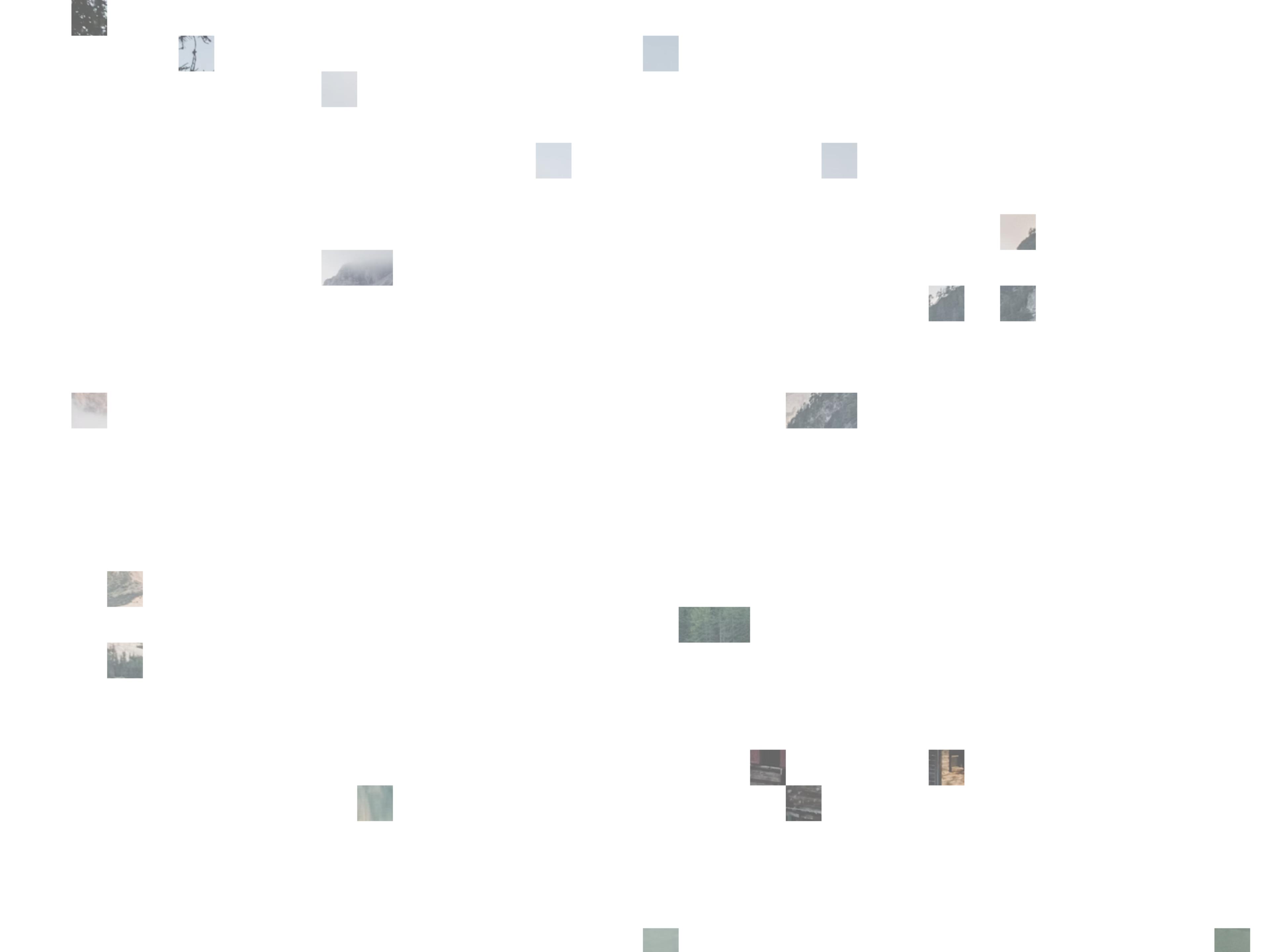
  • Pixel Image TrailPixel Image Trail

    Pixel Image Trail

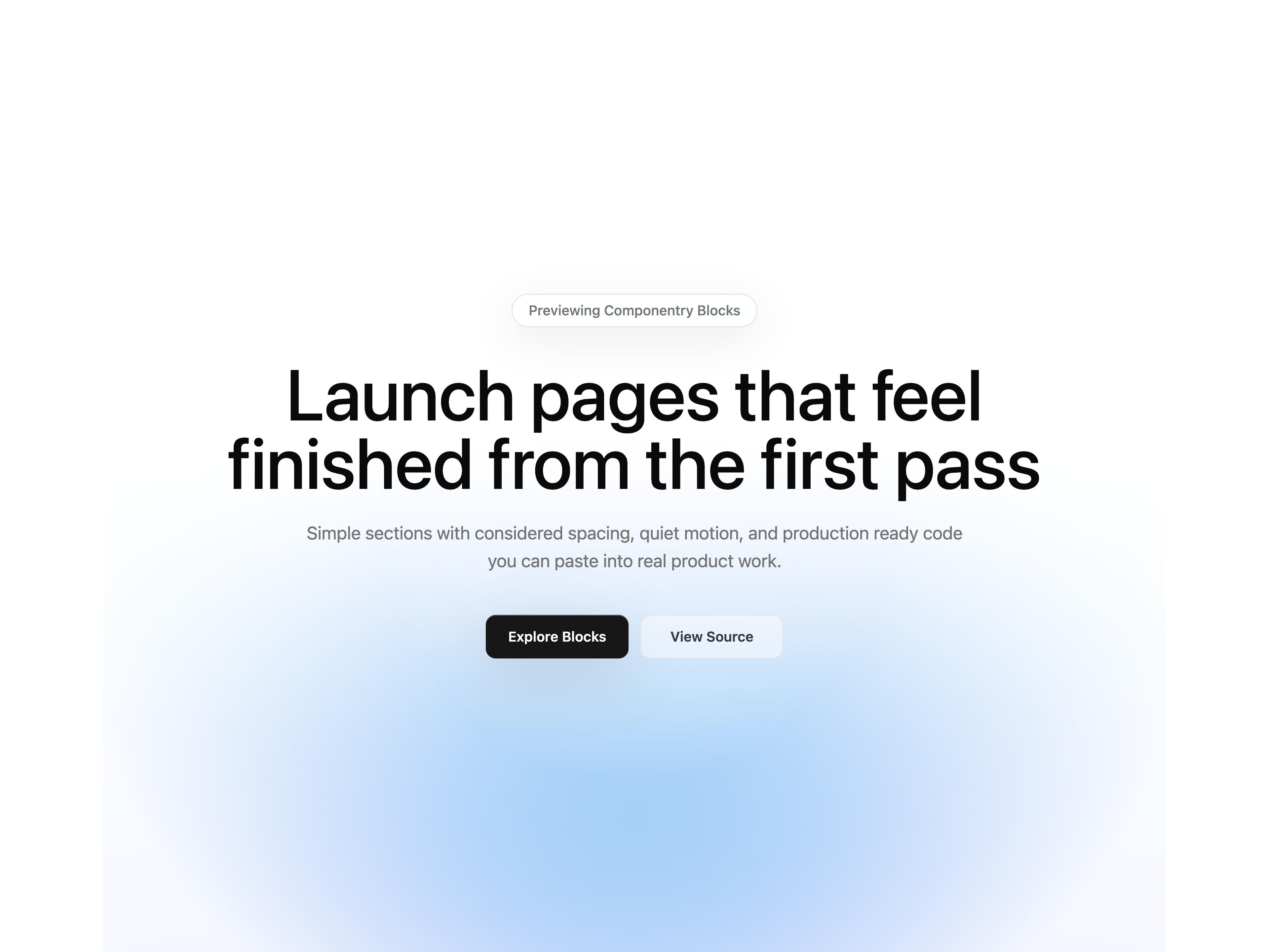
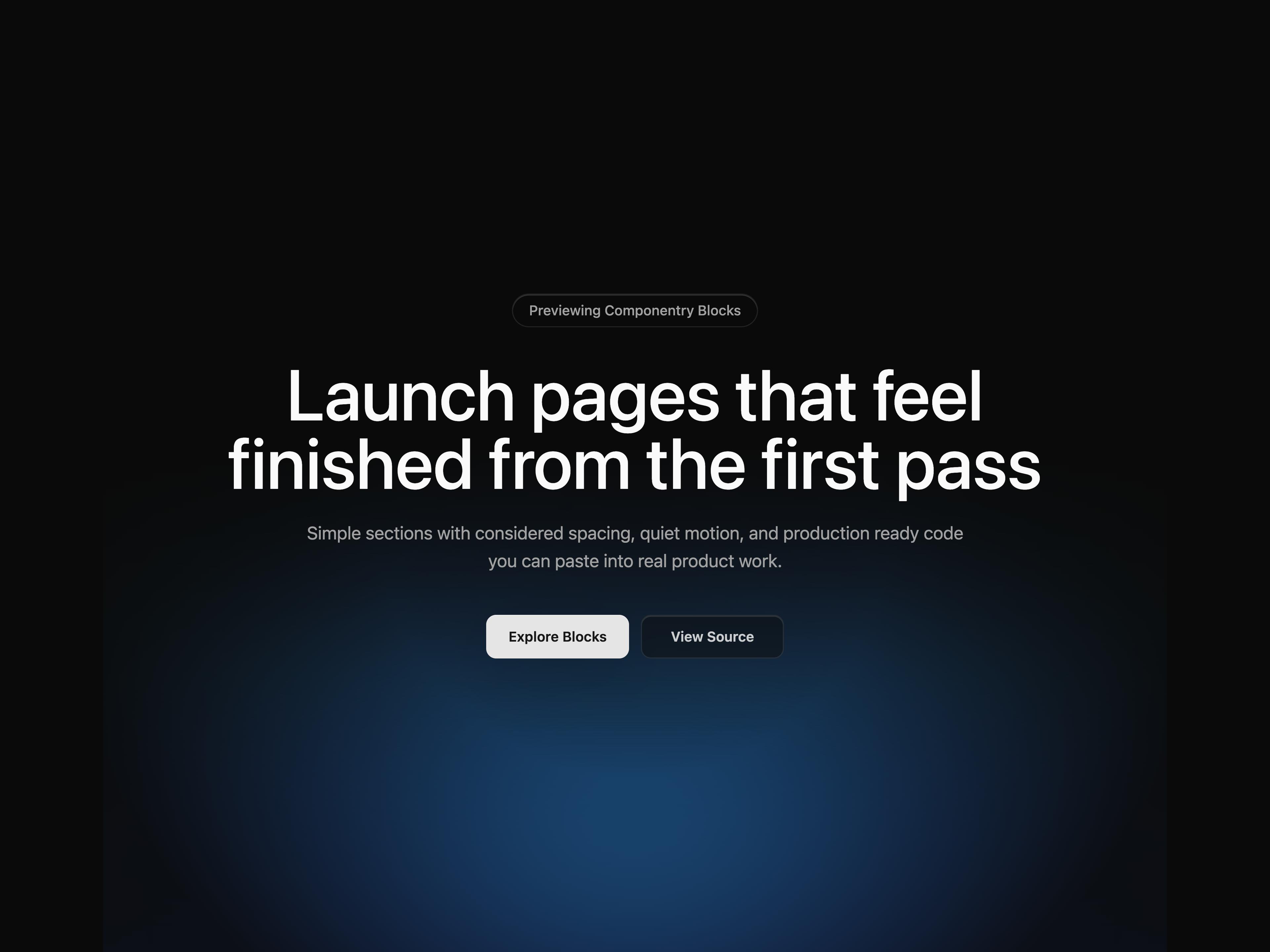
  • Gradient HeroGradient Hero

    Gradient Hero

  • Spectral Ribbon

    Spectral Ribbon

  • Image Trail

    Image Trail

  • Text MorphText Morph

    Text Morph

  • Testimonial Marquee

    Testimonial Marquee

  • Magnet Lines

    Magnet Lines

  • Animated Gradient

    Animated Gradient

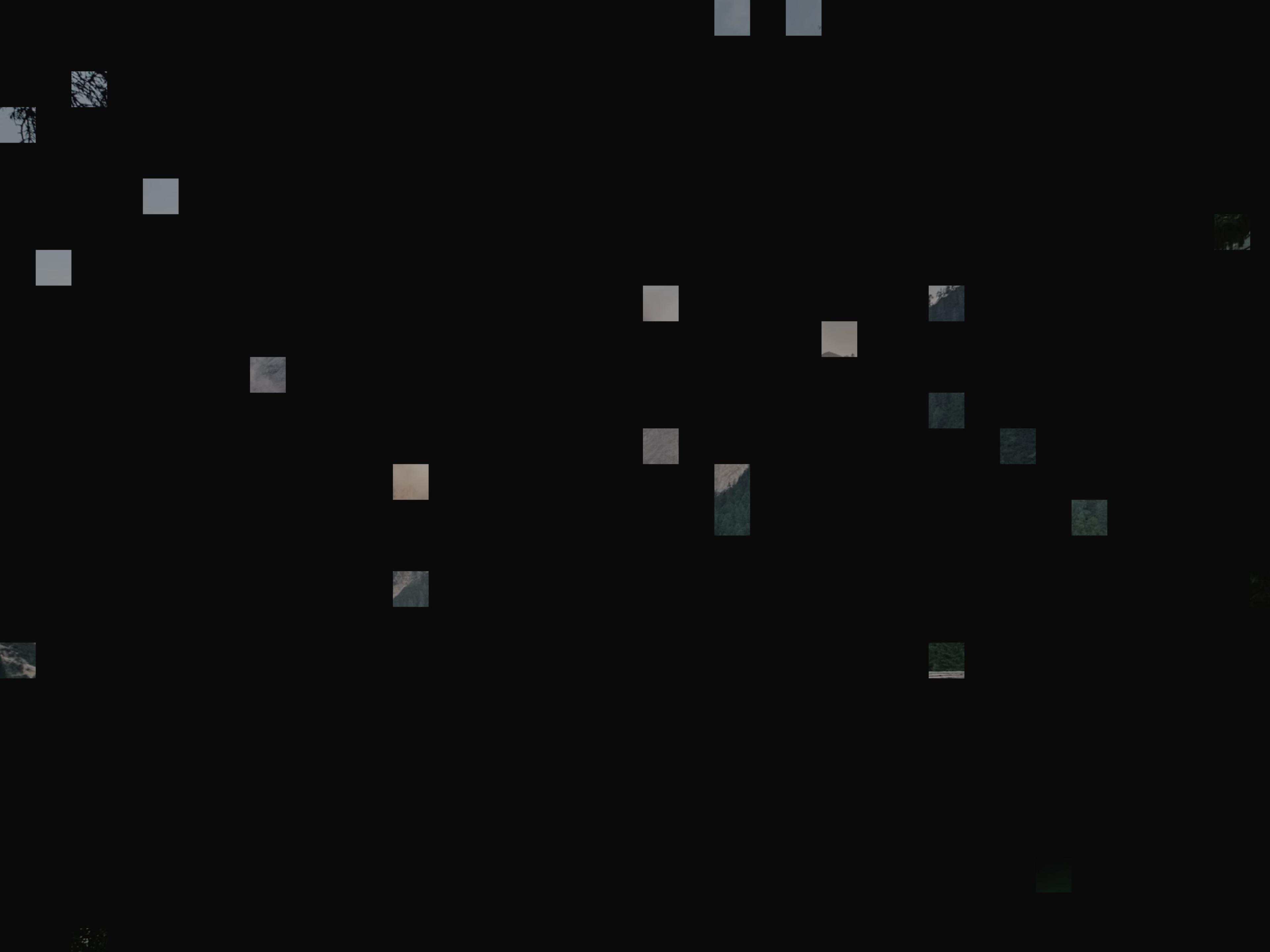
  • Infinite Image Field

    Infinite Image Field

  • Particle Galaxy

    Particle Galaxy

  • Pixel CanvasPixel Canvas

    Pixel Canvas

  • Silk Aurora

    Silk Aurora

  • Circuit Board

    Circuit Board

  • Eye Tracking

    Eye Tracking

  • That's all 18 components

    About Componentry

    Componentry publishes a shadcn registry at componentry.fun, with 57 components installable through the shadcn CLI.

    Components
    57
    GitHub stars
    633
    Last commit
    Oct 12, 2026
    Repository
    harshjdhv/componentry

    Also in the Componentry registry

    Copy a prompt for your agent, copy the install command, or open the docs that ship it.

    • annotated-text

    • ascii-effect

    • aurora-flow

    • case-study-flip-stack

    • closing-plasma

      Docs ↗
    • cursor-driven-particle-typography

      Docs ↗
    • dither-gradient

      Docs ↗
    • fisheye-infinite-grid

    • flight-status-card

      Docs ↗
    • flipping-word-swap

    • github-calendar

      Docs ↗
    • grain-gradient

    • hover-transition

    • image-ripple-effect

      Docs ↗
    • kinetic-text-reveal

      Docs ↗
    • layered-stack

      Docs ↗
    • letter-cascade

      Docs ↗
    • liquid-chrome

    • mac-keyboard

      Docs ↗
    • matrix-rain

      Docs ↗
    • music-player

      Docs ↗
    • newsletter-bookshelf

    • orbit-card-stack

      Docs ↗
    • pricing-01

    • pricing-02

    • prism-gradient

    • ripple-transition

    • scroll-based-velocity

      Docs ↗
    • scroll-split-card

      Docs ↗
    • scroll-tilted-grid

    • signature

      Docs ↗
    • spiral-3d-slider

    • sticky-scroll-cards

      Docs ↗

    From the Componentry readme

    Componentry

    Beautiful, interactive UI components you can copy and paste into your apps.

    Crafted with React, Tailwind CSS, and Framer Motion. Open source. Free forever.

    Documentation · Components · Report Bug · Request Feature


    Introduction

    Componentry is a collection of beautifully designed, interactive UI components built with React and Tailwind CSS. Just run the CLI command, add the component to your project, and start building.

    Why Componentry?

    • Copy & Paste - Not a dependency. You own the code.
    • Interactive - Cursor-following effects, 3D transforms, and smooth animations.
    • Customizable - Built with Tailwind CSS. Easy to modify.
    • Accessible foundations - Native controls and component-specific keyboard and motion support. Validate accessibility in your application.
    • Dark Mode - All components support light and dark modes.
    • TypeScript - Fully typed for the best developer experience.

    Quick Start

    Installation via CLI

    The fastest way to add components is using the shadcn CLI:

    npx shadcn@latest add @componentry/magnetic-dock
    

    Development

    This project uses Turborepo for monorepo management.

    Prerequisites

    • Node.js 20+
    • pnpm 10+

    Setup

    # Clone the repository
    git clone https://github.com/harshjdhv/componentry.git
    cd componentry
    
    # Install dependencies
    pnpm install
    
    # Start development server
    pnpm dev
    

    Project Structure

    componentry/ ├── apps/ │ └── web/ # Documentation site (Next.js) ├── packages/ │ ├── ui/ # Component library │ ├── eslint-config/ # Shared ESLint configuration │ └── typescript-config/ # Shared TypeScript configuration └── turbo.json # Turborepo configuration

    Available Scripts

    CommandDescription
    pnpm devStart development server
    pnpm buildBuild all packages
    pnpm lintRun linting
    pnpm formatFormat code with Prettier
    pnpm registry:generateRegenerate component and block payloads
    pnpm registry:checkCheck registry freshness, dependencies and docs coverage
    pnpm testRun distribution regression tests
    pnpm typecheckTypecheck the web and UI workspaces
    pnpm test:registry:installInstall and typecheck representative payloads in a fresh app

    Contributing

    We welcome contributions! Whether it's:

    • Reporting a bug
    • Submitting a fix
    • Proposing new features
    • Creating new components

    See the component creation guide for source, registry and documentation steps, and the maintenance guide for validation commands.

    How to Contribute

    1. Fork the repository
    2. Create your feature branch (git checkout -b feature/amazing-component)
    3. Commit your changes (git commit -m 'Add amazing component')
    4. Push to the branch (git push origin feature/amazing-component)
    5. Open a Pull Request

    Component Guidelines

    When creating new components:

    • Use TypeScript with proper type definitions
    • Support both light and dark modes
    • Include comprehensive props with sensible defaults
    • Add smooth transitions and animations
    • Write clear documentation with examples
    • Follow existing code style and patterns

    Tech Stack

    • Framework: Next.js 16
    • Styling: Tailwind CSS 4
    • Components: React 19
    • Build: Turborepo
    • Package Manager: pnpm

    License

    MIT License - feel free to use these components in personal and commercial projects.

    Third-Party Licenses

    Some components use third-party dependencies with separate license terms.

    • image-trail and layered-stack require gsap (GSAP).
    • If you use or redistribute those components, you are responsible for complying with GSAP's license terms.
    • GSAP license: https://gsap.com/licensing/

    See LICENSE for more information.

    Acknowledgments

    • Inspired by shadcn/ui
    • Built with Tailwind CSS
    • Powered by Vercel

    Made with care by Harsh Jadhav

    Read the rest on GitHub →

    What Componentry shipped recently

    Every appearance and removal our crawl has seen in the registry index.

    • lens-clockaddedOct 13, 2026
    • liquid-glass-carouseladdedSep 25, 2026
    • spectral-ribbonaddedSep 21, 2026
    • grain-gradientaddedSep 18, 2026
    • annotated-textaddedSep 13, 2026
    • auth-modalremovedSep 10, 2026
    • border-beamremovedSep 10, 2026
    • command-menuremovedSep 10, 2026
    • hyper-textremovedSep 10, 2026
    • interactive-hover-buttonremovedSep 10, 2026
    • liquid-blobremovedSep 10, 2026
    • noise-textureremovedSep 10, 2026
    • particle-galaxyremovedSep 10, 2026
    • pulsating-buttonremovedSep 10, 2026
    • scrub-inputremovedSep 10, 2026
    • shimmer-buttonremovedSep 10, 2026
    • showcase-cardremovedSep 10, 2026
    • spotlight-cardremovedSep 10, 2026
    • testimonial-marqueeremovedSep 10, 2026
    • bouncy-accordionremovedAug 18, 2026

    Registries like Componentry

    Magic UI

    Magic UI

    by Dillion Verma

    64

    components

    cult ui

    cult ui

    by cult/ui

    50

    components

    Motion Primitives

    Motion Primitives

    by Julien Thibeaut

    39

    components

    Animate UI

    Animate UI

    by Elliot Sutton

    34

    components

    UI Layouts

    UI Layouts

    by UI Layouts

    127

    components

    Fancy Components

    Fancy Components

    by Daniel Petho

    35

    components

    Browse every shadcn registry we track →

    1. Components
    2. /
    3. Harsh Jadhav
    4. /
    5. Componentry

    Related libraries

    Illos

    Illos

    by Naved

    23

    components

    SmoothUI

    SmoothUI

    by Edu Calvo

    96

    components

    ThreeUI

    ThreeUI

    by Meng To

    38

    components

    AT

    Atmos

    by Daiwiik Harihar

    21

    components

    Great UI

    Great UI

    by Saurabh Sharma

    26

    components

    visx

    visx

    by Airbnb

    29

    components

    About Componentry

    Componentry is a component library on 21st.dev by Harsh Jadhav with 18 public React components. Every component ships with a live interactive preview and full TSX source — copy the code, install it through the shadcn CLI, or pull it into Cursor or Claude Code over MCP.

    All 18 Componentry components

    • Animated Gradient
    • Circuit Board
    • Dithered Logo
    • Eye Tracking
    • Gradient Hero
    • Image Trail
    • Infinite Image Field
    • Lens Clock
    • Liquid Glass Carousel
    • Magnet Lines
    • Particle Galaxy

    Browse all component libraries →

    Pixel Canvas
  • Pixel Image Trail
  • Silk Aurora
  • Spectral Ribbon
  • Testimonial Marquee
  • Text Morph
  • Wheel Carousel