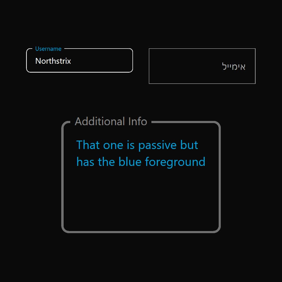
import React, { useState } from "react";
import { FloatingLabelInput } from "@/components/ui/floating-label-input";

export default function DemoOne() {
  const [username, setUsername] = useState('');
  const [email, setEmail] = useState('');
  const [password, setPassword] = useState('');
  const [info, setInfo] = useState('');

  return (
    <div
      style={{
        minHeight: 300,
        background: 'var(--background)', // from your CSS
        display: 'flex',
        flexDirection: 'column',
        justifyContent: 'center',
        alignItems: 'center',
        padding: '32px',
        boxSizing: 'border-box',
      }}
    >
      {/* Inputs row */}
      <div
        style={{
          display: 'flex',
          flexDirection: 'row',
          gap: '32px',
          justifyContent: 'center',
          alignItems: 'flex-start',
          width: '100%',
          maxWidth: 1440,
        }}
      >
        {/* Username */}
        <div style={{ maxWidth: 260, minWidth: 180, flex: '1 1 180px', display: 'flex', alignItems: 'center' }}>
          <FloatingLabelInput
            label="Username"
            value={username}
            onValueChange={setUsername}
            parentBackground="var(--background)"
            foregroundColor="var(--floating-input-label-foreground)"
            inputFocusOutlineColor="var(--floating-input-label-outline-focus)"
          />
        </div>
        {/* Email RTL */}
        <div style={{ maxWidth: 260, minWidth: 180, flex: '1 1 180px', display: 'flex', alignItems: 'center' }}>
          <FloatingLabelInput
            label="אימייל"
            value={email}
            isRTL
            onValueChange={setEmail}
            type="email"
            rounding="0px"
            inputHeight="72px"
            inputFontSize="1.5rem"
            labelFontSize="1.125rem"
            labelActiveFontSize="14px"
            parentBackground="var(--background)"
            foregroundColor="var(--floating-input-label-foreground)"
            mutedForegroundColor="var(--floating-input-label-muted)"
            accentColor="var(--floating-input-label-accent-email)"
            inputFocusOutlineColor="var(--floating-input-label-outline-focus)"
          />
        </div>
        {/* Password */}
        <div style={{ maxWidth: 260, minWidth: 180, flex: '1 1 180px', display: 'flex', alignItems: 'center' }}>
          <FloatingLabelInput
            label="Password"
            value={password}
            onValueChange={setPassword}
            type="password"
            parentBackground="var(--background)"
            foregroundColor="var(--floating-input-label-foreground)"
            inputFocusOutlineColor="var(--floating-input-label-outline-focus)"
          />
        </div>
        {/* Additional Info */}
        <div style={{ maxWidth: 260, minWidth: 180, flex: '1 1 180px', display: 'flex', alignItems: 'center' }}>
          <FloatingLabelInput
            label="Additional Info"
            value={info}
            onValueChange={setInfo}
            parentBackground="var(--background)"
            inputOutlineColor="var(--floating-input-label-outline)"
            inputFocusOutlineColor="var(--floating-input-label-outline-focus-2)"
            outlineWidth="3px"
            rounding="10px"
            accentColor="var(--floating-input-label-accent-textarea)"
            foregroundColor="var(--floating-input-label-info-foreground)"
            mutedForegroundColor="var(--floating-input-label-muted-2)"
            labelActiveFontSize="15px"
            textarea={true}
          />
        </div>
      </div>
      {/* Labels column, stacked and centered below */}
      <div
        style={{
          marginTop: 32,
          color: "var(--floating-input-label-labels)",
          width: "100%",
          maxWidth: 340,
          display: 'flex',
          flexDirection: 'column',
          gap: '8px',
          fontSize: '0.96rem',
          alignItems: 'stretch',
        }}
      >
        <div>
          <strong>Username:</strong> {username || <span style={{ opacity: 0.5 }}>—</span>}
        </div>
        <div>
          <strong>Email:</strong> {email || <span style={{ opacity: 0.5 }}>—</span>}
        </div>
        <div>
          <strong>Password:</strong> {password || <span style={{ opacity: 0.5 }}>—</span>}
        </div>
        <div>
          <strong>Additional Info:</strong> {info || <span style={{ opacity: 0.5 }}>—</span>}
        </div>
      </div>
    </div>
  );
}