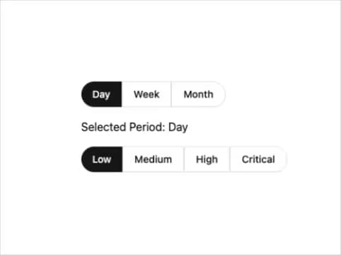
The SegmentedButtonGroup component is a clean and flexible button group built entirely with shadcn UI. It visually splits a single button into multiple segments, allowing users to toggle between options like “Day / Week / Month” or priority levels. Each segment acts as an individual button, with the active segment highlighted while others remain outlined, creating a clear and intuitive selection interface. The component dynamically supports any number of segments, maintains rounded corners on the first and last buttons for a seamless appearance, and provides callbacks for handling user selection. Its simple yet elegant design makes it ideal for dashboards, filters, and interactive toggle controls in modern web applications.