
About
Alert in shadcn/ui format
Built with React and Tailwind. Copy the prompt and paste it into Claude Code, Cursor or Lovable: your agent adds Alert to your project and fits it to your theme.
Code
How Alert is used: the demo's code. The component's own source comes with a free account.
Usage.tsx
import { Alert, AlertContent, AlertTitle } from "@/components/ui/alert"
import { CircleAlert } from "lucide-react"

function AlertWithList() {
  return (
    <Alert
      layout="complex"
      variant="error"
      icon={<CircleAlert className="opacity-60" size={16} strokeWidth={2} />}
    >
      <AlertContent>
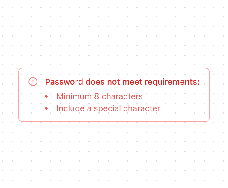
        <AlertTitle>Password does not meet requirements:</AlertTitle>
        <ul className="list-inside list-disc text-sm opacity-80">
          <li>Minimum 8 characters</li>
          <li>Include a special character</li>
        </ul>
      </AlertContent>
    </Alert>
  )
}

export { AlertWithList }
Dependencies
More by Serafim
View all
Spline Scene
9.8K
Testimonials with Marquee
2.4K
Gradient Button
2K
Pixel Canvas
926
Animated Blur Number
834
Empty State
798
Balloons
788
Status Badge
692