shadcncraft
2components116views16bookmarks
Installs all 399 components. Without our CLI, run instead.
Auto-indexed
shadcncraft contents
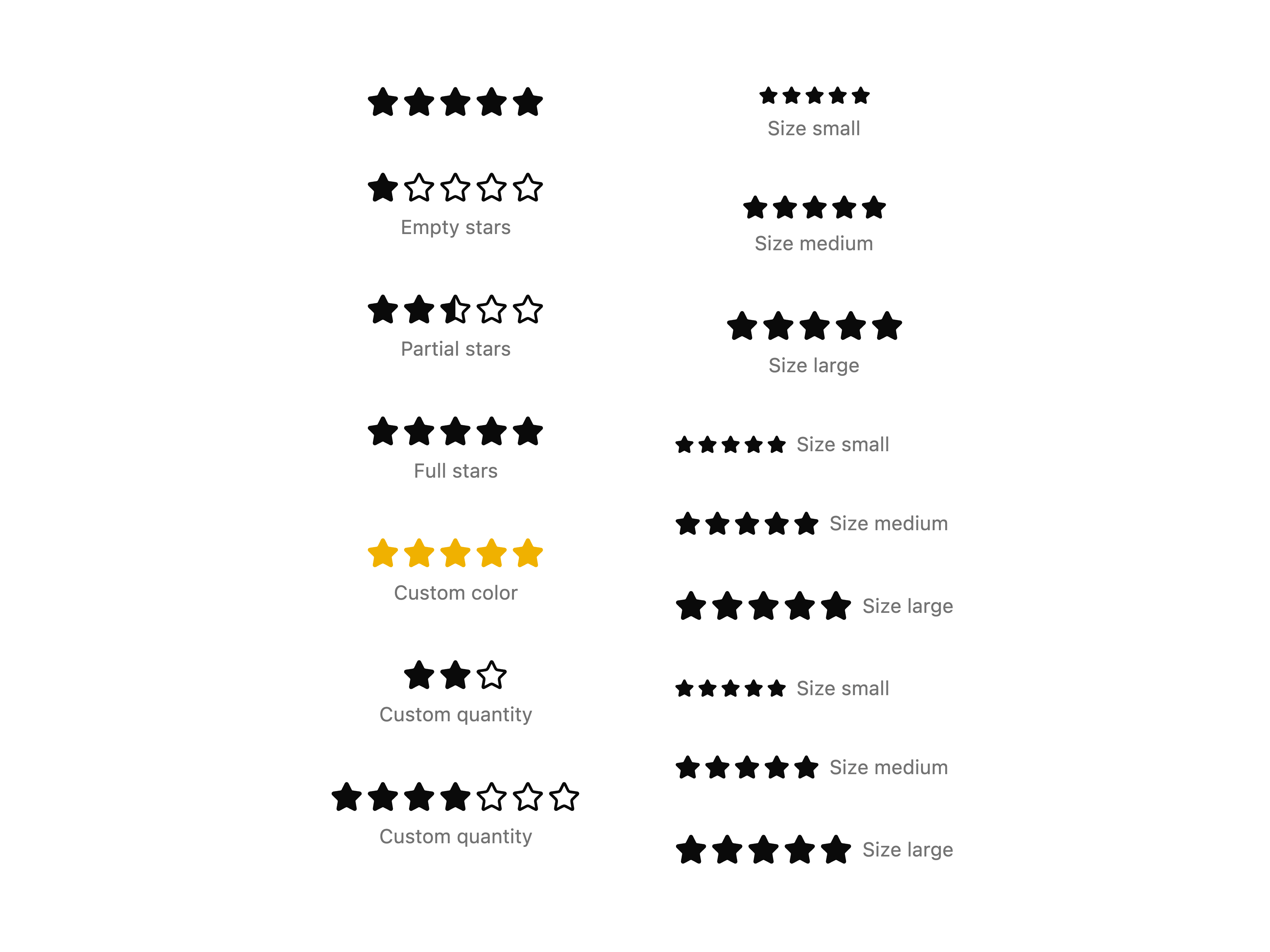
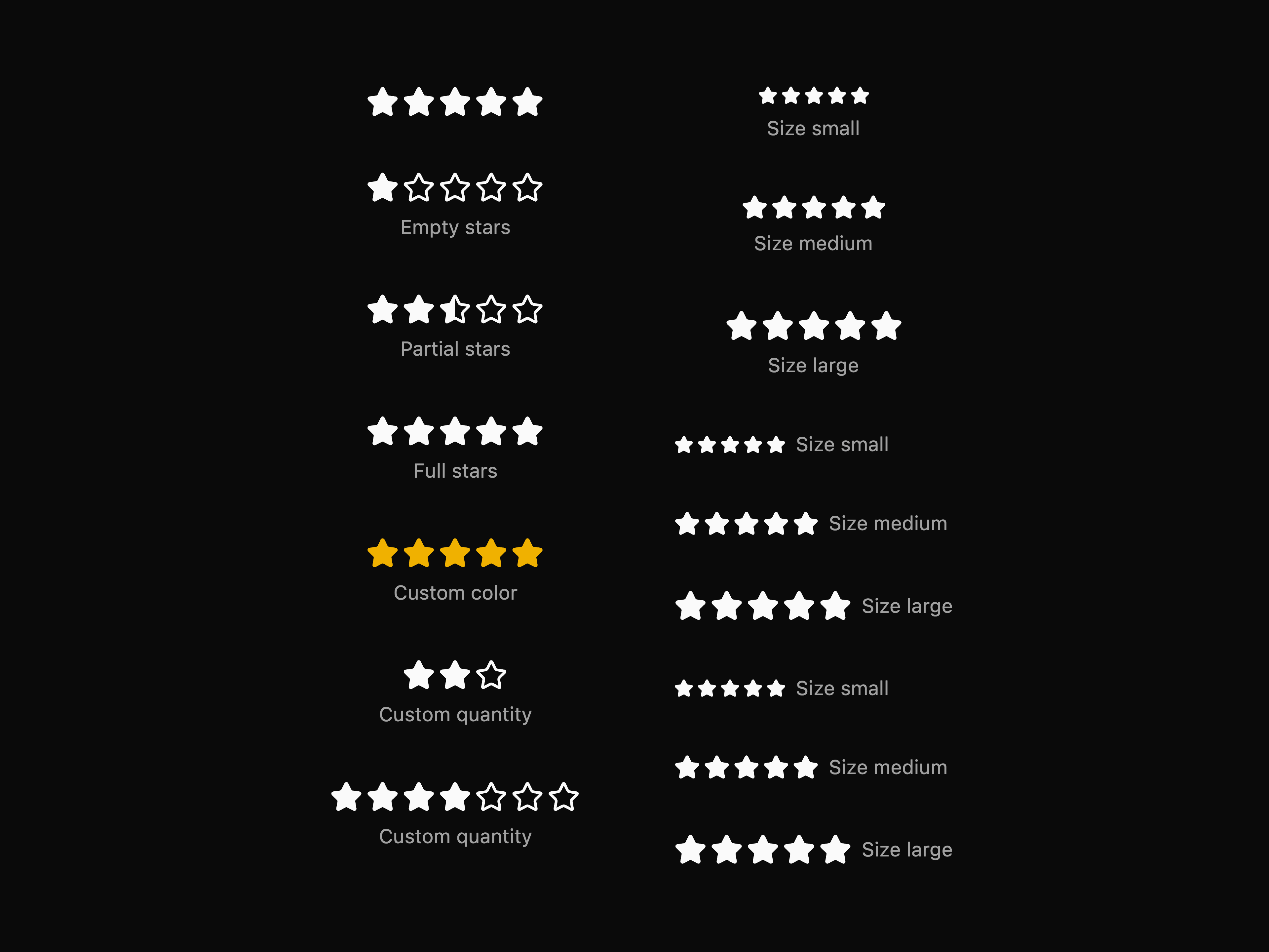
Star Rating
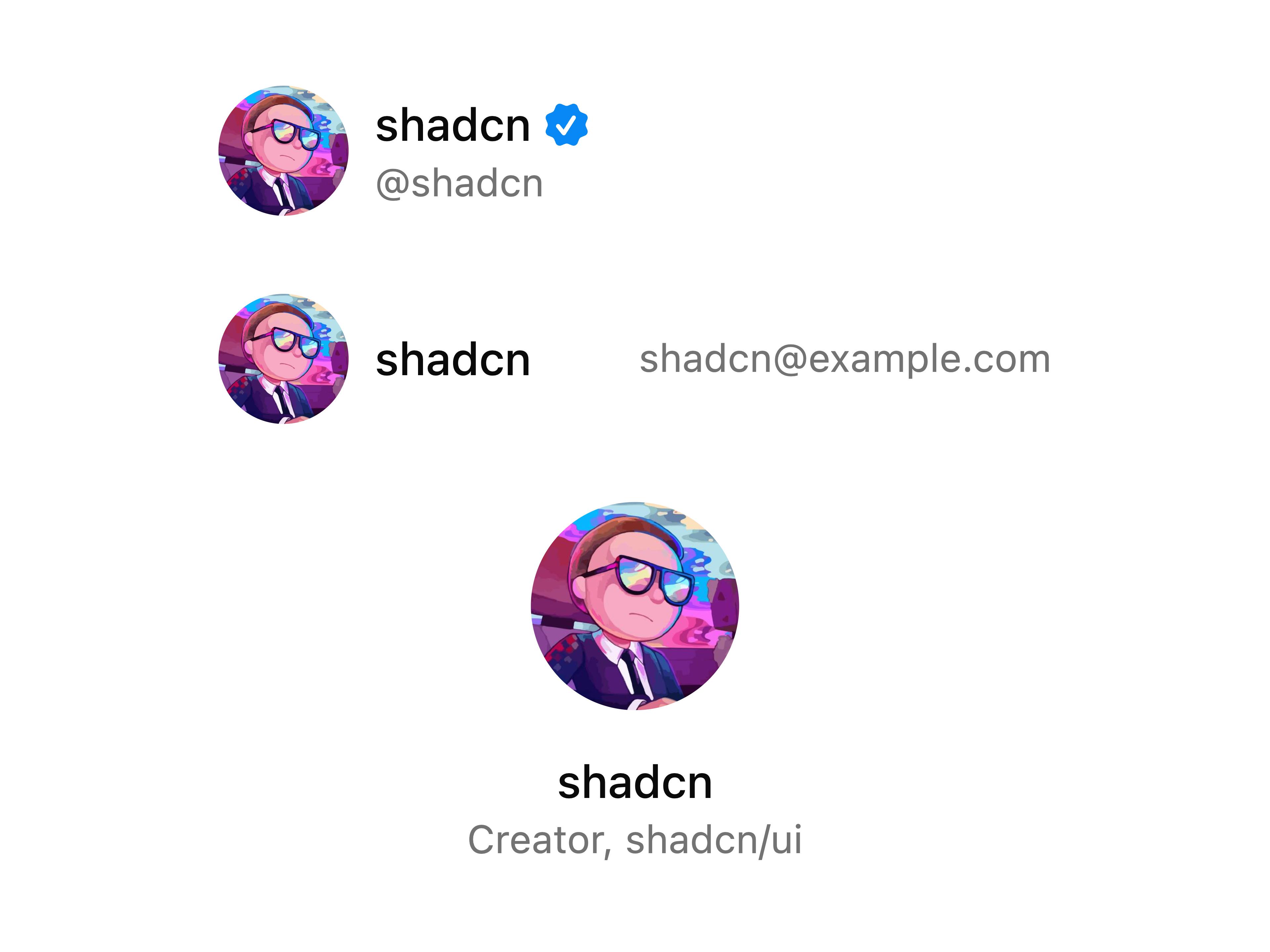
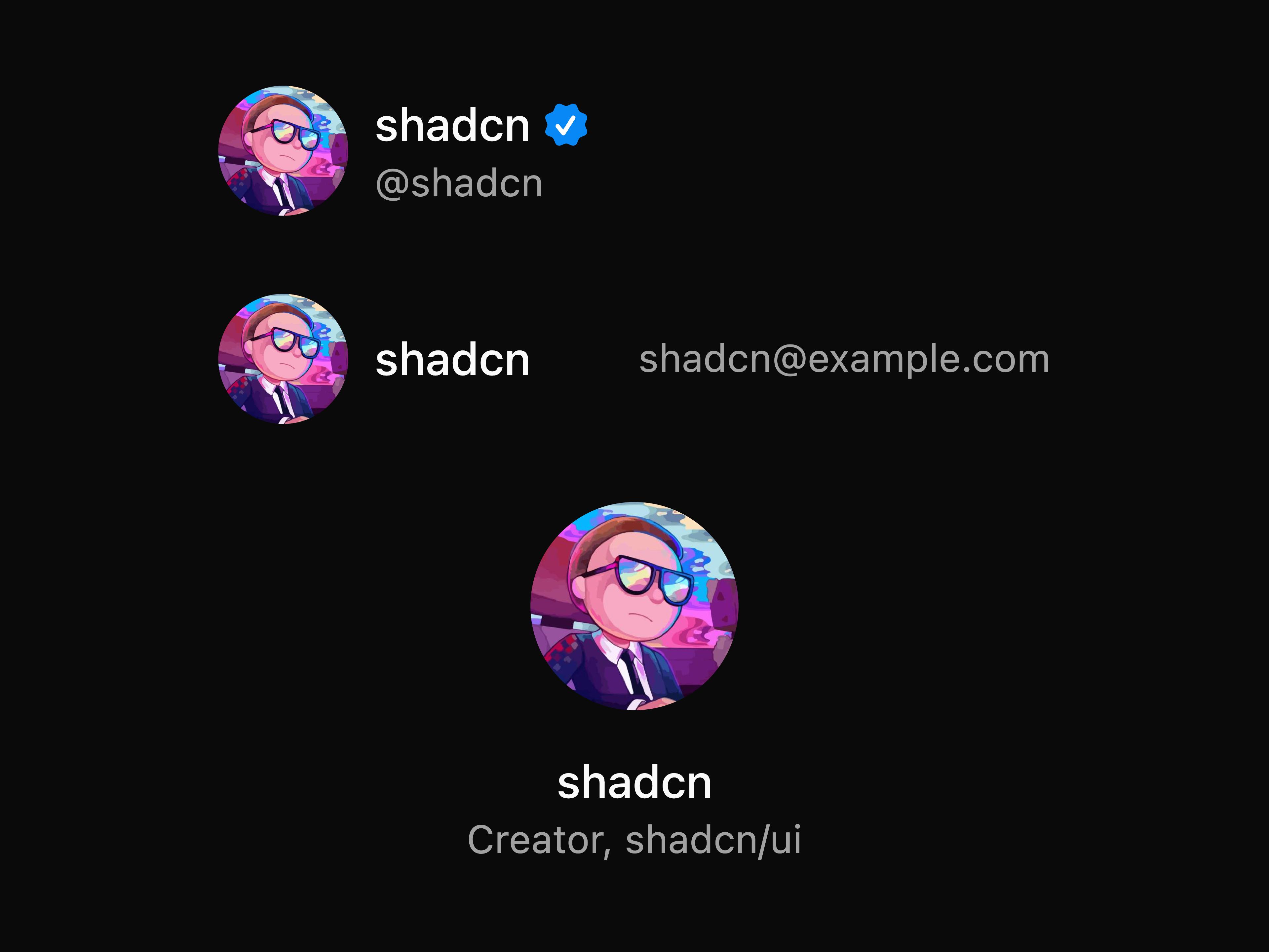
Profile Card
That's all 2 components
About shadcncraft
shadcncraft publishes a shadcn registry at shadcncraft.com, with 399 components installable through the shadcn CLI.
- Components
- 399
Also in the shadcncraft registry
Copy a prompt for your agent, copy the install command, or open the docs that ship it.
404-1
button404-2
button404-3
button, card404-4
button404-5
button404-6
buttonabsence-rate-1
button, card, chart, emptyaccount-balance-history-1
button, card, chartaccount-balance-history-2
button, card, chartaccount-security-1
button, card, itemaccount-selector-1
button, dropdown-menuaccount-summary-1
cardaccount-summary-2
itemaccount-transfer-1
button, dropdown-menu, input-group, itemactivity-feed-1
activity-feed-item-1
avatar, button, button-group, inputai-insights-1
button, card, empty, itemannouncement
app-shell-1
avatar, collapsible, dropdown-menu, sidebarapp-shell-2
avatar, collapsible, dropdown-menu, sidebarapp-shell-3
avatar, collapsible, dropdown-menu, sidebarapp-shell-4
avatar, dropdown-menu, sidebarapp-shell-header-1
button, dropdown-menu, separator, sidebarapp-shell-header-2
breadcrumb, button, dropdown-menu, input-groupapp-shell-header-3
button, dropdown-menu, input-group, kbdapp-shell-header-4
button, dropdown-menu, separator, sidebarapp-shell-header-5
button, dropdown-menu, select, separatorapp-shell-header-6
button, dropdown-menu, input-group, separatorassistant-panel-1
alert-dialog, avatar, button, collapsibleattribution-breakdown-1
button, card, chart, emptyattrition-by-department-1
button, card, chart, emptyAvatar Stack
avatar-stackA compact, visually appealing component for displaying multiple user avatars in an overlapping stack. Perfect for showing participants in a group chat, team members, or active collaborators. Supports customizable size, max visible avatars, border styling, and optional '+n' indicator for overflow. Renders gracefully from 1 to dozens of users while maintaining a small footprint.
1 fileavatar-upload-1
avatar, button, input, use-file-uploadavatar-upload-2
avatar, button, input, use-file-uploadbalance-1
card, chart, semantic-tokensbalance-2
card, chart, semantic-tokensbalance-3
card, chartbanking-dashboard-1
accordion, button, avatar, button-groupbanner-1
button, inputBanner 10 – Inline announcement link
banner-10A minimal announcement banner for low-friction updates. Renders as simple inline text with an optional icon and link, plus a close action. Best for subtle product news or secondary announcements that shouldn't compete with primary page content.
button1 filebanner-2
button, inputbanner-3
buttonbanner-4
buttonbanner-5
buttonbanner-6
buttonbanner-7
buttonbanner-8
buttonbanner-9
benefit-plans-1
button, card, empty, skeletonbenefits-1
ui-showcasebenefits-10
benefits-11
benefits-12
Benefits 13 – Card grid with section header
benefits-13A layout with a section header followed by a grid of equal-height cards. Each card includes an icon, title, and short text, arranged in a consistent grid that collapses responsively. Use when you need a structured, repeatable set of items with strong visual separation.
1 filebenefits-14
ui-showcasebenefits-15
commandbenefits-16
command, separatorbenefits-17
cardbenefits-18
tabs, ui-showcasebenefits-19
commandbenefits-2
button, ui-showcasebenefits-20
ui-showcasebenefits-21
cardbenefits-22
separatorbenefits-3
benefits-4
benefits-5
benefits-6
benefits-7
separatorbenefits-8
benefits-9
benefits-table-1
button, checkbox, dropdown-menu, emptyblog-blockquote
blog-image
blog-listing-1
buttonblog-listing-2
buttonblog-listing-3
buttonblog-listing-4
buttonblog-listing-card-1
blog-listing-card-2
blog-listing-featured-card-1
blog-listing-featured-card-2
blog-listing-featured-card-3
calendar-1
avatar, button, empty, popovercampaign-performance-1
button, card, empty, itemcard-summary-1
button, cardcareers-1
button, separatorcareers-2
button, separatorcareers-3
buttoncareers-4
button, separatorcareers-5
buttoncart-item-1
button, button-groupcelebrations-1
avatar, button, card, emptychannel-performance-1
button, card, chart, emptychat-1
attachment, bubble, button, emptychat-shell-1
alert-dialog, avatar, command, dropdown-menucheckout-1
button, field, input, labelcheckout-2
button, field, input, labelcheckout-3
button, field, input, labelchip
clearflow-1
accordion, button, card, checkboxcode-snippet-2
buttoncomposer-1
attachment, dropdown-menu, input-group, switchcontact-1
button, input, textarea, checkboxcontact-10
Contact 11 – Centered form with supporting sidebar
contact-11A balanced contact layout with a primary, centered form and a secondary sidebar that mirrors or reinforces the same interaction. The main column keeps focus on the form, while the sidebar provides a persistent fallback or alternative entry point. Useful when you want a calm, symmetrical layout with built-in redundancy for conversion.
button, label, input, textarea1 filecontact-2
button, input, textarea, checkboxcontact-3
button, input, textarea, checkboxcontact-4
contact-5
popovercontact-6
contact-7
contact-8
contact-9
button, avatarcost-per-acquisition-trend-1
button, card, chart, emptycourse-progress-1
button, card, chart, emptycourses-1
button, card, empty, progresscoverage-planner-1
avatar, button, card, emptycta-1
buttoncta-2
buttoncta-3
buttoncta-4
buttoncta-5
buttoncta-6
buttoncta-7
button, ui-showcasecta-8
buttoncurrency-converter-1
button, dialog, input-group, itemcurrency-exchange-1
button, chart, dropdown-menu, input-groupcurrent-project-1
avatar, button, card, emptycustomer-health-score-1
button, card, chart, emptydaily-feedback-1
button, card, empty, inputdata-review-1
button, carddata-review-2
data-review-3
button, carddata-review-4
data-table-pagination
button, selectday-one-setup-1
alert, avatar, button, carddeals-table-1
avatar, button, card, emptydeal-velocity-by-segment-1
button, card, empty, skeletondocuments-table-1
button, checkbox, dropdown-menu, emptyemployee-about-1
button, card, empty, skeletonemployee-rating-1
button, card, chart, emptyemployee-spotlight-1
avatar, button, card, emptyengagement-by-day-hour-1
button, card, empty, skeletoneveryday-money-1
button, card, separatorexchange-rate-panel-1
button, chart, separatorexpenses-1
card, chart, select, separatorfaqs-1
faqs-2
accordionfaqs-3
accordionFAQ 4 – Centered accordion with supporting panel
faqs-4A clean, centered FAQ accordion paired with a narrow sidebar version. Uses a strong section header and clear dividers for easy scanning, with an optional support link at the end. Works well for product or marketing pages where FAQs are a secondary section, not the main focus.
accordion1 fileFeatured Icon
featured-iconA component that places an icon inside a styled square or circle frame for extra prominence. This component makes supporting visuals stand out in marketing layouts.
1 filefeature-promo-1
button, cardfeature-stack
file-part-1
attachmentfile-upload-1
file-upload-2
file-upload-3
file-upload-area-1
file-upload-card-1
item, button, progress, semantic-tokensfooter-1
separatorfooter-2
input, button, separatorfooter-3
separatorFooter 4 – Brand-led sitemap footer
footer-4A sitemap footer anchored by a short brand statement and logo, followed by structured link columns and legal links. Gives more context about the company while keeping navigation clear. Works well for marketing sites where brand positioning matters as much as wayfinding.
react-icons1 filegender-split-1
button, card, chart, emptygoal-progress-1
button, card, empty, progressgrowth-simulator-1
button, card, empty, inputheadcount-1
button, card, chart, emptyheadcount-by-department-1
button, empty, skeleton, tableheader-1
breadcrumb, button, input, separatorheader-2
breadcrumb, button, inputheader-3
breadcrumb, button, input, separatorheader-4
breadcrumb, button, separator, tabsheader-5
avatar, breadcrumb, button, inputheader-6
button, input, separatorhero-1
buttonhero-10
buttonhero-2
button, avatarhero-3
button, avatarhero-4
buttonhero-5
button, inputhero-6
buttonhero-7
hero-8
buttonhero-9
buttonhero-time-series-1
button, card, chart, emptyhr-dashboard-1
avatar, button, dropdown-menu, tabsImage Zoom
image-zoomImage zoom is a component that allows you to zoom in on an image.
react-medium-image-zoom1 fileinline-cta-1
buttoninline-cta-2
buttoninline-cta-3
button, inputinline-hint
semantic-tokensjob-listing
cardjob-timeline-1
avatar, button, card, emptykanban-1
avatar, button, card, itemkudos-1
avatar, button, card, emptyleads-by-region-1
button, card, empty, skeletonlead-to-customer-funnel-1
button, card, chart, emptyleave-balances-1
button, card, empty, progressleave-requests-table-1
button, checkbox, dropdown-menu, emptylocation-spending-summary-1
card, chartlocation-spending-summary-2
card, itemmarketing-funnel-1
button, card, empty, skeletonMarquee
A smooth, endlessly looping scroller ideal for showcasing logos, testimonials, images, or sponsor lists. Features auto-play with customizable speed, pause-on-hover, reverse direction, and seamless loop behavior.
1 filemessage-card-1
avatarmessaging
avatarmetric
buttonmetric-card-1
card, semantic-tokensmetric-card-2
card, semantic-tokensmetric-cards-1
button, card, empty, separatormetrics-1
metrics-10
metrics-11
metrics-2
metrics-3
metrics-4
metrics-5
metrics-6
metrics-7
metrics-8
metrics-9
mobile-navigation-menu
collapsiblemodal-1
button, dialog, semantic-tokensmodal-2
button, dialog, semantic-tokensmodal-3
button, card, dialog, fieldmoney-in-and-out-2
cardmultistep-1
button, card, field, inputmultistep-2
button, card, field, inputmultistep-3
button, card, field, inputneeds-attention-1
button, card, empty, itemnew-hires-table-1
avatar, button, dropdown-menu, emptynewsletter-signup-1
button, inputnewsletter-signup-2
button, input, ui-showcasenewsletter-signup-3
button, inputnewsletter-signup-4
button, inputNewsletter Signup 5 – Inline callout with contained form
newsletter-signup-5A horizontal newsletter signup pattern presented inside a soft container to separate it from surrounding content. The headline and description anchor the left side while the inline form sits to the right, creating a clear scan path and compact footprint. Works well as an embedded callout within long pages and collapses cleanly to a stacked layout on smaller screens.
button, input1 filenotes-1
button, card, dialog, emptyone-on-one-agenda-1
button, card, checkbox, emptyorg-chart-1
avatar, button, card, emptyPage Heading
page-headingA component that acts as the text-focused version of a hero banner. This component combines a pre-heading label, an H1 heading, supporting description text, and call-to-action buttons.
1 filepaid-media-allocation-1
button, card, chart, emptypayday-agenda-1
avatar, button, separatorpayment-messaging-1
avatar, bubble, button, cardpeople-directory-1
avatar, button, card, emptypeople-you-pay-1
buttonperformance-reviews-table-1
avatar, button, checkbox, dropdown-menupipeline-by-stage-1
button, card, empty, skeletonPlaceholder Logo
placeholder-logoA component for that can be replaced with your brand's main logo. This component ensures layouts stay consistent before brand assets are applied.
1 filepricing-1
button, use-carouselpricing-10
buttonpricing-2
button, use-carouselpricing-3
buttonpricing-4
tabs, buttonpricing-5
tabs, buttonpricing-6
tabs, buttonpricing-7
tabs, button, table, selectpricing-8
avatar, buttonpricing-9
buttonpricing-card-1
button, tooltippricing-table-1
tableproduct-card-1
product-card-2
product-category-1
product-category-2
product-category-3
product-category-4
product-category-5
product-category-card-1
product-details-1
button, button-group, separatorproduct-details-2
accordion, breadcrumb, button, button-groupproduct-details-3
button, button-group, separatorproduct-details-4
button, button-groupproduct-details-5
button, button-groupproduct-details-6
accordion, button, separatorproduct-list-1
buttonproduct-list-2
buttonproduct-list-3
buttonproduct-list-4
buttonproduct-list-5
button, use-carouselprogress-1
progress-2
progress-3
progress-4
progress-item-1
projects-table-1
button, checkbox, dropdown-menu, emptyproject-time-log-1
button, card, empty, progressquestionnaire-part-1
bubble, marker, questionnairereasoning-part-1
bubble, collapsible, markerrecipient-listing-1
avatar, itemrep-leaderboard-1
avatar, button, card, emptyrequests-table-1
avatar, button, checkbox, dropdown-menurevenue-vs-target-1
button, card, empty, skeletonreview-cycle-1
avatar, button, card, emptyrich-separator
separatorsales-marketing-dashboard-1
button, command, field, inputsavings-goal-1
button, cardschedule-1
avatar, button, calendar, cardscheduled-transfers-1
avatar, button, item, separatorsection-footer-1
button, button-group, separatorsection-footer-2
button, separatorsection-footer-3
button, input, separatorsection-footer-4
pagination, separatorSection Heading
section-headingA component that standardizes heading typography and spacing. This component includes a pre-heading label, main heading, and body text in different layout variants.
1 filesend-again-1
bubble, button, card, separatorshare-dialog-1
button, dialog, field, radio-groupshopping-cart-1
drawer, button, separatorshopping-cart-2
button, input, separatorshopping-cart-3
button, input, separatorshopping-cart-4
button, input, separatorsocial-proof-1
social-proof-2
social-proof-3
social-proof-4
social-proof-5
social-proof-6
sources-part-1
collapsible, markerspending-balance-1
card, chart, select, separatorspending-by-tag-1
card, chartspending-trackers-1
button, cardspending-tracker-summary-1
button, card, selectstatus-tracker-1
avatar, button, card, emptystock-market-1
button, button-group, card, chartsub-feature
table-1
button, checkbox, dropdown-menu, emptytable-10
button, dropdown-menu, empty, itemtable-11
button, dropdown-menu, empty, input-grouptable-12
button, dropdown-menu, empty, itemtable-13
avatar, button, dropdown-menu, emptytable-14
avatar, button, dropdown-menu, emptytable-15
button, checkbox, dropdown-menu, emptytable-16
button, empty, tabletable-17
button, checkbox, dropdown-menu, emptytable-18
avatar, button, empty, inputtable-19
button, checkbox, dropdown-menu, emptytable-2
button, checkbox, dropdown-menu, emptytable-20
button, checkbox, dropdown-menu, emptytable-21
button, empty, inputtable-3
button, checkbox, dropdown-menu, emptytable-4
avatar, button, checkbox, dropdown-menutable-5
avatar, button, checkbox, dropdown-menutable-6
avatar, button, checkbox, dropdown-menutable-7
avatar, button, dropdown-menu, emptytable-8
avatar, button, checkbox, dropdown-menutable-9
button, checkbox, dropdown-menu, emptytags
button, command, popovertalent-grid-1
avatar, button, card, emptyteam-1
team-2
buttonteam-3
team-4
button, table, use-carouselteam-5
buttonteam-absences-1
button, card, empty, separatorteam-activity-1
avatar, button, card, emptyteam-card-1
team-card-2
team-pulse-1
avatar, button, card, emptyteams-table-1
avatar, button, dropdown-menu, emptytenure-distribution-1
button, card, chart, emptytestimonials-1
testimonials-10
cardTestimonial 11 – Editorial quote grid
testimonials-11A structured testimonial layout that combines a clear section header with a multi-column grid of short quotes. It balances scannability and depth by presenting many voices at once, using consistent cards and subtle hierarchy to reinforce trust without relying on a single standout story.
1 filetestimonials-12
cardtestimonials-13
buttontestimonials-14
button, use-carouseltestimonials-15
testimonials-16
testimonials-17
testimonials-18
testimonials-19
button, use-carouseltestimonials-2
testimonials-20
buttontestimonials-21
cardtestimonials-22
cardtestimonials-23
cardtestimonials-3
testimonials-4
testimonials-5
buttontestimonials-6
button, use-carouseltestimonials-7
button, use-carouseltestimonials-8
button, use-carouseltestimonials-9
buttontext-part-1
bubbleticker
avatar, semantic-tokenstime-off-summary-1
button, card, empty, skeletontimesheet-1
button, card, empty, skeletontime-tracker-1
button, card, empty, fieldtool-part-1
bubble, collapsible, markertop-apps-1
button, card, empty, progresstop-landing-pages-1
button, card, empty, skeletontop-navigation-1
button, navigation-menu, use-click-outside, use-mobiletop-navigation-2
button, navigation-menu, use-click-outside, use-mobiletop-navigation-3
button, navigation-menu, use-click-outside, use-mobiletop-navigation-4
button, navigation-menu, use-click-outside, use-mobileTop Navigation 5 – Minimal center-aligned links with inline auth
top-navigation-5A stripped-back, center-aligned top navigation that prioritizes clarity and whitespace. Primary links sit in a single horizontal row with the brand anchored to the left and a lightweight login action on the right. On small screens, the layout collapses into a simple slide-out menu with stacked links and a single secondary action, keeping the structure familiar while reducing visual noise.
button, use-click-outside, use-mobile1 filetraffic-by-channel-1
button, card, empty, skeletontransactions-1
button, card, select, separator


