Components
Toggle
A collection of customizable toggle switch components built with React and Tailwind CSS.
Features
- Minimal and Orange toggle variants
- Dark mode support
- Smooth transitions and animations
- Fully accessible with keyboard navigation
- TypeScript support with proper types
- Follows shadcn/ui component patterns
Variants
Minimal Toggle A simple toggle switch with green accent colors and dark mode support. Features a sliding circle indicator and smooth transitions.
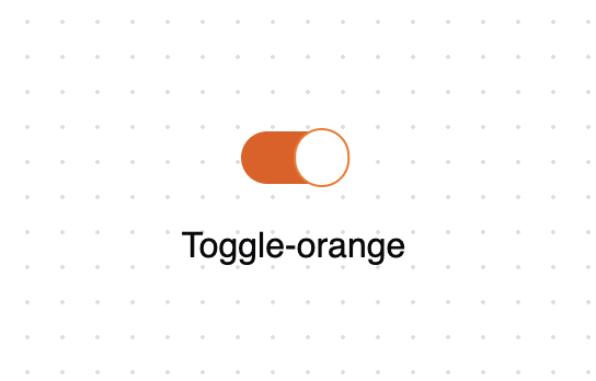
Orange Toggle A more elaborate toggle with orange accent colors and hover effects. Includes a floating animation and custom border styling.

"use client"

import { MinimalToggle, OrangeToggle } from "@/components/ui/toggle"

function MinimalToggleDemo() {
  return (
    <div className="flex flex-col items-center gap-4 p-1 text-center xl:gap-8">
      <MinimalToggle tabIndex={0} />
      <span>Toggle-minimal</span>
    </div>
  )
}

function OrangeToggleDemo() {
  return (
    <div className="flex flex-col items-center gap-4 p-1 text-center xl:gap-8">
      <OrangeToggle />
      <span>Toggle-orange</span>
    </div>
  )
}

export { MinimalToggleDemo, OrangeToggleDemo }
Tags
Published
Similar components
Explore more
Part of Edil Ozi — browse the full library on 21st.dev.