blobatar
Deterministic geometric blobatars from any string. No dependencies, ~4.4 KB
gzipped.
bun add blobatar # npm / pnpm / yarn all work too
Usage
A blobatar always stands for somebody — a user, a bot, a team, a repo — so the
value it is generated from is that somebody's name: a username, a display
name, an email, a handle, an id. Any string works, and the same string always
renders the same blobatar.
React
bun add blobatar @blobatar/react
import { Blobatar } from "@blobatar/react";

;
Everything but name is optional. Remaining props land on the underlying
element, so className, alt and the rest behave as you would expect.
Vue
bun add blobatar @blobatar/vue
import { Blobatar } from "@blobatar/vue";
The same props and the same behavior as the React adapter. Anything not
declared as a prop lands on the underlying element, so class, style, alt
and the rest behave as you would expect.
Svelte
bun add blobatar @blobatar/svelte
import { Blobatar } from "@blobatar/svelte";
Svelte 5 or newer. This package ships its component as source rather than as
built JavaScript, because a .svelte file only becomes renderable code inside
your own compiler — any toolchain that resolves the svelte export condition
handles that with no configuration, and one that does not reports an unresolved
import naming the package rather than handing your bundler a file it cannot
execute. See ADR-0010.
Solid and Preact
bun add blobatar @blobatar/solid # or @blobatar/preact
import { Blobatar } from "@blobatar/solid";

;
The React section with the import swapped, which is the whole difference — each
is compiled by its own framework's JSX transform rather than re-using React's,
so solid-js reactivity and Preact's runtime both behave as they should.
React Native and Expo
bun add blobatar @blobatar/react-native
npx expo install react-native-svg          # or bun add react-native-svg
import { Blobatar } from "@blobatar/react-native";

;
Expo needs nothing beyond that install. An Expo app is a React Native app, and
react-native-svg is the same library in both, so there is no @blobatar/expo
and there is not going to be one.
Two differences from every other adapter, and both are the platform rather than
the package:
size is required. On the web, omitting it lets CSS size the element and
the viewBox scales to whatever the page decides. React Native has no such
fallback, so an unsized blobatar is a blank square. Defaulting it here was the
alternative and it is the one thing an adapter may never do: a default size is
a default that changes the picture, and the core is the only place a default is
written down.
There is no animate. Blobatar's idle motion is a stylesheet: motion.css,
a root class, and a dozen seeded custom properties the CSS reads. React Native
has none of the three. The prop is absent from the type rather than accepted and
ignored, so passing it is a compile error instead of a blobatar that silently
sits still.
expression does work, in full. A static pose bakes into the geometry, which is
why it survives here for the same reason it survives in the string API. What is
missing is only the morph between poses, which was always the part that needed
CSS.
Everything else is the same: same names, same options, same blobatar. Anything
not declared as a prop lands on the underlying . `title` becomes the accessibility label rather than a element, because react-native-svg
has none. Without one the tree is hidden from screen readers, which is the
same call aria-hidden makes on the web.
Flutter and Dart
flutter pub add blobatar
import 'package:blobatar/flutter.dart';

AnimatedBlobatar(
  name: user.email,
  size: 64,
  animation: BlobatarAnimation.always,
  options: const BlobatarOptions(
    background: Backdrop.squircle,
    expression: happy,
  ),
)
The official Dart/Flutter SDK lives in
packages/flutter. It ports the generation-2 core
rather than calling into JavaScript, renders native Canvas paths, and includes
static and animated widgets. Its checked-in reference vectors pin blobatar
2.4.0; the seed-to-look mapping is unchanged. See the package README for
parity evidence, supported platforms, reduced-motion behavior, and the pure
Dart calculation API.
shadcn/ui
The registry serves shadcn's Avatar with a blobatar as the fallback for a
missing profile image:
npx shadcn@latest registry add @blobatar=https://blobatar.dev/r/{name}.json
npx shadcn@latest add @blobatar/avatar
Or straight from this repository, without registering anything:
npx shadcn@latest add Alain00/blobatar/avatar
That reads main, so it is the current composition rather than the last
released one. Both forms copy the same file.
import { Blobatar } from "@/components/ui/blobatar";

;
That Blobatar is not the adapter's — it takes a src alongside the name,
and everything the adapter takes goes in a blobatar prop. A project using both
imports one of them under another name.
It is also all that gets copied into your project: the composition, which you
own and edit. The generator stays in blobatar and @blobatar/react, installed
as ordinary dependencies — a copied-in generator would be pinned to whichever
generation you took it from, and the whole point is that a name renders the same
picture everywhere.
Five more items are interface built out of that avatar, each one a composition
you own after installing it:
npx shadcn@latest add @blobatar/presence-avatar
npx shadcn@latest add @blobatar/agent-list
npx shadcn@latest add @blobatar/user-table
npx shadcn@latest add @blobatar/password-field
npx shadcn@latest add @blobatar/group-chat
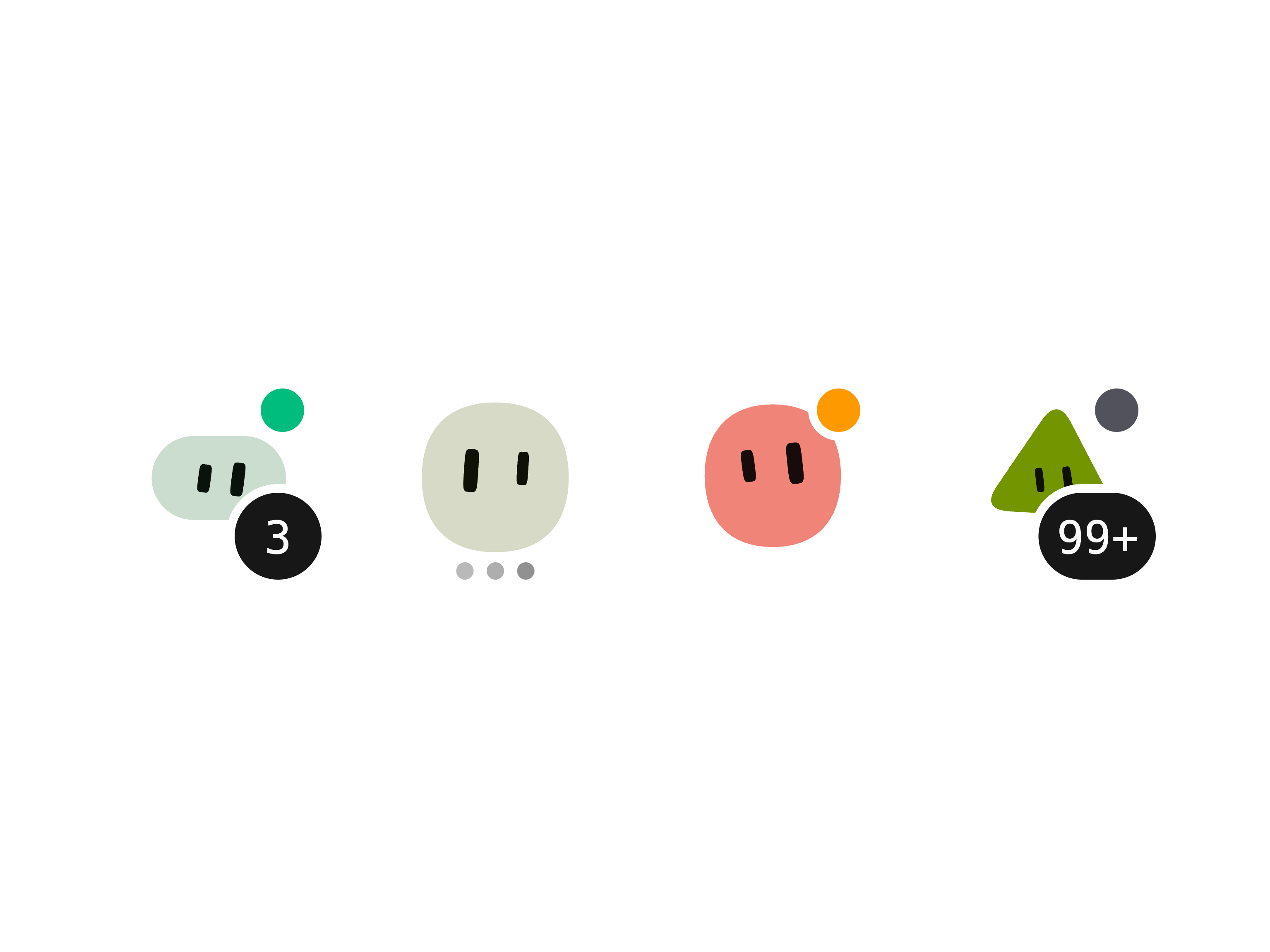
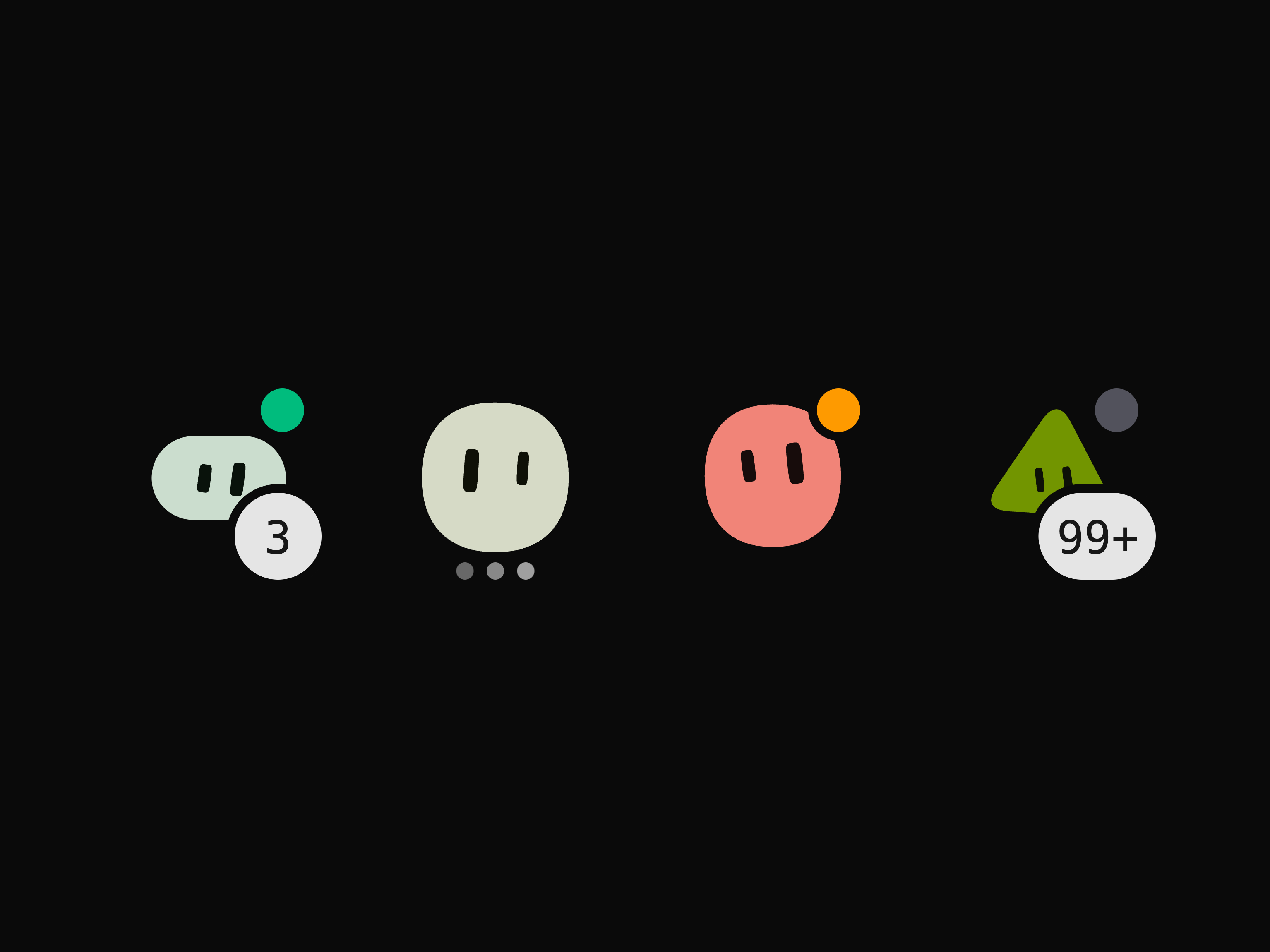
presence-avatar is a face with a presence dot and an unread badge, animated,
plus a thinking state that adds a three-dot loading indicator. agent-list is the aside an agent runner needs,
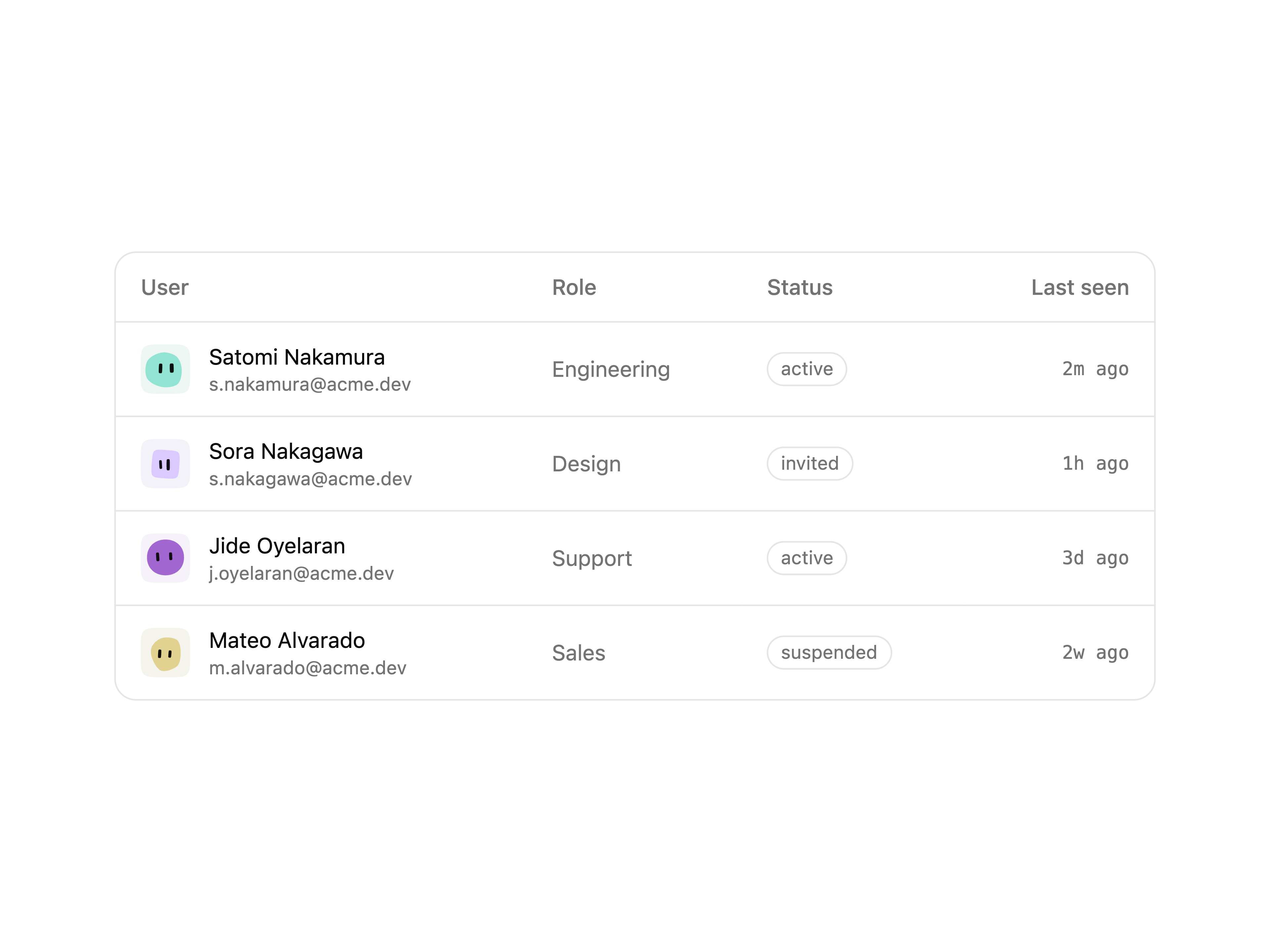
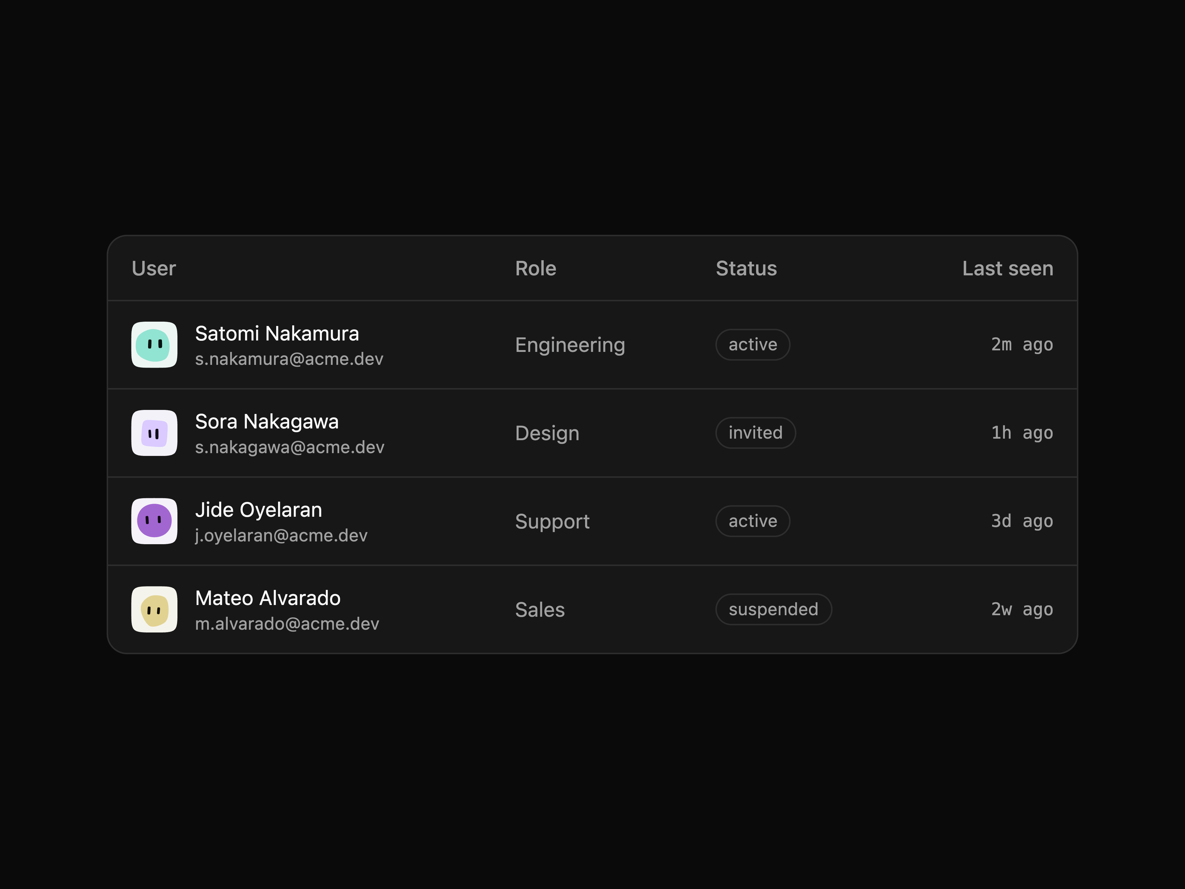
built on it. user-table is a table of people with a static blobatar per row.
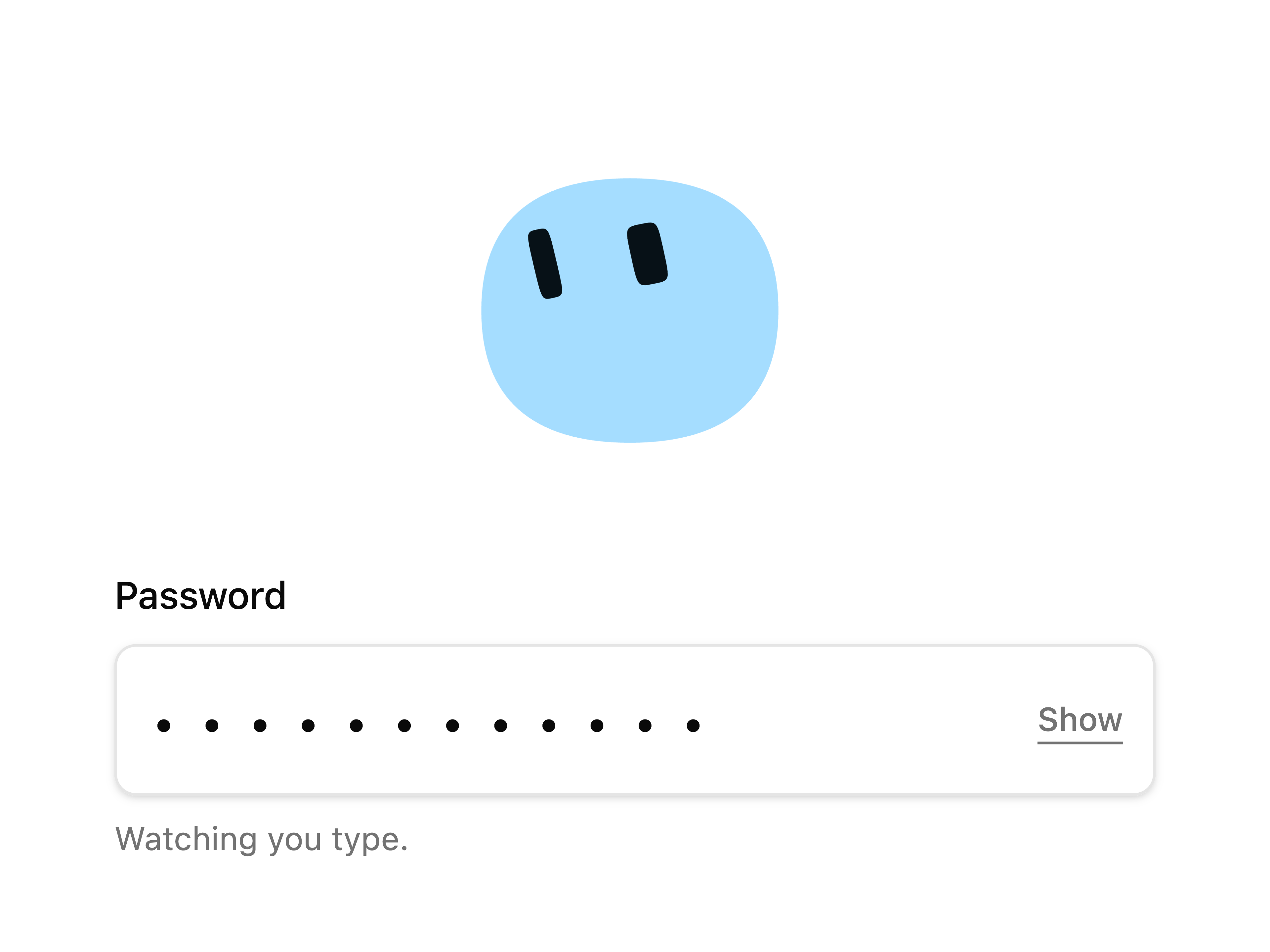
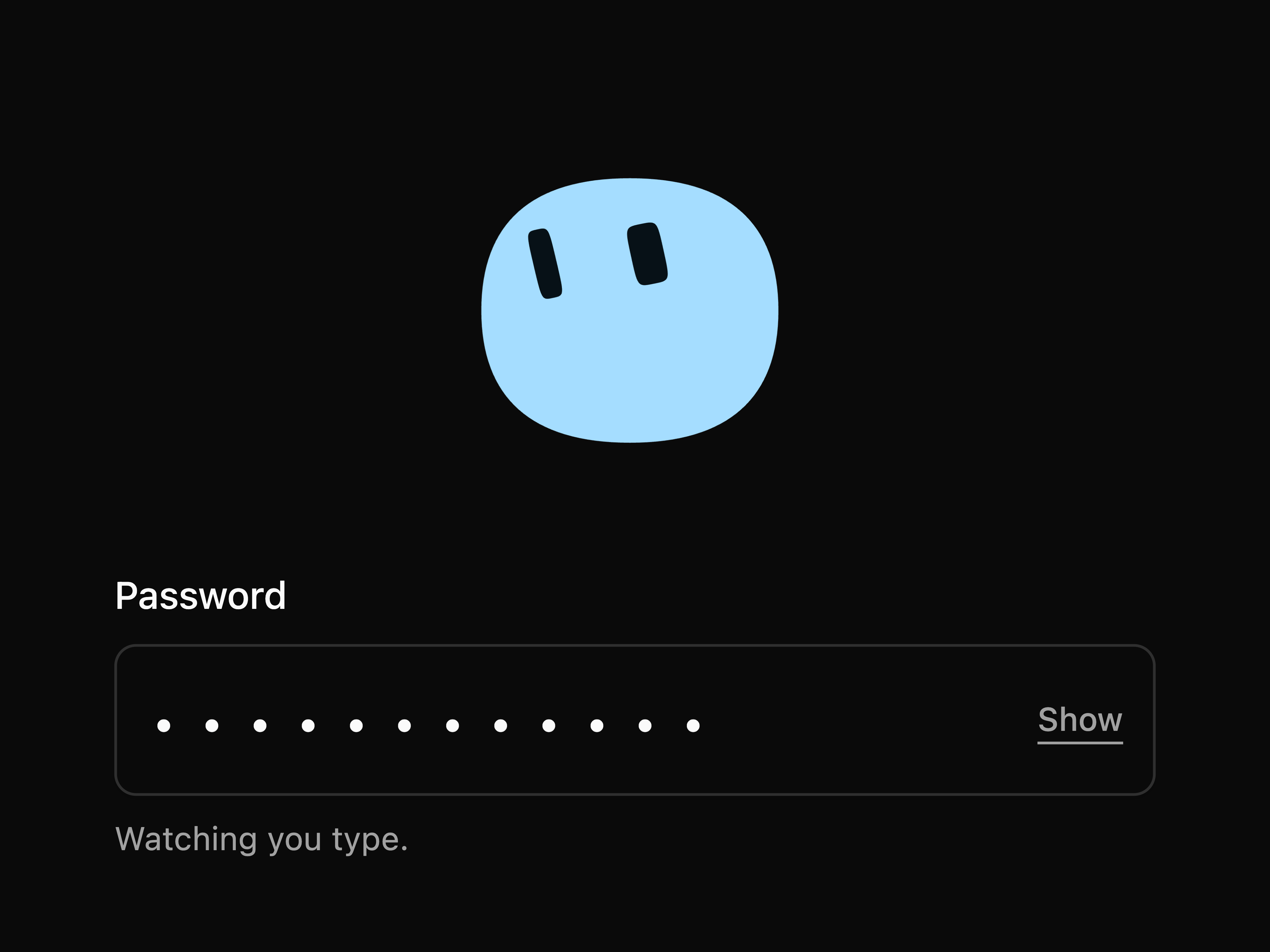
password-field is a password input with a face that watches the caret while
you type and goes sleepy when you reveal what you typed, which is the one item
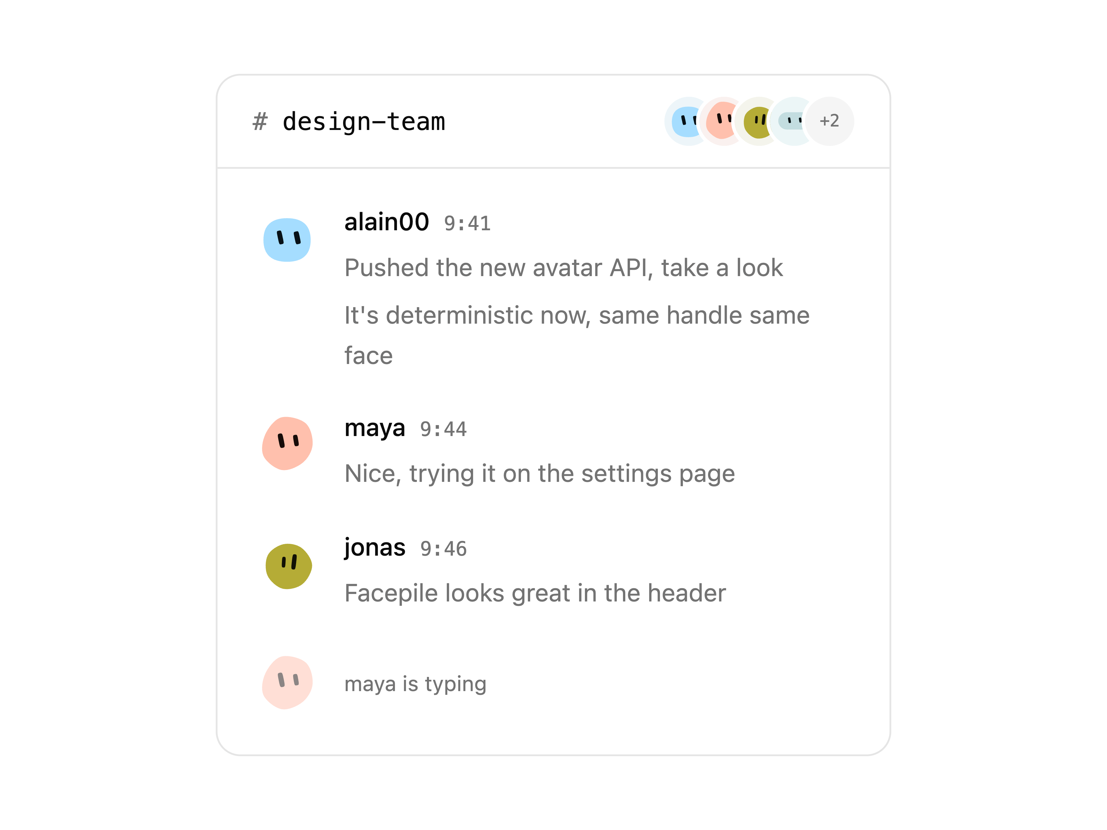
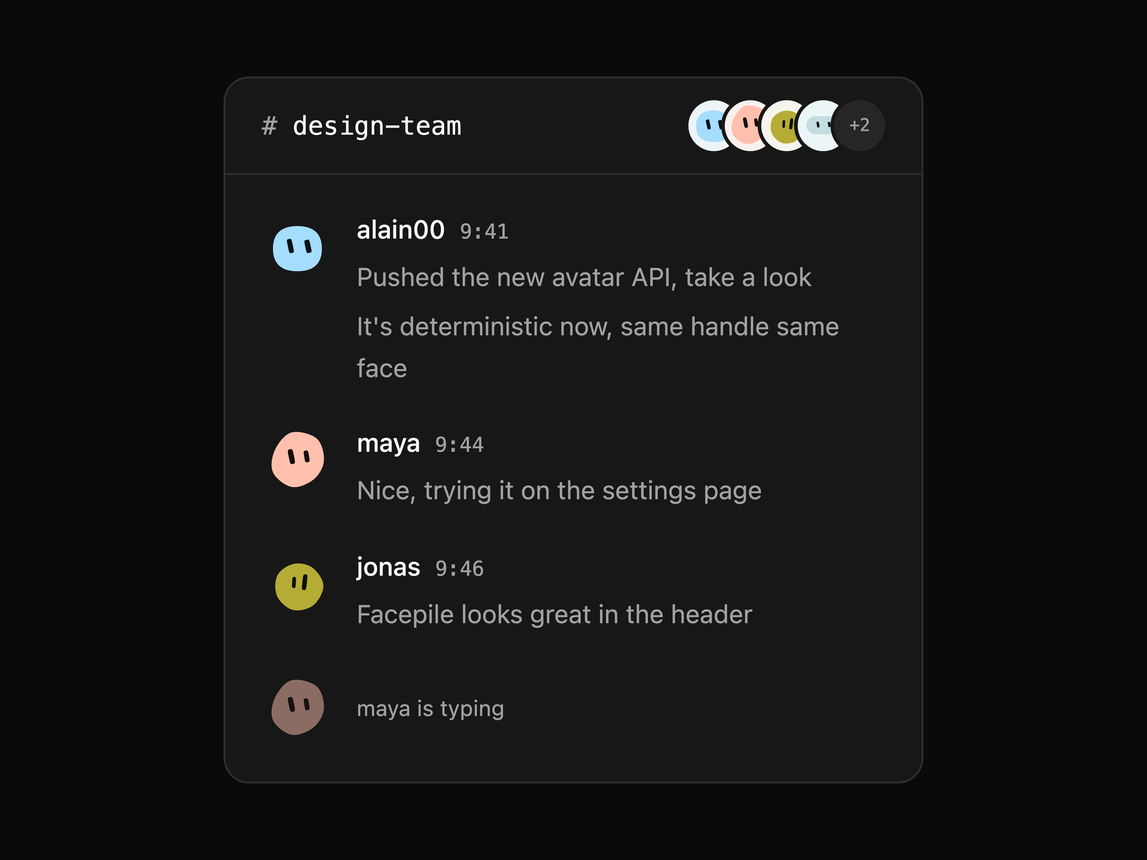
built on blobatar/gaze. group-chat is a thread with consecutive messages
grouped under one face. All five are rendered, with the command that installs
each, at blobatar.dev/components.
Anywhere else
blobatar() returns SVG markup as a string, and blobatarUri() wraps it in a
data: URI for `` or background-image:
import { blobatar } from "blobatar";
import { blobatarUri } from "blobatar/uri";

blobatar("alain@example.com"); // '…'

el.style.backgroundImage = `url("${blobatarUri(user.id)}")`;
The main entry also carries the palette and trait utilities. If all you do is
render, import the renderer on its own and save about a kilobyte:
import { blobatar } from "blobatar/blob";
Configuring
Options are the same across every adapter and the string API. background, hue
and tone cover the common cases; traits pins any individual axis as the 0–1
position the hash would otherwise have produced:
;

// Always a sun with wide eyes — colour and everything else still per name.
blobatar(user.email, { traits: { shape: 0.95, "eye.ratio": 0 } });
Keys you leave out still come from the name — lock the two things that carry
your brand, and every user still gets their own creature. Pin everything and the
name stops mattering, which is how you build one fixed blobatar.
Every value those options take, and what each one draws:
Animation and expressions
Both are opt-in. animate idles the blobatar — breathe, bob, blink, glance —
and expressions are imported as values so you ship only the poses you use:
import { Blobatar } from "@blobatar/react";
import { happy } from "blobatar/expression";
import "blobatar/motion.css"; // required — nothing animates without it

;
The same props work in every adapter — only the component import changes.
The one exception is React Native, which has no animate. See that section above.
The eyes can also follow the cursor. That layer is the one piece of the motion
system that needs JavaScript, so it is a separate entry point and a second
stylesheet you opt into:
import { useGaze } from "@blobatar/react/gaze";
import "blobatar/gaze.css";

const { ref } = useGaze({ travel: 3, lookAt: "pointer" });
;
Every adapter has it, under the shape its framework reaches an element with —
same options, same targets, same layer:
useGaze({ travel: 3, lookAt: "pointer" })          // React    → ref
useGaze({ travel: 3, lookAt: "pointer" })          // Preact   → elementRef
useGaze(blobRef, { travel: 3, target: "pointer" }) // Vue      → takes your ref
createGaze({ travel: 3, target: "pointer" })       // Solid    → is the ref
gaze({ travel: 3, target: "pointer" })             // Svelte   → {@attach}
Each package's README has the two-line integration. Anywhere else, gaze(svgEl)
is the same thing without the binding.
npx shadcn@latest add @blobatar/password-field is a worked example of it.
Coming from blobatar/react or blobatar/vue
Those subpaths still work and render exactly the same component — the packages
above re-export them. They are deprecated and go in v3. Move whenever it suits
you:
bunx blobatar-codemod .
bun add @blobatar/react   # and/or @blobatar/vue
animate changes the rendering mode: a static blobatar is a single ``, an
animated one is inline SVG. Use "hover" in a grid and "always" for the
single-blobatar case. Motion respects prefers-reduced-motion.
Over HTTP
No install and no build step — a URL that renders one:
The path segment is the name, percent-encoded, and the query string is the
options under the names the library gives them — size (or s), background,
hue, tone, expression, title, gen:
https://blobatar.dev/avatar/alain%40example.com?size=64&background=squircle
https://blobatar.dev/avatar/team-rocket?expression=smug
Gravatar's d, f and r are accepted and ignored, so an existing Gravatar
URL becomes a blobatar by changing the host and nothing else:
- https://www.gravatar.com/avatar/?s=200&d=identicon
+ https://blobatar.dev/avatar/?s=200&d=identicon
The hash is used as the name. It is one-way, so the email cannot be recovered —
but it is itself derived from the email, so each person still gets one stable
blobatar of their own. It will not be the same one /avatar/ gives:
pick one scheme per application.
gen picks the shape vocabulary. New silhouettes cannot be added without
reshuffling existing ones — the thresholds partition a single range — so they
arrive as a new generation instead:
| silhouettes |
|---|
gen=1 | round, organic, boxy, nub, cloud, sun |
gen=2 | …and capsule, triangle, hexagon, droplet |
An unversioned URL follows the current package major and now renders gen 2.
Pin ?gen=1 on existing URLs that must keep the original six shapes:
https://blobatar.dev/avatar/alain00?gen=1
https://blobatar.dev/avatar/alain00?gen=2
A generation that has appeared in a URL keeps answering. The list only ever
grows: gen=1 will not be retired, redirected to a newer vocabulary, or
answered with a placeholder, because a URL that renders someone's face is
usually written down somewhere its author no longer controls. That is what
naming a generation buys, and it is why a pinned URL earns a year-long
immutable cache rather than a day — it cannot come back different. The cost
falls on the endpoint, which depends on every frozen package major it still
serves; the library itself carries only the current one.
GET /avatar/ returns the whole parameter list as plain text, which is the
reference this section is a summary of.
Deploy your own
blobatar.dev/avatar is free to use, but it is one small Worker rather than
something you have an agreement with, and it is rate-limited. If avatars are
load-bearing for you, run the endpoint yourself. The button clones
apps/api into your GitHub or GitLab account and deploys it to
your Cloudflare account — no configuration, no card, about a minute — and you
get:
https://blobatar-api..workers.dev/avatar/
Attach your own hostname afterwards in the Cloudflare dashboard, or as a
routes entry in wrangler.jsonc, and every push to your clone redeploys.
It stays inside the Workers free plan for anything short of real scale:
100,000 requests a day, and a blobatar costs 12µs of CPU against the 10ms
allowed per request and 357 gzipped bytes to send. There is no database, no
bucket and no state — the avatar is a pure function of the URL, which is also
why every cache between you and it does the actual work.
Full docs — options table, guarantees, and how it works →
Workspace
| Path | What it is |
|---|
packages/blobatar | The library. Docs here. |
packages/cli | The terminal surface, published as @blobatar/cli. |
apps/api | The HTTP endpoint, deployable on its own. Serves /avatar/. |
apps/site | The landing page, plus apps/api behind blobatar.dev. |
apps/demo | The tuning grid — the internal design tool, not a demo. |
bun install
bun dev        # tuning grid   → localhost:3001
bun site       # landing page  → localhost:3000
bun api        # the endpoint  → localhost:8787/avatar/alain
bun test       # library tests
bun run check  # tests + size budgets
bun run media  # redraw the README images (needs Chrome + ImageMagick)
CONTEXT.md is the glossary — worth two minutes before changing
anything, since shape and the name/seed split mean specific and
easily-confused things here. Architectural decisions live in docs/adr/.