uiable publishes a shadcn registry at uiable.com, with 354 components installable through the shadcn CLI.
Copy a prompt for your agent, copy the install command, or open the docs that ship it.
Accordion Basic variant for component.
Accordion Borders variant for component.
Accordion Card variant for component.
Accordion Disabled variant for component.
Accordion Flush variant for component.
Alert Basic variant for component.
Alert Border Left Danger variant for component.
Alert Border Left Dark variant for component.
Alert Colors variant for component.
Alert Destructive variant for component.
Alert Dialog Destructive variant for component.
Alert Dialog Media variant for component.
Alert Dialog Small Media variant for component.
Alert Dismissible Danger variant for component.
Alert Dismissible Dark variant for component.
Alert Dismissible Info variant for component.
Alert Dismissible Primary variant for component.
Alert Dismissible Secondary variant for component.
Alert Dismissible Success variant for component.
Alert Dismissible Warning variant for component.
Alert Icon Danger variant for component.
Alert Icon Dark variant for component.
Alert Icon Info variant for component.
Alert Icon Primary variant for component.
Alert Icon Secondary variant for component.
Alert Icon Success variant for component.
Alert Icon Warning variant for component.
Alert Light Dark variant for component.
Alert Light Info variant for component.
Alert Light Primary variant for component.
Alert Light Secondary variant for component.
Alert Light Success variant for component.
Alert Light Warning variant for component.
Alert Solid Danger variant for component.
Alert Solid Dark variant for component.
Alert Solid Primary variant for component.
Alert Solid Secondary variant for component.
Alert Solid Success variant for component.
Alert Solid Warning variant for component.
Aspect Ratio Portrait variant for component.
Aspect Ratio Square variant for component.
Aspect Ratio Standard variant for component.
Attachment Group variant for component.
Attachment Sizes variant for component.
Attachment Triggers variant for component.
Avatar Badge variant for component.
Avatar Badge Icon variant for component.
Avatar Basic variant for component.
Avatar Border Radius variant for component.
Avatar Dropdown variant for component.
Avatar Fallback variant for component.
Avatar Group variant for component.
Avatar Group Count variant for component.
Avatar Group Count Icon variant for component.
Avatar Placeholder Icon variant for component.
Avatar Size variant for component.
Badge Avatar variant for component.
Badge Colors variant for component.
Badge Gradient variant for component.
Badge Icon variant for component.
Badge Light Danger variant for component.
Badge Light Dark variant for component.
Badge Light Info variant for component.
Badge Light Primary variant for component.
Badge Light Secondary variant for component.
Badge Light Success variant for component.
Badge Light Warning variant for component.
Badge Link variant for component.
Badge Outline Danger variant for component.
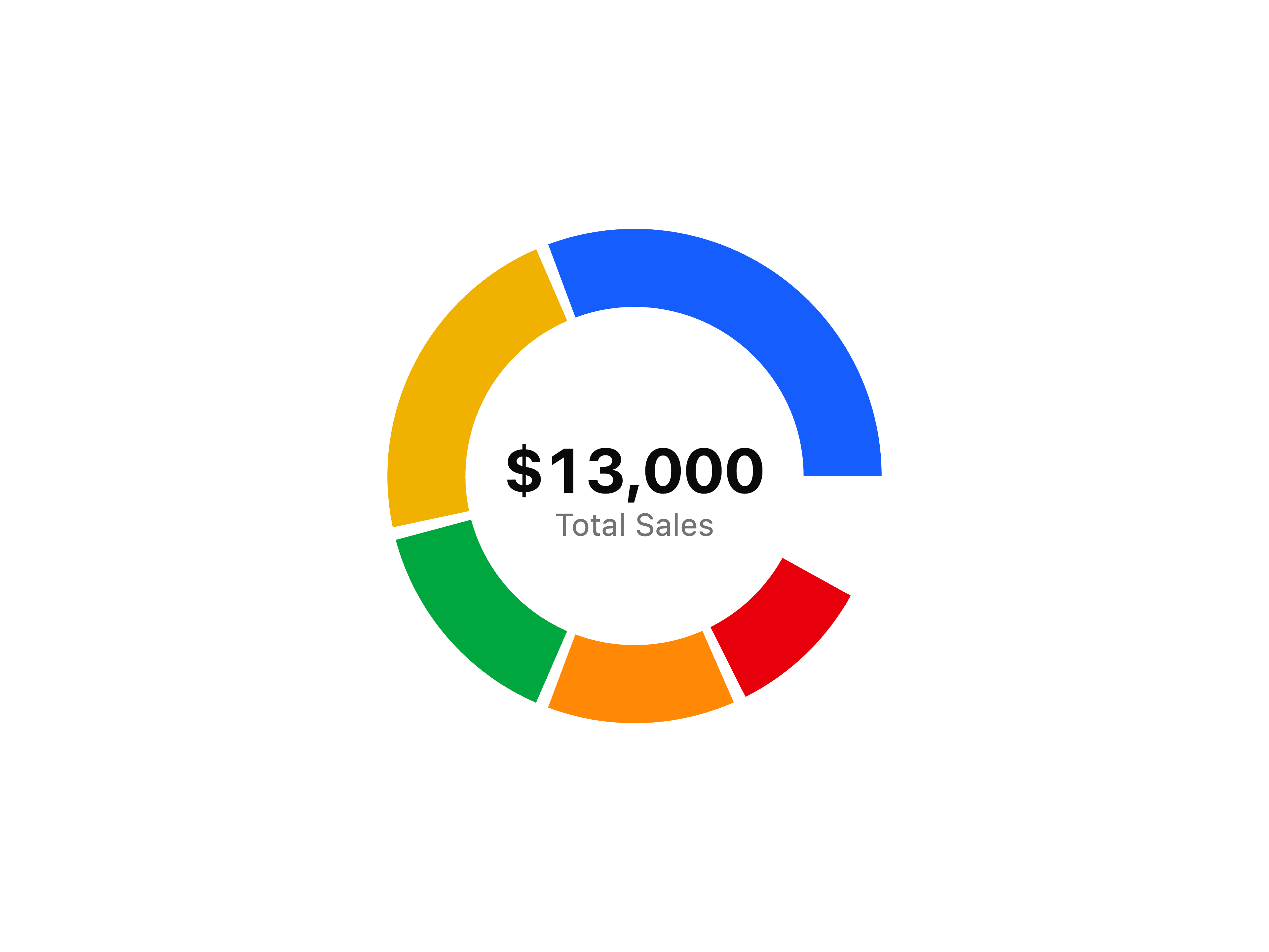
Badge Outline Dark variant for component.
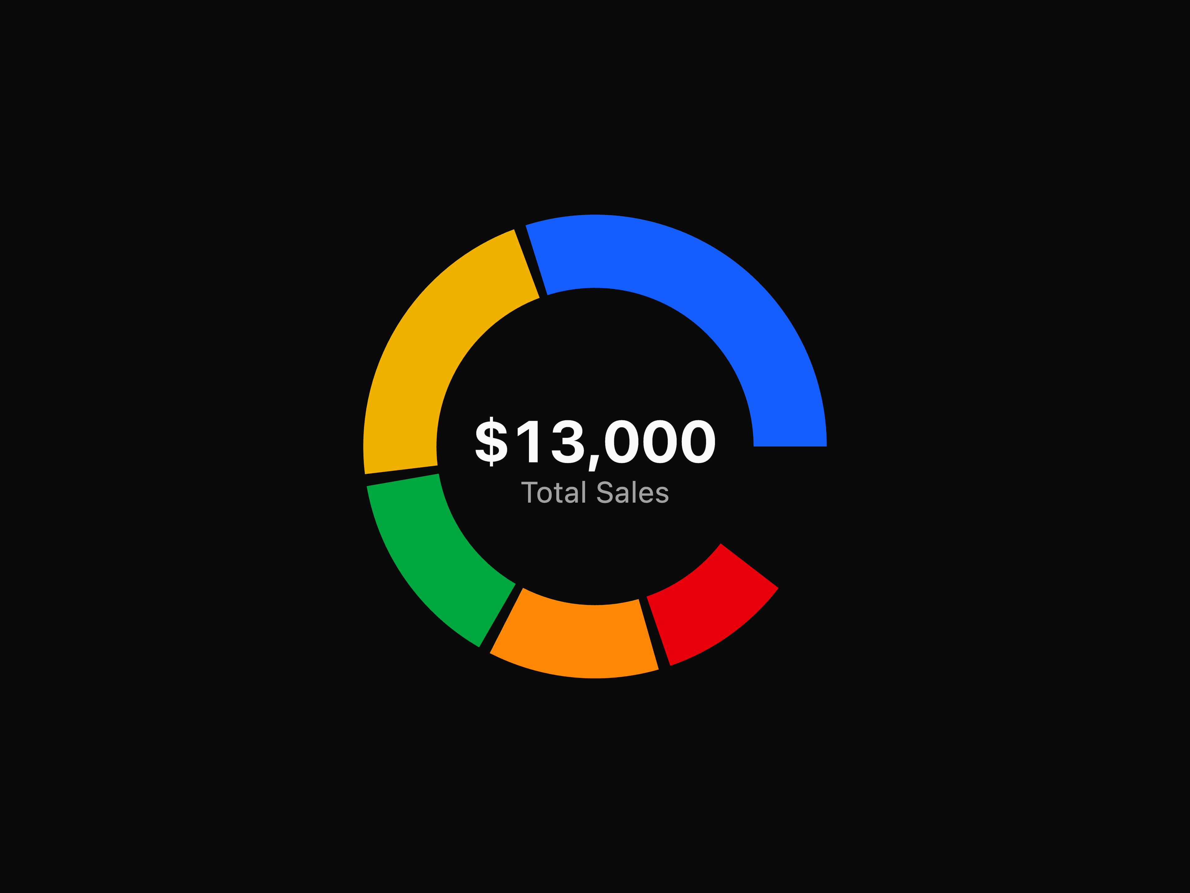
Badge Outline Info variant for component.
Badge Outline Primary variant for component.
Badge Outline Secondary variant for component.
Badge Outline Success variant for component.
Badge Outline Warning variant for component.
Badge Pill Danger variant for component.
Badge Pill Dark variant for component.
Badge Pill Info variant for component.
Badge Pill Secondary variant for component.
Badge Pill Success variant for component.
Badge Pill Warning variant for component.
Badge Sizes variant for component.
Badge Solid Dark variant for component.
Badge Solid Info variant for component.
Badge Solid Primary variant for component.
Badge Solid Secondary variant for component.
Badge Solid Success variant for component.
Badge Solid Warning variant for component.
Badge Spinner variant for component.
Badge Status variant for component.
Component 1 variant for block.
Component 2 variant for block.
Contact variant for block.
Contact 11 variant for block.
Cta 1 variant for block.
Cta 2 variant for block.
Faq variant for block.
Faq 1 variant for block.
Feature 1 variant for block.
Footer variant for block.
Gallery 10 variant for block.
Gallery 2 variant for block.
Gallery 3 variant for block.
Gallery 4 variant for block.
Hero 3 variant for block.
Layout Block List variant for component.
Navbar variant for block.
Portfolio 4 variant for block.
Portfolio 5 variant for block.
Pricing 2 variant for block.
Pricing 3 variant for block.
Process 1 variant for block.
Process 3 variant for block.
Process 6 variant for block.
Layout Block Sidebar variant for component.
Testimonial 1 variant for block.
Breadcrumb Basic variant for component.
Breadcrumb Collapsed variant for component.
Breadcrumb Dropdown variant for component.
Breadcrumb Ellipsis variant for component.
Breadcrumb Separator variant for component.
Breadcrumb Stepper variant for component.
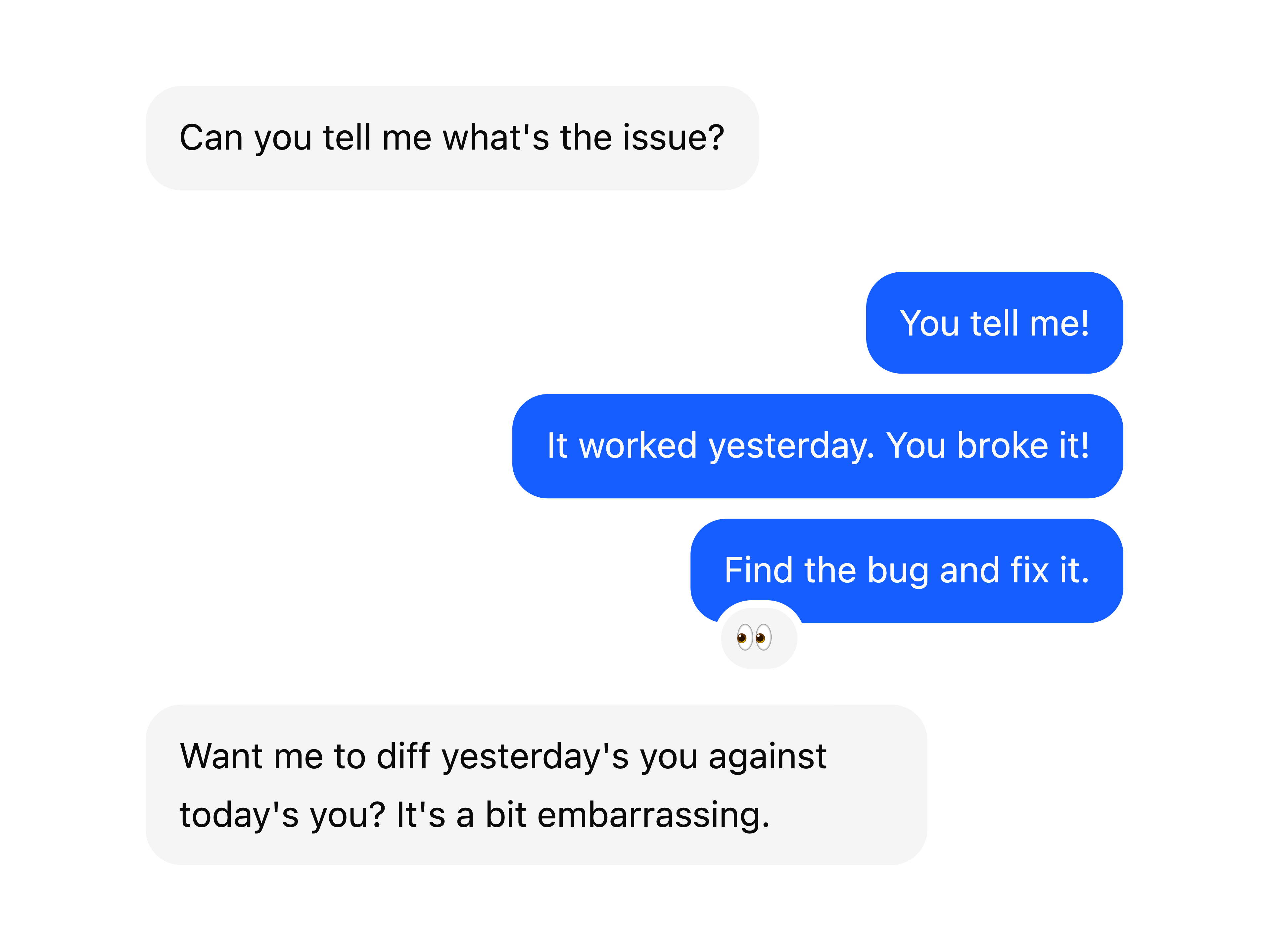
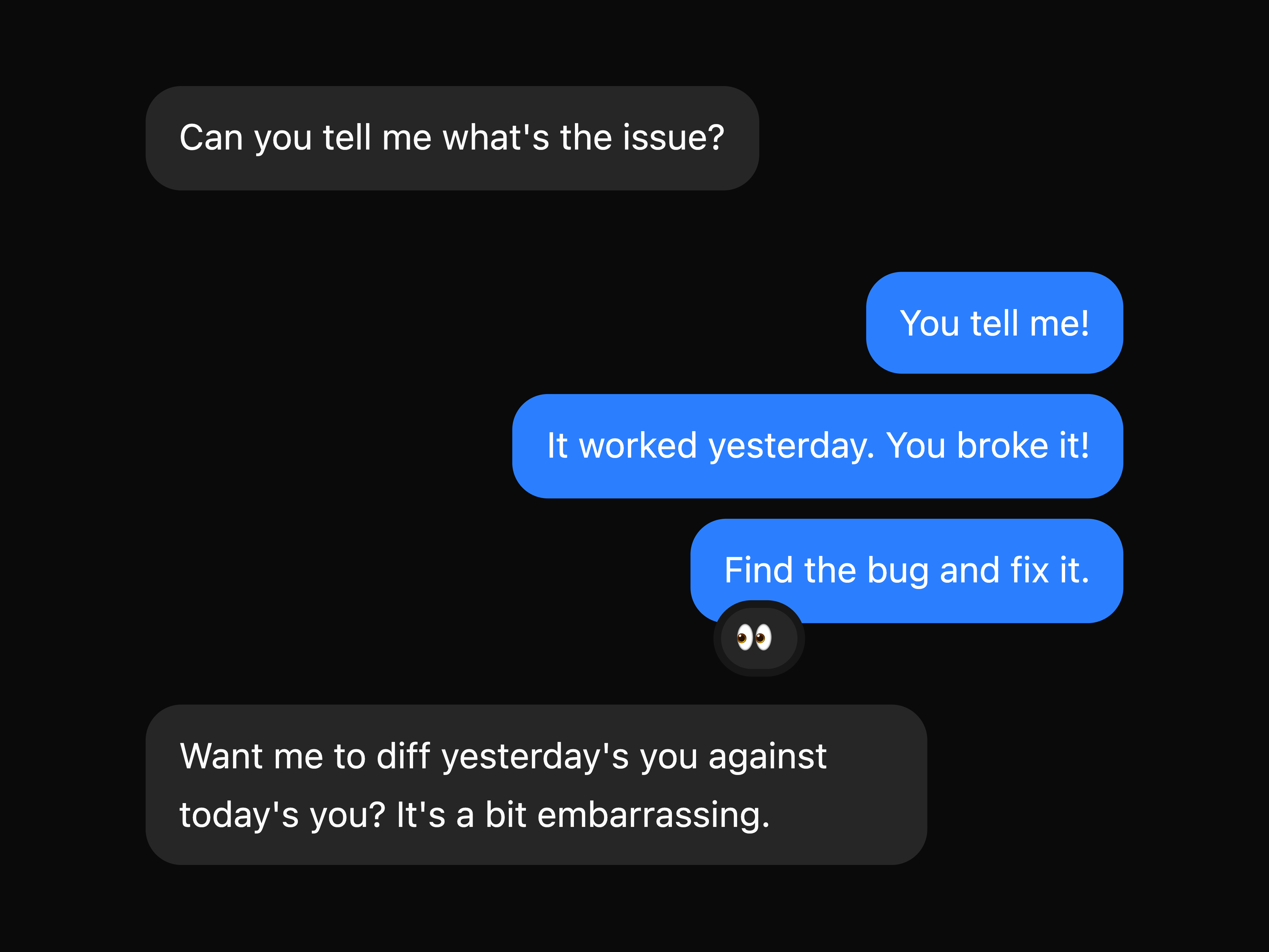
Bubble component.
Bubble Alignment variant for component.
Bubble Link variant for component.
Bubble Popover variant for component.
Bubble Reactions variant for component.
Bubble Tooltip variant for component.
Bubble Variants variant for component.
Button Animated Border variant for component.
Button Default variant for component.
Button Destructive variant for component.
Button Ghost variant for component.
Button Group component.
Button Group Icon variant for component.
Button Group Input Group variant for component.
Button Group Nested variant for component.
Button Group Orientation variant for component.
Button Group Qty Select variant for component.
Button Group Select variant for component.
Button Group Separator variant for component.
Button Group Size variant for component.
Button Group Social variant for component.
Button Group Split variant for component.
Button Group Toolbar variant for component.
Button Icon variant for component.
Button Icon Danger variant for component.
Button Icon Dark variant for component.
Button Icon Info variant for component.
Button Icon Primary variant for component.
Button Icon Secondary variant for component.
Button Icon Success variant for component.
Button Icon Warning variant for component.
Button Light Danger variant for component.
Button Light Dark variant for component.
Button Light Info variant for component.
Button Light Primary variant for component.
Button Light Secondary variant for component.
Button Light Success variant for component.
Button Light Warning variant for component.
UIAble A modern UI library built with Tailwind CSS and Shadcn architecture.
UIAble is an open-source collection of reusable UI components designed for developers who want clean, practical, and fully customizable building blocks for modern frontend projects, without lock-in, without unnecessary abstraction, and without rebuilding the same UI patterns from scratch every time.
Most UI libraries built on Shadcn end up looking and feeling nearly identical. Same structure. Same visual defaults. Same tradeoffs.
UIAble was built to be different, not by adding more features but by being more intentional about what a component library should actually do in a real project.
The common frustrations with existing libraries:
UIAble addresses all of these directly.
No black-box packages. Components are copied directly into your codebase. You see them, you edit them, you own them.
The focus is on components that handle real requirements, including form validation, edge case inputs, accessible dialogs, scalable tables, and proper keyboard navigation, rather than components optimized for screenshots.
UIAble uses Tailwind CSS in a clean, sensible way. No class soup. No structural gymnastics. Just readable component code that happens to use Tailwind well.
If you stop using UIAble tomorrow, your code still works. Because it's already yours.
The entire component library is transparent and open for contribution. No gated tiers. No "pro" version. Just components.
| Layer | Technology |
|---|---|
| Styling | Tailwind CSS v4 |
| Architecture | shadcn/ui |
| Primitives | Base UI |
| Language | TypeScript |
| Framework | React (Next.js compatible) |
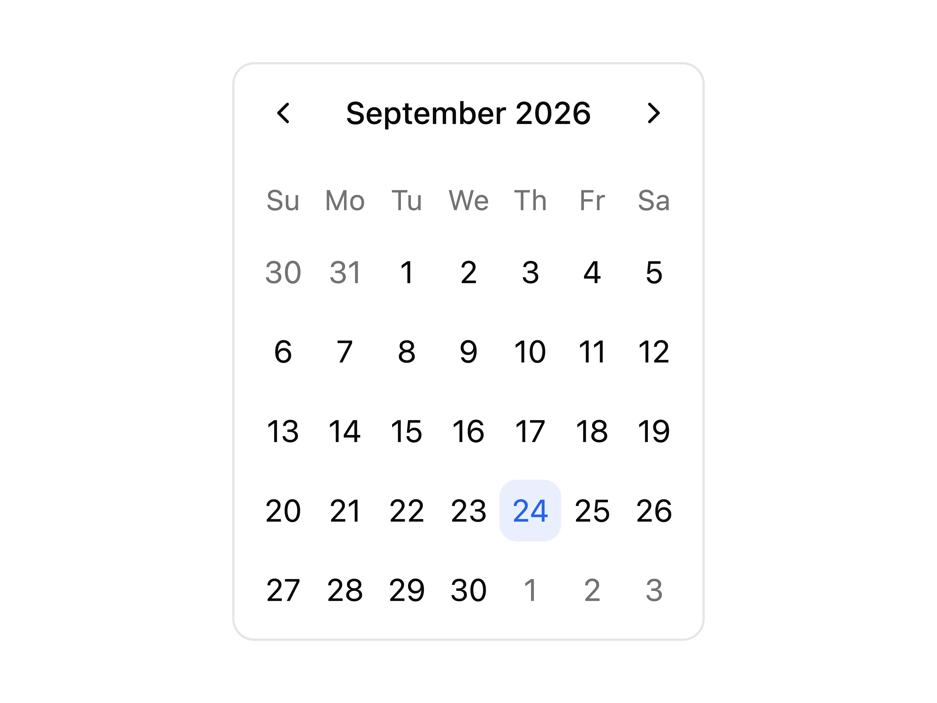
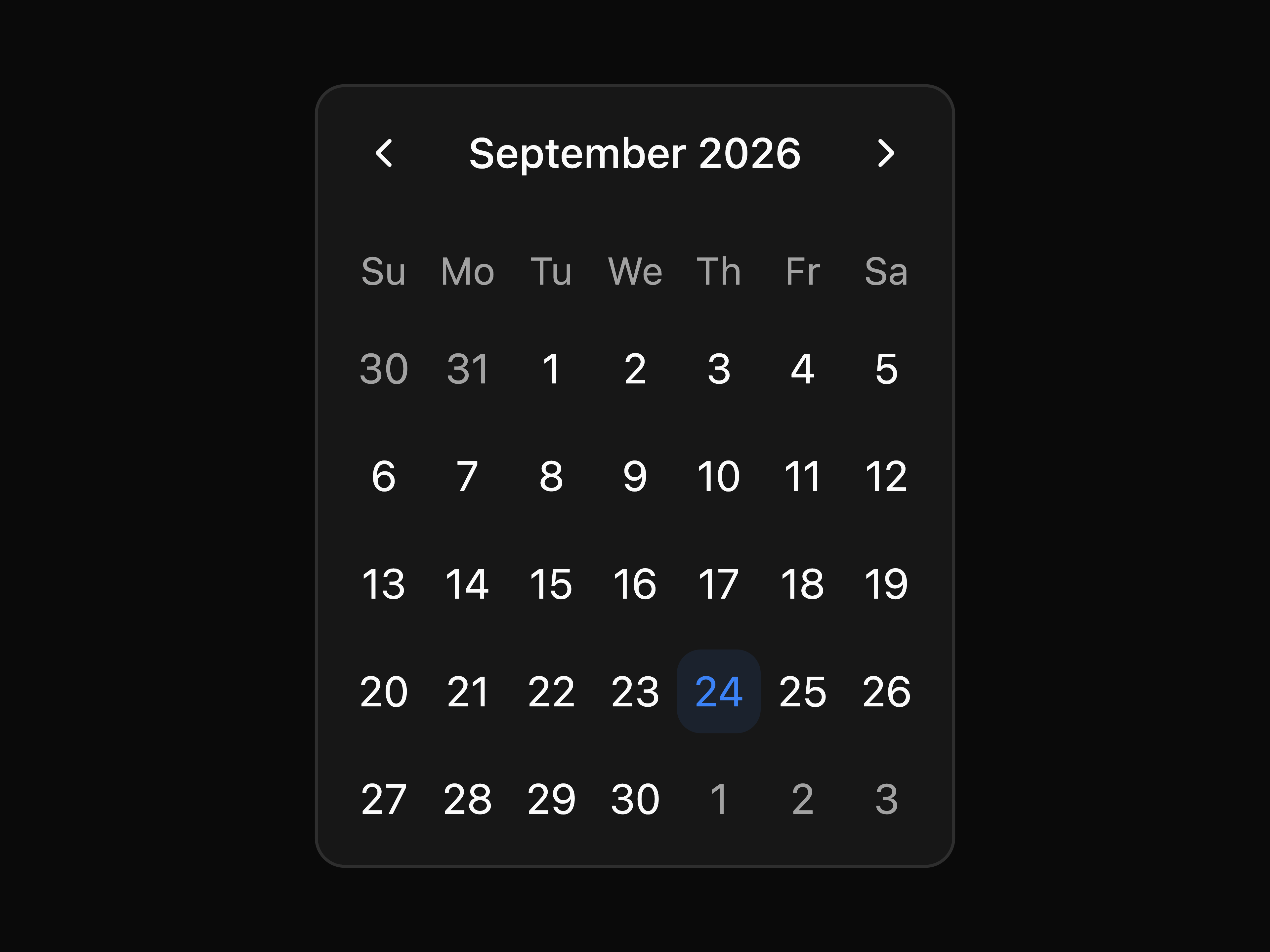
Button Button Group Checkbox Combobox Command Date Picker Input Input Group Input OTP Item Native Select Questionnaire Radio Radio Group Select Slider Switch Textarea Toggle Toggle Group Calendar
Coupon Attachment Avatar Badge Bubble Card Carousel Chart Data Table Empty Field Hover Card Kbd Label Marker Message Message Scroller List Group Scroll Area Separator Table Tooltip Typography Aspect Ratio Skeleton Timeline Tree View
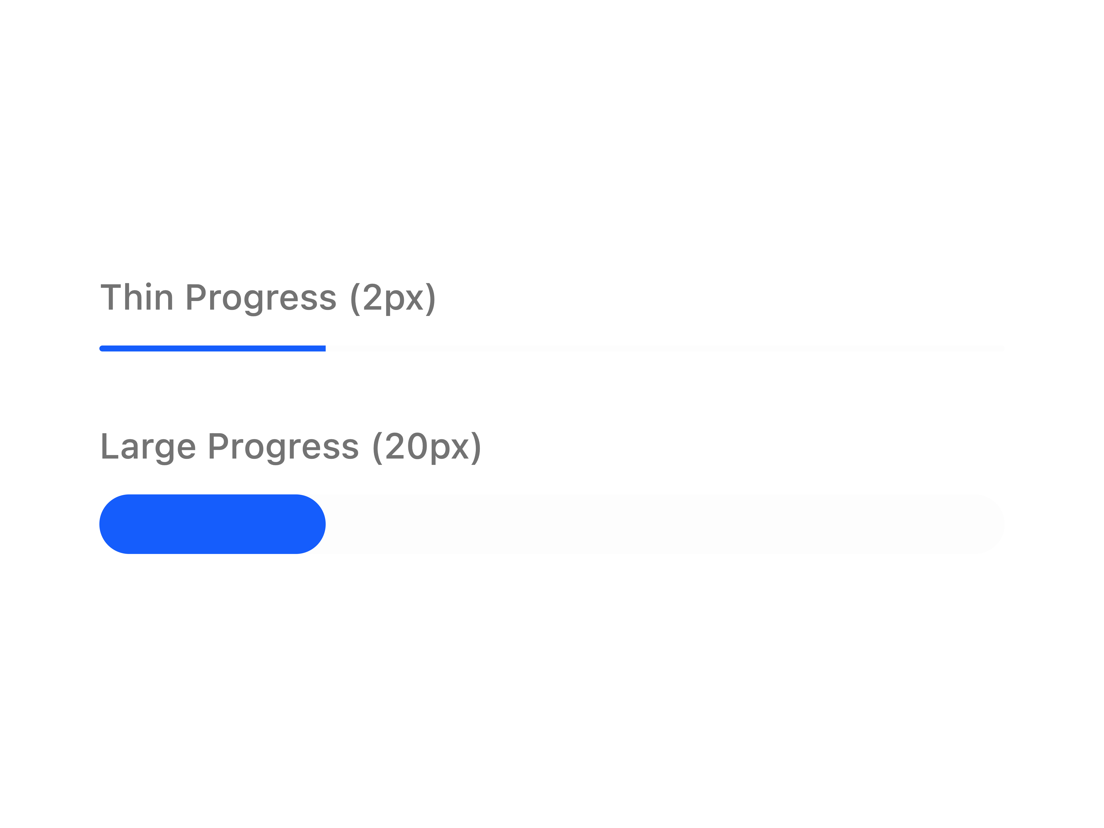
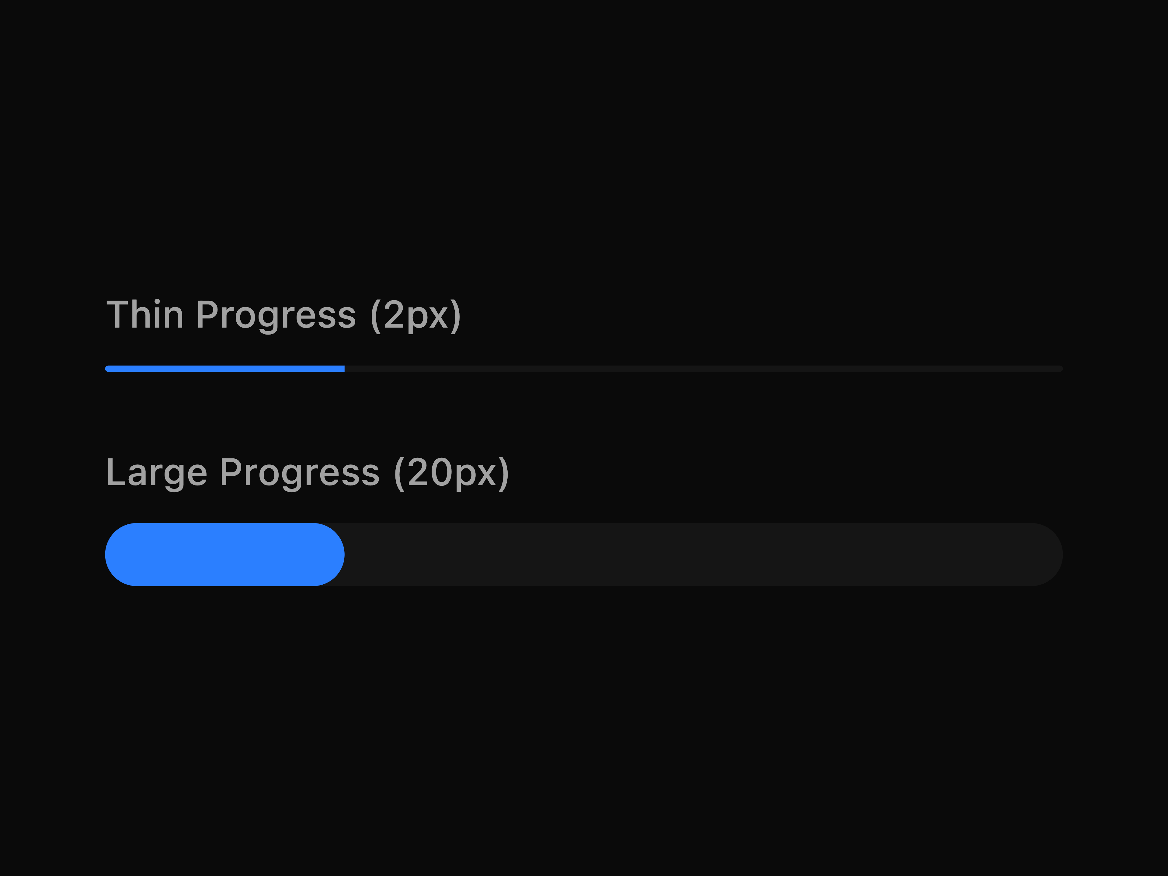
Alert Alert Dialog Dialog Drawer Progress Sheet Sonner Spinner
Breadcrumb Dropdown Menu Menubar Navigation Menu Pagination Tabs Sidebar
Accordion Collapsible
Context Menu Popover Resizable
Pre-built page sections ready to drop into your project.
Bento 4 Bento 5
Charts 7 Charts 11
Check Mail 2
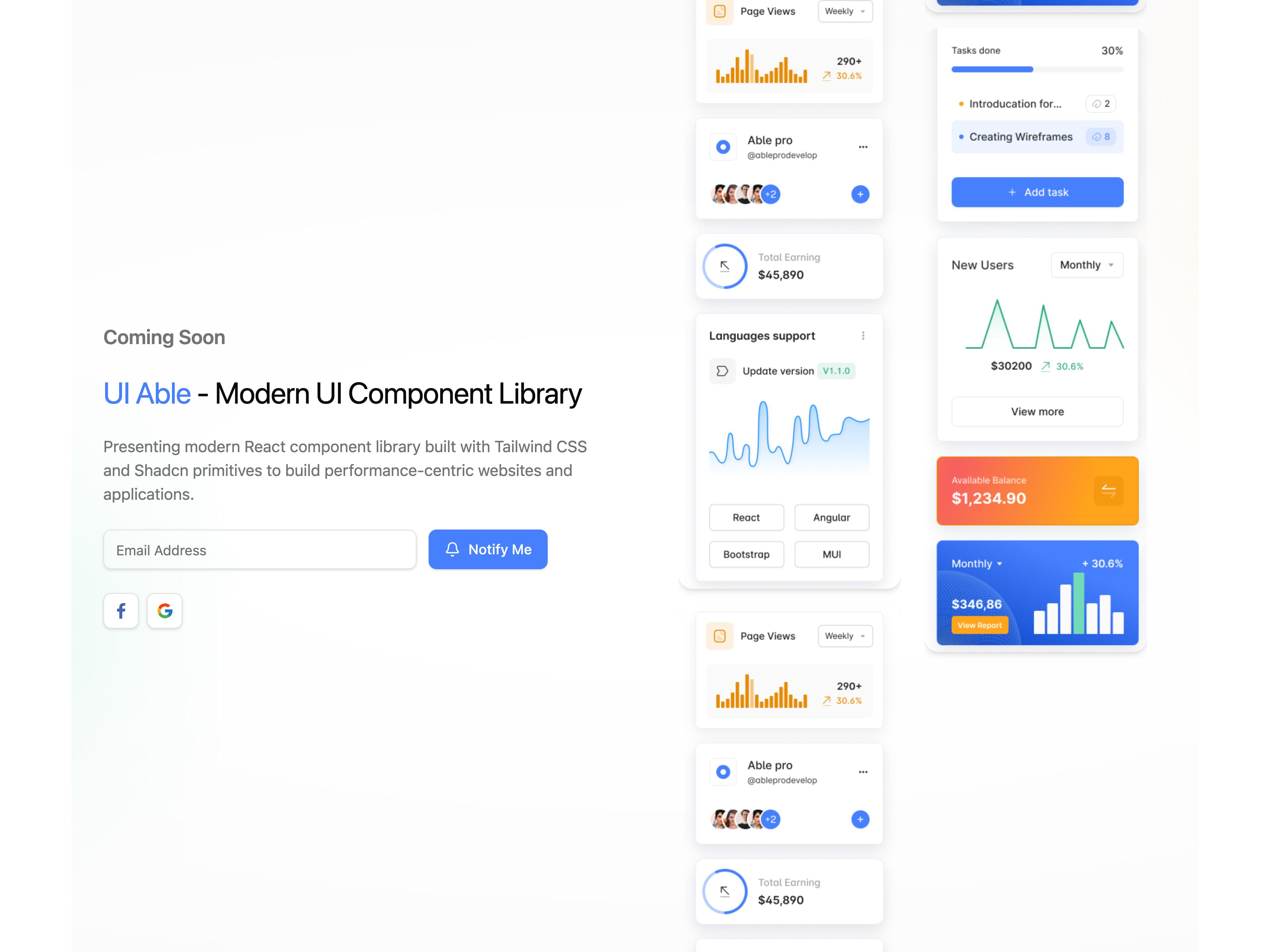
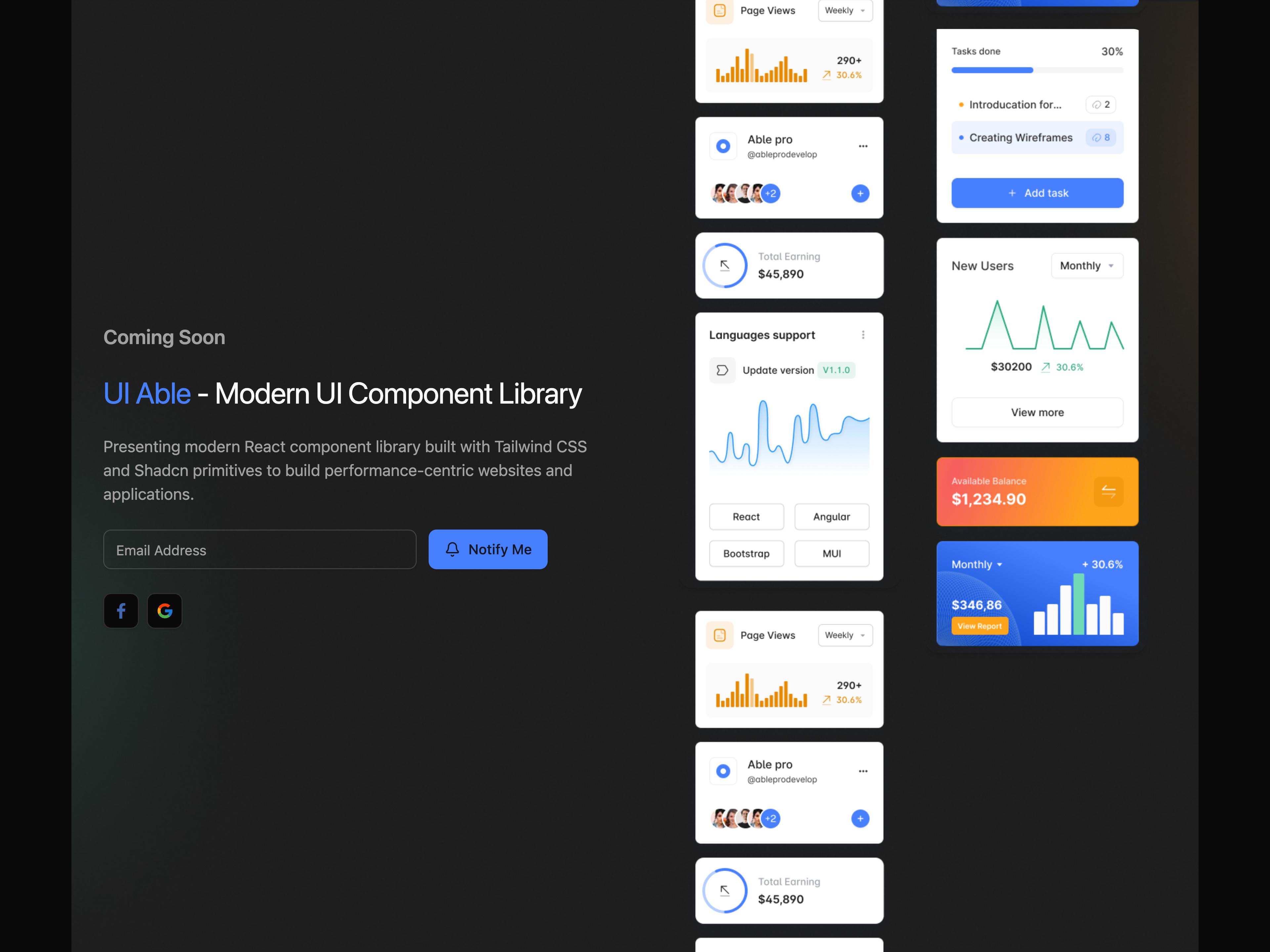
Coming Soon 1 Coming Soon 2
Contact 1 Contact 3 Contact 5 Contact 6 Contact 7 Contact 8 Contact 10 Contact 11 Contact 19 Contact 20 Contact 21
Content 1 Content 2 Content 4 Content 9 Content 10 Content 11 Content 15 Content 16
Call To Action 1 Call To Action 2 Call To Action 3 Call To Action 6 Call To Action 9 Call To Action 12 Call To Action 14
E-commerce 2 E-commerce 3 E-commerce 5 E-commerce 7 E-commerce 8 E-commerce 9 E-commerce 10 E-commerce 19 E-commerce 21
Error 404 1 Error 404 2
Error 500 1 Error 500 2
FAQ 1 FAQ 4 FAQ 6 FAQ 8 FAQ 9 FAQ 10
Feature 1 Feature 2 Feature 3 Feature 4 Feature 6 Feature 8 Feature 9 Feature 18 Feature 24 Feature 27 Feature 30 Feature 39 Feature 42 Feature 45
Footer 2 Footer 3 Footer 7 Footer 10 Footer 19 Footer 20
Gallery 1 Gallery 2 Gallery 3 Gallery 4 Gallery 10 Gallery 11
Hero 2 Hero 3 Hero 4 Hero 5 Hero 6 Hero 8 Hero 9 Hero 15 Hero 24
Join Waitlist 1
About Blocks Showcase Component 1 Component 2 Components Contact FAQ Feature Footer Hero Navbar Testimonials
Login 1 Login 2
Navbar 2 Navbar 6
Portfolio 2 Portfolio 4 Portfolio 5 Portfolio 8 Portfolio 9 Portfolio 10
Pricing 2 Pricing 3 Pricing 9 Pricing 10 Pricing 12 Pricing 18 Pricing 19
Process 1 Process 3 Process 4 Process 6 Process 7 Process 9
Reset Password 1
Small Hero 5 Small Hero 6
Statistics 1 Statistics 4 Statistics 5 Statistics 11
Team 1 Team 3 Team 6 Team 7
Testimonial 1 Testimonial 5 Testimonial 6 Testimonial 8 Testimonial 9 Testimonial 16 Testimonial 17 Testimonial 18 Testimonial 20 Testimonial 21 Testimonial 22 Testimonial 24 Testimonial 25
Under Construction 1 Under Construction 2
Widgets 11 Widgets 17 Widgets 18 Widgets 19 Widgets 22
Components are added based on practical frontend needs, not trend-driven requests. If you need something that isn't here, open a discussion or a PR.
MIT © UIAble
You can use, modify, and distribute UIAble freely in personal and commercial projects. No attribution required, though it's always appreciated.
See the full LICENSE file for details.
UIAble stands on the shoulders of great open-source work:
UIAble is intentionally not trying to feel like a product. It's trying to feel like something you quietly copy into your project — and forget about, because it just works.
The packages and primitives its components pull in, counted across the registry.
Every appearance and removal our crawl has seen in the registry index.
uiable is a component library on 21st.dev by uiable with 168 public React components. Every component ships with a live interactive preview and full TSX source — copy the code, install it through the shadcn CLI, or pull it into Cursor or Claude Code over MCP.