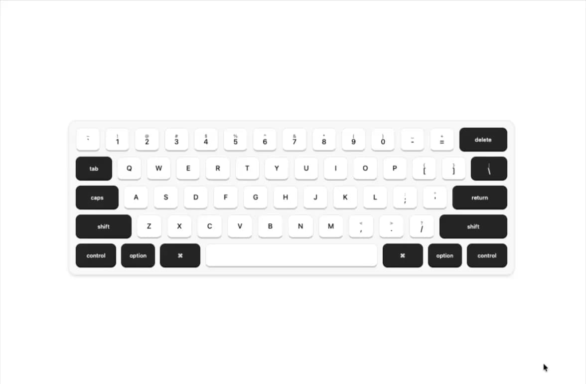
Spark UI
Components that make interfaces feel alive.
Spark UI is a focused collection of signature React components with expressive motion, distinctive visuals, and memorable interactions. It is a shadcn-compatible source registry: instead of installing a runtime package, you use the shadcn CLI to copy component source code directly into your project, where it is fully yours.
Key features
- Open code — components install as readable TypeScript source, not compiled bundles
- Theme ready — all styling flows through semantic CSS variables (light + dark out of the box)
- Accessible by default — keyboard navigation, visible focus, sensible ARIA
- Motion with purpose — animations give feedback and respect
prefers-reduced-motion
- Docs site included — MDX documentation with live previews, search, and copyable install commands
Tech stack
- Framework: Next.js (App Router) + React + TypeScript (strict)
- Styling: Tailwind CSS 4 with OKLCH semantic tokens
- Animation: Framer Motion
- Content: MDX (
next-mdx-remote)
- Syntax highlighting: Shiki (dual theme)
- Registry: shadcn registry (
shadcn build)
Local setup
cd ~/Downloads/spark-ui-master
npm install
npm run dev
Open http://localhost:3000 to view the site.
No Supabase project is needed — the site runs UI-only by default (NEXT_PUBLIC_BACKEND=false), with GitHub login and favorites hidden. See "GitHub authentication setup" below to enable them.
This project uses npm exclusively. Please do not introduce other package-manager lockfiles.
npm commands
| Command | Purpose |
|---|
npm run dev | Start the development server |
npm run lint | Run ESLint |
npm run registry:build | Generate registry JSON into public/r/ |
npm run build | Production build |
npm run check | Lint + registry build + production build |
How the registry works
Component source lives in registry/spark-ui/, demos in registry/demos/, and each installable item is declared in registry.json. Running:
npm run registry:build
generates one JSON file per component under public/r/. Those static files are what the shadcn CLI consumes.
Official links
Official website:    https://spark-ui-olive.vercel.app
Official repository: https://github.com/codeweb-dev/spark-ui
Official registry:   https://spark-ui-olive.vercel.app/r
The site origin is configured in one place: lib/constants.ts (SITE_CONFIG.url, overridable via NEXT_PUBLIC_APP_URL).
Installing a component into your app
Inspect an item first, then install it:
npx shadcn@latest view https://spark-ui-olive.vercel.app/r/shimmer-text.json
npx shadcn@latest add https://spark-ui-olive.vercel.app/r/shimmer-text.json
The machine-readable index of all items is https://spark-ui-olive.vercel.app/r/registry.json.
Security note
- Spark UI components are copied into your project as source code — review registry items (with
shadcn view or by reading this repository) before installing.
- The official repository above is the human-reviewable source of every registry item.
- Registry downloads never require credentials. Spark UI will never ask you to upload local files,
.env values, tokens, or secrets to install a component.
AI Agent Skill
This repository includes an Agent Skill that teaches compatible AI coding agents (Claude Code, Cursor, Codex, Windsurf, and other Agent Skills-compatible tools) how to install, import, compose, and customize Spark UI components — the full component catalog, registry install commands, composition rules, and styling conventions, derived from the actual source.
npx skills add codeweb-dev/spark-ui --skill spark-ui
Skill source:
skills/spark-ui/SKILL.md
Listing: skills.sh/codeweb-dev/spark-ui
Contributing
See CONTRIBUTING.md for the full guide to adding a new component — source file, demo, registry entries, MDX docs, checklists, and templates.
Open-source boundary
This repository is the open-source frontend: components, registry, docs site, and safe Supabase client helpers (lib/supabase/). The production Supabase backend (migrations, policies, deployment) is maintained in a separate private repository. The frontend talks to it only through the deployed Supabase project (URL + publishable key) and never imports backend code. Full policy: docs/architecture/OPEN_SOURCE_BOUNDARY.md. Local Supabase setup: supabase/README.md.
Deployment notes
- Deploy as a standard Next.js app (Vercel or any Node host).
- Set
NEXT_PUBLIC_APP_URL=https://spark-ui-olive.vercel.app in the Vercel project so metadata, sitemap, and install commands use the production domain.
- Run
npm run check before deploying; registry:build must run so public/r/ is current.
GitHub authentication setup (optional)
Backend features (GitHub login + favorites) are off by default — the site runs UI-only with no Supabase project, so most contributors can skip this section entirely. To enable them against your own Supabase project:
- Create a GitHub OAuth App and set its authorization callback URL to
https://PROJECT_REF.supabase.co/auth/v1/callback.
- Add the GitHub Client ID and Client Secret to the GitHub provider settings in the Supabase dashboard.
- Configure the Supabase Site URL and add your application callback URLs, including
http://localhost:3000/auth/callback for local development.
- Run
supabase/examples/favorites.sql in your project's SQL editor (see supabase/README.md).
- Copy
.env.example to .env.local, set NEXT_PUBLIC_BACKEND=true, and fill in NEXT_PUBLIC_SUPABASE_URL and NEXT_PUBLIC_SUPABASE_PUBLISHABLE_KEY from the Supabase project settings.
The GitHub Client Secret and Supabase service-role key must never be committed or exposed to browser code.
License
Released under the MIT License.