Ein UI
3components33views
Installs all 46 components. Without our CLI, run instead.
Auto-indexed
Ein UI contents
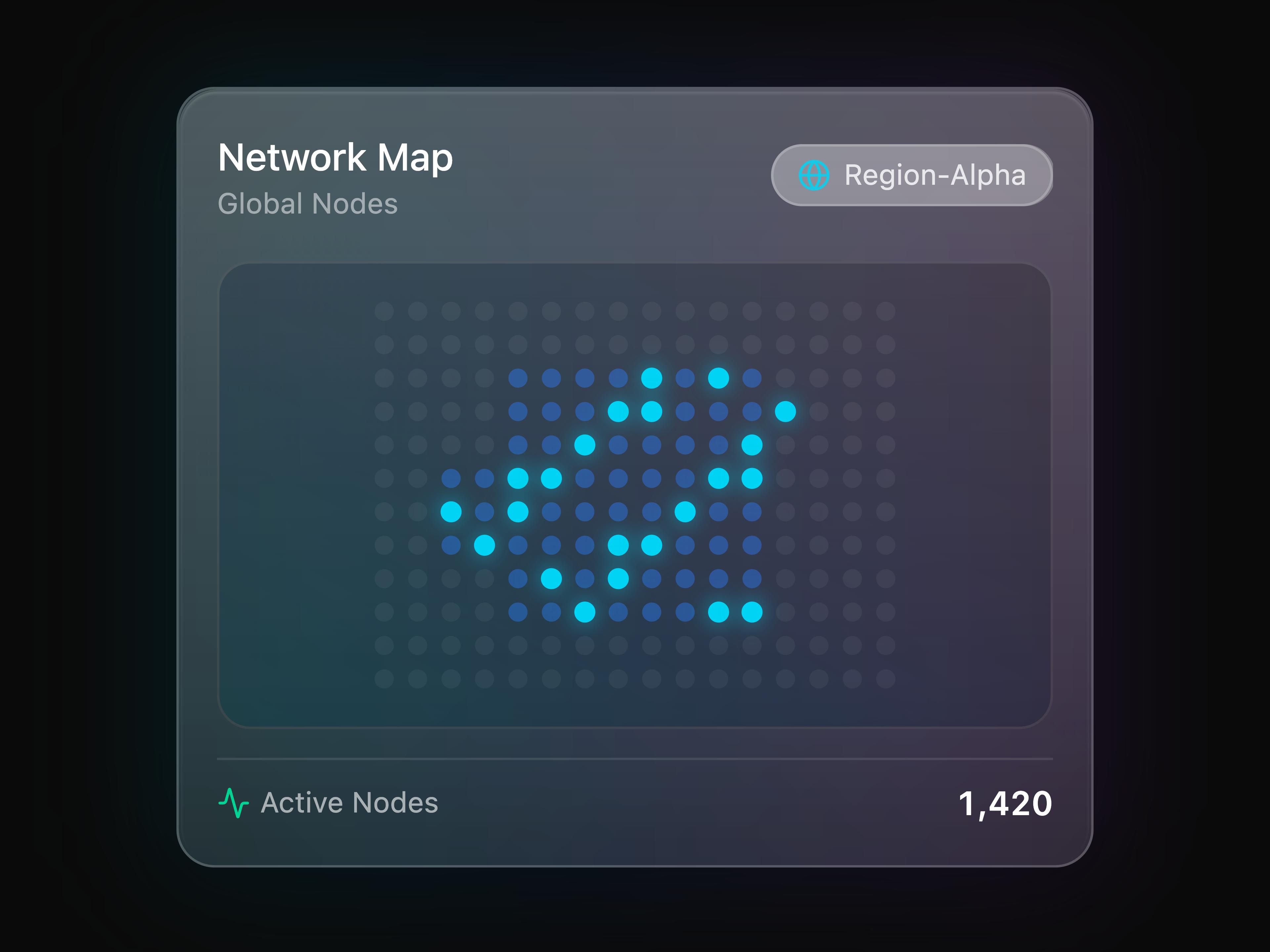
Glass Map Widget

Glass Command Palette

Glass Spotlight
That's all 3 components
About Ein UI
Ein UI publishes a shadcn registry at ui.eindev.ir, with 46 components installable through the shadcn CLI.
- Components
- 46
- GitHub stars
- 154
- Last commit
- Oct 11, 2026
- Repository
- einui/einui
Also in the Ein UI registry
Copy a prompt for your agent, copy the install command, or open the docs that ship it.
Admin Panel
admin-panelA complete admin dashboard built with liquid glass components.
lucide-react1 filearea-chart-widget
Base Widget
base-widgetbase widgets component
framer-motion1 fileCalendar Widgets
calendar-widgetCalendar widgets for displaying dates, events, and scheduling information.
lucide-react1 fileClock Widgets
clock-widgetClock widgets including analog, digital, world clock, stopwatch, and timer with liquid glass styling.
lucide-react1 fileForgot Password Page
forgot-password-pageA forgot password recovery page with email submission and confirmation state, including helpful tips and support contact.
lucide-react1 fileGlass Alert Dialog
glass-alert-dialogA liquid glass styled alert dialog for confirmations.
@radix-ui/react-alert-dialog1 fileGlass Avatar
glass-avatarCircular profile images with gradient glow effects and fallback initials for user representation.
@radix-ui/react-avatar1 fileGlass Badge
glass-badgeSmall visual indicators for status, labels, or categories with frosted glass styling and color variants.
class-variance-authority1 fileGlass Breadcrumb
glass-breadcrumbA liquid glass styled breadcrumb navigation component.
lucide-react1 fileGlass Button
glass-buttonInteractive button components with multiple variants, sizes, and optional glow effects.
@radix-ui/react-slot, class-variance-authority1 fileGlass Card
glass-cardFlexible container components with frosted glass morphism effect, perfect for displaying grouped content.
1 fileGlass Checkbox
glass-checkboxA liquid glass styled checkbox with animated check indicator.
@radix-ui/react-checkbox, framer-motion, lucide-react1 fileGlass Dialog
glass-dialogModal dialog components with backdrop blur and smooth animations for confirmations and forms.
@radix-ui/react-dialog, lucide-react1 fileGlass Dock
glass-dockA dock component with glass morphism styling and smooth animations.
1 fileGlass Gauge
glass-gaugeA gauge component with glass morphism styling, suitable for displaying progress or performance metrics.
1 fileGlass Input
glass-inputForm input components with focus glow animations and glass morphism styling.
1 fileGlass Morph Card
glass-morph-cardA card component with a morphing glass effect, suitable for displaying content in a visually appealing way.
1 fileGlass Notification
glass-notificationA customizable notification system with glass morphism styling, allowing for different types of messages and actions.
lucide-react1 fileGlass Orb
glass-orbAn interactive ambient orb that follows the cursor, emits soft glass particle trails, and updates its glow based on status.
1 fileGlass Popover
glass-popoverA liquid glass styled popover for floating content.
@radix-ui/react-popover1 fileGlass Progress
glass-progressVisual indicators for task completion with animated gradient fill and glow effects.
@radix-ui/react-progress1 fileGlass Radio Group
glass-radioA liquid glass styled radio group with animated selection.
@radix-ui/react-radio-group, framer-motion1 fileGlass Ripple
glass-rippleA ripple effect component that can be applied to various elements for a dynamic interaction experience.
1 fileGlass Scroll Area
glass-scroll-areaA liquid glass styled custom scrollbar component.
@radix-ui/react-scroll-area1 fileGlass Select
glass-selectA liquid glass styled select dropdown with frosted glass styling.
@radix-ui/react-select, lucide-react1 fileGlass Separator
glass-separatorA liquid glass styled separator/divider component.
@radix-ui/react-separator1 fileGlass Sheet
glass-sheetA liquid glass styled sheet/drawer with slide animations.
@radix-ui/react-dialog, class-variance-authority, lucide-react1 fileGlass Skeleton
glass-skeletonA liquid glass styled skeleton loading component with shimmer.
framer-motion1 fileGlass Slider
glass-sliderRange input controls with gradient track, glow effects, and smooth thumb interaction.
@radix-ui/react-slider1 fileGlass Switch
glass-switchToggle controls for binary options with smooth transitions and glow effects when activated.
@radix-ui/react-switch1 fileGlass Table
glass-tableA liquid glass styled table for displaying tabular data.
1 fileGlass Tabs
glass-tabsTabbed interface components with smooth transitions and glass morphism styling.
@radix-ui/react-tabs, framer-motion1 fileGlass Textarea
glass-textareaA liquid glass styled textarea with focus glow effects.
framer-motion1 fileGlass Timeline
glass-timelineA timeline component with glass morphism styling, suitable for displaying events or processes in a chronological order.
1 fileGlass Tooltip
glass-tooltipContextual information popups with glass morphism styling and smooth animations on hover.
@radix-ui/react-tooltip1 fileGlass Waveform
glass-waveformAn audio visualizer with liquid glass bars, gradient fills, and a frozen glass paused state.
1 fileLogin Page
login-pageA complete login page with email and password authentication, password visibility toggle, remember me option, and social login buttons.
lucide-react1 filePricing Page
pricing-pageA modern pricing page with multiple plan tiers, billing toggle, feature comparison, FAQ section, and call-to-action buttons.
lucide-react1 fileSign Up Page
signup-pageA complete sign up page with multi-step validation, password strength indicator, confirm password matching, and terms agreement checkbox.
lucide-react1 fileStats Widgets
stats-widgetStatistics and metrics widgets for displaying data, comparisons, and progress with liquid glass styling.
lucide-react1 fileStock Widgets
stock-widgetStock market widgets for displaying stock prices, trends, and news with liquid glass styling.
lucide-react1 fileWeather Widgets
weather-widgetWeather widgets for displaying temperature, conditions, forecasts, and hourly data with liquid glass styling.
lucide-react1 file