Groot Studio
3components81.1Kviews416bookmarks
Installs all 26 components. Without our CLI, run instead.
Auto-indexed
Groot Studio contents
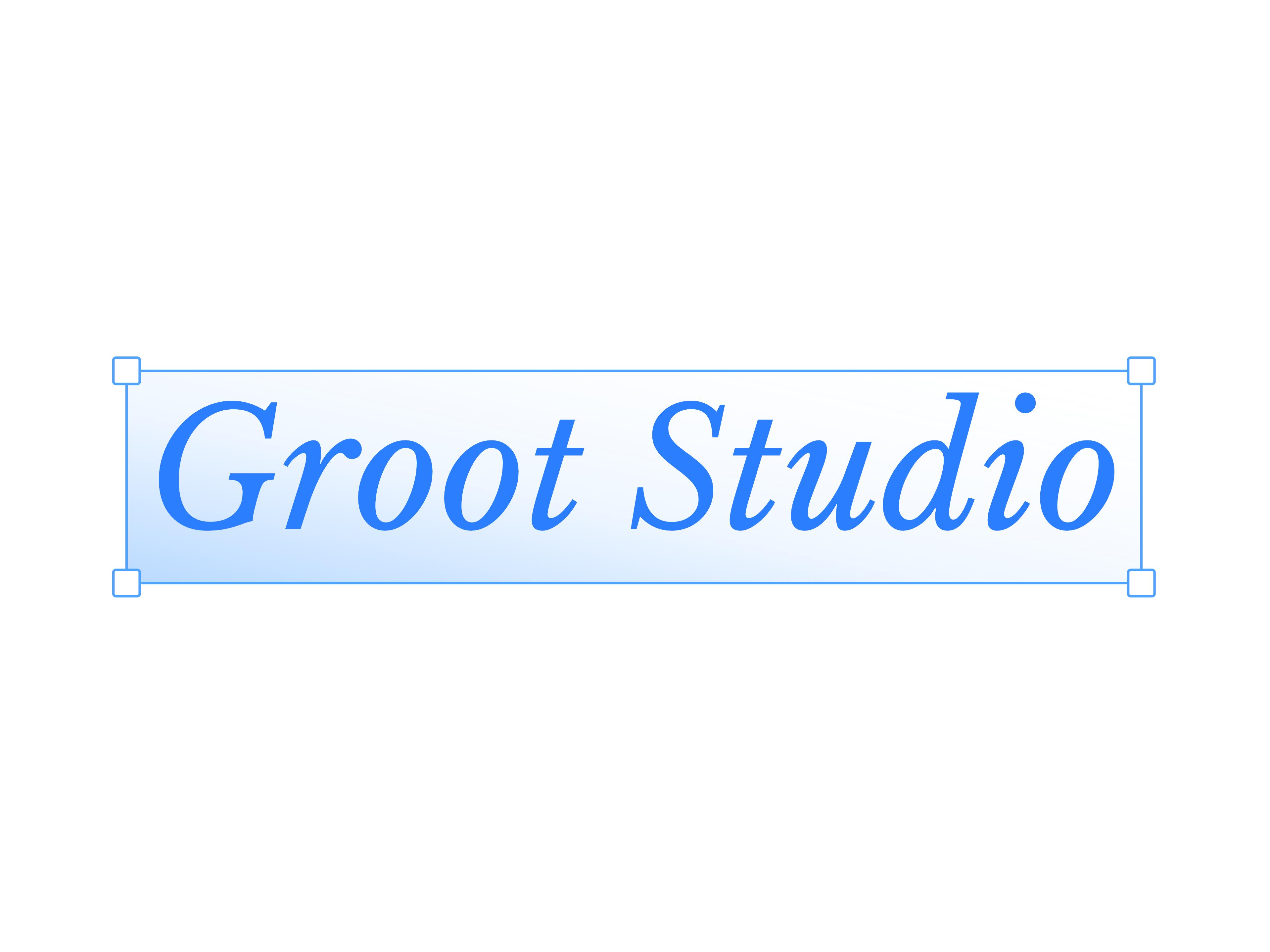
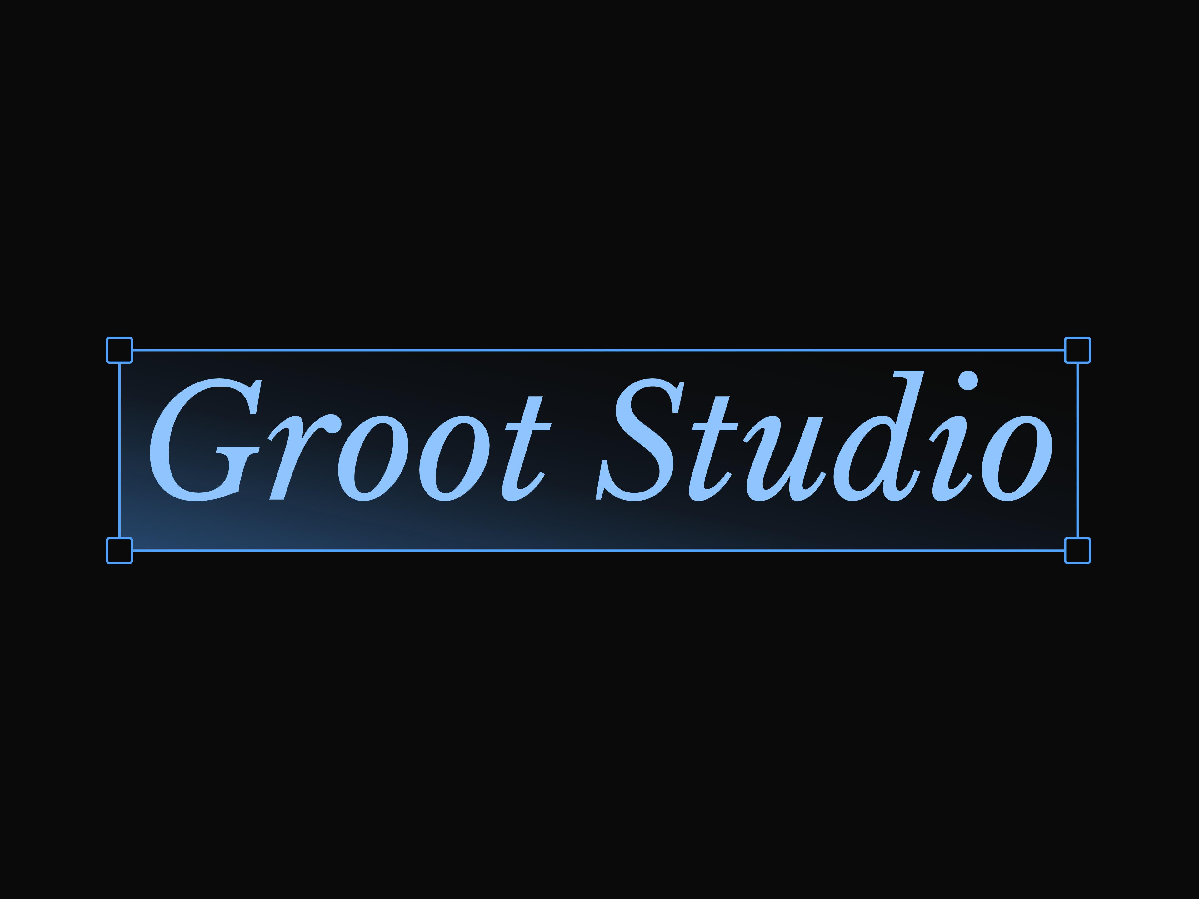
Text Frame

Cursor Trail

Logo Marquee
That's all 3 components
About Groot Studio
Groot Studio publishes a shadcn registry at grootstudio.vercel.app, with 26 components installable through the shadcn CLI.
- Components
- 26
- GitHub stars
- 60
- Last commit
- Sep 25, 2026
- Repository
- Subhadipjana95/Groot-Studio
Also in the Groot Studio registry
Copy a prompt for your agent, copy the install command, or open the docs that ship it.
3D Button
3d-buttonA premium 3D button component with customizable dual-tone gradients, shimmer effects and depth shadows.
1 fileAnimated Bars
animated-barsA dynamic background component with pulsating, gradient bars that create a fluid energy effect.
1 fileAnimated Layout
animated-layoutA modern and dynamic layout component featuring fluid animations, smooth transitions, and a responsive grid system.
motion, lucide-react1 fileAvatar Tooltips
avatar-tooltipsInteractive overlapping avatars that reveal animated, spring-based tooltips on hover.
motion1 fileDiscord Online (Next.js)
discord-onlineShows live Discord member presence count fetched server-side with 60s revalidation. Label shown on tooltip hover. Requires Next.js App Router.
button, tooltip1 fileDiscord Online (React / Vite)
discord-online-reactShows live Discord member presence count fetched client-side with 60s localStorage cache. Label shown on tooltip hover.
button, tooltip1 fileDrag Button
drag-buttonAn interactive draggable button requiring a left-to-right swipe to confirm actions, featuring optional success animations and spring physics.
motion, lucide-react1 fileGitHub Calendar
github-calendarA Next.js/React component to display GitHub contributions in a calendar grid format.
tooltip1 fileGitHub Stars
github-starsDisplays a GitHub repo star count with auto-fetch, daily revalidation, compact formatting, and a tooltip.
button, tooltip1 fileGitHub Stars (React / Vite)
github-stars-reactGitHub star count for Vite and non-Next.js React projects. Fetches client-side with localStorage caching for 24 hours.
button, tooltip1 fileGlow Card
glow-cardA card with a glowing hover effect.
1 fileGradient Background Text
gradient-background-textAnimated gradient background orb text with 3D engraved effect. Works on any background color.
motion1 fileImage Trail
image-trailA very smooth and interactive trail of images that follows your mouse cursor with discrete step interpolation.
motion1 fileLogo Grid
logo-gridGrid of client logos with plus-sign separators and highlighted rows.
lucide-react1 filePebble Toast
pebble-toastA premium notification stack with beautiful center/corner positioning, micro-animations, and dynamic gradients.
sonner, lucide-react, motion1 filePress Button
press-buttonAn industry-grade neobrutalist button with a 3D press effect.
1 fileShimmer Text Flip
shimmer-text-flipA sequence of texts cycles through fliping transition with shimmer glow effect.
motion, shadcn1 fileSliding Button
sliding-buttonA high-performance interactive button that slides an icon into view on hover with spring animations and depth shadows.
motion, lucide-react1 fileStyled Button
styled-buttonAn elegant styled button with vibrant radial gradients, shadow glows, and smooth active transitions.
1 fileText Outline Glow
text-outline-glowA very smooth and interactive trail of images that follows your mouse cursor with discrete step interpolation.
gsap, @gsap/react1 fileTheme Toggler
theme-togglerA minimal theme toggle button with a cinematic full-screen curtain wipe animation. Supports vertical and horizontal directions.
lucide-react1 file