neon-ui
5components9views
Installs all 56 components. Without our CLI, run instead.
Auto-indexed
neon-ui contents
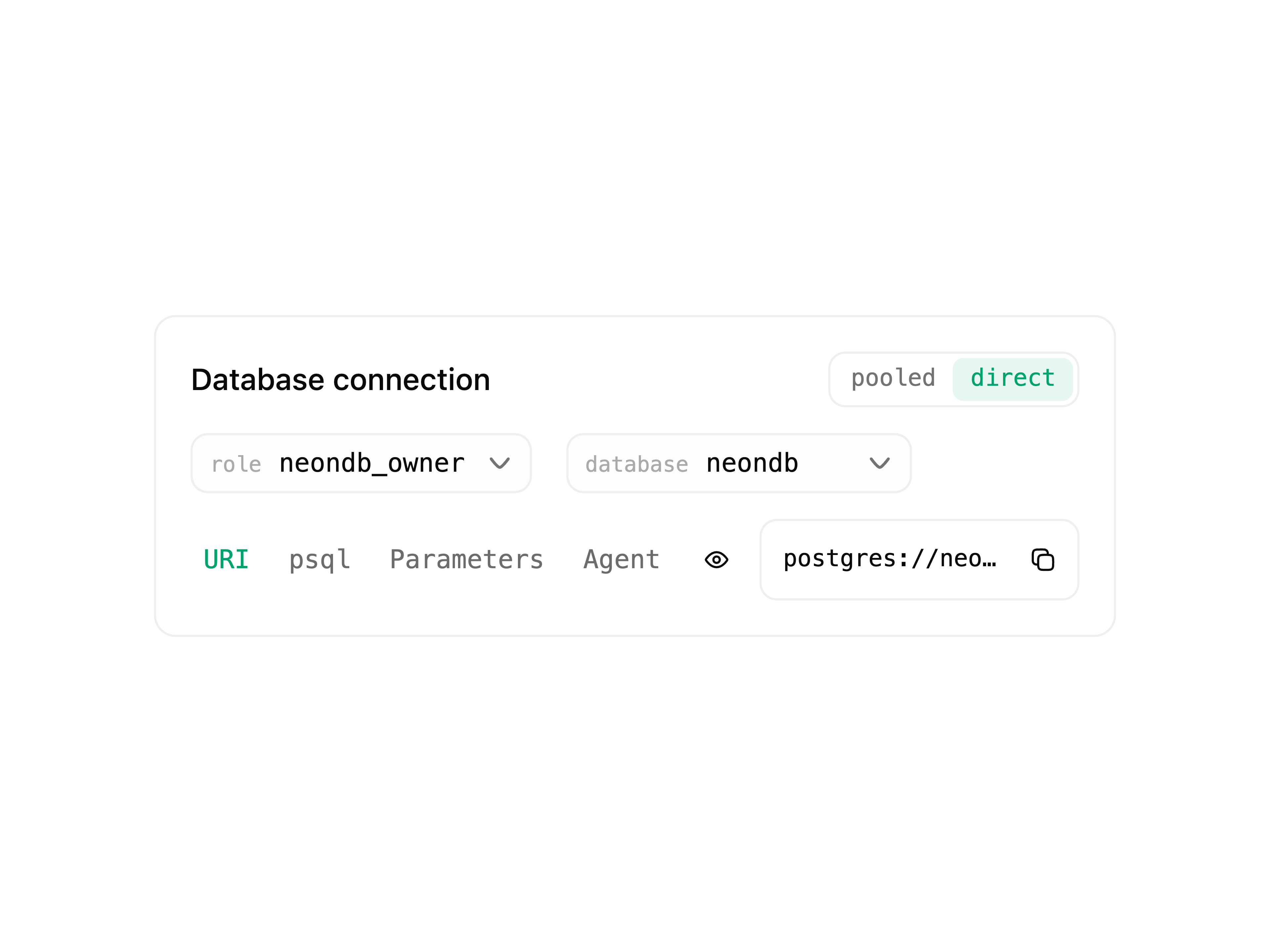
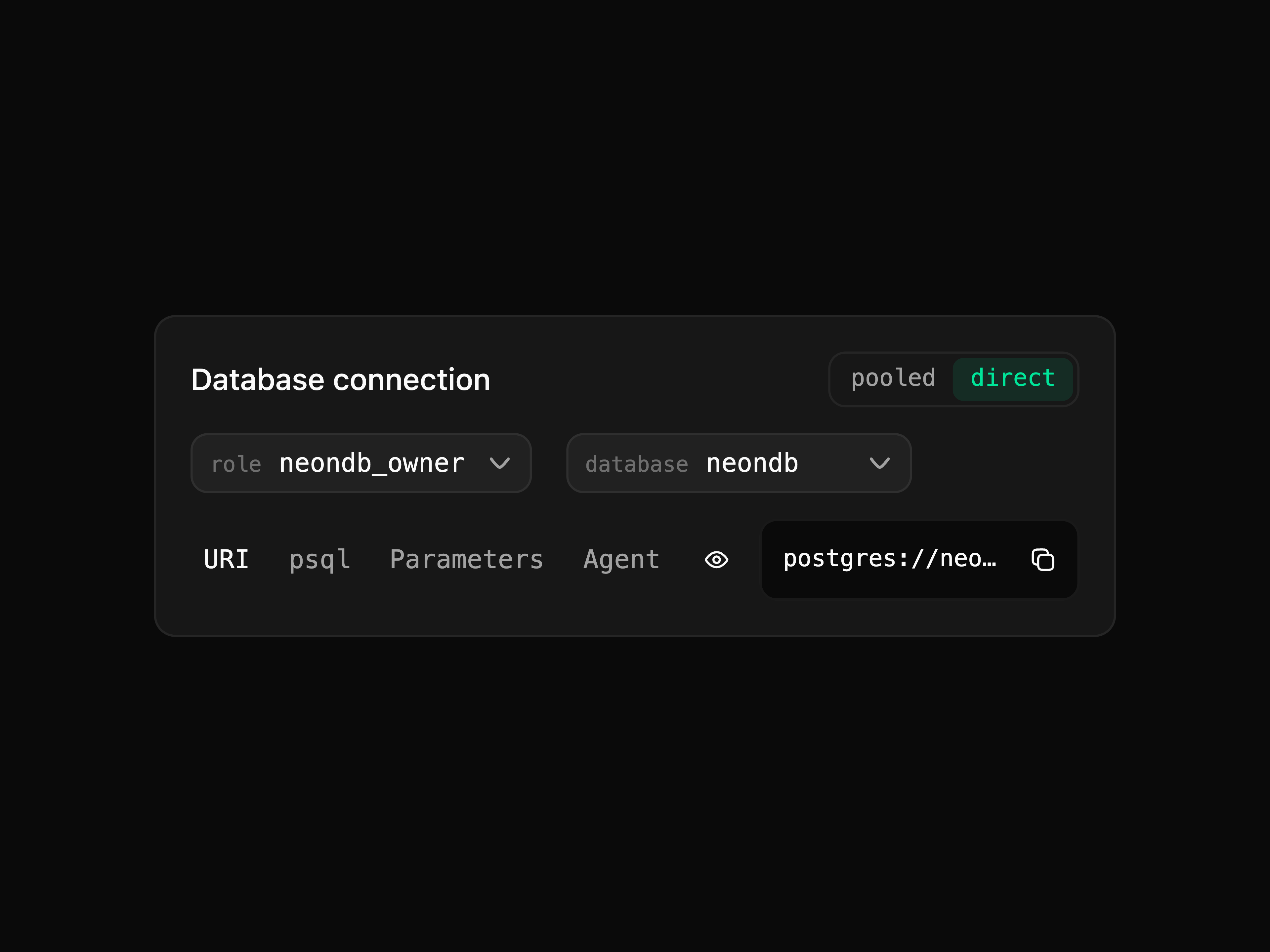
DB Connection Card
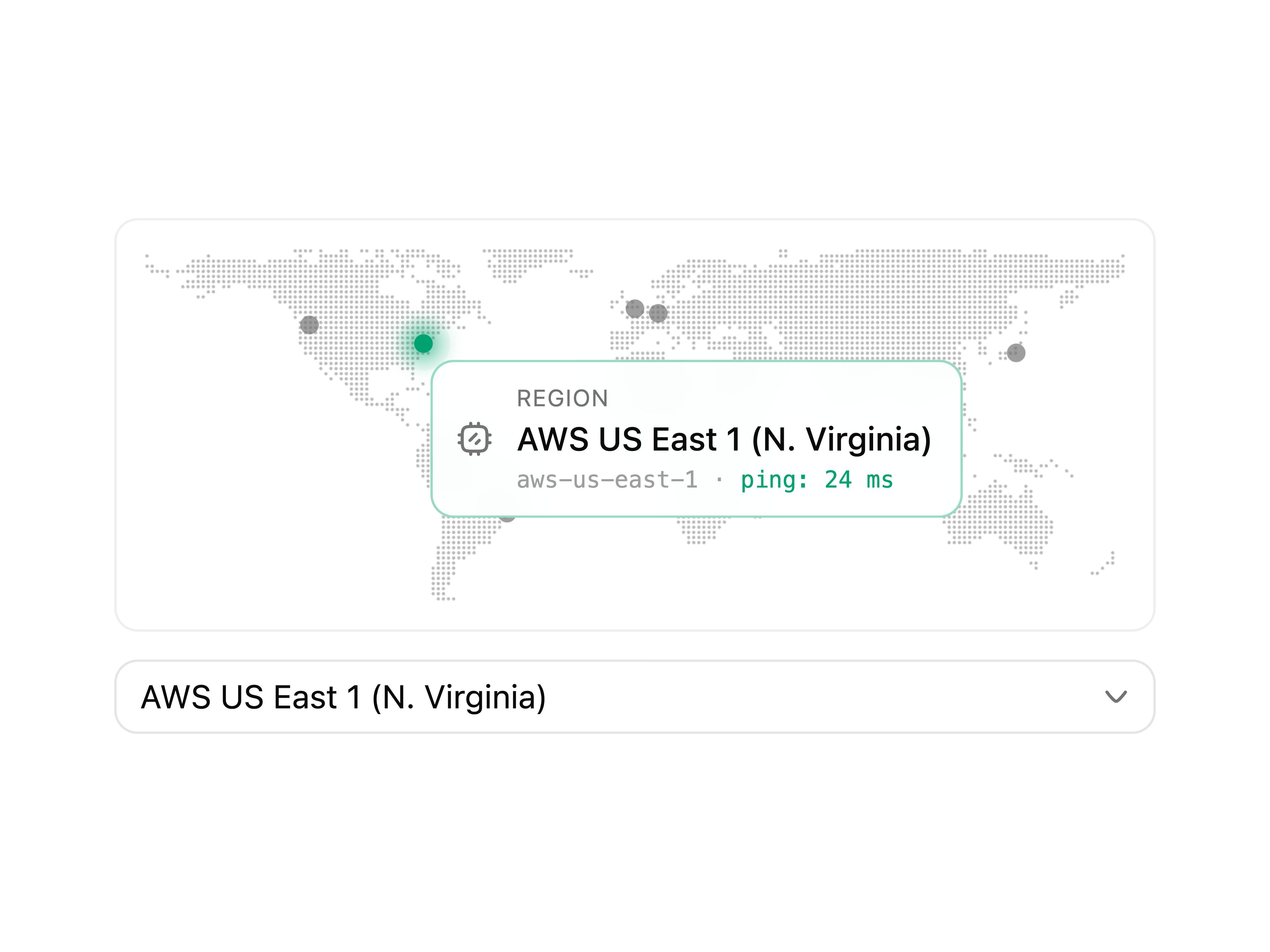
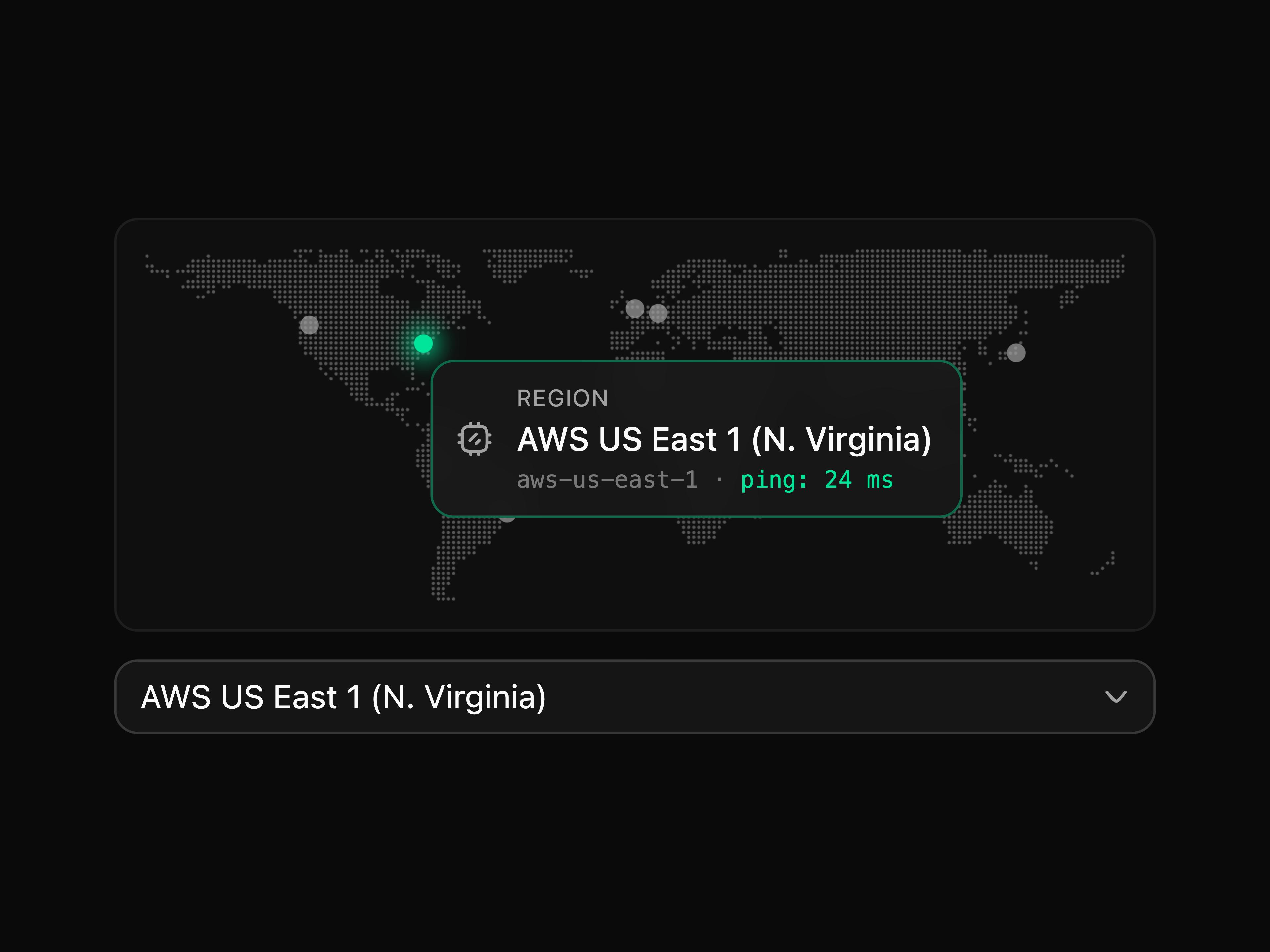
Region Select
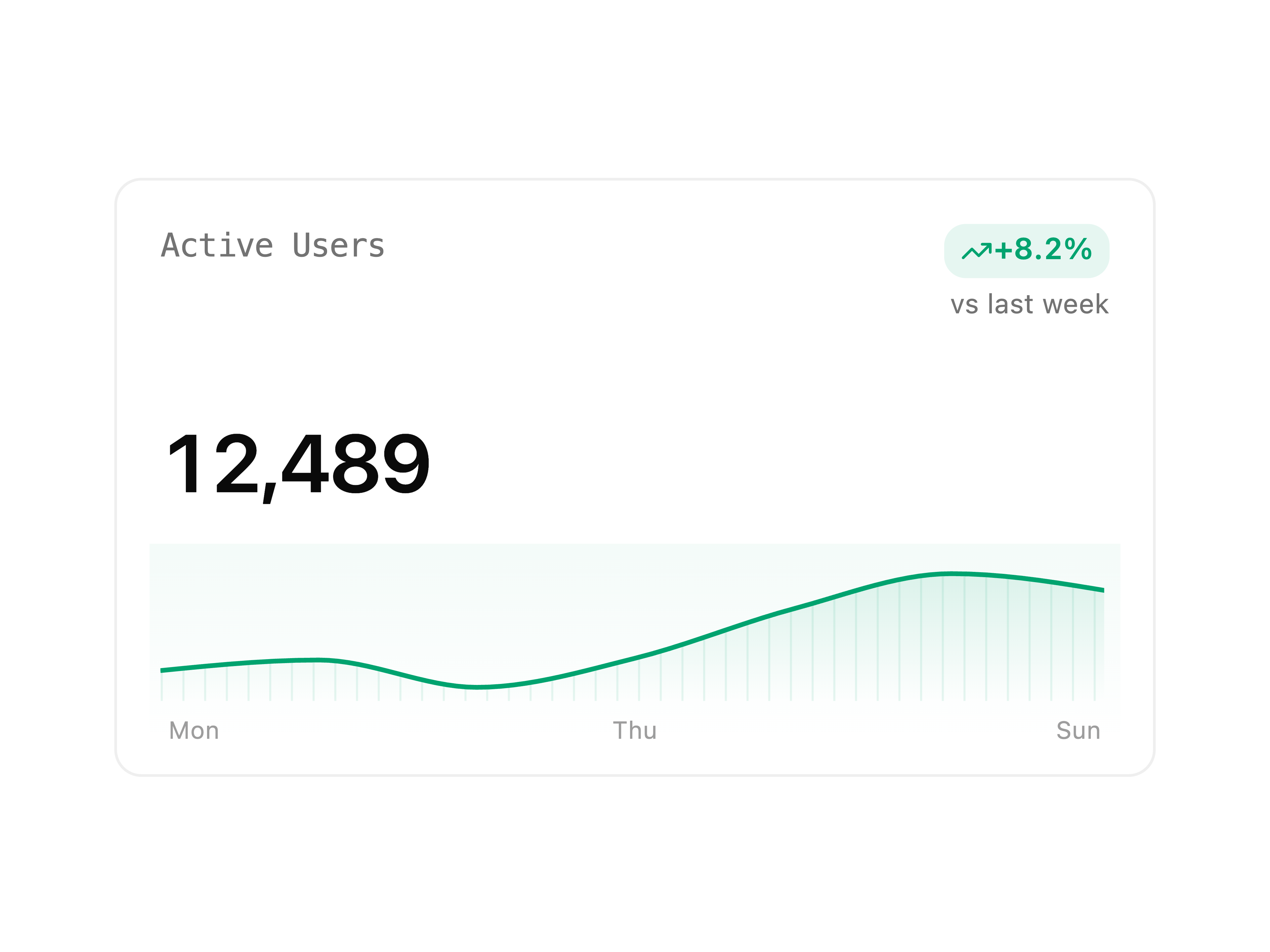
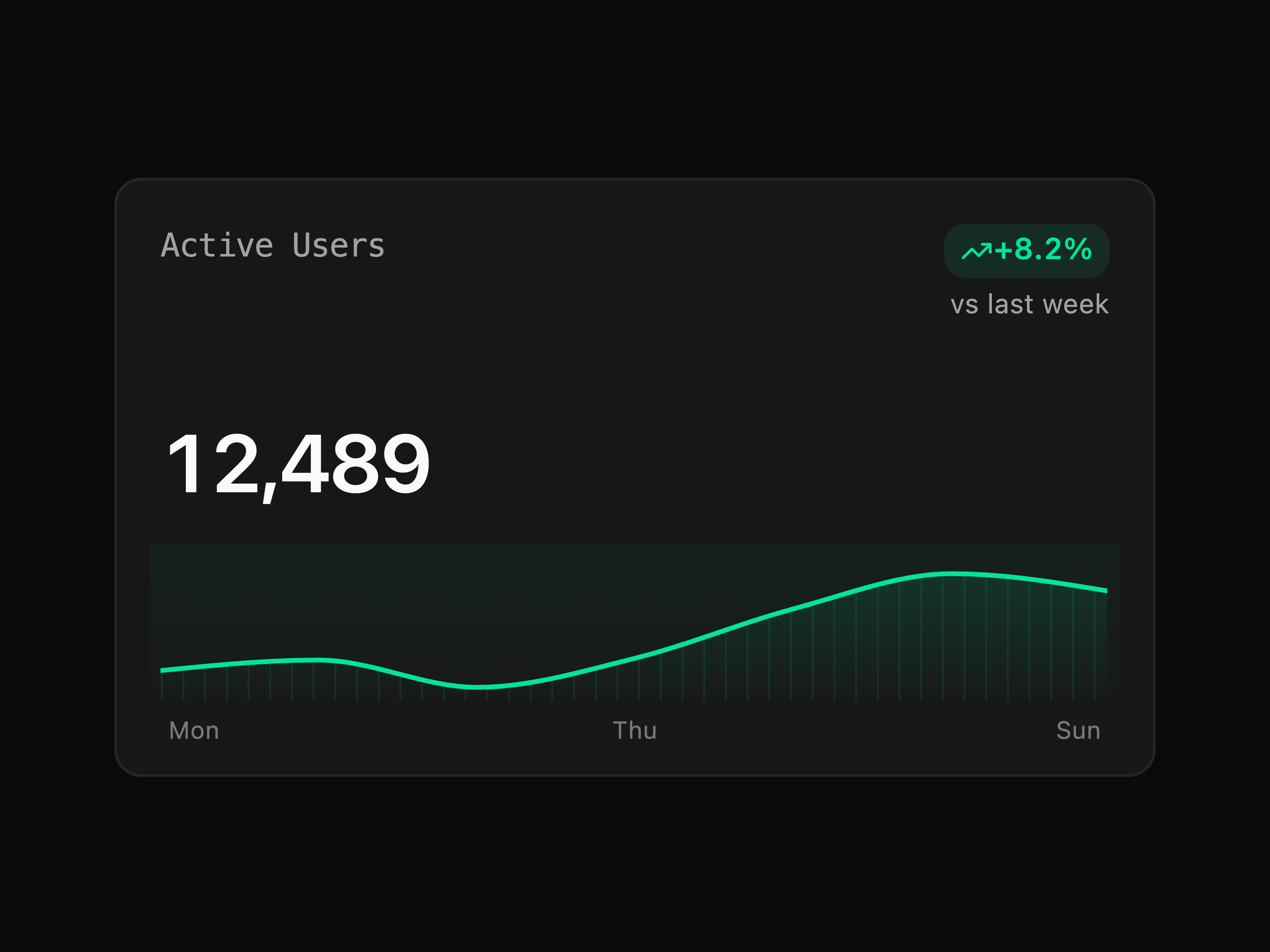
Metric Card
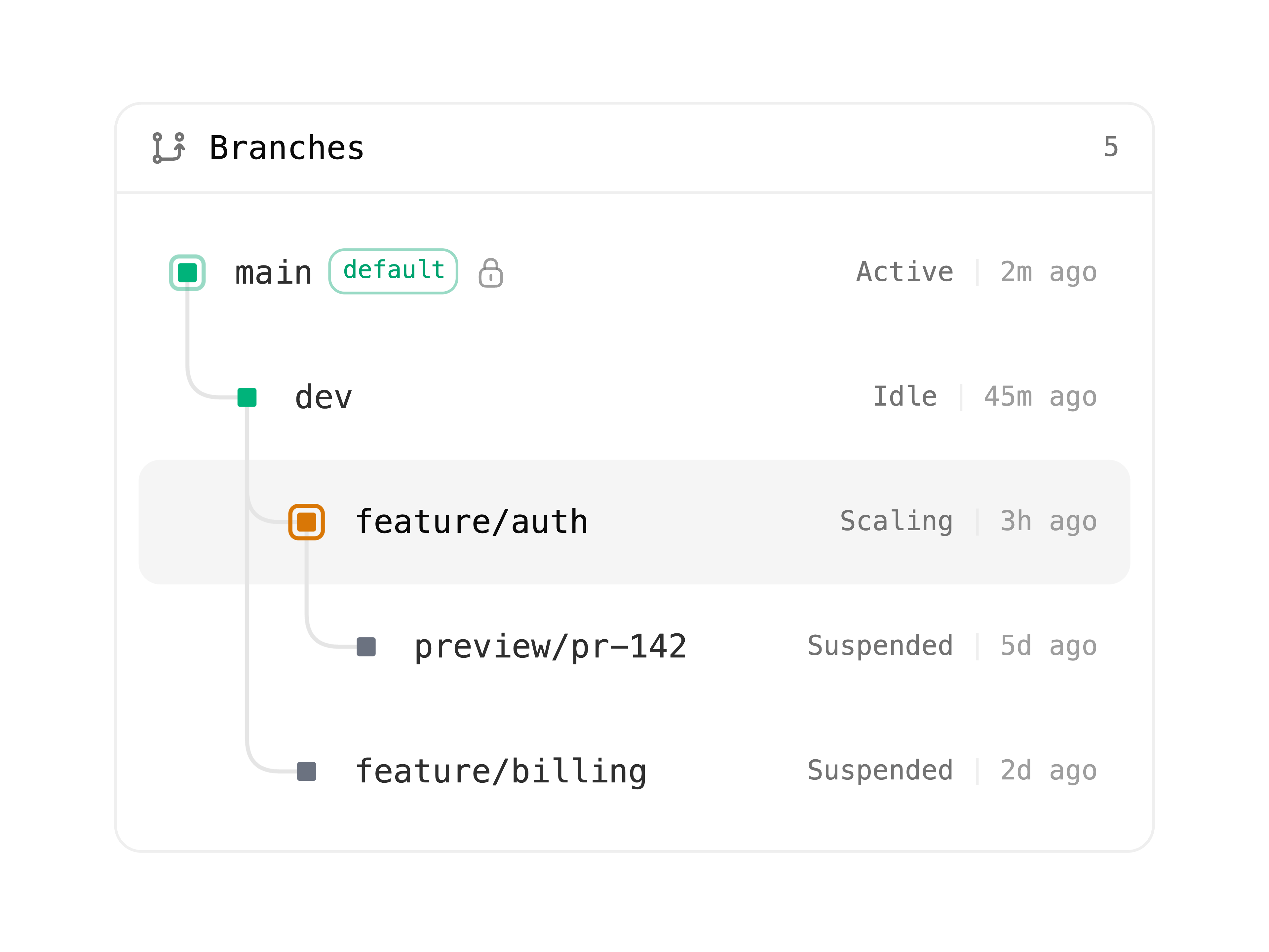
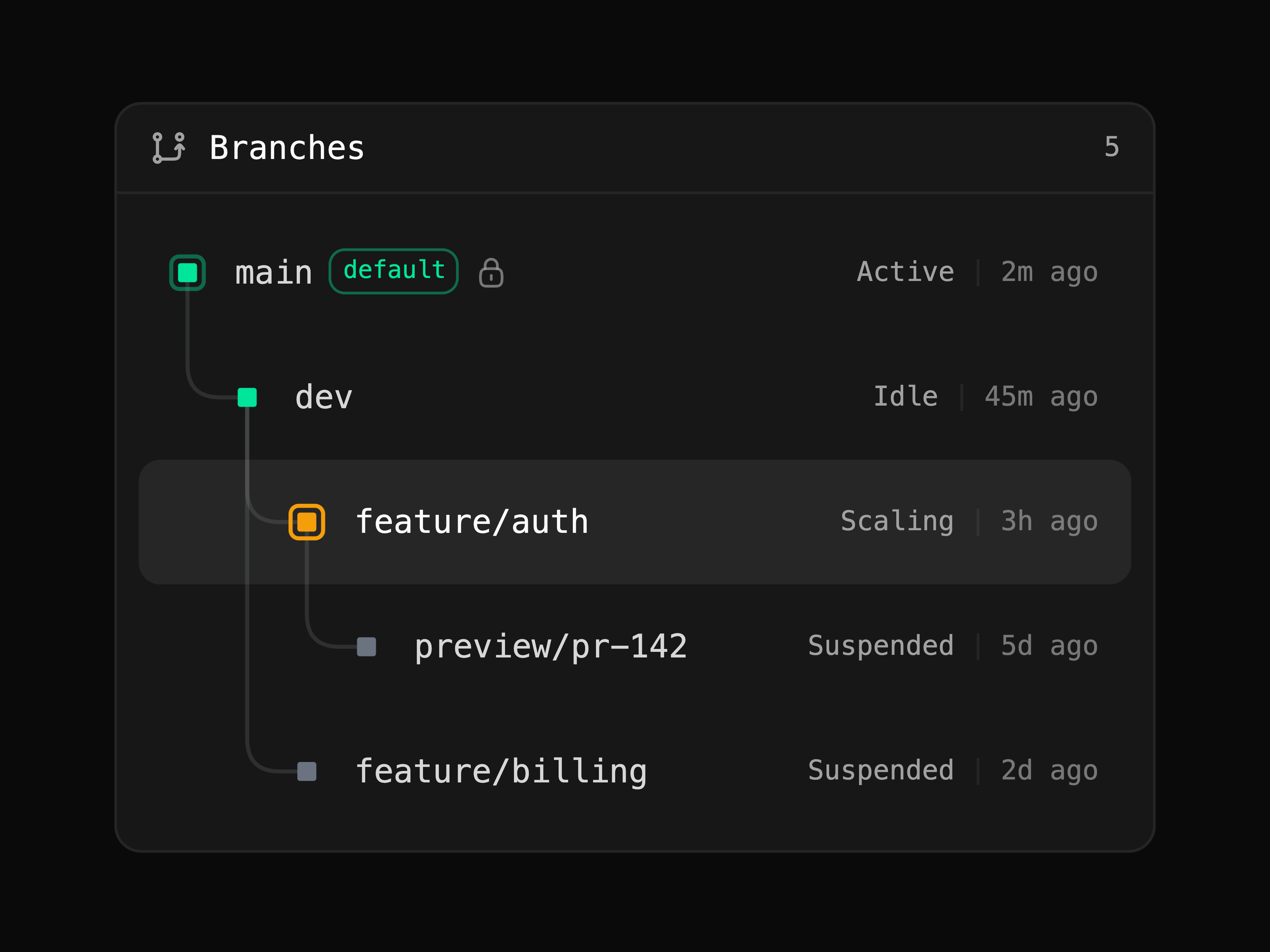
Branch Tree
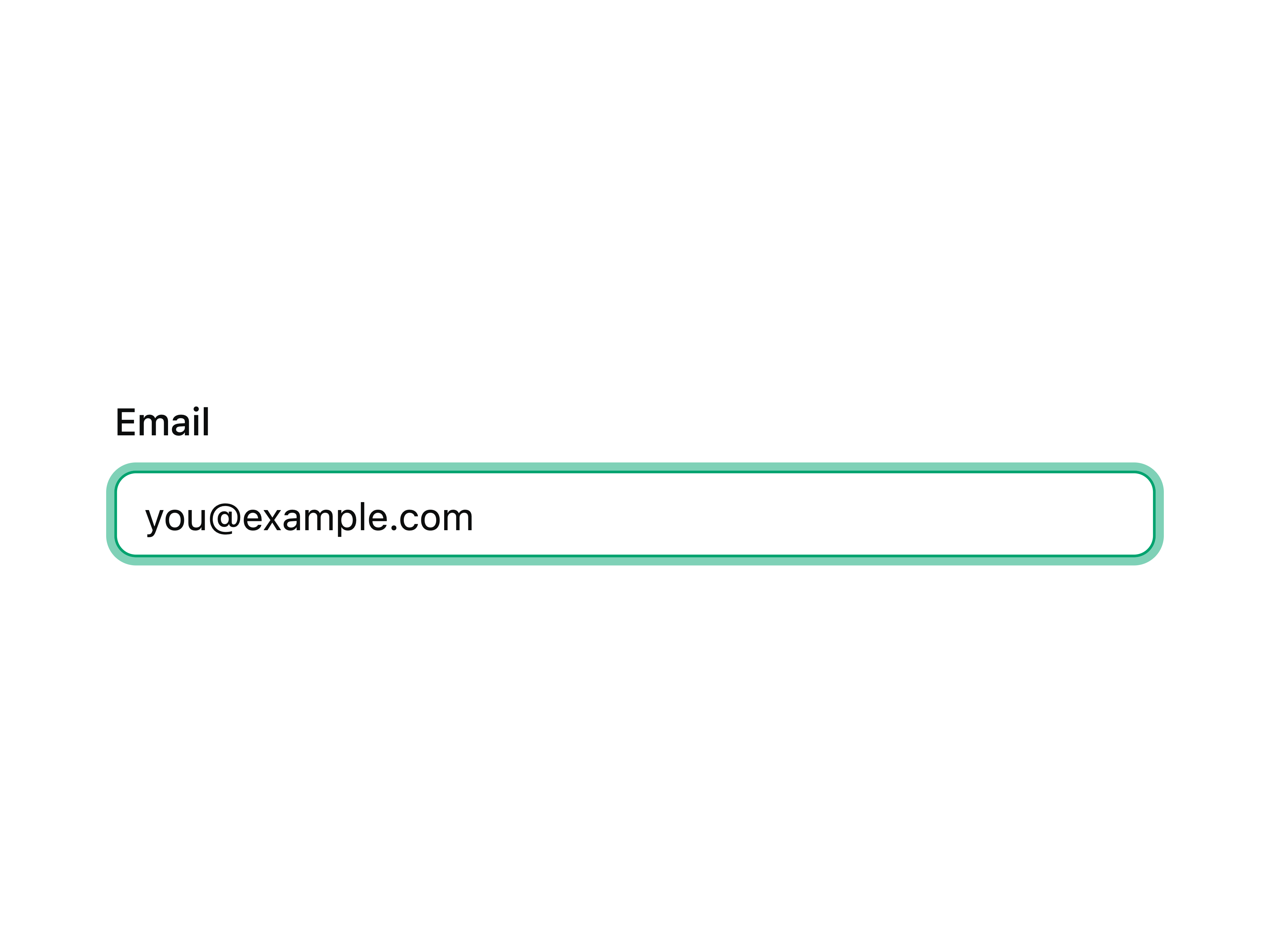
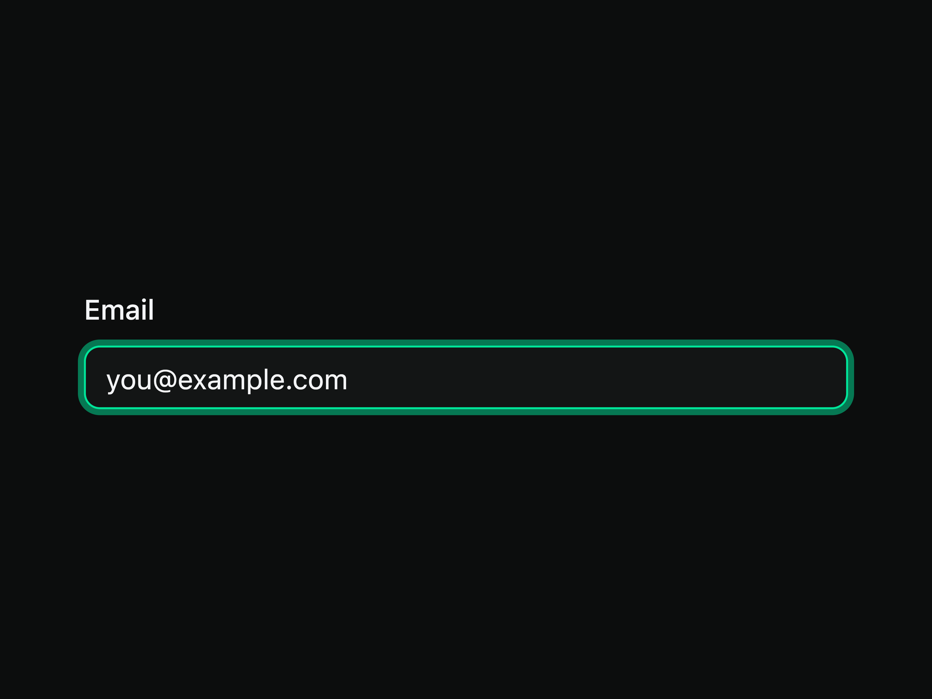
Input
That's all 5 components
About neon-ui
neon-ui publishes a shadcn registry at ui.neon.com, with 56 components installable through the shadcn CLI.
- Components
- 56
- GitHub stars
- 11
- Repository
- neondatabase/ui
Also in the neon-ui registry
Copy a prompt for your agent, copy the install command, or open the docs that ship it.
ActivityFeed
activity-feedA chronological feed of system events (provision, transfer, agent) on a status-vocabulary timeline, with expandable detail and optional per-entry actions.
@hugeicons/react, @hugeicons/core-free-icons1 fileAgentChat
agent-chatFull agent chat pane: streamed markdown turns, tool chips, reasoning, and a composer with a model-controls slot.
ai, @ai-sdk/react, streamdown, @hugeicons/react1 fileAnimatedWash
animated-washWebGL grain-gradient shader wash rising from the bottom edge, colored by currentColor with a hover lift. Adapted from paper-design/shaders (Apache-2.0).
utils2 filesApiKeyList
api-key-listCreate, reveal-once, and revoke Neon API keys (personal and organization), with an inline create flow, a one-time secret reveal, and per-row revoke confirmation.
@hugeicons/react, @hugeicons/core-free-icons1 fileAppCard
app-cardTenant dashboard grid card composing the status vocabulary: name, badges, timestamp, one-link hover.
@hugeicons/react, @hugeicons/core-free-icons1 fileAppCreator
app-creatorThe describe-an-app bar: auto-growing prompt, free/paid plan segment, and a create action with an in-flight state.
@hugeicons/react, @hugeicons/core-free-icons1 fileAuthForm
auth-formThe email/password card: mode switching, providers, structured errors, and a working state — Better Auth-shaped.
utils, neon-tokens1 fileAutoscaleChart
autoscale-chartAutoscaling compute units over time against the min/max bounds, with a scrubable readout.
recharts1 fileBannerPattern
banner-patternThe neon.com banner dot pattern as a live WebGL surface: a square-dot grid sampling a drifting green-to-amber field.
utils2 filesBranchDiff
branch-diffSchema and row-level comparison between two branches with change counts, search, kind filters, and expandable DDL and word-level value diffs.
@hugeicons/react, @hugeicons/core-free-icons, diff2 filesBranchPicker
branch-pickerA searchable branch selector with default/protected status and an inline create-branch affordance.
@hugeicons/react, @hugeicons/core-free-icons1 fileBranchUsageTable
branch-usage-tablePer-branch consumption attribution: sortable metric columns, magnitude rules, an expandable tail, and a list layout for a single metric.
utils, neon-tokens1 fileBubble
Chat bubble primitive with grouping and reactions.
@base-ui/react, class-variance-authority1 fileChainOfThought
chain-of-thoughtCollapsible step-by-step reasoning rail with statuses, search-result chips, and images.
@base-ui/react, @hugeicons/react, @hugeicons/core-free-icons1 fileCheckpointTimeline
checkpoint-timelineCheckpoint history rail with git sha, snapshot indicator, project id, restore with busy state, and empty state.
utils, neon-tokens1 fileColorPicker
color-pickerSwatch-and-hex trigger opening an HSV field, hue rail, hex input, and preset swatches.
@base-ui/react, @hugeicons/core-free-icons, @hugeicons/react1 fileComputeStatus
compute-statusCompact compute readout: lifecycle state (active/idle/scaling/suspended), autoscaling CU size, and scale-to-zero, in the house status vocabulary.
utils, neon-tokens1 fileConfirmDialog
confirm-dialogDestructive confirmation modal armed by press-and-hold, with keyboard hold support.
utils, neon-tokens1 fileConsumptionChart
consumption-chartInteractive consumption time series with labelled axes, unit-aware totals, a scrubbable readout, and a legend that filters.
recharts2 filesCostEstimateCard
cost-estimate-cardInvoice-shaped cost estimate: quantity by rate per metric, allowances shown, with an optional spending-limit meter.
utils, neon-tokens1 fileCreateProject
create-projectCreate-project onboarding panel: project form on the left, the interactive region map on the right.
@hugeicons/react, @hugeicons/core-free-icons1 fileDateRangePicker
date-range-pickerCustom date range picker: mono pill trigger, preset rail, hand-built month grid with range wash.
utils, neon-tokens1 fileDotMatrixWave
dot-matrix-waveField of dots breathing in a drifting noise wave, colored by currentColor. The RegionSelect dot-map aesthetic as a background surface.
utils2 filesElasticSlider
elastic-sliderSlider with elastic rubber-band drag and magnetic snap (by @iamncdai, MIT).
motion2 filesEmptyState
empty-stateIntentional dashed-border placeholder with title, description, icon, and action slots.
utils, neon-tokens1 fileHalftoneBloom
halftone-bloomHalftone ring field revealed by soft drifting color blooms: teal and amber light behind a punched-metal screen.
utils2 filesHealthCard
health-cardProject health rollup on the MetricCard shell: an overall status pill and tint over a mono grid of supporting signals (latency, errors, uptime).
@hugeicons/react, @hugeicons/core-free-icons1 fileInlineCitation
inline-citationInline source pill that previews stacked citations on hover and links to the source on click.
@base-ui/react1 fileLogsViewer
logs-viewerVirtualized, follow-tailing log pane with ANSI colors, level filters, search, and a retention cap.
@hugeicons/react, @hugeicons/core-free-icons, anser2 filesMarker
Inline conversation status marker.
@base-ui/react, class-variance-authority1 fileMeshGradient
mesh-gradientThe Neon brand-deck gradient as a live WebGL surface: a defocused warm color field drifting over near-black.
utils2 filesMessage
Conversation message layout primitive with avatar, content, and footer.
utils, neon-tokens1 fileMessageScroller
message-scrollerChat scroll container with turn anchoring, auto-follow, and jump-to-latest.
@shadcn/react, @hugeicons/core-free-icons, @hugeicons/react1 fileModelSelect
model-selectModel picker for agent chat input bars, grouped by provider.
motion, @base-ui/react, @hugeicons/core-free-icons, @hugeicons/react1 fileNeonAurora
neon-auroraThe neon.com hero as a live WebGL surface: clusters of thin vertical bars twinkling in green, teal, and blue.
utils2 filesNeonLoader
neon-loaderNoise-resolve loading indicator animated from the official Neon mark.
utils, neon-tokens1 file1 exampleProvisioningStatus
provisioning-statusProvisioning, waking, and error panel states composing NeonLoader with a live status detail line.
utils, neon-tokens1 fileQueryHistory
query-historySearchable recent SQL with status, timing, saved queries, expandable statements, copy, and rerun actions.
@hugeicons/react, @hugeicons/core-free-icons, @codemirror/lang-sql, @lezer/highlight2 filesReasoning
Collapsible extended-thinking fold that opens itself while the model streams and settles to a timed receipt.
@base-ui/react, @hugeicons/react, @hugeicons/core-free-icons, streamdown1 fileRegionCard
region-cardFloating server-info chip: region name, mono id, and a color-coded ping line.
@hugeicons/react, @hugeicons/core-free-icons1 fileRegionGlobe
region-globeTilted 3D globe (globe.gl) with a monochrome relief surface, clickable region markers, and arc travel effects between regions.
globe.gl1 fileSchemaExplorer
schema-explorerA collapsible Postgres schema tree: tables to columns, indexes, and relations, with types and a search.
@hugeicons/react, @hugeicons/core-free-icons1 fileSQLRunner
sql-runnerA guarded SQL editor with run and cancel controls, inline Postgres errors, and a typed results grid.
@hugeicons/react, @hugeicons/core-free-icons, codemirror, @codemirror/lang-sql2 filesStatusBadge
status-badgeDot-and-label status vocabulary for apps and branches, with a billing PlanBadge companion.
utils, neon-tokens1 fileStorageBreakdown
storage-breakdownStorage composition by volume or by cost — root, child, instant restore, and snapshots as one bar with per-segment shares.
utils, neon-tokens2 filesThinkingModelSelect
thinking-model-selectModel picker with an embedded reasoning-effort slider in the popup footer.
utils, neon-tokens1 fileThinkingSelect
thinking-selectReasoning-effort selector: Off, Low, Medium, High.
motion1 fileToolCallChip
tool-call-chipCompact running/complete/error indicator for one agent tool invocation.
@hugeicons/react, @hugeicons/core-free-icons1 fileUpgradeDialog
upgrade-dialogPricing dialog with drawn-check feature list and a processing upgrade action.
utils, neon-tokens1 fileUsageCard
usage-cardSingle Neon consumption metric on the MetricCard shell: derives label, format, unit, total, sparkline, and delta from raw per-project samples.
utils, neon-tokens1 fileUsagePanel
usage-panelPer-project consumption grid composing MetricCard, with plan-gated metrics and metering-lag notice.
utils, neon-tokens1 fileWorkspaceTabs
workspace-tabsWorkspace tab bar with gliding underline, per-tab action slot, and pane crossfade.
utils, neon-tokens1 file