"use client";

import { CountBadge, countLabel } from "@/components/ui/count-badge";
import { useState } from "react";
import { Bell, Inbox } from "lucide-react";

// Adapted from the sebs7n-ui docs example (https://ui.sebastianfermanelli.com/docs/components/count-badge):
// the same CountBadge usage (count/color/max, countLabel for the accessible name), with the
// surrounding toolbar/icon-button chrome rebuilt in plain Tailwind instead of importing the
// registry's own Button/Toolbar primitives (which pull in a much larger dependency chain).
export default function CountBadgeDemo() {
  const [unread, setUnread] = useState(3);

  return (
    <div className="flex w-full max-w-md flex-col gap-3">
      <div
        role="toolbar"
        aria-label="Facturación"
        className="relative flex min-h-11 w-full items-center gap-1.5 border-b border-separator bg-surface-bar px-2.5 text-label"
      >
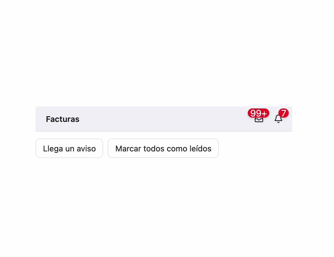
        <span className="flex-1 px-2 text-sm font-semibold text-label">
          Facturas
        </span>
        <button
          type="button"
          aria-label={countLabel("Pendientes de cobro", 128, "facturas")}
          className="relative inline-flex size-7 shrink-0 items-center justify-center rounded-md text-label hover:bg-black/5 dark:hover:bg-white/10"
        >
          <Inbox className="size-4" />
          <CountBadge count={128} />
        </button>
        <button
          type="button"
          aria-label={countLabel("Avisos", unread, "sin leer")}
          className="relative inline-flex size-7 shrink-0 items-center justify-center rounded-md text-label hover:bg-black/5 dark:hover:bg-white/10"
        >
          <Bell className="size-4" />
          <CountBadge count={unread} />
        </button>
      </div>
      <div className="flex gap-2">
        <button
          type="button"
          onClick={() => setUnread((n) => n + 1)}
          className="rounded-md border border-separator px-3 py-1.5 text-sm text-label hover:bg-black/5 dark:hover:bg-white/10"
        >
          Llega un aviso
        </button>
        <button
          type="button"
          onClick={() => setUnread(0)}
          className="rounded-md border border-separator px-3 py-1.5 text-sm text-label hover:bg-black/5 dark:hover:bg-white/10"
        >
          Marcar todos como leídos
        </button>
      </div>
    </div>
  );
}