HomeBookmarks
shadcnstoreshadcnstore
shadcnstore

shadcnstore

SHby ShadcnStore
15components112.8Kviews707bookmarks

Installs all 292 components. Without our CLI, run instead.

Auto-indexed

shadcnstore contents

  • Avatar GroupAvatar Group

    Avatar Group

  • Sliding TabsSliding Tabs

    Sliding Tabs

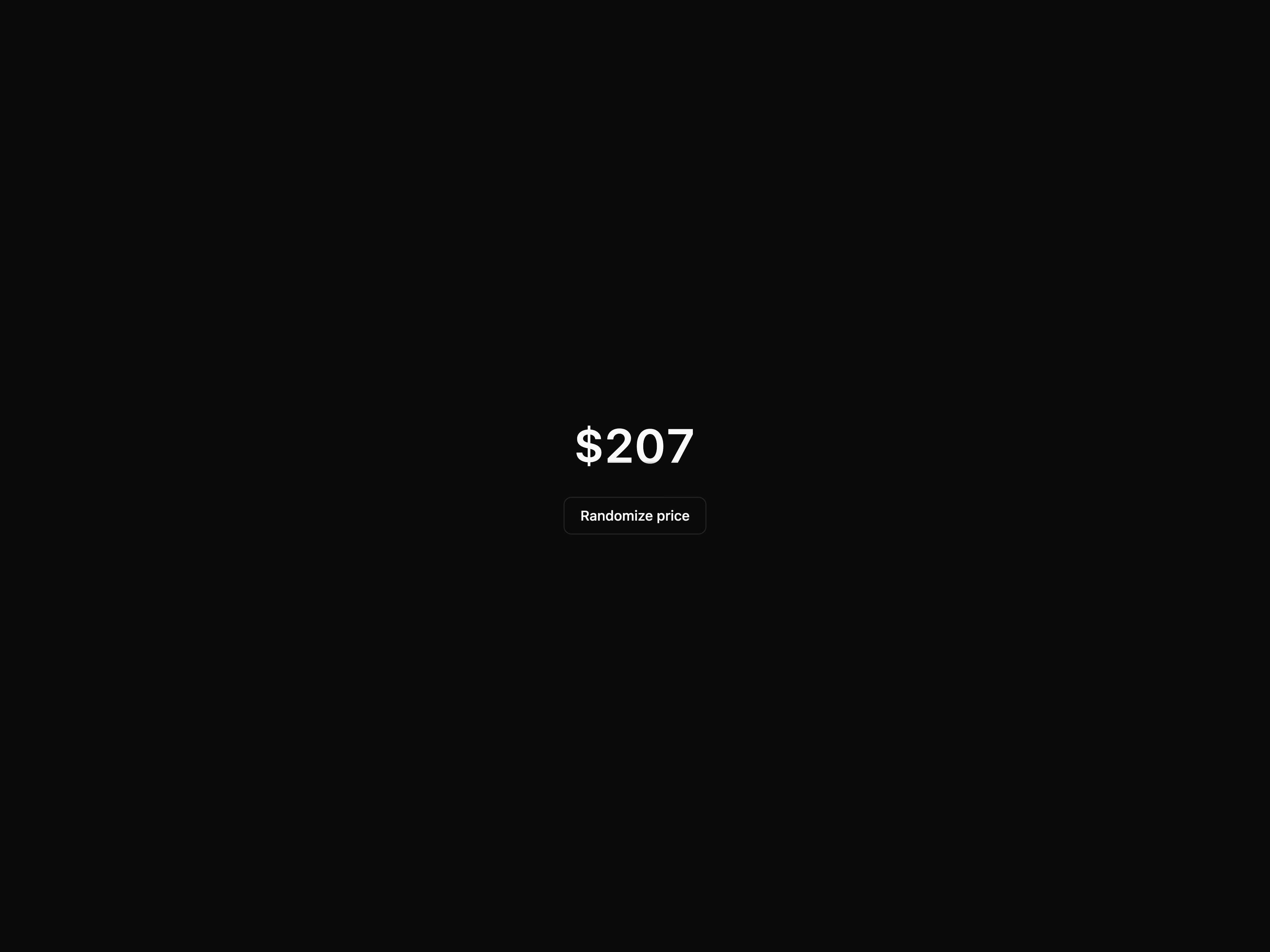
  • Spinning NumberSpinning Number

    Spinning Number

  • Confetti

    Confetti

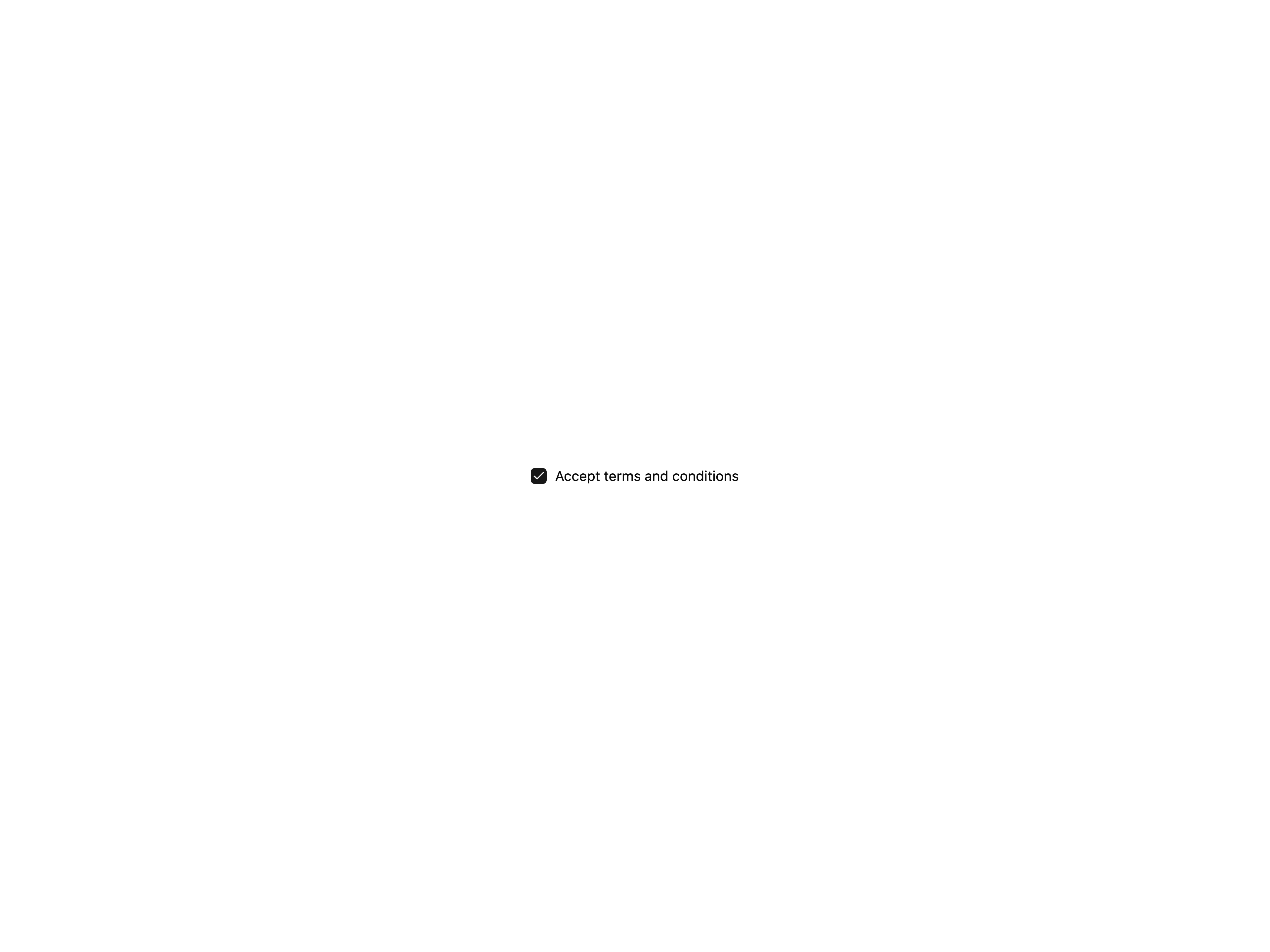
  • Animated Draw CheckboxAnimated Draw Checkbox

    Animated Draw Checkbox

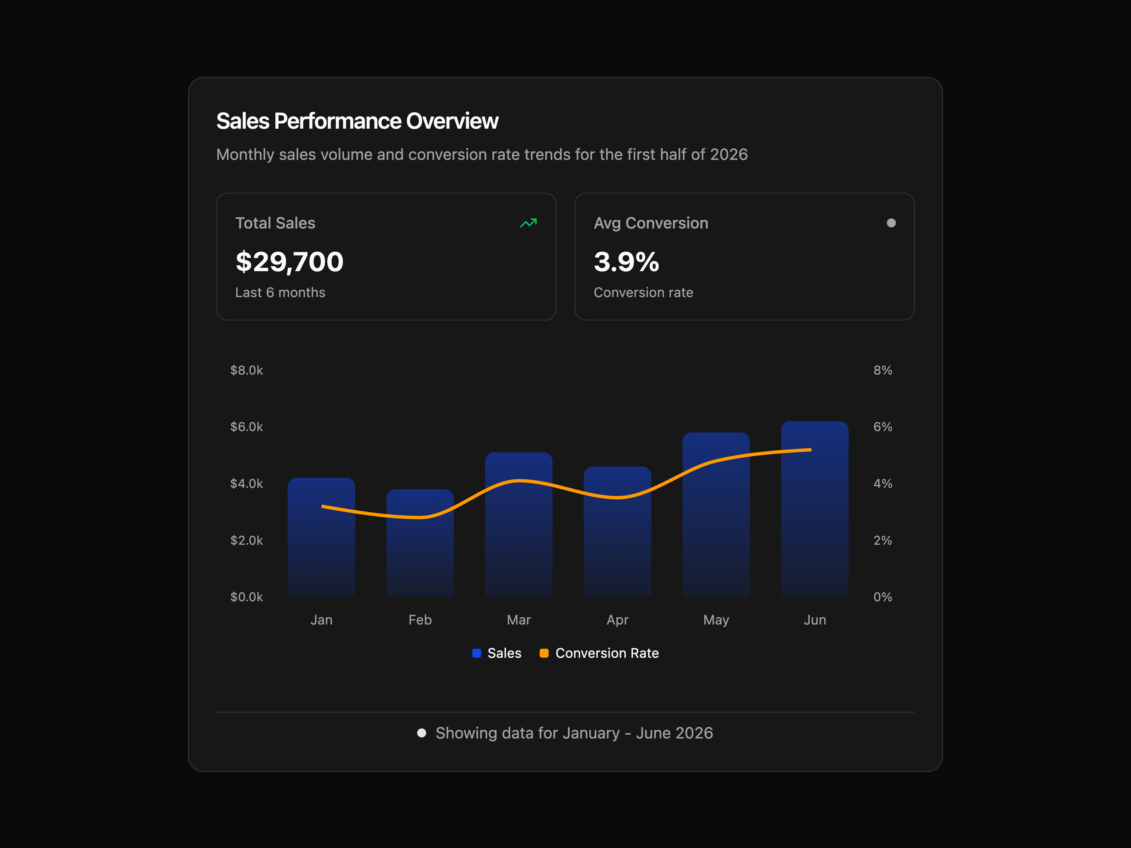
  • Sales Performance ChartSales Performance Chart

    Sales Performance Chart

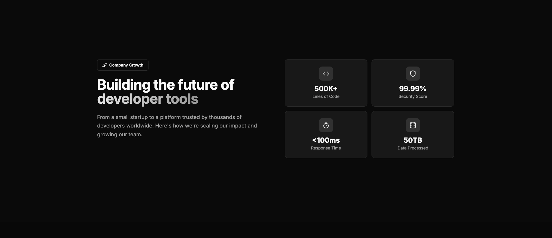
  • Statistic 2Statistic 2

    Statistic 2

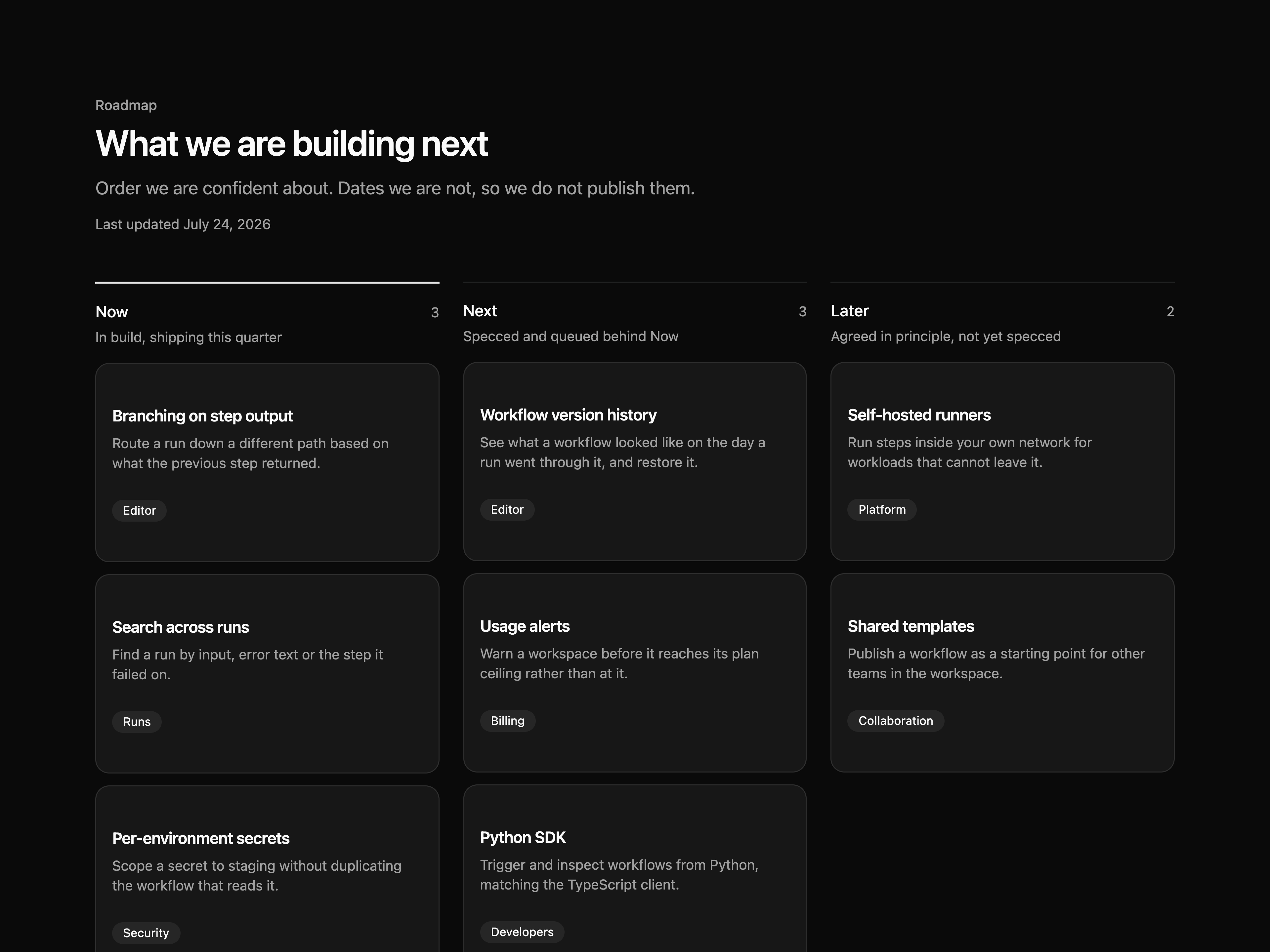
  • Roadmap BoardRoadmap Board

    Roadmap Board

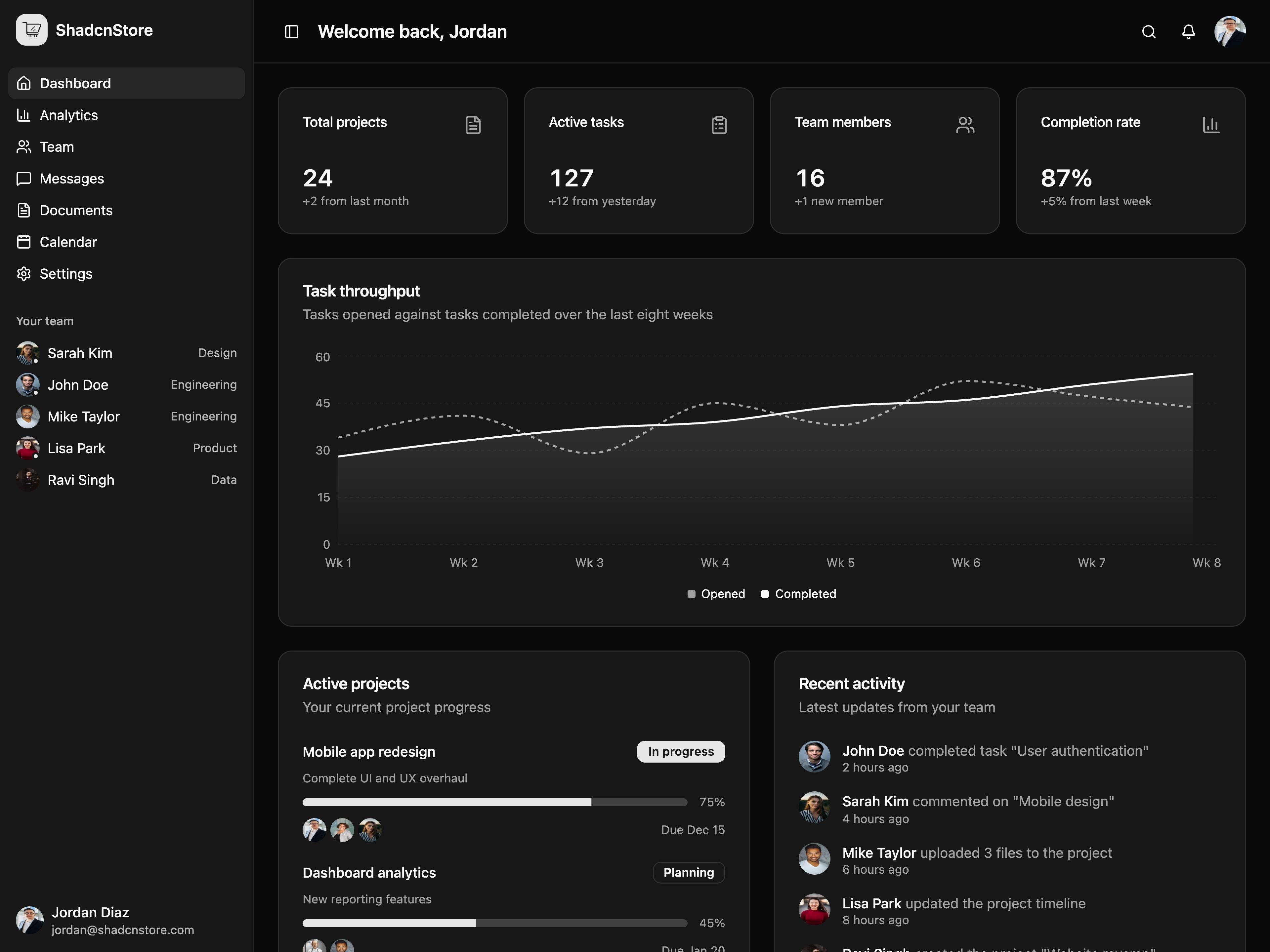
  • App Dashboard LayoutApp Dashboard Layout

    App Dashboard Layout

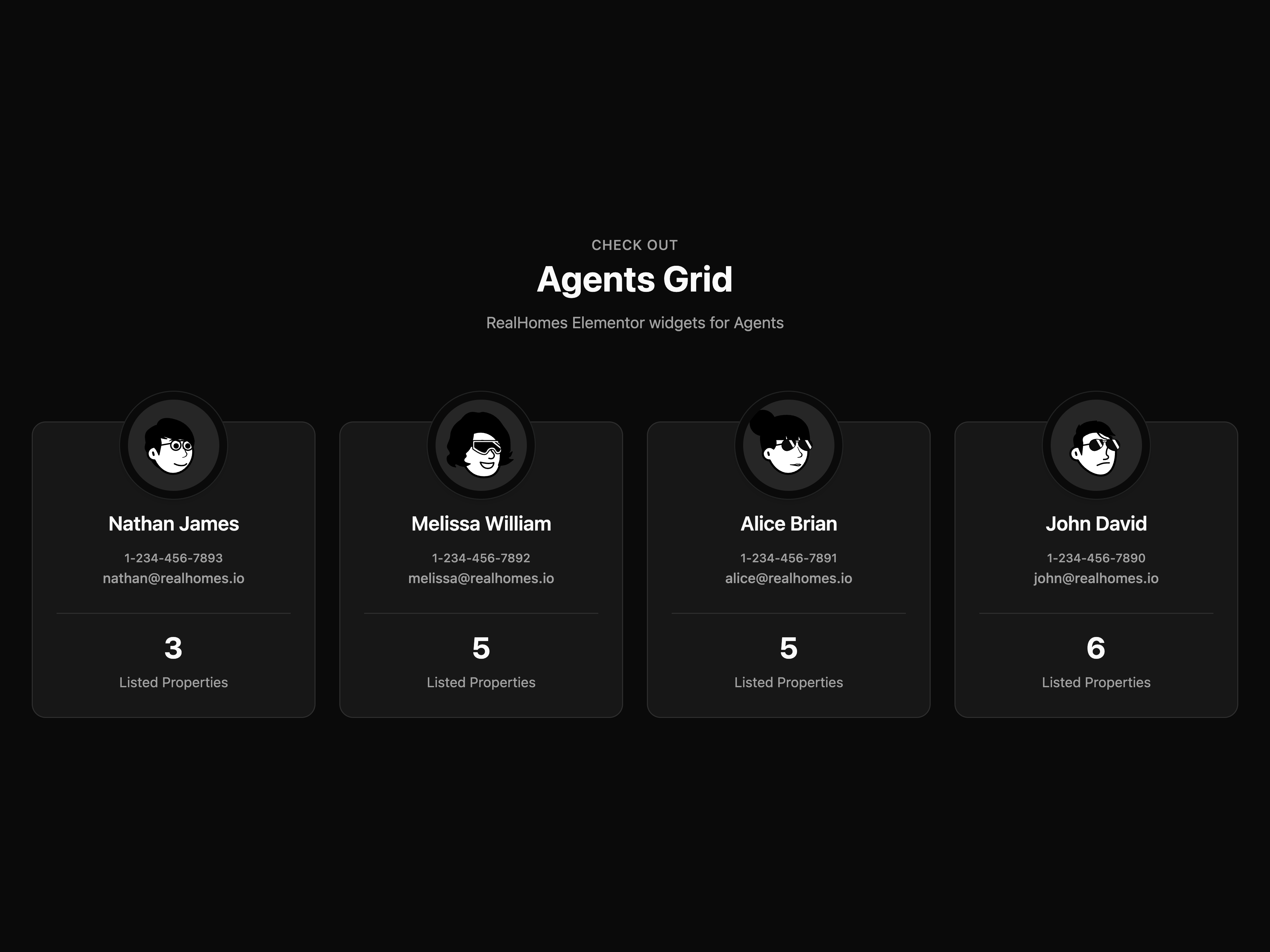
  • Agents Team GridAgents Team Grid

    Agents Team Grid

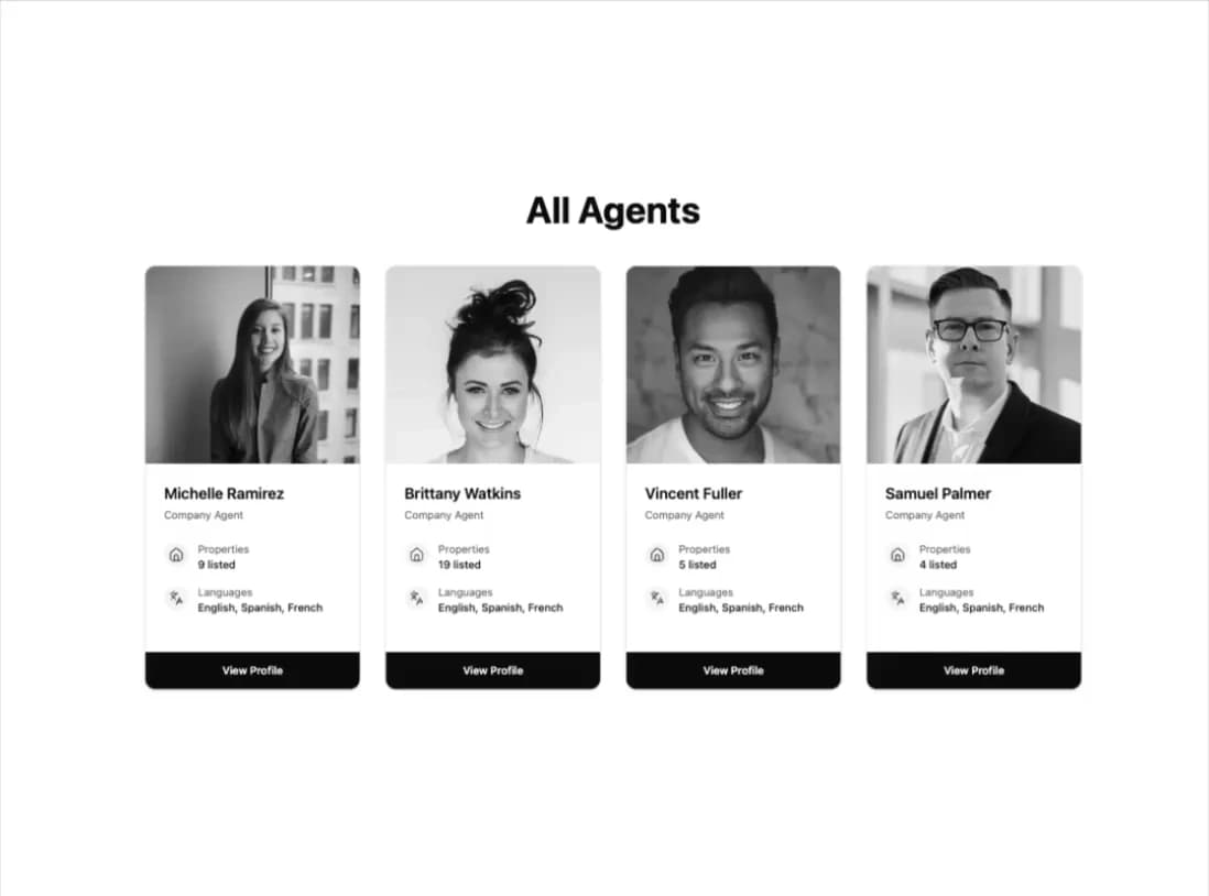
  • Team Profile Grid

    Team Profile Grid

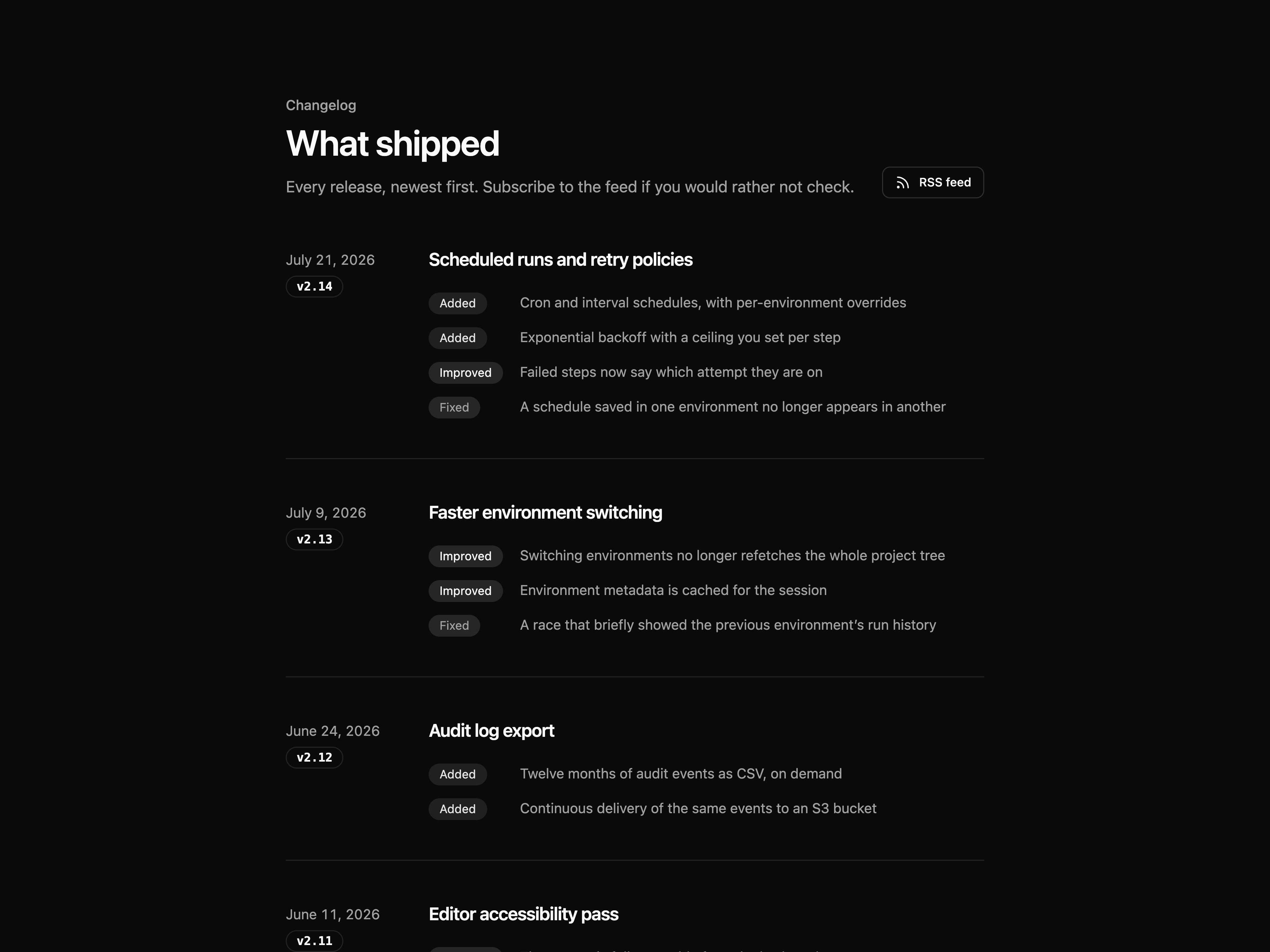
  • Changelog ListChangelog List

    Changelog List

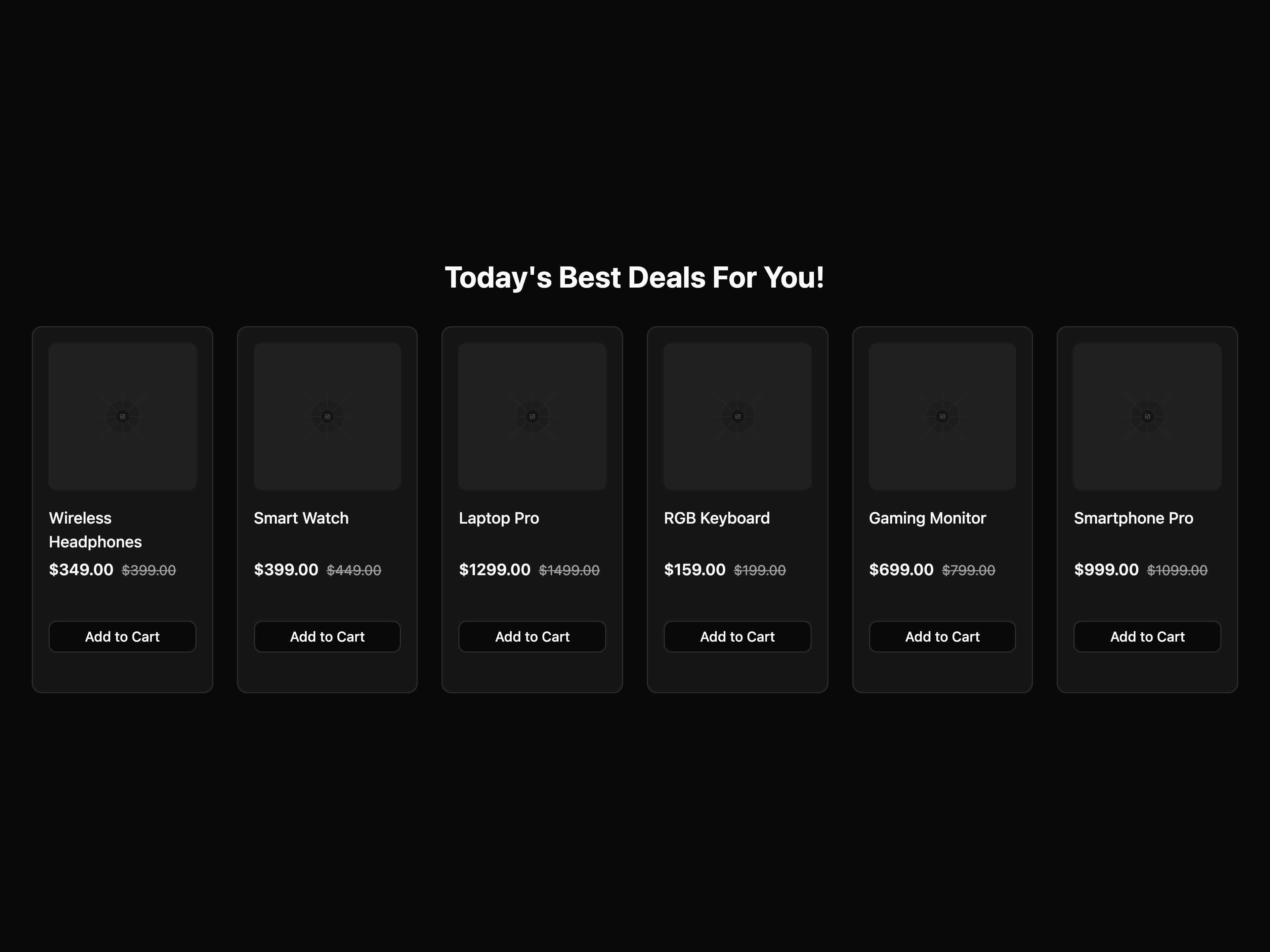
  • Product Listing CardProduct Listing Card

    Product Listing Card

  • Logo CloudLogo Cloud

    Logo Cloud

  • Users List Datatable

    Users List Datatable

  • That's all 15 components

    About shadcnstore

    shadcnstore publishes a shadcn registry at shadcnstore.com, with 292 components installable through the shadcn CLI.

    Components
    292
    GitHub stars
    1,260
    Last commit
    Oct 22, 2026
    Repository
    shadcnstore/shadcn-dashboard-landing-template

    Also in the shadcnstore registry

    Copy a prompt for your agent, copy the install command, or open the docs that ship it.

    • Task Management 2

      app-2

      Kanban-style task board with drag-and-drop functionality

      class-variance-authority, lucide-react4 files
    • app-3

      avatar, badge, bubble, button
    • app-4

      avatar, badge, breadcrumb, button
    • app-5

      avatar, badge, button, card
    • app-6

      alert-dialog, avatar, badge, button
    • app-7

      button, collapsible, combobox, field
    • app-8

      alert, alert-dialog, button, collapsible
    • app-9

      badge, button, dialog, input
    • Foundational Application Shell

      app-shell-1

      Responsive sidebar, breadcrumb header, workspace navigation, and calm application content frame

      lucide-react4 files
    • Responsive Icon Rail Shell

      app-shell-2

      Collapsible icon rail with persistent state, accessible tooltips, mobile sheet, and reflowing content

      lucide-react4 files
    • Top Navigation Application Shell

      app-shell-3

      Two-level top navigation with workspace context, scrollable sub-navigation, and centered content

      lucide-react4 files
    • app-shell-4

      avatar, badge, breadcrumb, button
    • app-shell-5

      avatar, badge, button, checkbox
    • Banner 1

      banner-1

      A dismissible announcement bar that remembers the choice

      lucide-react, motion3 files
    • Banner 2

      banner-2

      A promo banner with a live countdown and copyable discount code

      lucide-react, motion3 files
    • Banner 3

      banner-3

      A cookie consent bar with a granular preferences dialog

      lucide-react3 files
    • banner-4

      avatar, badge, button
    • banner-5

      alert, badge, button, card
    • Bento Grid 1

      bento-grid-1

      A responsive grid of listings

      lucide-react, motion6 files
    • bento-grid-10

      badge, button
    • bento-grid-11

      button, spinner, switch
    • bento-grid-12

      button
    • Bento Grid 2

      bento-grid-2

      A comprehensive dashboard component showcase featuring deployment analytics, team activity, performance metrics, and integrations - perfect for SaaS applications

      lucide-react4 files
    • Bento Grid 3

      bento-grid-3

      A professional bento grid highlighting services, client testimonials, and business achievements

      lucide-react3 files
    • Bento Grid 4

      bento-grid-4

      A responsive grid of listings

      motion4 files
    • bento-grid-5

      avatar, badge, button, chart
    • bento-grid-6

      badge, separator
    • bento-grid-7

      badge, button
    • bento-grid-8

      avatar, badge, button, chart
    • bento-grid-9

      avatar, badge, button
    • Three-Card Blog Layout

      blog-section-1

      A clean three-card layout with image placeholders, categories, titles and call-to-action links

      lucide-react3 files
    • Recent Blog Grid

      blog-section-2

      A grid of recent blog posts with images, titles, authors, and tags

      aspect-ratio, avatar, badge, card3 files
    • Stories Grid

      blog-section-3

      A horizontal scrollable stories grid with gradient borders and avatars

      lucide-react3 files
    • News Grid with Cards

      blog-section-4

      A responsive grid layout featuring news cards with images, titles, and metadata

      lucide-react3 files
    • Calendar 1

      calendar-1

      A month grid with event chips, a day popover and a create-event dialog

      lucide-react5 files
    • Calendar 2

      calendar-2

      A week time grid with positioned events and a mobile agenda fallback

      lucide-react3 files
    • calendar-3

      avatar, badge, button, calendar
    • calendar-4

      alert, avatar, badge, button
    • calendar-5

      avatar, badge, button, card
    • calendar-6

      avatar, badge, button, item
    • calendar-7

      avatar, badge, button, card
    • calendar-8

      button, card, empty, item
    • Horizontal Filter Bar 1

      category-filter-1

      A horizontal filter bar with dropdowns and active filter display

      lucide-react3 files
    • Sidebar Category Filter 2

      category-filter-2

      A sidebar filter with expandable categories and subcategories

      @base-ui/react, lucide-react5 files
    • Advanced Filter Sidebar 3

      category-filter-3

      A comprehensive filter sidebar with toggle-based selection and real-time results

      lucide-react5 files
    • category-filter-4

      badge, button, drawer, empty
    • category-filter-5

      badge, button, drawer, field
    • Changelog 1

      changelog-1

      An editorial release timeline with version anchors and copyable links

      lucide-react3 files
    • Changelog 2

      changelog-2

      A dense changelog with type filters, month grouping and expandable rows

      lucide-react4 files
    • changelog-3

      badge, button, card, separator
    • chart-10

      badge, card, chart
    • chart-11

      card
    • chart-12

      badge, card, chart, separator
    • Revenue & Growth Analytics Chart

      chart-2

      Modern combined bar and line chart showing revenue performance vs targets with growth percentage trends, featuring interactive time period filters and comprehensive metrics dashboard

      lucide-react, recharts3 files
    • Analytics Dashboard Chart

      chart-3

      Comprehensive analytics dashboard chart with product sales and volume metrics, featuring trend indicators and recent activity tracking

      lucide-react, recharts3 files
    • Multi-Tab Financial Dashboard

      chart-4

      Interactive financial dashboard with tabbed navigation showing Income (area chart), Expenses (radial chart), and Profit (bar chart) with real-time metrics

      lucide-react, recharts4 files
    • Earnings Timeline Dashboard

      chart-5

      Time-based earnings dashboard with interactive time period tabs (1d, 5d, 1m, 6m, 1y) and area chart visualization with recent activity tracking

      lucide-react, recharts4 files
    • Leading Companies Dashboard

      chart-6

      Radial progress chart dashboard showcasing company performance metrics with department breakdown and visitor statistics

      lucide-react, recharts4 files
    • chart-7

      card, chart
    • chart-8

      card, chart
    • chart-9

      badge, card, chart
    • Simple Checkout Form 1

      checkout-form-1

      A clean and straightforward checkout form with essential fields

      lucide-react9 files
    • Single-Page Checkout 2

      checkout-form-2

      A comprehensive single-page checkout with order summary and secure payment

      lucide-react6 files
    • Multi-Step Checkout 3

      checkout-form-3

      A guided multi-step checkout process with progress indicator and validation

      lucide-react9 files
    • Checkout Form with Collections 4

      checkout-form-4

      A checkout form with collections of presets

      lucide-react6 files
    • checkout-form-5

      button, card, separator, tabs
    • checkout-form-6

      button, calendar, card, combobox
    • Comparison 1

      comparison-1

      An us-versus-alternatives table that becomes cards on mobile

      lucide-react3 files
    • Comparison 2

      comparison-2

      A plan feature matrix with sticky headers and a mobile plan switcher

      lucide-react3 files
    • comparison-3

      badge, button, card, progress
    • Contact Form 1

      contact-section-1

      Clean and minimal contact form with essential fields

      lucide-react2 files
    • Contact Form 2

      contact-section-2

      Contact form alongside company information cards

      lucide-react2 files
    • Contact Form 3

      contact-section-3

      Contact form with location map and office details

      lucide-react2 files
    • Contact Form 4

      contact-section-4

      Two-column layout with form and contact details

      lucide-react2 files
    • Contact Form 5

      contact-section-5

      Contact section with frequently asked questions

      lucide-react3 files
    • Contact Form 6

      contact-section-6

      Contact form with team member cards and social links

      lucide-react5 files
    • CTA Section 1

      cta-section-1

      A clean and modern cta section

      lucide-react2 files
    • CTA Section 10

      cta-section-10

      Clean and elegant CTA perfect for any business website

      button, card2 files
    • cta-section-11

      badge, button
    • cta-section-12

      button, separator
    • cta-section-13

      badge, field, input-group, separator
    • CTA Section 4

      cta-section-4

      A clean and modern cta section

      lucide-react2 files
    • CTA Section 5

      cta-section-5

      Modern enterprise CTA with feature showcase cards

      lucide-react2 files
    • CTA Section 6

      cta-section-6

      Engaging newsletter signup with perks showcase and social proof elements

      lucide-react3 files
    • CTA Section 7

      cta-section-7

      High-impact productivity CTA with gradient buttons and trust indicators

      lucide-react2 files
    • CTA Section 8

      cta-section-8

      Interactive team showcase with hover effects and gradient text elements

      lucide-react3 files
    • CTA Section 9

      cta-section-9

      Split layout CTA with organized resource links and image hover animations

      lucide-react2 files
    • User Records with Stats Datatable

      datatable-2

      Advanced user records table with statistics cards, role icons, plan details, and status management. Features filter dropdowns, bulk actions, and comprehensive pagination

      lucide-react6 files
    • Products Inventory Datatable

      datatable-3

      Product inventory management table with images, SKU tracking, quantity badges, star ratings, and status indicators. Includes stock alerts and product actions

      lucide-react7 files
    • Advanced Orders Management Dashboard

      datatable-4

      Modern orders datatable with analytics cards, command palette (⌘K), tabs navigation, bulk actions, column visibility control, and real-time order tracking. Features multi-filter system, sortable columns, payment methods, priority levels, and comprehensive status workflow management.

      lucide-react8 files
    • datatable-5

      badge, button, dialog, dropdown-menu
    • datatable-6

      avatar, badge, button, checkbox
    • datatable-7

      badge, button, command, empty
    • Error Page 1

      error-page-1

      A responsive error page

      lucide-react2 files
    • Error Page 2

      error-page-2

      A responsive error page

      lucide-react2 files
    • Error Page 3

      error-page-3

      Interactive 404 page with search and help options

      lucide-react3 files
    • Error Page 4

      error-page-4

      Maintenance page with countdown and progress tracking

      lucide-react3 files
    • Faq Block 1

      faq-block-1

      A clean and modern faq block

      accordion3 files
    • Faq Block 2

      faq-block-2

      A clean and modern faq block

      lucide-react3 files
    • Faq Block 3

      faq-block-3

      A clean and modern faq block

      lucide-react3 files
    • Faq Block 4

      faq-block-4

      A clean and modern faq block

      lucide-react3 files
    • faq-block-5

      accordion, button, empty, field
    • Modern Feature 10

      feature-10

      Card-based feature section with dot pattern and intelligent design focus

      lucide-react3 files
    • feature-11

      badge, button
    • feature-12

      avatar, badge, separator
    • feature-13

      badge, button, progress
    • feature-14

      badge, button
    • Modern Feature 3

      feature-3

      A clean and modern feature design

      lucide-react3 files
    • Modern Feature 4

      feature-4

      Feature section with 2x3 grid layout and clean card design

      lucide-react3 files
    • Modern Feature 5

      feature-5

      Card-based feature section with dot pattern and intelligent design focus

      lucide-react3 files
    • Modern Feature 6

      feature-6

      Card-based feature section with decorative grid backgrounds

      lucide-react3 files
    • Modern Feature 7

      feature-7

      Feature section with dual image showcase and feature grid

      lucide-react3 files
    • Modern Feature 8

      feature-8

      Feature section with ecosystem overview and dashboard preview

      lucide-react3 files
    • Modern Feature 9

      feature-9

      Feature section with ecosystem overview and dashboard preview

      lucide-react3 files
    • Footer Section

      footer-section-1

      A responsive footer section

      lucide-react3 files
    • Footer Section 2

      footer-section-2

      A responsive footer section 2

      separator3 files
    • Footer Section 3

      footer-section-3

      A responsive footer section 3

      lucide-react3 files
    • Footer Section 4

      footer-section-4

      A responsive footer section 4

      lucide-react3 files
    • Footer Section 5

      footer-section-5

      A responsive footer section 5

      lucide-react3 files
    • Footer Section 6

      footer-section-6

      A responsive footer section 6

      lucide-react3 files
    • Footer Section 7

      footer-section-7

      A responsive footer section 7

      lucide-react3 files
    • Forgot Password Page 1

      forgot-password-page-1

      A responsive forgot password page

      lucide-react3 files
    • Forgot Password Page 2

      forgot-password-page-2

      Simple password reset form with email confirmation

      lucide-react3 files
    • Forgot Password Page 3

      forgot-password-page-3

      Multi-step password reset with verification code

      lucide-react3 files
    • Forgot Password Page 4

      forgot-password-page-4

      A modern forgot password page

      lucide-react3 files
    • Forgot Password Page 5

      forgot-password-page-5

      A modern two-column forgot password page with illustration

      lucide-react2 files
    • Forgot Password Page 6

      forgot-password-page-6

      A modern responsive forgot password page

      lucide-react4 files
    • Hero Section 1

      hero-section-1

      A clean and modern hero section

      lucide-react2 files
    • hero-section-10

      button, chart
    • hero-section-11

      badge, button
    • hero-section-12

      avatar, badge, button, separator
    • hero-section-13

      badge, button, card, item
    • hero-section-14

      badge, field, input-group, separator
    • Hero Section 2

      hero-section-2

      A clean and modern hero section

      lucide-react2 files
    • Hero Section 3

      hero-section-3

      A clean and modern hero section

      lucide-react3 files
    • Hero Section 4

      hero-section-4

      A clean and modern hero section

      lucide-react2 files
    • Hero Section 5

      hero-section-5

      A clean and modern hero section

      lucide-react2 files
    • Hero Section 6

      hero-section-6

      A clean and modern hero section

      lucide-react3 files
    • hero-section-7

      badge, bubble, button, message
    • hero-section-8

      badge, button
    • hero-section-9

      badge, button, card, separator
    • Modern Listing 1

      listing-1

      A clean and modern listing design

      lucide-react2 files
    • Modern Listing 2

      listing-2

      A clean and modern listing design

      lucide-react3 files
    • Modern Listing 3

      listing-3

      A clean and modern listing design

      lucide-react3 files
    • Modern Listing 4

      listing-4

      A clean and modern listing design

      lucide-react2 files
    • Modern Listing 5

      listing-5

      A clean and modern listing design

      lucide-react2 files
    • Modern Listing 6

      listing-6

      A clean and modern listing design

      lucide-react3 files
    • Login Page 2

      login-page-2

      Clean and simple login form with social authentication

      @base-ui/react, lucide-react3 files
    • Login Page 3

      login-page-3

      Split-screen login with background image and enhanced UX

      @base-ui/react, lucide-react4 files
    • Login Page 4

      login-page-4

      A modern animated login page

      @base-ui/react, lucide-react4 files
    • Login Page 5

      login-page-5

      A modern two-column login page with illustration

      @base-ui/react4 files
    • Login Page 6

      login-page-6

      A modern animated login page

      @base-ui/react, lucide-react4 files
    • ShadcnStore Success Stories

      logo-cloud-2

      Customer testimonials and success metrics highlighting ShadcnStore component benefits

      lucide-react4 files
    • ShadcnStore Industry Leaders

      logo-cloud-3

      Professional showcase featuring industry leaders who use ShadcnStore components

      lucide-react4 files
    • ShadcnStore Enterprise Solutions

      logo-cloud-4

      Enterprise-focused showcase highlighting ShadcnStore components for large-scale applications

      lucide-react4 files
    • ShadcnStore Community Partners

      logo-cloud-5

      Community-focused showcase featuring ShadcnStore partner companies and ecosystem growth

      lucide-react4 files
    • Navbar 1

      navbar-1

      A clean marketing navbar with a sheet menu on mobile

      lucide-react3 files
    • Navbar 2

      navbar-2

      A mega-menu navbar with grouped flyouts and a featured card

      lucide-react3 files
    • Navbar 3

      navbar-3

      A scroll-aware navbar that condenses into a floating pill

      lucide-react3 files
    • Navbar 4

      navbar-4

      A storefront navbar with live search, avatar account menu, animated cart badge, and a product grid demo

      lucide-react, motion9 files
    • navbar-5

      badge, breadcrumb, button, command
    • Order History 1

      order-history-1

      A clean and straightforward order history

      button, card, table3 files
    • Order History 2

      order-history-2

      A clean and straightforward order history

      badge, button, card, carousel3 files
    • Order History 3

      order-history-3

      A clean and straightforward order history

      @base-ui/react, lucide-react4 files
    • Order Management Table 4

      order-history-4

      A detailed table view for managing orders with sorting and pagination

      date-fns, lucide-react7 files
    • order-history-5

      badge, button, card, separator
    • Pricing Section 2

      pricing-section-2

      A clean and modern pricing section

      lucide-react2 files
    • Pricing Section 3

      pricing-section-3

      A clean and modern pricing section

      lucide-react3 files
    • Pricing Section 4

      pricing-section-4

      A clean and modern pricing section with a focus on features and benefits

      lucide-react2 files
    • Pricing Section 5

      pricing-section-5

      Two-tier pricing layout with Personal vs Team plans and comprehensive features grid

      lucide-react2 files
    • Pricing Section 6

      pricing-section-6

      Comprehensive 4-tier pricing with Free, Personal, Teams, and Enterprise plans

      lucide-react3 files
    • pricing-section-7

      badge, button, card, label
    • pricing-section-8

      badge, button, card, separator
    • Product Listing Card 2

      product-card-2

      A simple and clean product card design

      lucide-react3 files
    • Product Listing Card 3

      product-card-3

      A simple and clean product card design

      lucide-react4 files
    • Product Listing Card 4

      product-card-4

      A simple and clean product card design

      lucide-react3 files
    • Product Comparison Table

      product-card-5

      Table-style product listing with comparison and sorting features

      lucide-react3 files
    • Product Category Card 1

      product-category-1

      A clean and modern product category card design

      lucide-react3 files
    • Product Category Card 2

      product-category-2

      Image-based category cards with overlay text and trending badges

      lucide-react3 files
    • Product Category Card 3

      product-category-3

      A clean and modern product category card design

      card3 files
    • Product Category Card 4

      product-category-4

      A clean and modern product category card design

      lucide-react3 files
    • Product Category Card 5

      product-category-5

      Detailed category list with icons, subcategories, and search functionality

      lucide-react3 files
    • Category Grid Cards 6

      product-category-6

      A clean and modern product category card design

      lucide-react3 files
    • Category List View 7

      product-category-7

      A clean and modern product category card design

      lucide-react3 files
    • Product Overview 1

      product-overview-1

      A clean and modern product card design

      lucide-react4 files
    • Product Overview 2

      product-overview-2

      A clean and modern product card design

      lucide-react4 files
    • Product Overview 3

      product-overview-3

      A clean and modern product card design

      lucide-react4 files
    • Product Overview 4

      product-overview-4

      A clean and modern product card design

      lucide-react3 files
    • Product Overview 5

      product-overview-5

      A clean and modern product card design

      @base-ui/react, lucide-react8 files
    • product-overview-6

      badge, button, button-group, card
    • product-overview-7

      badge, button, separator, toggle-group
    • Product Review & Ratings 1

      review-rating-1

      A clean list of product testimonials with ratings

      lucide-react5 files
    • Product Review & Ratings 2

      review-rating-2

      A clean list of product testimonials with ratings

      lucide-react4 files
    • Product Review & Ratings 3

      review-rating-3

      A clean list of product testimonials with ratings

      lucide-react4 files
    • Product Review & Ratings 4

      review-rating-4

      A clean list of product testimonials with ratings

      lucide-react4 files
    • Customer Reviews List 5

      review-rating-5

      Simple review list with rating distribution and helpful voting

      lucide-react5 files
    • Basic Shopping Cart 1

      shopping-cart-1

      A more detailed cart summary with multiple items and discounts

      lucide-react4 files
    • Advanced Shopping Cart 2

      shopping-cart-2

      A clean and modern cart with promo codes and shipping info

      lucide-react6 files
    • Modern Shopping Cart 3

      shopping-cart-3

      A simple cart summary with item list and total

      lucide-react4 files
    • Compact Cart Sidebar 4

      shopping-cart-4

      A collapsible cart sidebar with progress tracking and quick checkout

      lucide-react4 files
    • shopping-cart-5

      badge, button, empty, separator
    • Signup Page 1

      signup-page-1

      A responsive signup page

      lucide-react3 files
    • Signup Page 2

      signup-page-2

      Multi-step signup form with progress tracking

      @base-ui/react, lucide-react4 files
    • Signup Page 3

      signup-page-3

      Simple signup form with social authentication options

      @base-ui/react, lucide-react6 files
    • Signup Page 4

      signup-page-4

      A modern animated signup page

      lucide-react3 files
    • Signup Page 5

      signup-page-5

      A modern two-column signup page with illustration

      lucide-react3 files
    • Signup Page 6

      signup-page-6

      A modern animated signup page

      button, card, input3 files
    • signup-page-7

      button, card, field, input
    • Statistic 1

      statistic-1

      Modern statistics grid with progress indicators and performance metrics

      lucide-react3 files
    • statistic-10

      badge, card
    • Statistic 3

      statistic-3

      Comprehensive platform statistics with trend indicators and progress bars

      lucide-react3 files
    • Statistic 4

      statistic-4

      A clean and modern statistics design

      lucide-react3 files
    • Statistic 5

      statistic-5

      Comprehensive business dashboard with summary cards and detailed analytics

      lucide-react3 files
    • Statistic 6

      statistic-6

      Clean metrics grid displaying key performance indicators

      lucide-react3 files
    • Statistic 7

      statistic-7

      A clean and modern statistics design

      lucide-react3 files
    • Statistic 8

      statistic-8

      A clean and modern statistics design

      lucide-react5 files
    • statistic-9

      badge, card, chart
    • Storefront Hero Section 1

      storefront-hero-1

      A clean and modern product card design

      lucide-react3 files
    • storefront-hero-10

      badge, button, separator
    • storefront-hero-11

      badge, button, toggle-group
    • storefront-hero-12

      badge, button, separator, toggle-group
    • storefront-hero-13

      badge, button
    • Storefront Hero Section 2

      storefront-hero-2

      A clean and modern product card design

      lucide-react3 files
    • Storefront Hero Section 3

      storefront-hero-3

      A clean and modern product card design

      lucide-react, motion6 files
    • Storefront Hero Section 4

      storefront-hero-4

      A clean and modern product card design

      lucide-react4 files
    • Storefront Hero Section 5

      storefront-hero-5

      Elegant hero section with category navigation and featured deals

      lucide-react3 files
    • Storefront Hero Section 6

      storefront-hero-6

      Clean layout highlighting featured products with hover effects

      lucide-react3 files
    • Storefront Hero Section 7

      storefront-hero-7

      Premium hero section with winter theme and featured products

      button3 files
    • Storefront Hero Section 8

      storefront-hero-8

      Modern tech store hero with featured products and countdown timer

      lucide-react, motion5 files
    • storefront-hero-9

      badge, button, card, item
    • Team Profile 3

      team-3

      A clean and modern team profile

      lucide-react3 files
    • Team Profile 4

      team-4

      A clean and modern team profile

      lucide-react3 files
    • Team Profile 5

      team-5

      A clean and modern team profile

      lucide-react3 files
    • Team Profile 6

      team-6

      A clean and modern team profile

      button, card3 files
    • Team Profile 7

      team-7

      A clean and modern team profile

      lucide-react3 files
    • Team Profile 8

      team-8

      A clean and modern team profile

      lucide-react3 files
    • Team Profile 9

      team-9

      A clean and modern team profile

      lucide-react3 files
    • Testimonial 1

      testimonial-1

      A testimonial block

      lucide-react3 files
    • testimonial-10

      avatar, badge
    • Testimonial 2

      testimonial-2

      A hero testimonial layout with featured testimonial and supporting cards

      lucide-react3 files
    • Testimonial 3

      testimonial-3

      A grid-based testimonial wall showcasing customer feedback

      avatar, card3 files
    • Testimonial 4

      testimonial-4

      A testimonial block

      lucide-react3 files
    • Testimonial 5

      testimonial-5

      A testimonial block

      lucide-react4 files
    • Testimonial 6

      testimonial-6

      A testimonial block

      lucide-react3 files
    • Testimonial 7

      testimonial-7

      A testimonial block

      lucide-react3 files
    • Testimonial 8

      testimonial-8

      A testimonial block

      lucide-react3 files
    • Testimonial 9

      testimonial-9

      A testimonial block

      lucide-react3 files
    • Timeline 1

      timeline-1

      A public Now/Next/Later roadmap board with vote chips

      lucide-react, motion3 files
    • Verify 1

      verify-1

      Two-factor code entry with resend cooldown, backup codes and lockout

      lucide-react2 files
    • Verify 2

      verify-2

      Email verification covering check-inbox, verified and expired states

      lucide-react2 files
    • verify-3

      alert, avatar, button, button-group
    • verify-4

      alert, button, card, field
    • verify-5

      alert, aspect-ratio, button, card
    • verify-6

      avatar, button, card, input-otp
    • Waitlist 1

      waitlist-1

      A single-screen waitlist page that returns a position in line

      lucide-react, motion3 files
    • Waitlist 2

      waitlist-2

      A launch countdown page that converts itself on launch day

      lucide-react, motion4 files
    • waitlist-3

      button, card, field, input-group
    • waitlist-4

      badge, button, collapsible, field
    • Analytics Dashboard Widget

      widget-1

      Comprehensive analytics dashboard with product sales and volume metrics, featuring trend indicators and recent activity tracking

      lucide-react3 files
    • widget-10

      card
    • widget-11

      badge, card
    • widget-12

      avatar, button, card
    • widget-13

      card
    • Active Tasks Timeline Widget

      widget-2

      Interactive task timeline widget with team avatars, progress tracking, and dashed border design for project management

      lucide-react3 files
    • Active Tasks Timeline Widget

      widget-3

      Interactive task timeline widget with team avatars, progress tracking, and dashed border design for project management

      avatar, card4 files
    • Active Tasks Timeline Widget

      widget-4

      Interactive task timeline widget with team avatars, progress tracking, and dashed border design for project management

      lucide-react3 files
    • Notable Channels Analytics Widget

      widget-5

      Social media channels overview widget with progress bars, metrics display, and interactive area chart showing engagement trends

      lucide-react, recharts3 files
    • Top Products Sales & Volume Widget

      widget-6

      Side-by-side product comparison widget displaying top products by sales and volume with percentage changes, icons, and metrics

      lucide-react3 files
    • widget-7

      card
    • widget-8

      avatar, badge, card, item
    • widget-9

      badge, card, chart

    From the shadcnstore readme

    ShadCN Dashboard + Landing Page Template

    🎯 View Live Demo | 🧩 Explore Premium Blocks

    Introducing a sleek, modern, and open-source admin dashboard template built with the latest web technologies, including React + TypeScript + Vite and Next.js + TypeScript. Powered by shadcn/ui and Tailwind CSS v4, this project offers a clean, responsive, and highly customizable UI. Developed and maintained by ShadcnStore, this free and open-source template is designed to accelerate your development process. Whether you're building an admin panel, SaaS dashboard, or launching an AI-driven product, this dashboard provides a beautiful, production-ready interface for your application — complete with a seamless dashboard and a fully-featured landing page to help you hit the ground running.

    🚀 Free & Open Source by ShadcnStore - Your gateway to premium UI components and templates.

    2.0 is out. The template now runs on Base UI instead of Radix UI, with every dependency on its latest release. Upgrading a customized copy? See the changelog.


    🌟 Live Demo

    Experience the template in action:

    • 🖥️ Dashboard Demo - Complete admin dashboard with apps
    • 🌐 Landing Page Demo - Beautiful marketing landing page

    Note: This template includes both a complete dashboard (with mail, tasks, chat, calendar apps) and a marketing landing page in both Vite and Next.js versions.


    ✨ What's Included

    🎯 Two Complete Templates:

    • 🖥️ Admin Dashboard - Modern, feature-rich dashboard with 30+ pages
    • 🌐 Landing Page - Business-ready landing page template

    ⚡ Dual Framework Support:

    • Vite - Lightning-fast development experience
    • Next.js 16 - Production-ready with App Router

    🎨 Live Theme Customization:

    • tweakcn integration - Real-time theme editing
    • Built-in customizer - Preview all possible combinations live
    • Multiple layouts - Sidebar variants & collapsible options

    🚀 Key Features

    📊 Dashboard Features

    • 2 Dashboard Variants - Overview & Analytics dashboards
    • App Demos - Mail, Tasks, Chat, Calendar, Users applications
    • 30+ Pages - Authentication, Settings, Errors, FAQ, Pricing
    • Data Tables - Advanced tables with sorting, filtering, and pagination
    • Charts & Analytics - Recharts integration with beautiful visualizations

    🎨 Design & Theming

    • Live Theme Customizer - Real-time color and layout switching
    • tweakcn Integration - Professional theme management
    • Multiple Layouts - Sidebar variants, collapsible navigation
    • Responsive Design - Mobile-first approach with container queries
    • Dark/Light Mode - Seamless theme switching

    ⚡ Developer Experience

    • Modern Tech Stack - React 19, TypeScript, Tailwind CSS v4
    • Cross-Platform - Works with both Vite and Next.js
    • Type Safety - Full TypeScript support throughout
    • Component Library - shadcn/ui on Base UI (base-nova style)
    • Easy Customization - Well-structured, modular codebase

    🏗️ Project Structure

    📁 shadcn-dashboard/
    ├── 📁 vite-version/              # Vite + React version
    │   ├── 📁 src/
    │   │   ├── 📁 app/               # Demo pages & applications
    │   │   │   ├── 📁 dashboard/     # Dashboard variants
    │   │   │   ├── 📁 dashboard-2/   # Alternative dashboard layout
    │   │   │   ├── 📁 landing/       # Landing page template
    │   │   │   ├── 📁 auth/          # Authentication pages
    │   │   │   ├── 📁 mail/          # Email application demo
    │   │   │   ├── 📁 tasks/         # Task management demo
    │   │   │   ├── 📁 chat/          # Chat application demo
    │   │   │   ├── 📁 calendar/      # Calendar demo
    │   │   │   ├── 📁 settings/      # User settings pages
    │   │   │   ├── 📁 errors/        # Error pages (404, 500, etc.)
    │   │   │   ├── 📁 users/         # User management pages
    │   │   │   ├── 📁 faqs/          # FAQ pages
    │   │   │   └── 📁 pricing/       # Pricing pages
    │   │   ├── 📁 components/        # UI components
    │   │   │   ├── 📁 ui/            # shadcn/ui components
    │   │   │   ├── 📁 layouts/       # Layout components
    │   │   │   └── 📁 theme-customizer/ # Live theme editor
    │   │   ├── 📁 hooks/             # Custom React hooks
    │   │   ├── 📁 lib/               # Utilities & configurations
    │   │   └── 📁 types/             # TypeScript type definitions
    │   └── 📄 package.json           # Vite dependencies
    │
    ├── 📁 nextjs-version/            # Next.js 16 version
    │   ├── 📁 src/
    │   │   ├── 📁 app/               # App Router with route groups
    │   │   │   ├── 📁 (auth)/        # Authentication route group
    │   │   │   │   ├── 📁 login/     # Login pages
    │   │   │   │   ├── 📁 signup/    # Registration pages
    │   │   │   │   ├── 📁 forgot-password/ # Password recovery
    │   │   │   │   └── 📁 errors/    # Error pages (404, 500, etc.)
    │   │   │   ├── 📁 (dashboard)/   # Dashboard route group
    │   │   │   │   ├── 📁 dashboard/ # Main dashboard
    │   │   │   │   ├── 📁 dashboard-2/ # Alternative dashboard
    │   │   │   │   ├── 📁 mail/      # Email application
    │   │   │   │   ├── 📁 tasks/     # Task management
    │   │   │   │   ├── 📁 chat/      # Chat application
    │   │   │   │   ├── 📁 calendar/  # Calendar demo
    │   │   │   │   ├── 📁 settings/  # User settings
    │   │   │   │   ├── 📁 users/     # User management
    │   │   │   │   ├── 📁 faqs/      # FAQ pages
    │   │   │   │   ├── 📁 pricing/   # Pricing pages
    │   │   │   │   └── 📄 layout.tsx # Dashboard layout
    │   │   │   ├── 📁 landing/       # Landing page template
    │   │   │   ├── 📄 layout.tsx     # Root layout
    │   │   │   ├── 📄 loading.tsx    # Global loading component
    │   │   │   ├── 📄 not-found.tsx  # 404 page
    │   │   │   └── 📄 page.tsx       # Homepage
    │   │   ├── 📁 components/        # Same component structure as Vite
    │   │   ├── 📁 hooks/             # Custom React hooks
    │   │   ├── 📁 lib/               # Utilities & configurations
    │   │   └── 📁 types/             # TypeScript type definitions
    │   └── 📄 package.json           # Next.js dependencies
    │
    ├── 📄 README.md                  # This file
    └── 📄 LICENSE                    # MIT License
    

    � Quick Start

    Prerequisites

    • Node.js 20.19+ (22 LTS or newer recommended)
    • pnpm (recommended) or npm

    1. Clone the Repository

    git clone https://github.com/shadcnstore/shadcn-dashboard-landing-template
    cd shadcn-dashboard-landing-template
    

    2. Choose Your Framework

    🔥 Vite Version (Recommended for Development)

    cd vite-version
    pnpm install
    pnpm dev
    

    Access at: http://localhost:5173

    ⚡ Next.js Version (Production-Ready)

    cd nextjs-version
    pnpm install
    pnpm dev
    

    Access at: http://localhost:3000

    3. Start Building

    • Dashboard: Navigate to /dashboard or /dashboard-2
    • Landing Page: Visit /landing for the business template
    • Theme Customizer: Use the built-in customizer to preview themes live
    • Apps: Explore Mail, Tasks, Chat, Calendar, Users
    • Authentication: Check out Signin, Signup, Forgot Password
    • Settings: Visit Account, Appearance, Billing

    🛠️ Development Commands

    Vite Version

    pnpm dev          # Start development server
    pnpm build        # Build for production
    pnpm preview      # Preview production build
    pnpm lint         # Run ESLint
    

    Next.js Version

    pnpm dev          # Start development server
    pnpm build        # Build for production
    pnpm start        # Start production server
    pnpm lint         # Run Next.js linter
    

    🎨 Theme Customization

    Live Theme Customizer

    This template includes a powerful live theme customizer powered by tweakcn:

    1. Open the customizer - Click the theme customizer button
    2. Choose colors - Pick from preset themes or create custom palettes
    3. Layout options - Switch between sidebar variants and layouts
    4. Real-time preview - See changes instantly across all components
    5. Export themes - Save your custom themes for production use

    Built-in Themes

    • 🌊 Default - Clean blue theme
    • 🌙 Dark - Professional dark theme
    • 🌸 Rose - Warm pink accents
    • 🌿 Green - Fresh green palette
    • 🌅 Orange - Vibrant orange theme
    • 🔴 Red - Bold red accents
    • 💜 Violet - Modern purple theme

    Custom Theme Creation

    Adding Custom Themes to the Customizer

    To add your own custom themes to the live customizer, create theme objects in your theme configuration:

    // src/config/theme-data.ts (or similar file)
    export const customTheme = {
      name: "Custom Brand",
      cssVars: {
        light: {
          primary: "210 100% 50%",
          "primary-foreground": "0 0% 98%",
          secondary: "210 100% 95%",
          "secondary-foreground": "210 100% 20%",
          accent: "210 100% 90%",
          "accent-foreground": "210 100% 15%",
          // Add more color variables as needed
        },
        dark: {
          primary: "210 100% 60%",
          "primary-foreground": "210 100% 15%",
          // Dark mode variants
        }
      }
    }
    

    Manual CSS Variable Customization

    To directly modify theme colors, update your CSS variables in globals.css or index.css:

    :root {
      --primary: oklch(0.5 0.2 240);
      --primary-foreground: oklch(0.98 0.02 240);
      --secondary: oklch(0.96 0.01 240);
      --secondary-foreground: oklch(0.2 0.02 240);
      /* Customize other variables */
    }
    
    .dark {
      --primary: oklch(0.7 0.2 240);
      --primary-foreground: oklch(0.15 0.02 240);
      /* Dark mode variants */
    }
    

    Removing the Theme Customizer

    If you want to remove the theme customizer from your project:

    Vite Version:

    1. Remove the theme customizer component: src/components/theme-customizer.tsx
    2. Remove the theme customizer button from your layout
    3. Remove theme-related imports from your main layout file
    4. Delete the src/components/theme-customizer/ folder if it exists

    Next.js Version:

    1. Remove the theme customizer component: src/components/theme-customizer.tsx
    2. Remove the theme customizer button from src/app/layout.tsx
    3. Remove theme-related imports from your layout files
    4. Delete the src/components/theme-customizer/ folder if it exists

    📖 Learn More: For comprehensive theming documentation, visit the official shadcn/ui theming guide which covers CSS variables, color formats, and advanced customization techniques.


    📦 Tech Stack

    Core Framework

    • React 19 - Latest React with concurrent features
    • TypeScript - Full type safety
    • Vite 8 - Ultra-fast development
    • Next.js 16 - Production-ready with App Router

    UI & Styling

    • shadcn/ui - base-nova style components
    • Base UI - Accessible, unstyled primitives
    • Tailwind CSS v4 - Utility-first styling
    • tweakcn - Advanced theme management
    • Lucide React - Beautiful icons

    State & Data

    • Zustand - Lightweight state management
    • React Hook Form - Forms with validation
    • Zod - Schema validation
    • TanStack Table - Advanced data tables

    Development

    • ESLint - Code linting
    • Prettier - Code formatting
    • TypeScript - Static type checking

    📋 What's Included

    🖥️ Dashboard Pages

    • Dashboard - Overview with analytics cards and charts
    • Dashboard v2 - Alternative dashboard with different metrics

    📱 Application Demos

    • 📧 Mail - Complete email interface (Inbox, Read, Compose)
    • ✅ Tasks - Task management with drag & drop
    • 💬 Chat - Real-time chat interface
    • 📅 Calendar - Event scheduling and management
    • 👥 Users - User management and profiles with advanced tables

    🔐 Authentication

    • Login - 3 login page variants with different layouts
    • Sign Up - 3 registration page variants with different designs
    • Forgot Password - 3 password recovery page variants

    ⚙️ Settings & Profile

    • User Settings - Manage your personal information and preferences
    • Account Settings - Profile management
    • Plans & Billing - Subscription and payment pages
    • Appearance - Theme and display preferences
    • Notifications - Notification preferences
    • Connections - Social media integrations

    ❌ Error Pages

    • 404 - Page not found
    • 401 - Unauthorized access
    • 403 - Forbidden
    • 500 - Internal server error
    • Under Maintenance - Maintenance mode page

    🌐 Landing Page Template

    • Hero Section - Compelling headlines and CTAs
    • About Section - Company/product introduction with interactive elements
    • Features Section - Product/service highlights with icons
    • Stats Section - Key metrics and achievements display
    • Logo Carousel - Partner/client logos showcase
    • Team Section - Team member profiles and information
    • Testimonials Section - Customer reviews and social proof
    • Blog Section - Latest blog posts and articles
    • Pricing Section - Pricing tables and plans
    • FAQ Section - Frequently asked questions with expandable answers
    • Contact Section - Contact forms and information
    • CTA Section - Call-to-action components
    • Navigation & Footer - Complete navigation and footer components
    • Theme Customizer - Live theme switching for landing page

    📄 Additional Pages

    • FAQ - Frequently asked questions
    • Pricing - Detailed pricing pages

    🌟 Why Choose This Template?

    🆓 Completely Free & Open Source

    • MIT Licensed - Use for personal and commercial projects
    • No restrictions - Modify, distribute, and sell
    • Community driven - Contributions welcome

    🏢 Business Ready

    • Production code - Clean, maintainable, and scalable
    • Professional design - Modern UI that looks great
    • Complete templates - Dashboard + Landing page included

    🎨 Advanced Theming

    • Live customization - See changes in real-time
    • tweakcn integration - Professional theme management
    • Multiple layouts - Sidebar variants and options

    ⚡ Developer Friendly

    • Modern stack - Latest React, TypeScript, Tailwind CSS
    • Great DX - Fast development with Vite
    • Type safe - Full TypeScript coverage
    • Well documented - Clear code and comments

    🚀 Take It Further with ShadcnStore

    This free template is just the beginning! ShadcnStore offers a complete ecosystem of free & premium UI components, dashboards and templates to accelerate your development:

    🎁 Available Now

    • Premium Blocks - 150+ production-ready UI blocks
      • Application Blocks - Advanced dashboard components
      • Marketing Blocks - Landing page sections
      • E-commerce Blocks - Online store components
      • Free Blocks - No-cost starter components

    🔜 Coming Soon

    • Premium Templates - Complete application templates
    • Landing Page Collection - Business-ready landing pages
    • Premium Dashboards - Advanced dashboard solutions

    💡 Perfect For

    • SaaS Applications - Complete dashboard solutions
    • Marketing Sites - Beautiful landing pages
    • E-commerce - Online store interfaces
    • Internal Tools - Admin panels and dashboards

    🎯 Explore ShadcnStore - Premium blocks, dashboards and templates for modern web applications.


    🤝 Contributing

    We welcome contributions! Here's how you can help:

    Ways to Contribute

    • 🐛 Report bugs - Found an issue? Let us know!
    • 💡 Suggest features - Have ideas for improvements?
    • 🔧 Submit PRs - Fix bugs or add new features
    • 📖 Improve docs - Help make documentation better
    • ⭐ Star the repo - Show your support!

    Getting Started

    1. Fork the repository
    2. Create a feature branch: git checkout -b my-feature
    3. Make your changes and test thoroughly
    4. Commit: git commit -m "Add new feature"
    5. Push: git push origin my-feature
    6. Open a Pull Request

    Code Style

    • Use TypeScript for all new code
    • Follow ESLint and Prettier configurations
    • Add type definitions for props and data
    • Write clear commit messages
    • Test your changes in both Vite and Next.js versions

    📄 License

    This project is licensed under the MIT License - see the LICENSE file for details.

    You are free to:

    • ✅ Use commercially
    • ✅ Modify and distribute
    • ✅ Include in private projects
    • ✅ Sell products built with this template

    Attribution to ShadcnStore is appreciated but not required.


    🙏 Credits & Acknowledgments

    This template is built on the shoulders of amazing open-source projects:

    • shadcn/ui - Beautiful and accessible components
    • Base UI - Accessible, unstyled primitives
    • Tailwind CSS - Utility-first CSS framework
    • Lucide Icons - Beautiful & consistent icons
    • tweakcn - Advanced theme customization
    • Recharts - Composable charting library
    • TanStack Table - Powerful data tables

    📞 Support & Community

    Get Help

    • 📖 Documentation - This README covers everything
    • 🐛 Issues - Report bugs

    Stay Connected

    • 🌐 Website - ShadcnStore.com
    • 🐦 Twitter - @shadcnstore
    • 💬 Discord - Join our server
    • 📧 Email - hello@shadcnstore.com

    ⭐ Star this repo if it helped you!

    A free & open-source template by ShadcnStore - Premium UI components, dashboards and templates for modern web development.

    Read the rest on GitHub →

    What shadcnstore builds on

    The packages and primitives its components pull in, counted across the registry.

    button226card189badge160separator75avatar71input65select37progress34field29input-group27dropdown-menu25label25

    What shadcnstore shipped recently

    Every appearance and removal our crawl has seen in the registry index.

    • about-1removedSep 7, 2026
    • about-2removedSep 7, 2026
    • ai-chat-1removedSep 7, 2026
    • ai-chat-2removedSep 7, 2026
    • ai-prompt-1removedSep 7, 2026
    • app-3addedSep 7, 2026
    • app-4addedSep 7, 2026
    • app-5addedSep 7, 2026
    • app-6addedSep 7, 2026
    • app-7addedSep 7, 2026
    • app-8addedSep 7, 2026
    • app-9addedSep 7, 2026

    Registries like shadcnstore

    UI Layouts

    UI Layouts

    by UI Layouts

    127

    components

    Chánh Đại

    Chánh Đại

    by Chánh Đại

    18

    components

    Tailark

    Tailark

    by Méschac Irung

    56

    components

    8bitcn

    8bitcn

    by OrcDev

    103

    components

    Browse every shadcn registry we track →

  • app-shell-4addedSep 7, 2026
  • app-shell-5addedSep 7, 2026
  • banner-4addedSep 7, 2026
  • banner-5addedSep 7, 2026
  • bento-grid-10addedSep 7, 2026
  • bento-grid-11addedSep 7, 2026
  • bento-grid-12addedSep 7, 2026
  • bento-grid-5addedSep 7, 2026
  • Eldora UI

    Eldora UI

    by Mudunuri bhaskara karthikeya varma

    13

    components

    Launch UI

    Launch UI

    by Mikolaj Dobrucki

    6

    components

    1. Components
    2. /
    3. ShadcnStore
    4. /
    5. shadcnstore

    Related libraries

    Ruixen UI

    Ruixen UI

    by Ruixen UI

    347

    components

    REAVIZ

    REAVIZ

    by REAVIZ

    12

    components

    ReUI

    ReUI

    by Sean Hello

    263

    components

    shadcn/ui

    shadcn/ui

    by shadcn

    88

    components

    Systaliko UI

    Systaliko UI

    by YoucefBnm Bnm

    41

    components

    Tailark

    Tailark

    by Méschac Irung

    56

    components

    About shadcnstore

    shadcnstore is a component library on 21st.dev by ShadcnStore with 15 public React components. Every component ships with a live interactive preview and full TSX source — copy the code, install it through the shadcn CLI, or pull it into Cursor or Claude Code over MCP.

    All 15 shadcnstore components

    • Agents Team Grid
    • Animated Draw Checkbox
    • App Dashboard Layout
    • Avatar Group
    • Changelog List
    • Confetti
    • Logo Cloud
    • Product Listing Card
    • Roadmap Board
    • Sales Performance Chart
    • Sliding Tabs
    • Spinning Number

    Browse all component libraries →

  • Statistic 2
  • Team Profile Grid
  • Users List Datatable