A collection of shadcn/ui components, blocks and page templates for building modern, fast and beautiful websites. Built on Radix UI and Base UI. Works with the shadcn CLI and any preset, in light, dark and RTL.
Installs all 279 components. Without our CLI, run instead.
Hirael publishes a shadcn registry at hirael.com, with 279 components installable through the shadcn CLI.
Copy a prompt for your agent, copy the install command, or open the docs that ship it.
Bright, shader-lit agency landing page: a full-viewport hero with an animated WebGL backdrop and pill navigation, an editorial about section, a featured-work grid of autoplaying video cards, and a dark closing footer with a call to action. Built on the shaders package, with a self-contained light palette.
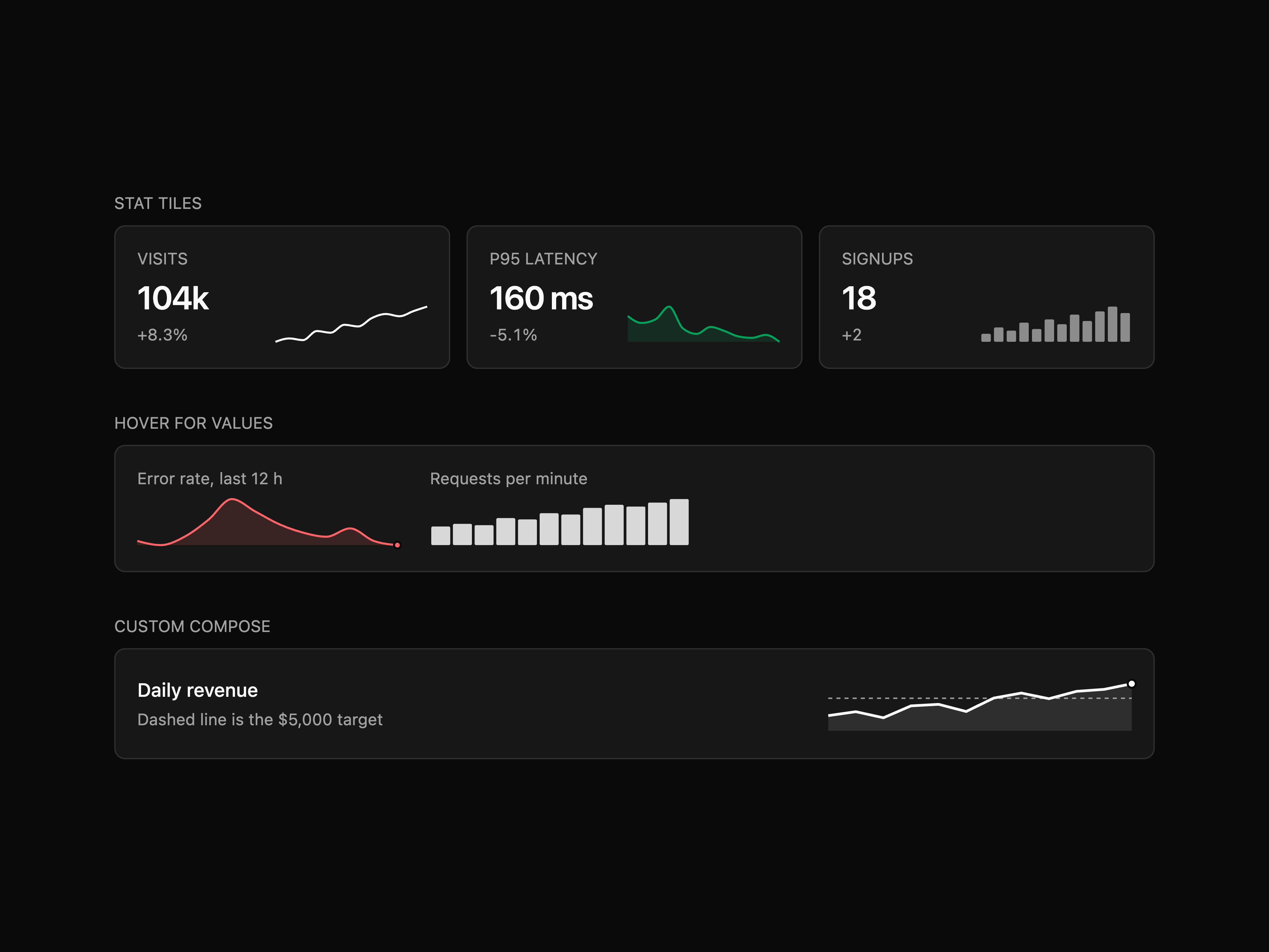
Count-up number that tweens to its target with easing, Intl formatting (currency, compact, percent), prefix/suffix and reduced-motion support.
Top-of-page banner with default / primary / muted tones, optional dismiss button and localStorage persistence.
Drop-in admin shell layout built on the shadcn Sidebar primitive: collapsible icon-rail sidebar with nav badges and a footer profile row, sticky topbar with breadcrumb, command-palette search and notification button, plus a live-filtering accounts table in the main area.
Split-pane inbox shell: icon rail with unread indicator, searchable conversation list with an unread filter, and a reading pane with star toggle and a reply composer that appends to the thread.
Starter shell on the shadcn Sidebar primitive (inset variant): workspace switcher and ⌘K search in the rail, icon-collapsible nav with tooltips, an inset header with trigger, notification count and avatar, and a welcome heading over dashed placeholder slots.
Dark, liquid-glass marketing landing page: a full-viewport hero with a cross-fading background video, a frosted glass pill nav and an inline email form, then scroll-revealed about, featured-video, philosophy and services sections, closing on a multi-column footer. Framer Motion throughout, with a self-contained pure-black palette and Instrument Serif accents.
Composable audio player with play/pause, scrub-safe seek with buffered tint, skip, time readouts, volume and playback rate.
Compliance-style event log with expandable rows that reveal actor, action, status and request metadata. Composable disclosure parts.
Overlapping avatar group with size (sm/md/lg) and spacing (tight/normal/loose) variants, image or fallback support, numeric overflow chip, and asChild on items/overflow so each avatar can render as a link or button.
Editorial blog index with a featured post on top and a 4-column grid of post cards underneath. Built on Card and Badge.
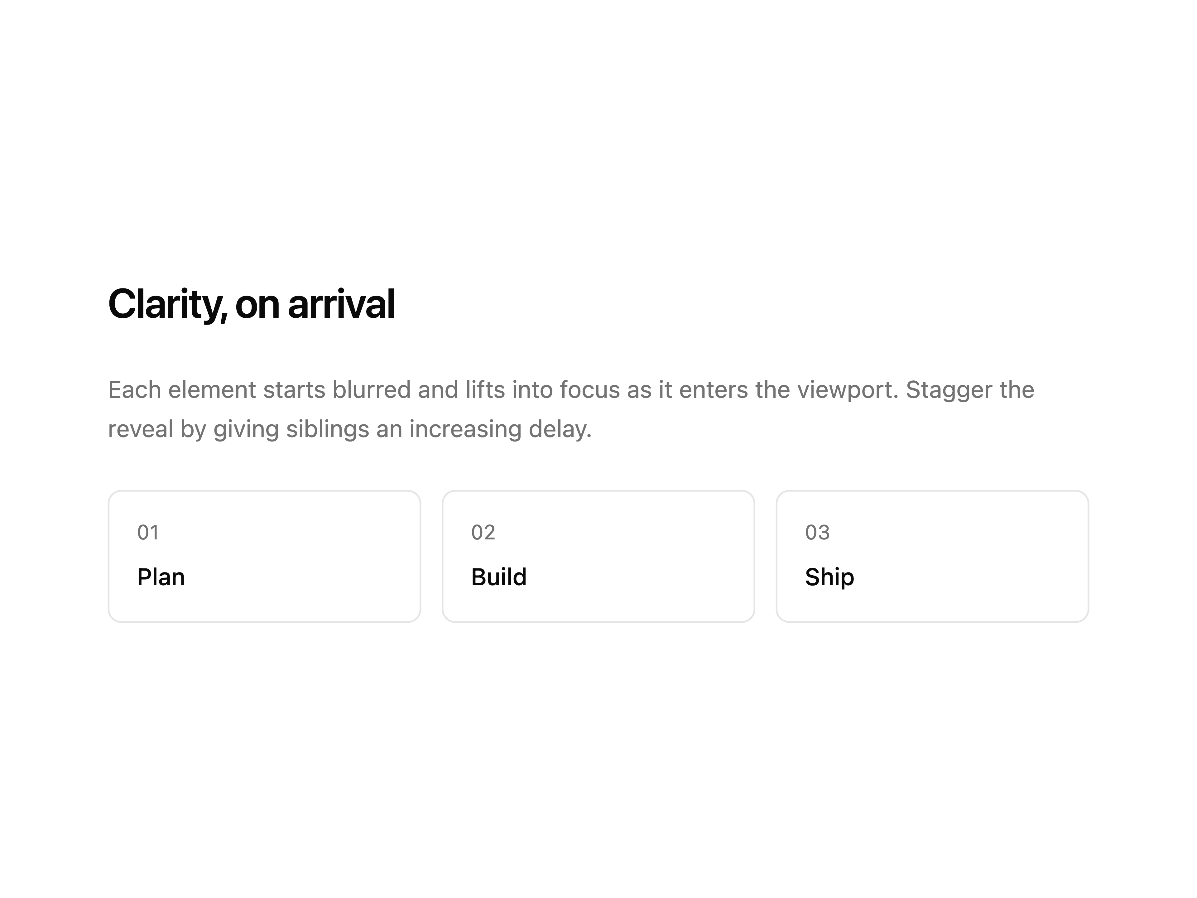
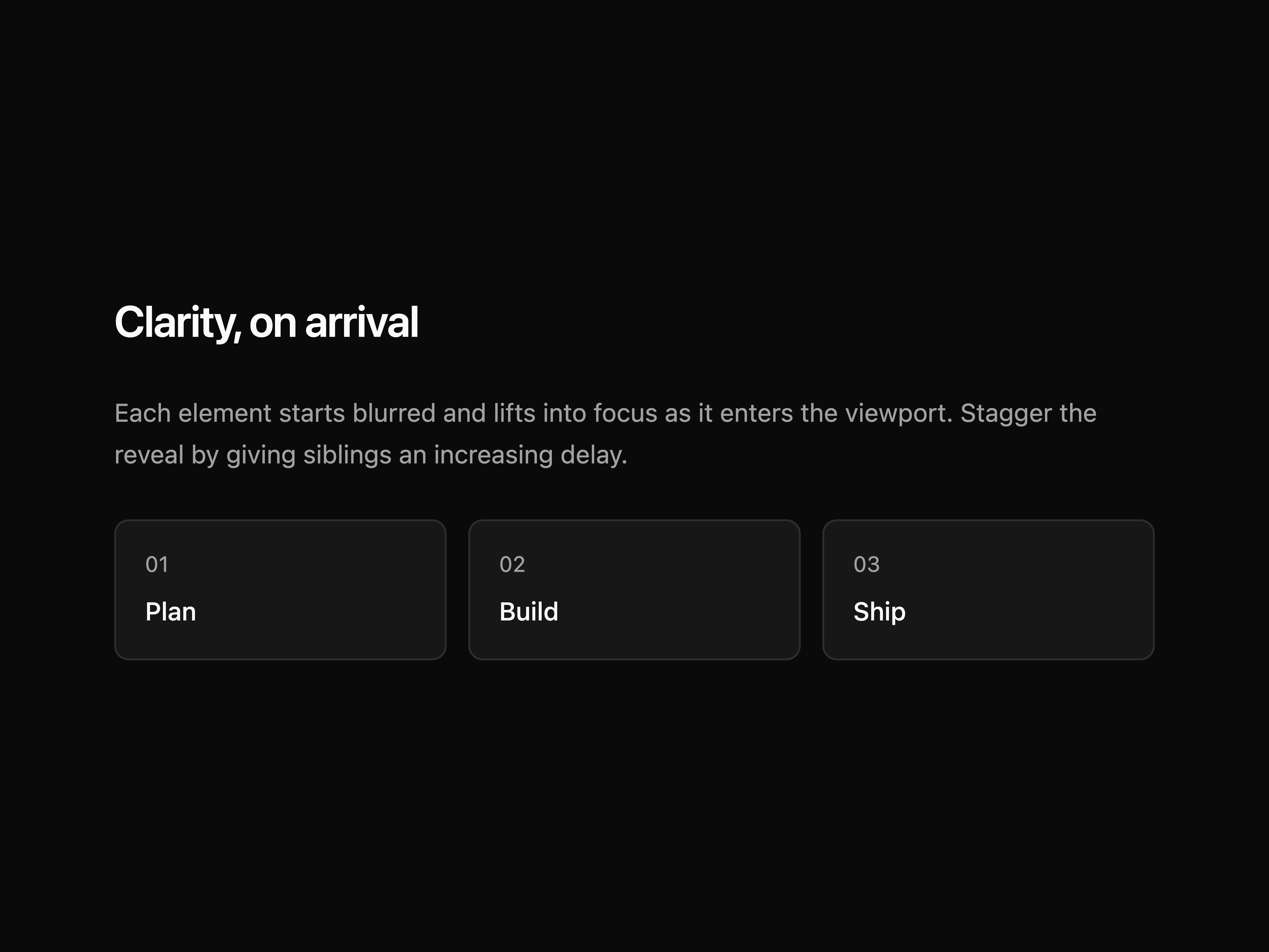
Reveals content with a blur, fade and lift as it scrolls into view. Configurable delay, duration and threshold; respects reduced-motion.
GitHub-style contribution heatmap with month and weekday labels, tooltips, configurable intensity scale and a legend.
MDX-style admonition with info / success / warning / error / neutral variants and optional icon override. Ships --info / --success / --warning theme tokens.
SV gradient + hue slider with HEX / RGB / HSL tabs, eyedropper (where supported) and recent swatches.
Imperative confirmation dialog: a root provider plus a useConfirm hook that resolves a promise on confirm or cancel. Default or destructive tone, an optional icon, and an async confirm action with a pending spinner.
Production contact form with controlled state, inline validation, character counter, topic select, consent checkbox and a pending/sent state machine. Channel list and remote-location card alongside.
Click-to-copy button with copied feedback, icon-only or labelled, ghost / outline variants and a non-secure-context clipboard fallback.
Dark, cinematic creative-studio landing page: a full-viewport hero with an animated backdrop and pull-up wordmark, a scroll-revealed about section, and a staggered feature-card grid. Framer Motion throughout, with a self-contained warm-cream palette.
Framed CTA card with corner marks, headline + sub-copy on the left, dual buttons stacked on the right.
Full-bleed centered CTA with framing top/bottom rules, highlight underlay on the key word, and an inline install command.
Centered "get in touch" CTA with a mono eyebrow, serif headline, mail button, a direct-contact line, and a row of outline social icon buttons, capped by a soft radial glow dome with a starfield speckle.
Contact CTA panel with a scroll-reactive radial glow, an eyebrow badge, a word-by-word reveal headline, and two contact actions (email and call) each pairing a button with its detail line.
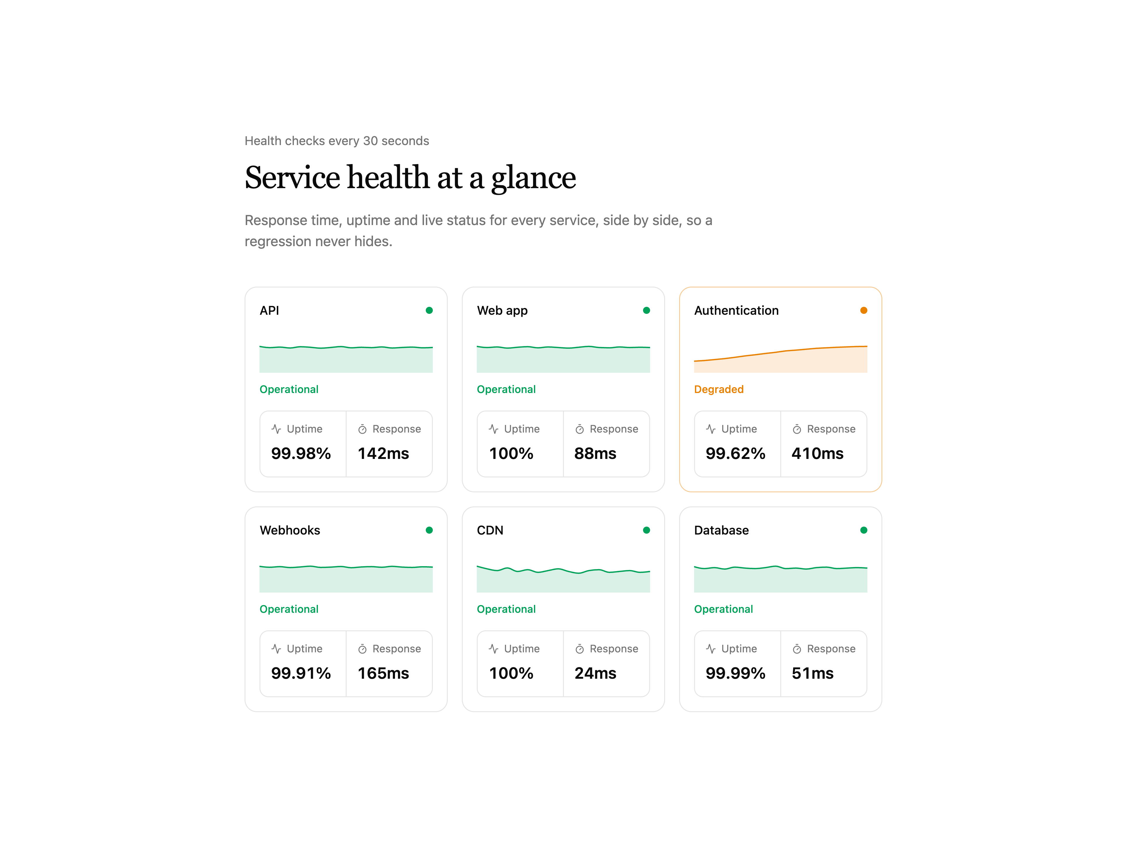
Operations dashboard with Tabs date-range switcher (1d / 7d / 30d / 90d), 4-up metric strip, weekly bar chart and a recent-activity feed. Data switches live with the range.
Dual-month range picker with hover preview, presets, min/max bounds and keyboard nav. Includes an inline DateRangeCalendar, no date library.
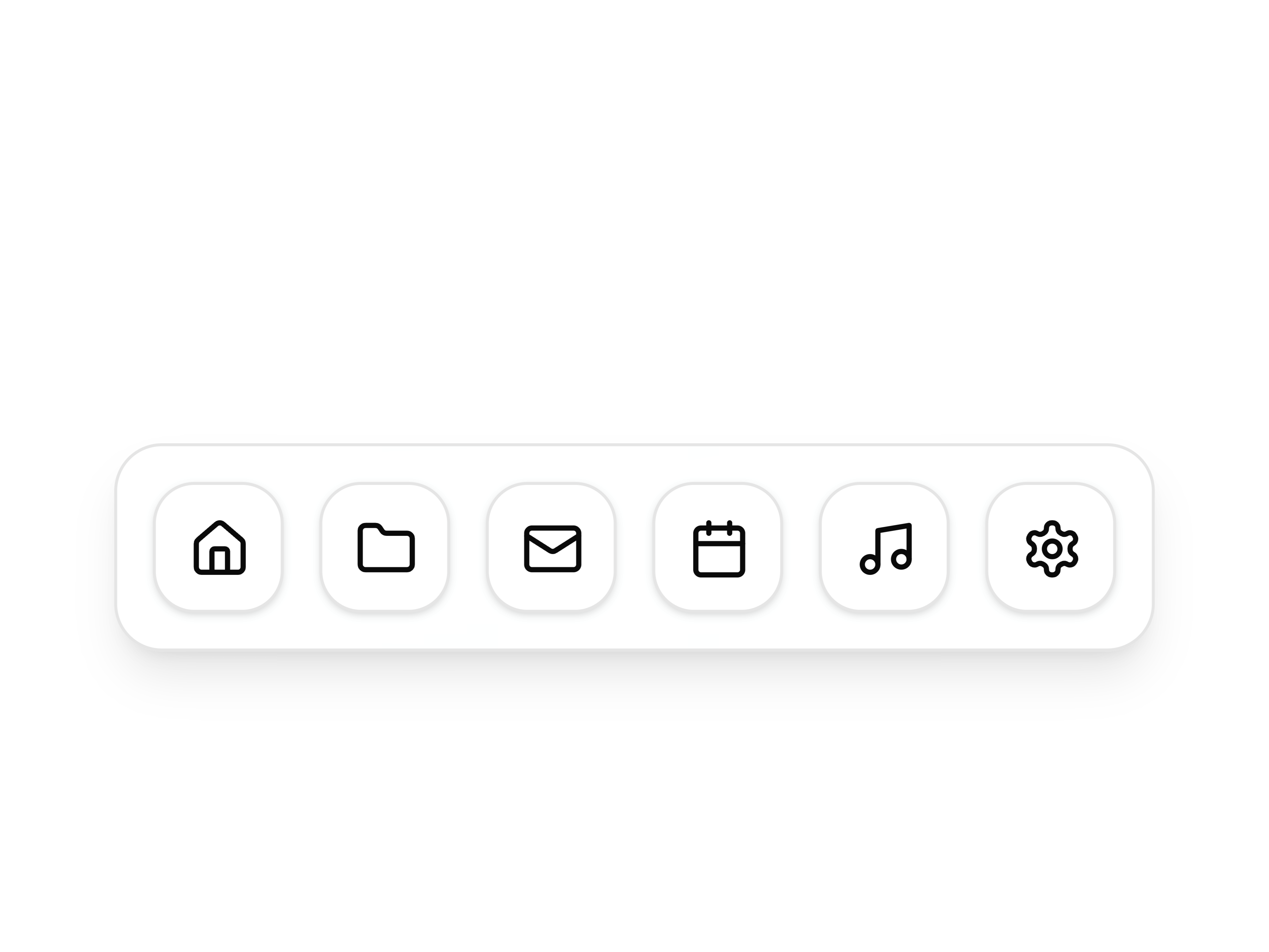
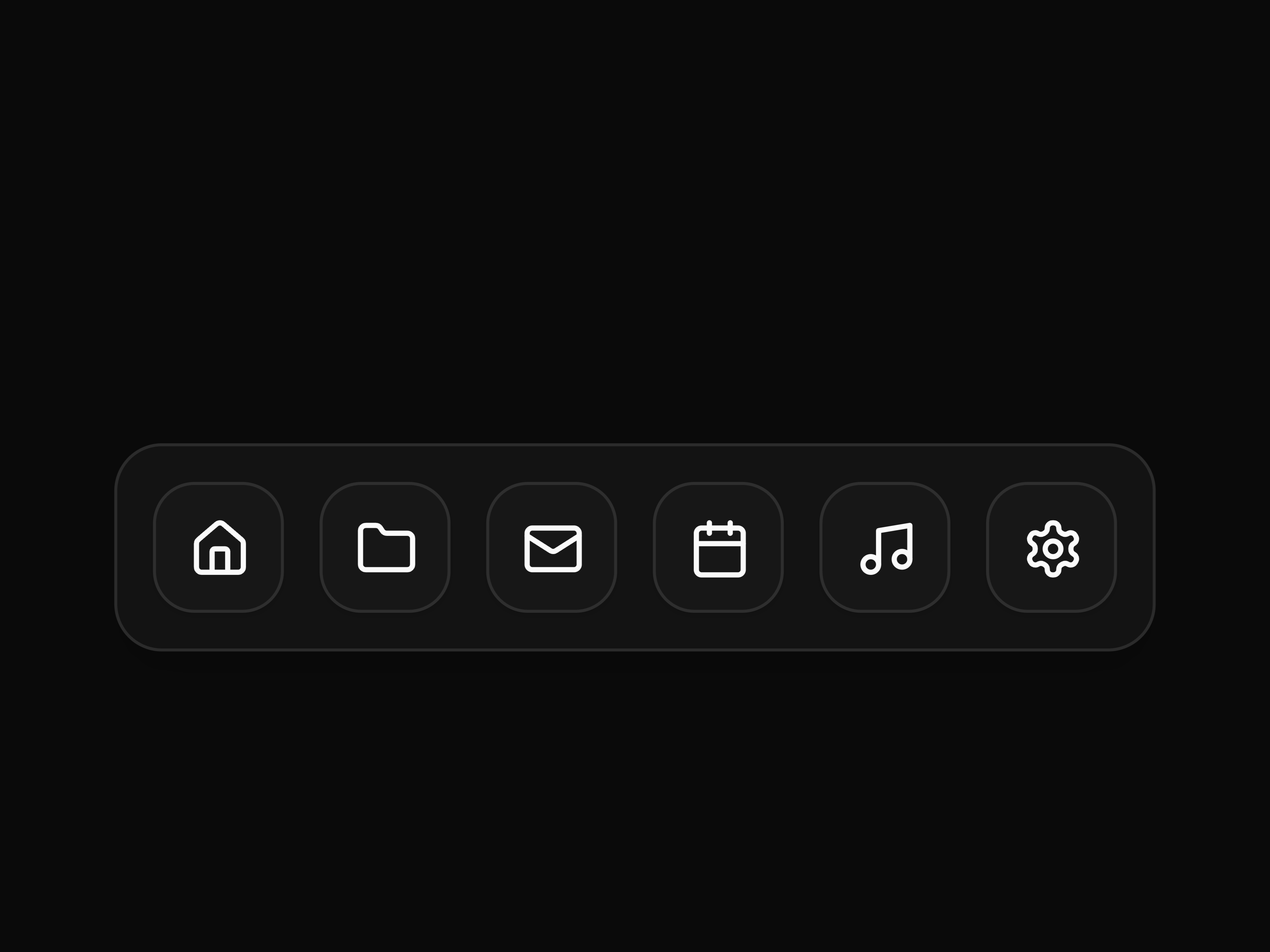
macOS-style dock with cursor magnification: icons scale and spring as the pointer passes, with hover and focus labels. Built on motion.
Centered heading with two-column accordion grid below. Each row tagged with a Qn index.
Drag-drop + click upload zone with previews, accept and max-size validation. Compound and single-prop APIs.
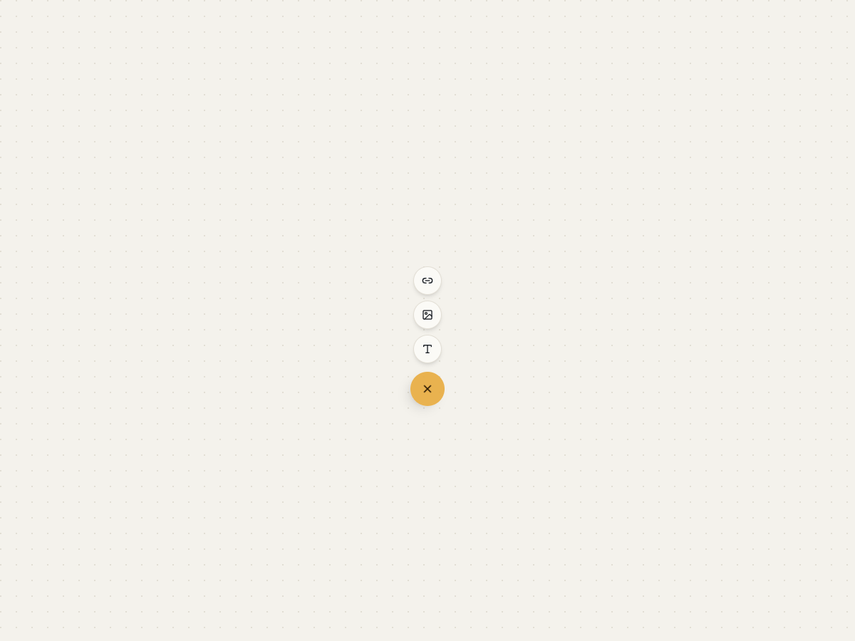
Expanding speed-dial FAB: a primary trigger that rotates open to stagger a stack of secondary actions on any side. Compound API.
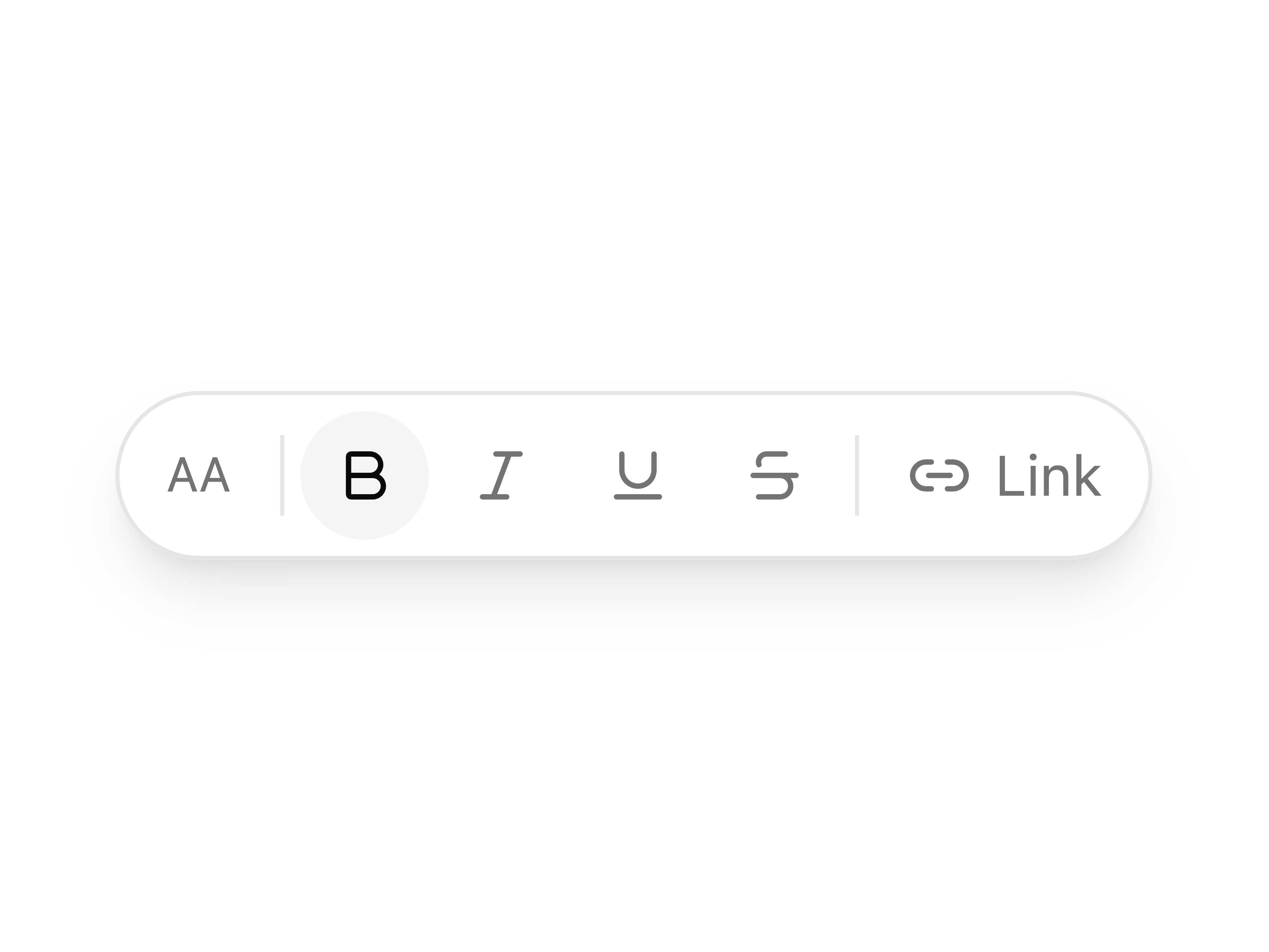
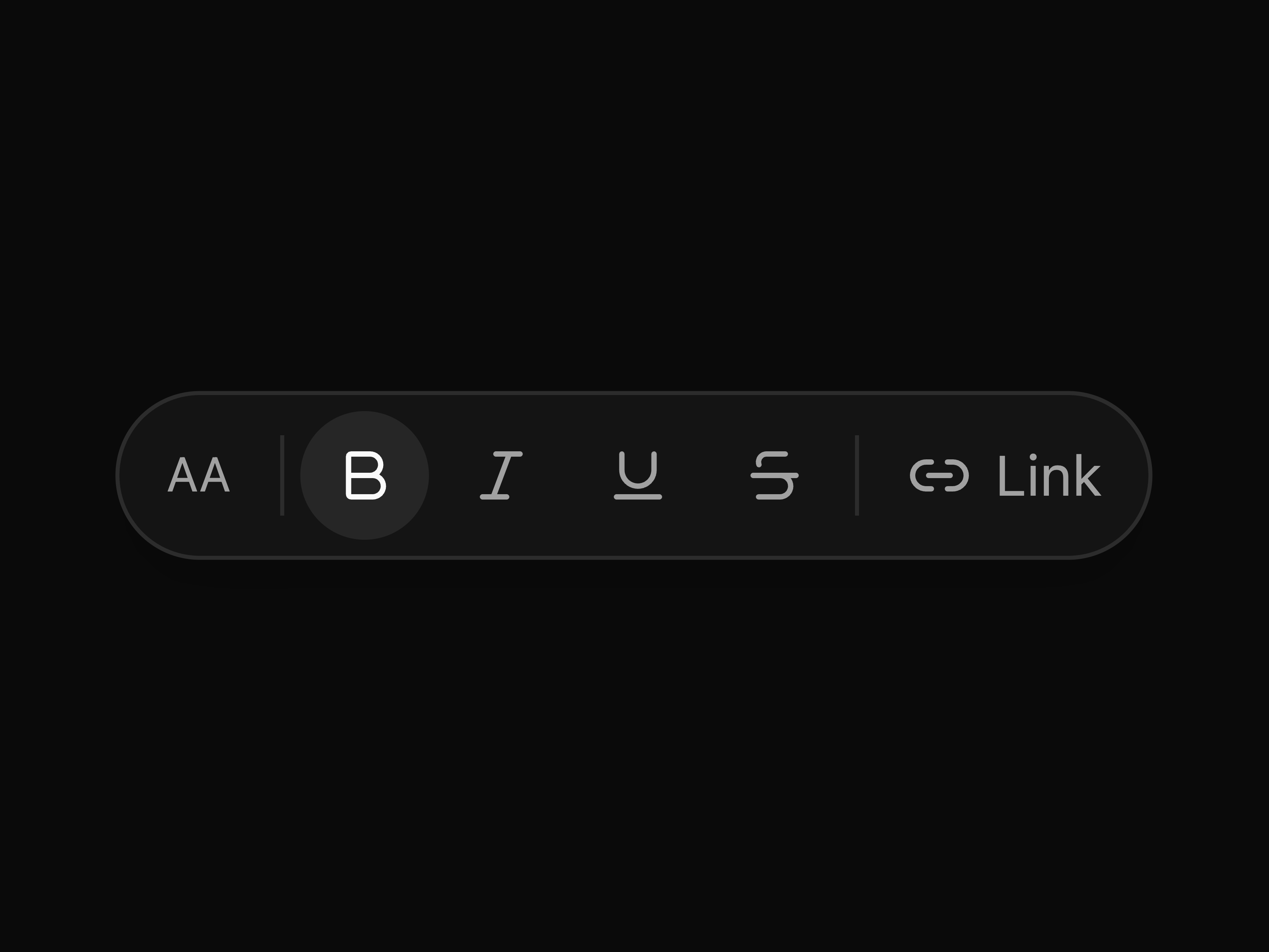
Floating pill toolbar for text selection and canvas actions, with toggle buttons, separators and labels. Position it anywhere.
Brand + tagline column alongside Product / Company / Resources link columns, with a copyright row and social icons below a thin rule.
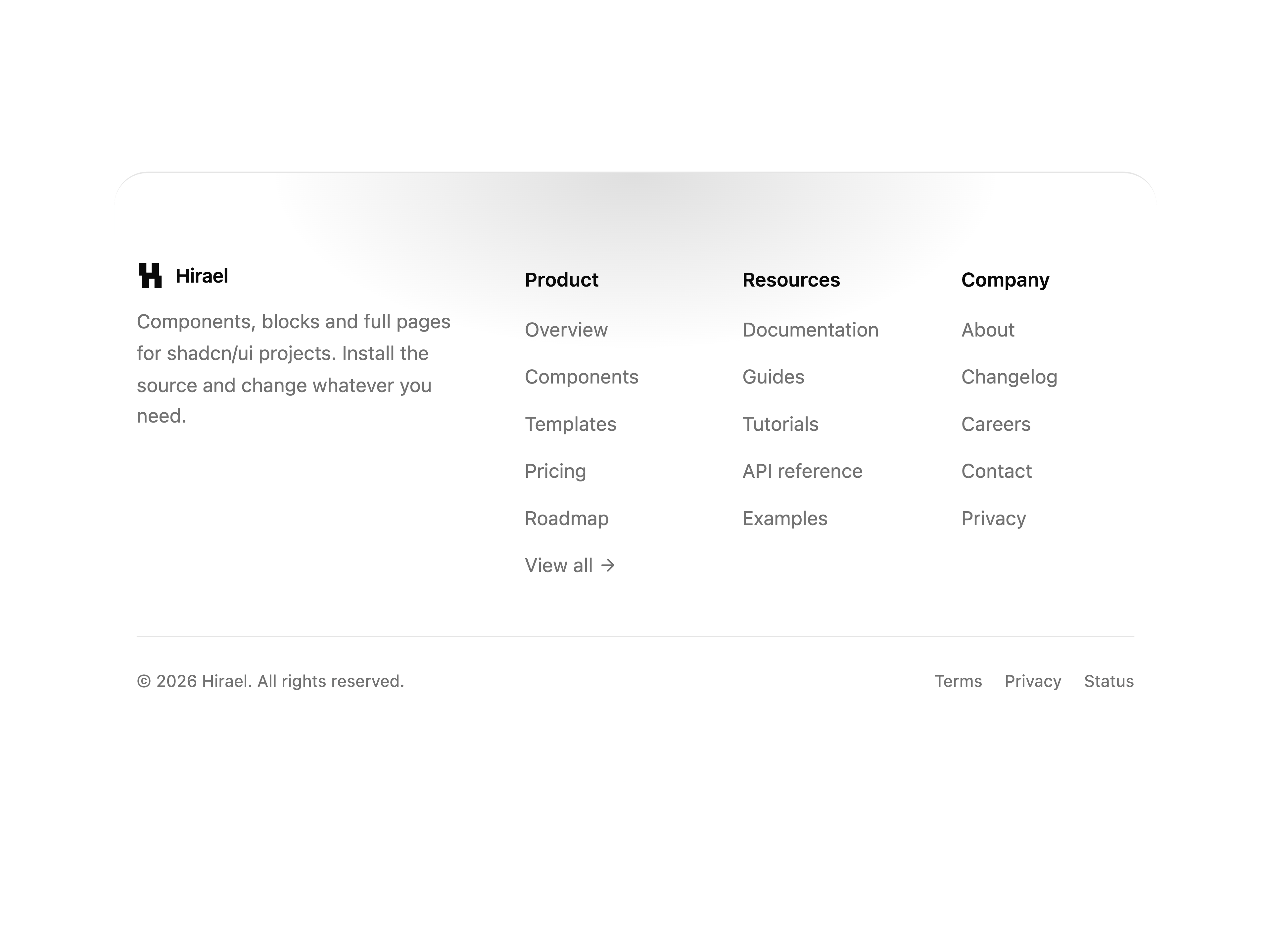
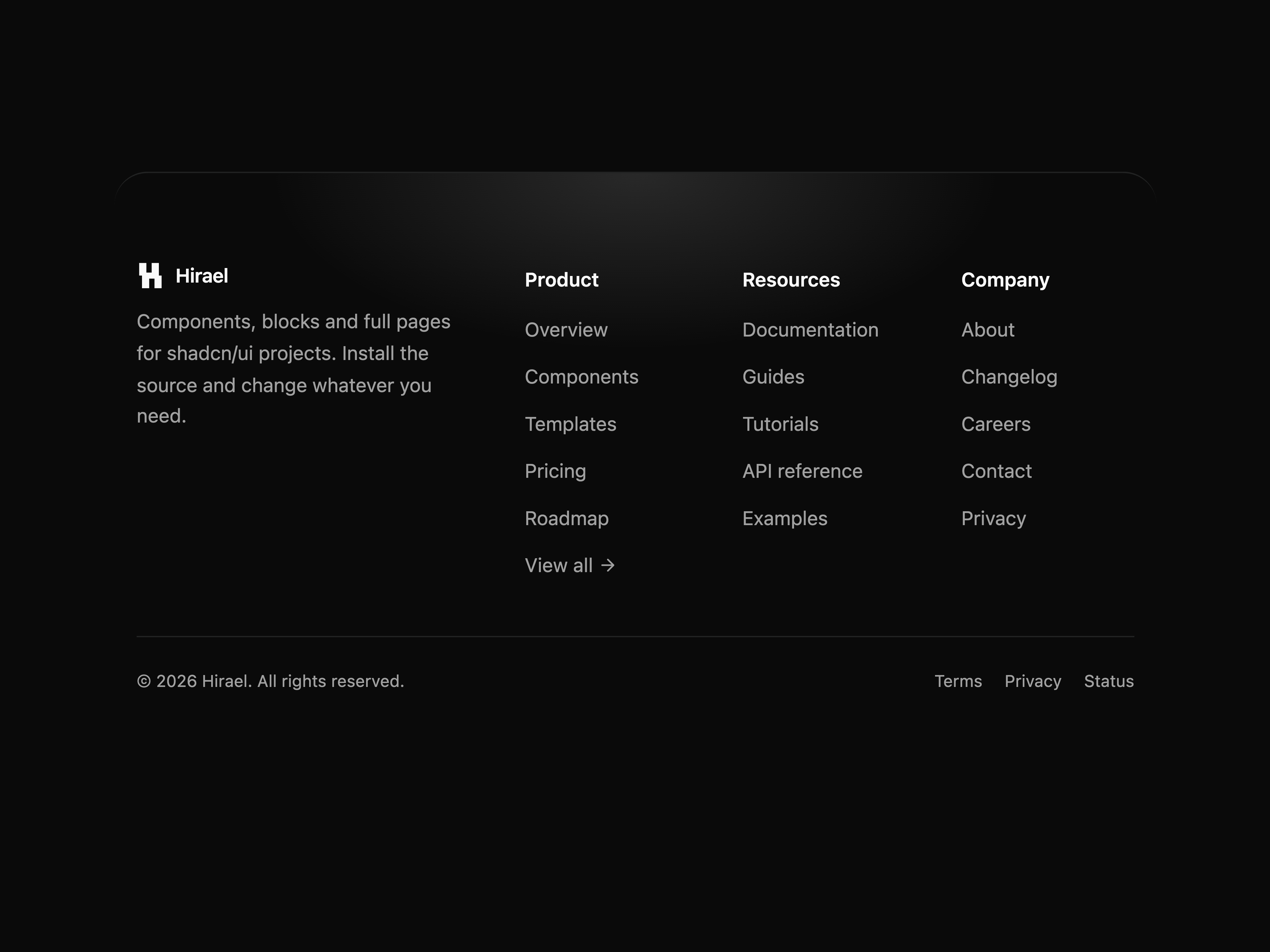
Rounded-top footer with a brand block beside a multi-column link grid. Each column caps at five links and shows a "View all" arrow when there are more. A soft radial tint sits behind the top edge, and a bottom meta row carries the copyright and secondary links.
Boxed link-column footer: a two-column brand block with wordmark, blurb, and ghost social buttons, two link columns, and a divided copyright row. Sits in a soft outlined panel.
Centered reset-request card: email with inline validation and a pending submit, swapping to a check-your-inbox state that echoes the address with resend and back-to-sign-in links.
Sticky top nav with brand monogram, centered anchor links, dual auth CTAs and a slide-down mobile menu.
Full-bleed hero card over an animated light-beam shader, with a glass pill nav, a trust badge, a serif headline, dual CTA and a three-stat footer.
Centered hero over animated grayscale gradient bars, with a live pill, a serif headline with an underlined accent, dual CTA and a wordmark strip.
Editorial centered hero on a faded grid, with a serif headline, sub-copy, dual CTA and a logo cloud of customer wordmarks.
Full-bleed image-banner hero with a dark scrim, a slim nav, a serif headline and dual CTA aligned to the bottom.
Centered personal hero: a live "available for work" badge, a serif headline with a primary-tinted emphasis span, a sub-line, a three-stat row with hairline dividers, dual rounded CTAs, and a tooltip-backed core-stack icon row framed by gradient rules. Rotated geometric border accents fade in behind it (and stay still under reduced motion).
Centered hero on a framed, token-lit panel: a pill badge eyebrow, a serif headline with an italic emphasis span, sub-copy, dual CTA buttons, and a faux app-window preview below. Headline, sub-copy, and CTAs fade and rise in with staggered motion that respects reduced-motion.
Click-to-edit text with preview, validation, async submit and confirm/cancel controls. Input and textarea modes.
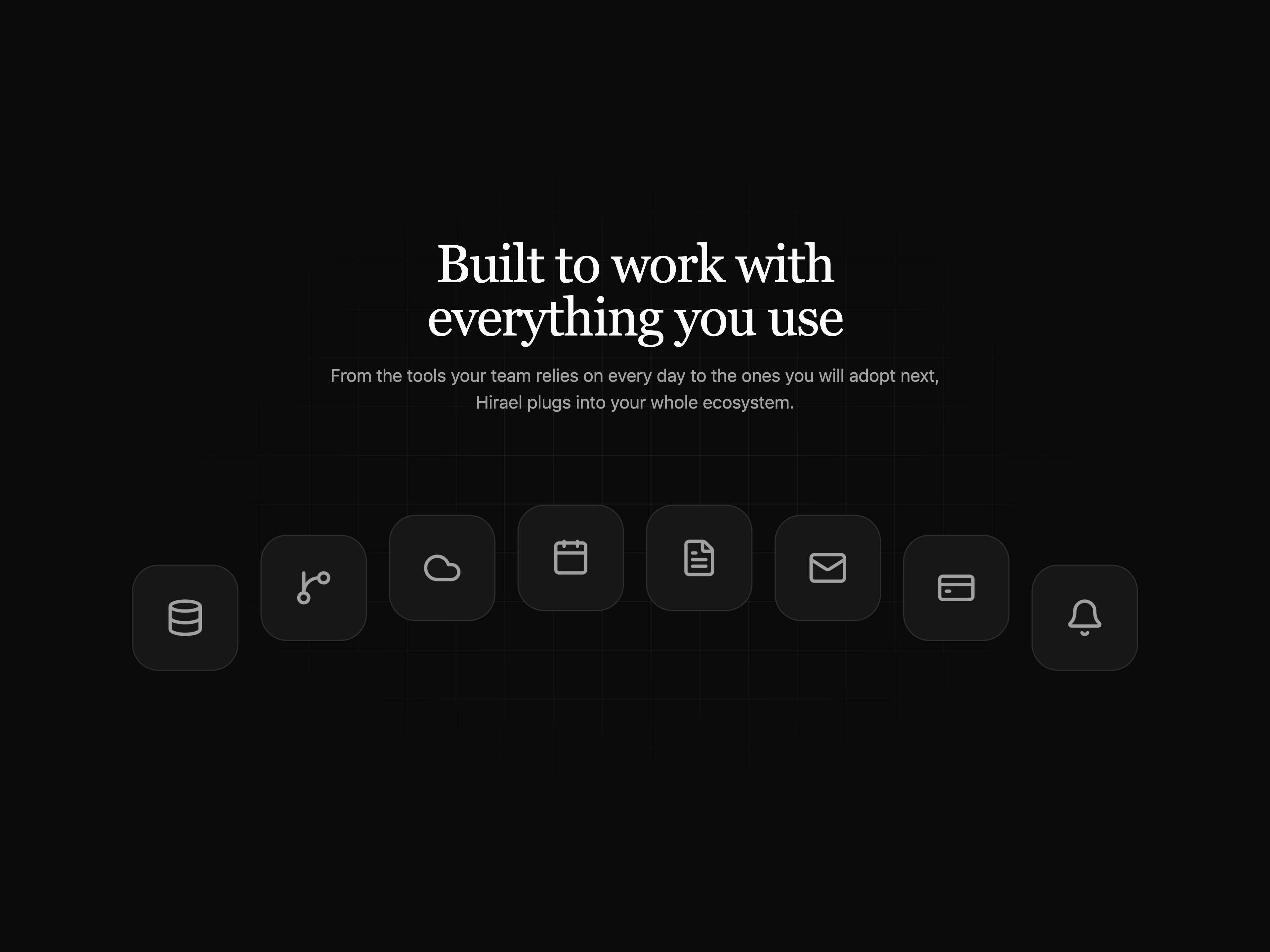
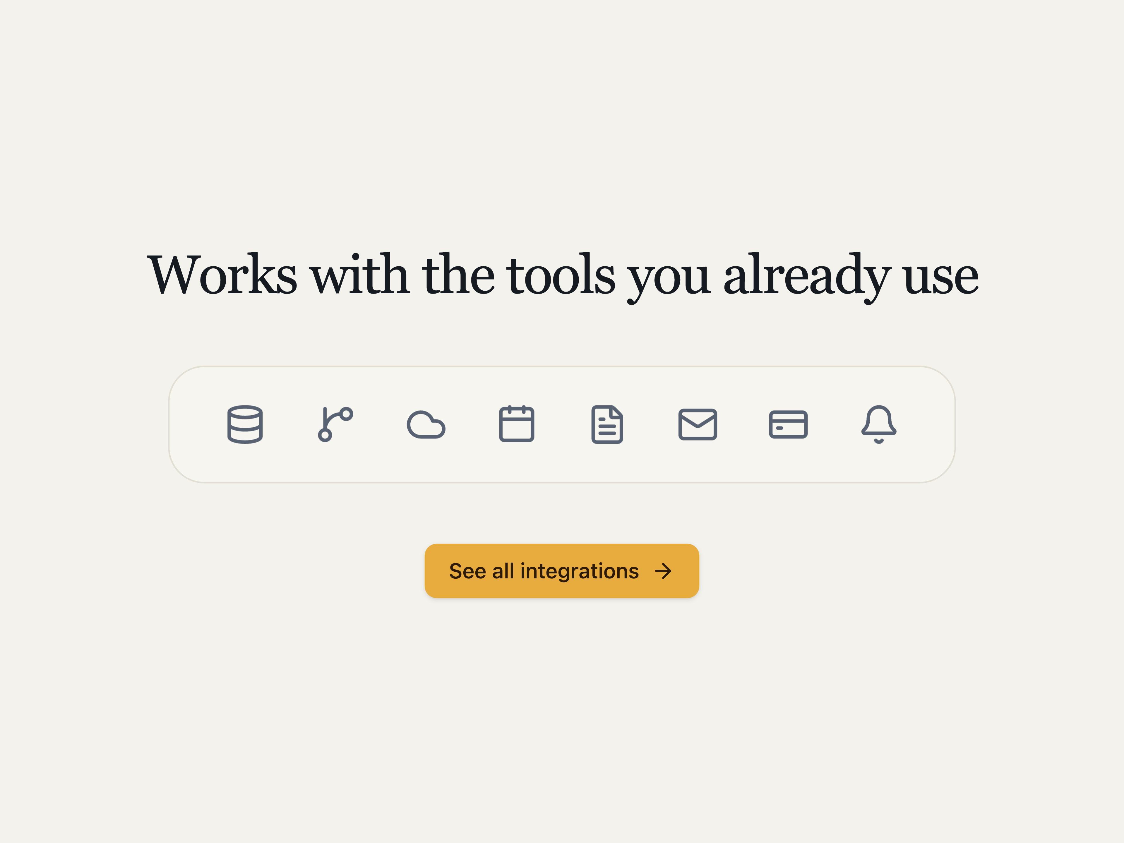
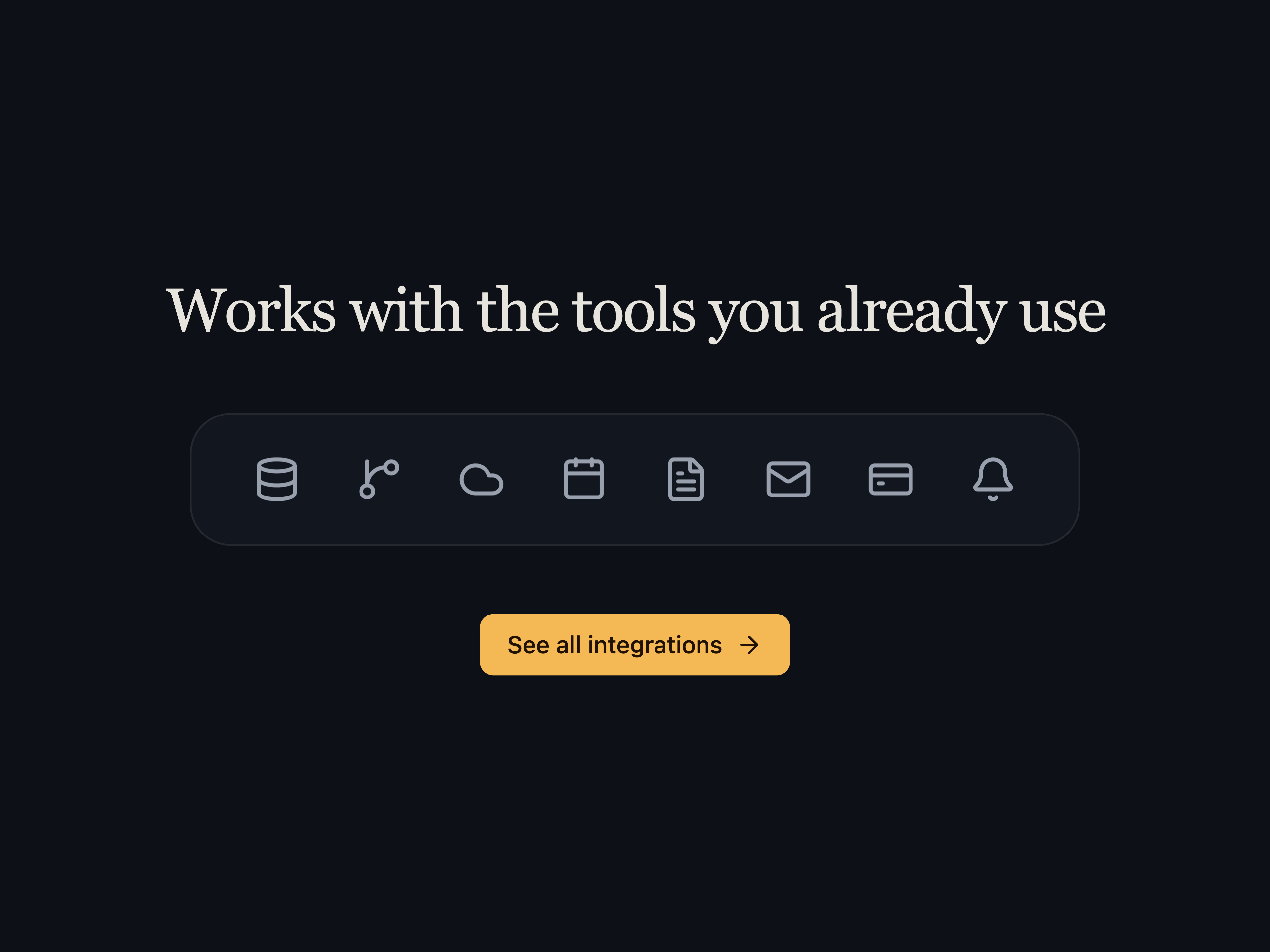
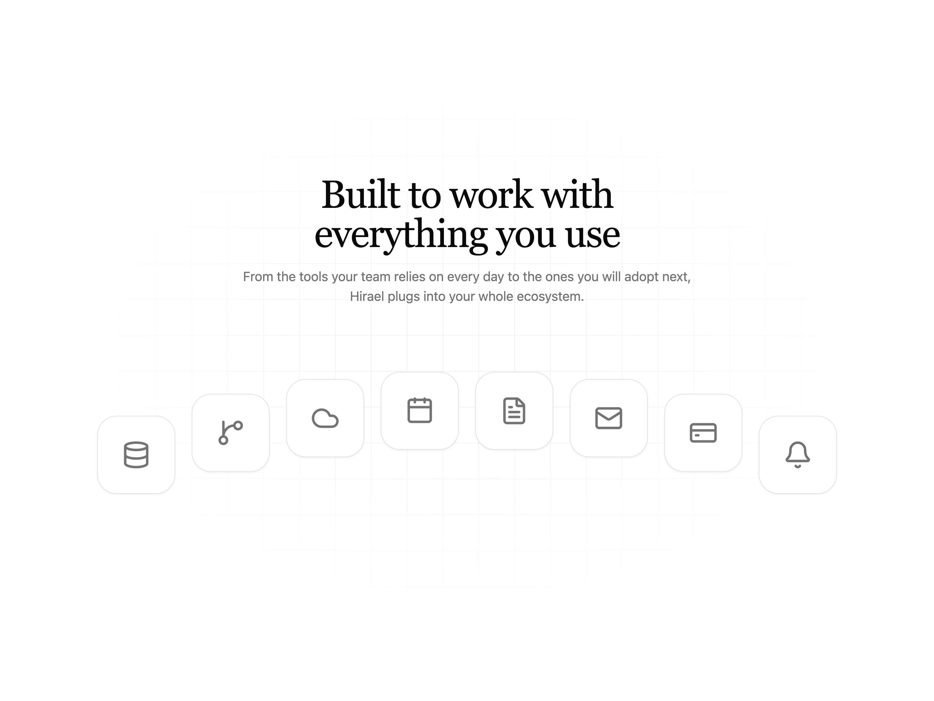
Two-column integrations section with copy and feature list on the left, orbit diagram (central hub + 7 logo spokes connected by dashed rays) on the right.
3D tactile keycap with hover lift and pressed states. Compound API with KbdGroup for chords and KbdDisplay for inline keys.
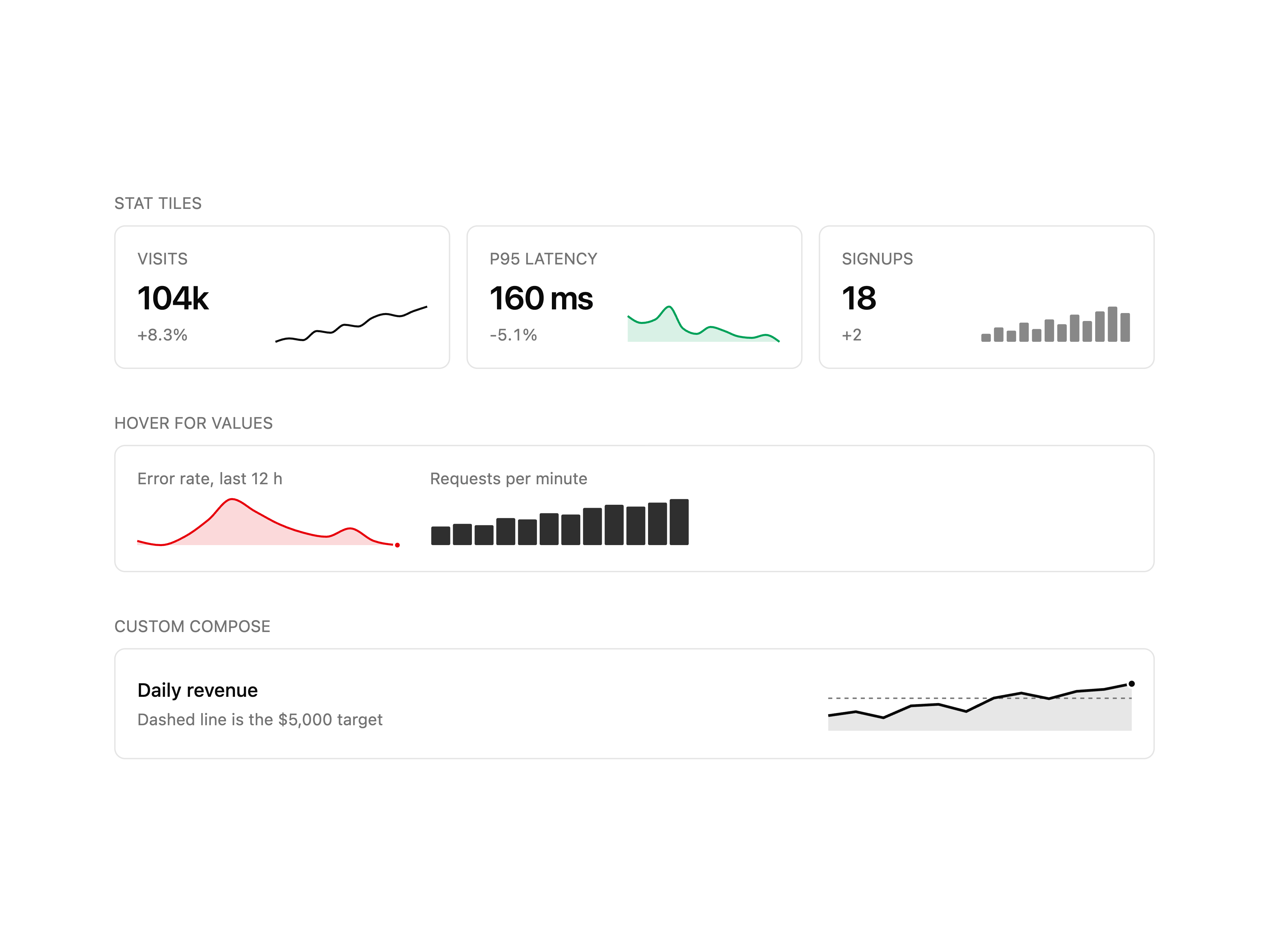
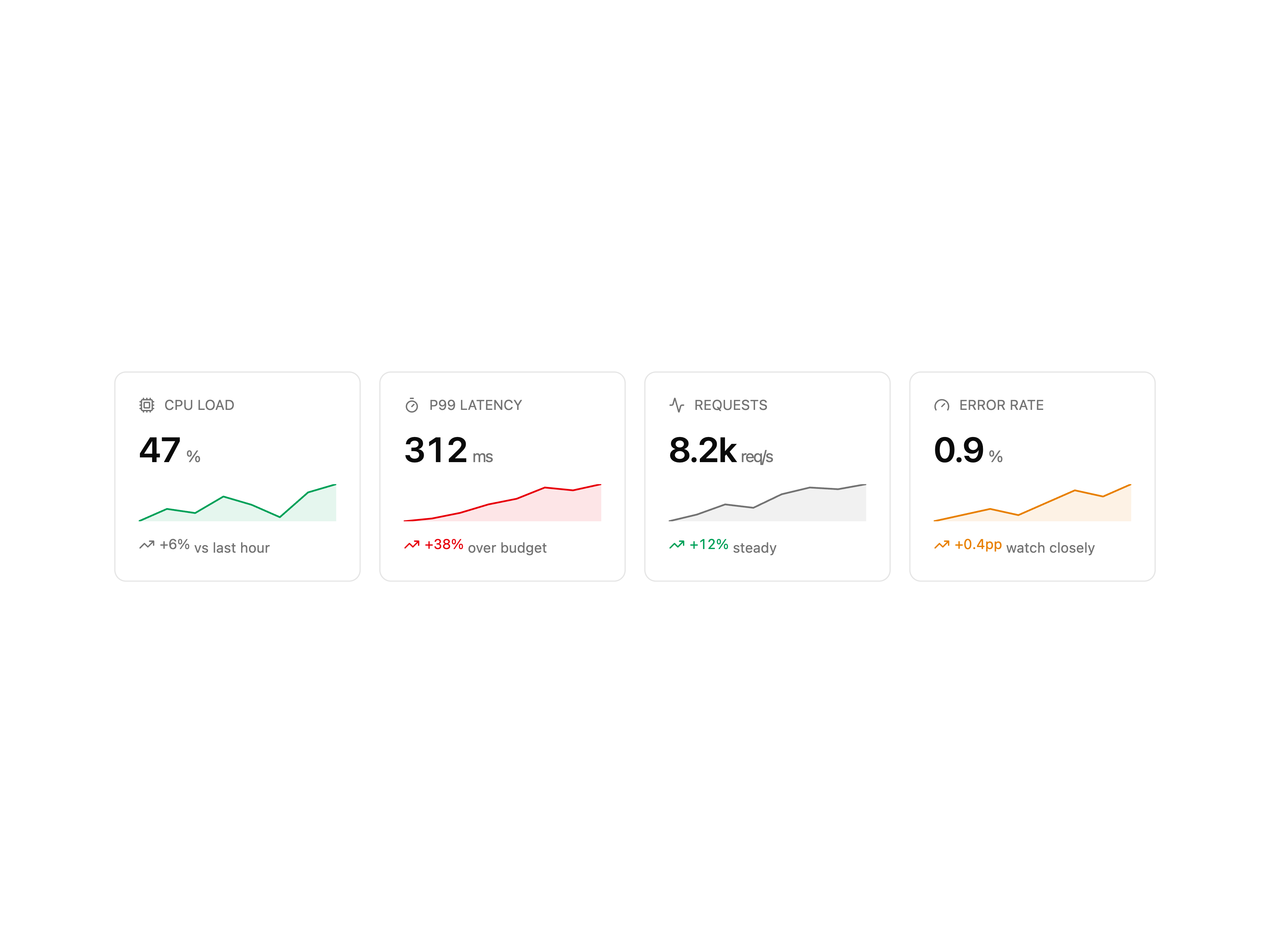
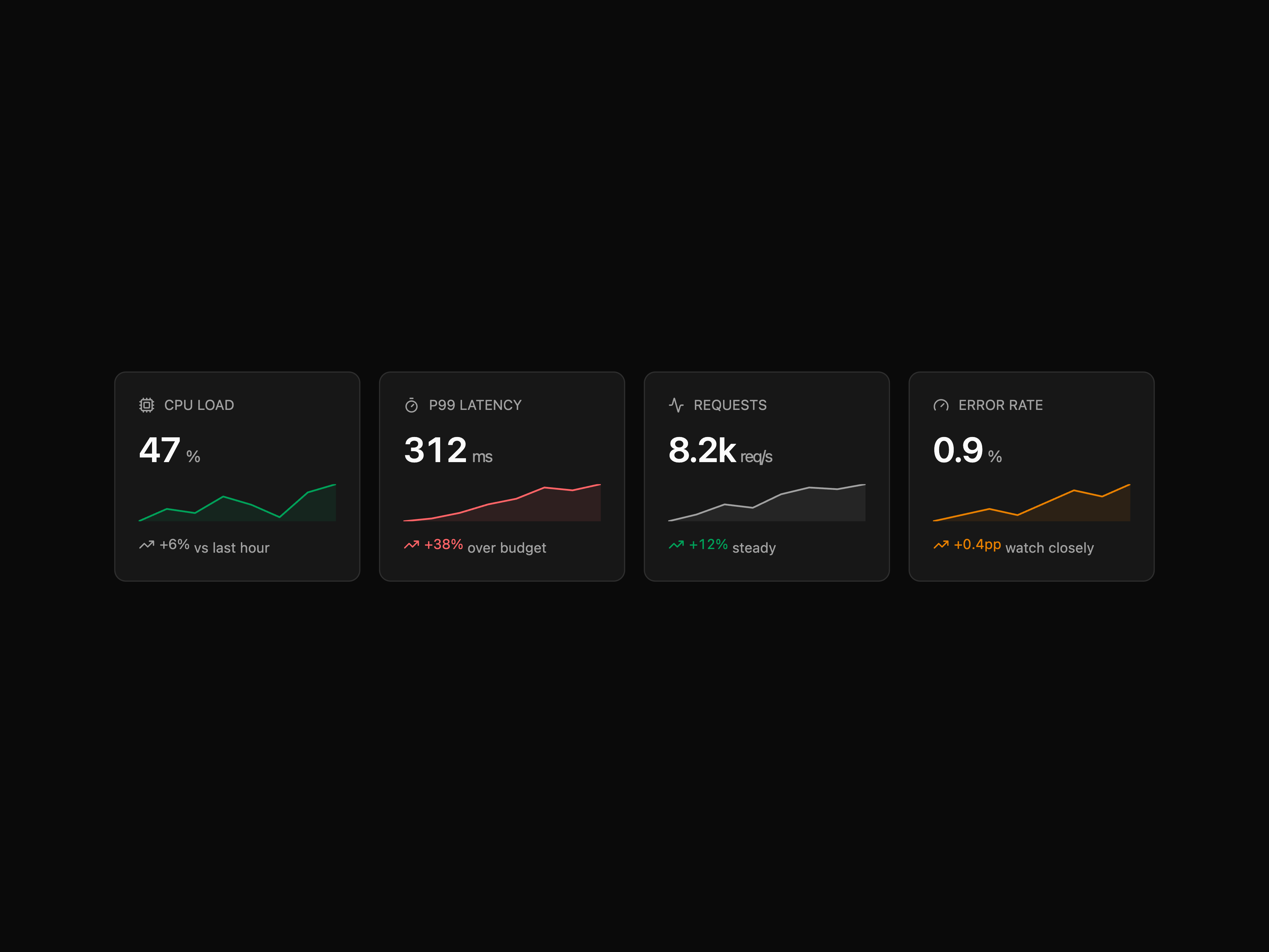
Hairline-joined grid of KPI tiles with label, value, an up/down/flat delta chip and a dependency-free sparkline. Ships composable parts.
Fullscreen image lightbox on Radix Dialog with gallery navigation, zoom and pan, swipe gestures, captions and a thumbnail strip.
Two-pane login: form on the left, dark testimonial panel with quote and metrics on the right. Uses the strength-meter variant of password-input.
Centered eyebrow + headline above a 5-column bordered wordmark grid, with stat strip and case-study link below.
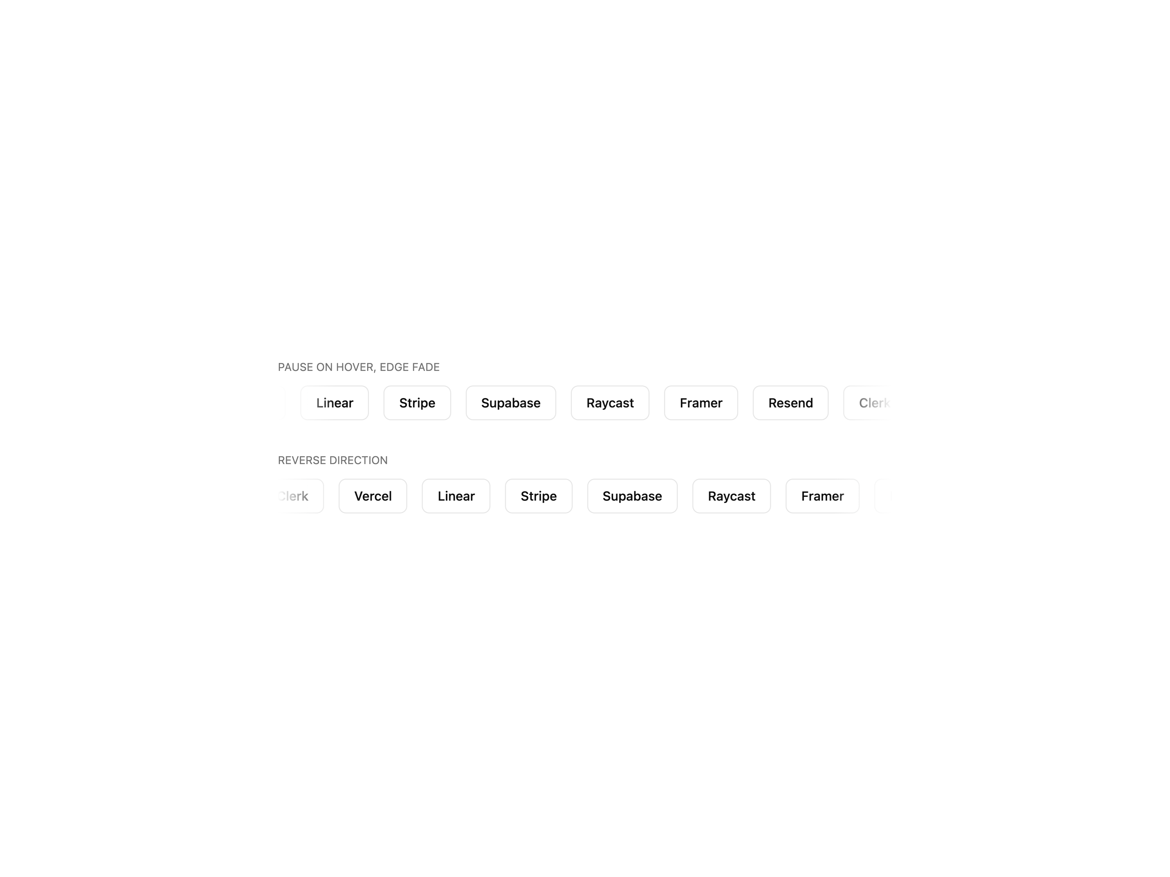
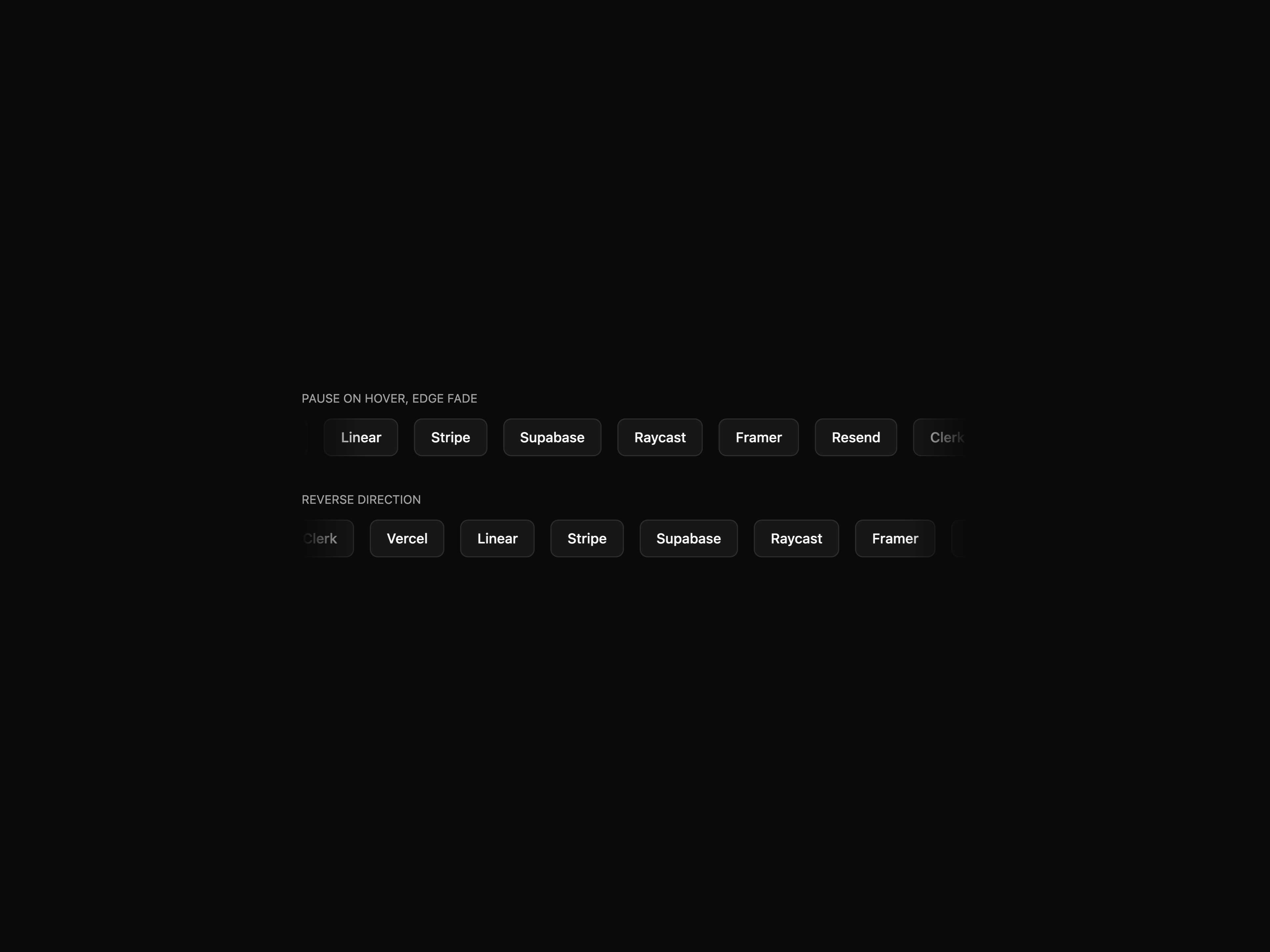
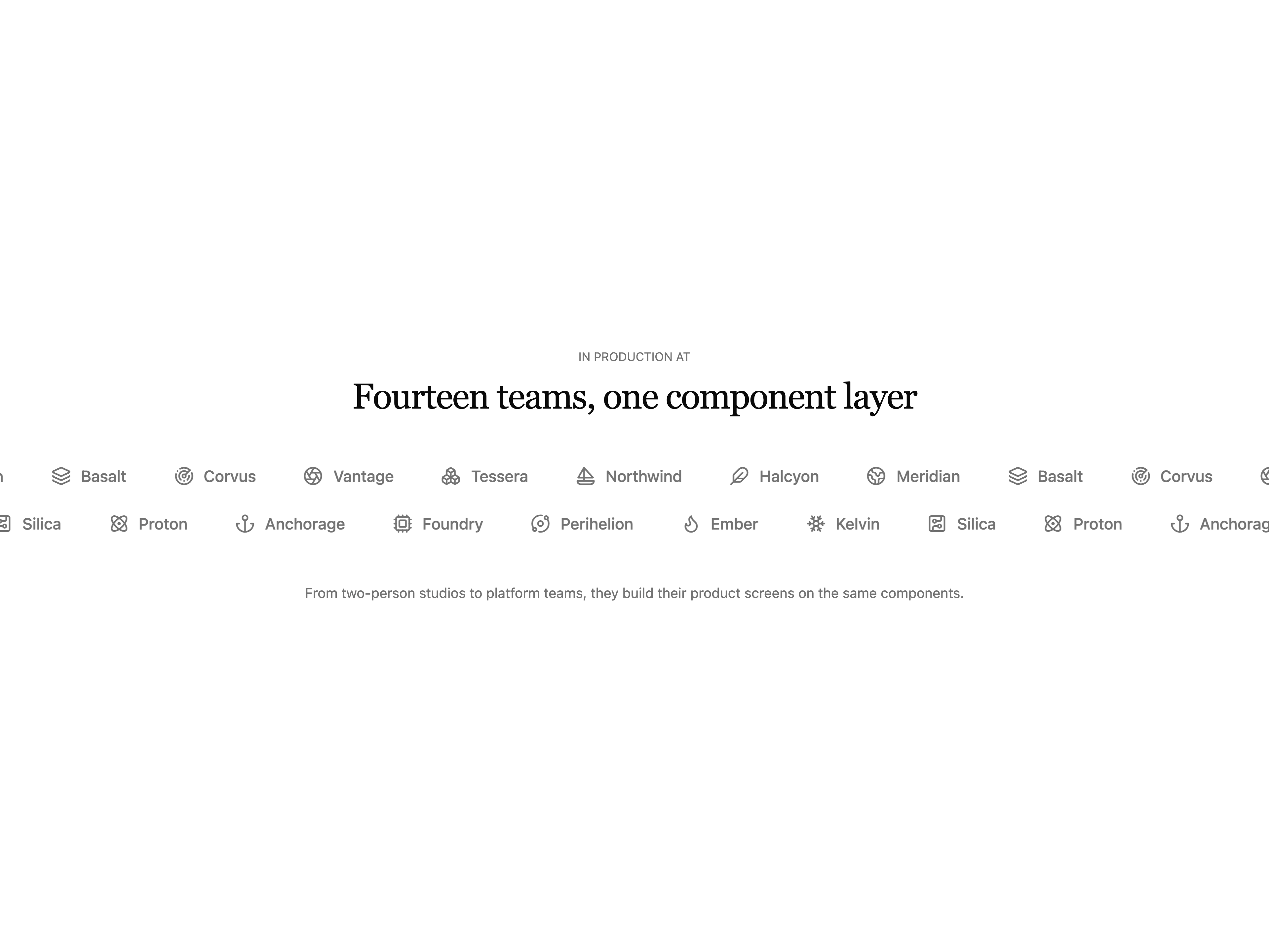
Infinite scrolling row or column for logos and testimonials, with pause-on-hover, reverse and vertical modes. Keyframes ship inline, zero config.
Compact metric card with a value and unit, a tone-aware sparkline and an up / down trend line. Compound API.
Dark, monochrome newsletter landing page: a full-screen video hero with an inline subscribe form, an answer-engine section, scroll-revealed mission copy, a four-up feature grid and a streaming-video call to action. Framer Motion throughout, with a self-contained pure-black palette and liquid-glass accents.
A trigger card that morphs into a centered dialog via shared-layout animation, with focus trapping, scroll lock, Esc to close and reduced-motion support.
Chip-based multi-select with command-palette dropdown, search, select-all and async loader. Compound and single-prop APIs.
Centered subscribe panel with an inline email form, inline validation and a success state that swaps in a confirmation once a valid address is entered.
Light enterprise-infrastructure landing page: a floating pill navbar that shrinks on scroll, a full-screen video hero, a dark service-card grid that unfolds on hover, a chaos-versus-control split around a circular streaming video, and a four-pillar delivery staircase. Self-contained navy-and-lavender palette with multi-stop brand gradients, driven by hls.js and lucide-react.
Dark, single-page personal portfolio: a counter loading screen, an HLS video hero with a floating nav and a cycling role line, a bento work grid, a journal list, a scroll-pinned parallax gallery with lightbox, count-up stats and a video contact footer. Self-contained dark palette, driven by GSAP and Framer Motion.
Three-tier card row with a featured middle plan. Each card lists price, blurb, feature checklist and a primary or outline CTA.
Compare-by-feature pricing table with sticky tier header (tier name, price, CTA) and ~8 feature rows below.
Three-tier card row with a monthly/yearly billing toggle that tweens the price, a featured plan, per-plan icon, feature checklist and CTA.
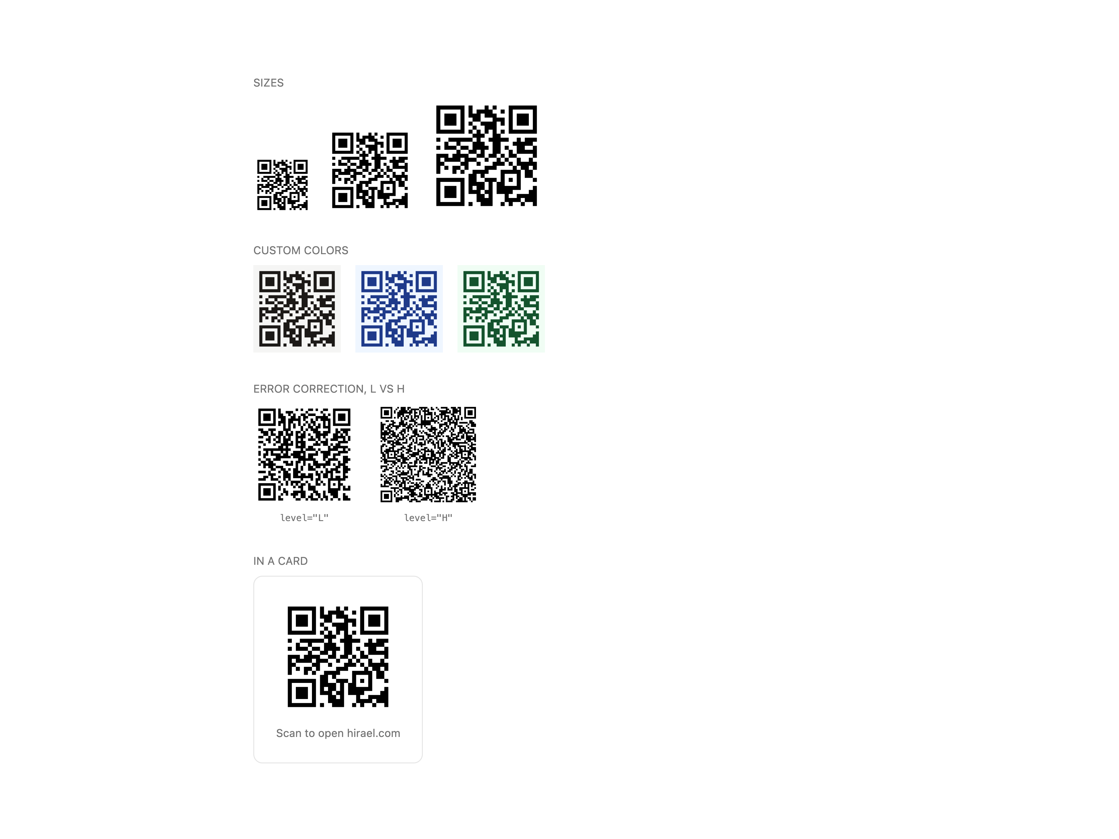
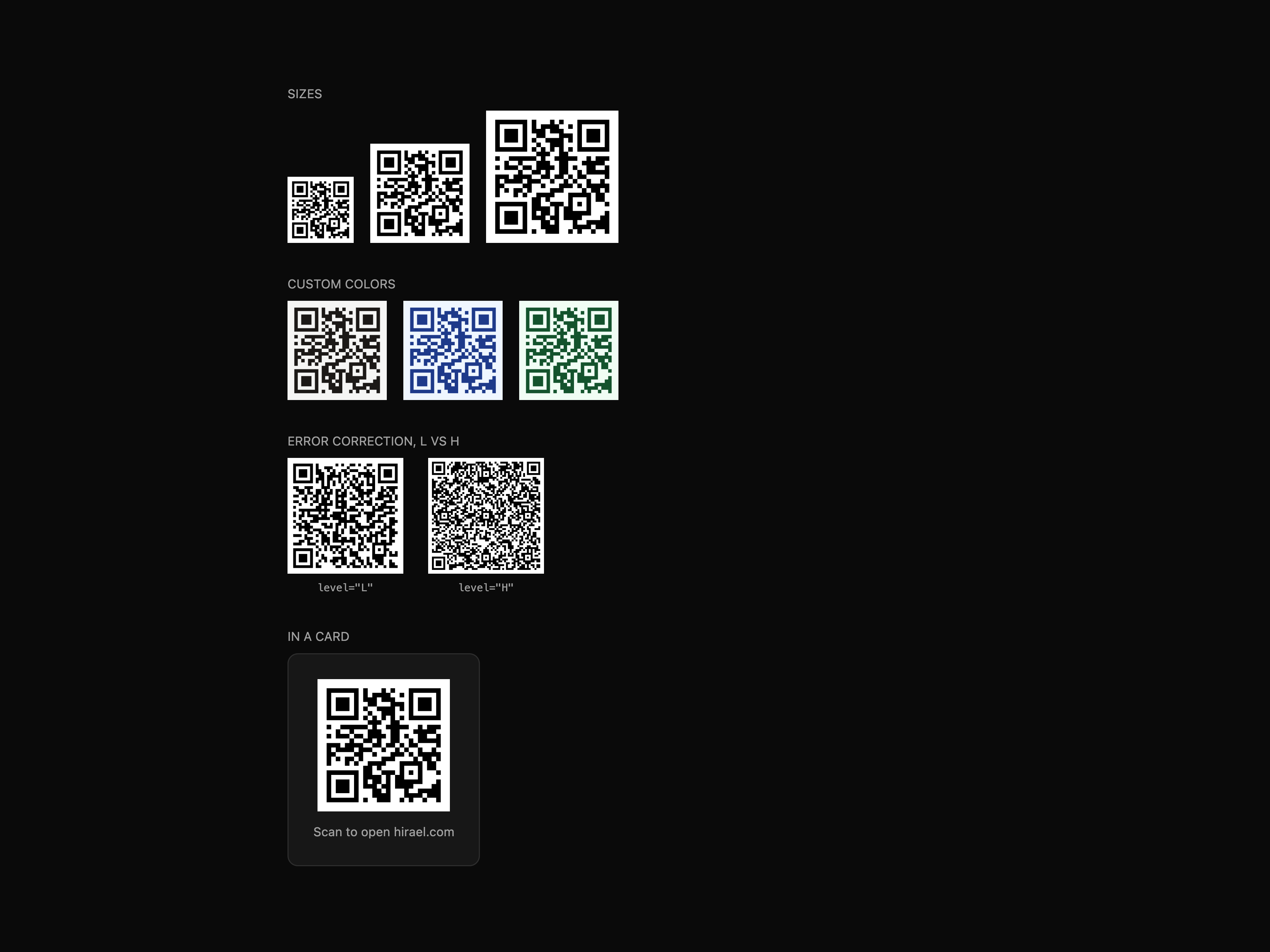
Dependency-free QR code generator rendering crisp SVG, with L/M/Q/H error correction, quiet-zone control and currentColor theming.
Grid of dashboard shortcut tiles with icon, label and description. Each tile is a button or, via asChild, a link. Ships composable parts.
Star rating with hover preview, half-star precision, read-only mode and sm / md / lg sizes.
DeFi staking landing page for a fluid-asset protocol: a video hero on a rounded card with glass stat cards and a carved documentation corner, a metrics band, a bento feature grid, a video call to action and a light footer. Self-contained light palette, Helvetica system type, Framer Motion throughout.
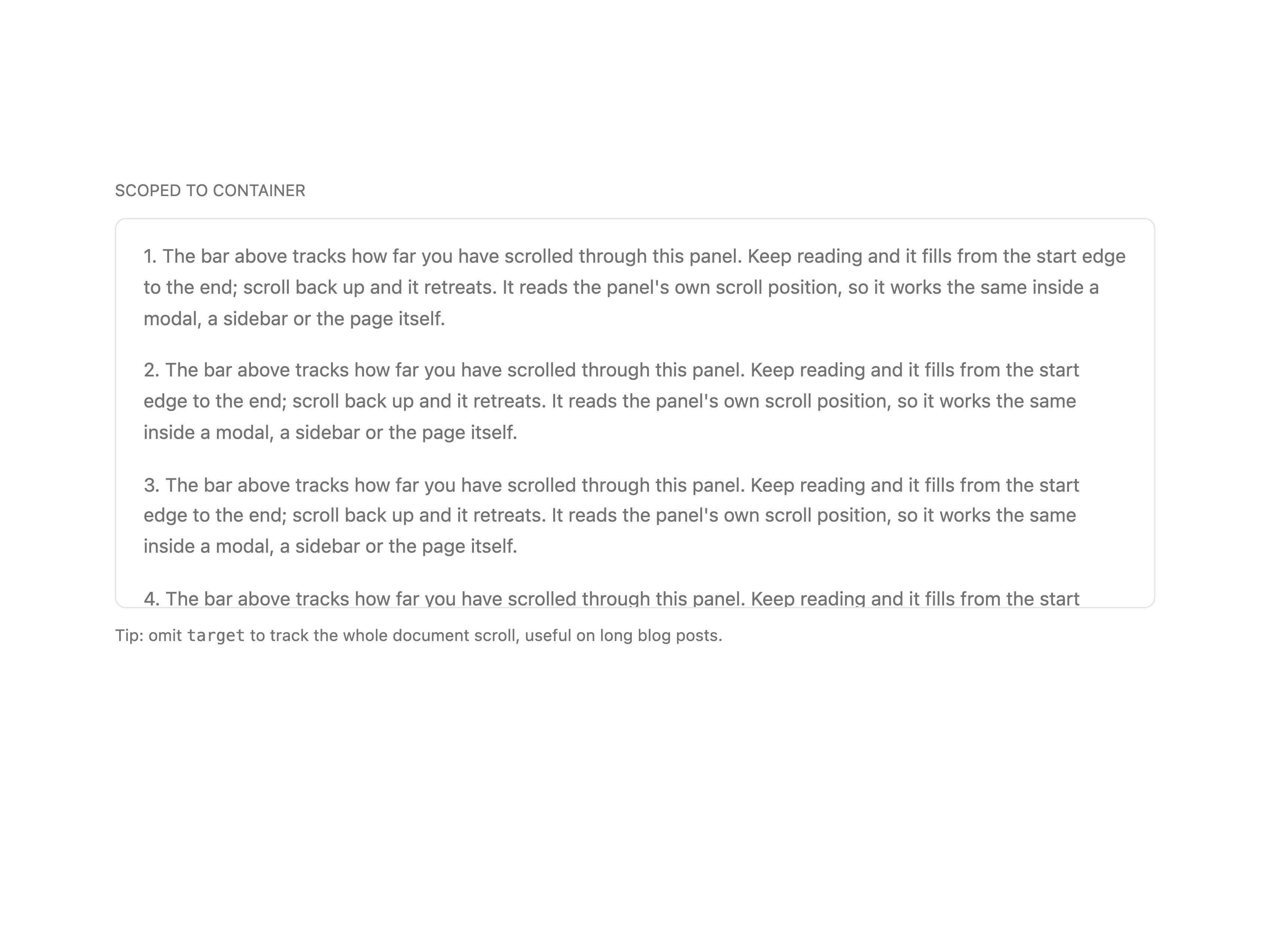
Fixed reading progress bar. Tracks document scroll by default or a scoped container ref.
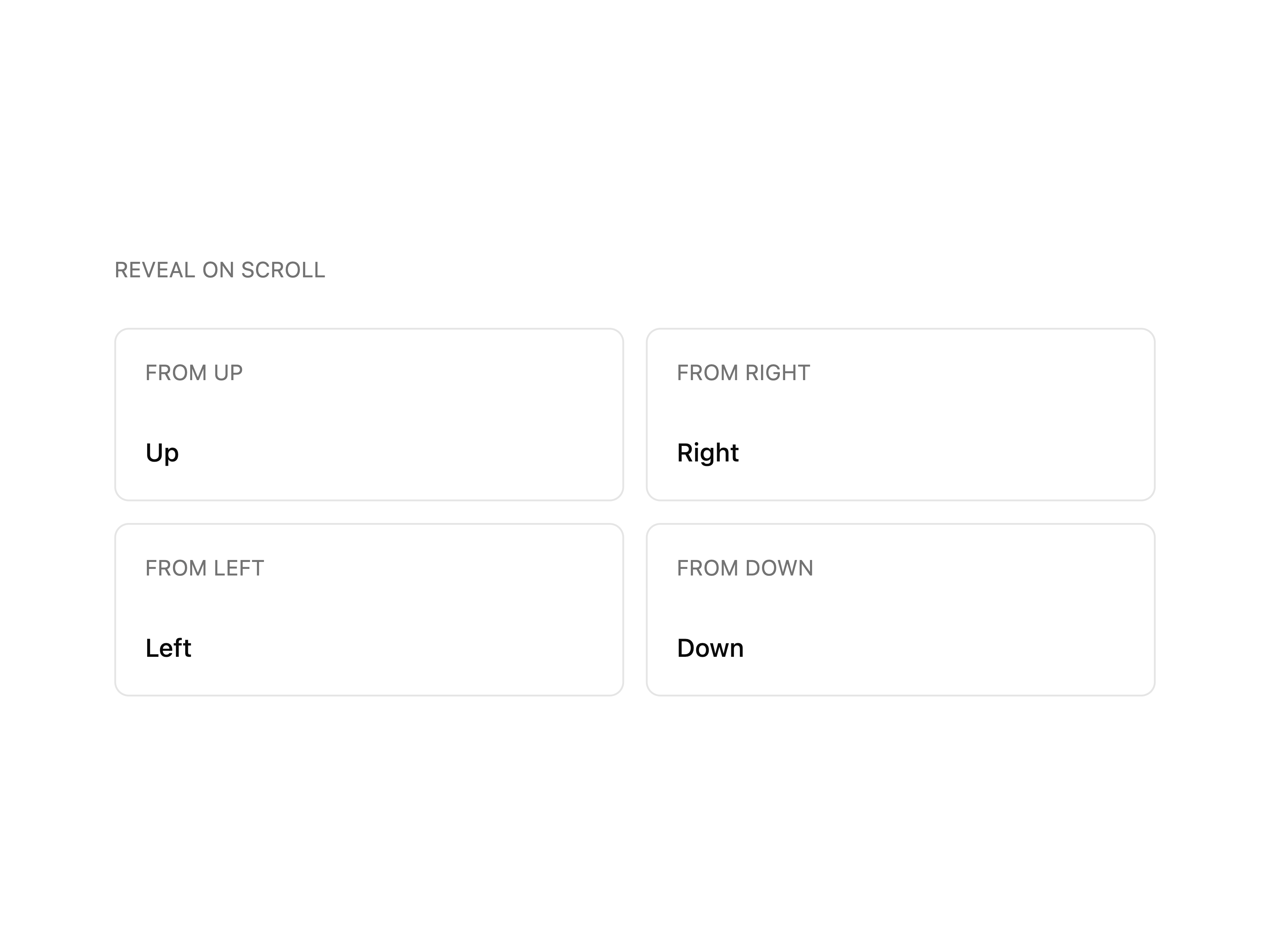
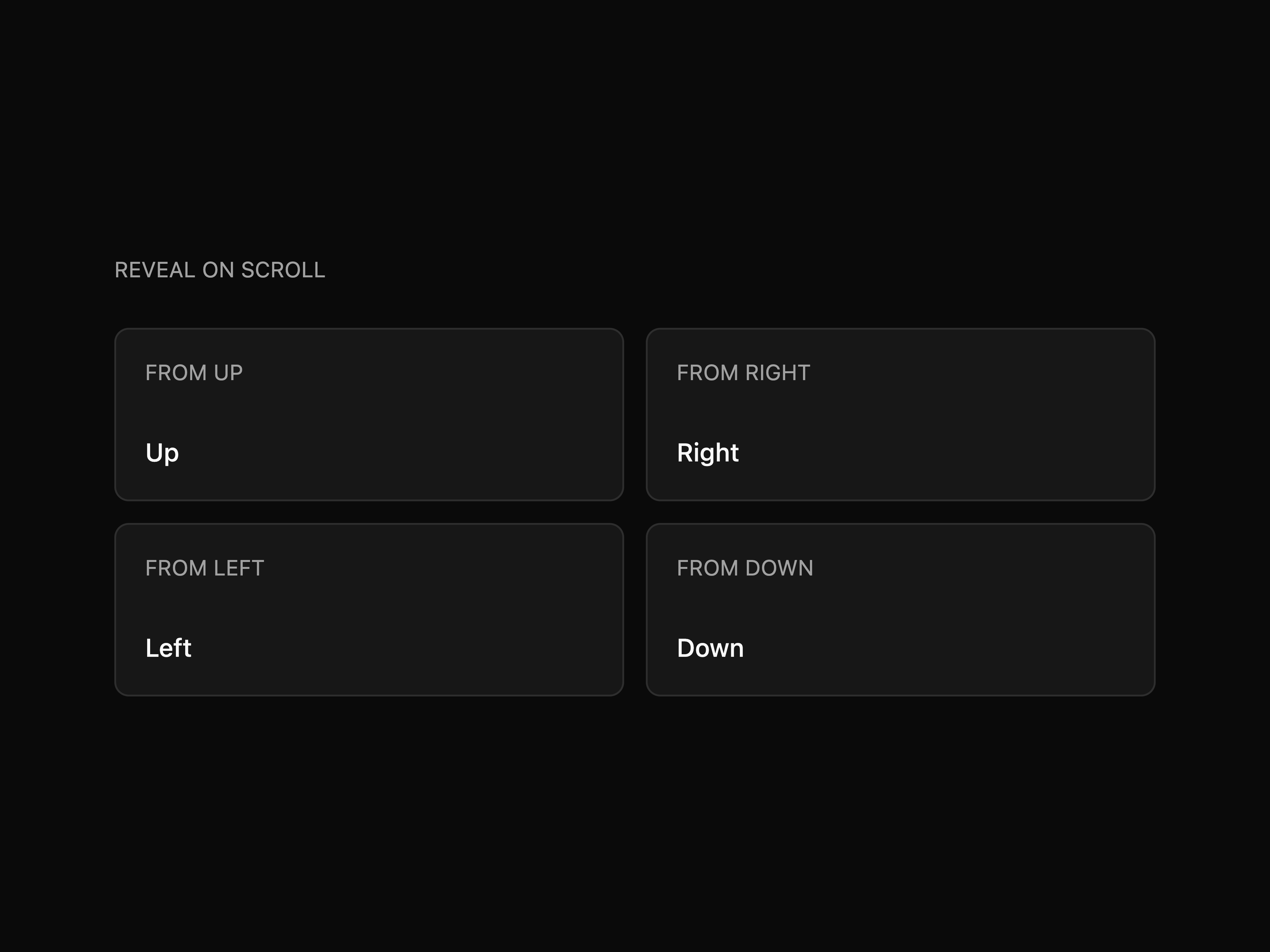
Fades and slides content in from any direction as it enters the viewport. Configurable distance, delay and replay; respects reduced-motion.
Canvas signature capture with velocity-based ink, per-stroke undo, theme-aware re-inking and PNG/JPEG export via ref.
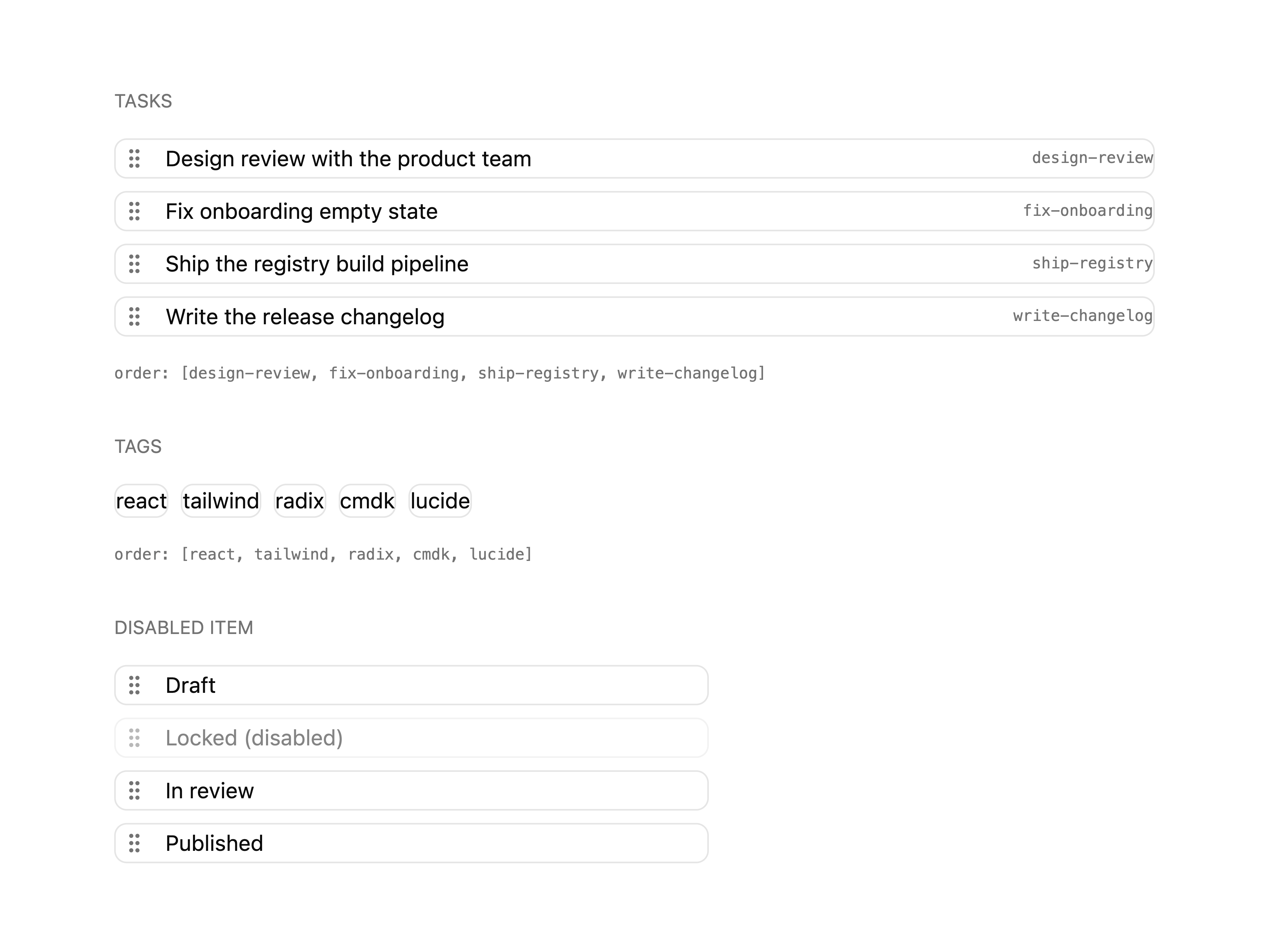
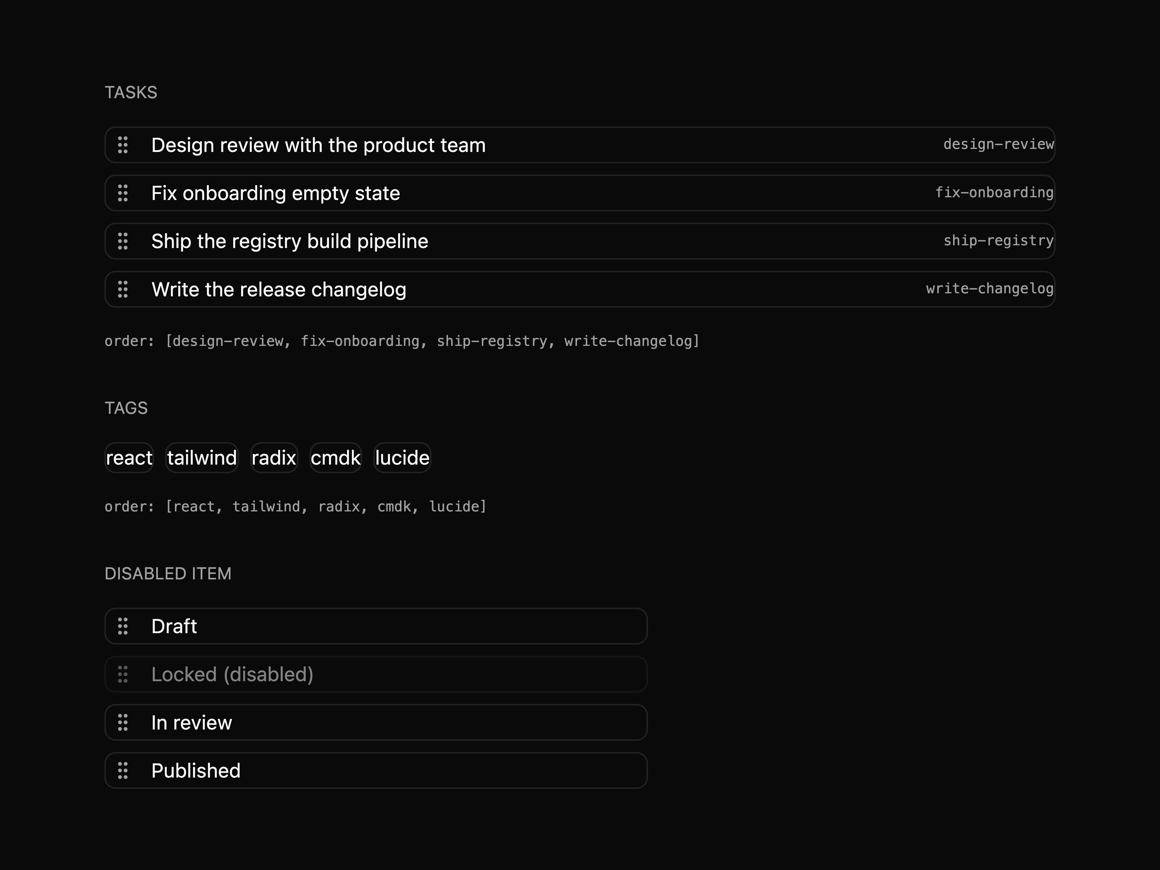
Drag-to-reorder list with pointer and keyboard sorting, handle or whole-item dragging, and live-region announcements. No dnd-kit.
Card surface with a soft spotlight that tracks the cursor and fades in on hover. Built on design tokens, no hard-coded colors.
Multi-step progress indicator with horizontal and vertical orientation, completed / active / inactive states, clickable steps and a compound API.
Terminal surface with a title bar, output lines and an interactive prompt input with command-history recall. Ships composable parts.
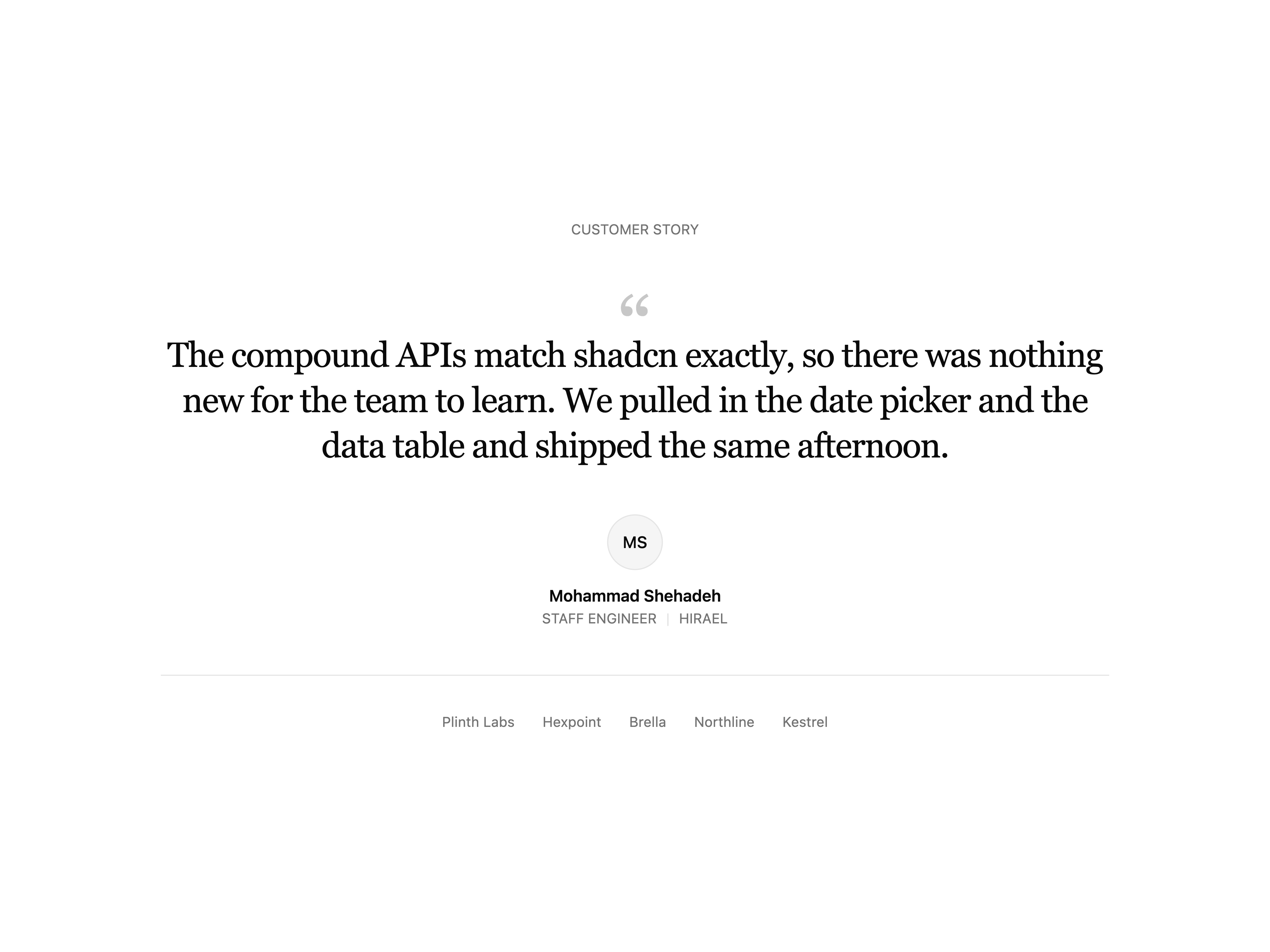
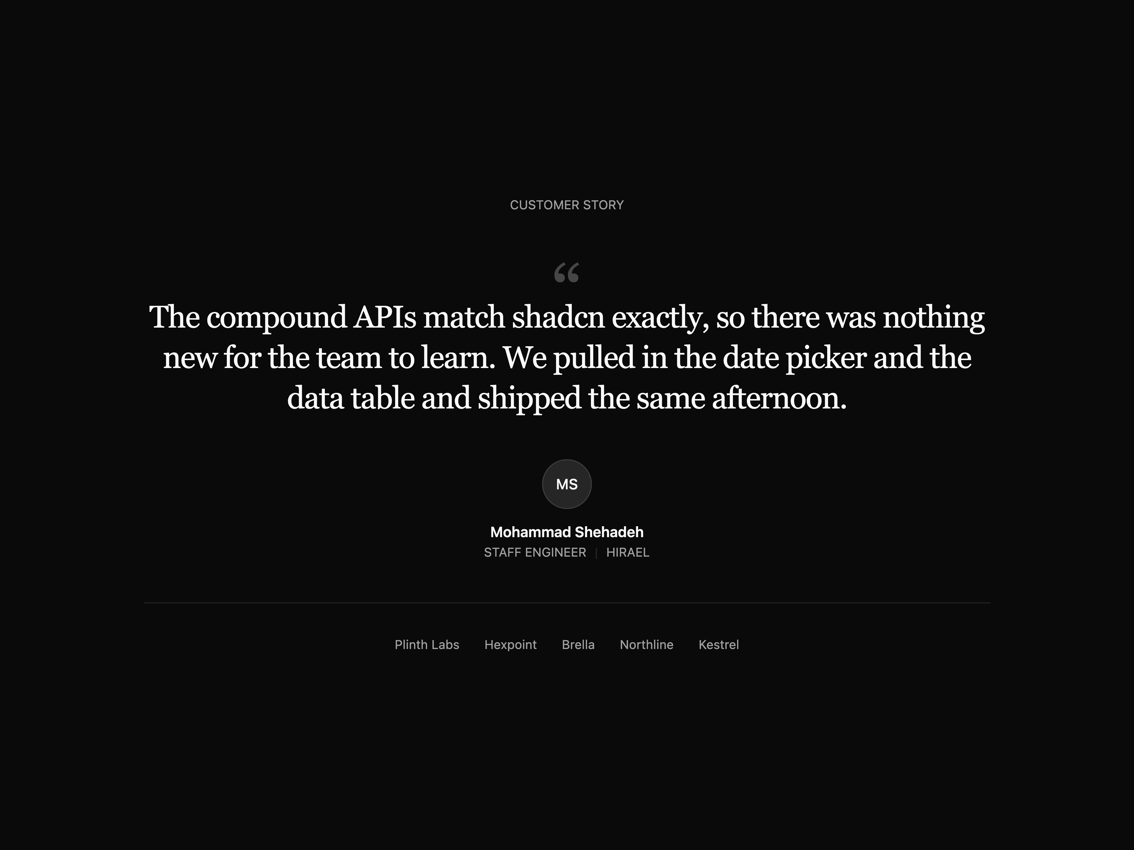
Centered single quote with stylized open-mark, author block (avatar, name, role, company) and a muted wordmark row below.
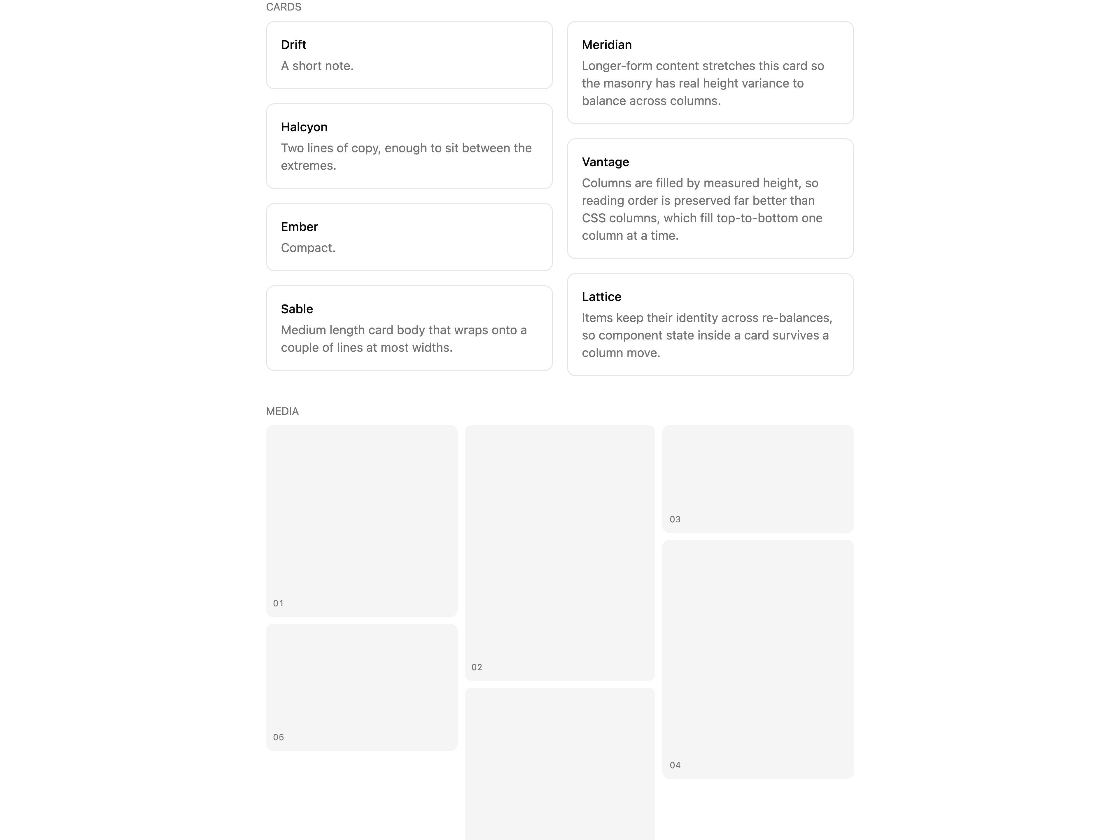
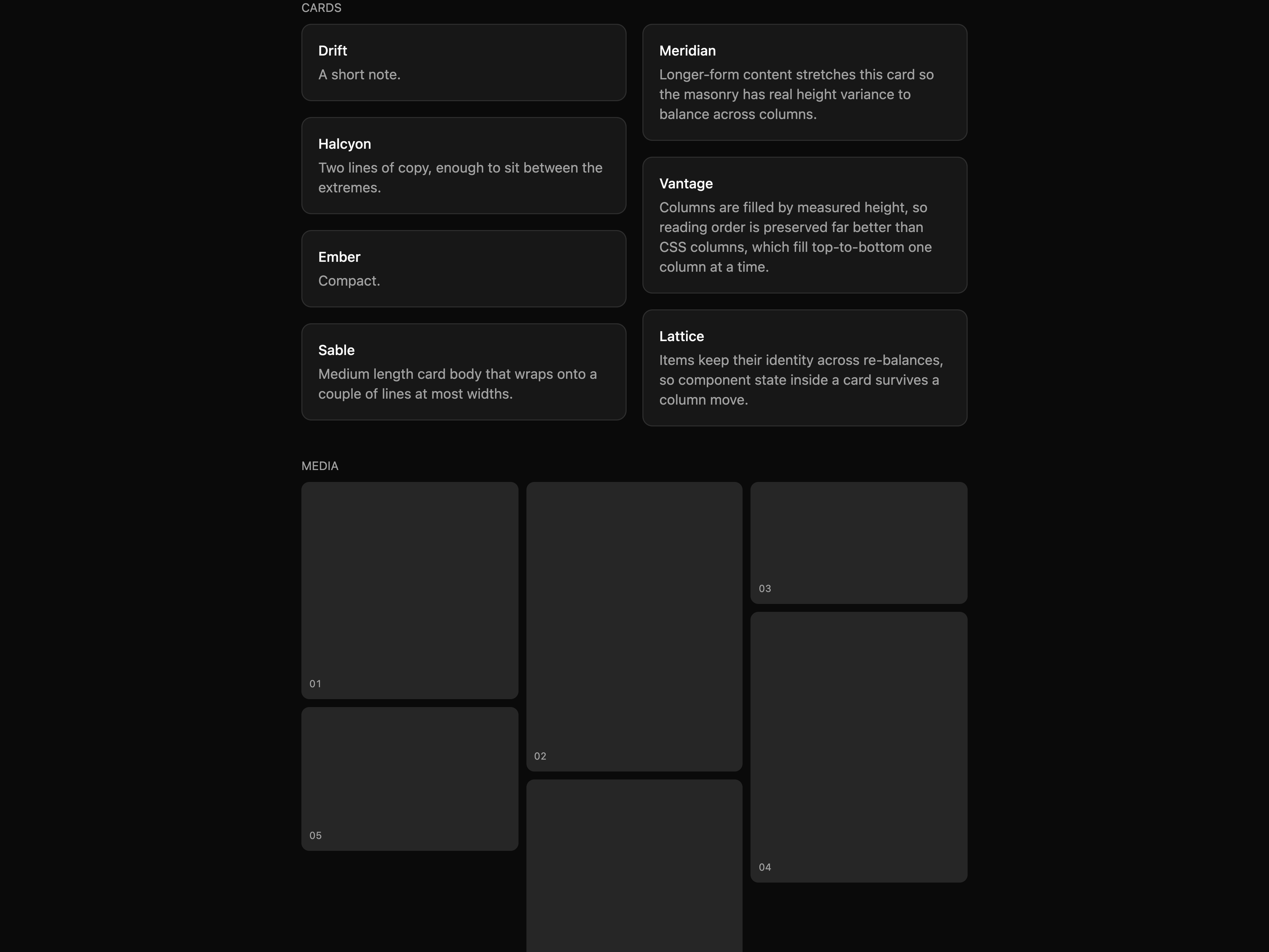
Masonry quote grid (CSS columns) with ~6 bordered quote cards of varying length and author rows.
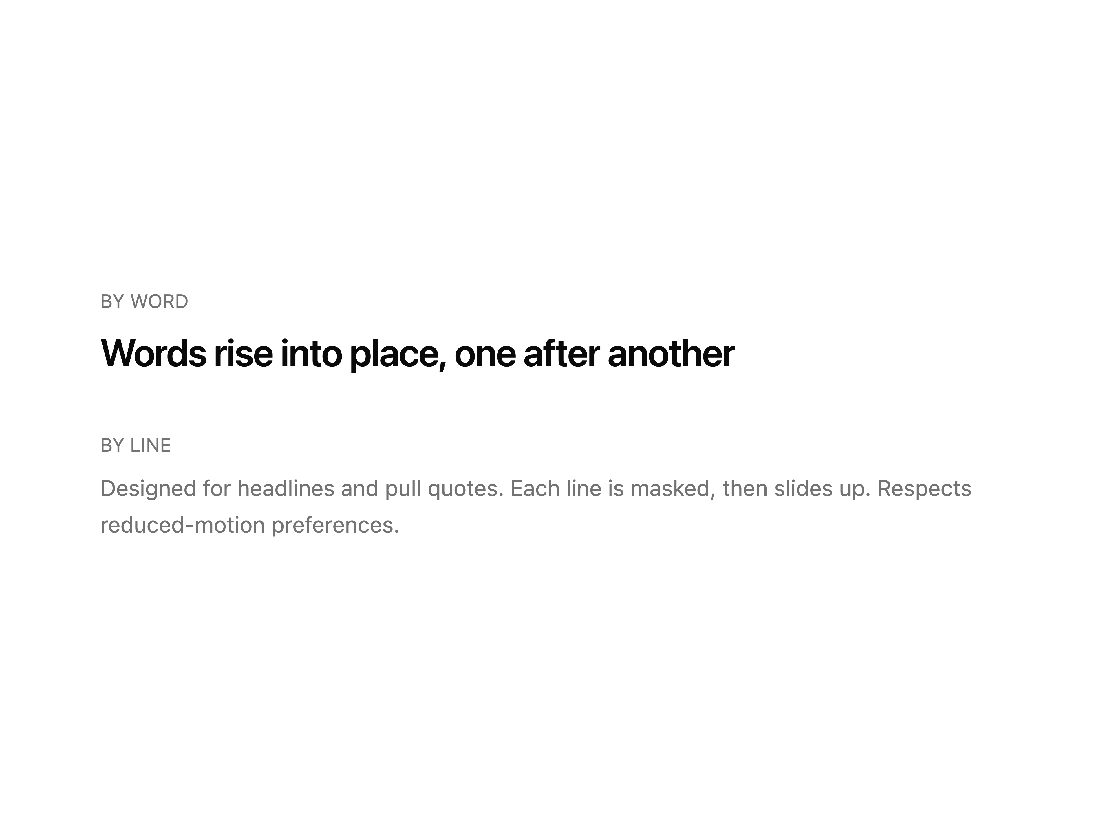
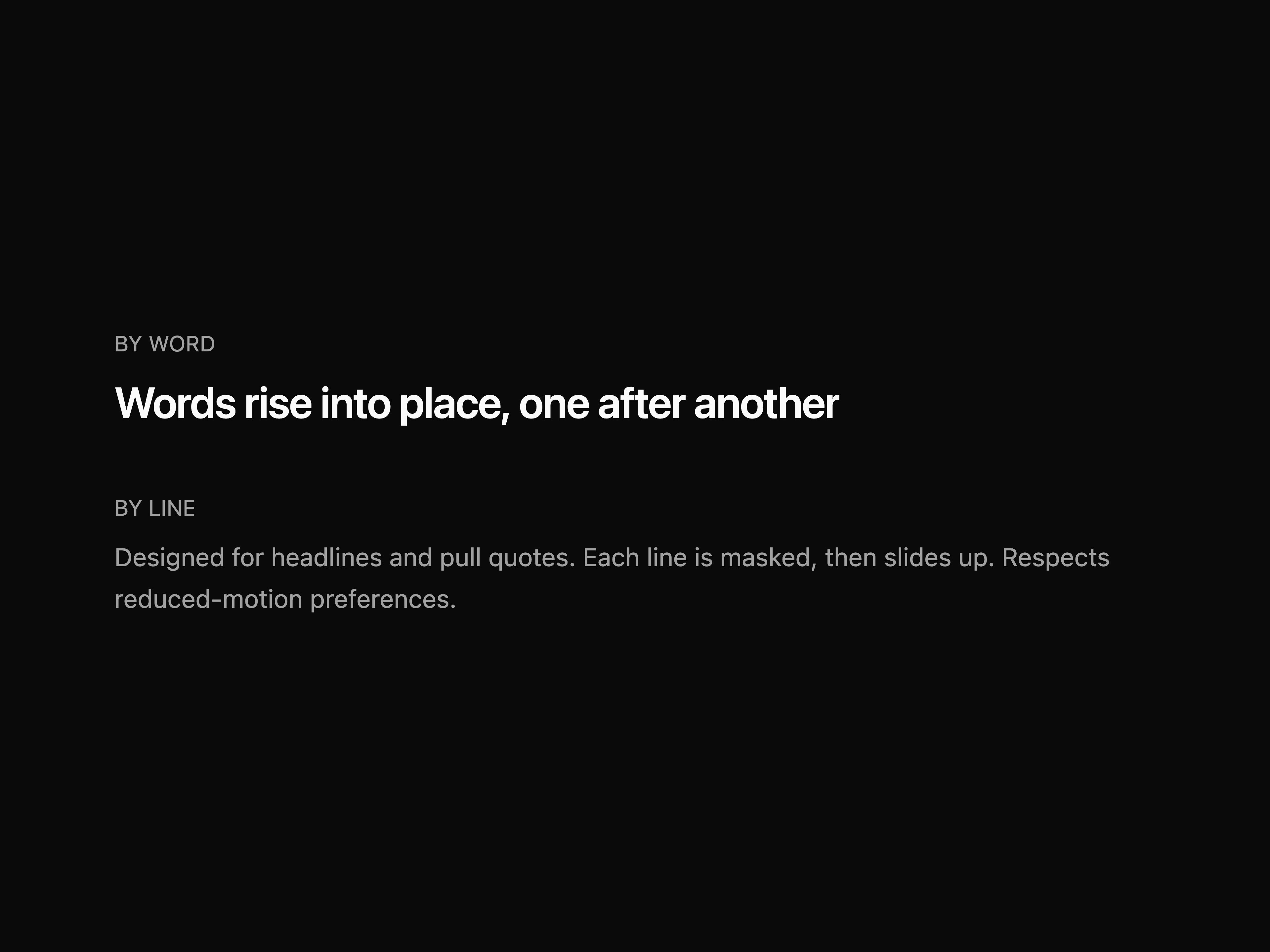
Staggered text entrance that masks and slides each word, character or line into place on scroll. Respects reduced-motion.
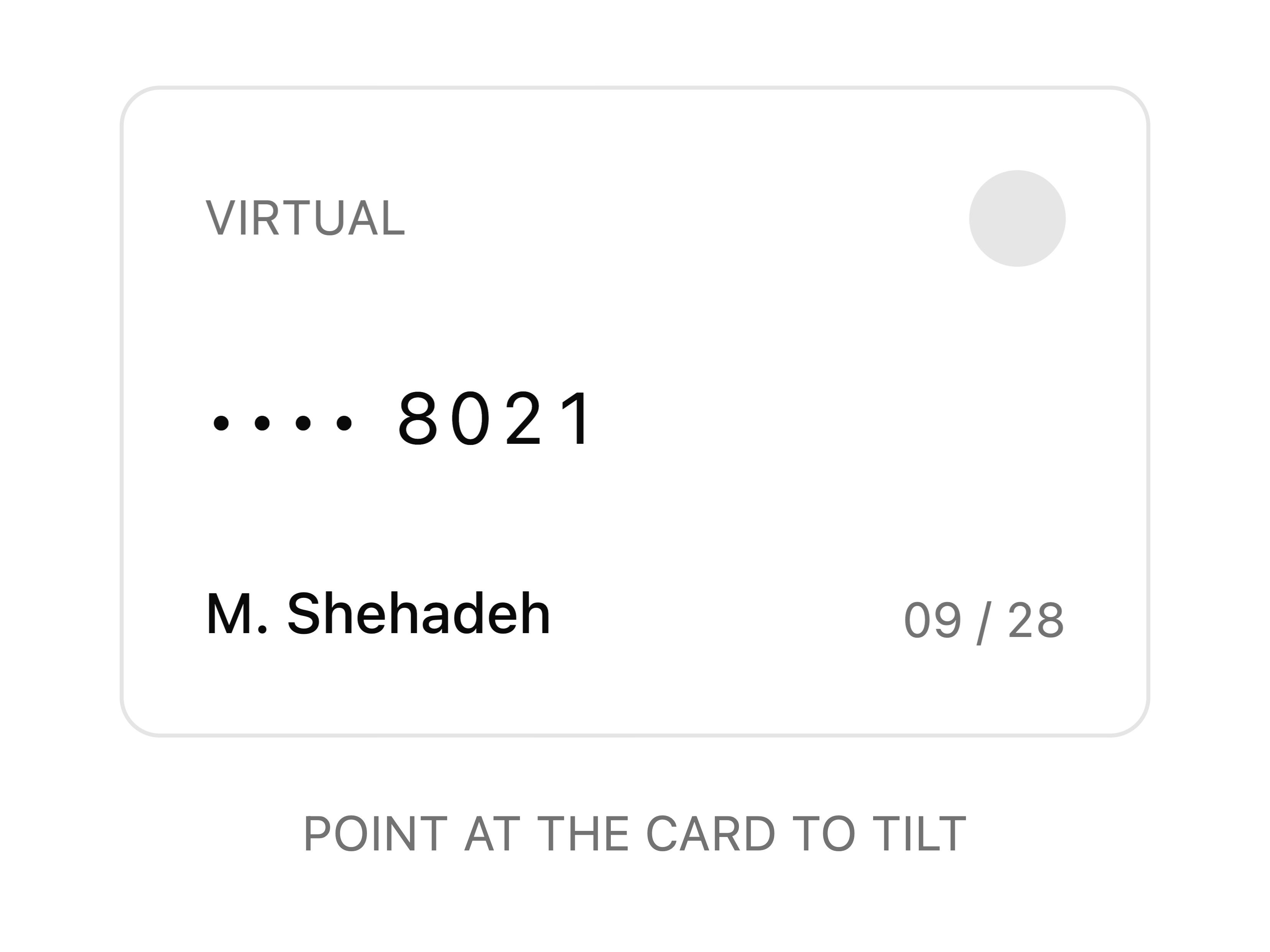
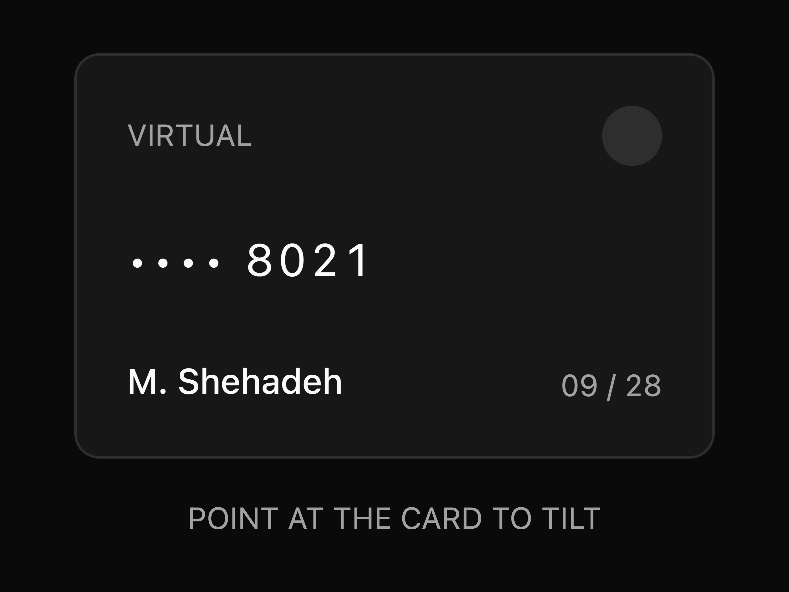
3D pointer tilt with optional cursor-following glare and configurable max angle, scale and perspective. Respects reduced-motion.
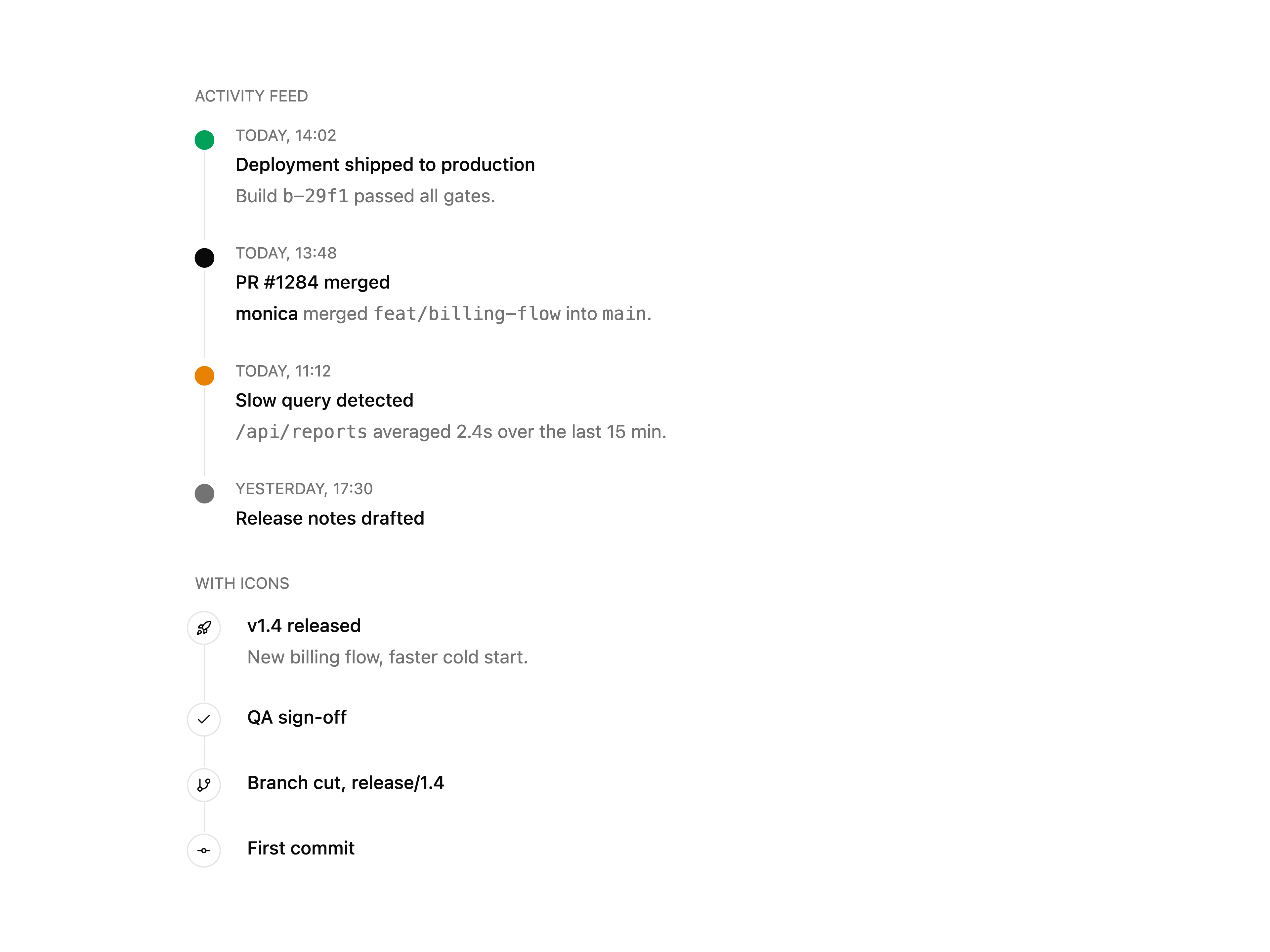
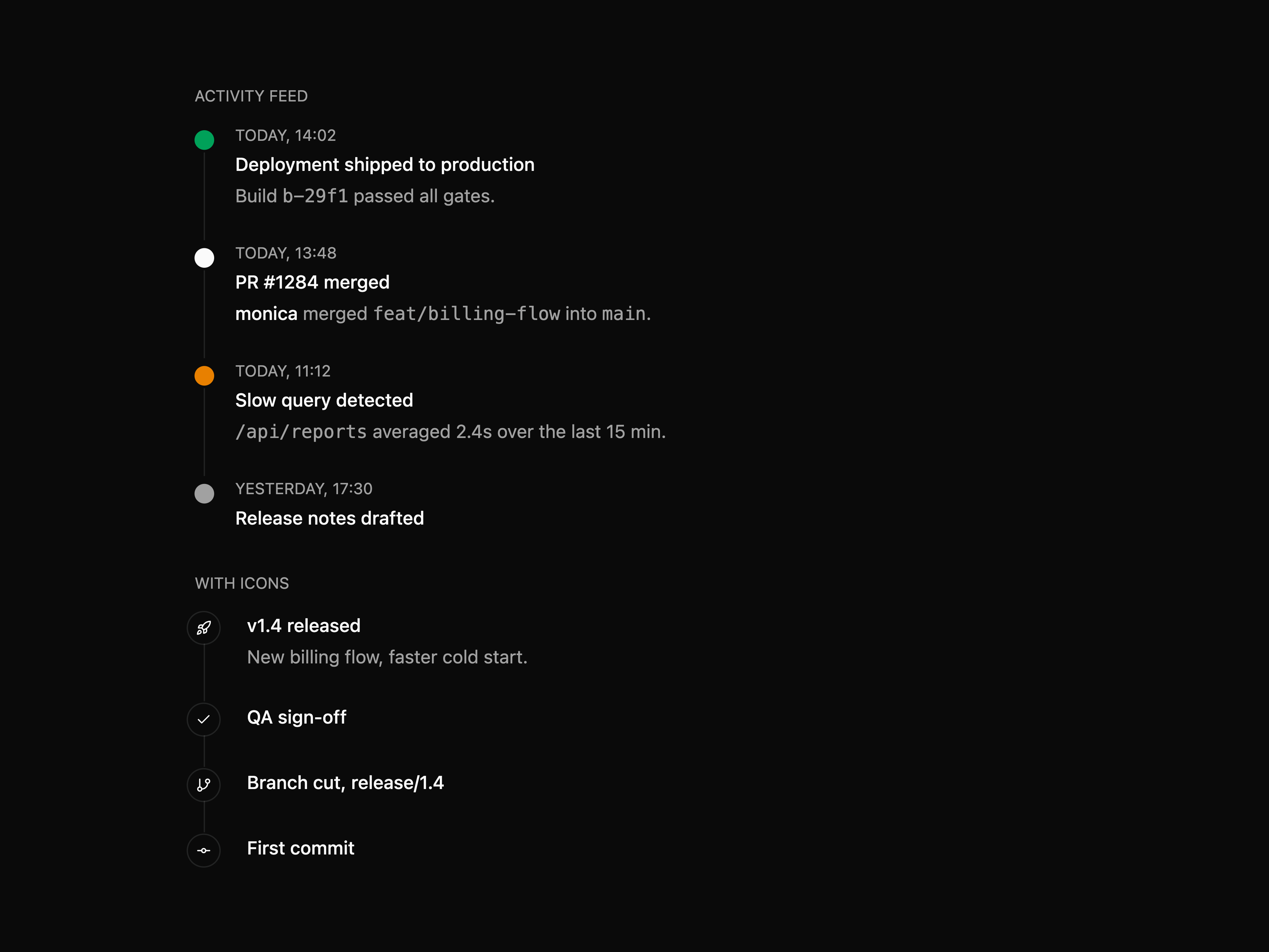
Vertical event timeline with default or icon dots, tone variants and labelled time / title / description parts.
Hour, minute and optional second scroll columns with 12/24h modes, step intervals and keyboard nav.
Premium fintech landing page for a stablecoin: a full-bleed video hero with a custom halo wordmark and an infinite brand marquee, a meet-the-product card grid, a backers marquee, and a use-modes split with an autoplaying video panel, closing on a dark anchor footer. Self-contained light palette.
Dark, premium landing page for an electric RV brand: a full-screen video hero with liquid-glass navigation, a centered tagline, a split feature card with switchable tabs, an HLS streaming statement with a stats row, a video preorder call to action and a multi-column footer. Self-contained pure-black palette, Inter + Instrument Serif type.
The components shadcn/ui doesn't ship.
80+ components, 140+ section blocks and 10+ full-page templates. Built on shadcn primitives, installed with the shadcn CLI, owned by you.
Website · Components · Blocks · Templates · Changelog
npx shadcn@latest add @hirael/multi-select
No setup needed. Hirael is listed in shadcn's registry directory, so any project that uses shadcn/ui can install from it right away.
Every preview is live on hirael.com, with light, dark and RTL toggles.
| Inputs | multi-select, tag input, phone, currency, address, credit card, mention, password, duration, number range |
| Pickers | date, date range, time, month, year, color, emoji, country |
| Files and media | file dropzone, image cropper, avatar upload, signature pad, lightbox, image compare, audio player |
| Data | data table, kanban, tree view, JSON viewer, diff viewer, YAML editor, cron editor, calendar heatmap, sparkline |
| Overlays and flows | command palette, product tour, dock, stepper, confirm dialog, unsaved-changes guard, table of contents |
| Motion | marquee, text reveal, scroll reveal, animated number, spotlight card, tilt card, morphing dialog |
| Blocks | hero, feature, pricing, FAQ, auth, dashboard, app shell, ecommerce, AI chat, cloud console, changelog and more |
| Templates | complete landing pages, portfolios and SaaS sites, ready to edit |
1. Set up shadcn/ui if your project doesn't use it yet.
npx shadcn@latest init
2. Add the components you need. The CLI also installs anything they depend on, including the shadcn/ui components they're built from.
npx shadcn@latest add @hirael/multi-select @hirael/date-range-picker @hirael/pricing-04
3. Use them in your code.
'use client';
import { useState } from 'react';
import { MultiSelect, MultiSelectContent, MultiSelectTrigger } from '@/components/multi-select';
const frameworks = [
{ value: 'next', label: 'Next.js' },
{ value: 'remix', label: 'Remix' },
{ value: 'astro', label: 'Astro' },
];
export function FrameworkPicker() {
const [value, setValue] = useState([]);
return (
);
}
The commands above install the Radix UI version. If your project uses Base UI,
install from the base path instead:
npx shadcn@latest add https://hirael.com/r/base/multi-select.json
Hirael is free and MIT licensed. If it saved you a few hours:
Sponsored by Sahabti.
Contributions are welcome, from bug fixes to new components and blocks. Please read the contributing guide to learn how the project is organized and how to submit a change, and follow our Code of Conduct.
Running the site locally
This repository is the Hirael website. It previews every component, block and template, and serves the files the shadcn CLI installs from. You'll need Node.js 24 and pnpm 12.
git clone https://github.com/MohammadShehadeh/hirael.git
cd hirael
pnpm install
pnpm dev
The site runs at http://localhost:3000.
| Command | What it does |
|---|---|
pnpm dev | Starts the development server |
pnpm build | Builds the registry and exports the static site to out/ |
pnpm test | Runs the tests |
pnpm lint | Checks the code with ESLint |
pnpm typecheck | Checks the TypeScript types |
See the contributing guide for how the code is organized.
Please report security vulnerabilities privately, as described in SECURITY.md.
MIT © Mohammad Shehadeh. See LICENSE.
The packages and primitives its components pull in, counted across the registry.
Every appearance and removal our crawl has seen in the registry index.
Hirael is a component library on 21st.dev by Mohammad Shehadeh with 149 public React components. Every component ships with a live interactive preview and full TSX source — copy the code, install it through the shadcn CLI, or pull it into Cursor or Claude Code over MCP.