
tailwind-admin
8components11.7Kviews28bookmarks
Installs all 102 components. Without our CLI, run instead.
Auto-indexed
tailwind-admin contents
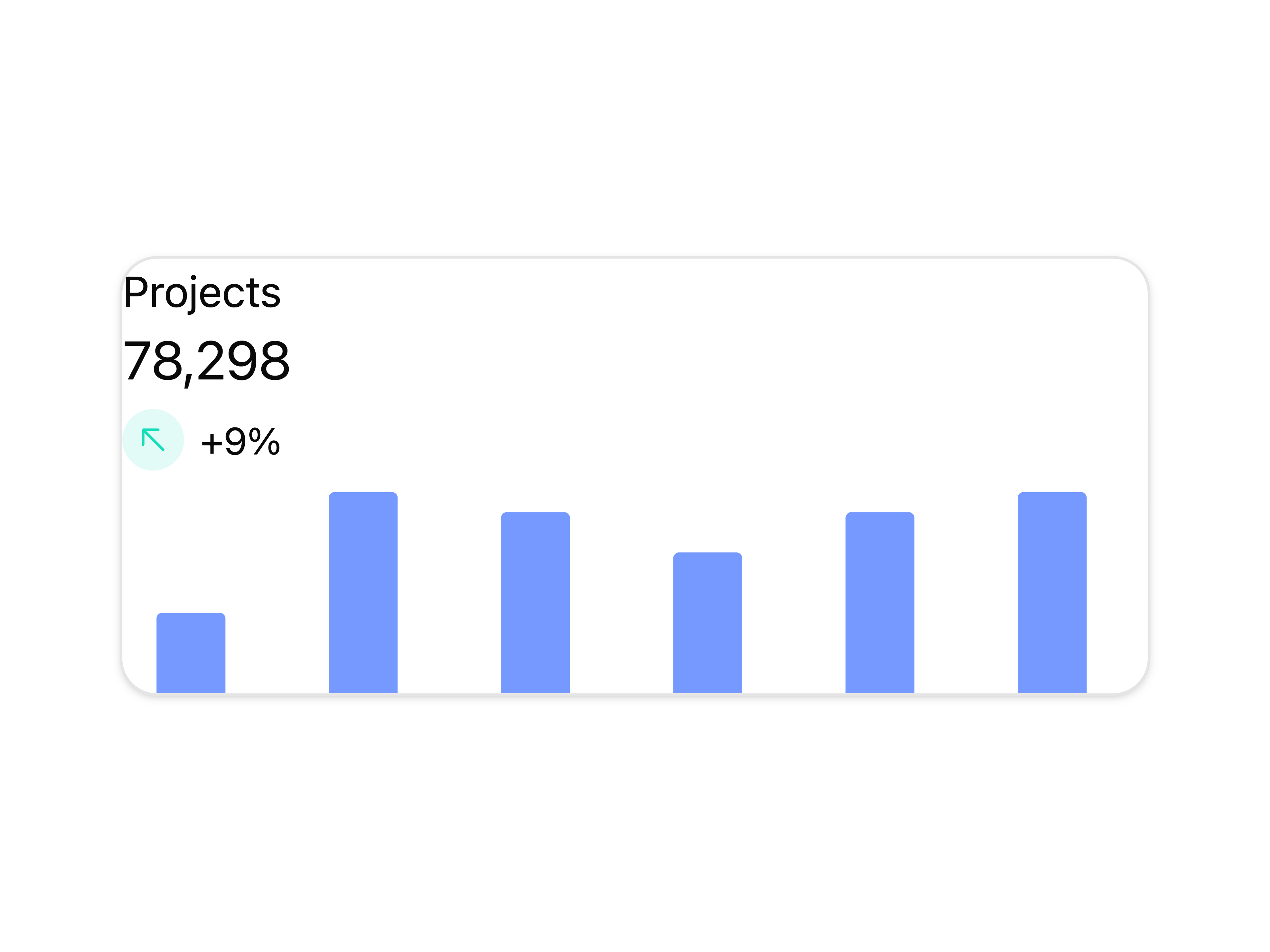
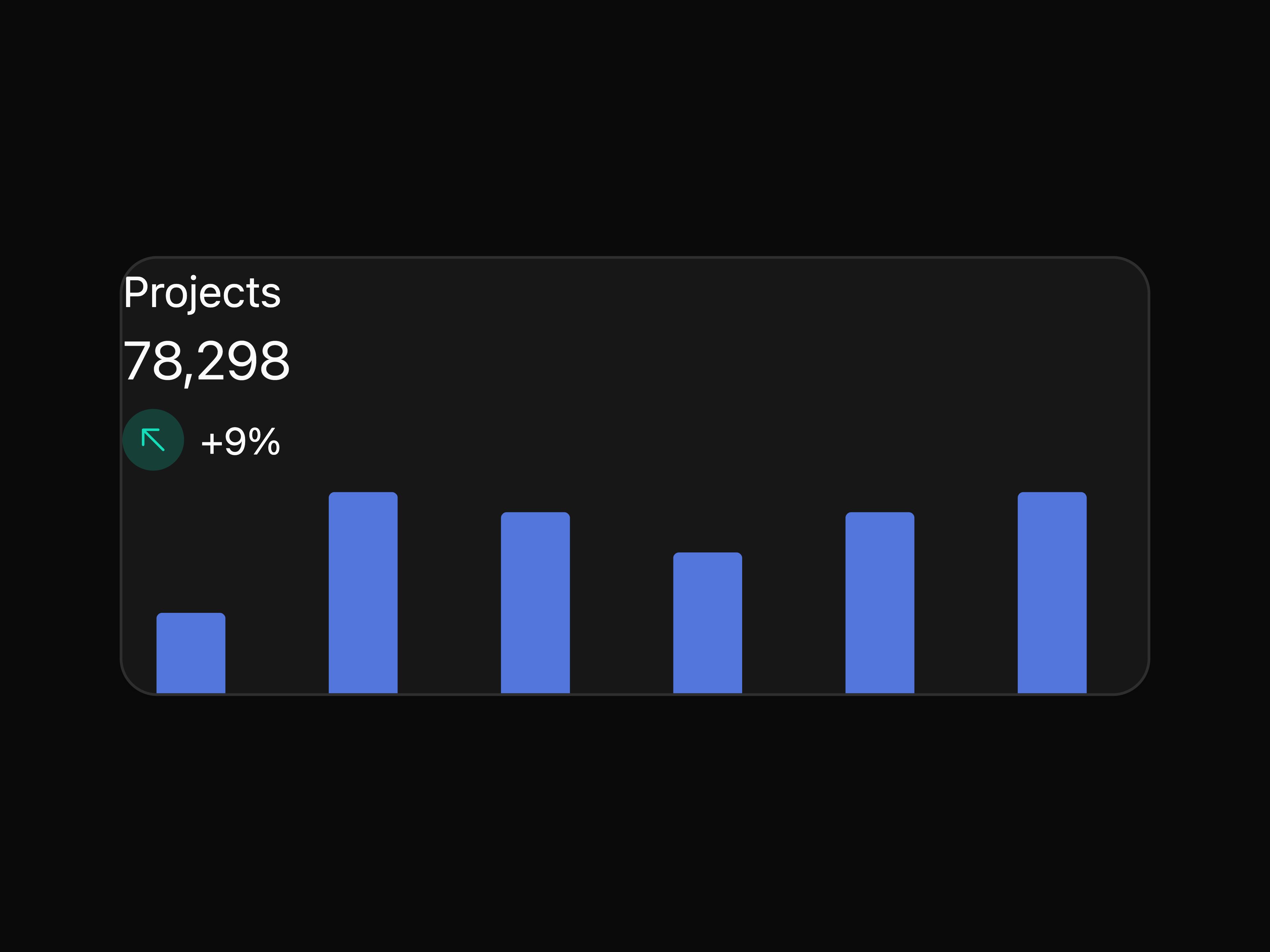
Projects Sparkline Chart Card
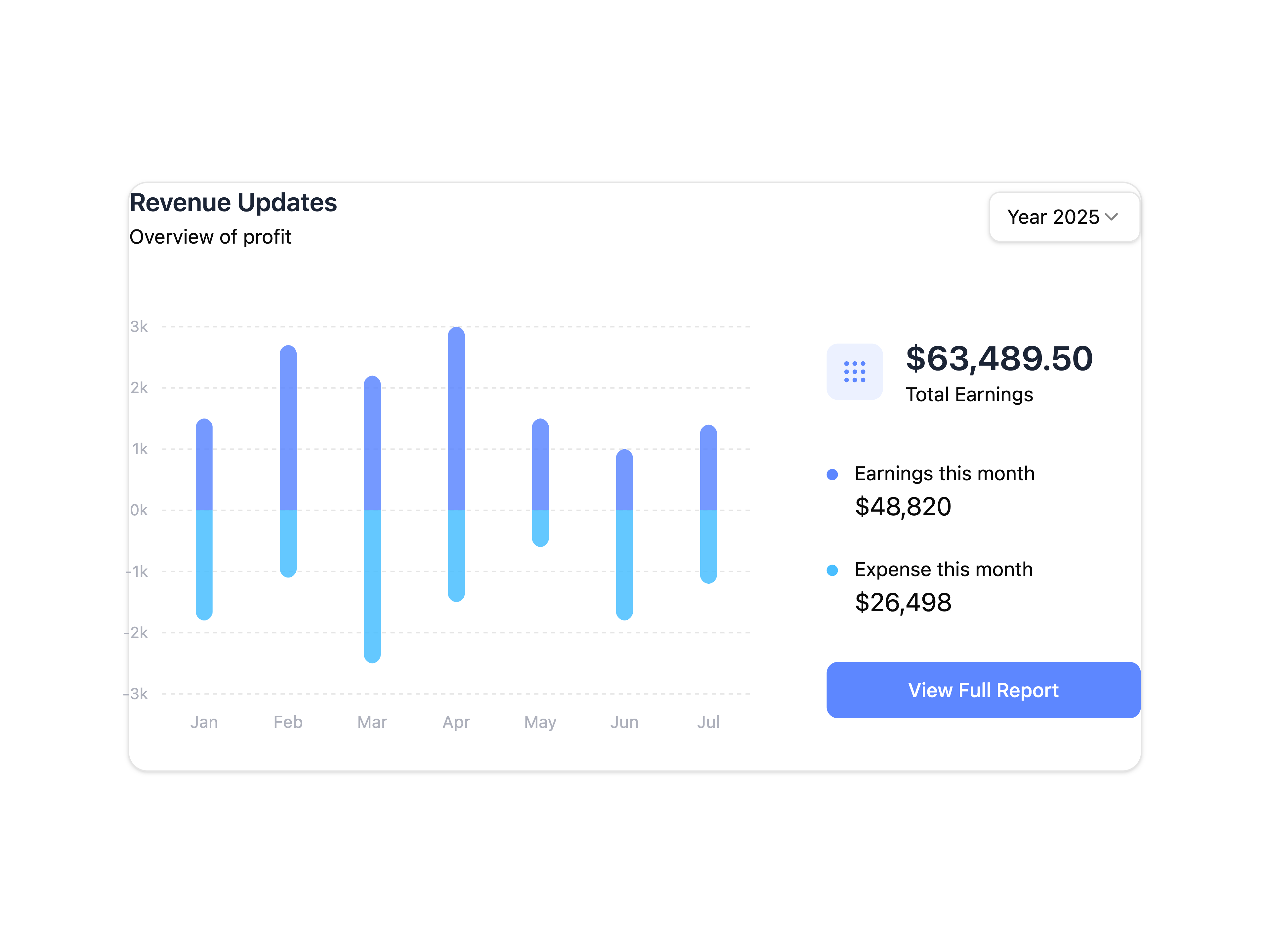
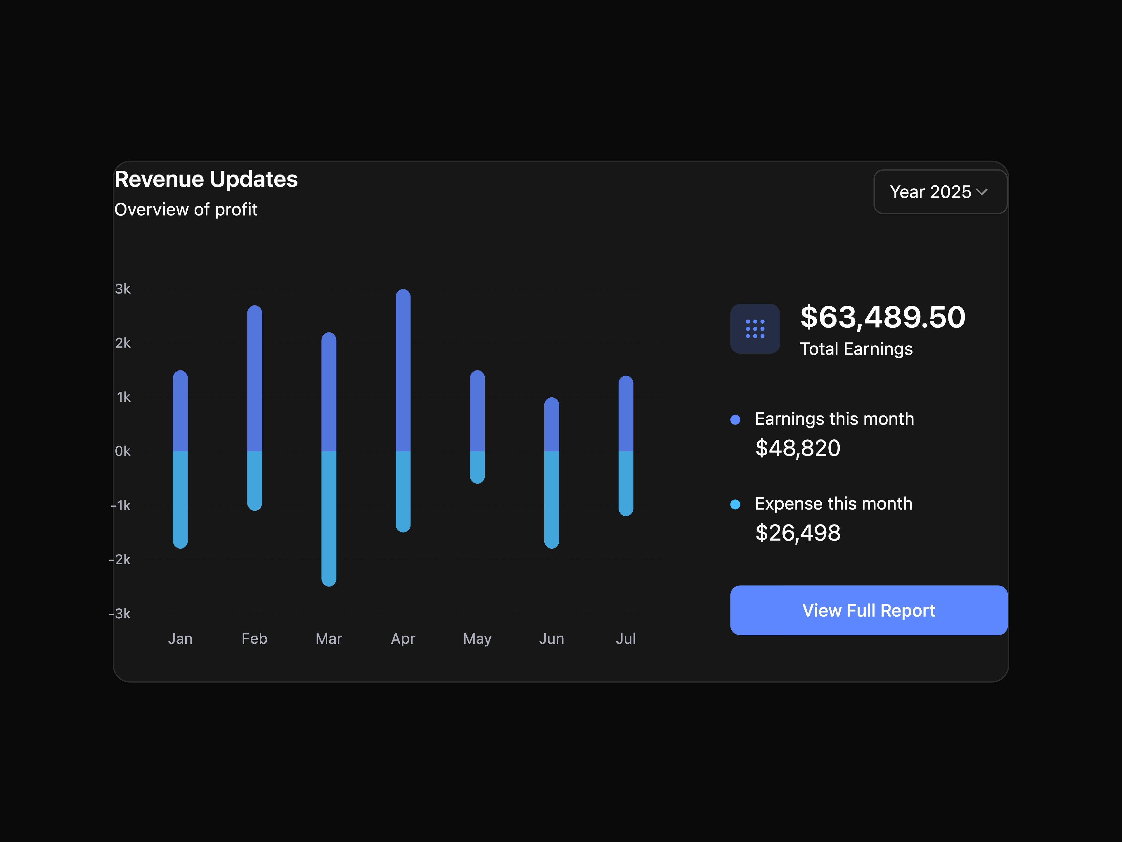
Revenue Updates Chart
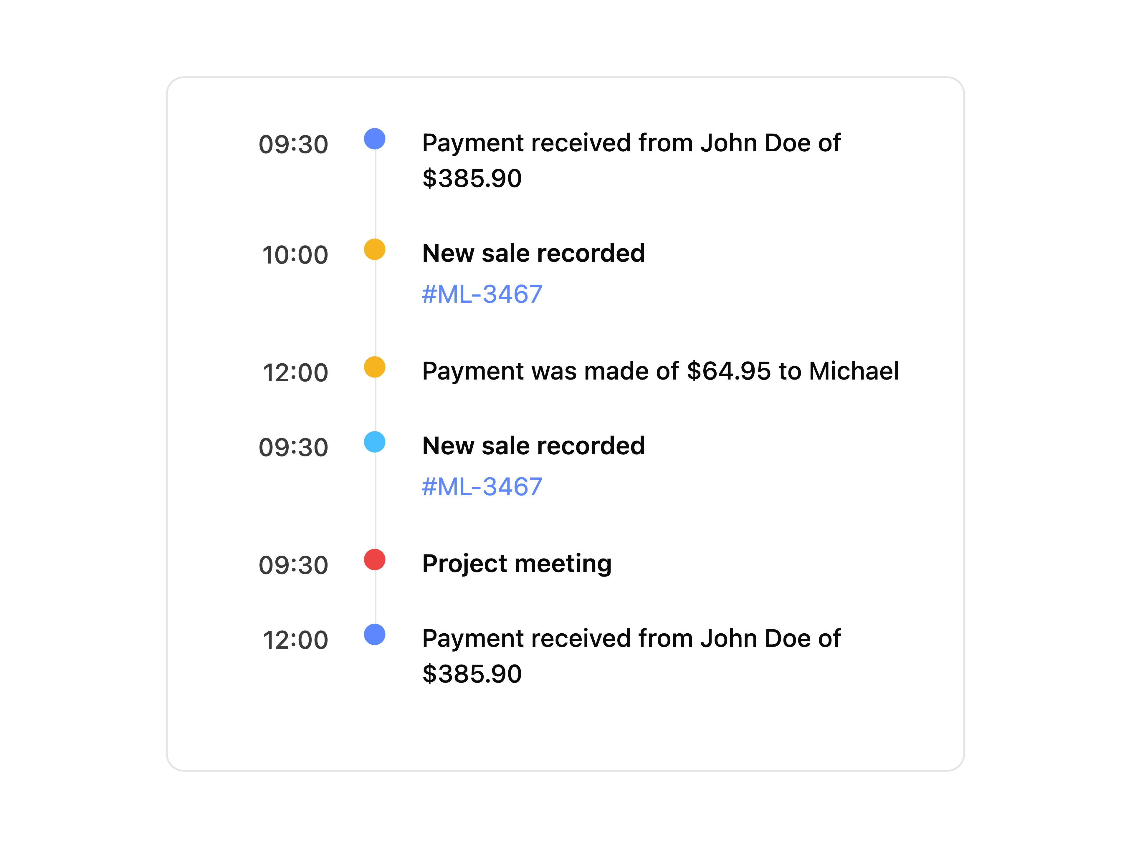
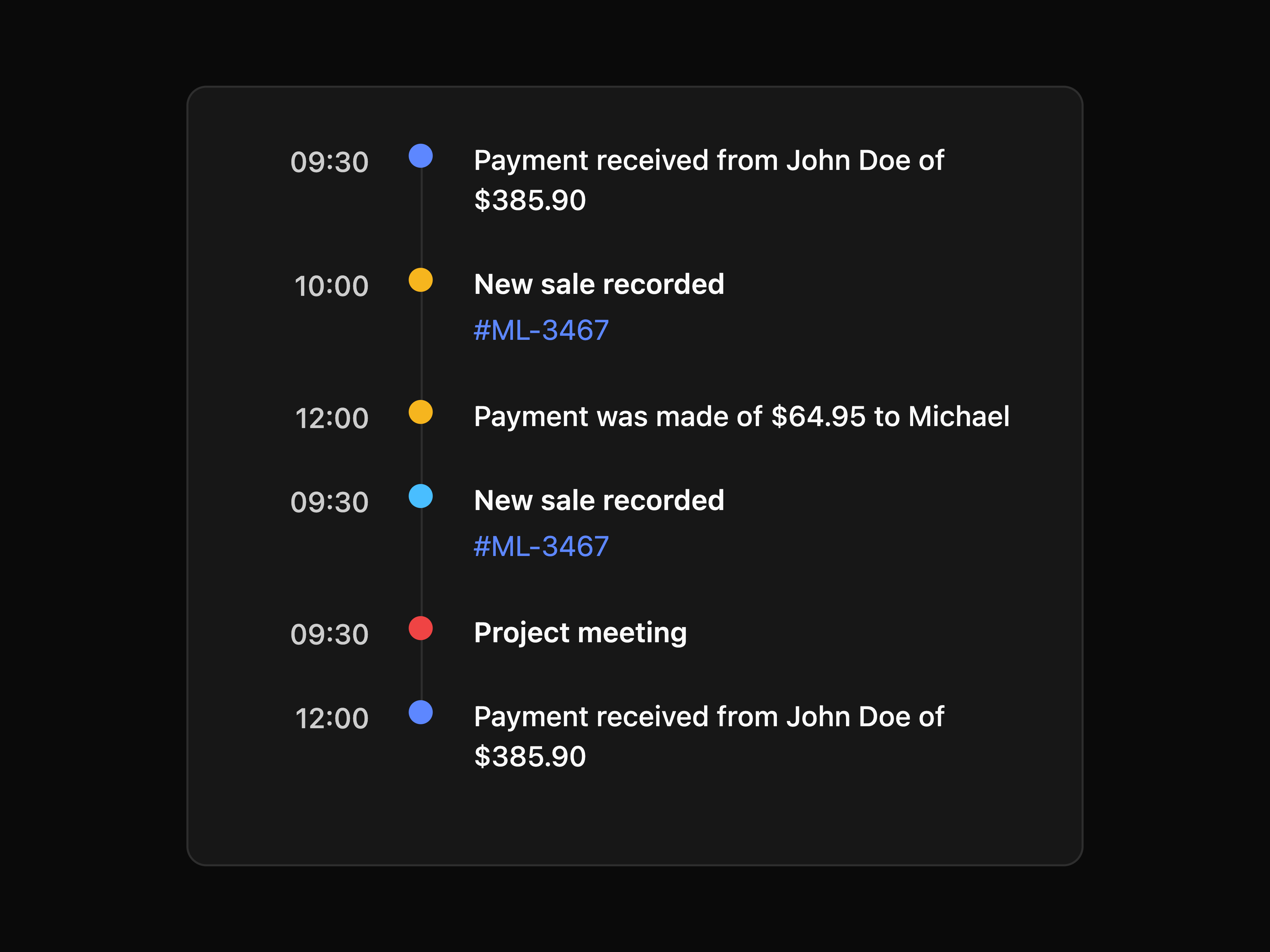
Action Tracking Timeline
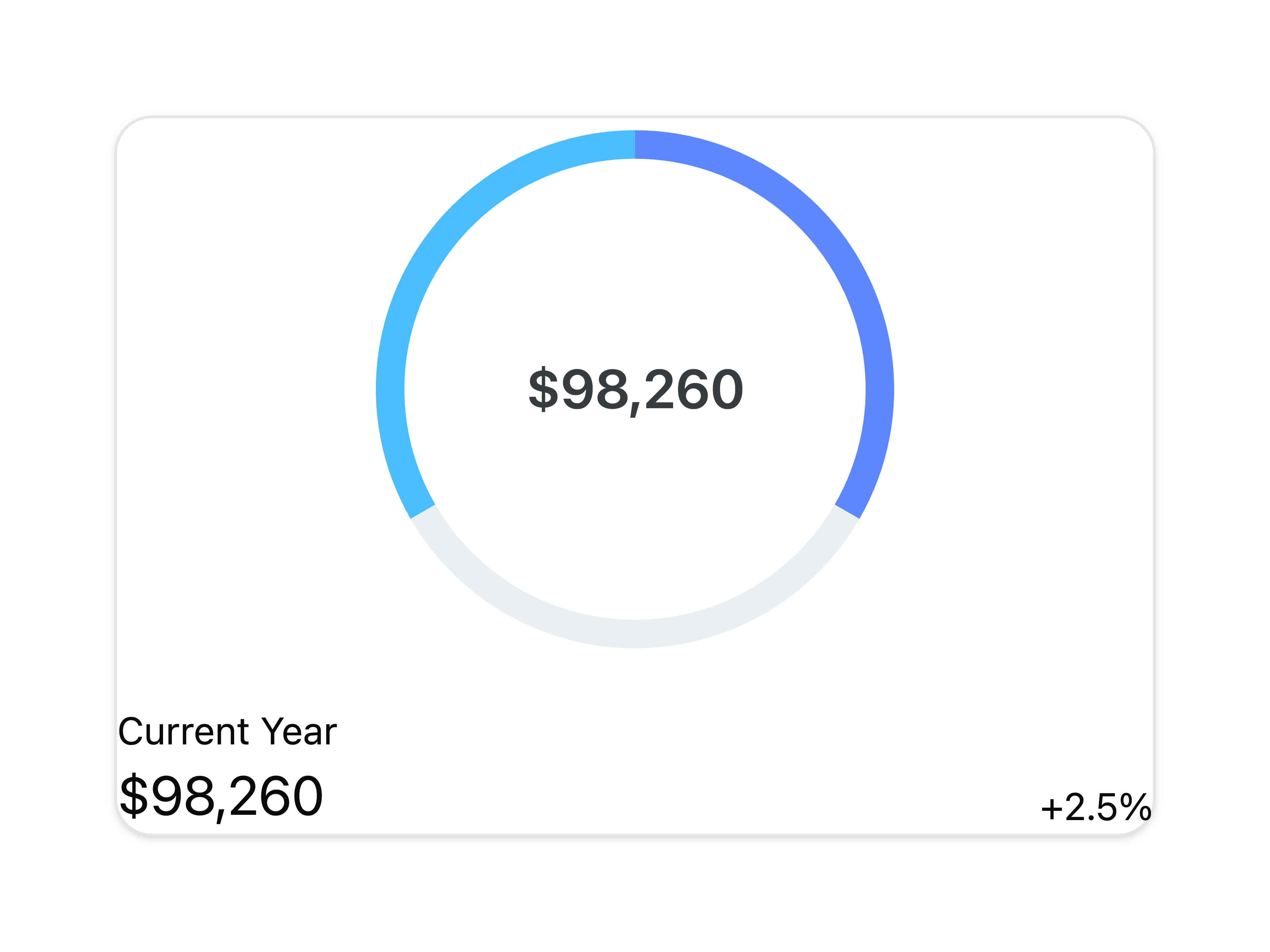
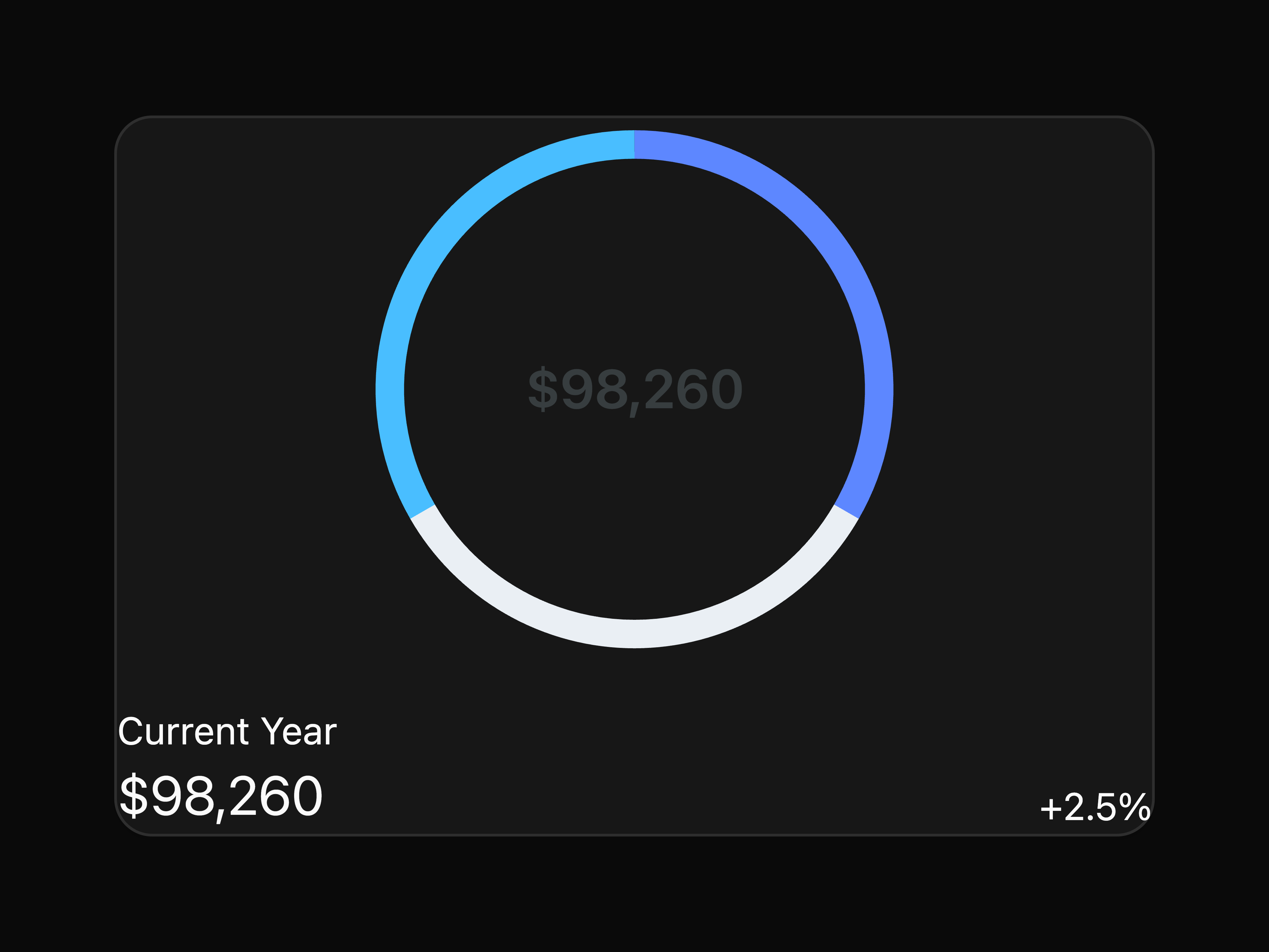
Current Year Chart

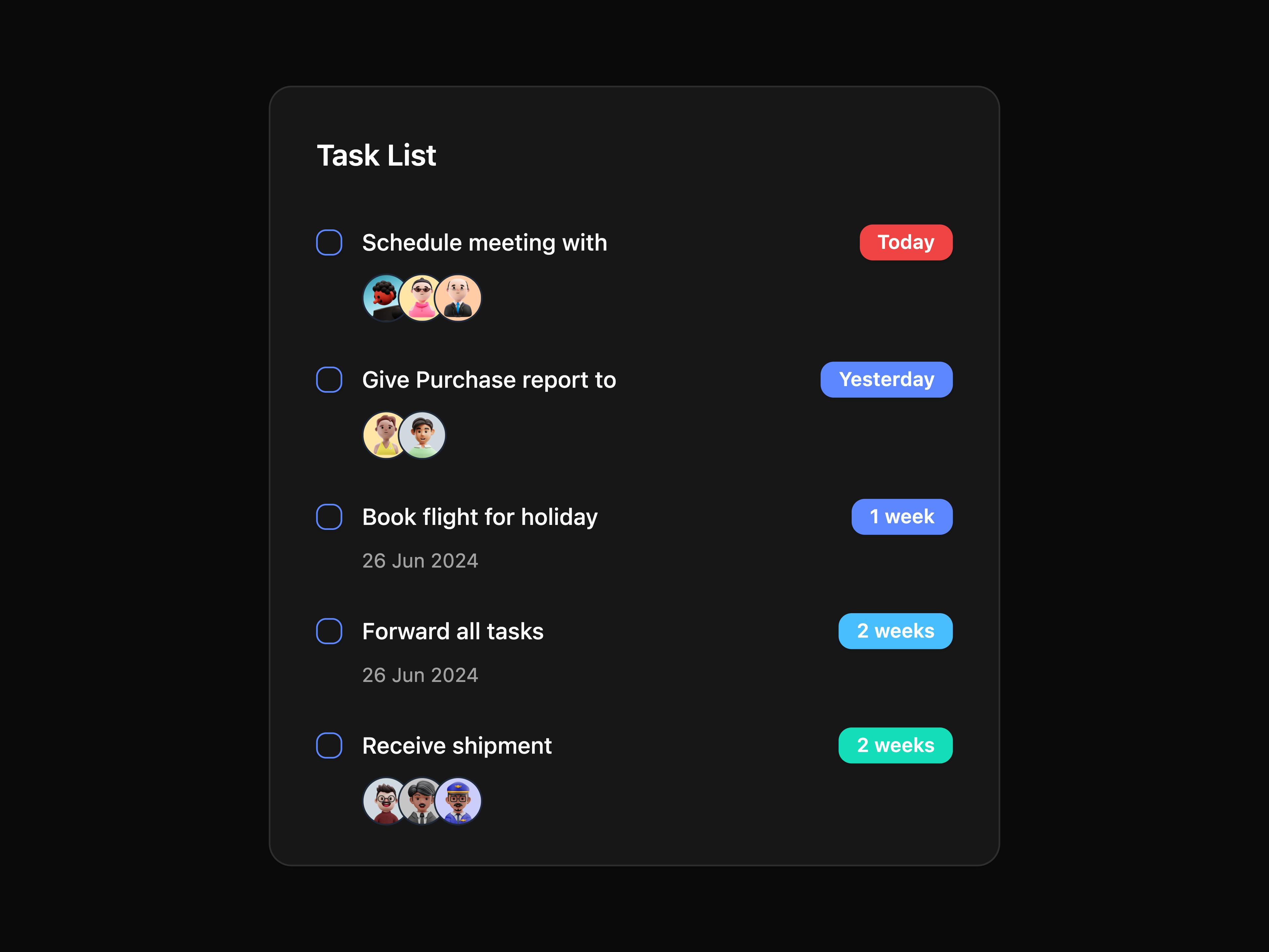
Task List Card


Signup Form Split


Elastic Slider Motion

Animate Table Motion
That's all 8 components
About tailwind-admin
tailwind-admin publishes a shadcn registry at tailwind-admin.com, with 102 components installable through the shadcn CLI.
- Components
- 102
- GitHub stars
- 286
- Last commit
- May 26, 2026
Also in the tailwind-admin registry
Copy a prompt for your agent, copy the install command, or open the docs that ship it.
alert-card-motion
A Card component with alert animation.
framer-motion, lucide-react1 fileanimate-border-card-motion
A Card component with animated border effect.
lucide-react2 filesanimated-list-motion
A list component with staggered animation.
motion/react, simplebar-react, lucide-react1 fileanimated-tab-motion
A tab component with animated selection.
motion/react1 fileanimated-text-background-motion
A text component with animated gradient background.
framer-motion1 fileanimated-tooltip-motion
A tooltip component with animated selection.
motion/react1 filebell-notify-button
A Button component with optional code display for UI blocks.
motion/react, lucide-react1 filebest-selling-product
A Card component with optional code display for UI blocks.
card, button1 fileblog-cards
A Card component with optional code display for UI blocks.
@iconify/react, react-icons1 filecard-circle-motion
A Card component with circle reveal animation.
framer-motion1 filecard-lift-motion
A Card component with lift animation on hover.
framer-motion1 filecurrent-value-chart
A Chart component with optional code display for UI blocks.
card, button1 filecustomers-chart
A Chart component with optional code display for UI blocks.
card1 filedownload-banner
A banner component with optional code display for UI blocks.
button1 fileearned-chart
A Chart component with optional code display for UI blocks.
card1 fileempty-banner
A banner component with optional code display for UI blocks.
button, card1 fileerror-banner
A banner component with optional code display for UI blocks.
button, card1 fileexpandable-card-motion
A Card component that expands on click.
motion/react, lucide-react1 fileexpnace-chart
A Chart component with optional code display for UI blocks.
card1 filefeed-cards
A Card component with optional code display for UI blocks.
@iconify/react1 filefile-upload-motion
A file upload component with drag and drop animation.
motion/react, @tabler/icons-react, react-dropzone1 fileflip-card-motion
A Card component with flip animation.
framer-motion, @iconify/react1 filefollowers-chart
A Chart component with optional code display for UI blocks.
@iconify/react1 filegift-cards
A Card component with optional code display for UI blocks.
card, button1 fileglitch-button
A Button component with glitch animation effect.
framer-motion1 fileglow-link-button
A Button component with glow effect on hover.
1 filegreeting-banner
A banner component with optional code display for UI blocks.
@iconify/react1 fileheartbeat-effect-button
A Button component with heartbeat effect animation on hover.
button1 fileheart-like-button
A Button component with heart animation for like functionality.
motion/react, lucide-react1 filehover-lift-button
A Button component that lifts on hover.
framer-motion1 fileimage-comparison-motion
A component for comparing two images with a slider.
motion/react1 fileincome-chart
A Chart component with optional code display for UI blocks.
card1 fileinput-form-motion
An input form component with spotlight effect.
motion/react1 fileinput-placeholder-motion
An input form component with spotlight effect.
motion/react1 fileinsight-card-motion
A Card component displaying insights with animation.
lucide-react1 filelink-preview
An preview link component with spotlight effect.
motion/react, qss1 fileliquid-fill-button
A Button component with liquid fill animation on hover.
framer-motion1 filelogin-1
A Card component with optional code display for UI blocks.
card, button, field, input1 filelogin-2
A Card component with optional code display for UI blocks.
button, field, input1 filelogin-3
A Card component with optional code display for UI blocks.
button, field, input, card1 filelogin-4
A Card component with optional code display for UI blocks.
button, field, input, card1 filemagnetic-button
A Button component with magnetic effect animation on hover.
button1 filematrix-rain-button
A Button component with matrix rain animation effect.
framer-motion1 filemessage-card-motion
A Card component displaying messages with animation.
lucide-react1 filemonthly-earning-chart
A Chart component with optional code display for UI blocks.
card, button1 filemost-visited-chart
A Chart component with optional code display for UI blocks.
@iconify/react1 filemusic-cards
A Card component with optional code display for UI blocks.
@iconify/react1 filemutual-banner
A banner component with optional code display for UI blocks.
card, button1 filenotification-banner
A banner component with optional code display for UI blocks.
card, button1 fileotp-1
A Card component with optional code display for UI blocks.
button, field, input-otp, card1 fileotp-2
A Card component with optional code display for UI blocks.
button, field, input-otp1 fileotp-3
A Card component with optional code display for UI blocks.
button, field, input-otp, card1 filepage-impression-chart
A Chart component with optional code display for UI blocks.
@iconify/react1 filepayment-gateways
A Card component with optional code display for UI blocks.
card, button1 fileplayful-wiggle-button
A Button component with playful wiggle animation.
motion/react1 filepoll-of-week
A Card component with optional code display for UI blocks.
card, button1 filepoll-result
A Card component with optional code display for UI blocks.
card, progress1 fileproducts-cards
A Card component with optional code display for UI blocks.
@iconify/react1 fileprofile-cards
A Card component with optional code display for UI blocks.
card, button1 filerecent-comments
A Card component with optional code display for UI blocks.
card1 filerecent-messages
A Card component with optional code display for UI blocks.
card1 filerecent-transaction
A Card component with optional code display for UI blocks.
card, badge1 filereview-cards
A Card component with optional code display for UI blocks.
card, button1 fileripple-effect-button
A Button component with ripple effect animation on hover.
motion/react1 filesales-overview-chart
A Chart component with optional code display for UI blocks.
react-icons1 filesettings-card
A Card component with optional code display for UI blocks.
@iconify/react1 fileshine-effect-button
A Button component with shine effect animation on hover.
button1 fileshiny-button
A Button component with shiny effect animation.
button2 filesshiny-text-motion
A text component that shines.
card2 filessignup-1
A Card component with optional code display for UI blocks.
card, button, field, input1 filesignup-2
A Card component with optional code display for UI blocks.
button, field, input1 filesignup-3
A Card component with optional code display for UI blocks.
button, field, input, card1 filesocial-card
A Card component with optional code display for UI blocks.
card1 filesocial-cards
A Card component with optional code display for UI blocks.
card1 filesocial-post
A Card component with optional code display for UI blocks.
lucide-react1 filestar-favourite-button
A Button component with star animation for favourite functionality.
motion/react, lucide-react1 filetap-pop-button
A Button component with tap and pop animation effect.
framer-motion1 filetext-roller-motion
A text component that rolls through a list of words.
1 filetext-shimmer-motion
A text component with shimmer effect.
motion/react1 filethree-d-card-motion
A Card component with 3D hover effect.
framer-motion1 filetop-cards
A Card component with optional code display for UI blocks.
swiper1 filetotal-earnigs-chart
A Chart component with optional code display for UI blocks.
card1 filetransition-tab-motion
A tab component with transition effects.
motion/react1 filetyping-animation-motion
A text component with typing animation.
1 fileupcomming-activities
A Card component with optional code display for UI blocks.
card1 fileuser-cards
A Card component with optional code display for UI blocks.
card, button1 fileuser-info-card
A Card component with optional code display for UI blocks.
@iconify/react1 fileuser-profile-card
A Card component with optional code display for UI blocks.
@iconify/react1 fileviews-chart
A Chart component with optional code display for UI blocks.
card1 fileweekly-stats-chart
A Chart component with optional code display for UI blocks.
@iconify/react1 filewelcome-banner
A banner component with optional code display for UI blocks.
card, button1 fileyarly-breakup-chart
A Chart component with optional code display for UI blocks.
@iconify/react1 fileyearly-sales-chart
A Chart component with optional code display for UI blocks.
react-icons1 file