The Gridcn
17components60.9Kviews214bookmarks
Installs all 92 components. Without our CLI, run instead.
Auto-indexed
The Gridcn contents
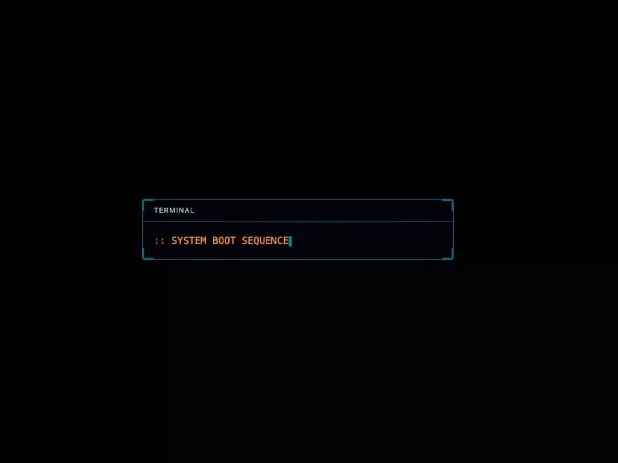
Terminal

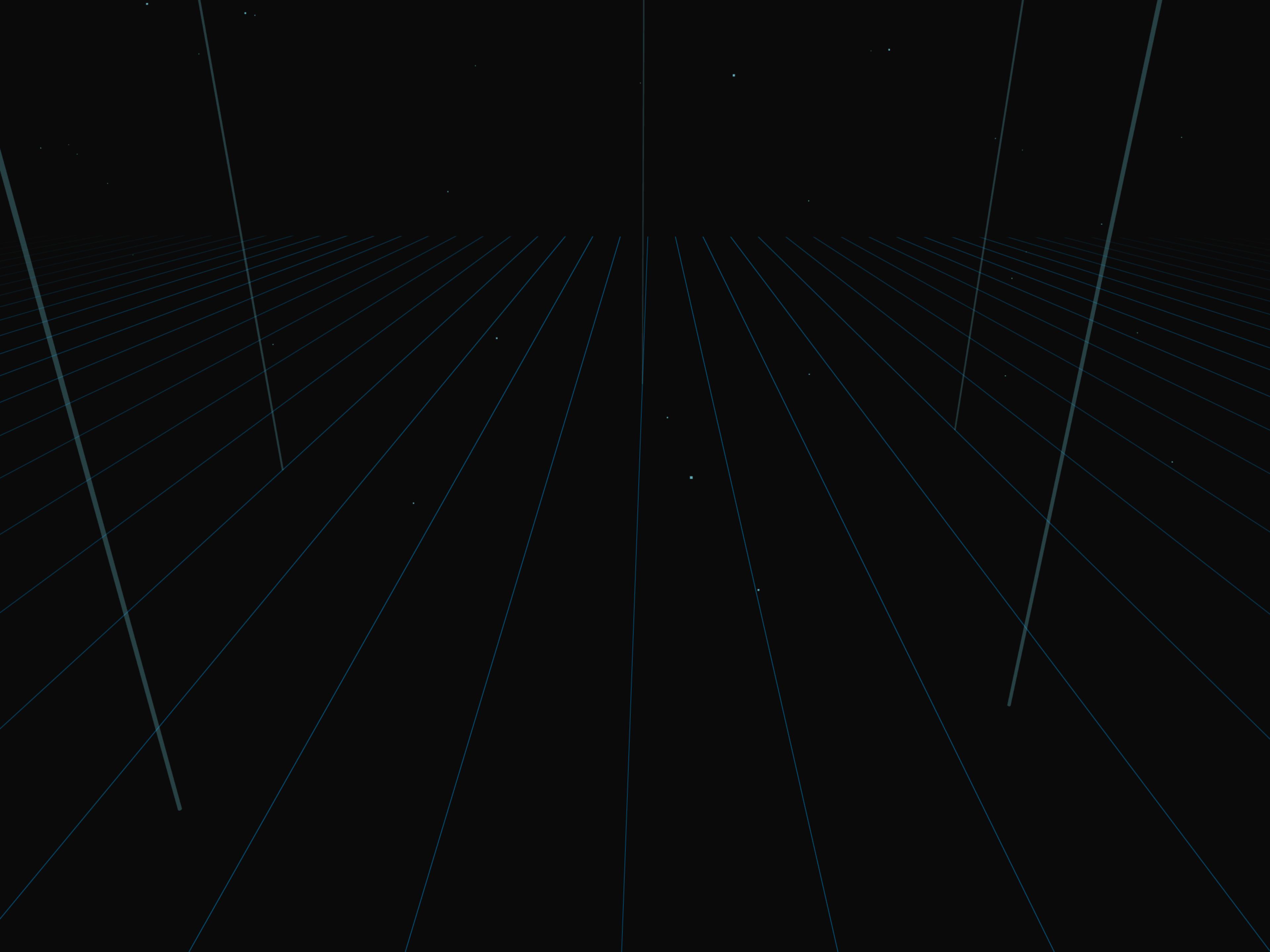
3D Tron Grid Background
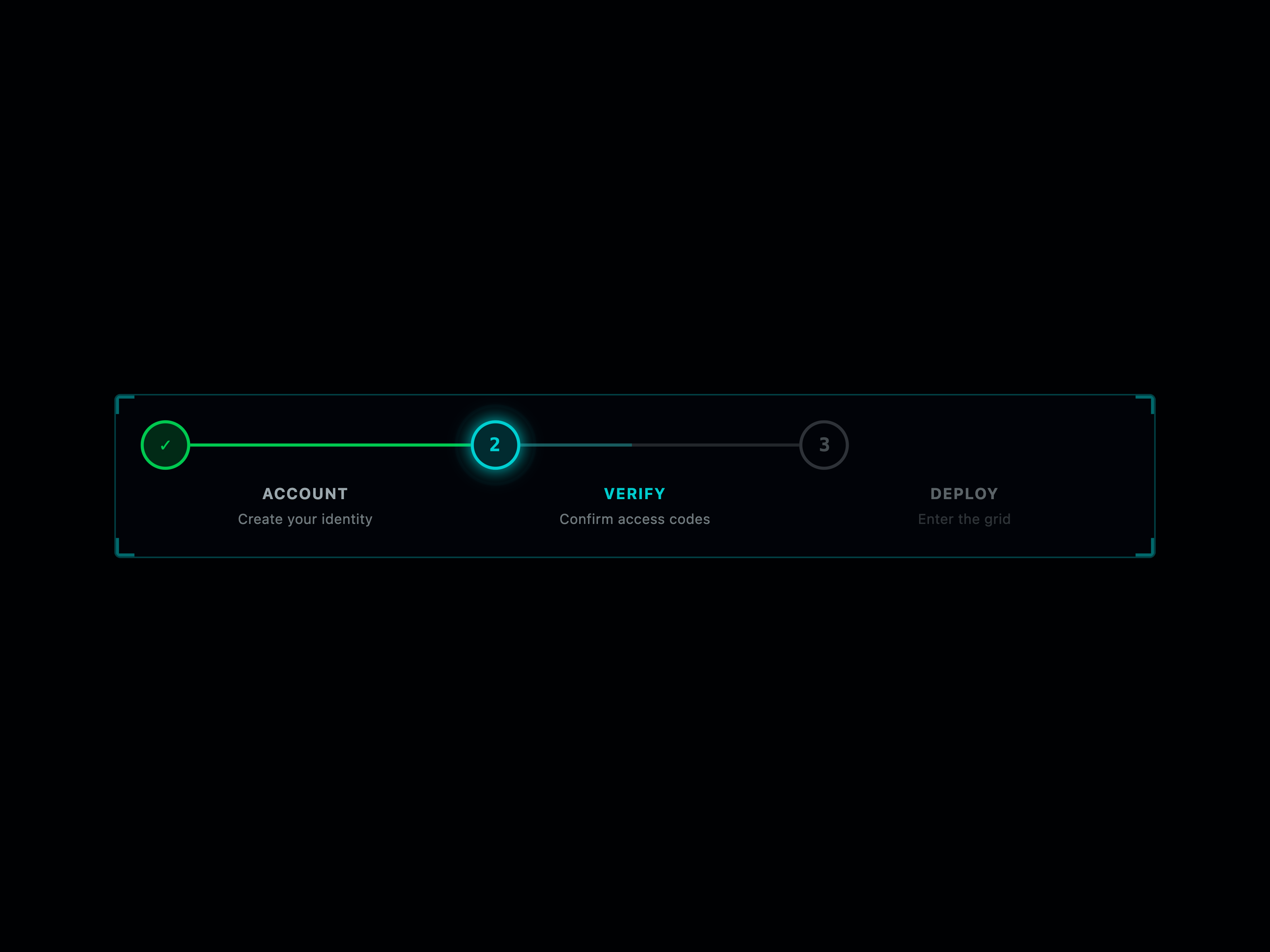
Tron Stepper
Dropdown

Avatar Group

Timeline Bar


Video Progress

Pagination

Energy Meter

Waveform

CRT Effect

Data Stream

Grid Scan Overlay

Grid Floor

Beam Marker

Breadcrumb Nav

Uplink Header
That's all 17 components
About The Gridcn
The Gridcn publishes a shadcn registry at thegridcn.com, with 92 components installable through the shadcn CLI.
- Components
- 92
- GitHub stars
- 392
- Last commit
- Sep 3, 2026
- Repository
- educlopez/thegridcn-ui
Also in the The Gridcn registry
Copy a prompt for your agent, copy the install command, or open the docs that ship it.
Agent Avatar
agent-avatar1 fileAnnouncement Bar
announcement-bar1 fileAnomaly Banner
anomaly-banner1 fileArrival Panel
arrival-panel1 fileBoot Sequence
boot-sequence1 fileButton Group
button-group@radix-ui/react-slot, class-variance-authority1 fileChangelog
1 fileChip
1 fileCircuit Background
circuit-background1 fileCommand Menu
command-menu1 fileComparison Table
comparison-table1 fileCoordinate Display
coordinate-display1 fileCountdown
1 fileData Card
data-card1 fileDerez Timer
derez-timer1 fileDiagnostics Panel
diagnostics-panel1 fileDivider
1 fileEmpty
class-variance-authority1 fileEmpty State
empty-state1 fileFAQ
1 fileFeature Card
feature-card1 fileField
class-variance-authority1 fileFile Upload
file-upload1 fileFloating Panel
floating-panel1 fileGauge
1 fileGlow Container
glow-container1 fileHeatmap
1 fileHud
1 fileHud Corner Frame
hud-corner-frame1 fileHUD Frame
hud-frame1 fileIdentity Disc
identity-disc1 fileInput Group
input-groupclass-variance-authority1 fileItem
@radix-ui/react-slot, class-variance-authority1 fileKanban Board
kanban-board1 fileKbd
1 fileLocation Display
location-display1 fileLogo Cloud
logo-cloud1 fileMap
1 fileMap Marker
map-marker1 fileMarquee
1 fileModal
1 fileNotification
1 fileNumber Input
number-input1 filePricing Card
pricing-card1 fileProgress Bar
progress-bar1 fileRadar
1 fileRating
1 fileRegen Indicator
regen-indicator1 fileReticle
1 fileSignal Indicator
signal-indicator1 fileSparkline
1 fileSpeed Indicator
speed-indicator1 fileSpinner
lucide-react1 fileStat
1 fileStat Card
stat-card1 fileStats Counter
stats-counter1 fileStatus Bar
status-bar1 fileTag
1 fileText Input
text-input1 fileTron Alert
thegridcn-alert1 fileBadge
thegridcn-badge1 fileSelect
thegridcn-select1 fileSkeleton
thegridcn-skeleton1 fileSlider
thegridcn-slider1 fileTabs
thegridcn-tabs1 fileTimeline
thegridcn-timeline1 fileToggle
thegridcn-toggle1 fileTooltip
thegridcn-tooltip1 fileTimer
1 fileTunnel
Instanced tunnel rings for better performance
@react-three/fiber, three1 file