HomeBookmarks
tool-uitool-ui
tool-ui

tool-ui

TUby tool-ui
3components9views

Installs all 24 components. Without our CLI, run instead.

Auto-indexed

tool-ui contents
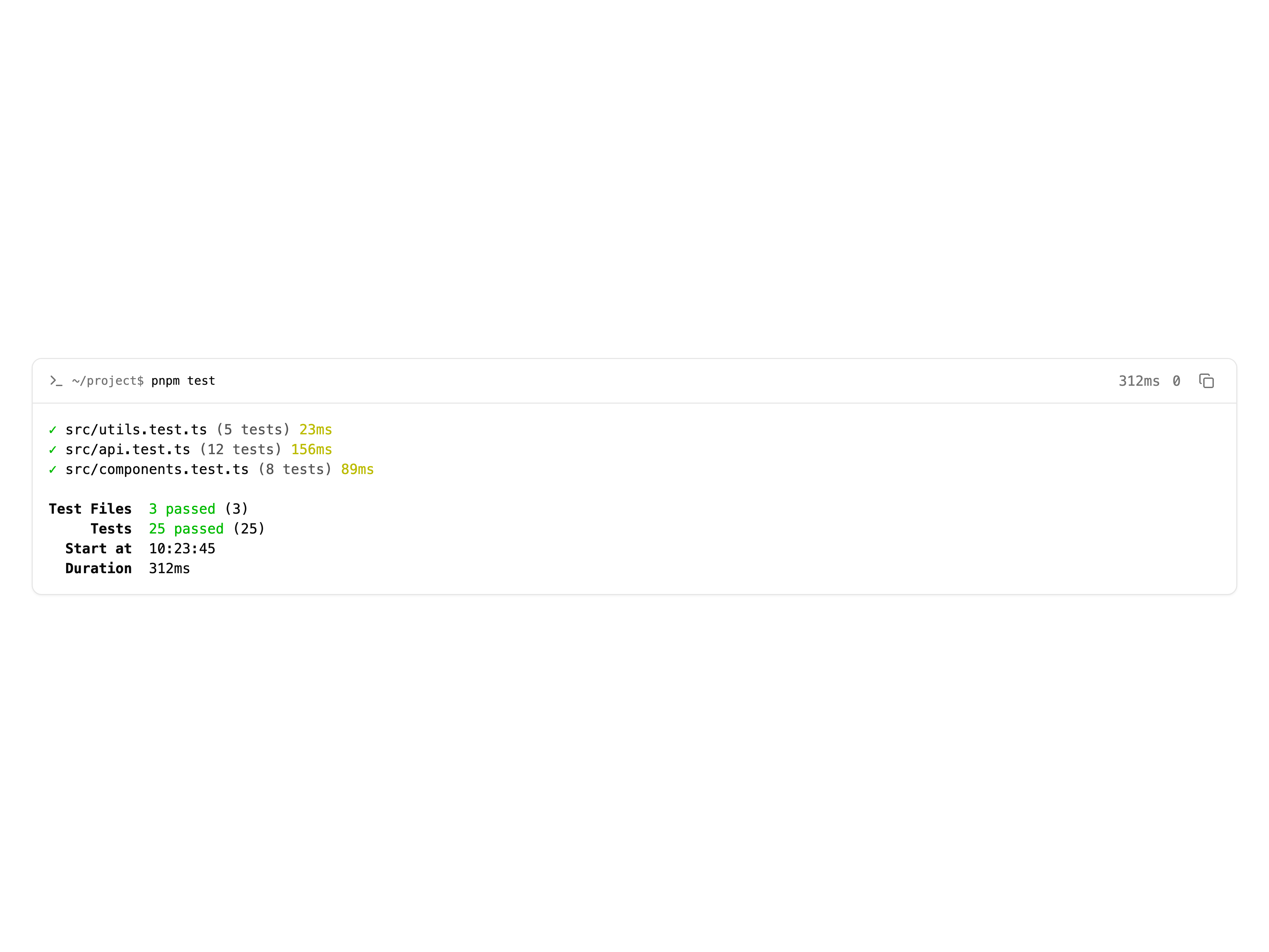
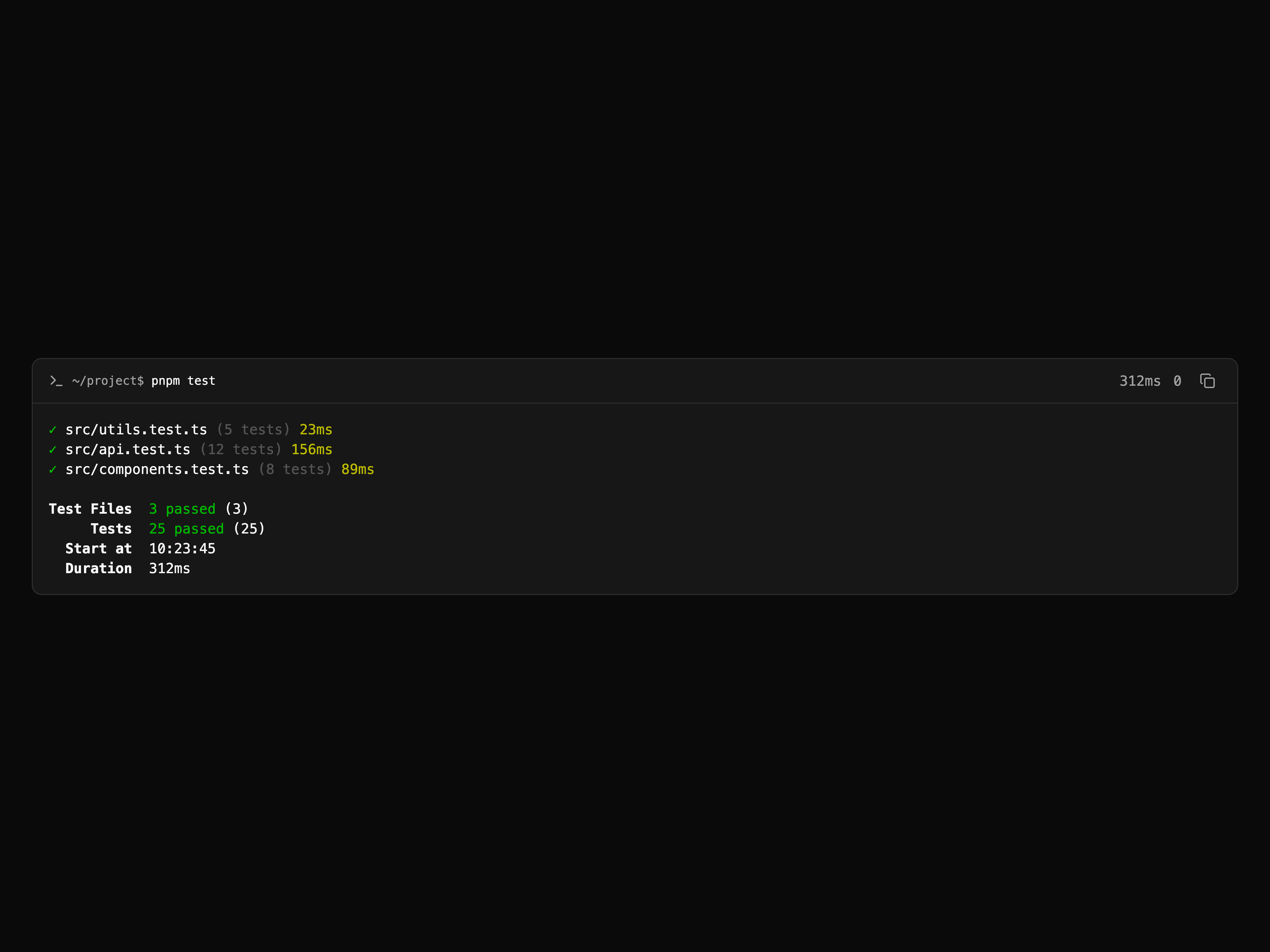
  • TerminalTerminal

    Terminal

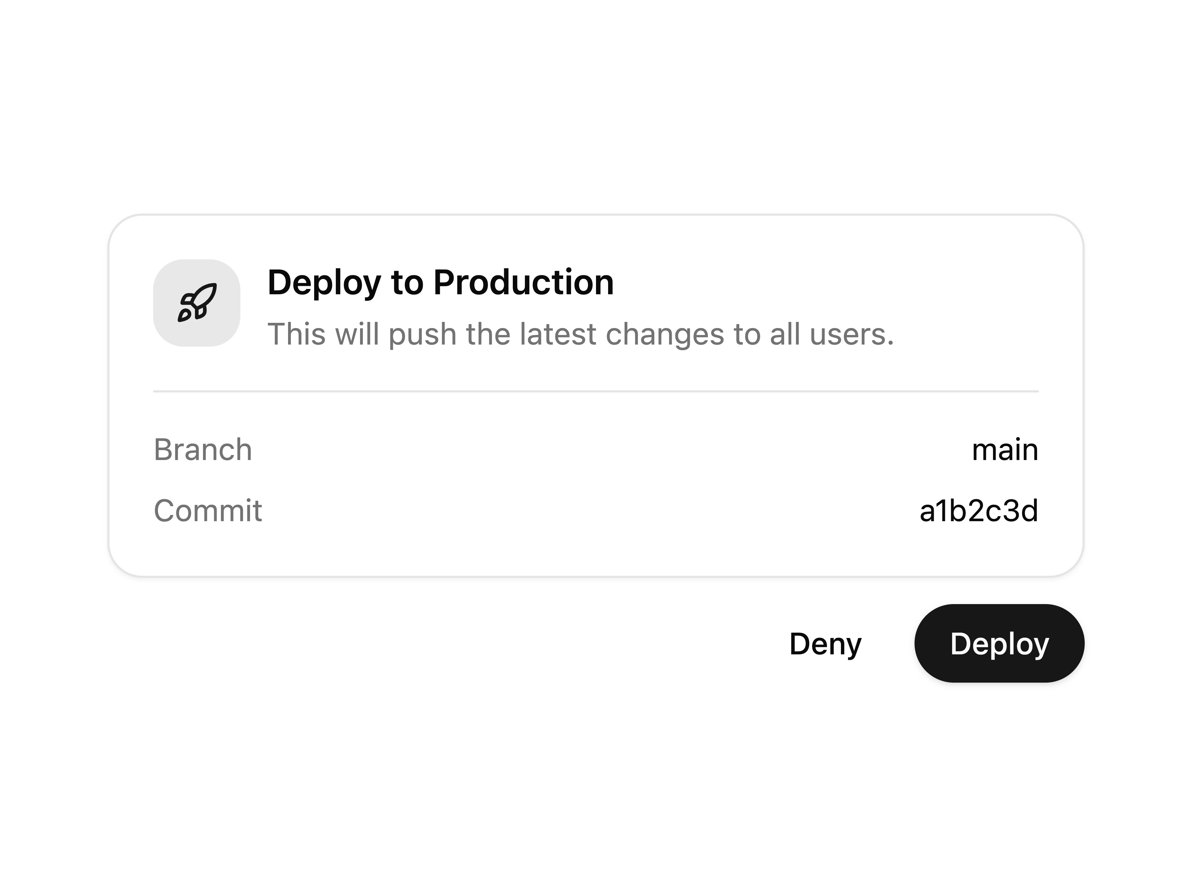
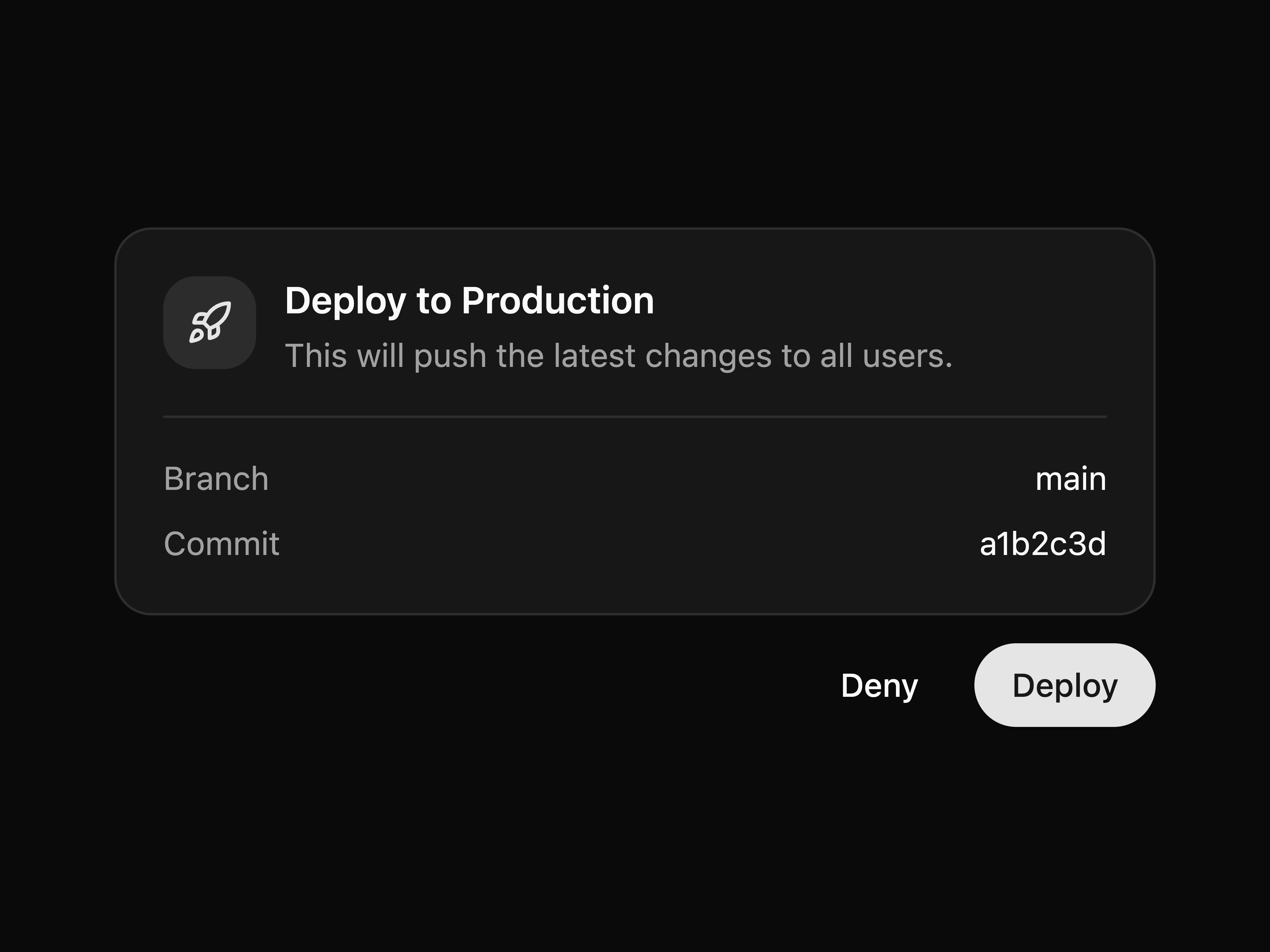
  • Approval CardApproval Card

    Approval Card

  • Item CarouselItem Carousel

    Item Carousel

  • That's all 3 components

    About tool-ui

    tool-ui publishes a shadcn registry at tool-ui.com, with 24 components installable through the shadcn CLI.

    Components
    24
    GitHub stars
    779
    Last commit
    Aug 31, 2026
    Repository
    assistant-ui/tool-ui

    The repository behind this registry is archived on GitHub, so it is no longer maintained upstream.

    Also in the tool-ui registry

    Copy a prompt for your agent, copy the install command, or open the docs that ship it.

    • Audio

      Audio playback with artwork and metadata.

      lucide-react, zod9 files
    • Code Block

      code-block

      Display syntax-highlighted code snippets.

      lucide-react, shiki, zod11 files
    • Code Diff

      code-diff

      Code Diff component for AI interfaces.

      @pierre/diffs, lucide-react, zod10 files
    • Geo Map

      geo-map

      Display geolocated entities and fleet positions.

      leaflet, react-leaflet, supercluster, zod12 files
    • Image

      Display images with metadata and attribution.

      zod14 files
    • Image Gallery

      image-gallery

      Grid layout for browsing image collections.

      lucide-react, zod18 files
    • Instagram Post

      instagram-post

      Render Instagram post previews.

      lucide-react, zod8 files
    • Linkedin Post

      linkedin-post

      Render LinkedIn post previews.

      lucide-react, zod14 files
    • Option List

      option-list

      Single or multi-select choices with confirmation actions.

      lucide-react, zod14 files
    • Order Summary

      order-summary

      Itemized purchase confirmation with pricing.

      lucide-react, zod8 files
    • Parameter Slider

      parameter-slider

      Numeric parameter adjustment controls.

      @radix-ui/react-slider, zod16 files
    • Plan

      Display step-by-step task workflows in AI interfaces.

      lucide-react, zod9 files
    • Preferences Panel

      preferences-panel

      Compact settings panel for user preferences.

      lucide-react, zod16 files
    • Question Flow

      question-flow

      Multi-step guided questions with branching.

      lucide-react, zod8 files
    • Stats Display

      stats-display

      Display key metrics in compact cards.

      zod9 files
    • Video

      Video playback with controls and poster.

      lucide-react, zod16 files
    • Weather Widget

      weather-widget

      Display weather conditions and forecasts.

      lucide-react5 files
    • X Post

      x-post

      Render X (Twitter) post previews.

      lucide-react, zod14 files

    From the tool-ui readme

    Copy/paste React components for rendering tool calls in AI chat interfaces. Built by assistant-ui.

    Docs · Gallery · Quick Start

    When a model calls a tool, most apps dump raw JSON into the conversation. These components turn tool payloads into interactive UI like approvals, forms, tables, charts, and media cards so users can understand and act without leaving the chat.

    Featured Components

      Option List
      Let users select from multiple choices


      Question Flow
      Multi-step guided questions with branching


    Why Tool UI?

    • Copy/paste, not install — shadcn/ui model. Components live in your codebase. No dependency lock-in.
    • Schema-validated — Every component has a Zod schema. Parse tool output, render when valid, fail safely when not.
    • Interactive with receipts — Components aren't just displays. Users make choices that flow back to the assistant. Choices persist as receipts.
    • Built on shadcn/ui — Radix primitives, Tailwind styling, your theme. No new design system to learn.

    Components

    • Progress: Plan, Progress Tracker
    • Input: Option List, Parameter Slider, Preferences Panel, Question Flow
    • Display: Citation, Geo Map, Item Carousel, Link Preview, Stats Display, Terminal, Weather Widget
    • Artifacts: Chart, Code Block, Code Diff, Data Table, Instagram Post, LinkedIn Post, Message Draft, X Post
    • Confirmation: Approval Card, Order Summary
    • Media: Audio, Image, Image Gallery, Video

    Each component includes a Zod schema for payload validation and presets for realistic example data. Browse them all in the Gallery.

    License

    MIT License. See LICENSE for details.

    Read the rest on GitHub →

    What tool-ui builds on

    The packages and primitives its components pull in, counted across the registry.

    button18separator6card4collapsible4tooltip4accordion2slider2badge1dropdown-menu1label1popover1select1

    Hooks and utilities

    • chart
    • data-table

    Registries like tool-ui

    OpenStatus

    OpenStatus

    by OpenStatus

    3

    components

    Kibo UI

    Kibo UI

    by Hayden Bleasel

    28

    components

    UI TripleD

    UI TripleD

    by Moumen Soliman

    107

    components

    hax-design

    hax-design

    by Zachary BENSALEM

    7

    components

    Browse every shadcn registry we track →

    deltacomponents

    deltacomponents

    by deltacomponents

    8

    components

    Motoko UI

    Motoko UI

    by Vlad Vovk

    9

    components

    1. Components
    2. /
    3. tool-ui
    4. /
    5. tool-ui

    Related libraries

    IC

    Image Carousels

    by Kedhareswer Naidu

    21

    components

    Ruixen UI

    Ruixen UI

    by Ruixen UI

    347

    components

    ShadcnSpace

    ShadcnSpace

    by ShadcnSpace

    189

    components

    Aceternity UI

    Aceternity UI

    by Manu Arora

    89

    components

    ReUI

    ReUI

    by Sean Hello

    263

    components

    Systaliko UI

    Systaliko UI

    by YoucefBnm Bnm

    41

    components

    About tool-ui

    tool-ui is a component library on 21st.dev by tool-ui with 3 public React components. Every component ships with a live interactive preview and full TSX source — copy the code, install it through the shadcn CLI, or pull it into Cursor or Claude Code over MCP.

    All 3 tool-ui components

    • Approval Card
    • Item Carousel
    • Terminal

    Browse all component libraries →