Aceternity UI publishes a shadcn registry at ui.aceternity.com, with 262 components installable through the shadcn CLI.
Copy a prompt for your agent, copy the install command, or open the docs that ship it.
Background Dots
Background Dots Masked
Background Dots Masked Vertical
Background Grid with Dots
Background Grid with Dots and Animations
Background Lines
Background With Full Video
Background With Skewed Lines
Background With Skewed Rectangles
Bento grid showcasing MacBook, iPhone, iPad, and Dynamic Island illustrations
A grid of 6 with skeletons, title and descriptions. Skeletons are modern and designed to be minimal. With chat like interfaces for skeletons, perfect for showcasing features or demos of product.
Blog Content Centered
Blog Content With Toc
Blog listing with three featured cards and a denser four-column grid below, category labels on each post
Blog With Search
Blog With Search — magazine layout with cover story and card grid
Centered Around Testimonials
Centered With Logo
Chat Conversation
Collaborative Cursors
Contact Form Grid With Details
Contact Section With Shader Background and Rotating Testimonials
Contact section with dithered landscape background, testimonial card, and split form
CTA Centered Masonry Gallery
CTA With Background Noise
CTA With Centered Text
CTA With Dashed Grid Lines
CTA With Masonry Images
Feature section with dithered image backdrop, tabbed content cards, and chat conversation skeletons
A dot distortion shader for creating dynamic background effects.
Swipeable stack of profile cards with spring physics; flick cards off the deck and they cycle to the back
Animated Dynamic Island with customizable idle, loading, and processed states
Empty project state with corner grid lines, CTAs, and fanned template thumbnails
Empty hiring-style layout with a swipeable card deck above primary actions
Centered empty state with stacked photo frames and gentle motion
Soft panel empty state with overlapping template previews and doc link
Expandable Card On Click
FAQs With Dashed Lines and Accordion
Bento Grid Feature Section With Animated Skeletons
Three-column feature section with icon-led copy on the sides and a centered showcase area (image backdrop plus animated reveal)
Feature section with horizontal device skeletons (iPhone, MacBook, iPad) with animated beams, Dynamic Island interactions, and compliance/security cards
Feature section with animated terminal and expandable feature tabs
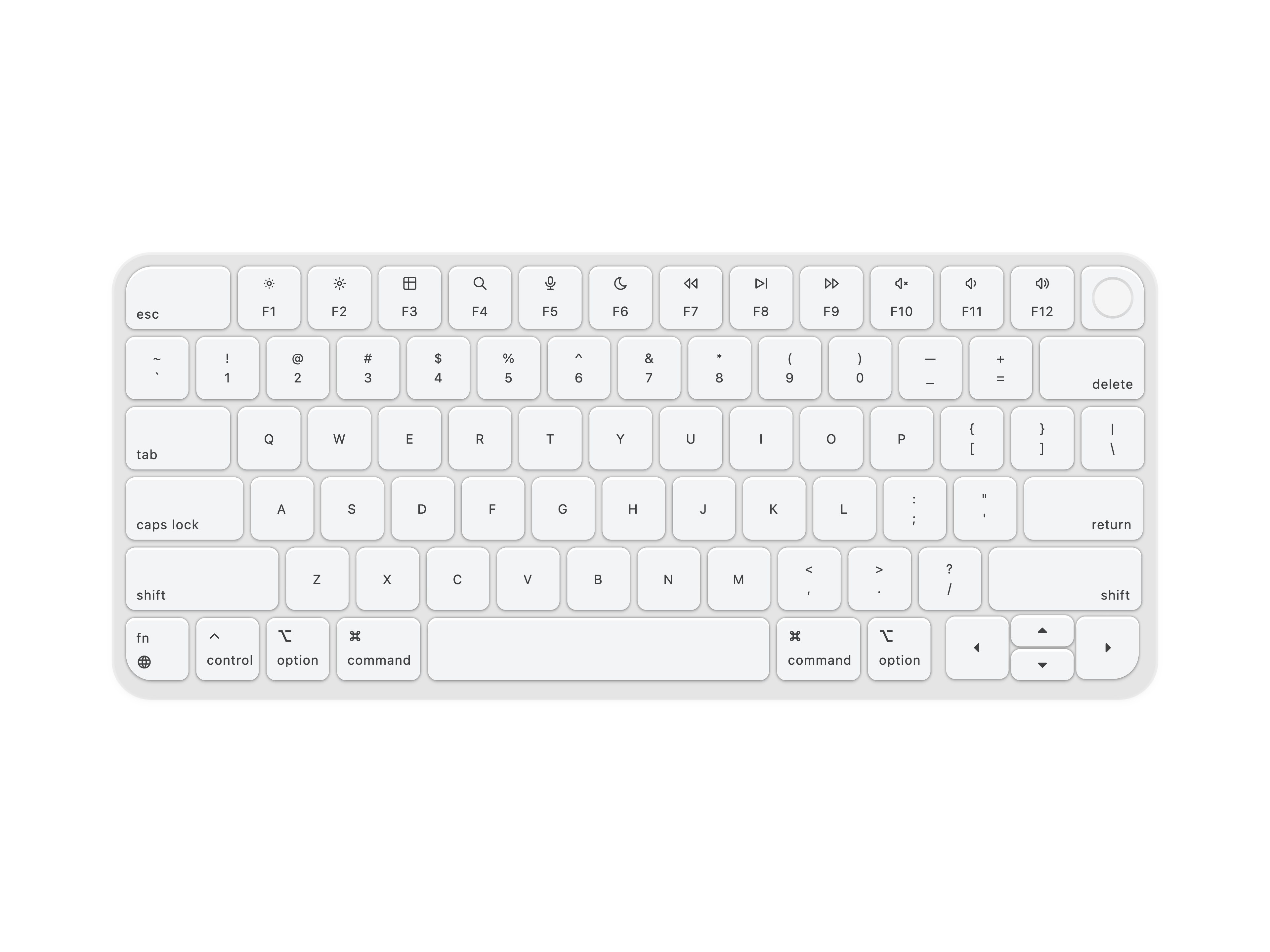
Feature section with vertical grid layout, animated skeletons including login form, world map, chat conversation, and keyboard
A grid of 3 with micro-interactions and animations. Title and descriptions are flex row aligned on desktop screens and column on mobile screens. There are skeleton items with perspective designs, adding depth into the design. Cards have title, description, badge, and tags.
Features Section With Skeletons
Feature section with accordion list, CTAs, and a cinematic image preview with floating assistant UI
Feature grid with hover-driven headline and Motion text swap, responsive cell dividers
Feature cards with animated isometric box illustrations
Three-column feature section with square-edged cards, corner marks, and AI note-taking UI mockups
Features with sticky scroll
Minimal feature grid with inline icons and responsive separators
Animated Image Carousel with Scanning Bar Reveal and Sparkle Effects
Folder With Files
Footer With Big Text
Frequently Asked Questions Accordion
Full Background Image With Text
Hero Section With Dither Background
Hero Section With Flickering Lights
Hero Section With Images Grid and Navbar
Hero Section With Infinite Scroll Cards
Hero Section With Mesh Gradient
Hero section with hover highlight showing element dimensions and sliding number animation
Hero Section With Multi Color Background
Hero Section With Noise Background
Hero Section With Shadow and Scales
Hero With Background And Navbar
Hero With Centered Image
Hero with navbar, large chat-style prompt textarea, action bar, and sample work grid
Hero with animated dither shader background, scale bands, product screenshot, and logo rail
Hero with hatch scale bands, corner frames, split copy and image, and a logo rail
A modern hero section with image and scales. Incorporates tailwind's blue 500 variant of color. A beautiful hero section with title, description, 2 CTA buttons and an Image. Image has a mouse move event that shows the scales behind the image. Perfect for hero sections that require a modern look.
Minimal Isometric Box Illustration with Hover Animation
A lines gradient shader for creating animated gradient backgrounds.
Login Form With Gradient
Login Signup Minimal
Login With Socials And Email
Logo Cloud Marquee
A collection of 6 logos of modern companies, animation is staggered and logos are aligned in a grid of 3. Perfect for logo clouds that require a modern look.
A logo cloud with 10 logos in a 5x2 grid that swap every 3 seconds. Logos animate horizontally with blur effect and staggered timing for a smooth transition.
Logos With Blur Flip
MacBook illustration with floating icon cards on hover
Masonry Bento Grid With Images, useful for showcasing brands or products
Minimal Hero Section With Parallax Images, images are displayed on top of each other with animation. Simple hero section with Title, description, CTA Buttons and images.
Modern Hero With Gradients
Feature section with YouTube creator highlights, multicolor gradient rows, thumbnails, and embedded video modal
Multi-illustration bento grid with world map, keyboard, and login skeletons
Feature section with sticky nav, scroll-spy feature levels, and landscape illustration panels
Classic navbar with search
Dark navbar with ridge shadows, dropdown mega menu with blog panel, and light/dark mode
Navbar with Mega Menu and Hover Effects
Navbar with Pills and tabs
Navbar with Underline and hover effects
Navbar With Children
Premium Auth Split with WebGL Shader
Minimal Pricing with Enterprise Section
Pricing Page With Featured And Enterprise. This pricing page is designed to showcase the features of the product and the enterprise plan. It includes a featured plan with a discount, a regular plan, a bigger plan and an enterprise plan. Featured plan has an immersive shadow to make it stand out.
Data-driven pricing cards with featured plan styling and dark mode support
Pricing With Switch
Pricing With Switch And Add On
Registration Form With Images
Rotating Notification Cards with Stacked Animation
Simple Centered Contact Form
Simple CTA With Images
Simple FAQs With Background
Simple Footer With Four Grids
Simple login form with dashed grid lines border decoration
Simple Navbar With Hover Effects
Simple Pricing With Three Tiers
Simple Sidebar With Hover
A single row logo cloud with 5 logos that flips in an interval.
Spotlight Logo Cloud
A spotlight shader for creating dynamic spotlight background effects with customizable positions and animations.
Stats For Changelog
Stats With Gradient
Stats With Grid Background
Stats With Number Ticker
Team Section With Light Background
Team Section With Scales
Team Section With Small Avatars
Team Section With Timeline Cards
Testimonials Background With Drag
Two-row testimonial marquee with framed section and bordered cards
Text Generate Typewriter with Keyboard Sounds
Three-column feature section with pipeline UI, lifestyle image, and CRM activity timeline
Three Columns With Images
Two Column With Image
The packages and primitives its components pull in, counted across the registry.
This page collects the Aceternity UI components published on 21st — animated React components by Manu Arora known for effects like aurora backgrounds, sparkles, 3D cards, bento grids, timelines, and scroll reveals. Everything is built with Tailwind CSS and Motion, and every entry opens into a live interactive preview, so you can watch the animation run before touching any code.
Use this collection to preview and compare the components side by side, then copy the TSX for the one you pick, install it through the shadcn CLI, or pull it straight into Cursor or Claude Code over MCP. The components are Tailwind-based and drop into any Next.js or React project.