Components
Curated UI collection
Shadcn segmented control components provide a collection of 60 different implementations and variations for building toggle-based selection interfaces in React applications. Whether you need basic segmented controls or more complex multi-option selectors, this curated collection includes components designed to work seamlessly with shadcn's design system. Browse through various styling approaches, sizes, and interaction patterns to find the segmented control component that best fits your project requirements.


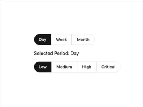
A segmented control is a UI component that allows users to select one option from a group of mutually exclusive choices. It typically displays multiple options in a horizontal or vertical layout where selecting one option deselects the others, commonly used for filtering, view switching, or preference selection.
There are 60 different shadcn segmented control components and variations available in this collection, including 1 exact match result. This provides multiple options for different design needs and use cases.
Yes, shadcn components are built on top of Radix UI primitives and styled with Tailwind CSS, allowing you to customize colors, sizes, spacing, and other styling properties to match your design system and brand requirements.

© 2026 21st Labs, Inc.