abui
2components7.8Kviews59bookmarks
Installs all 16 components. Without our CLI, run instead.
Auto-indexed
abui contents
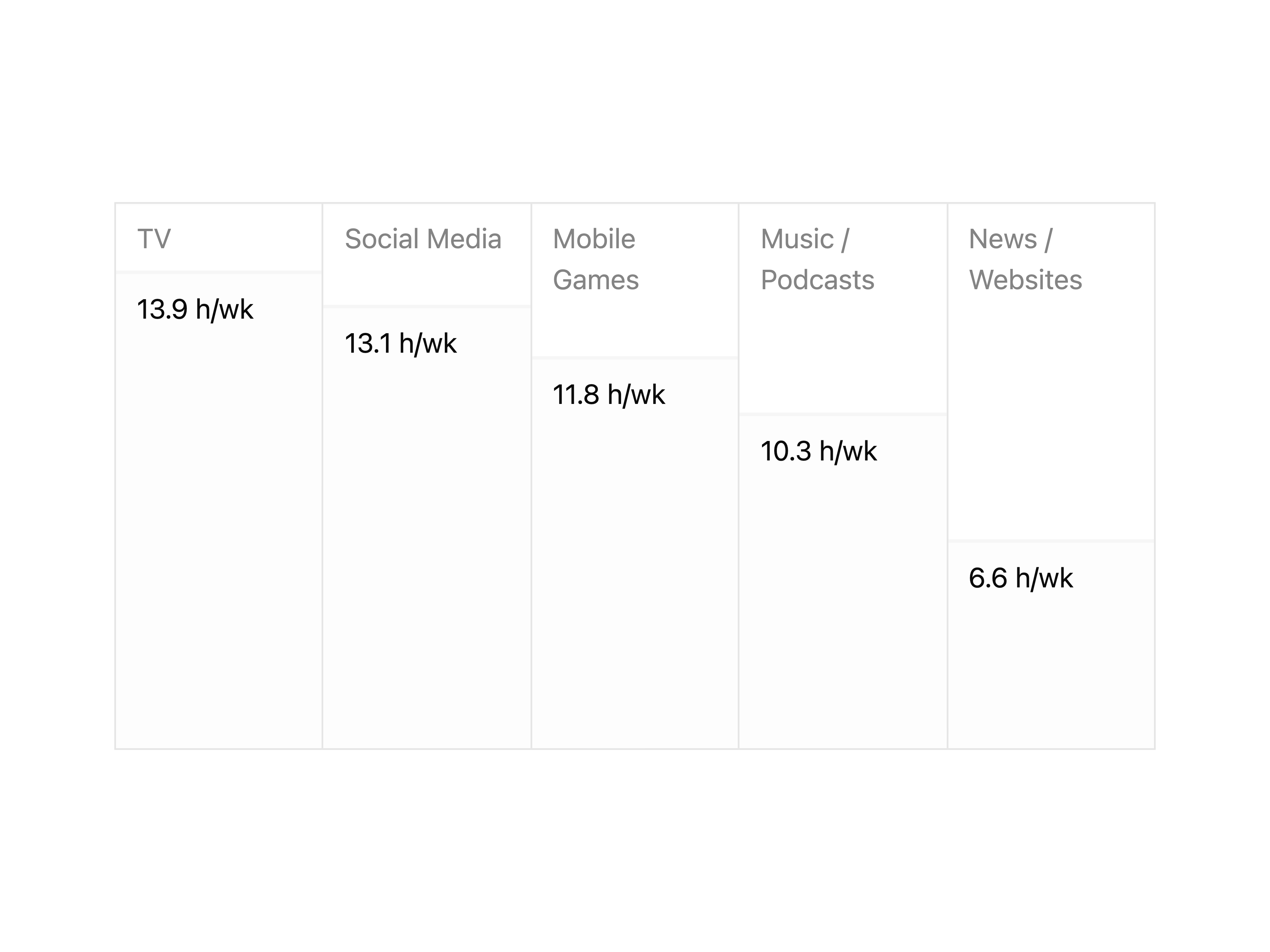
Animated Chart
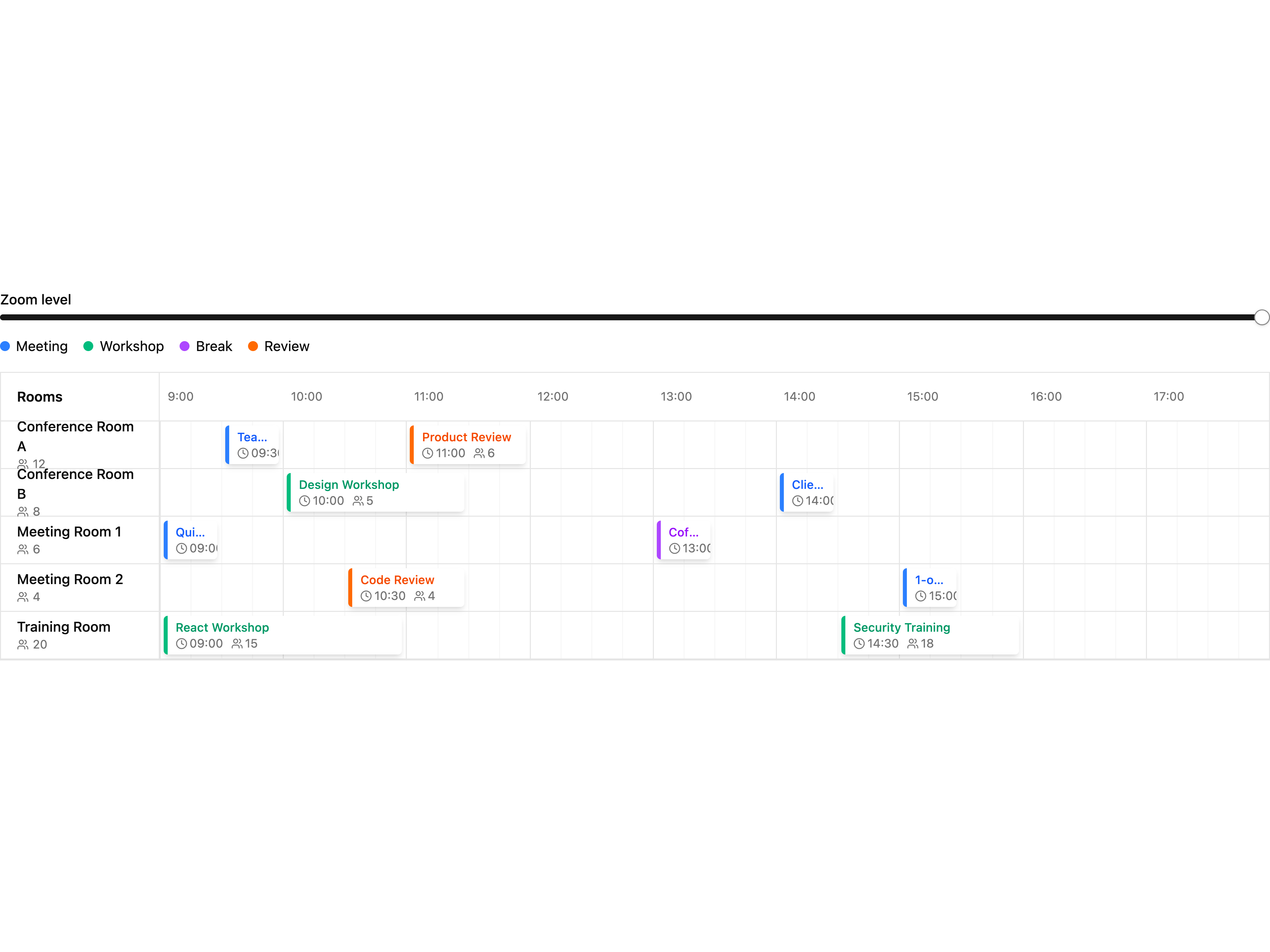
Timeline
That's all 2 components
About abui
abui publishes a shadcn registry at abui.io, with 16 components installable through the shadcn CLI.
- Components
- 16
- GitHub stars
- 55
- Last commit
- Dec 15, 2025
- Repository
- antoniobrandao/abui
Also in the abui registry
Copy a prompt for your agent, copy the install command, or open the docs that ship it.
Accordion Multiselect
accordion-multiselectAn accordion multiselect component with categories and services.
@radix-ui/react-accordion, @radix-ui/react-checkbox, lucide-react1 fileAvailability
A weekly availability designer with draggable and resizable time slots.
lucide-react1 fileBreakpoint Display
breakpoint-displayA breakpoint display component.
1 fileCalendar Year
calendar-yearA calendar year component.
dayjs1 fileColor Swatch Selector
color-swatch-selectorA color swatch selector component.
1 fileLabel Selector
label-selectorA text label selector component for sizes, variants, and other text-based options.
@radix-ui/react-radio-group, class-variance-authority1 fileRadio Rows
radio-rowsA radio rows component.
1 fileRadio Tabs
radio-tabsA radio tabs component.
button1 fileScroll Progress
scroll-progressA scroll progress indicator that shows reading progress as a horizontal bar at the top or bottom of the viewport.
motion@121 fileSpinner
A customizable loading spinner component with size, speed, and color variants.
class-variance-authority1 fileText Gradient
text-gradientA text gradient effect component.
1 fileTimeline Steps
timeline-stepsA component for displaying chronological events, activities, or steps
class-variance-authority1 fileTable of Contents
tocA table of contents component with active anchor tracking and depth-aware line styling. Features two variants: default (straight line) and clerk (depth-responsive line that follows hierarchy).
1 file