corr
9components6.3Kviews148bookmarks
Installs all 58 components. Without our CLI, run instead.
Auto-indexed
corr contents

Screen Size Guard

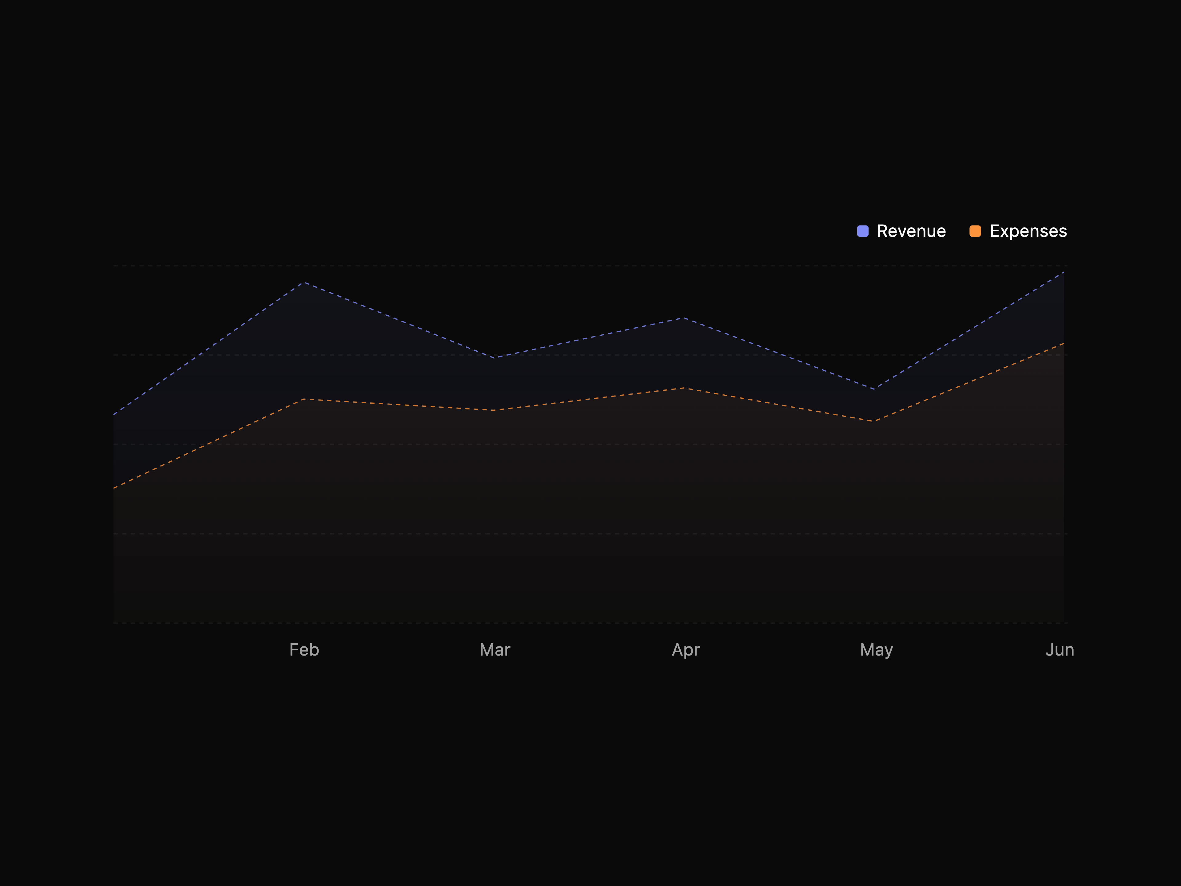
Area Chart

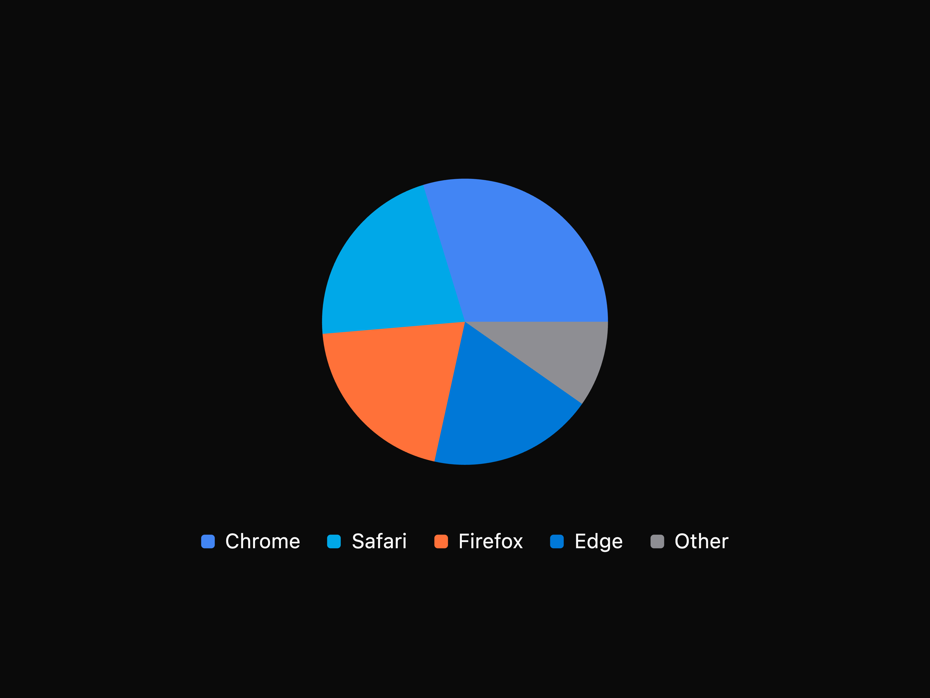
Pie Chart

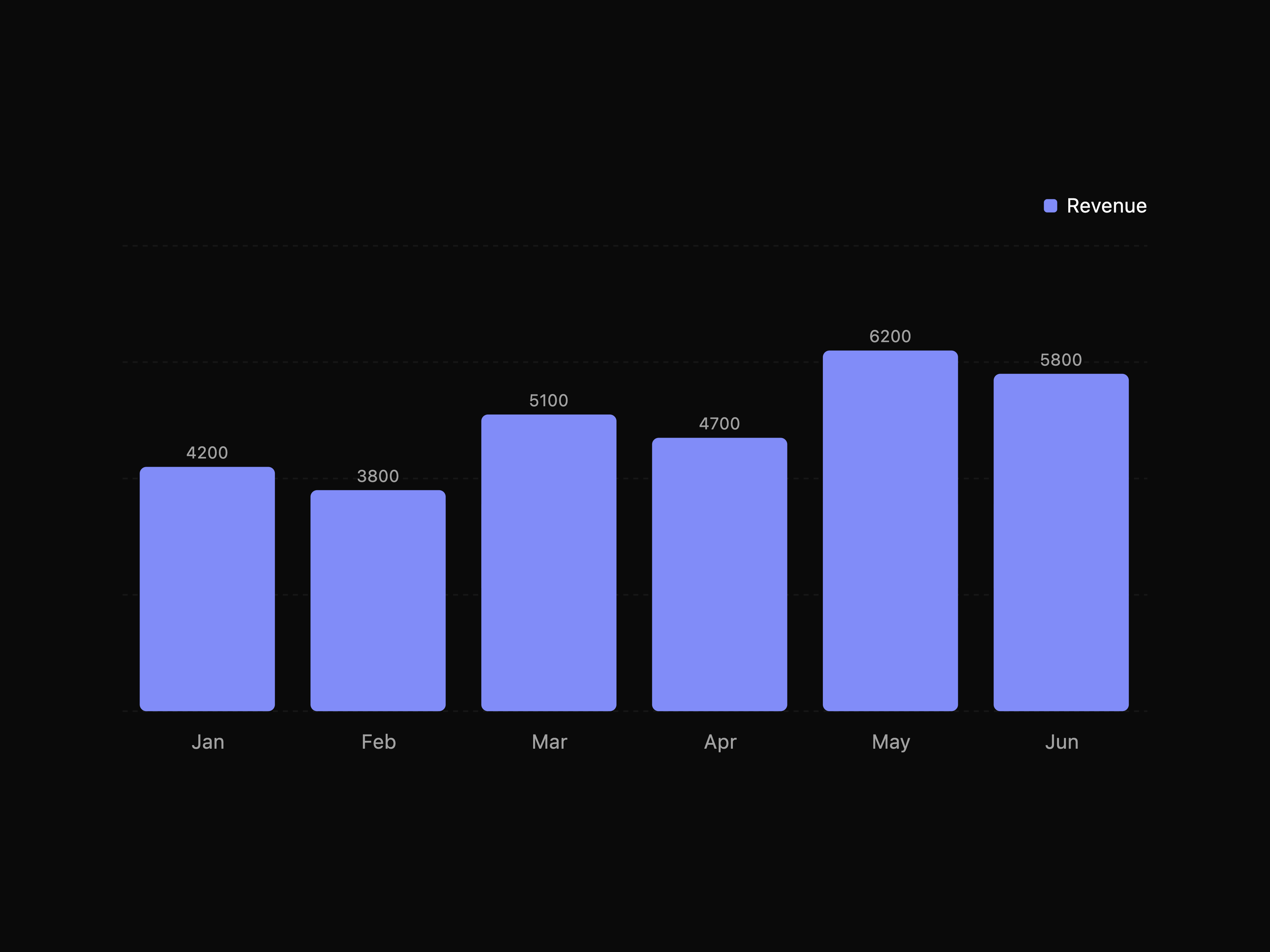
Composed Chart

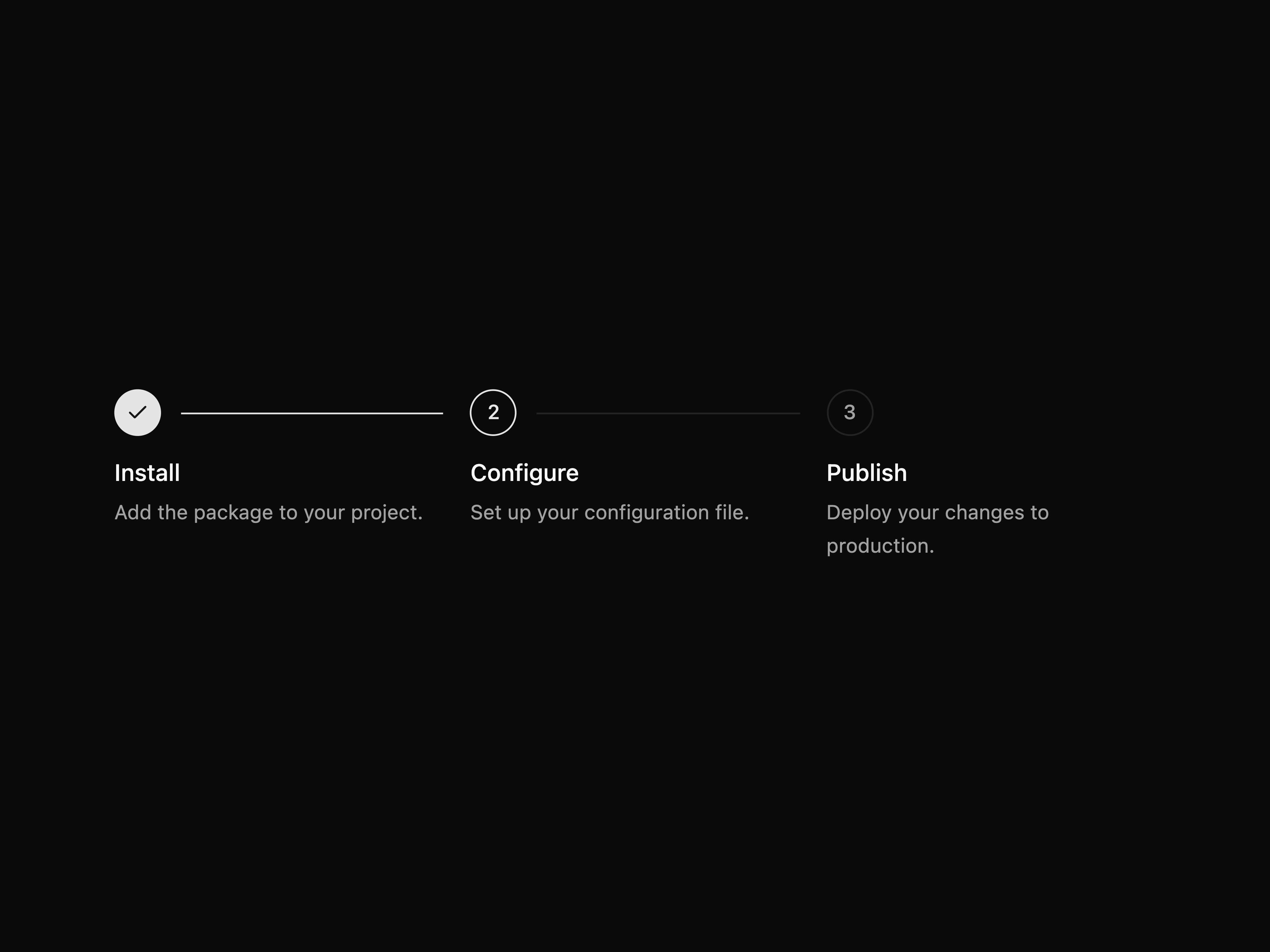
Stepper


Status Pill


Metric Badge


Audit Log


Key Value List
That's all 9 components
About corr
corr publishes a shadcn registry at ui.corr.sh, with 58 components installable through the shadcn CLI.
- Components
- 58
Also in the corr registry
Copy a prompt for your agent, copy the install command, or open the docs that ship it.
Accordion List
accordion-listA clean accordion list wrapper for FAQs, settings, and dense help content.
accordion, card1 fileDialog
action-dialogA compact dialog wrapper for focused confirmation and form actions.
button, dialog1 fileDrawer
action-drawerA mobile-friendly drawer wrapper with title, description, content, and footer actions.
button, drawer, input1 fileAnimated Buttons
animated-buttonsAnimated action buttons that transition through hover, loading, and complete states.
lucide-react, motion1 fileAnimated Copy Button
animated-copy-buttonA copy button that animates between idle and copied states.
lucide-react, motion1 fileAnimated Dialog
animated-dialogA dialog wrapper with subtle Motion transitions for confirmation and form flows.
button, dialog1 fileAnimated Disclosure
animated-disclosureAn expandable disclosure panel with vertical and horizontal motion directions.
lucide-react, motion1 fileAnimated List
animated-listA generic list wrapper with Motion entry, exit, and reorder transitions.
motion1 fileAnimated Number
animated-numberA NumberFlow-powered animated number primitive for counters, timers, and metrics.
@number-flow/react1 fileAnimated Progress
animated-progressA smooth progress bar with determinate, semantic, and pending states.
motion1 fileAnimated Toggle Card
animated-toggle-cardSelectable cards with a shared animated active state.
motion1 fileAvailability
A draggable weekly availability scheduler for creating, resizing, moving, disabling, and deleting time spans.
@dnd-kit/core, @dnd-kit/utilities, lucide-react, nanoid1 fileBar Chart
bar-chartA styled EvilCharts bar chart for comparing categories with stacked, gradient, hatched, and horizontal variants.
motion, recharts7 filesChart Empty Loading Error
chart-empty-loading-errorA standardized chart state frame for ready, loading, empty, and error states.
lucide-react1 fileCode Block
code-blockA copyable code block with line numbers, language selection, and lightweight language-aware syntax highlighting.
lucide-react1 fileCommand Palette
command-paletteA reusable command dialog wrapper for grouped actions, app navigation, and searchable command menus.
lucide-react, motion1 fileComponent Health Panel
component-health-panelA registry health panel for dependencies, source files, JSON URLs, and install commands.
lucide-react, motion1 fileDate Picker Field
date-picker-fieldA date picker field with local-safe date normalization and optional ISO date string output.
date-fns, lucide-react2 filesDestructive Gate
destructive-gateA dialog and mobile drawer confirmation that gates destructive actions behind a generated three-word phrase.
lucide-react, radix-ui, vaul3 filesEmpty State
empty-stateA small empty-state wrapper around the shadcn empty primitive with action slots and visual variants.
lucide-react1 fileFile Manager
file-managerA file manager block with upload, list/grid layout, and item actions.
@dnd-kit/core, lucide-react, motion1 fileFile Upload Dropzone
file-upload-dropzoneA controlled drag-and-drop file upload field with selected file rows.
lucide-react1 fileFilters
A composable filter builder with searchable fields, operators, select and multiselect values, text validation, keyboard shortcuts, and i18n labels.
class-variance-authority, lucide-react1 fileForm Builder
form-builderA reusable form builder block with drag-and-drop fields, JSON definitions, previews, and keyed response data.
@dnd-kit/core, date-fns, lucide-react, motion2 filesKanban
A composable drag-and-drop kanban board with sortable columns, sortable cards, handles, overlays, and move callbacks.
@dnd-kit/core, @dnd-kit/sortable, @dnd-kit/utilities, @radix-ui/react-slot1 fileLine Chart
line-chartA styled EvilCharts line chart for tracking change over time with dots, glow states, brushes, and buffer lines.
motion, recharts7 filesMailbox
A responsive mailbox block with folders, message lists, compose flow, confirmations, and toast feedback.
lucide-react, sonner1 fileMetric Chart Card
metric-chart-cardA compact metric card with animated numbers, deltas, and a small line, bar, or area chart.
@number-flow/react, lucide-react, motion, recharts2 filesPreview Data Provider
preview-data-providerA shared mock data provider for consistent registry demos and examples.
1 filePreview Link
preview-linkA link wrapper that shows a static page preview card on hover.
motion, radix-ui6 filesProfile Avatar
profile-avatarAn animated profile avatar preview that morphs from the trigger into a focused overlay.
motion1 fileProject Card Carousel
project-card-carouselA responsive project carousel block with preview cards, edge blur, controls, stack badges, and contact-link handling.
lucide-react, motion, radix-ui6 filesRadar Chart
radar-chartA styled EvilCharts radar chart for comparing multi-metric profiles across radial axes.
motion, recharts7 filesRadial Chart
radial-chartA styled EvilCharts radial chart for circular totals, progress groups, and semi-radial layouts.
motion, recharts7 filesRegistry Install Card
registry-install-cardA registry install surface with copy actions, JSON links, and compact usage metrics.
lucide-react, motion2 filesresource-wiki
badge, button, dropdown-menu, inputResponsive Preview Shell
responsive-preview-shellA responsive preview utility with viewport controls and a smooth carousel with soft blurred edges.
lucide-react, motion1 fileSankey Chart
sankey-chartA styled EvilCharts sankey chart for weighted flows between stages.
motion, recharts7 filesSection Tabs
section-tabsA compact tabs wrapper for switching between related panels.
tabs1 fileSettings Page
settings-pageA responsive settings page block with profile, notification, and security sections.
lucide-react, motion1 fileShimmer Skeleton
shimmer-skeletonA subtle shimmer skeleton for loading cards, lists, and table rows.
motion1 fileStatus Page
status-pageA status page block with uptime metrics, GitHub-style day bars, service filtering, and incident history.
@number-flow/react, class-variance-authority, lucide-react, motion3 filesTimeline
A composable horizontal timeline with draggable slots, rows, drop validation, current-time markers, and custom slot rendering.
@dnd-kit/core, @radix-ui/react-slot, tunnel-rat1 fileToast Action
toast-actionA simple sonner toast trigger with title, description, and undo action.
sonner1 fileTypography Effects
typography-effectsMotion typography utilities for shimmer text, cycling loading messages, and lyric-style active word emphasis.
motion2 files