cubby-ui
9components6.7Kviews147bookmarks
Installs all 29 components. Without our CLI, run instead.
Auto-indexed
cubby-ui contents
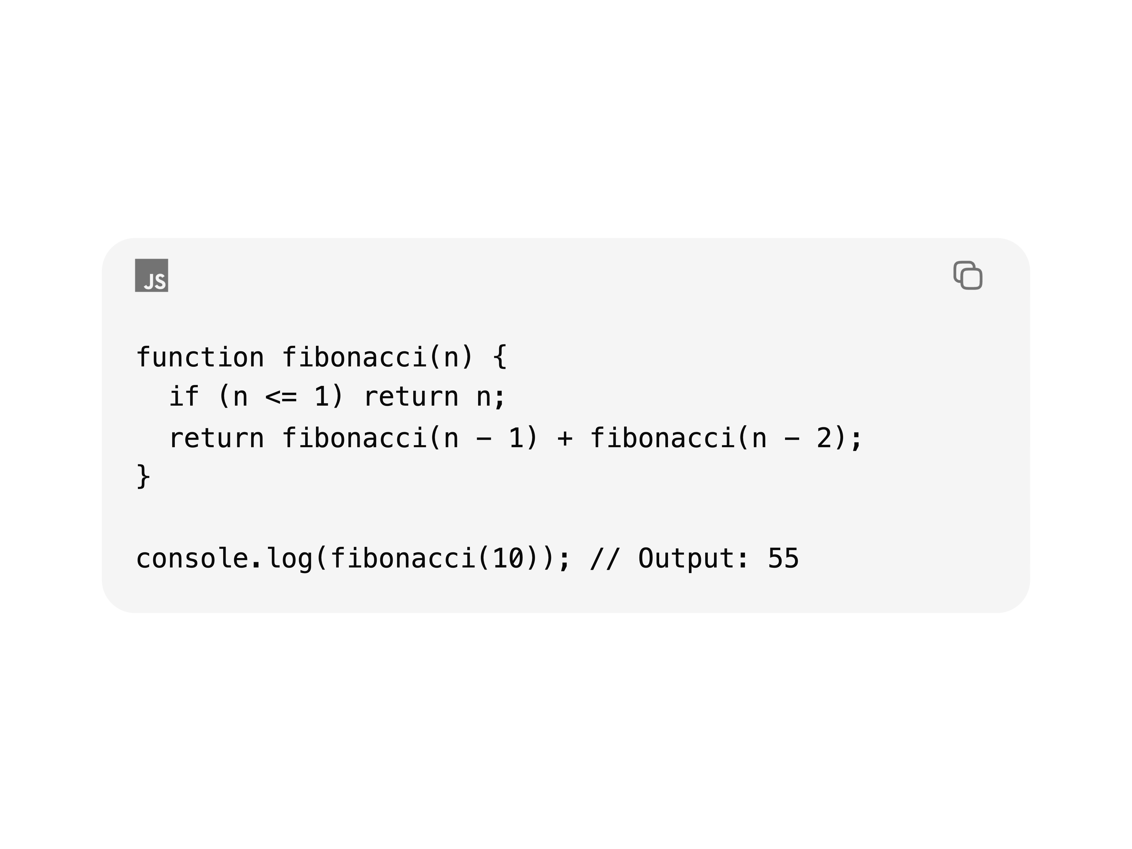
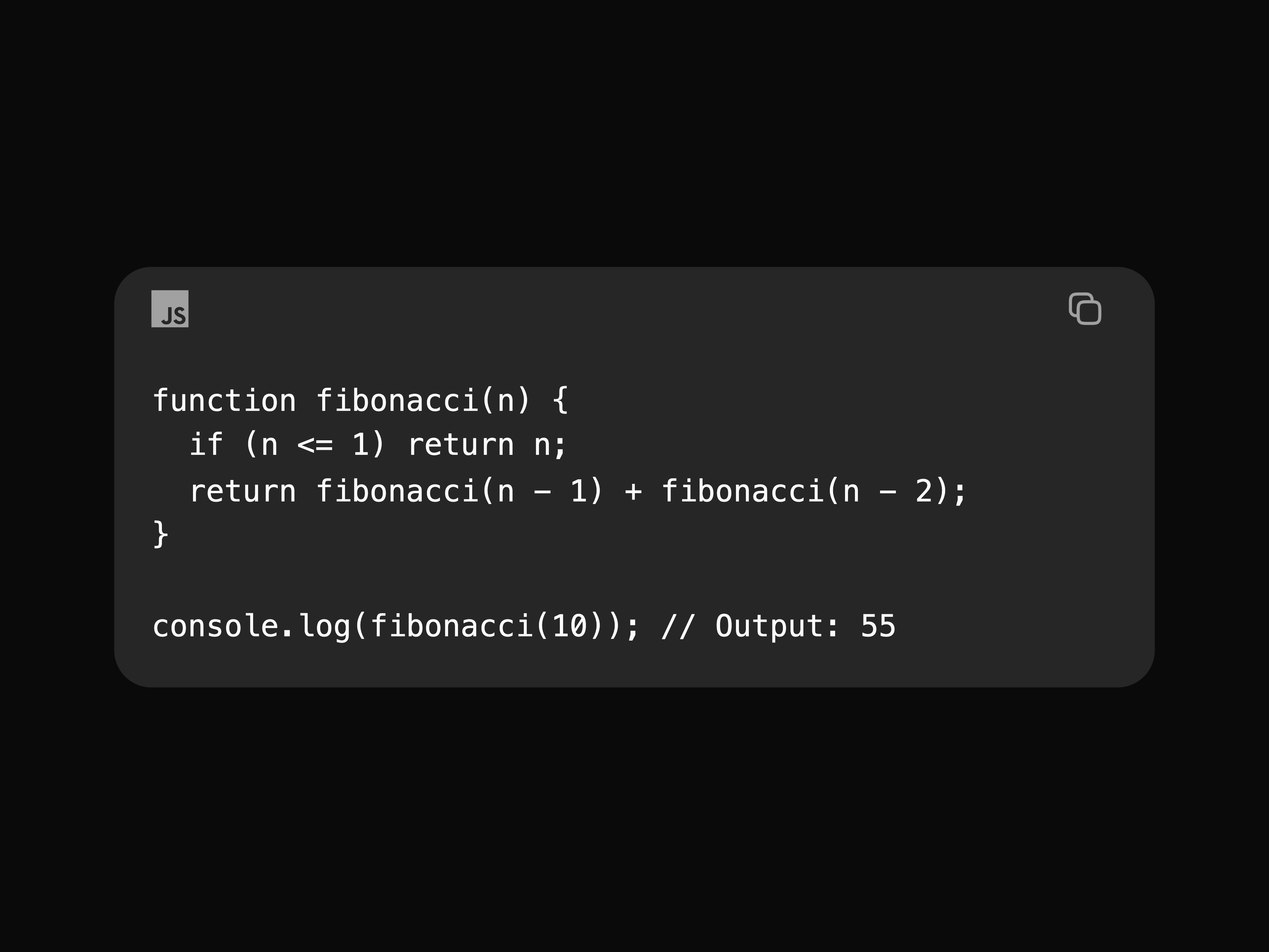
Code Block
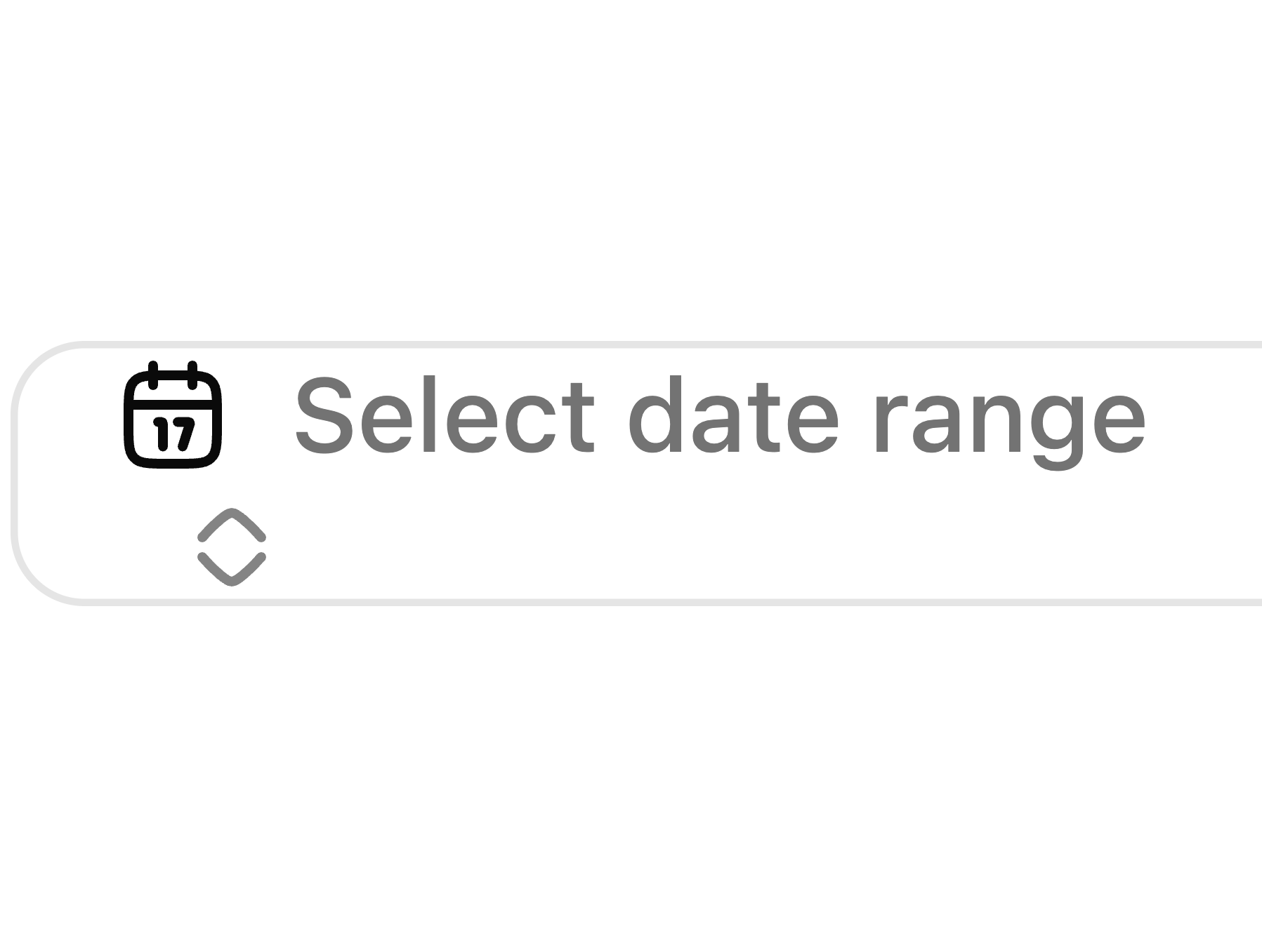
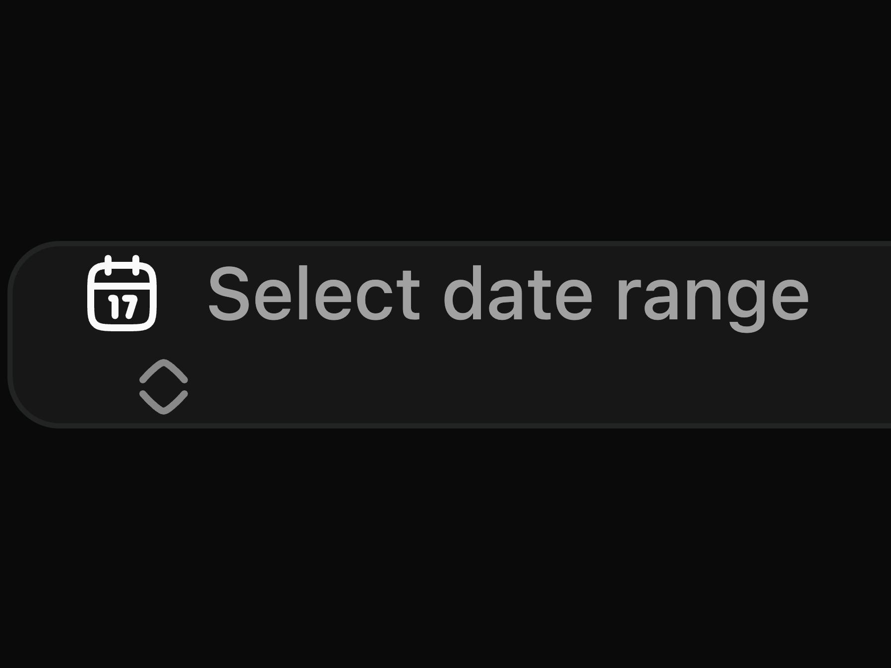
Date Range Picker
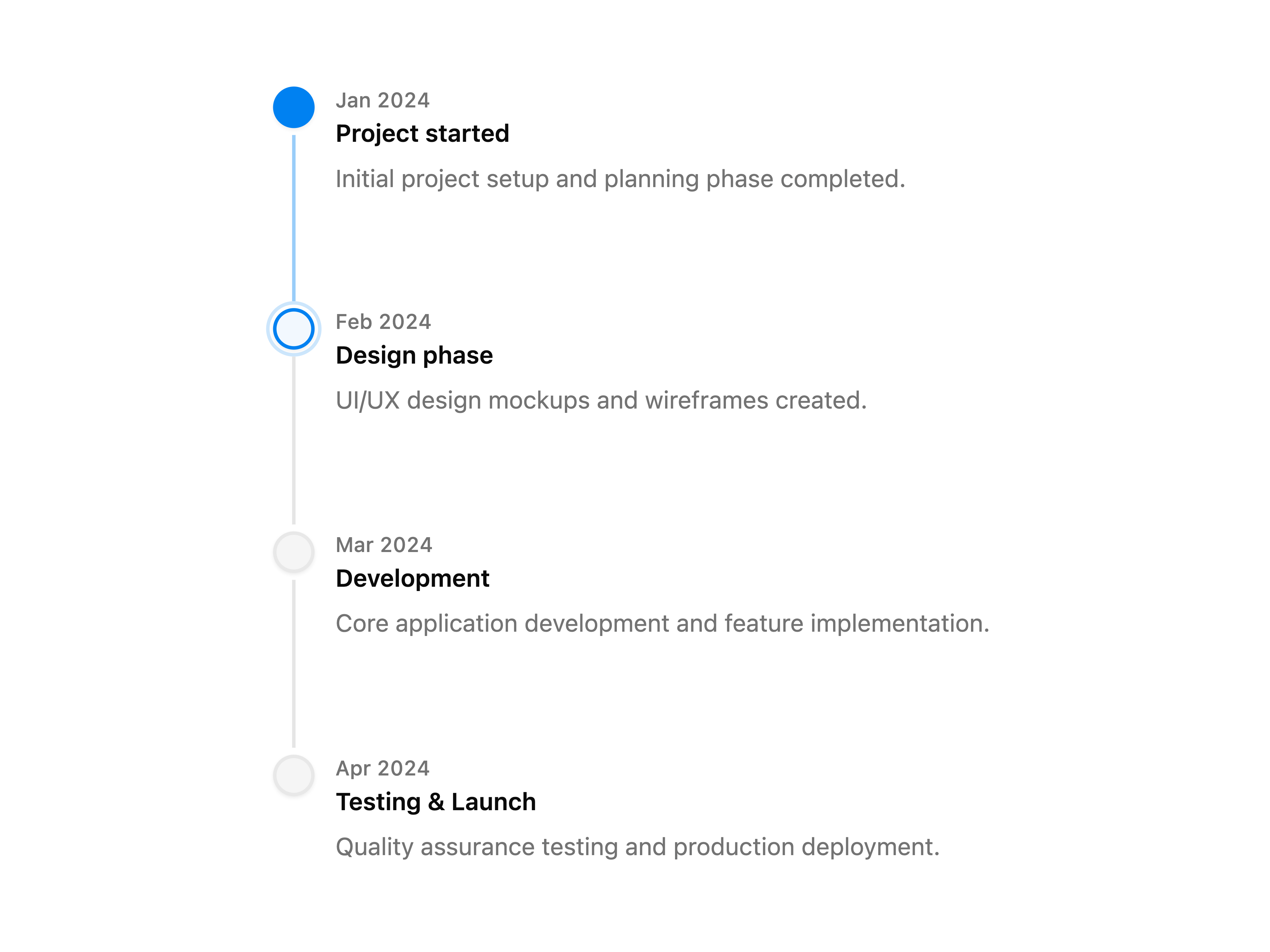
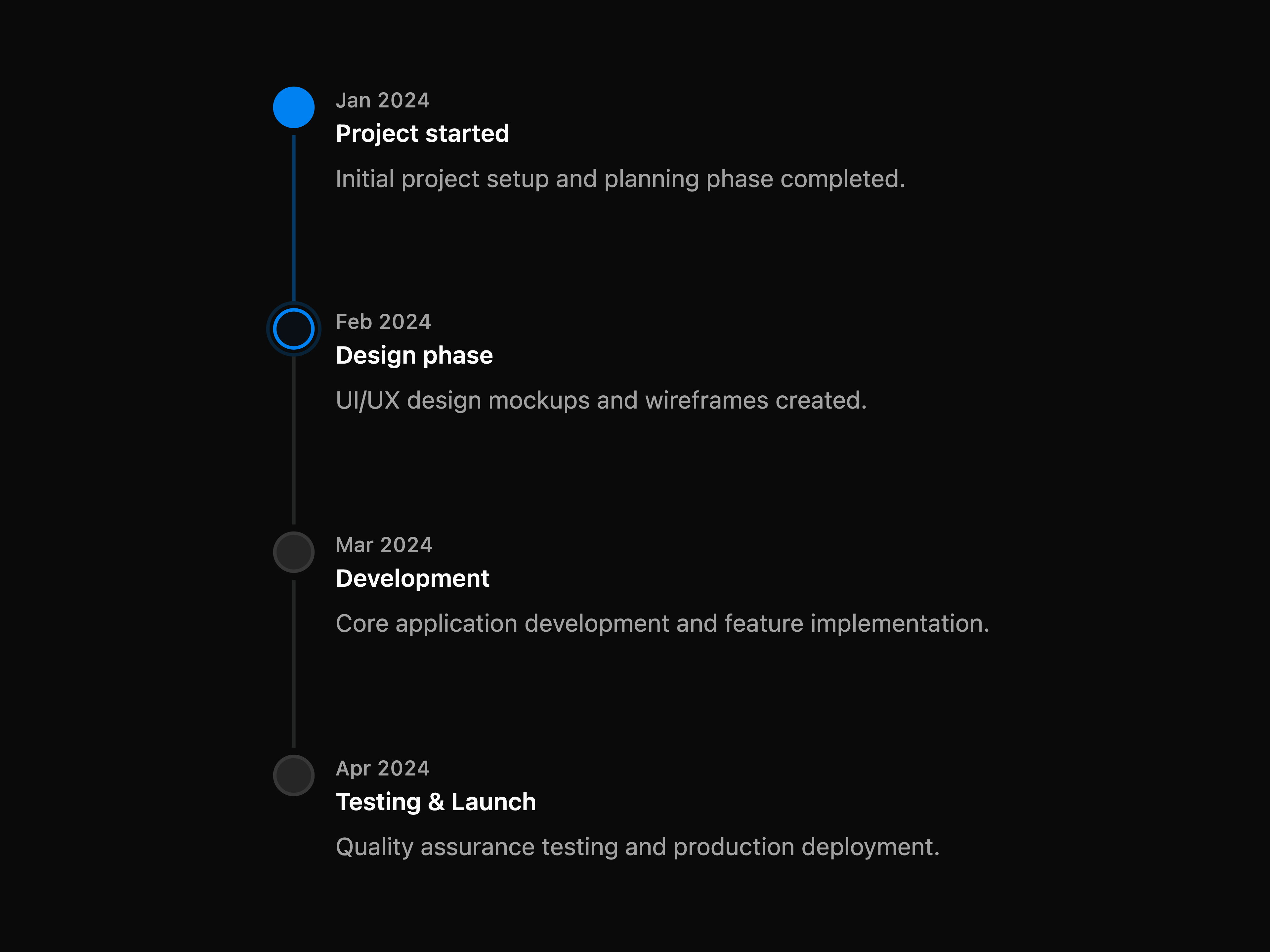
Timeline
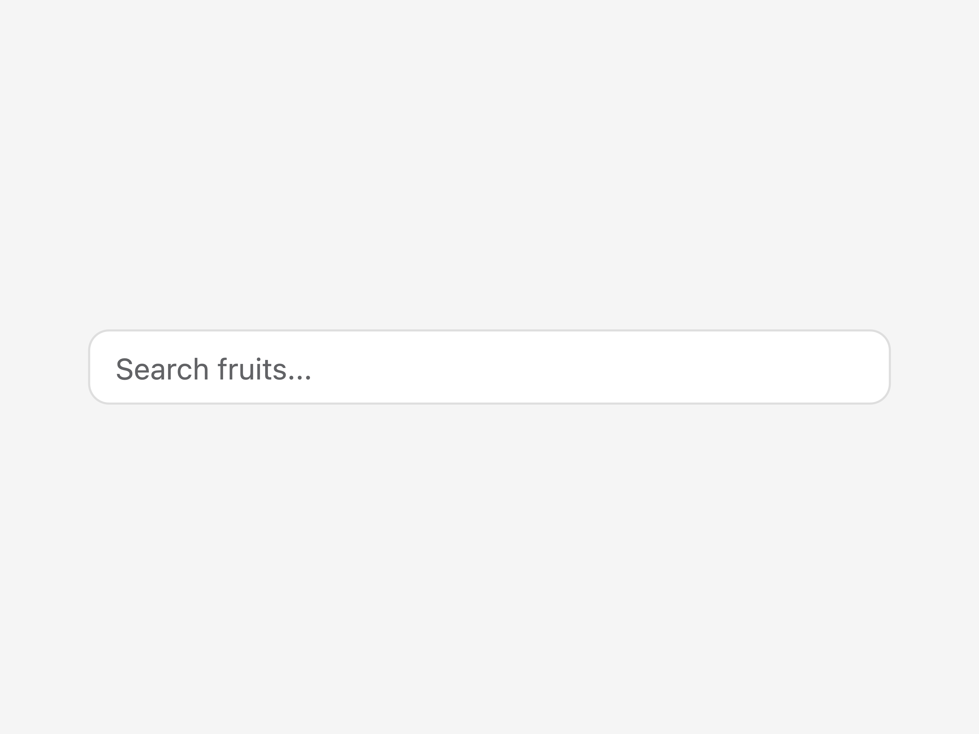
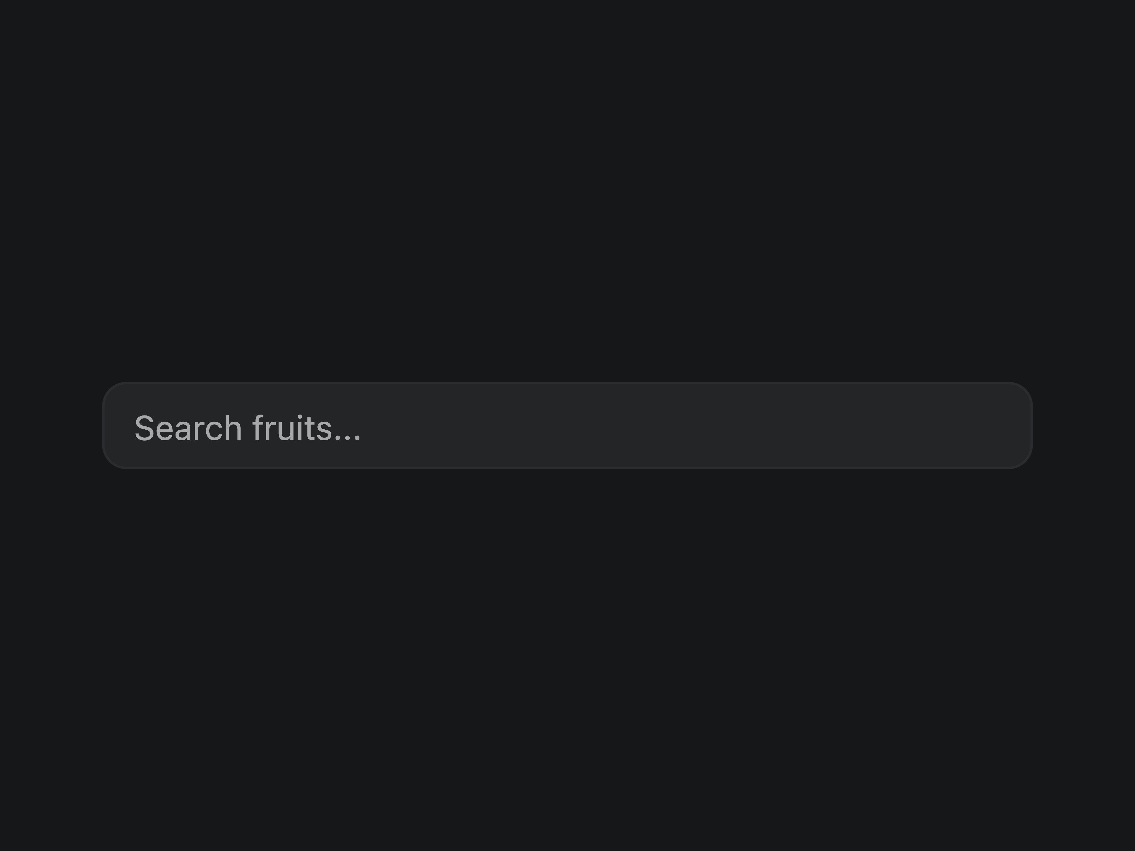
Autocomplete

Copy Button
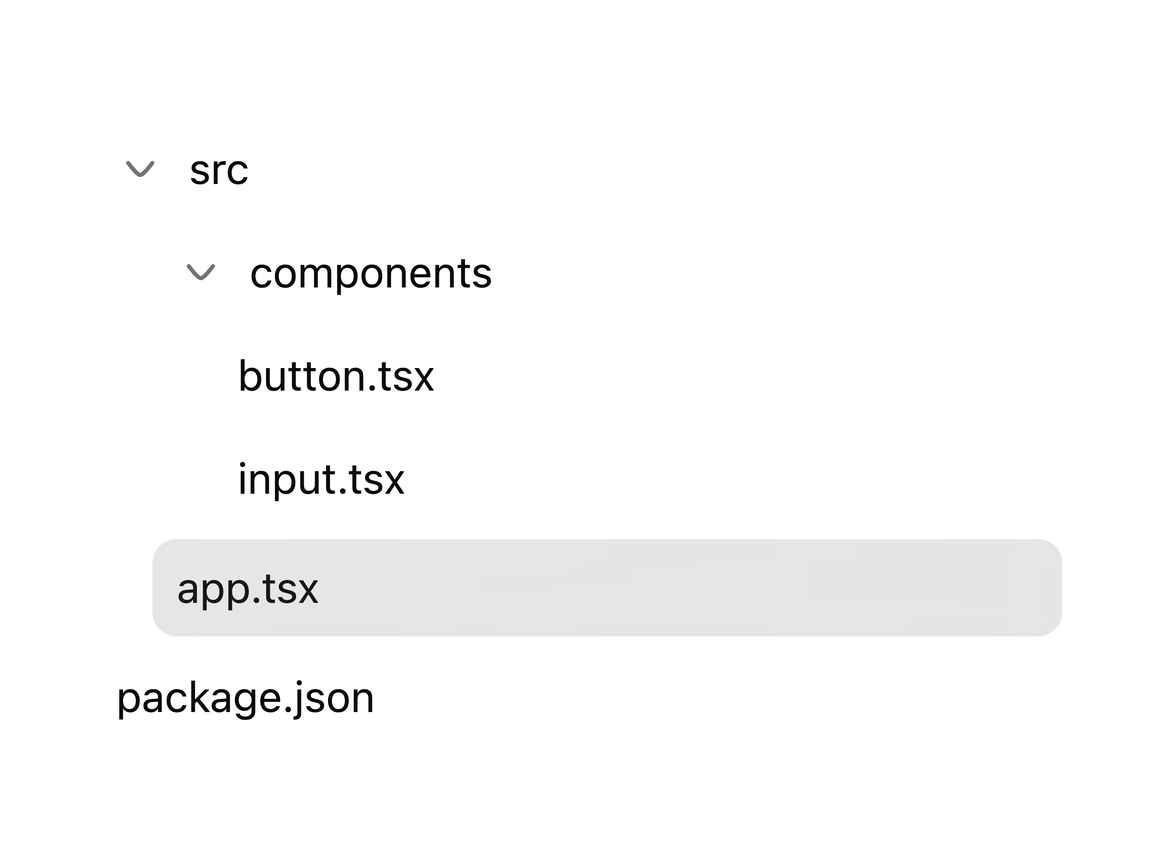
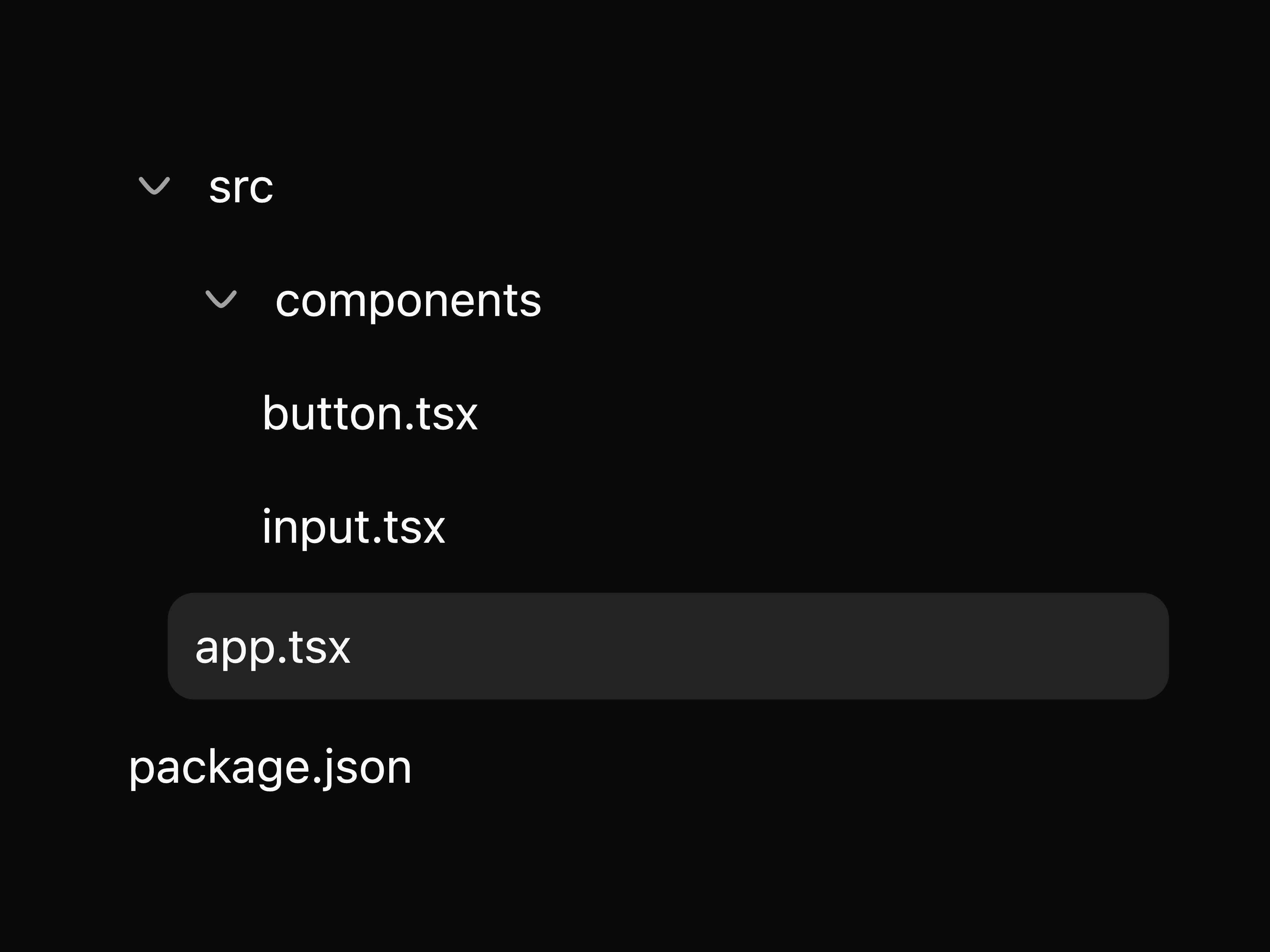
Tree
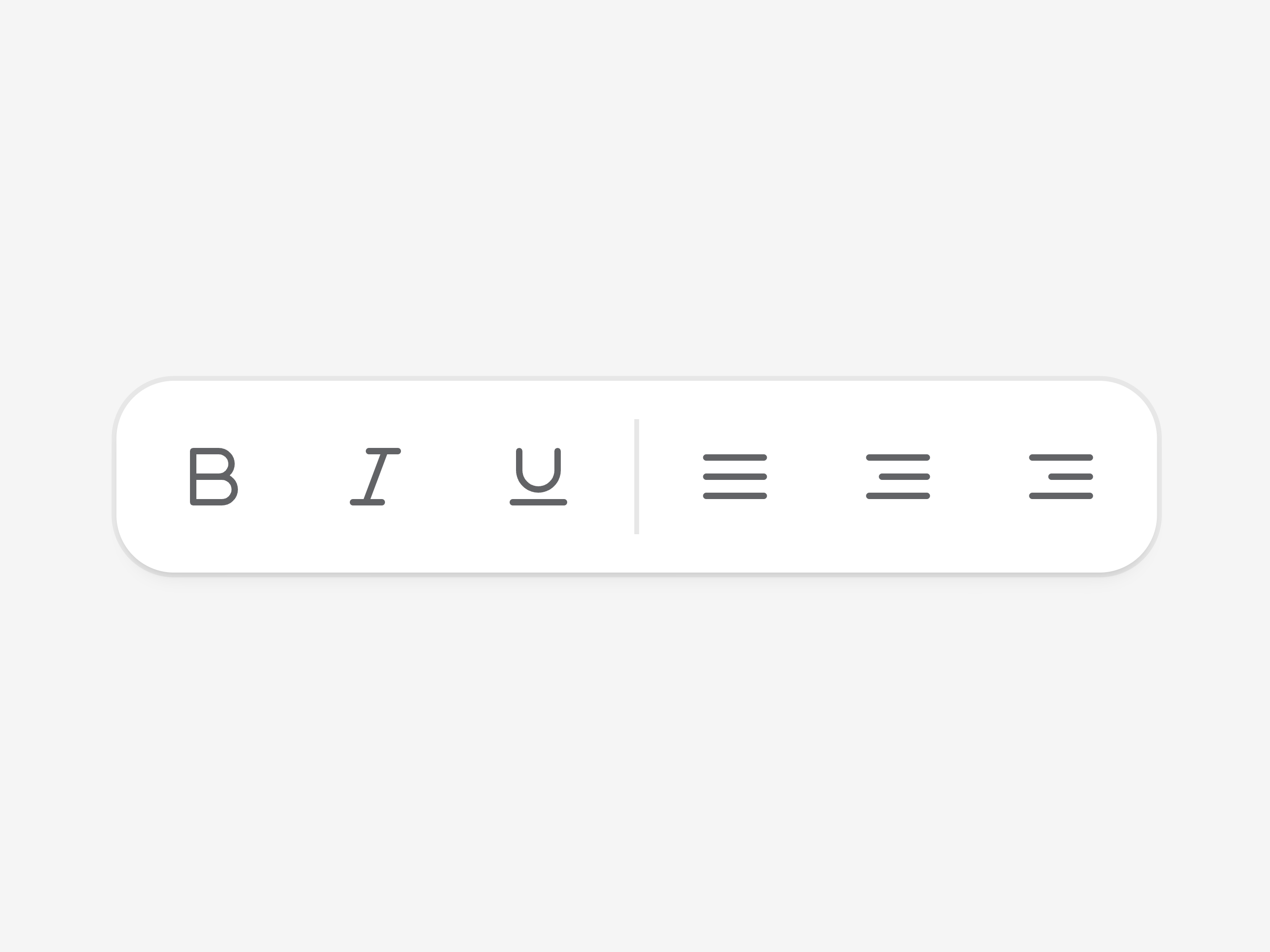
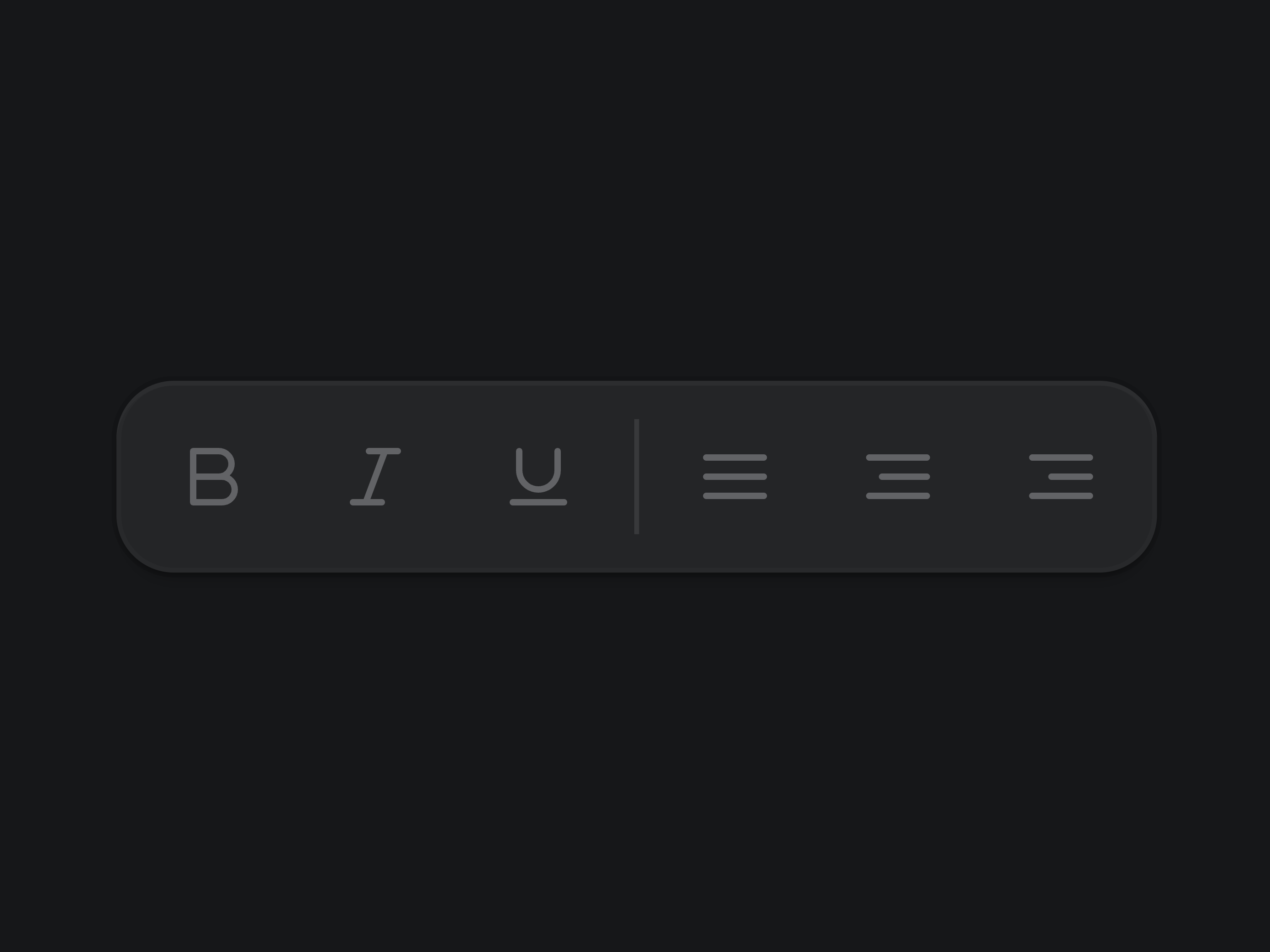
Toolbar


OTP Field


Fancy Button
That's all 9 components
About cubby-ui
cubby-ui publishes a shadcn registry at cubby-ui.dev, with 29 components installable through the shadcn CLI.
- Components
- 29
- GitHub stars
- 42
- Last commit
- Oct 16, 2026
- Repository
- joncoronel/cubby-ui
Also in the cubby-ui registry
Copy a prompt for your agent, copy the install command, or open the docs that ship it.
All Components
allInstall all Cubby UI components with a single command.
Base Drawer
base-drawerA base-drawer component.
@hugeicons/react, @hugeicons/core-free-icons1 fileBreadcrumbs
A breadcrumbs component.
@hugeicons/react, @hugeicons/core-free-icons1 fileButton Group
button-groupA button-group component.
class-variance-authority1 fileCheckbox-group
A checkbox-group component.
1 fileCircular Slider
circular-sliderA circular-slider component.
class-variance-authority5 filesFieldset
A fieldset component.
1 fileFilters
A filter bar of segmented pills with per-field operators and value controls.
@hugeicons/react, @hugeicons/core-free-icons5 filesInput Group
input-groupA input-group component.
class-variance-authority1 fileKbd
A kbd component.
class-variance-authority1 fileMarching Border
marching-borderA marching-border component.
2 filesMeter
A meter component.
class-variance-authority1 fileNumber Field
number-fieldA number-field component.
class-variance-authority, @hugeicons/react, @hugeicons/core-free-icons1 filePreview-card
A preview-card component.
elevated1 fileQR Code
qr-codeA from-scratch, zero-dependency QR code generator rendered as pure scalable SVG.
15 filesScroll Fade
scroll-fadeA CSS utility that fades the edges of any scroll container as you scroll, with no component required.
1 fileShimmer
A CSS utility that sweeps an animated highlight across text for live status and streaming states, with no component required.
1 filetext-morph
Transition Panel
transition-panelA transition-panel component.
1 file