Installs all 94 components. Without our CLI, run instead.
iconiq publishes a shadcn registry at iconiqui.com, with 94 components installable through the shadcn CLI.
Copy a prompt for your agent, copy the install command, or open the docs that ship it.
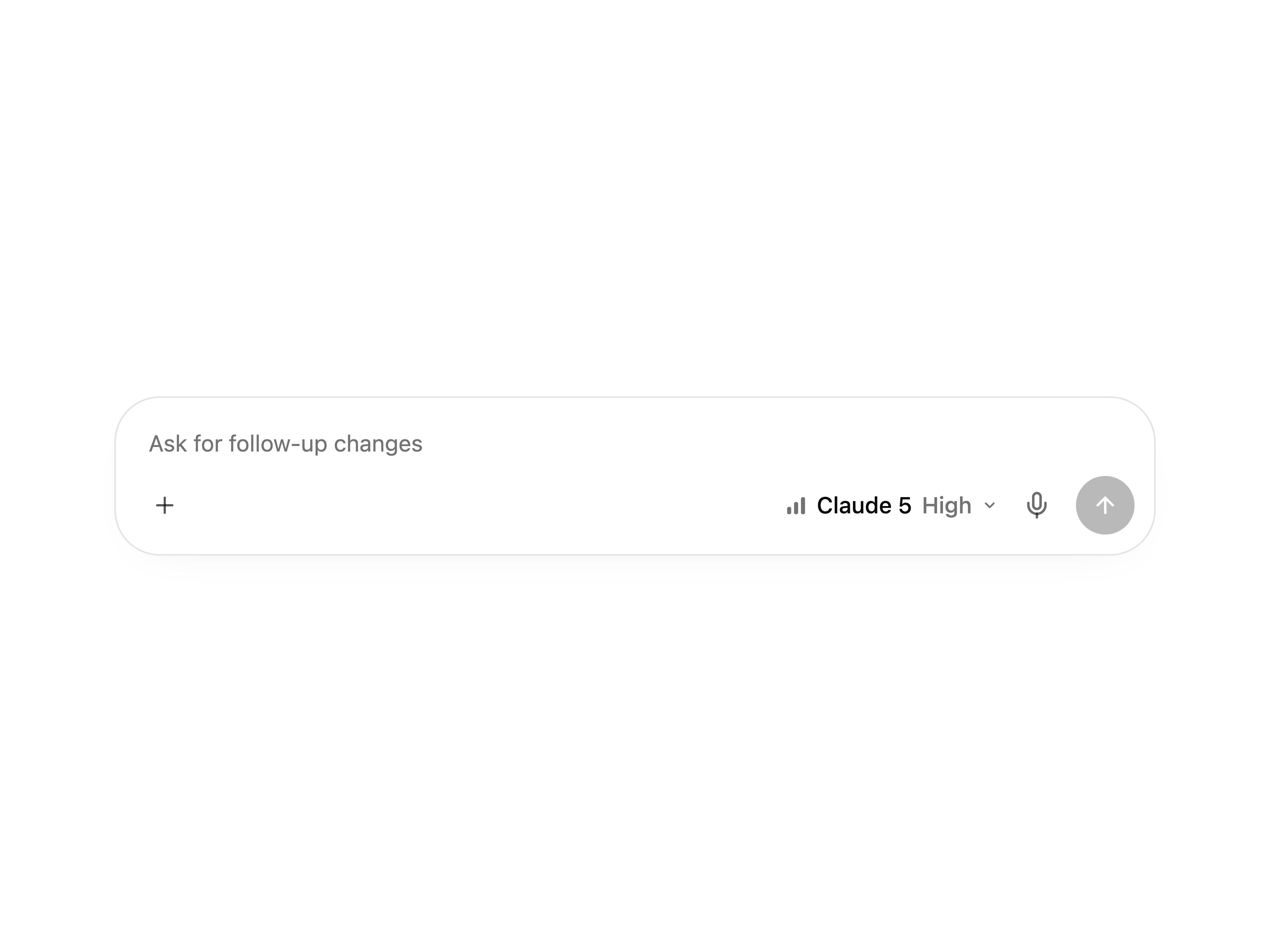
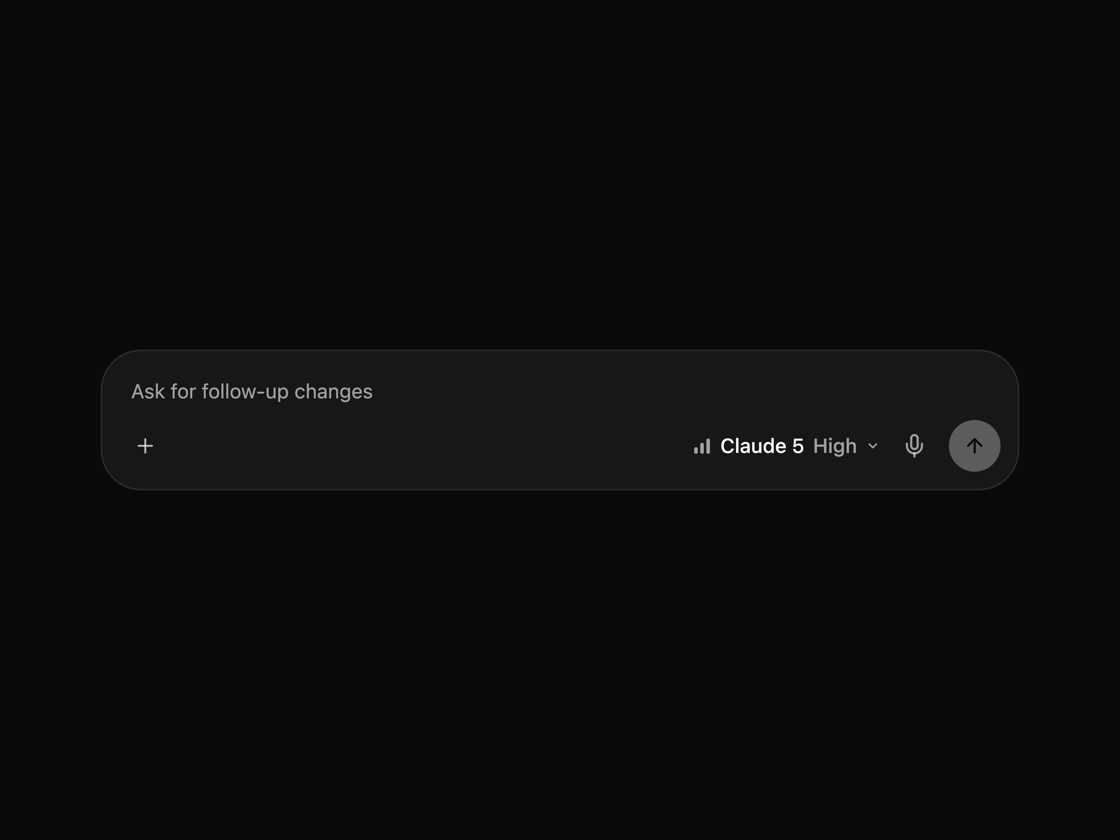
Chat-style AI composer with agent and model chips, sent-message bubbles, and an Apple Intelligence-style gradient wave on send.
Compound Accordion, AccordionItem, AccordionTrigger, and AccordionContent parts layered over Base UI primitives with default and quiet variants.
Top-of-screen announcement banner with four gradient tones, a left-aligned ringed icon and message, a right-aligned outlined action, a dismiss collapse, and a fluid spring morph that melts the bar into a confirmation pill when its action is clicked.
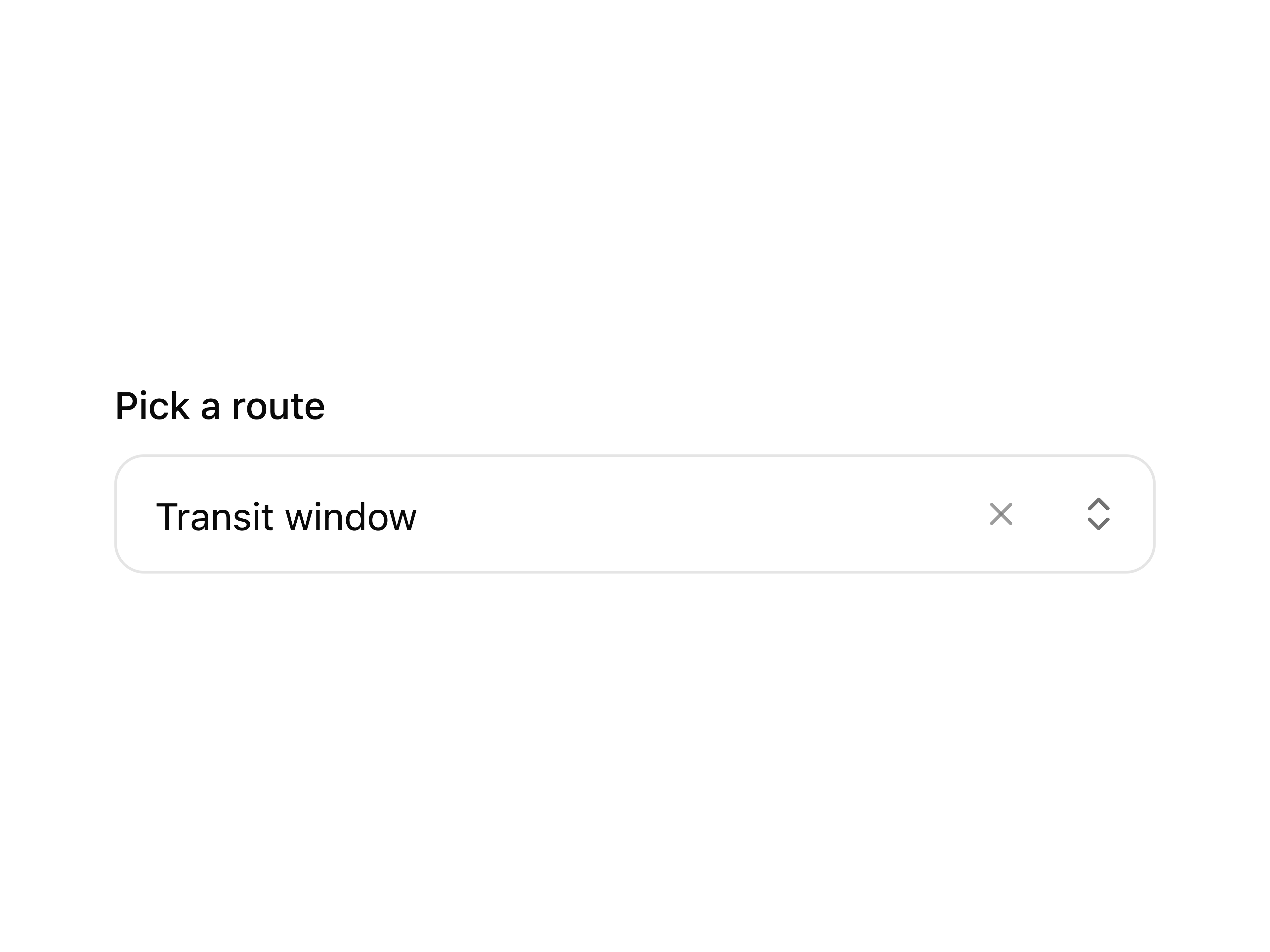
Base UI autocomplete with list filtering, suggestion highlight motion, and the same Iconiq input shell as the combobox install.
Avatar with the same single Iconiq API layered over Base UI primitives, keeping immediate fallback initials and a quiet image crossfade.
Button with embedded Iconiq theme tokens, optional loading, href link rendering, ripple, press spring, hover lift, and intrinsic-width animation over the Base UI button primitive.
Checkbox with the same Iconiq API layered over Base UI primitives, preserving the original fill spring, press scale, checkmark draw, and label fade.
Composable context menu layered over Base UI primitives, preserving the original panel spring, row entrance, active highlight, and shortcut layout.
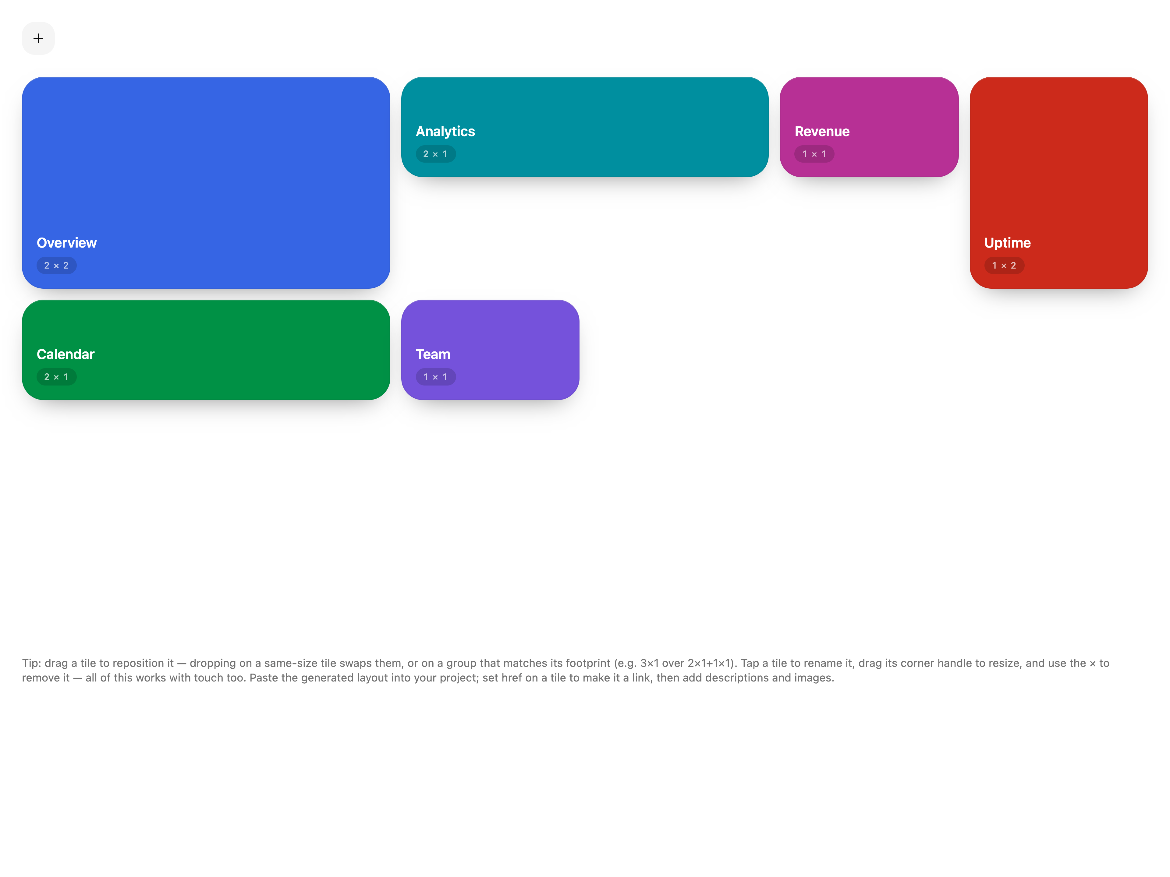
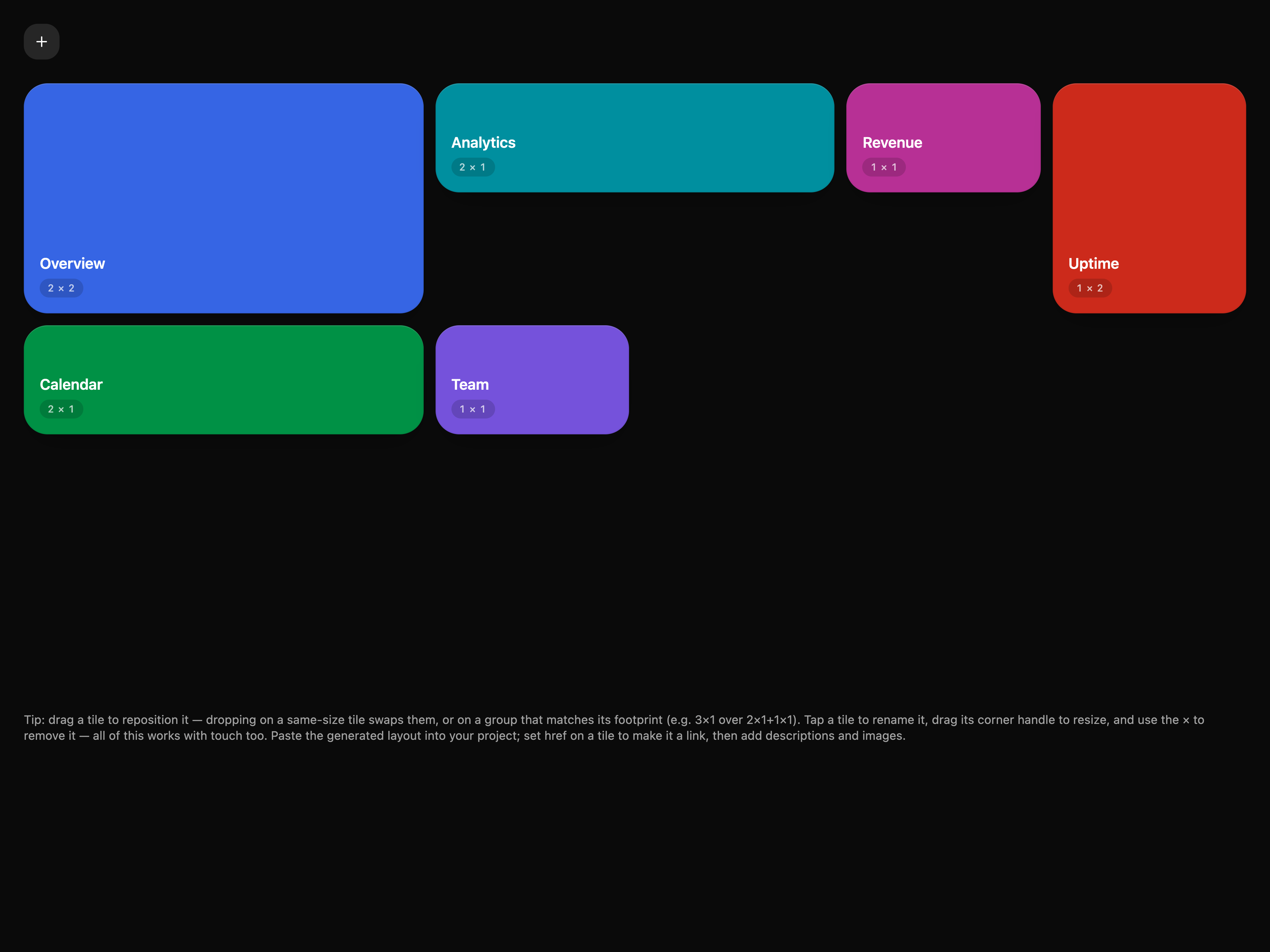
Interactive bento-grid layout tool — drag tiles to reposition, tap to rename, drag a corner to resize, add tiles, then export the generated grid layout code to drop straight into your own project.
Hover card with the same Iconiq API layered over Base UI popover primitives, preserving delayed hover reveal, instant focus open, collision-aware placement, and spring-driven content motion.
Compound Select parts layered over Base UI primitives, preserving the original trigger press, chevron rotation, grouped rows, and panel motion.
Floating selection toolbar with the same Iconiq API layered over Base UI toolbar primitives, including viewport-aware positioning, keyboard shortcuts, and fluid button motion.
Separator with line, dashed, and dotted variants layered over the Base UI primitive, supporting horizontal and vertical orientation with a decorative default.
Slider with the same Iconiq API layered over Base UI primitives, preserving the original spring-settled fill, active track height, and thumb scale motion.
Switch with the same Iconiq API layered over Base UI primitives, preserving the original spring thumb travel, pressure-like squash, and foreground fill sweep.
Tabs with the same Iconiq API layered over Base UI primitives, preserving the measured underline, keyboard flow, and motion-smoothed panel shell from the core tabs component.
Two-state button with spring press feedback, a muted fill that bounces in when pressed, and a subtle content lift layered over Base UI toggle primitives.
Segmented toggle group with the same fluid wipe fill, sheen sweep, and icon press feedback as the standalone toggle, over Base UI toggle-group primitives.
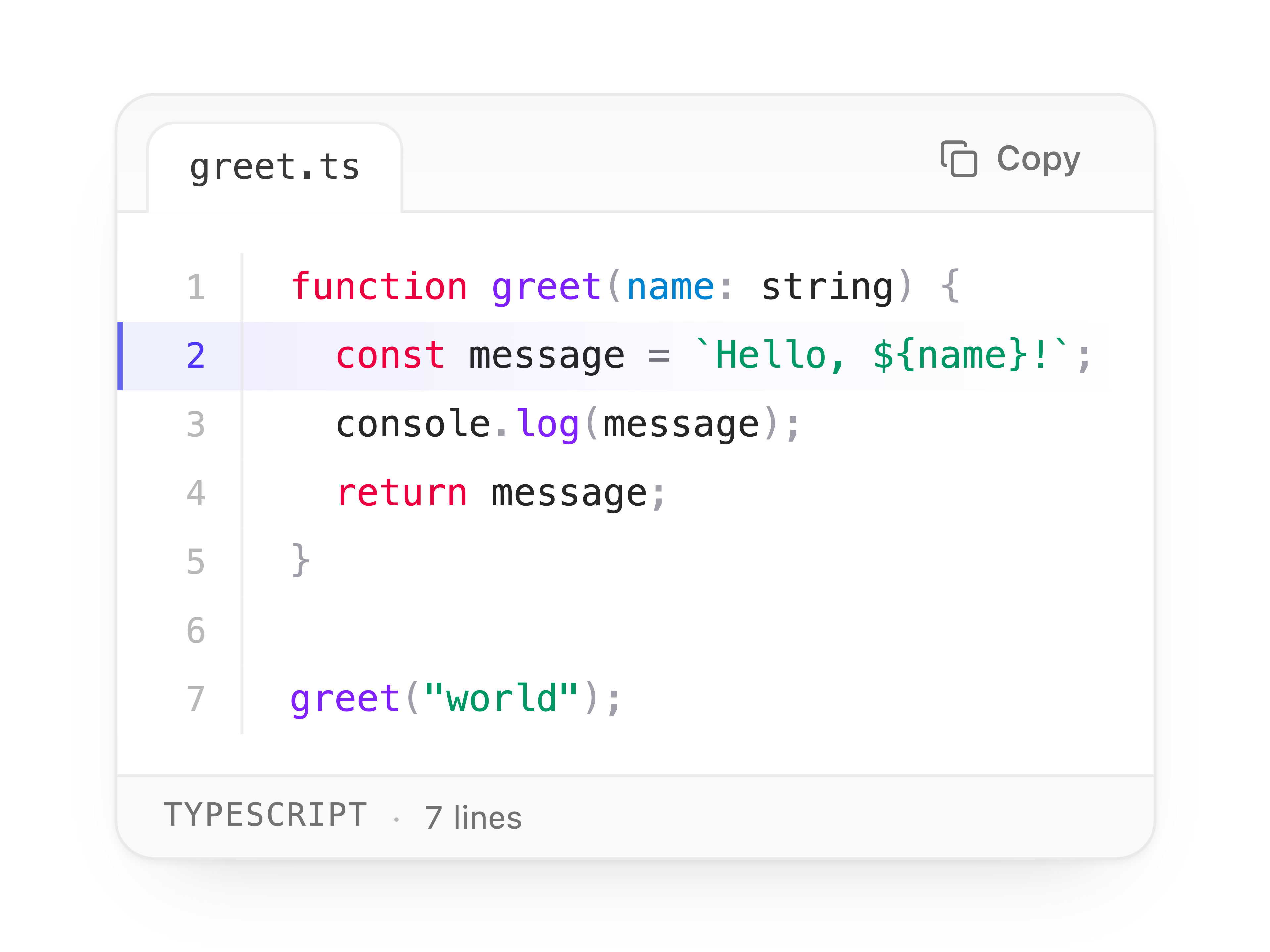
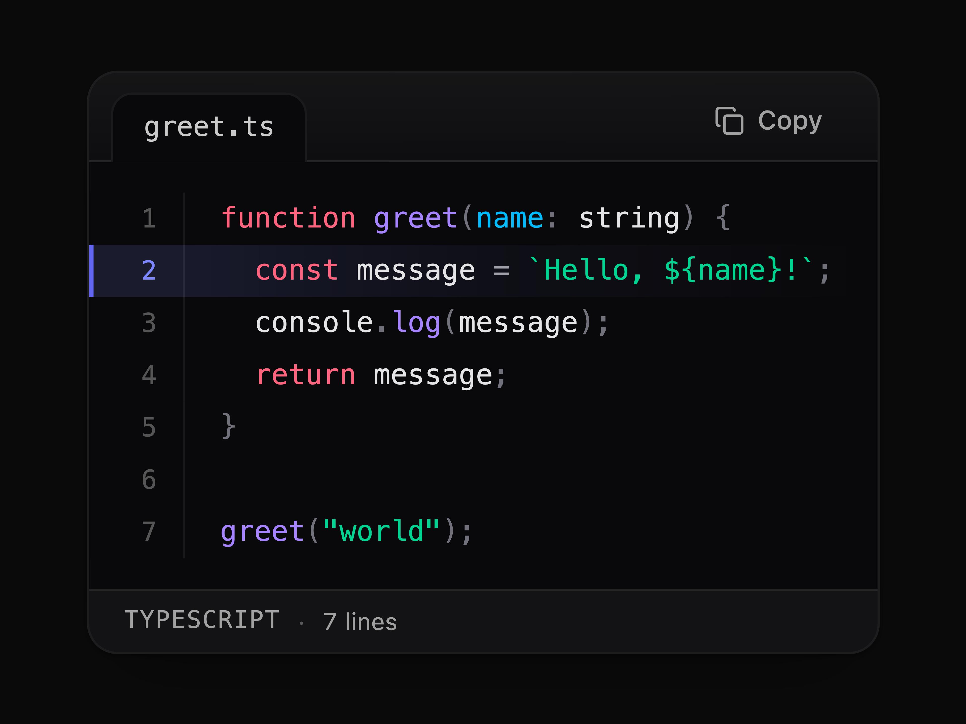
Editor-style code block with a filename tab, a top-right spring-crossfade copy button, a bottom status bar with language and line count, line numbers, built-in theme-aware syntax highlighting, and line emphasis.
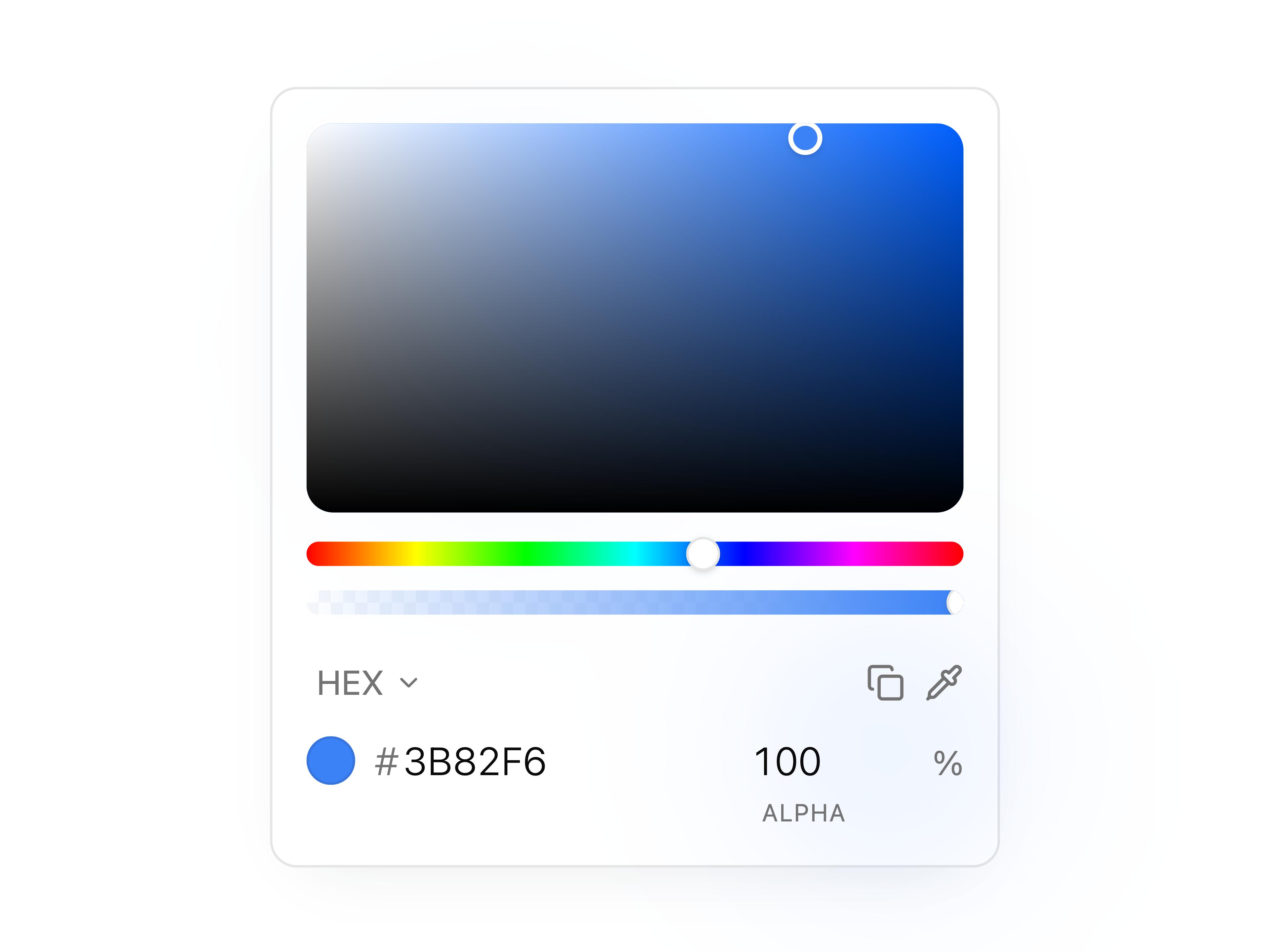
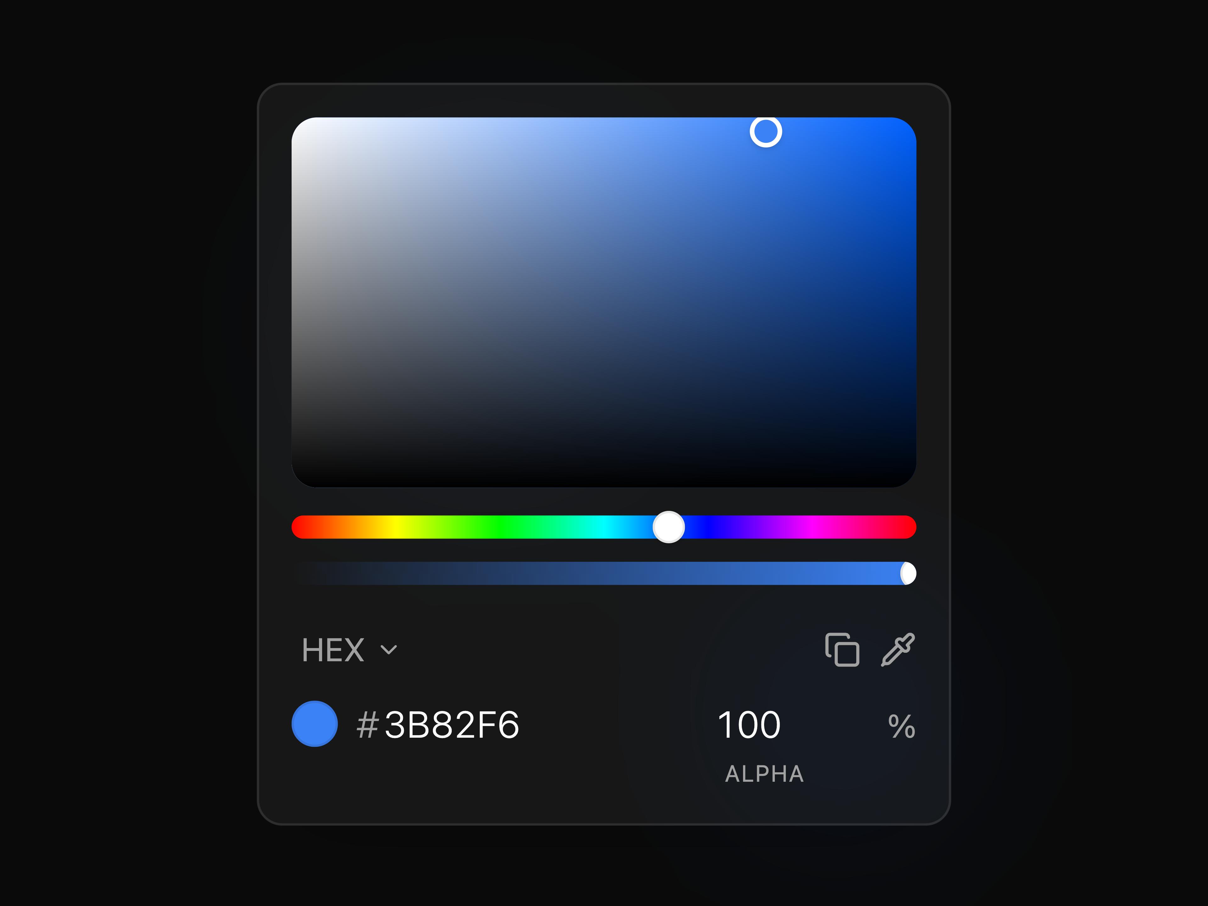
HSV panel with saturation field, hue/alpha sliders, multi-format readouts, hex input, and EyeDropper.
Radix dialog command menu with grouped search, keyboard shortcuts, navigation items, custom triggers, and optional theme switching.
GitHub-style contribution calendar with compound calendar, block, total-count, and legend parts — pass raw Activity data or just a GitHub username and it fetches and caches the last year of contributions itself, shimmers a skeleton grid while loading, then fades the muted grid in and lights the greens up level by level — lightest to darkest — with springy pops, plus custom per-day tooltips and reduced-motion aware behavior.
Collapsed pill that morphs into an expanded feedback panel with a send button, loading state, and a textarea, driven by pure CSS transitions with asymmetric open/close easing.
Drag-and-drop file uploader with click-to-browse fallback, queued file rows, image previews, built-in progress states, and optional change callbacks.
Async button with idle, loading, and success states.
Full-width looping announcement ribbon with repeated content, optional reverse direction, and diagonal rotation controls.
Multi-column logo grid that cycles through sponsor logos with a staggered wave animation.
Hand-drawn text annotations — wavy, circle, highlight, underline, and more — that draw themselves in like ink as they scroll into view, with an optional animate prop for a fully static render.
Composable chat message primitives — group, row, avatar, bubble, header, and footer — where each message slides in beside its composer with a bouncy spring: sent messages arrive from the right, received from the left, morphing up from the bubble's tail corner and bouncing back once as they land, plus reduced-motion aware behavior.
Compound Accordion, AccordionItem, AccordionTrigger, and AccordionContent parts layered over Radix UI primitives with Motion-heavy panel choreography.
Rounded action button with a radial foreground fill that spreads on hover or focus-visible. Built with Motion.
Compound star rating built from Rating and RatingButton — hover to preview, click or use arrow keys to set the value, with configurable size on the root, a springy scale pop, and color fade that ripples across the stars.
Avatar with the same single Iconiq API layered over Radix UI primitives, preserving immediate fallback initials and the quiet image reveal.
Checkbox with the same Iconiq API layered over Radix UI primitives, preserving the original fill spring, press scale, checkmark draw, and label fade.
Base UI collapsible reasoning trace for AI replies with a shimmering trigger label and no status icon, per-step dots that pop into checkmarks once done, a self-timing elapsed-seconds readout, a crossfading collapsed preview of the current step, and a staggered vertical timeline once expanded.
Staggered word or character reveal with spring lift, blur fade, and optional scroll-triggered playback.
Hover card with the same Iconiq API layered over the dedicated Radix Hover Card primitive, preserving delayed hover reveal, instant focus open, collision-aware placement, and spring-driven content motion.
Radio group with the same Iconiq API layered over Radix UI primitives, preserving the original shared highlight, spring-loaded ring and dot, and staggered row entrance.
Floating selection toolbar with the same Iconiq API layered over Radix UI toolbar primitives, including viewport-aware positioning, keyboard shortcuts, and fluid button motion.
Separator with line, dashed, and dotted variants layered over the Radix UI primitive, supporting horizontal and vertical orientation with a decorative default.
Slider with the same Iconiq API layered over Radix UI primitives, preserving the original spring-settled fill, active track height, and thumb scale motion.
Switch with the same Iconiq API layered over Radix UI primitives, preserving the original spring thumb travel, pressure-like squash, and foreground fill sweep.
Two-state button with spring press feedback, a muted fill that bounces in when pressed, and a subtle content lift layered over Radix UI toggle primitives.
Segmented toggle group with the same fluid wipe fill, sheen sweep, and icon press feedback as the standalone toggle, over Radix UI toggle-group primitives.
Floating inline formatting toolbar for editable text selections with viewport-aware positioning, keyboard shortcuts, theme tokens, and bold, italic, underline, link, copy, and strikethrough actions.
Animated onboarding checklist card with staggered task rows, a drawn checkmark badge, and a floating progress pill with a spring-smoothed pie.
Loading indicator with ring, bouncing dots, or dot-matrix sweep variants. Motion; uses primary and muted theme tokens.
Word-by-word AI text streaming where each word fades in crisply wearing a blue gradient, then crossfades into the theme foreground once settled — black in light mode, white in dark — with a pulsing gradient dot at the stream head, natural prose wrapping, sr-only full-text announcement, and reduced-motion aware behavior.
Team invitation block with fluid morphing variants for inviting members, managing the team, assigning roles, and tracking pending invites.
Inline testimonial wall where hovering one quote blurs and dims the rest while the author attribution reveals beside the highlighted quote. Pure CSS :has()-driven hover state — no per-frame JS animation.
Cycling text with vertical slide transitions—pass your own items and interval for rotating headlines or status copy.
AI loading state with a sparkle glyph that wobbles through liquid blob keyframes into a circle while a companion twinkle blooms on the same timeline, cycling status words that slide through a soft blur, a per-word shimmer sweep, layout-stable width, and reduced-motion aware behavior.
Inline live clock for city aliases or IANA timezones with fluid digit rolls, pulsing separators, and spring transitions.
Single typography primitive that maps the full heading, label, paragraph, subheading, and documentation scale through one variant prop.
Week strip that morphs into a full month grid, with a shared-layout spring pill and a draggable grabber handle.
iOS-style wheel picker with a 3D barrel, drag and flick inertia, detent snapping, velocity-driven motion blur, a per-row emphasis morph into the selection lens, optional looping columns, and reduced-motion aware springs.
shadcn/ui primitives you own, Subtle motion animations you feel—paste a component, tune the tokens, and ship without the boilerplate hunt.
Visit https://iconiqui.com/installation to view the documentation.
To access MCP server Visit https://iconiqui.com/mcp .
npx skills add https://iconiqui.com --skill iconiq
Please read the contributing guide.
This project follows the Code of Conduct. By participating, you agree to uphold it.
Licensed under the MIT license.
Every appearance and removal our crawl has seen in the registry index.
iconiq is a component library on 21st.dev by Edwin Vakayil with 14 public React components. Every component ships with a live interactive preview and full TSX source — copy the code, install it through the shadcn CLI, or pull it into Cursor or Claude Code over MCP.