HomeBookmarks
hexuihexui
hexui

hexui

HSby hexui-sh
6components15Kviews34bookmarks

Installs all 34 components. Without our CLI, run instead.

Auto-indexed

hexui contents
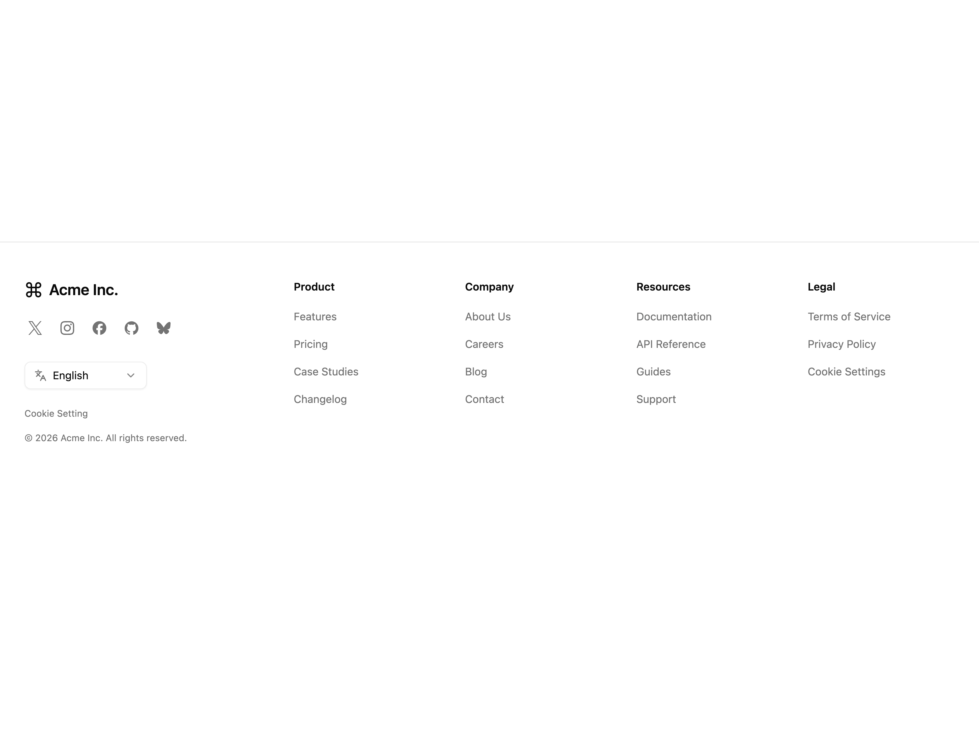
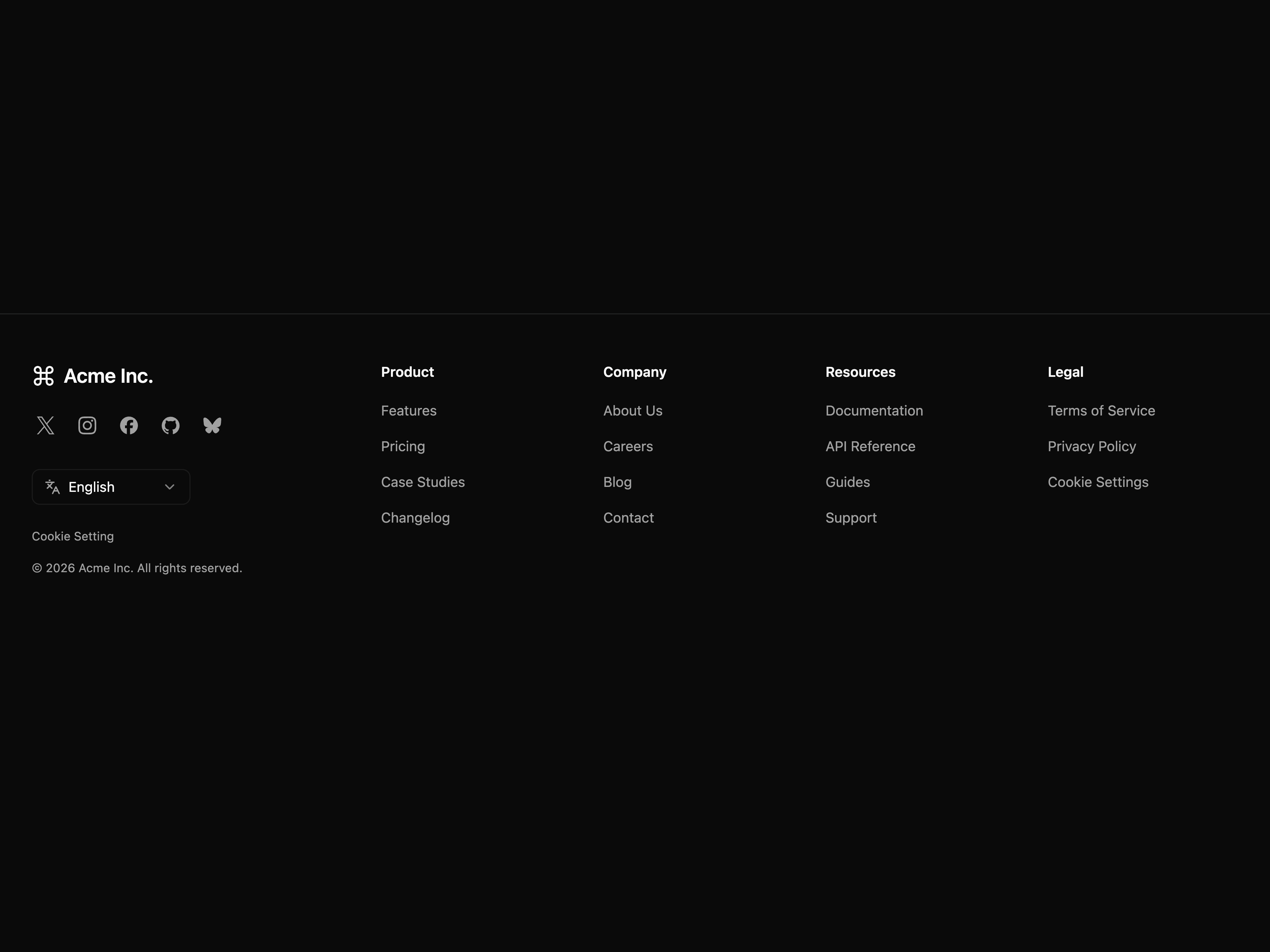
  • Footer with Social Links and Language SwitcherFooter with Social Links and Language Switcher
    Footer with Social Links and Language Switcher
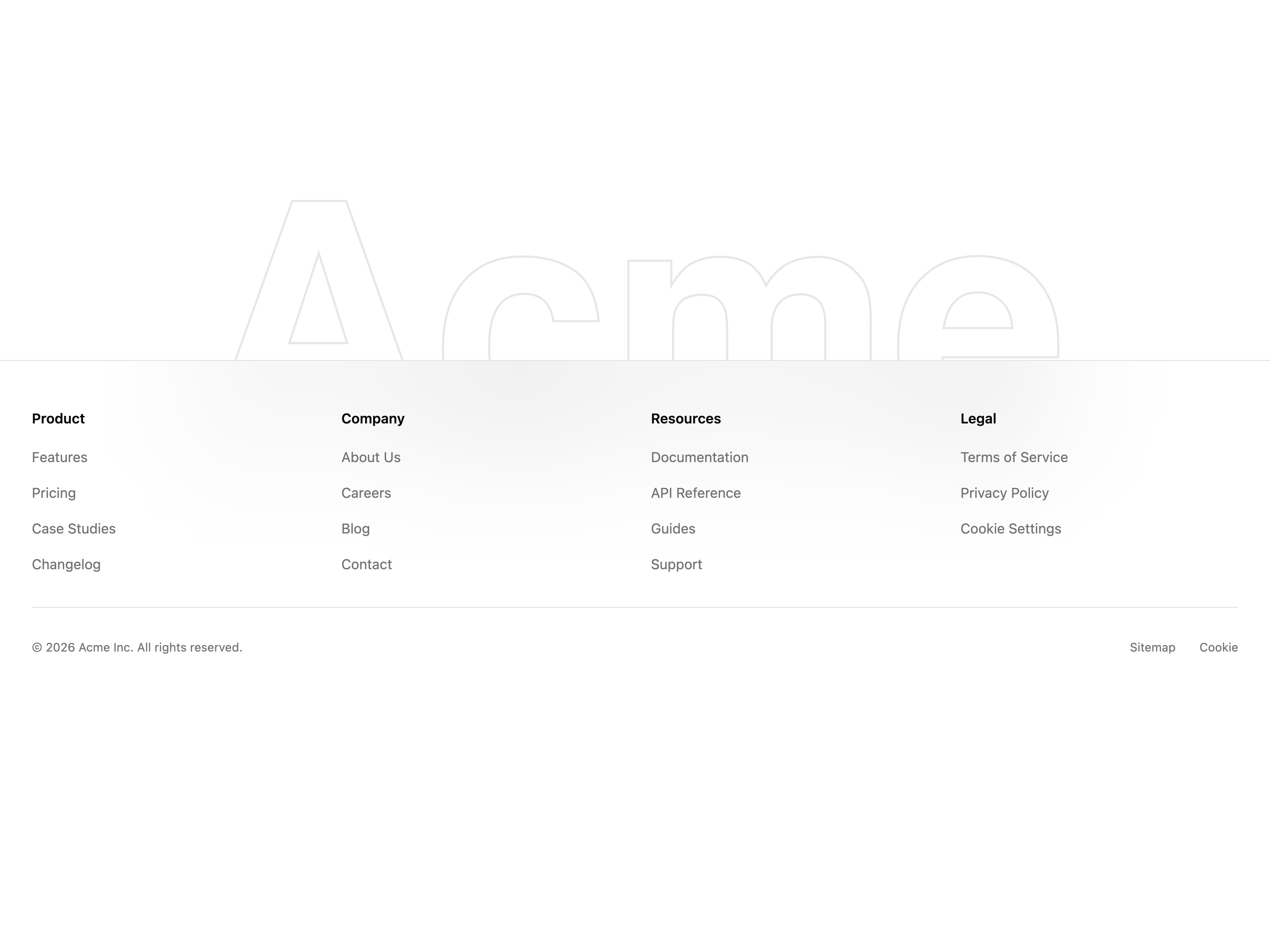
  • Fluid Gradient FooterFluid Gradient Footer

    Fluid Gradient Footer

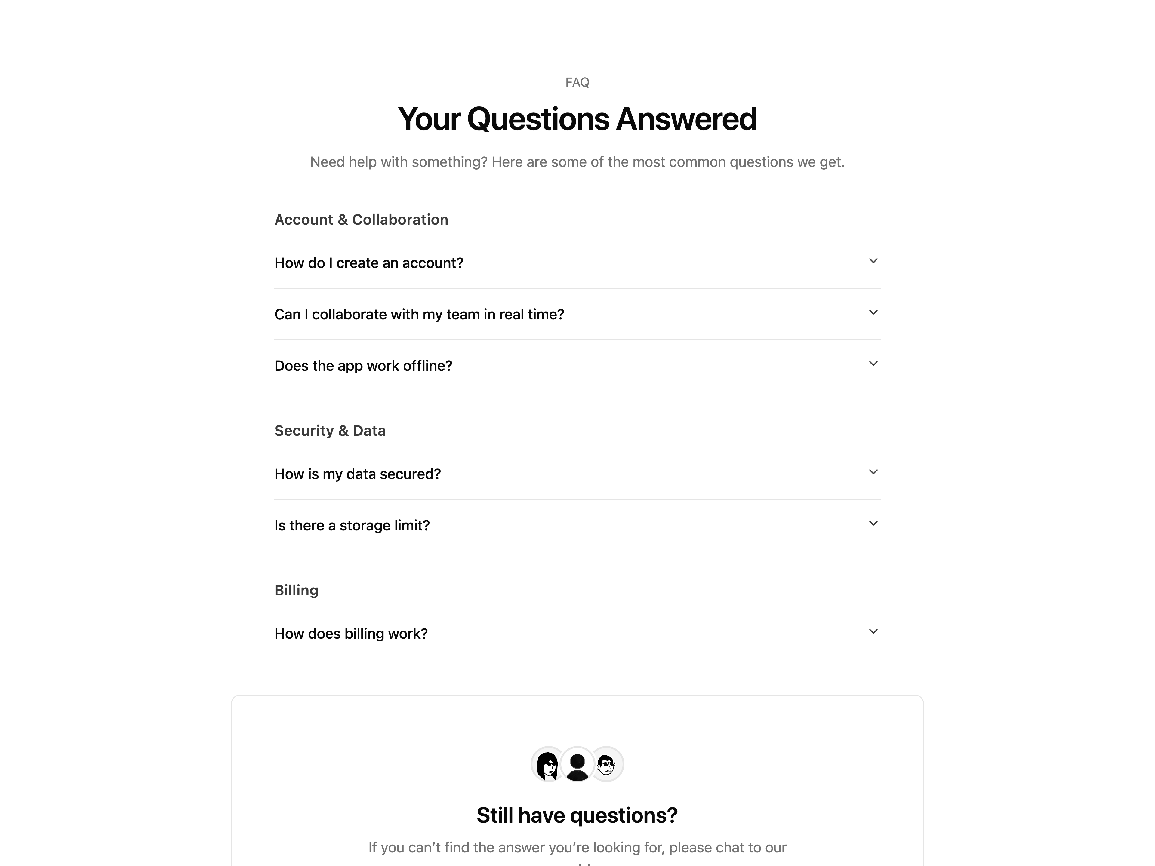
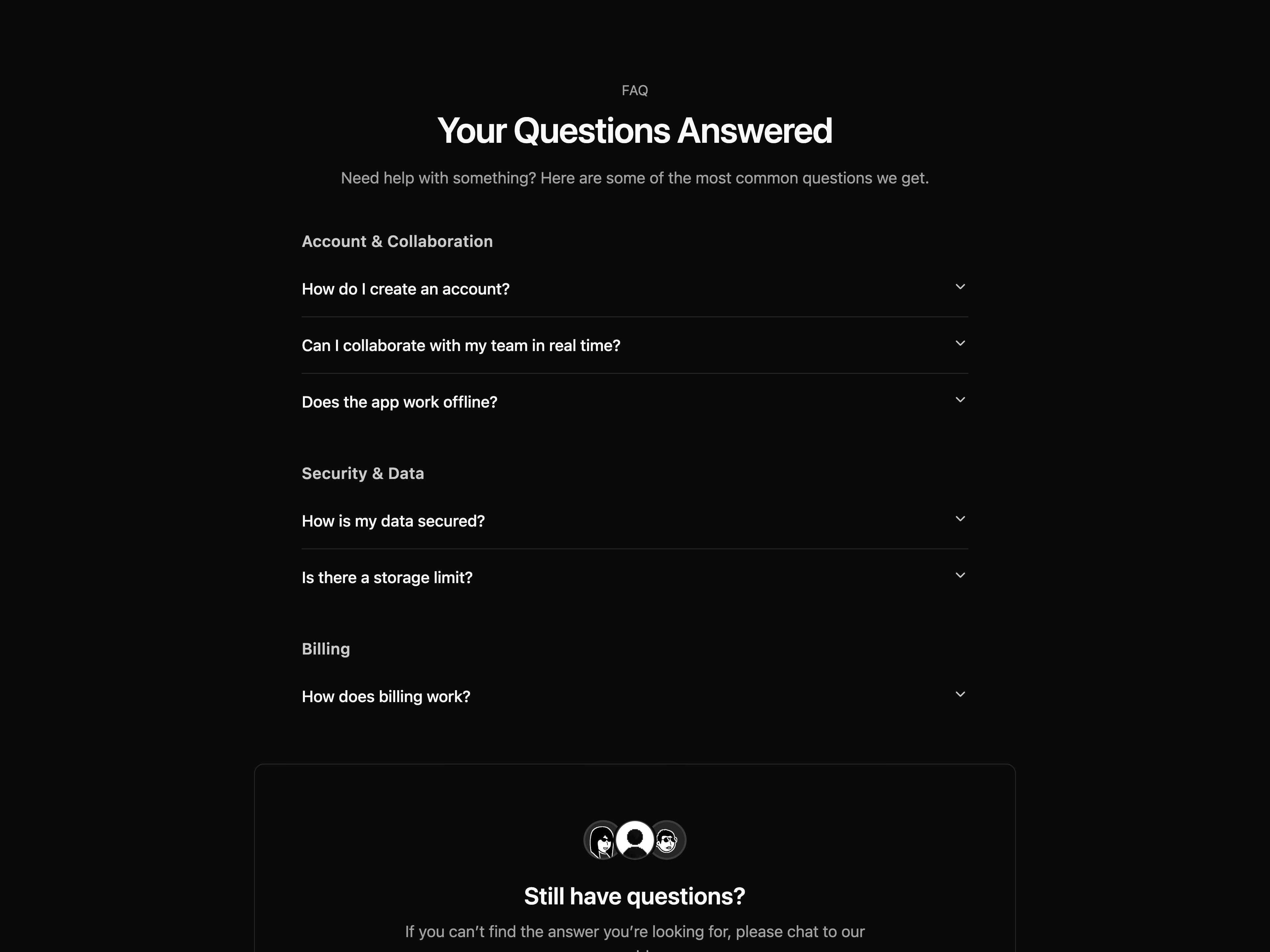
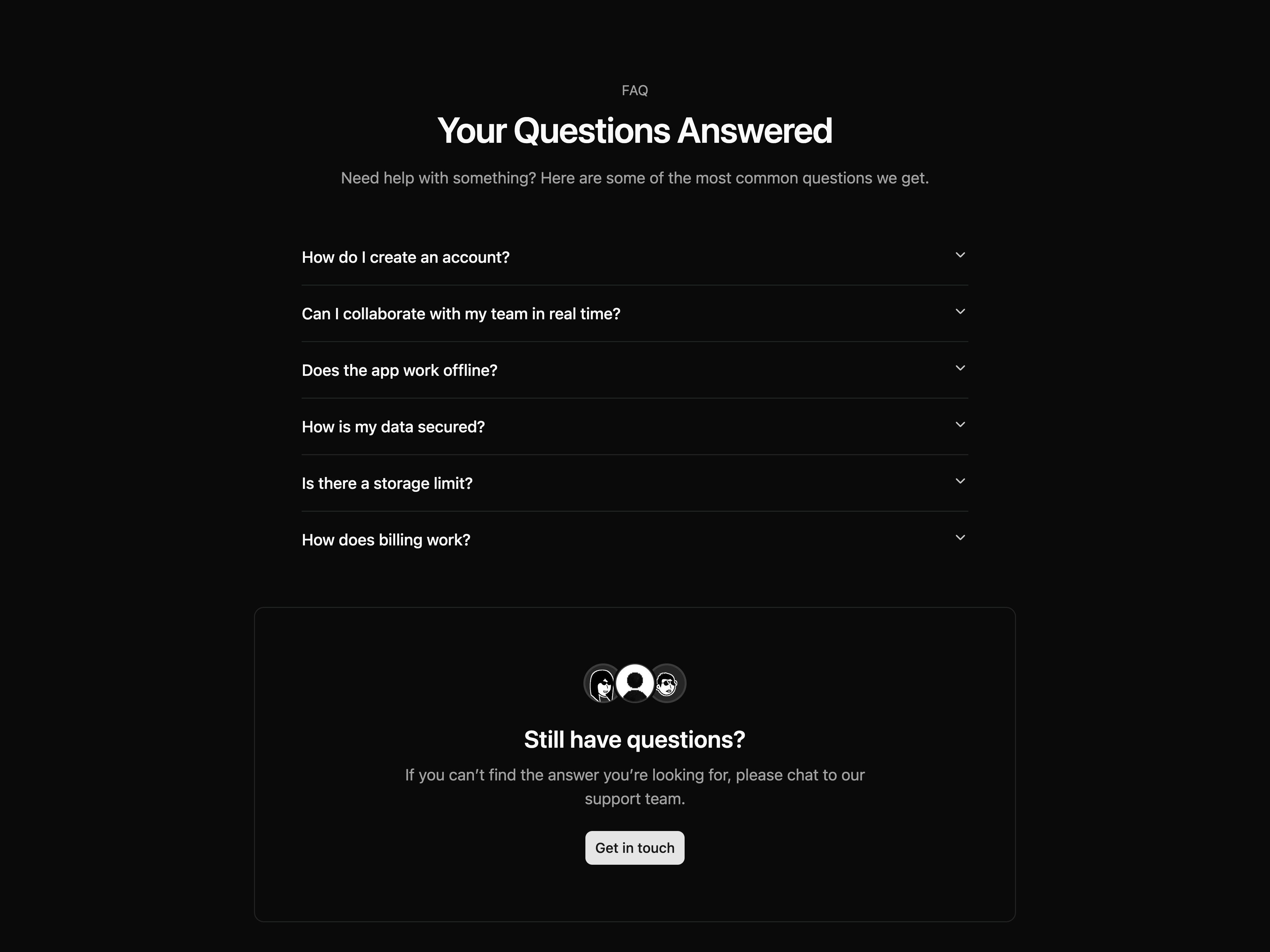
  • Categorized FAQ SectionCategorized FAQ Section

    Categorized FAQ Section

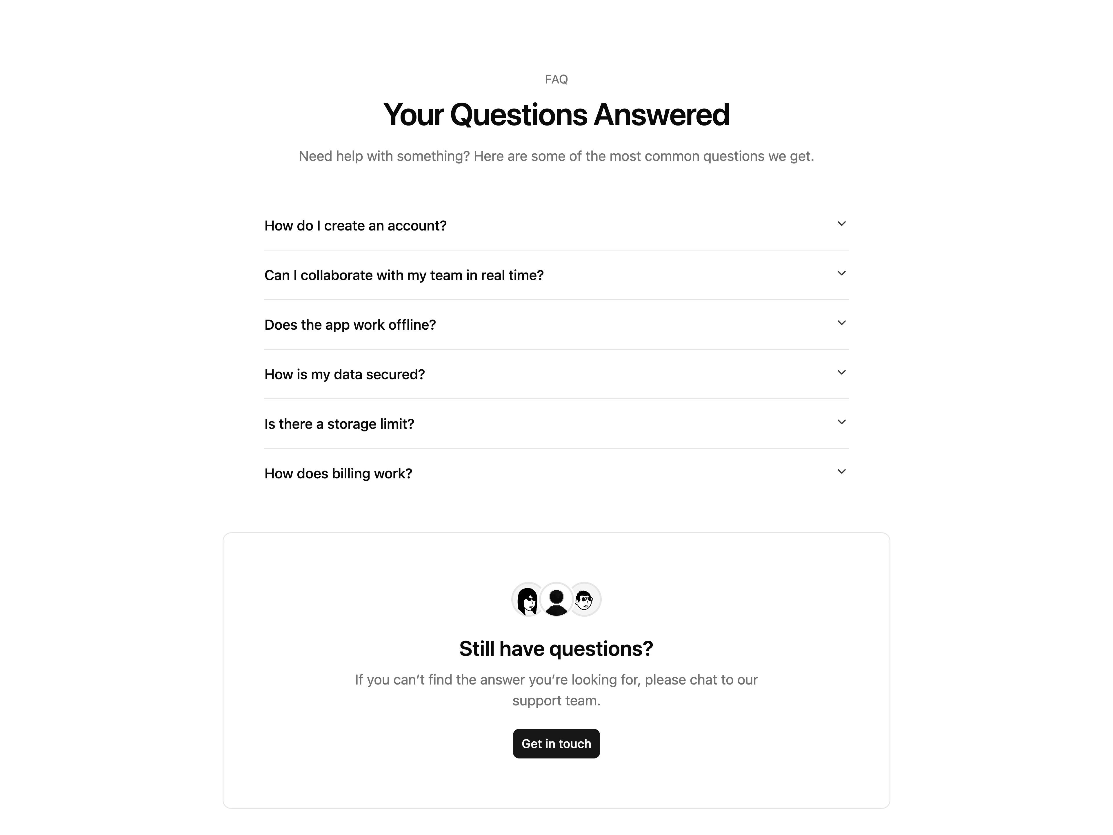
  • FAQ Accordion SectionFAQ Accordion Section

    FAQ Accordion Section

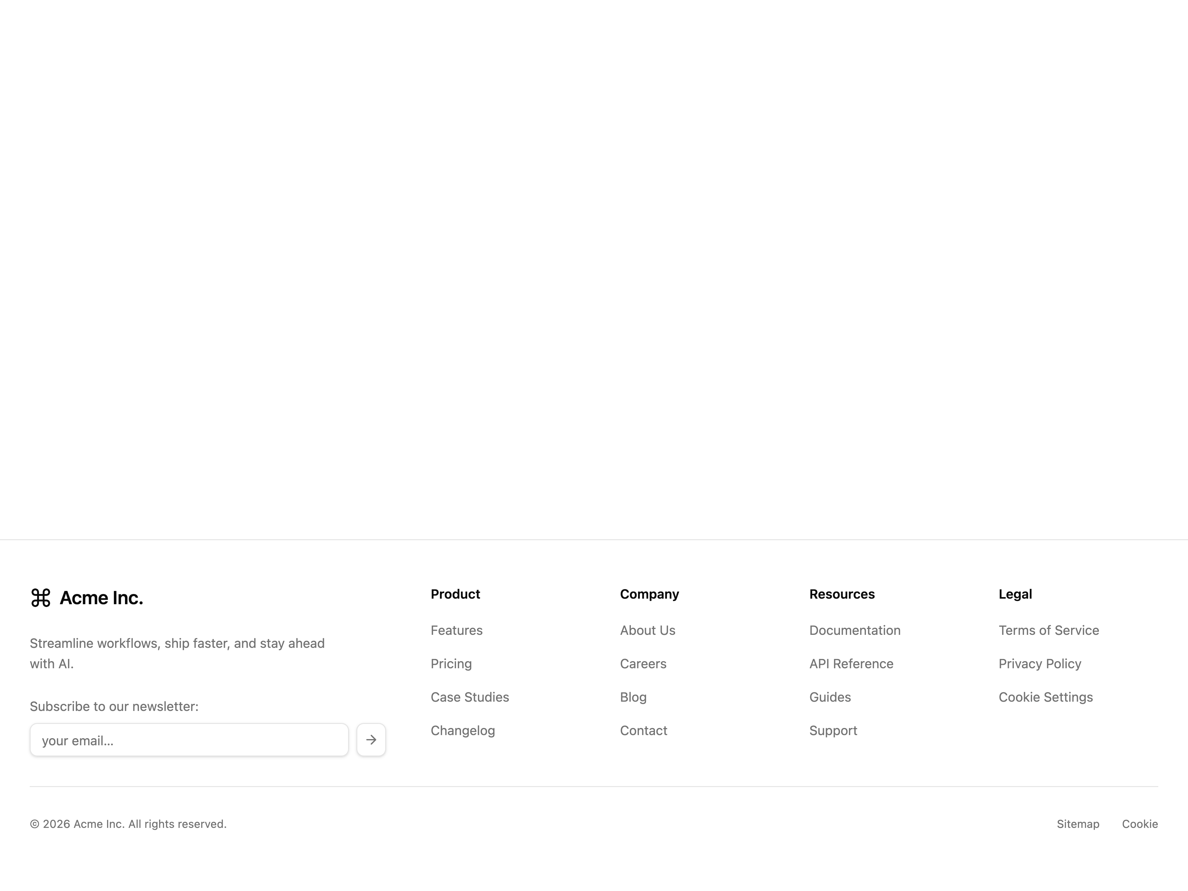
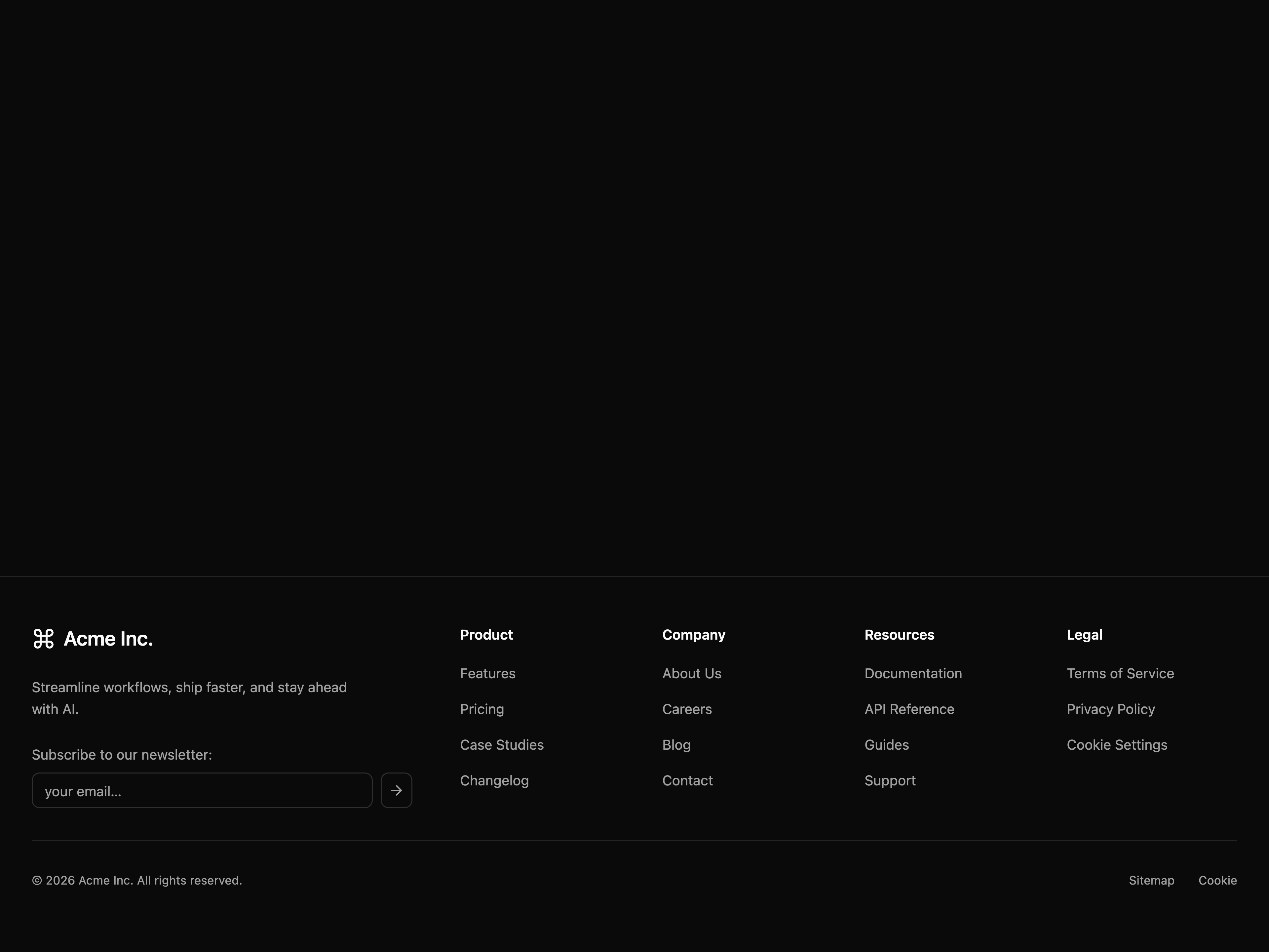
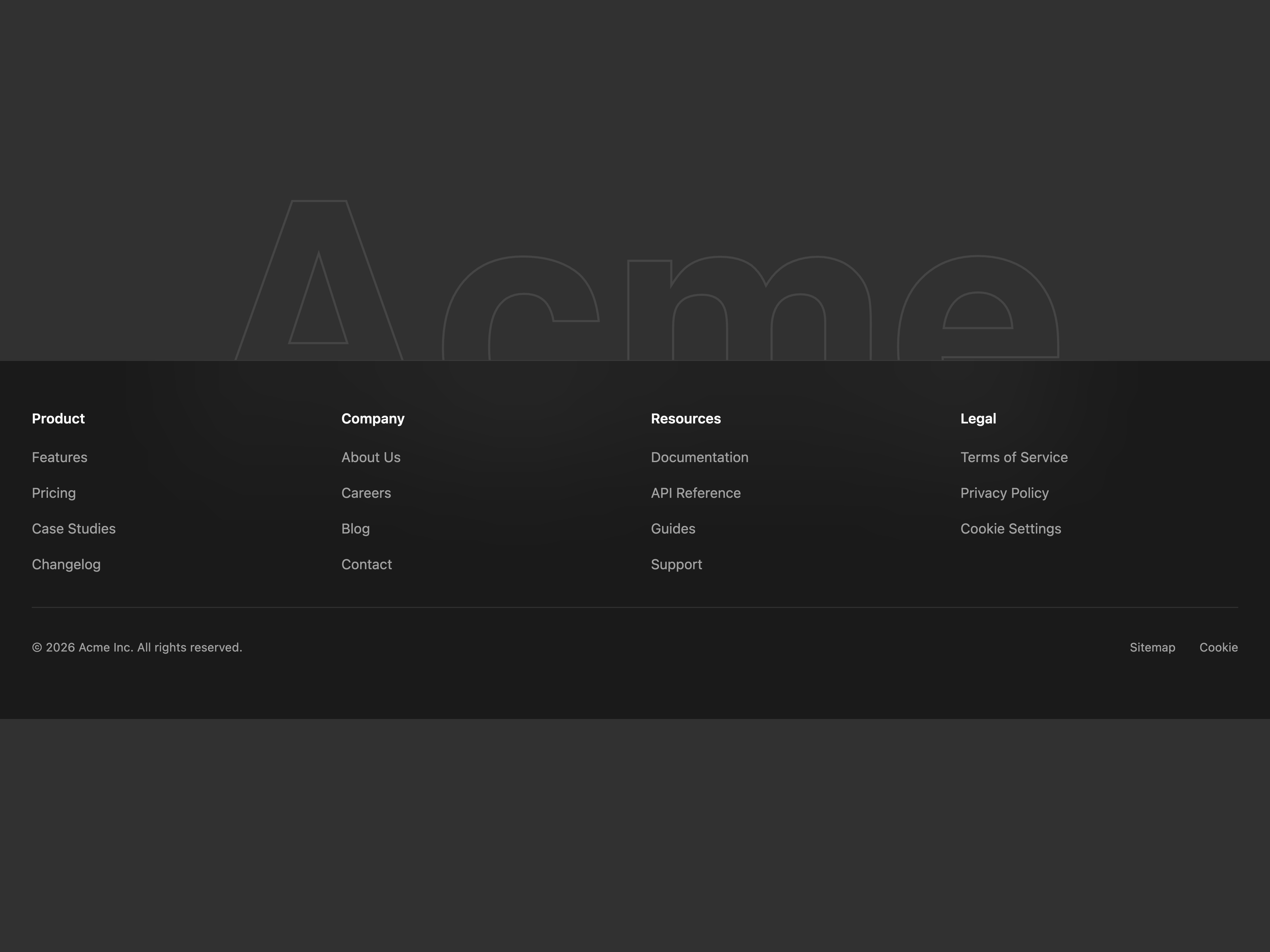
  • Subscription FooterSubscription Footer

    Subscription Footer

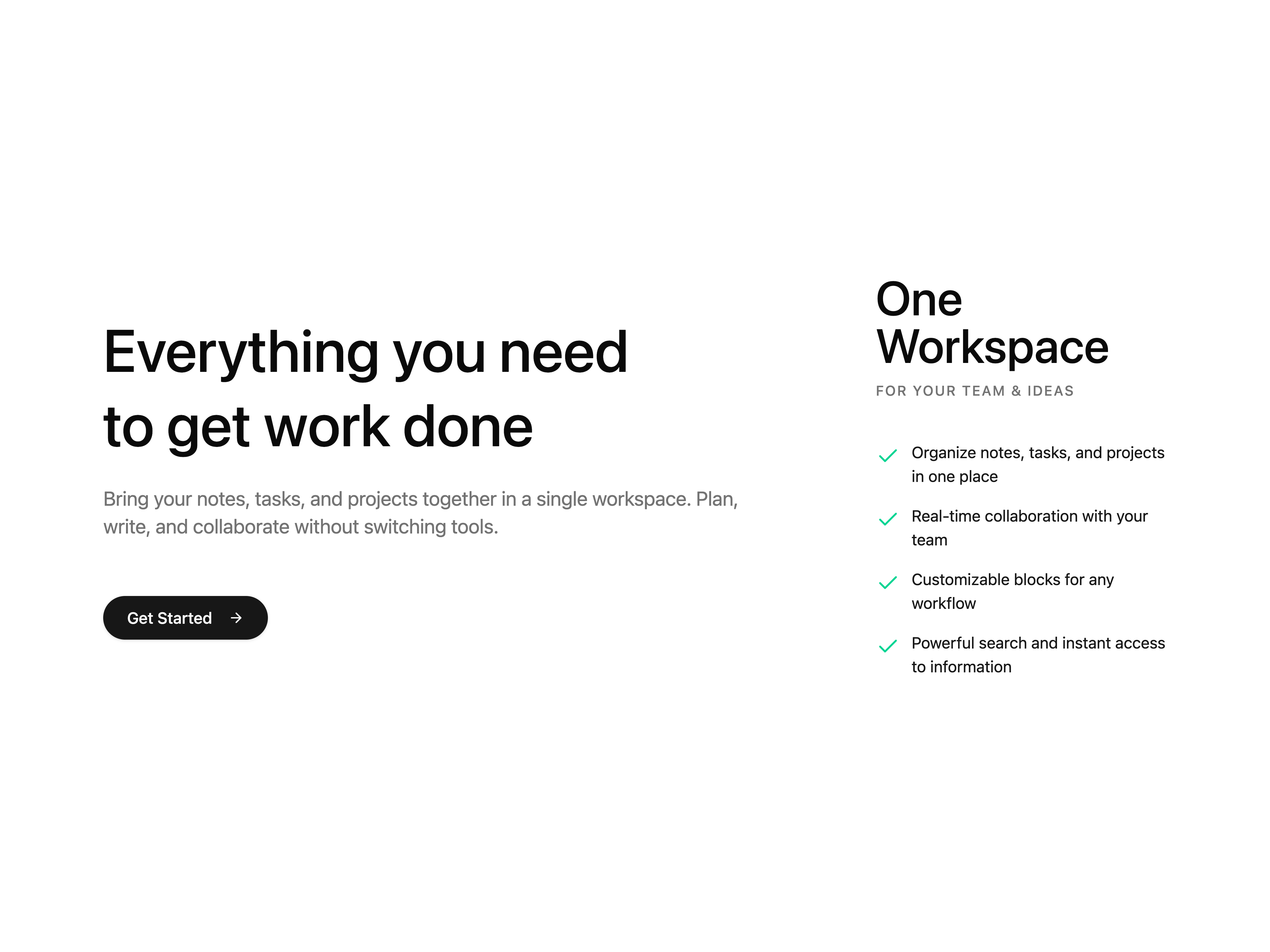
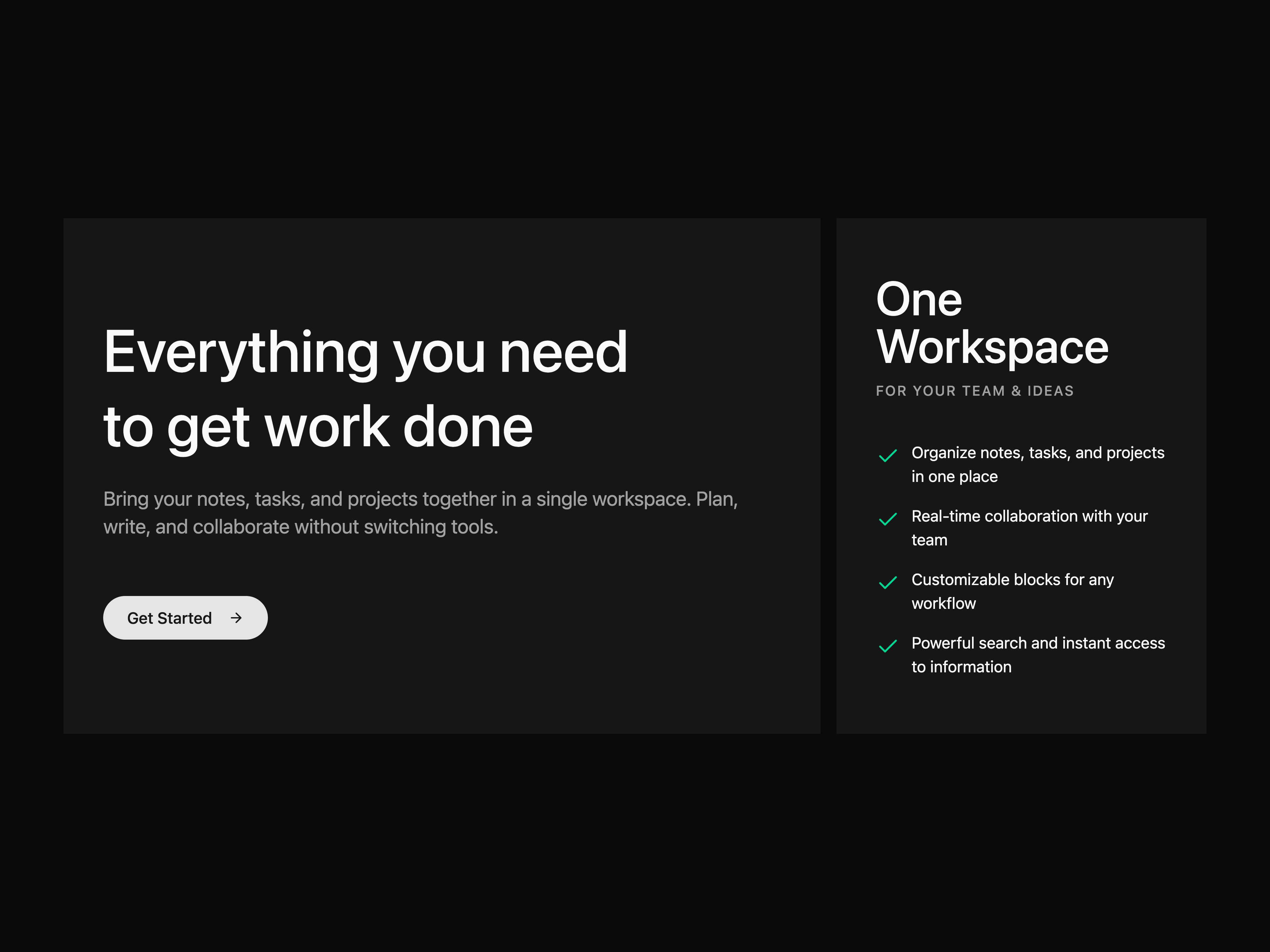
  • Split Feature CTASplit Feature CTA

    Split Feature CTA

  • That's all 6 components

    About hexui

    hexui publishes a shadcn registry at hexui.sh, with 34 components installable through the shadcn CLI.

    Components
    34
    GitHub stars
    17
    Last commit
    Aug 30, 2026
    Repository
    hexui-sh/ui

    Also in the hexui registry

    Copy a prompt for your agent, copy the install command, or open the docs that ship it.

    • Banner-1

      A dismissible announcement bar

      lucide-react2 files
    • Banner-2

      A full-width dismissible announcement bar

      lucide-react2 files
    • Cta-1

      A simple full-width CTA section

      lucide-react2 files
    • Cta-2

      A simple CTA section with spacious padding

      lucide-react2 files
    • Cta-3

      A CTA section designed to showcase mobile product mockups

      lucide-react2 files
    • Faq-3

      A simple FAQ section arranged in a clean grid layout

      2 files
    • Faq-4

      A simple FAQ section with icons arranged in a clean grid layout

      lucide-react2 files
    • Footer-3

      Footer for organizations that place typography at the bottom

      lucide-react4 files
    • Footer-4

      A simple footer for portfolios with a signature

      @icons-pack/react-simple-icons4 files
    • Hero-1

      A simple and versatile hero section

      lucide-react5 files
    • Hero-2

      A hero section designed to showcase media content

      lucide-react4 files
    • Hero-3

      A simple horizontally aligned hero section

      lucide-react4 files
    • Hero-4

      A hero section with bold visuals that emphasize brand presence

      lucide-react3 files
    • Hero-5

      A hero section with a large background image and centered content to present a brand or product with impact

      lucide-react3 files
    • Login-1

      A simple login form

      @icons-pack/react-simple-icons, lucide-react2 files
    • Login-2

      A login form with social sign-in options below the credentials

      @icons-pack/react-simple-icons, lucide-react2 files
    • Login-3

      A login form with a customizable side background

      @icons-pack/react-simple-icons, lucide-react2 files
    • Login-4

      A login form with a customizable side background and a testimonial panel

      @icons-pack/react-simple-icons, lucide-react2 files
    • Marquee

      A marquee component that infinitely scrolls content in a horizontal or vertical direction.

      1 file
    • Sidebar-1

      A sidebar for a note-taking application.

      lucide-react9 files
    • Sidebar-2

      A sidebar built for developer app dashboards

      lucide-react5 files
    • Sidebar-3

      A sidebar designed for AI applications

      lucide-react7 files
    • Social-Proof-Companies-1

      A social proof section that displays brand logos in a grid layout

      2 files
    • Social-Proof-Companies-2

      A social proof section with animated brand logos arranged in a grid layout

      2 files
    • Social-Proof-Companies-3

      A social proof section with brand logos arranged in a grid layout and hover interactions that guide user attention

      lucide-react2 files
    • Social-Proof-Companies-4

      A social proof section that showcases brand logos in a marquee layout

      3 files
    • Social-Proof-Testimonials-1

      A social proof section with expert testimonial cards arranged in a grid layout

      avatar, button, card3 files
    • Social-Proof-Testimonials-2

      A social proof section that displays expert testimonial cards in a marquee layout

      avatar, card4 files

    From the hexui readme

    Hex UI A Beautiful Collection of Modern React Blocks & Templates

    Documentation

    Visit docs to view the documation.

    Contributing

    Please read the contributing guide.

    Star History

    License

    Licensed under the MIT license.

    Read the rest on GitHub →

    What hexui builds on

    The packages and primitives its components pull in, counted across the registry.

    button21avatar7input5field4dropdown-menu3sidebar3accordion2card2tooltip2select1signature1

    What hexui shipped recently

    Every appearance and removal our crawl has seen in the registry index.

    • banner-1addedAug 18, 2026
    • banner-2addedAug 18, 2026
    • cta-1addedAug 18, 2026
    • cta-2addedAug 18, 2026
    • cta-3addedAug 18, 2026
    • cta-4addedAug 18, 2026
    • faq-1addedAug 18, 2026
    • faq-2addedAug 18, 2026
    • faq-3addedAug 18, 2026
    • faq-4addedAug 18, 2026
    • footer-1addedAug 18, 2026
    • footer-2addedAug 18, 2026

    Registries like hexui

    UI Layouts

    UI Layouts

    by UI Layouts

    127

    components

    Tailark

    Tailark

    by Méschac Irung

    56

    components

    8bitcn

    8bitcn

    by OrcDev

    103

    components

    Eldora UI

    Eldora UI

    by Mudunuri bhaskara karthikeya varma

    13

    components

    Browse every shadcn registry we track →

  • footer-3addedAug 18, 2026
  • footer-4addedAug 18, 2026
  • footer-5addedAug 18, 2026
  • hero-1addedAug 18, 2026
  • hero-2addedAug 18, 2026
  • hero-3addedAug 18, 2026
  • hero-4addedAug 18, 2026
  • hero-5addedAug 18, 2026
  • Launch UI

    Launch UI

    by Mikolaj Dobrucki

    6

    components

    ShadcnSpace

    ShadcnSpace

    by ShadcnSpace

    189

    components

    1. Components
    2. /
    3. hexui-sh
    4. /
    5. hexui

    Related libraries

    Hirael

    Hirael

    by Mohammad Shehadeh

    218

    components

    FirstReply

    FirstReply

    by Jason Mohab-Ali

    27

    components

    uiable

    uiable

    by uiable

    168

    components

    ShadcnSpace

    ShadcnSpace

    by ShadcnSpace

    189

    components

    Tailark

    Tailark

    by Méschac Irung

    56

    components

    Efferd

    Efferd

    by Efferd

    115

    components

    About hexui

    hexui is a component library on 21st.dev by hexui-sh with 6 public React components. Every component ships with a live interactive preview and full TSX source — copy the code, install it through the shadcn CLI, or pull it into Cursor or Claude Code over MCP.

    All 6 hexui components

    • Categorized FAQ Section
    • FAQ Accordion Section
    • Fluid Gradient Footer
    • Footer with Social Links and Language Switcher
    • Split Feature CTA
    • Subscription Footer

    Browse all component libraries →