Nexus UI
14components449.8Kviews1.6Kbookmarks
Installs all 105 components. Without our CLI, run instead.
Auto-indexed
Nexus UI contents
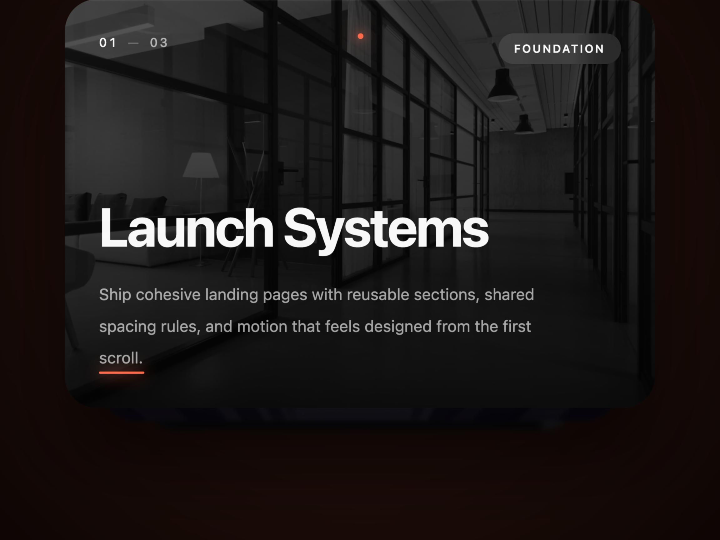
Cinematic Card Deck
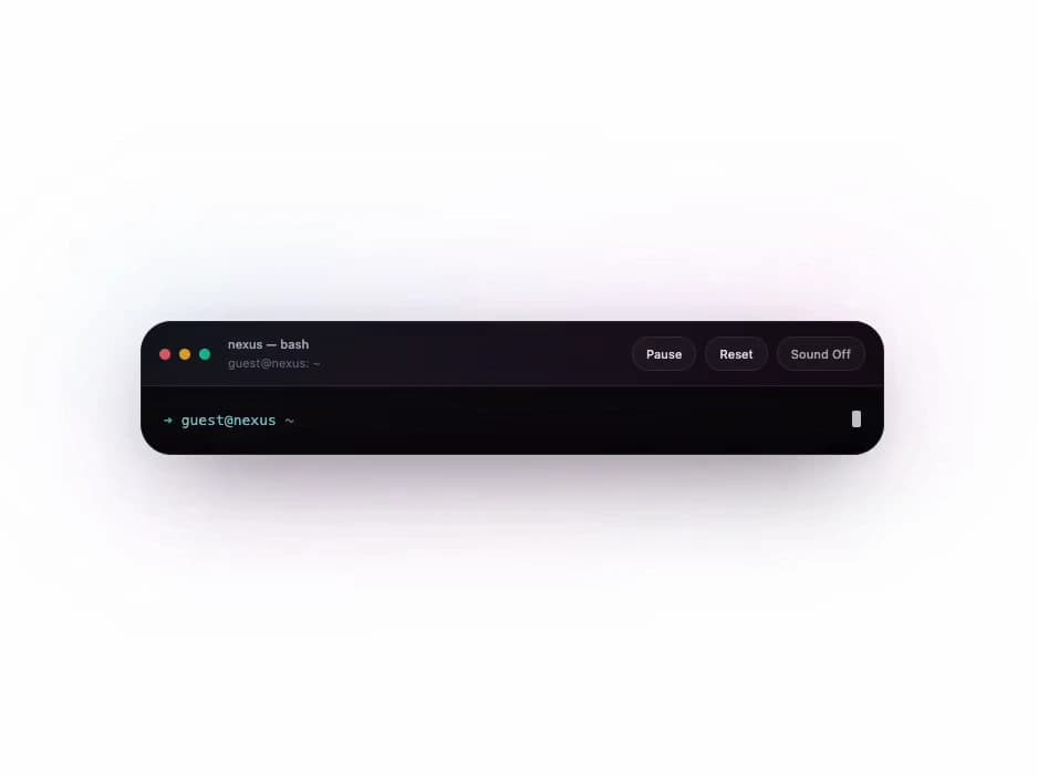
Interactive Terminal

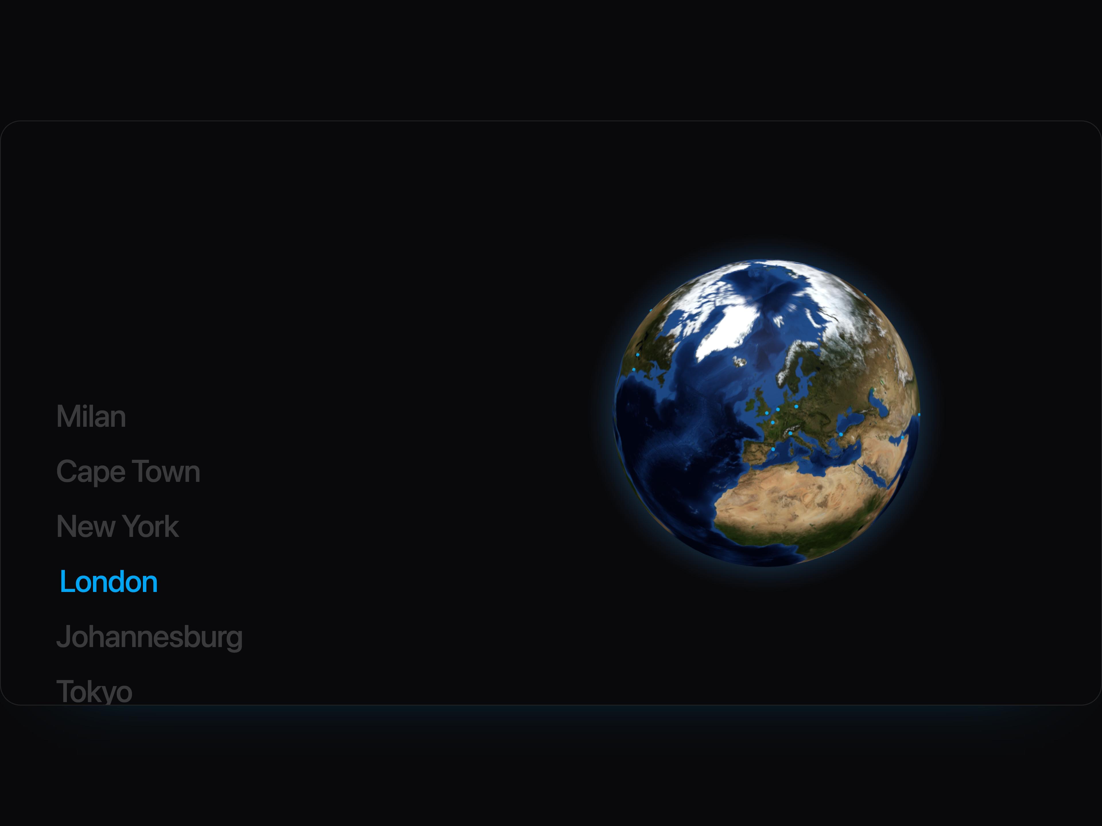
Interactive Globe Explorer
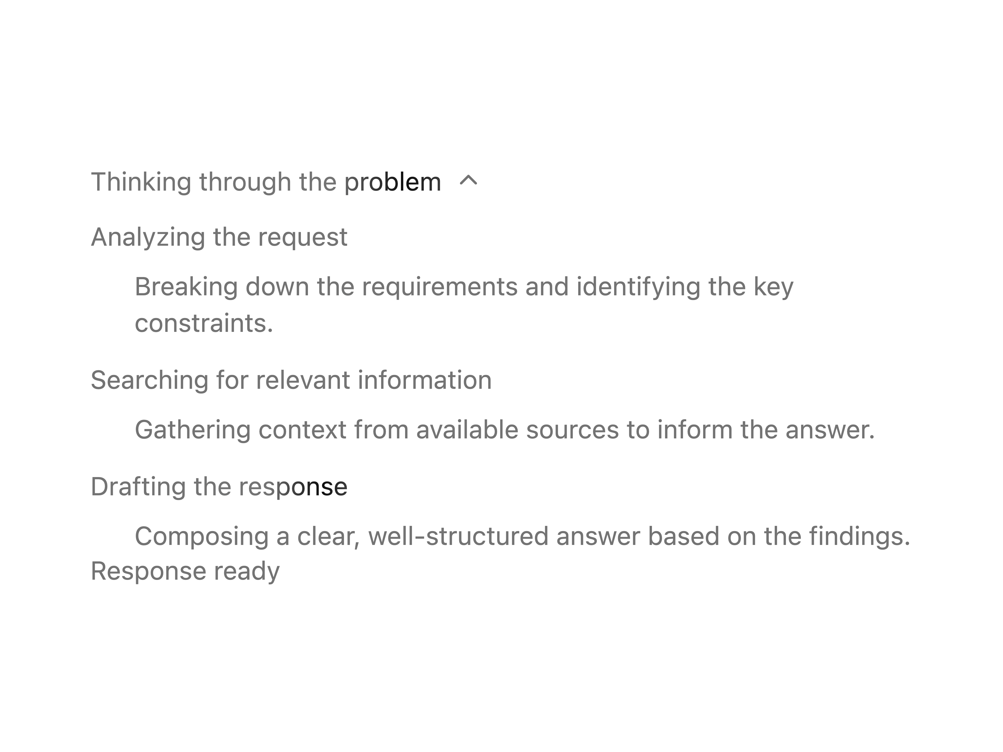
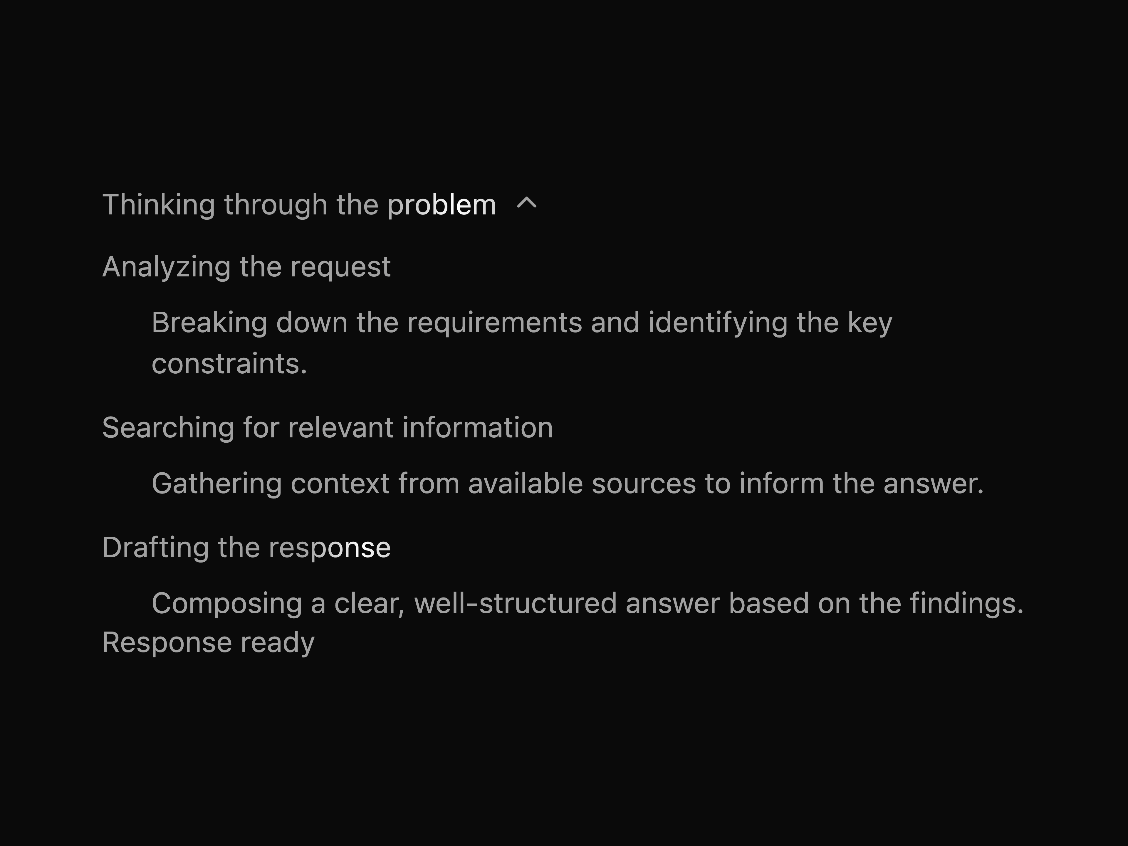
Chain of Thought


Suggestions

Thread


Signup Form

Images Badge

Shooting Stars Grid

Vector Tilt Scene

Beam Sweep Field

Image Trail

Cinematic Logo Cloud

Logo Clouds
That's all 14 components
About Nexus UI
Nexus UI publishes a shadcn registry at nexus-ui.com, with 105 components installable through the shadcn CLI.
- Components
- 105
Also in the Nexus UI registry
Copy a prompt for your agent, copy the install command, or open the docs that ship it.
Animated Bento Grid
animated-bento-gridFeature showcase bento grid with entrance animations and configurable column spans. Each tile supports custom content, tags, and motion entrance delays.
framer-motion, react2 filesanimated-tabs
nexus-fontAvatar Group
avatar-groupOverlapping avatar stack with per-avatar entrance animations (flip, slide, scale, bounce), four hover styles, name tooltips, and automatic color-coded fallback initials when no image is supplied.
framer-motion, react2 filesBackground Boxes
background-boxesAnimated isometric grid background with hover color effects and cross markers. Fully configurable skew, scale, box dimensions, and colors.
framer-motion, react2 filesBackground Gradient
background-gradientAnimated gradient wrapper with soft glow and blur for cards, buttons, and hero sections.
framer-motion, react3 filesbefore-after
nexus-fontBento Grid Skeleton
bento-grid-skeletonBento grid with animated skeleton placeholder tiles — chat, dashboard, avatar, workflow, calendar, and code variants. Perfect for loading states.
framer-motion, react2 filesSignal Bento Grid
bento-signal-gridAnimated bento tiles with breathing gradients for product metrics.
framer-motion1 fileBlog Content Sections
blog-content-sectionsCentered article, table-of-contents, editorial, featured post, and hover-card blog sections.
framer-motion, react, lucide-react6 files3D Card Carousel
card-carousel-3dCylindrical 3D card carousel — cards arranged in a circle on the Z axis, rotating continuously or on scroll. Radius, perspective, item size, speed, and direction are all configurable.
framer-motion, react2 filesCommand Palette
command-paletteAnimated command palette with ⌘K shortcut, grouped navigation/actions/theme commands, backdrop blur overlay, and Framer Motion enter/exit transitions.
framer-motion, lucide-react, cmdk, @radix-ui/react-dialog2 filesBefore / After Compare
compareDrag a vertical handle to compare two images side-by-side. Supports mouse and touch, optional labels, custom start position, and any aspect ratio.
lucide-react, react2 filesContact Page
contact-pageContact block variants with forms, social links, imagery, and the included Nexus mark.
react, framer-motion, lucide-react, topojson-client2 filescursor-buddy
nexus-font, utilsCursor Text Reveal
cursor-text-revealAn immersive cursor-following spotlight that reveals alternate text, gradients, or imagery beneath perfectly aligned headline layers.
framer-motion, react2 filesDepth Testimonials
depth-testimonialsStacked testimonial planes with staggered motion reveals.
framer-motion1 filedot-sphere
nexus-font, utilsDraggable Card Stack
draggable-card-stackShuffled deck of portrait cards on a dark surface. Drag or fling the top card to send it to the back; press ← to pull the bottom card to the front. Supports images and videos, hover overlay, auto-play, and fully configurable stack geometry.
framer-motion, react2 filesdynamic-island
nexus-font, utilsEditorial Blog Rail
editorial-blog-railFeatured article plus compact secondary headlines for content hubs.
nexus-font, utils1 fileemoji-reactions
nexus-font, utilsEncrypted Text
encrypted-textCharacters shuffle through gibberish before locking into the final string — a futuristic cyber decoding reveal for hero headings, buttons, badges, and nav links.
framer-motion, react2 filesExpandable Cards
expandable-cardsResponsive card grid where clicking a card smoothly expands it into a full-detail overlay with image, description, and a CTA button.
framer-motion, lucide-react, react2 filesFeature Tools Card
feature-tools-cardA dark glass card with five magnetic icon slots, a rotating conic-gradient orbit ring, and 3-D tilt physics. Swap the default integration icons for any SVG or image.
react2 filesFloat Glass Navbar
float-glass-navbarGlass navigation rail with spring entrance and CTA emphasis.
framer-motion1 fileNexus floating dock
floating-dockBottom-centered macOS-style dock with pointer-driven magnification, neighbor scaling, glass pill chrome, tooltips, and a touch-friendly expandable mobile menu.
framer-motion, lucide-react, react, next7 filesGlass Login Stack
glass-login-stackMinimal glass authentication panel with crisp focus states.
framer-motion1 fileGlow Button
glow-buttonFramer-style glowing CTA button with expanding shadow, radial border sweep, glass edge, and animated arrow.
framer-motion, lucide-react, react2 filesGlowing Effect Cards
glowing-effect-cardsCursor-reactive glowing border cards with a responsive 2-1-2 layout for refined SaaS sections and dashboards.
framer-motion, lucide-react, react4 filesGooey Search Input
gooey-inputExpandable pill search with a detached icon bubble merged through an SVG goo filter and spring layout.
framer-motion, lucide-react, react3 filesAurora Hero Spotlight
hero-aurora-spotlightCursor-reactive spotlight layered over an aurora field for launch heroes.
framer-motion1 filehold-to-confirm
nexus-fonthold-to-record
nexus-font, utilsLattice Feature Grid
lattice-feature-gridFour-up feature grid with scroll reveals and glass tiles.
framer-motion1 filelike-burst
nexus-font, utilsLink Preview
link-previewHover-triggered image tooltip that transforms inline text links into cinematic visual previews. Spring-animated entrance with blur, scale, mouse-tracking tilt, and a soft floating glide — perfect for blogs, portfolios, and product pages.
framer-motion, react, react-dom, next1 fileMac Keyboard
mac-keyboardFully interactive Mac-style keyboard with Web Audio synthesised click sounds, Framer Motion keycap animations, and real-time physical keyboard highlighting.
framer-motion, react6 filesMeteor Effect
meteorsAnimated diagonal meteor beams with glow heads and trailing streaks, designed as a reusable background layer for cards and hero sections.
framer-motion, react2 filesMilestone Timeline
milestone-timelineVertical roadmap timeline with glowing nodes.
framer-motion1 fileMotion FAQ Disclosure
motion-faq-disclosureLightweight FAQ with directional affordance and animated answers.
framer-motion, react1 fileMotion Layer Scroller
motion-layer-scrollerScroll-driven parallax depth engine — each layer moves at an independent speed and axis as the user scrolls. Compose scenes with overlapping planes.
framer-motion, react2 filesNebula Glass Card
nebula-glass-card3D tilt card with spring physics and luminous edge lighting.
framer-motion1 fileOrbital Loader
orbital-loaderDual counter-rotating rings with breathing inner glow.
framer-motion1 fileotp-input
nexus-fontpassword-strength
nexus-fontPhone Input
phone-inputA modern animated phone number input with country selector and validation.
framer-motion, lucide-react, react2 filesprice-odometer
nexus-fontPricing Section
pricing-sectionFour interactive pricing layouts with radio selection, animated monthly and yearly billing transitions, and configurable feature lists.
react, framer-motion, lucide-react3 filesProfile Orbit
profile-orbitAn interactive profile carousel where five floating avatars orbit a central card. Clicking any avatar, the nav arrows, or the keyboard cycles through people with a smooth fade + spring animation.
react1 filePulse Dashboard KPIs
pulse-dashboard-kpisKPI strip with micro-hover lifts and soft chart placeholders.
framer-motion1 fileradio-cards
nexus-fontReal-Time Cursors
real-time-cursorsCollaborative workspace preview with animated teammate cursors, code review cards, and simulated live presence trails.
framer-motion, lucide-react, react10 filesrotating-headline
nexus-fontScrolling Testimonials
scrolling-testimonialsInfinite vertical scroll testimonial wall with multi-column layout, independent column speeds, reverse direction support, gradient fade masks, and avatar initials fallback.
react1 fileScroll Progress Bar
scroll-progress-barA minimal vertical progress rail that fills smoothly as a target section moves through the viewport or a scrollable container.
framer-motion, react2 filesScroll Reveal Text
scroll-reveal-textScroll-linked text reveal where words, characters, or lines emerge from muted gray to bright white with optional blur dissolve and staggered cascade.
framer-motion, react2 filesshared-element-cards
nexus-fontslide-to-confirm
nexus-font, utilsSpectra Frame
spectra-frameZero-dependency interactive image grid — photos start in black & white and burst into full color on hover with adaptive scale. Built-in responsive columns, scoped CSS injection, and picsum placeholder defaults.
react1 fileSplit Contact Glass
split-contact-glassMarketing narrative paired with a compact contact capture form.
framer-motion1 fileSplit Signup Convert
split-signup-convertTwo-column signup with narrative panel and compact fields.
framer-motion1 fileRippleLine squiggly text
squiggly-textHero-grade headline with an animated wave underline, turbulence + Gaussian blur + displacement, optional glyph micro-warp, and reduced-motion fallbacks.
framer-motion, react3 filesStateful message button
stateful-buttonAnimated async button with idle → loading → success transitions, built-in click guarding, and smooth icon/text motion.
framer-motion, lucide-react, react3 filesStep Flow
step-flowA responsive four-step process section with a sliding highlight, animated image swaps, and hover or click step selection.
framer-motion, react2 filesSVG Noise Shader
svg-noise-shaderFeTurbulence-driven noise field for textured sci-fi surfaces.
framer-motion1 fileText Generate Effect
text-generate-effectAnimated text reveal that fades words, characters, or lines into view with optional blur and upward motion.
framer-motion, react3 files3D Folder Card
three-d-folderInteractive folder card that opens on hover, fans project cards upward, and includes a lightbox gallery for visual collections.
framer-motion, lucide-react, react2 filestick-slider
nexus-font, utilstilt-pass
nexus-fonttime-scrubber
nexus-font, utilstoast-stack
nexus-font, utilsToggle Pricing
toggle-pricing-proAnnual/monthly toggle with spring knob and contextual savings callout.
framer-motion, react1 fileTracing Spotlight Panel
tracing-spotlight-panelCursor-traced highlight for feature callouts and pricing tiers.
framer-motion1 fileupload-dropzone
nexus-font, utilsWarp Speed Card
warp-speed-cardA focused warp-speed effect — hover a single phrase to reveal a dark space scene with streaking beams confined to the text's bounding box. The text itself stays static; the effect lives entirely behind it.
framer-motion, react2 filesWheel Selector
wheel-selectorAn interactive radial navigation dial for services, features, or portfolio items with drag, wheel, and click input plus a responsive mobile arch.
framer-motion, lucide-react, react2 filesWord Magnet
word-magnetCursor-reactive text where whole words gently repel from the pointer and spring back without splitting letters.
framer-motion, react2 filesWorkbench Sidebar
workbench-sidebarDense sidebar navigation tuned for dashboards and tools.
framer-motion1 file