odysseyui
7components63.4Kviews316bookmarks
Installs all 148 components. Without our CLI, run instead.
Auto-indexed
odysseyui contents
Typewriter
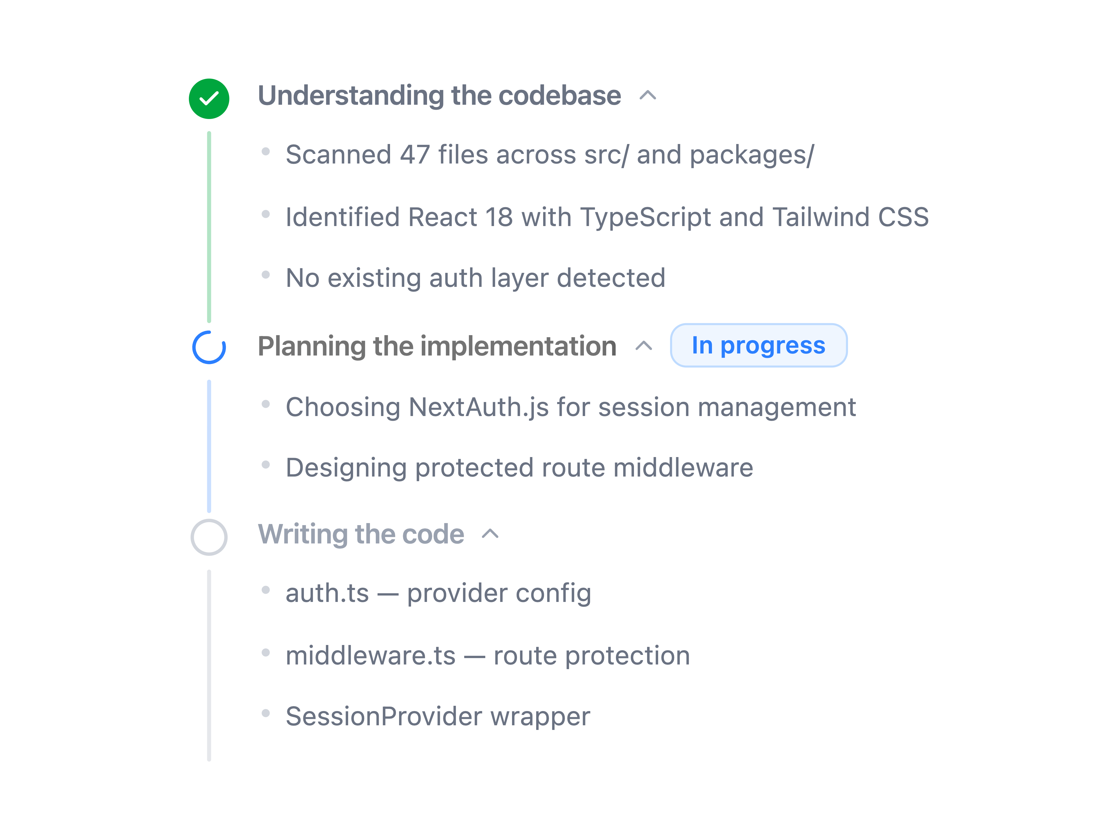
Thought Chain
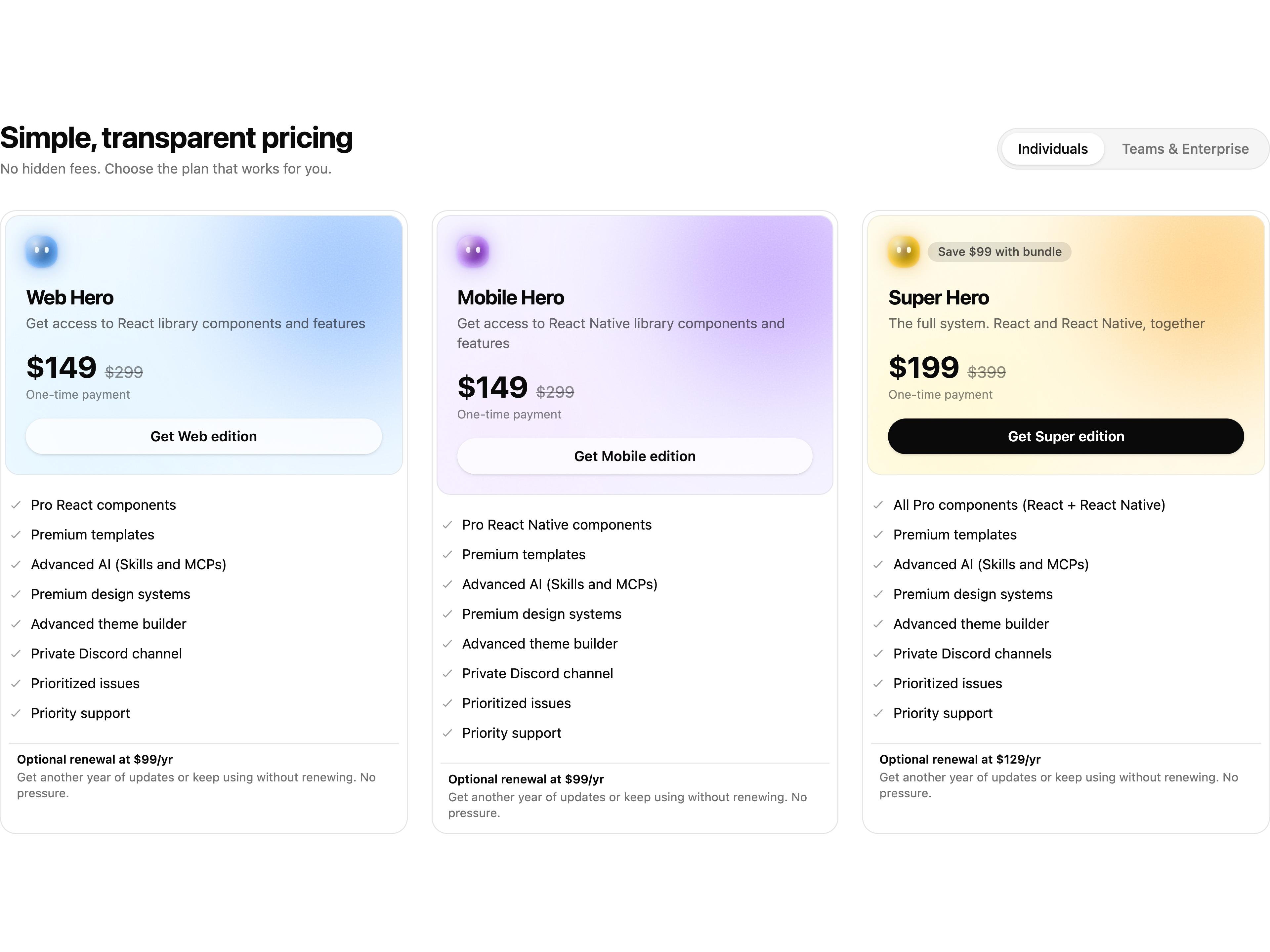
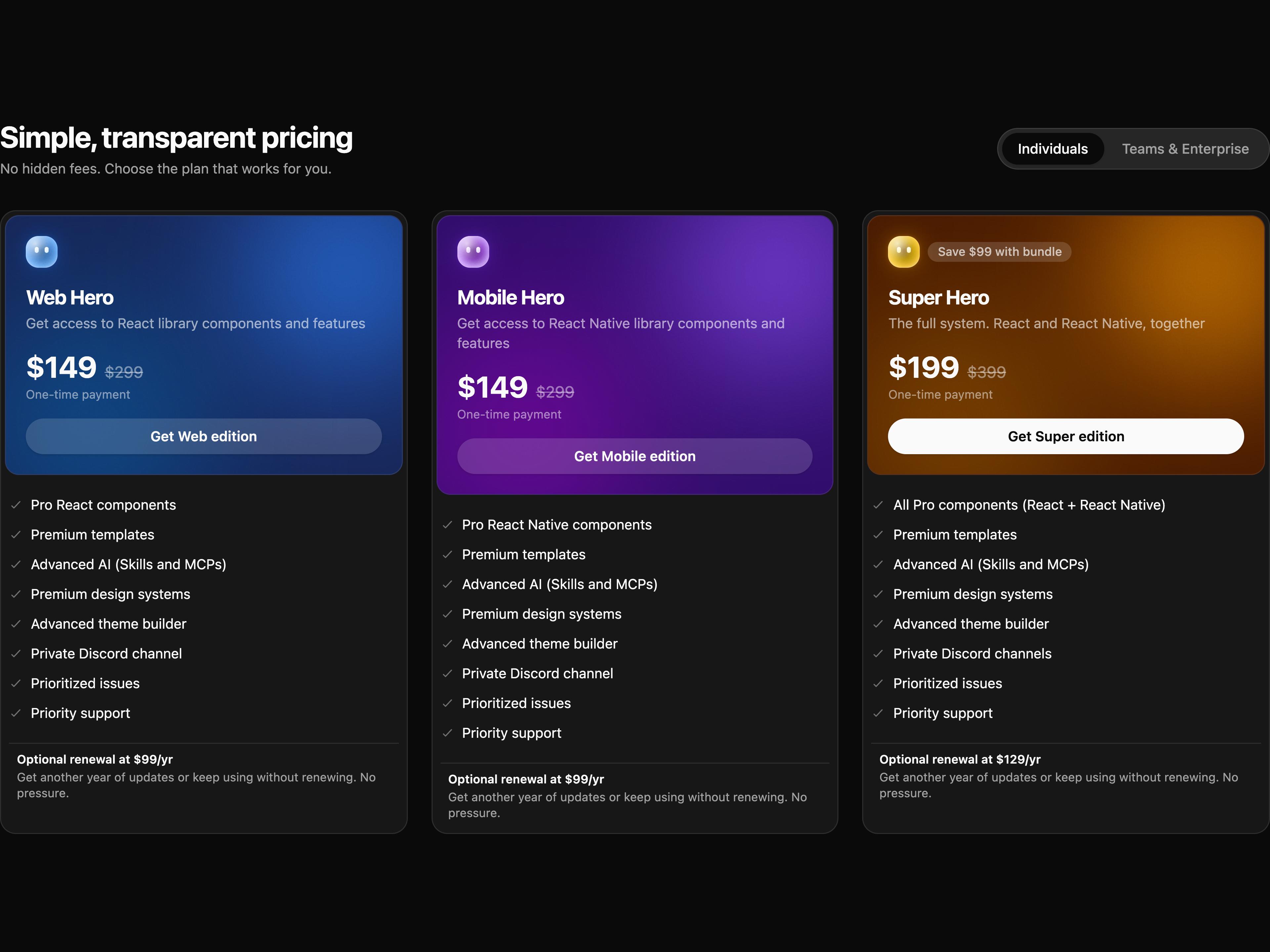
Pricing 6

AI Orb Avatar
Greeting Preloader
GitHub Stars Button
Liquid Button
That's all 7 components
About odysseyui
odysseyui publishes a shadcn registry at odysseyui.com, with 148 components installable through the shadcn CLI.
- Components
- 148
- GitHub stars
- 30
- Last commit
- May 6, 2026
- Repository
- Shr3kx/OdysseyUI
Also in the odysseyui registry
Copy a prompt for your agent, copy the install command, or open the docs that ship it.
Chat Container
components-ai-chat-containerA composable chat container with auto-scroll, empty state, animated messages, scroll-to-bottom button, and divider support.
motion, @hugeicons/react, @hugeicons/core-free-icons1 file1 exampleMessage Bubble
components-ai-message-bubbleA composable chat message bubble with avatar, content, and timestamp sub-components. Role-aware layout for user and assistant messages.
@hugeicons/react, @hugeicons/core-free-icons1 file1 exampleModel Selector
components-ai-model-selectorA modal-based AI model picker with provider filtering, search, starred models, and capability badges.
motion, lucide-react1 file1 examplePrompt Input
components-ai-prompt-inputSimple Prompt Interface input design.
@hugeicons/core-free-icons, @hugeicons/react1 file1 exampleSearch Modal
components-ai-search-modalA full-featured chat search modal with conversation preview, inline rename, delete, keyboard navigation, and time-grouped results.
motion, @hugeicons/react, @hugeicons/core-free-icons, react-markdown2 files1 exampleSteps
components-ai-stepsA collapsible AI tool-run steps component with animated shimmer trigger and a vertical progress bar.
lucide-react1 file1 exampleToken Usage
components-ai-token-usageA token usage card showing input/output counts, costs, proportion bar, and an interactive token breakdown with tooltips.
lucide-react, class-variance-authority1 file1 exampleAvatar Group
components-animate-avatar-groupAn animated avatar group that displays overlapping user images and smoothly shifts each avatar forward on hover to highlight it.
motion1 file1 exampleCard Stroke
components-animate-card-strokeA card component with animated SVG stroke and split-text reveal on hover.
gsap1 file1 exampleCode
components-animate-codeA code component that animates the code as it is written.
next-themes1 file1 exampleCode Block
components-animate-code-blockA styled code block frame component with language badge and optional copy functionality.
shiki1 file1 exampleCode Tabs
components-animate-code-tabsA tabs component that displays code for different languages.
shiki1 file1 exampleCursor
components-animate-cursorAn animated cursor component that allows you to customize both the cursor and cursor follow elements with smooth animations.
1 file1 exampleFooter
components-animate-footerA minimal footer design inspired by Dia browser.
gsap1 file1 exampleGitHub Stars Wheel
components-animate-github-stars-wheelA scrolling wheel that displays GitHub stars count.
motion1 file1 exampleTabs
components-animate-tabsA set of layered sections of content—known as tab panels—that are displayed one at a time.
1 file1 exampleApp Shell 1
components-app-shells-app-shell-1Collapsible sidebar app shell with search command palette, breadcrumb page header, scrollable nav sections, and avatar-based user dropdown.
@hugeicons/react, @hugeicons/core-free-icons2 files1 exampleApp Shell 2
components-app-shells-app-shell-2A floating sidebar app shell with collapsible icon mode, searchable navigation, keyboard shortcuts modal, and user menu.
@hugeicons/react, @hugeicons/core-free-icons2 files1 exampleButton
components-buttons-buttonA button component with a variety of styles and animations.
class-variance-authority1 file2 examplesCopy Button
components-buttons-copyA copy button component with a variety of styles and animations.
motion, lucide-react, class-variance-authority1 file1 exampleIcon Button
components-buttons-iconAn icon button component with a variety of styles and animations.
class-variance-authority1 fileSmart Upload
components-buttons-smart-uploadTurn file uploads into engaging moments with smooth animations and intuitive visual feedback
framer-motion, @hugeicons/core-free-icons, @hugeicons/react1 file1 exampleTheme Toggler Button
components-buttons-theme-togglerA button that toggles the theme gradually.
next-themes, class-variance-authority, lucide-react1 file1 exampleNotification List
components-community-notification-listA fun notification list with animated stacking and cards that expand as you interact.
motion, lucide-react1 file1 examplePlayful Todolist
components-community-playful-todolistA playful todolist component with animated wavy strikethroughs for each completed task.
motion1 file1 exampleFAQ 1
components-faqs-faq-1Accordion-based FAQ section with a serif heading and divider separators.
accordion1 file1 exampleLogo Cloud 1
components-logoclouds-logocloud-1Animated logo cloud with staggered fade-in and group cycling.
motion1 file1 exampleLogo Cloud 2
components-logoclouds-logocloud-2Animated logo cloud that cycles groups of 3 logos with spring blur transitions.
motion1 file1 exampleLogo Cloud 3
components-logoclouds-logocloud-3Infinite scrolling logo marquee with progressive blur edges and motion-powered animation.
motion, react-use-measure1 file1 exampleLogo Cloud 4
components-logoclouds-logocloud-4CSS-animated logo carousel that cycles groups with blur and slide transitions.
1 file1 exampleLogo Cloud 5
components-logoclouds-logocloud-5CSS marquee logo cloud with configurable direction, speed, gap, and fade edges.
1 file1 exampleAlbum Cards
components-music-album-cardsA stacked album card row where clicking a card ejects a spinning vinyl disc, with hover lift and neighbor dimming effects. Requires a /api/spotify route.
spotify-url-info1 file1 exampleSpotify Card
components-music-spotify-cardA horizontal Spotify music card with blurred album art background, vinyl record animation, seek bar, and playback controls. Requires a /api/spotify route.
spotify-url-info1 file1 exampleVertical Spotify Card 1
components-music-vertical-spotify-card-1A vertical Spotify music card with a progressive blur album art background, seek bar, and transport controls. Requires a /api/spotify route.
spotify-url-info1 file1 exampleVertical Spotify Card 2
components-music-vertical-spotify-card-2A vertical Spotify music card with a color-extracted blurred gradient background, album art, seek bar, and transport controls. Requires a /api/spotify route.
spotify-url-info1 file1 examplePricing 1
components-pricings-pricing-1Modern pricing grid with animated sliding numbers, billing toggle, and featured plan corner decorations.
motion, react-use-measure1 file1 examplePricing 2
components-pricings-pricing-2Three-column pricing with gradient featured card and illustrated cursor decoration.
button1 file1 examplePricing 3
components-pricings-pricing-3Asymmetric three-column pricing with elevated featured plan, amber badge, and security footer note.
button, badge1 file1 examplePricing 4
components-pricings-pricing-4Pastel pricing cards with animated billing toggle, tag badges, and info rows.
motion, react-use-measure1 file1 examplePricing 5
components-pricings-pricing-5Horizontal list-style pricing layout with accent icon blobs, strikethrough original prices, and optional recommended badge.
button, badge1 file1 exampleTree Filter
components-primitives-tree-filterAnimated tree-structured filter with nested checkboxes, search, and group cycling.
motion, @hugeicons/react, @hugeicons/core-free-icons1 file1 exampleCheckbox
components-radix-checkboxA control that allows the user to toggle between checked and not checked.
class-variance-authority1 file1 exampleDropdown Menu
components-radix-dropdown-menuDisplays a menu to the user — such as a set of actions or functions — triggered by a button.
lucide-react1 fileHover Card
components-radix-hover-cardFor sighted users to preview content available behind a link.
1 file1 exampleText Highlighter
components-texts-text-highlighterRough-notation powered text annotations — highlight, underline, box, circle, and more.
motion, rough-notation1 file1 exampleText Reveal
components-texts-text-revealScramble-reveal animation that decodes characters progressively into the final text.
motion1 file1 exampleText Shimmer
components-texts-text-shimmerSleek text shimmer effect.
motion1 file1 exampleText Shimmer Wave
components-texts-text-shimmer-wave3D wave shimmer effect that ripples through each character sequentially.
motion1 file1 exampleBadge
components-ui-badgeA badge component with semantic and color variants built on Base UI.
@base-ui-components/react, class-variance-authority1 file2 examplesAlarm Clock Icon
icons-alarm-clockAlarm clock icon component.
motion1 fileArrow Right Icon
icons-arrow-rightArrow right icon component.
motion1 fileAudio Lines Icon
icons-audio-linesAudio Lines icon component.
motion1 fileBattery Full Icon
icons-battery-fullBattery Full icon component.
motion1 fileBell Ring Icon
icons-bell-ringBell ring icon component.
motion1 fileClock Icon
icons-clockClock icon component.
motion1 fileDisc 3 Icon
icons-disc-3Disc 3 icon component.
motion1 fileIcon
icons-iconBase component to use animated icons.
motion1 fileLoader Icon
icons-loaderLoader icon component.
motion1 fileMenu Icon
icons-menuMenu icon component.
motion1 fileParty Popper Icon
icons-party-popperParty popper icon component.
motion1 fileSettings Icon
icons-settingsSettings icon component.
motion1 fileTrash 2 Icon
icons-trash-2Trash 2 icon component.
motion1 fileUser Icon
icons-userUser icon component.
motion1 fileWifi Icon
icons-wifiWifi icon component.
motion1 fileAvatar Group
primitives-animate-avatar-groupAn animated avatar group that displays overlapping user images and smoothly shifts each avatar forward on hover to highlight it.
motion1 file1 exampleCode Block
primitives-animate-code-blockA code block component that animates the code as it is written.
shiki1 file1 exampleCursor
primitives-animate-cursorAn animated cursor component that allows you to customize both the cursor and cursor follow elements with smooth animations.
motion1 file1 exampleGithub Stars
primitives-animate-github-starsA component that animates a number of stars, smoothly animating number transitions using the SlidingNumber component.
motion1 file1 examplePin List
primitives-animate-pinned-listA pin list component that allows you to pin items to the top of the list.
motion1 file1 exampleScroll Progress
primitives-animate-scroll-progressA scroll progress component that allows you to track the progress of a scrollable element.
motion1 file1 exampleAnimate Slot
primitives-animate-slotA slot component that allows you to use motion components with any element.
motion1 fileSpring
primitives-animate-springA flexible, animated spring component that attaches a draggable element to its origin with a spring line.
motion1 file1 exampleTabs
primitives-animate-tabsA set of layered sections of content—known as tab panels—that are displayed one at a time.
motion1 file1 exampleTooltip
primitives-animate-tooltipAn animated tooltip that shows contextual info on hover or focus and smoothly glides to the next element without disappearing between transitions.
motion, @floating-ui/react1 file1 exampleBase Accordion
primitives-base-accordionAn easily stylable accordion component.
motion, @base-ui-components/react1 file1 exampleBase Alert Dialog
primitives-base-alert-dialogA dialog that requires user response to proceed.
motion, @base-ui-components/react1 file1 exampleBase Checkbox
primitives-base-checkboxAn easily stylable checkbox component.
motion, @base-ui-components/react1 file1 exampleBase Collapsible
primitives-base-collapsibleA collapsible panel controlled by a button.
motion, @base-ui-components/react1 file1 exampleBase Dialog
primitives-base-dialogA popup that opens on top of the entire page.
motion, @base-ui-components/react1 file1 exampleFiles
primitives-base-filesA component that allows you to display a list of files and folders.
motion1 file1 exampleBase Menu
primitives-base-menuA list of actions in a dropdown, enhanced with keyboard navigation.
motion, @base-ui-components/react1 file1 exampleBase Popover
primitives-base-popoverAn accessible popup anchored to a button.
motion, @base-ui-components/react1 file1 exampleBase Preview Card
primitives-base-preview-cardA popup that appears when a link is hovered, showing a preview for sighted users.
motion, @base-ui-components/react1 file1 exampleBase Progress
primitives-base-progressDisplays the status of a task that takes a long time.
motion, @base-ui-components/react1 file1 exampleBase Radio
primitives-base-radioAn easily stylable radio button component.
motion, @base-ui-components/react1 file1 exampleBase Switch
primitives-base-switchA control that indicates whether a setting is on or off.
motion, @base-ui-components/react1 file1 exampleBase Tabs
primitives-base-tabsA component for toggling between related panels on the same page.
motion, @base-ui-components/react1 file1 exampleBase Toggle
primitives-base-toggleA two-state button that can be on or off.
motion, @base-ui-components/react1 file1 exampleBase Toggle Group
primitives-base-toggle-groupProvides a shared state to a series of toggle buttons.
motion, @base-ui-components/react1 file1 exampleBase Tooltip
primitives-base-tooltipA popup that appears when an element is hovered or focused, showing a hint for sighted users.
motion, @base-ui-components/react1 file1 exampleButton
primitives-buttons-buttonA simple button that animates on hover and tap.
motion1 file1 exampleFlip Button
primitives-buttons-flipA button that flips between two states on hover.
motion1 file1 exampleRipple Button
primitives-buttons-rippleA button that animates on tap with a ripple effect.
motion1 file1 exampleAuto Height
primitives-effects-auto-heightAn effect that automatically adjusts the height of an element based on its content.
motion1 file1 exampleBlur
primitives-effects-blurAn effect that allows you to animate elements with a blur effect on first view or load.
motion1 file1 exampleClick
primitives-effects-clickAn effect that creates animated effects at the click position, adding interactive feedback to user actions.
motion1 file1 exampleEffect
primitives-effects-effectAn effect that allows you to animate elements on first view or load.
motion1 file1 exampleFade
primitives-effects-fadeAn effect that allows you to animate elements with a fade effect on first view or load.
motion1 file1 exampleHighlight
primitives-effects-highlightA highlight effect that allows you to highlight elements on hover, click or with a controlled value.
motion1 file1 exampleImage Zoom
primitives-effects-image-zoomAn effect that allows you to zoom in on an image on hover.
motion1 file1 exampleMagnetic
primitives-effects-magneticA magnetic effect that clings to the cursor, creating a magnetic attraction effect.
motion1 file1 exampleParticles
primitives-effects-particlesA particles effect that creates a particle system.
motion1 file1 exampleShine
primitives-effects-shineAn animated light sweep effect with configurable timing, colors, and triggers (hover, tap, or continuous).
motion1 file1 exampleSlide
primitives-effects-slideAn effect that allows you to animate elements with a slide effect on first view or load.
motion1 file1 exampleTheme Toggler
primitives-effects-theme-togglerAn effect that allows you to toggle the theme gradually.
1 file1 exampleTilt
primitives-effects-tiltAn effect that allows you to animate elements with a tilt effect on mouse hover.
motion1 file1 exampleZoom
primitives-effects-zoomAn effect that allows you to animate elements with a zoom effect on first view or load.
motion1 file1 exampleHeadless Checkbox
primitives-headless-checkboxCheckboxes provide the same functionality as native HTML checkboxes, without any of the styling, giving you a clean slate to design them however you'd like.
motion, @headlessui/react1 file1 exampleHeadless Dialog
primitives-headless-dialogA fully-managed, renderless dialog component jam-packed with accessibility and keyboard features, perfect for building completely custom dialogs and alerts.
motion, @headlessui/react1 file1 exampleHeadless Disclosure
primitives-headless-disclosureA simple, accessible foundation for building custom UIs that show and hide content, like togglable accordion panels.
motion, @headlessui/react1 file1 exampleHeadless Popover
primitives-headless-popoverPopovers are perfect for floating panels with arbitrary content like navigation menus, mobile menus and flyout menus.
motion, @headlessui/react1 file1 exampleHeadless Switch
primitives-headless-switchSwitches are a pleasant interface for toggling a value between two states, and offer the same semantics and keyboard navigation as native checkbox elements.
motion, @headlessui/react1 file1 exampleHeadless Tabs
primitives-headless-tabsEasily create accessible, fully customizable tab interfaces, with robust focus management and keyboard navigation support.
motion, @headlessui/react1 file1 exampleRadix Accordion
primitives-radix-accordionA vertically stacked set of interactive headings that each reveal an associated section of content.
motion, radix-ui1 file1 exampleRadix Alert Dialog
primitives-radix-alert-dialogA modal dialog that interrupts the user with important content and expects a response.
motion, radix-ui1 file1 exampleRadix Checkbox
primitives-radix-checkboxA control that allows the user to toggle between checked and not checked.
motion, radix-ui1 file1 exampleRadix Collapsible
primitives-radix-collapsibleAn interactive component which expands/collapses a panel.
motion, radix-ui1 file1 exampleRadix Dialog
primitives-radix-dialogA window overlaid on either the primary window or another dialog window, rendering the content underneath inert.
motion, radix-ui1 file1 exampleRadix Dropdown Menu
primitives-radix-dropdown-menuDisplays a menu to the user — such as a set of actions or functions — triggered by a button.
motion, radix-ui1 file1 exampleFiles
primitives-radix-filesA component that allows you to display a list of files and folders.
motion1 file1 exampleRadix Hover Card
primitives-radix-hover-cardFor sighted users to preview content available behind a link.
motion, radix-ui1 file1 exampleRadix Popover
primitives-radix-popoverDisplays rich content in a portal, triggered by a button.
motion, radix-ui1 file1 exampleRadix Progress
primitives-radix-progressDisplays an indicator showing the completion progress of a task, typically displayed as a progress bar.
motion, radix-ui1 file1 exampleRadix Radio Group
primitives-radix-radio-groupA set of checkable buttons—known as radio buttons—where no more than one of the buttons can be checked at a time.
motion, radix-ui1 file1 exampleRadix Sheet
primitives-radix-sheetExtends the Dialog component to display content that complements the main content of the screen.
motion, radix-ui1 file1 exampleRadix Switch
primitives-radix-switchA control that allows the user to toggle between checked and not checked.
motion, radix-ui1 file1 exampleRadix Tabs
primitives-radix-tabsA set of layered sections of content—known as tab panels—that are displayed one at a time.
motion, radix-ui1 file1 exampleRadix Toggle
primitives-radix-toggleA two-state button that can be either on or off.
motion, radix-ui1 file1 exampleRadix Toggle Group
primitives-radix-toggle-groupA set of two-state buttons that can be toggled on or off.
motion, radix-ui1 file1 exampleRadix Tooltip
primitives-radix-tooltipA popup that displays information related to an element when the element receives keyboard focus or the mouse hovers over it.
motion, radix-ui1 file1 exampleCounting Number
primitives-texts-counting-numberA counting number animation.
motion1 file1 exampleGradient Text
primitives-texts-gradientA gradient text animation.
motion1 file1 exampleHighlight Text
primitives-texts-highlightA highlight text animation.
motion1 file1 exampleMorphing Text
primitives-texts-morphingA text component that smoothly morphs characters to transition between strings.
motion1 file1 exampleRolling Text
primitives-texts-rollingA rolling text animation.
motion1 file1 exampleRotating Text
primitives-texts-rotatingA rotating text animation.
motion1 file1 exampleScrolling Number
primitives-texts-scrolling-numberA scrolling number animation.
motion1 file1 exampleShimmering Text
primitives-texts-shimmeringA shimmering text animation.
motion1 file1 exampleSliding Number
primitives-texts-sliding-numberA sliding number animation.
motion, react-use-measure1 file1 exampleSplitting Text
primitives-texts-splittingA splitting text animation.
motion1 file2 examplesTyping Text
primitives-texts-typingA typing text animation.
motion1 file1 example