PaceKit
5components136.7Kviews368bookmarks
Installs all 28 components. Without our CLI, run instead.
Auto-indexed
PaceKit contents
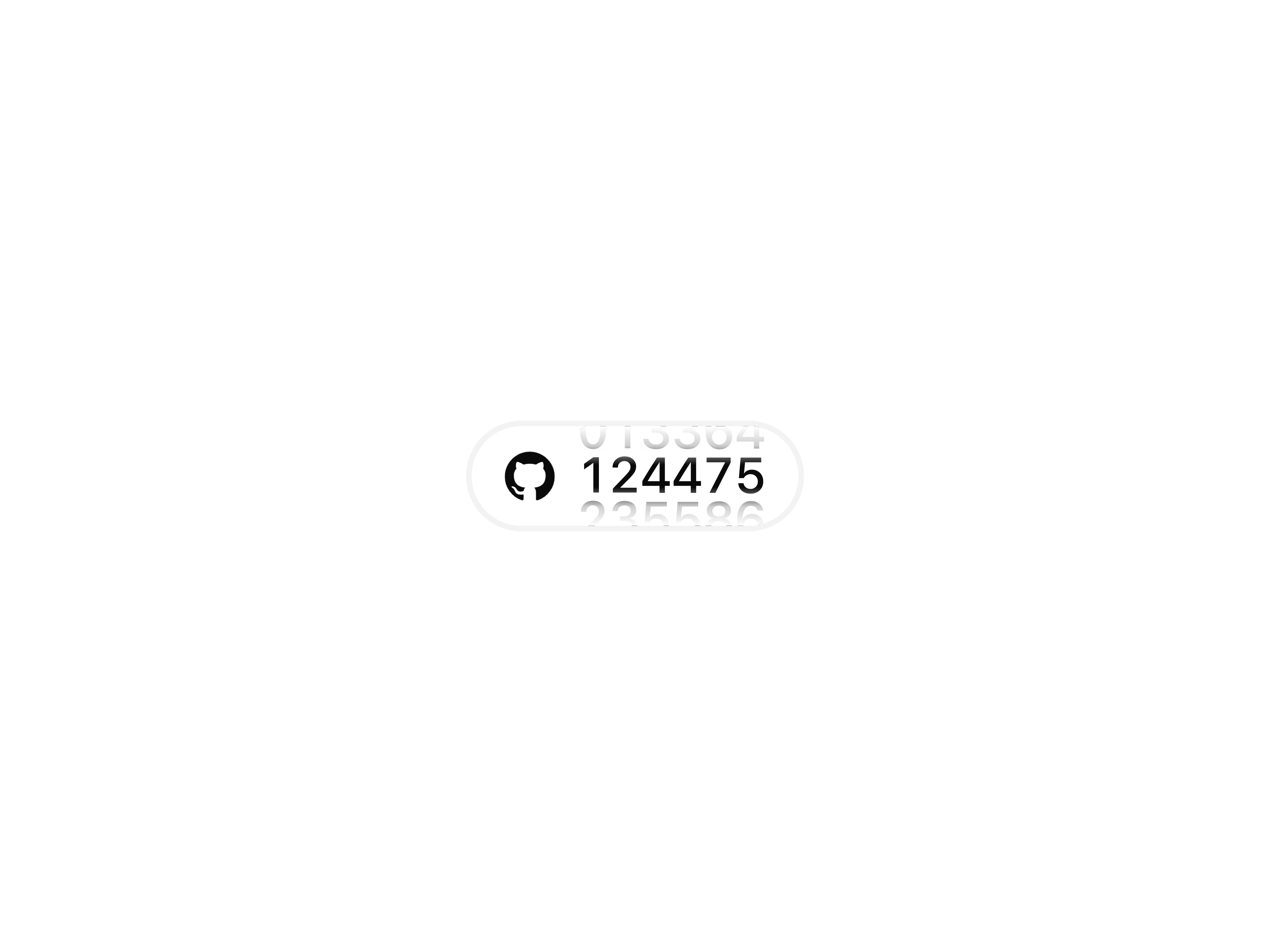
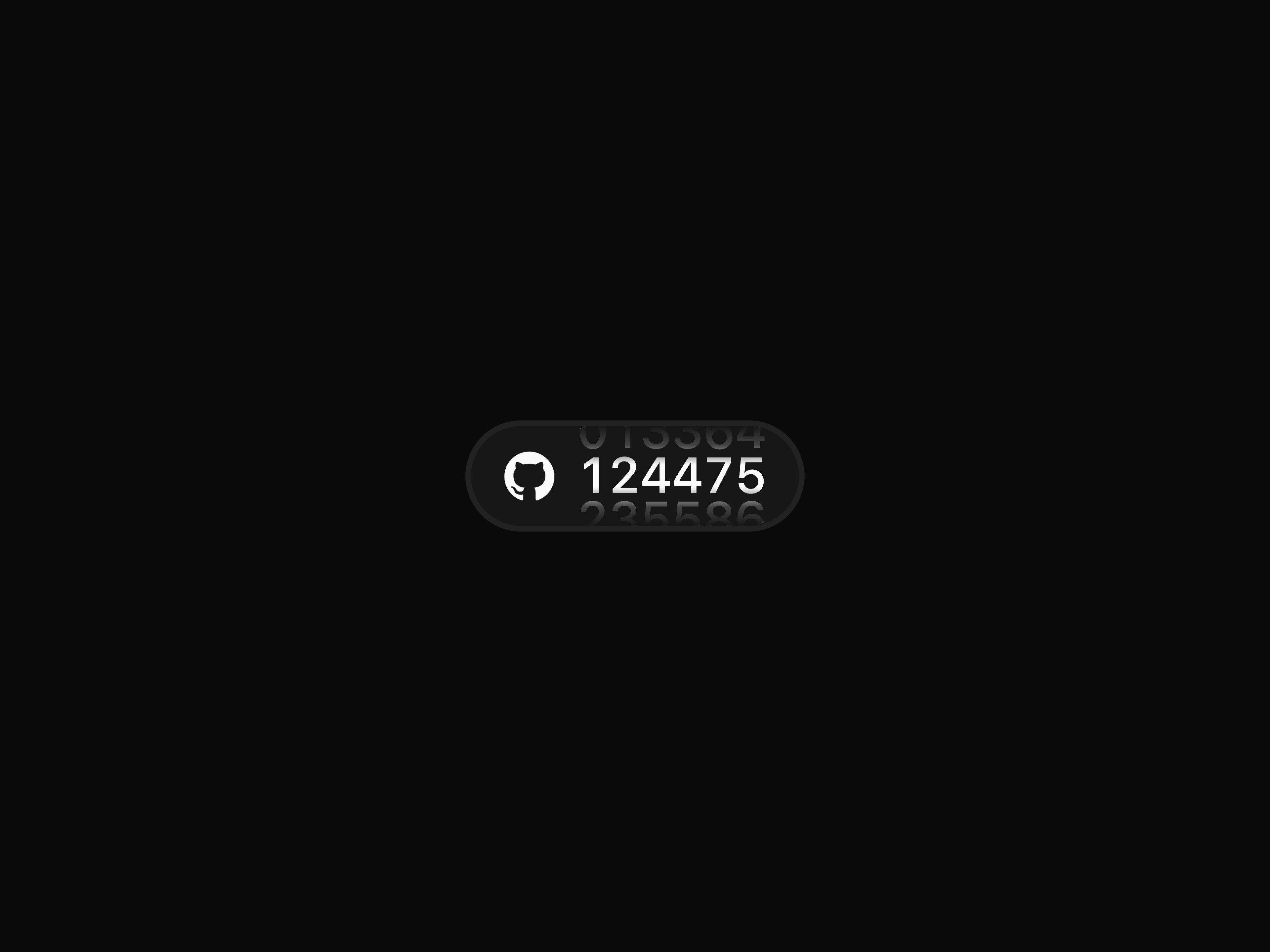
GitHub Star Counter


Form Input


Form Select

AI Response Writer

Gradient Shadow
That's all 5 components
About PaceKit
PaceKit publishes a shadcn registry at gsap.pacekit.dev, with 28 components installable through the shadcn CLI.
- Components
- 28
- GitHub stars
- 15
- Last commit
- Jul 31, 2026
Also in the PaceKit registry
Copy a prompt for your agent, copy the install command, or open the docs that ship it.
Modal Ability Selector
ai-modal-ability-selectorCompact selector for toggling abilities with icons and custom styles
gsap, @gsap/react1 fileModal Selector
ai-modal-selectorAI-focused model selector with preview, tooltips, and capability indicators built-in
gsap, @gsap/react1 fileModal Ability Selector
ai-token-counterCompact selector for toggling abilities with icons and custom styles
gsap, @gsap/react1 fileAnimated Stack
animated-stackA smooth stacked card component that expands on hover and collapses with animation.
gsap, @gsap/react1 fileDot Flow
dot-flowVisually expressive status updates with animated dots and smooth sliding text transitions.
gsap, @gsap/react1 fileDot Loader
dot-loaderA compact 7x7 dot grid loader with smooth animation to visualize frame sequences or loading states in your app.
1 fileDraw Line Text
draw-line-textA smooth text effect that draws characters as strokes and fills them in—perfect for headers and highlights.
gsap, @gsap/react1 fileFillable Button
fillable-buttonA button that fills with color on hover.
gsap, @gsap/react1 fileFlip Reveal
flip-revealAnimated container that reveals or hides items using GSAP Flip transitions and keys.
gsap, @gsap/react1 fileLayered Stack
layered-stackAn interactive component that dynamically layers elements, creating a visually engaging stacked animation effect.
gsap, @gsap/react1 fileLiquid Cursor
liquid-cursorA smooth, fluid cursor that follows your mouse with gentle stretch and bounce effects.
gsap, @gsap/react1 fileLiquid Glass
liquid-glassA smooth glass effect with subtle blur, ideal for UI highlights and overlays.
gsap, @gsap/react1 fileProfile Peek
profile-peekHover to peek profile with smooth reveal, right from the image.
gsap, @gsap/react1 fileReveal On Scroll
reveal-on-scrollAnimate content into view on scroll with effects like fade, slide, zoom, and blur.
gsap, @gsap/react1 fileReveal Text
reveal-textA smooth text reveals animation where each heading reveals related content on interaction.
gsap, @gsap/react1 fileSpring Button
spring-buttonA button that shrinks on press and springs back with bounce.
gsap, @gsap/react1 fileStagger on Scroll
stagger-on-scrollStagger elements into view with scroll-triggered fade, slide, zoom, or blur effects.
gsap, @gsap/react1 fileSwap
A flexible swap component that animates content changes with smooth customizable transition effects.
gsap, @gsap/react1 fileText Fall Button
text-fall-buttonA button with dynamic text that falls into place with a smooth, elastic motion on hover or click.
gsap, @gsap/react1 fileTilt Card
tilt-cardInteractive 3D tilt card that responds to cursor, adds depth and motion
gsap, @gsap/react1 file