Sora UI
11components80.8Kviews338bookmarks
Installs all 62 components. Without our CLI, run instead.
Auto-indexed
Sora UI contents

Base Dropdown Menu
Base Dropdown Menu
Cursor Bubble
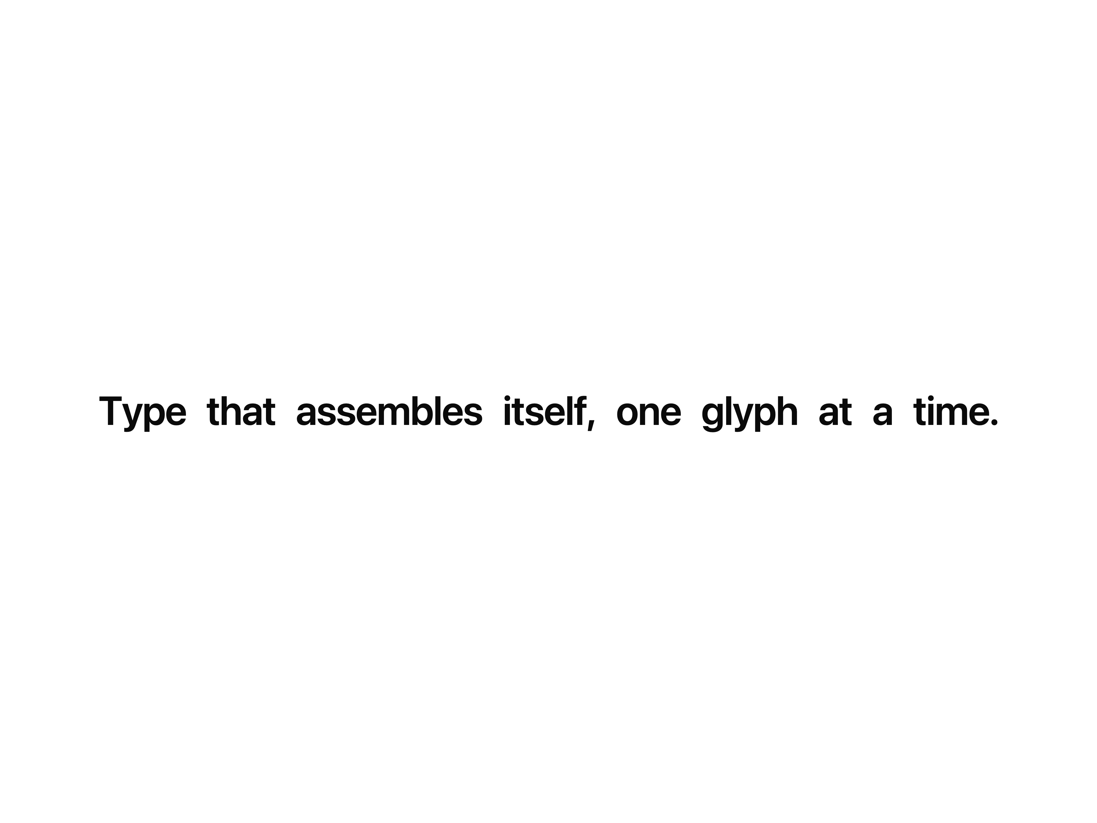
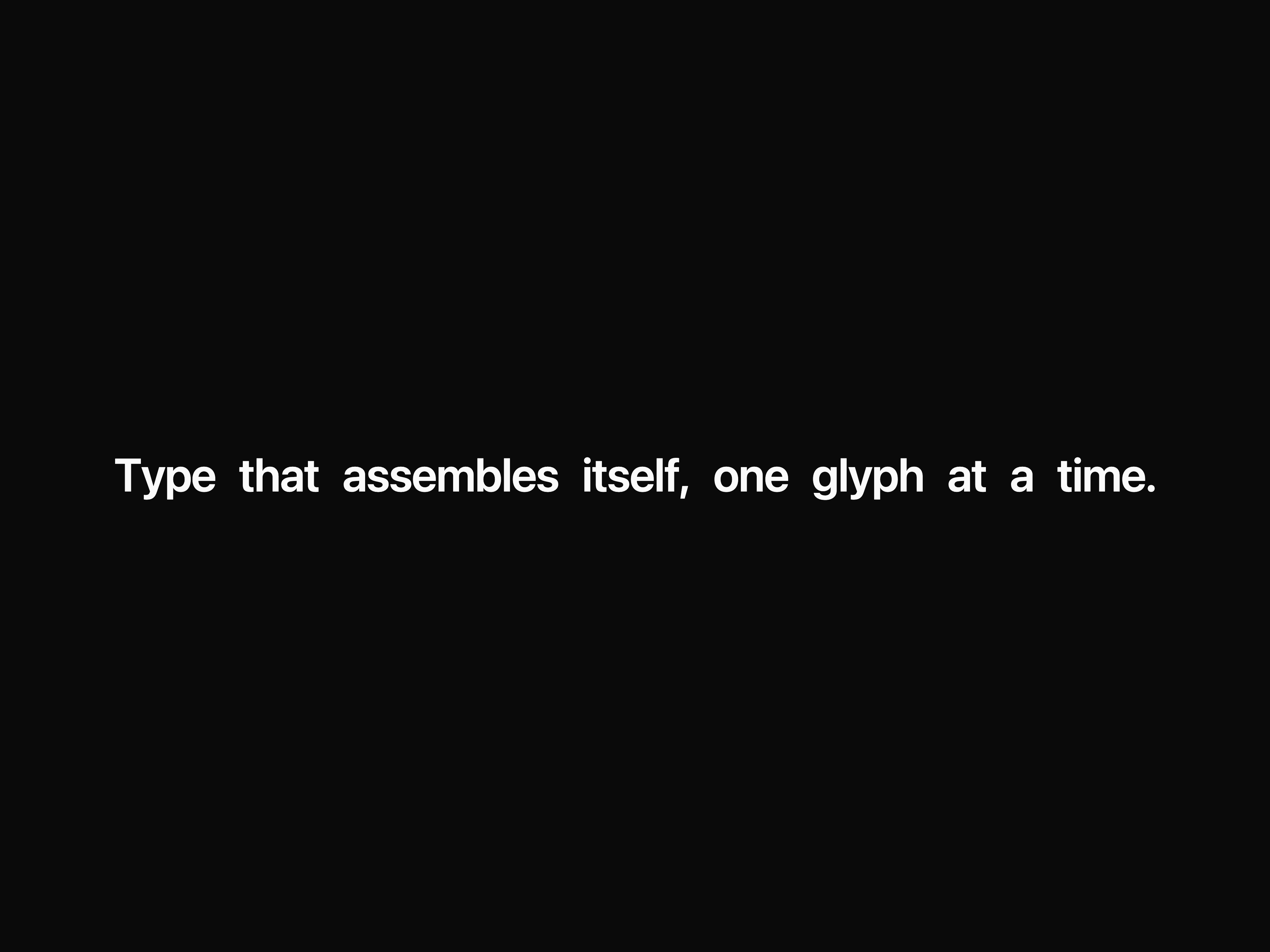
Typer
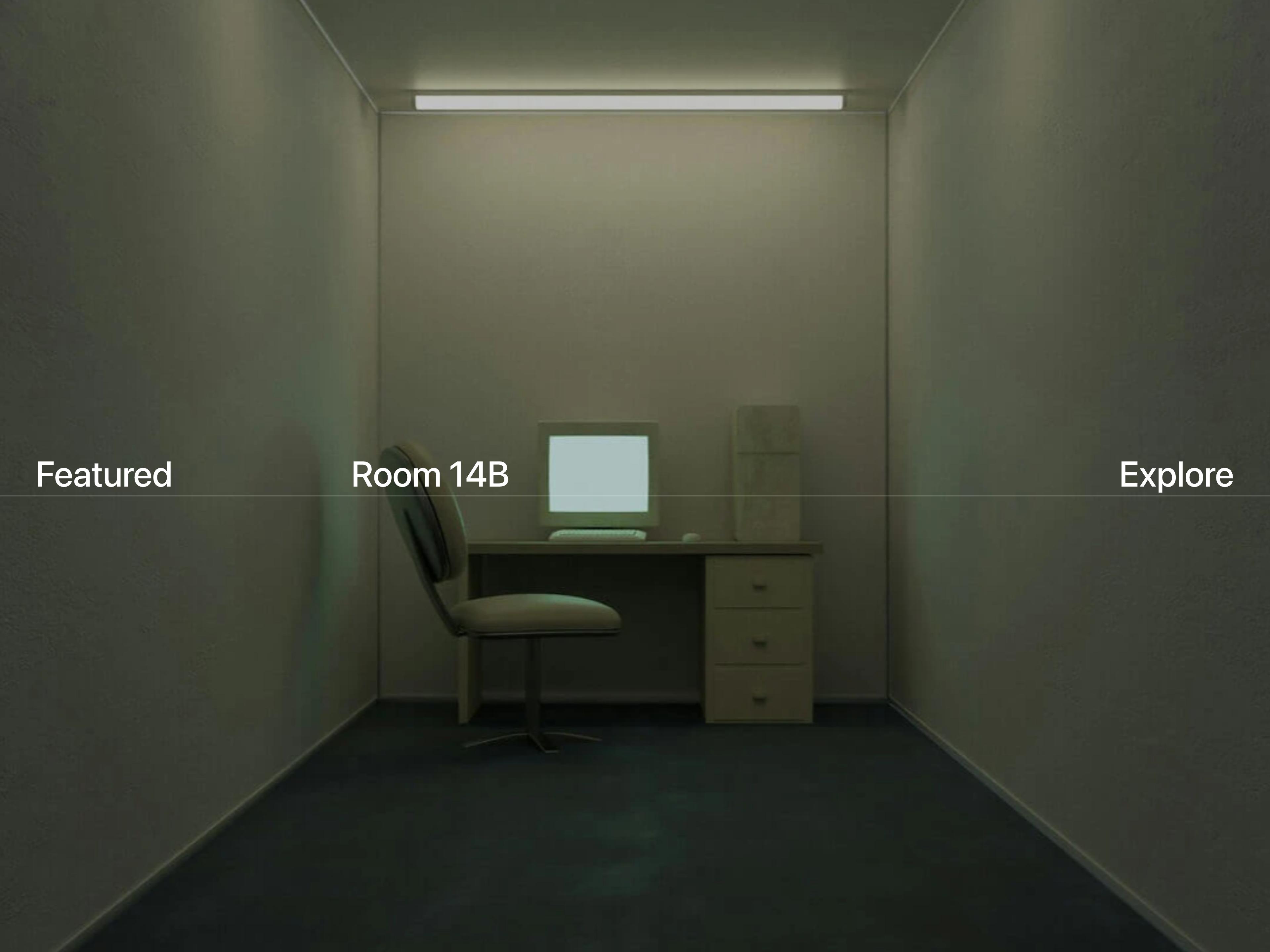
Scroll Gallery

Dual Wipe Reveal
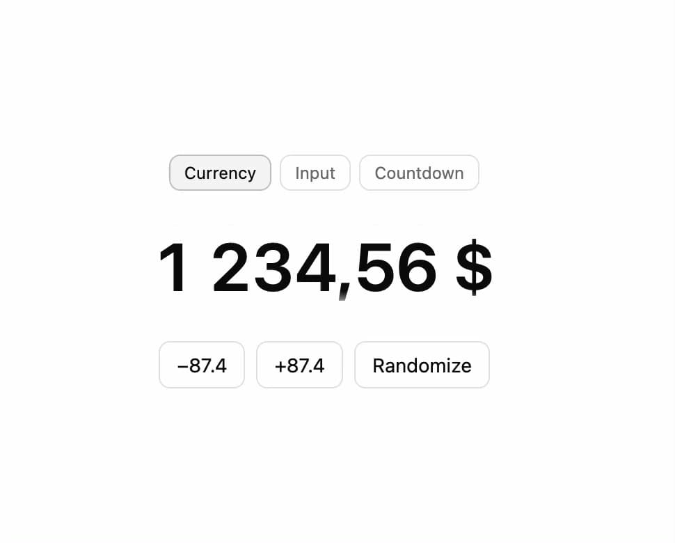
Number Flow

Base Alert Dialog

Base Alert Dialog

Text Scramble

Custom Cursor
That's all 11 components
About Sora UI
Sora UI publishes a shadcn registry at ui.soralabs.io.vn, with 62 components installable through the shadcn CLI.
- Components
- 62
- GitHub stars
- 12
- Last commit
- Oct 15, 2026
- Repository
- SoraLabsOSS/ui
Also in the Sora UI registry
Copy a prompt for your agent, copy the install command, or open the docs that ship it.
arrow-roll-button
utilsbase-accordion
utils4 examplesBase Button
base-buttonAn interactive button component built on Base UI with Motion hover/tap scaling and shadcn/ui variants.
@base-ui/react, motion, class-variance-authority1 file6 examplesBase Checkbox
base-checkboxAn accessible, stylable checkbox built on Base UI with a Motion-friendly animated indicator.
@base-ui/react, motion1 file4 examplesbase-context-menu
utils3 examplesBase Dialog
base-dialogAn accessible modal dialog built on Base UI with smooth Motion spring entrance and exit animations.
@base-ui/react, motion, lucide-react1 file3 examplesbase-input
utilsbase-switch
utils3 examplesbase-tooltip
utils1 exampleCursor Trail Reveal
cursor-trail-revealDesktop cursor trail that reveals staggered image strips with clip-path wipes as the pointer moves.
class-variance-authority1 file1 exampleDraw Underline Link
draw-underline-linkA link with a hand-drawn SVG underline that animates on hover, powered by Motion.
motion, class-variance-authority1 fileExpandable Tabs
expandable-tabsA pill-shaped tab bar that expands into a floating panel, with Motion driving the shell, label, and content transitions.
motion, lucide-react, react-use-measure1 file1 exampleFog Text Reveal
fog-text-revealInline text that materializes through a soft, turbulent WebGL fog mask, inherits font and color from CSS, and cycles through an array of messages.
motion1 file1 exampleHero Carousel
hero-carouselCrossfading hero image slideshow with a progress pill, play/pause, and prev/next controls.
utils1 file1 exampleHighlight
A Motion-powered highlight effect that allows you to highlight elements on hover, click or with a controlled value.
motion1 file2 examplesArrow Right
icons-arrow-rightAnimated right arrow that nudges forward and redraws its stroke on hover using a pure CSS stroke-dash animation.
utils1 fileBell
icons-bellNotification bell that rattles from its hanger on trigger — a decaying rotation pivot, powered by the AnimateIcon engine.
motion1 fileChevrons
icons-chevronsAnimated double up-chevron that cross-fades between the two carets on hover, powered by the AnimateIcon engine.
motion1 fileicons-copy
Infinite Scrolling Images
infinite-scrolling-imagesAn infinite card stack that advances with wheel, touch, or keyboard input using spring-based Motion transitions.
motion1 file1 exampleInline Testimonials
inline-testimonialsA flowing quote stream where each avatar reveals its author on hover, with Motion fading and blurring the rest.
motion1 file1 exampleLogo Carousel Swapper
logo-carousel-swapperStaggered logo column swapper with fade, vertical shift, and motion blur powered by Motion.
motion, class-variance-authority1 file1 exampleMagnetic Cards
magnetic-cardsA fanned stack of cards that fling away from the cursor on release, with GSAP InertiaPlugin easing each one back to rest.
gsap, @gsap/react1 file1 exampleParticle Hover Button
particle-hover-buttonA wrapper that emits glowing, pooled particles from the cursor while hovering any button or link.
motion1 file1 examplePixel Image Loader
pixel-image-loaderA canvas-based image that resolves from a blocky, pixelated placeholder up to full sharpness as it loads.
1 fileProgressive Blur
progressive-blurA stacked-layer blur that ramps smoothly from sharp to fully blurred toward an edge, for fading content under a fixed header or above a scroll boundary.
utils1 file1 exampleradix-accordion
utilsradix-alert-dialog
utilsRadix Button
radix-buttonAn interactive button component built on Radix UI Slot with Motion hover/tap scaling and shadcn/ui variants.
radix-ui, motion, class-variance-authority1 file6 examplesRadix Checkbox
radix-checkboxAn accessible, stylable checkbox built on Radix UI with a Motion-friendly animated indicator.
radix-ui, motion1 file4 examplesradix-context-menu
utilsRadix Dialog
radix-dialogAn accessible modal dialog built on Radix UI with smooth Motion spring entrance and exit animations.
radix-ui, motion, lucide-react1 file3 examplesradix-dropdown-menu
utilsradix-input
utilsradix-switch
utilsradix-tooltip
utilsRolling Text
rolling-textPer-character slot-machine reveal that rolls each letter into place once it scrolls into view, powered by Motion.
motion1 fileScroll Chapters
scroll-chaptersA draggable, chaptered progress-bar nav — two-way cursor/scroll sync, ghost-cursor hover preview, snap-to-step seeking, and a per-chapter panel that can opt in or out of showing.
gsap, @gsap/react1 file1 exampleSkeleton Shimmer
skeleton-shimmerSkeleton loading placeholders with a shimmer effect that transitions to revealed content via a CSS view-transition wipe animation. Skeletons are sized using placeholder data to reduce layout shifts.
motion1 file2 examplesSliding Chip Button
sliding-chip-buttonA chip-style call-to-action link with a Motion-powered sliding label and rotating icon chips on hover.
motion, class-variance-authority1 fileStagger Button
stagger-buttonA button that staggers per character or slides the whole label on hover, with a scaling background layer.
class-variance-authority1 fileSticky Scroll Cards
sticky-scroll-cardsScroll-pinned hero where a front card flips to reveal a stack of back cards, dismissed one at a time as you keep scrolling.
gsap, @gsap/react1 file1 exampleText Cursor Loop
text-cursor-loopCycles through a list of words with a per-character collapse/reveal transition and a trailing cursor glyph that wipes across the text between words.
motion1 file1 exampleText Effect
text-effectPreset-driven staggered text reveals with blur, fade, slide, and scale animations, powered by Motion.
motion1 file1 exampleText Loop
text-loopCycles through a list of items with an enter/exit animation, powered by Motion.
motion1 file1 exampleText Morph
text-morphPer-character layout morphing for labels, counters, and live text swaps, powered by Motion.
motion1 file2 examplesText Reveal Box
text-reveal-boxScroll-pinned word-by-word text reveal with a highlight flash, powered by GSAP ScrollTrigger.
gsap, @gsap/react1 file1 exampleTilt Card
tilt-card3D tilt card that rotates toward the cursor on spring physics, with an optional glare reflection.
motion1 file2 examplestilt-slide-transition
1 exampleVideo Player
video-playerDependency-free custom video player: modal overlay, chaptered timeline, hover-scrub preview, speed menu, picture-in-picture, fullscreen, keyboard shortcuts, and focus trapping.
motion1 file1 example