About
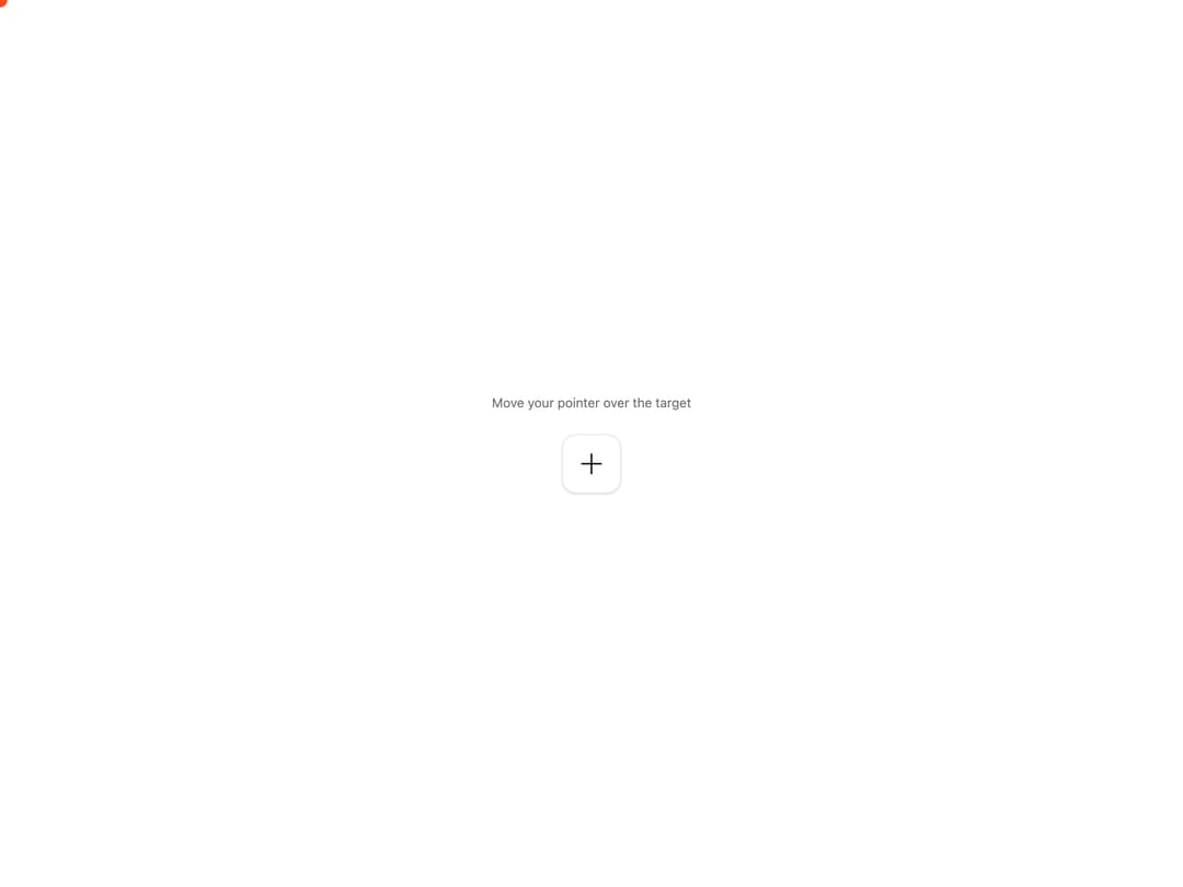
A smooth custom cursor that follows the pointer with spring physics and morphs into a larger ring when hovering interactive targets.
Built with React and Tailwind. Copy the prompt and paste it into Claude Code, Cursor or Lovable: your agent adds Custom Cursor to your project and fits it to your theme.
Code
How Custom Cursor is used: the demo's code. The component's own source comes with a free account.
Usage.tsx
"use client";

import {
  CustomCursor,
  CustomCursorTarget,
} from "@/components/ui/custom-cursor";

export default function CustomCursorDemo() {
  return (
    <CustomCursor className="w-full" color="#ff4c24" layout="demo">
      <div className="flex flex-col items-center gap-6">
        <p className="text-sm text-muted-foreground">
          Move your pointer over the target
        </p>
        <CustomCursorTarget
          aria-label="Interactive target"
          className="rounded-2xl border bg-background text-foreground shadow-sm"
          size="lg"
        >
          <svg
            aria-hidden="true"
            className="size-7"
            fill="none"
            viewBox="0 0 24 24"
          >
            <path
              d="M12 3v18M3 12h18"
              stroke="currentColor"
              strokeLinecap="round"
              strokeWidth="1.5"
            />
          </svg>
        </CustomCursorTarget>
      </div>
    </CustomCursor>
  );
}
Dependencies
More by soralabs
View all

Scroll Gallery
200
Dia Text Reveal
143
Dock Nav
133
Text Reveal Block
104
Pixelated Image Reveal
94
Text Roll
60
Section CTA
28
Text Reveal (Mask)
27