mischief
9components8.1Kviews7bookmarks
Installs all 112 components. Without our CLI, run instead.
Auto-indexed
mischief contents


Orb
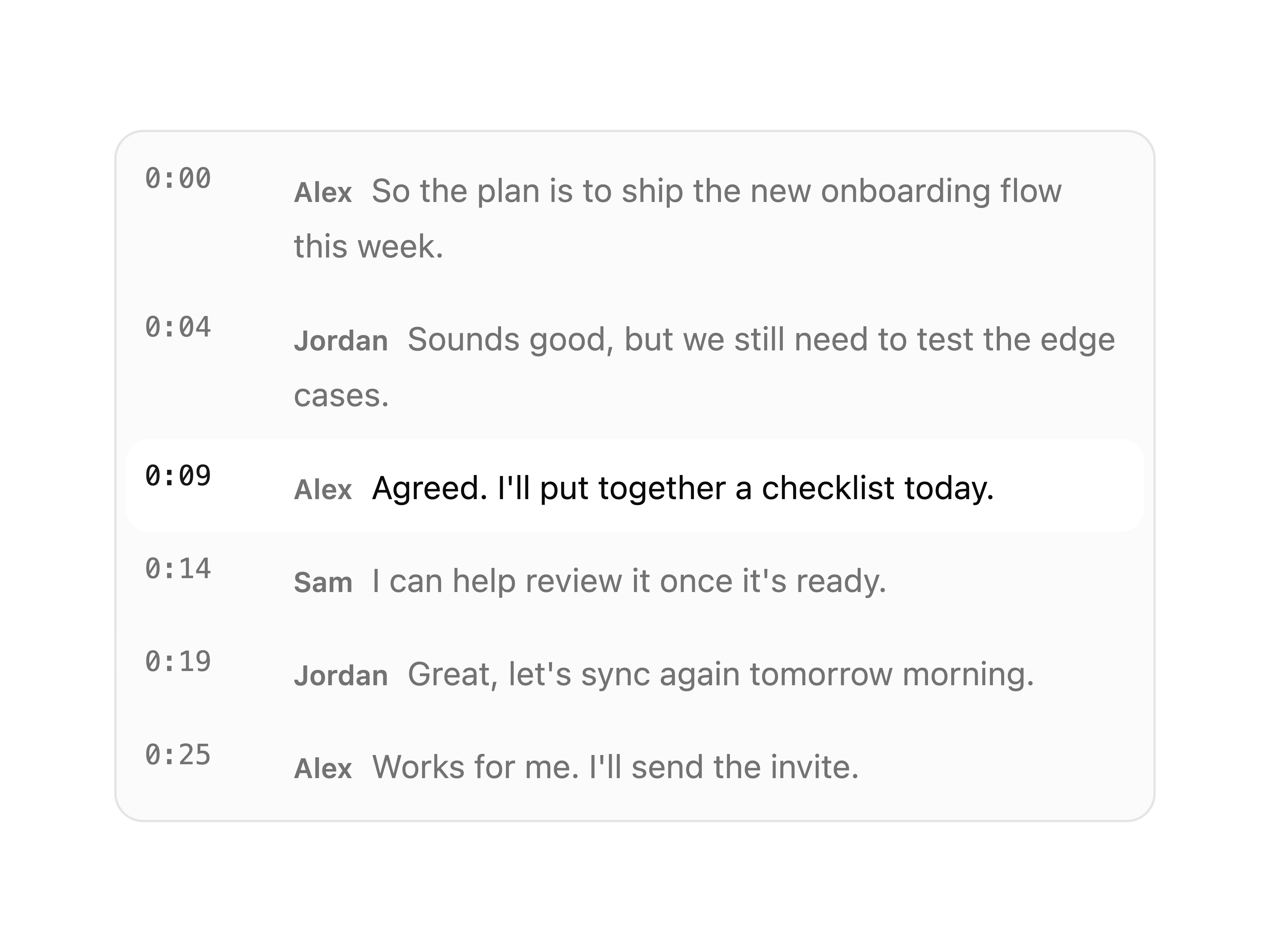
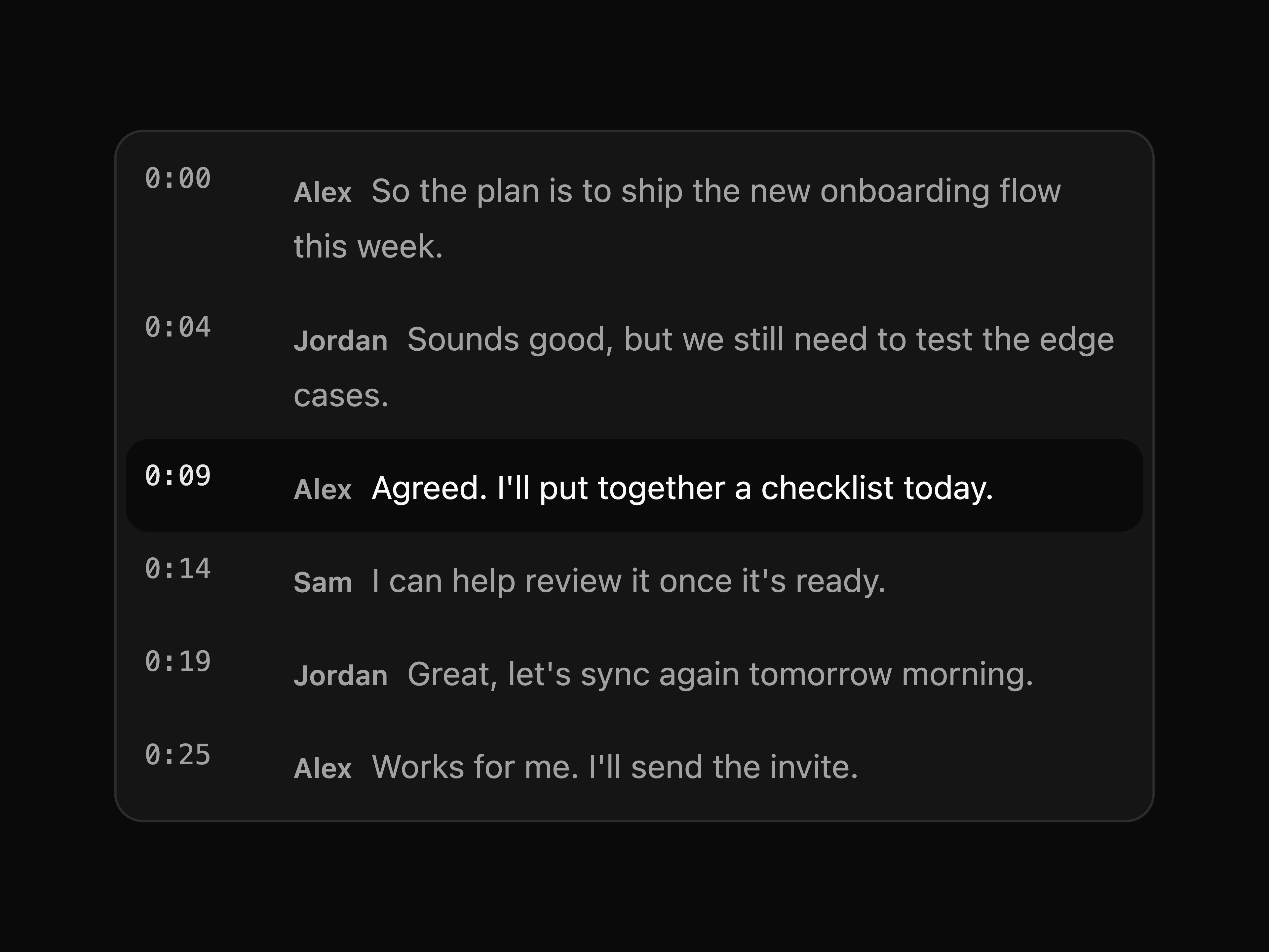
Transcript Viewer
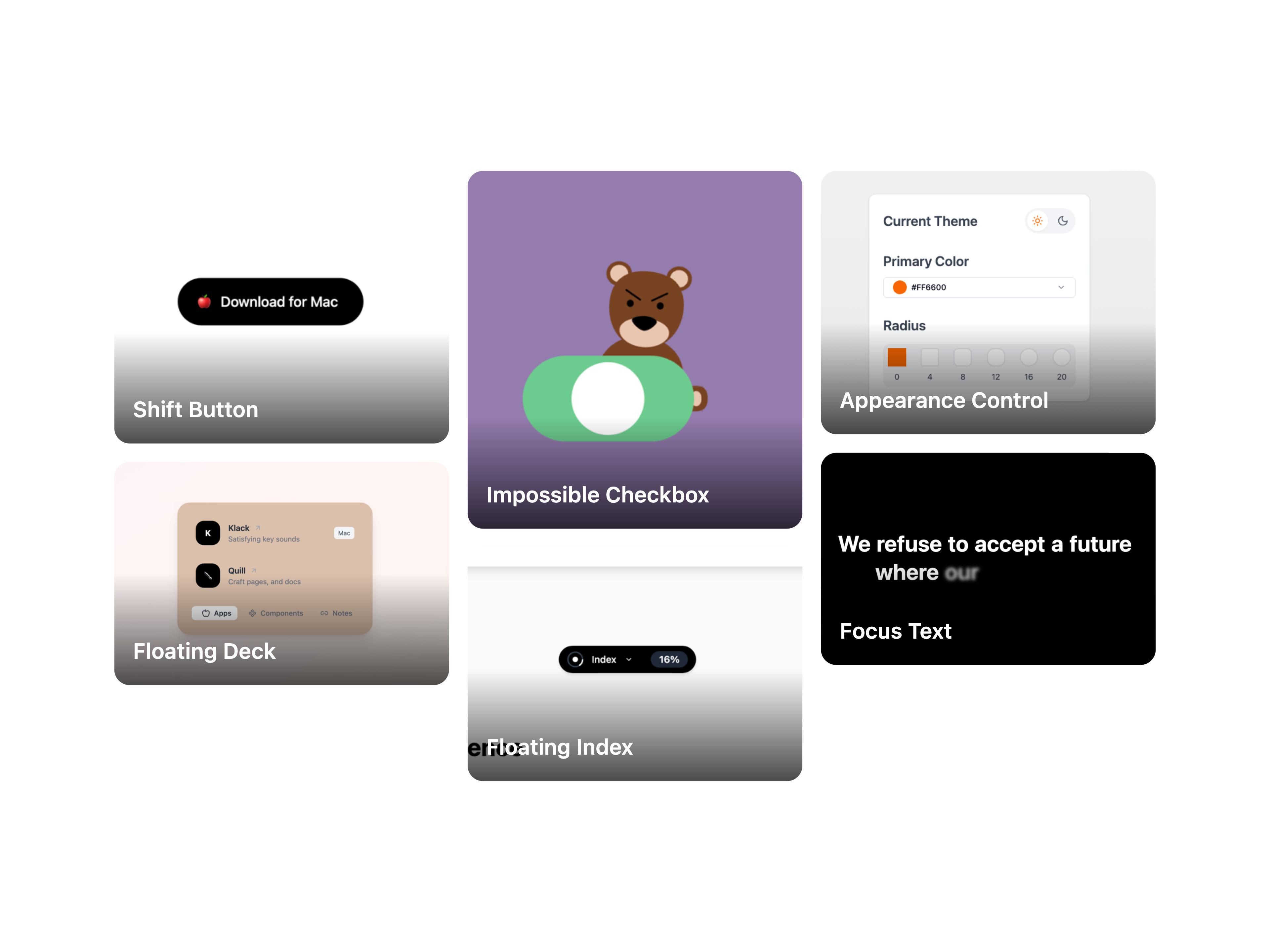
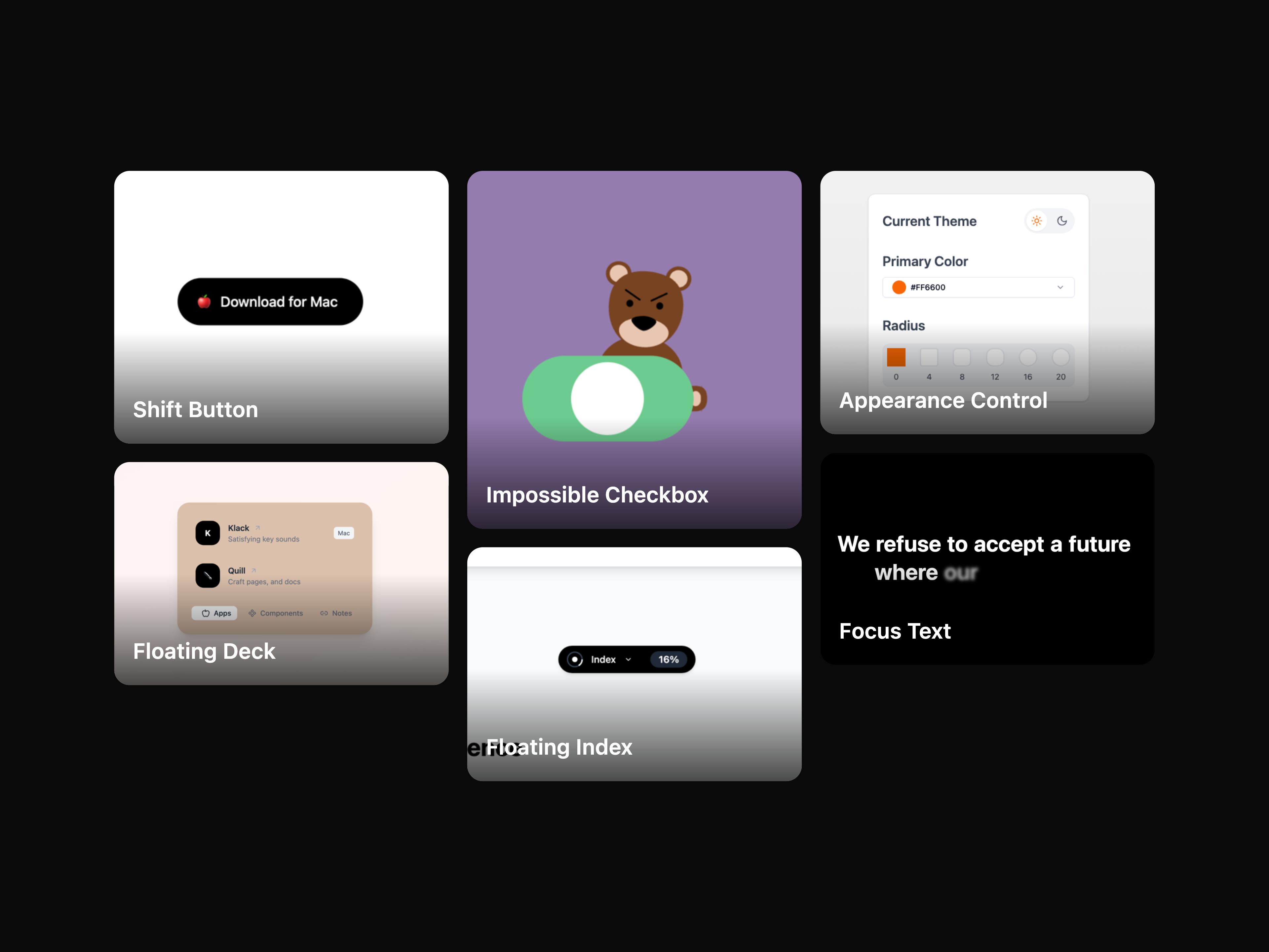
Image Grid
Burst
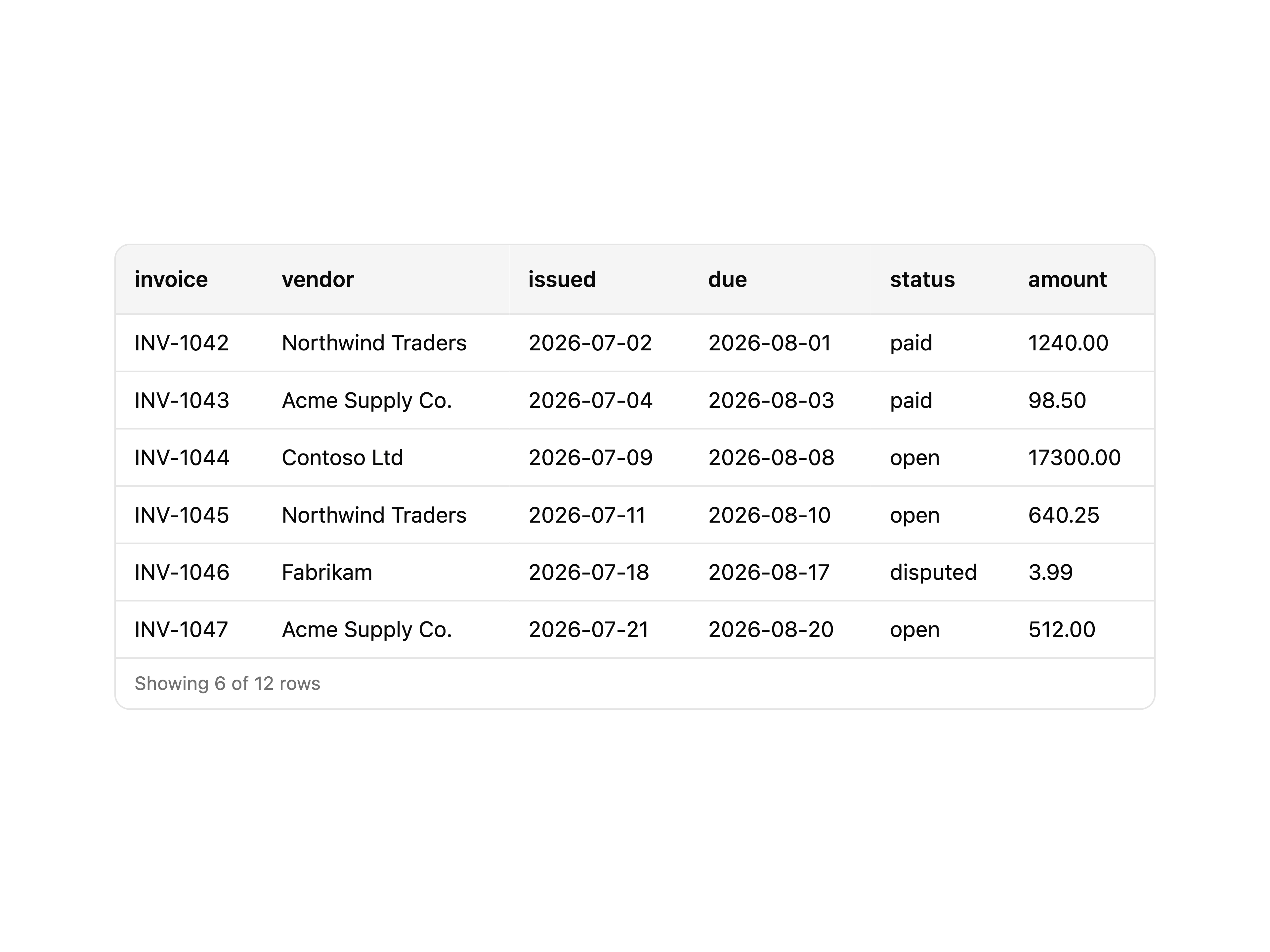
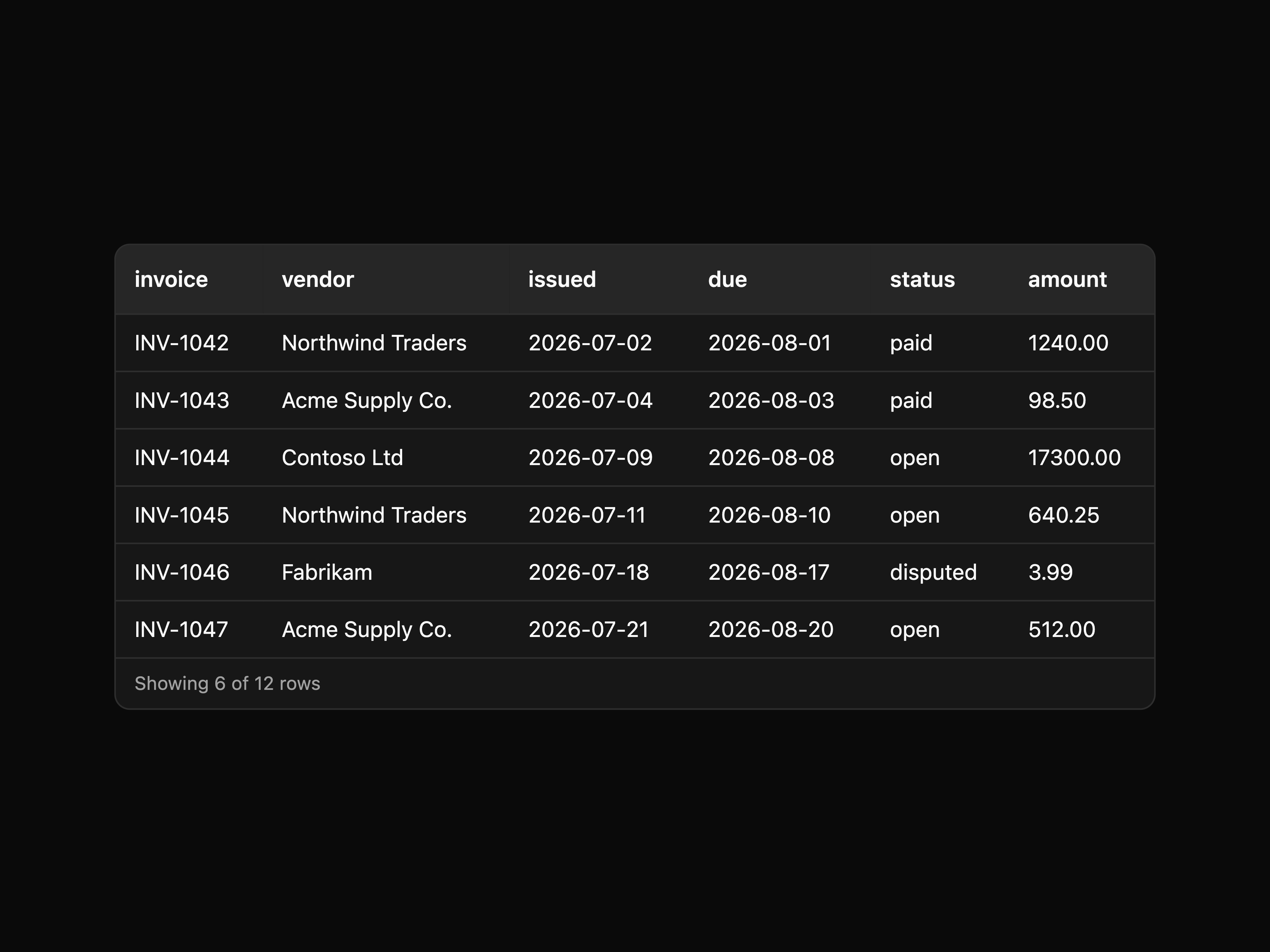
CSV Viewer
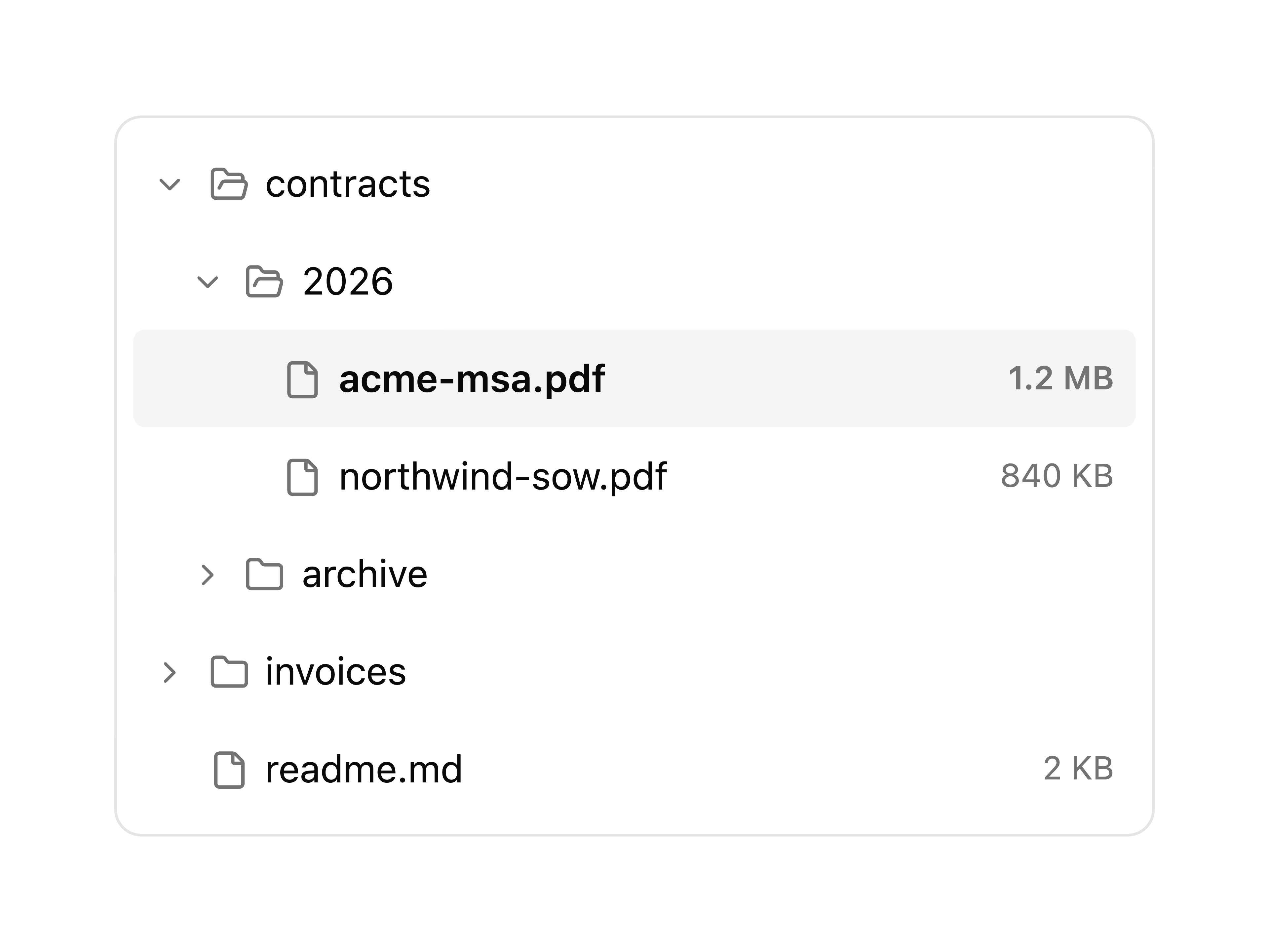
File Tree
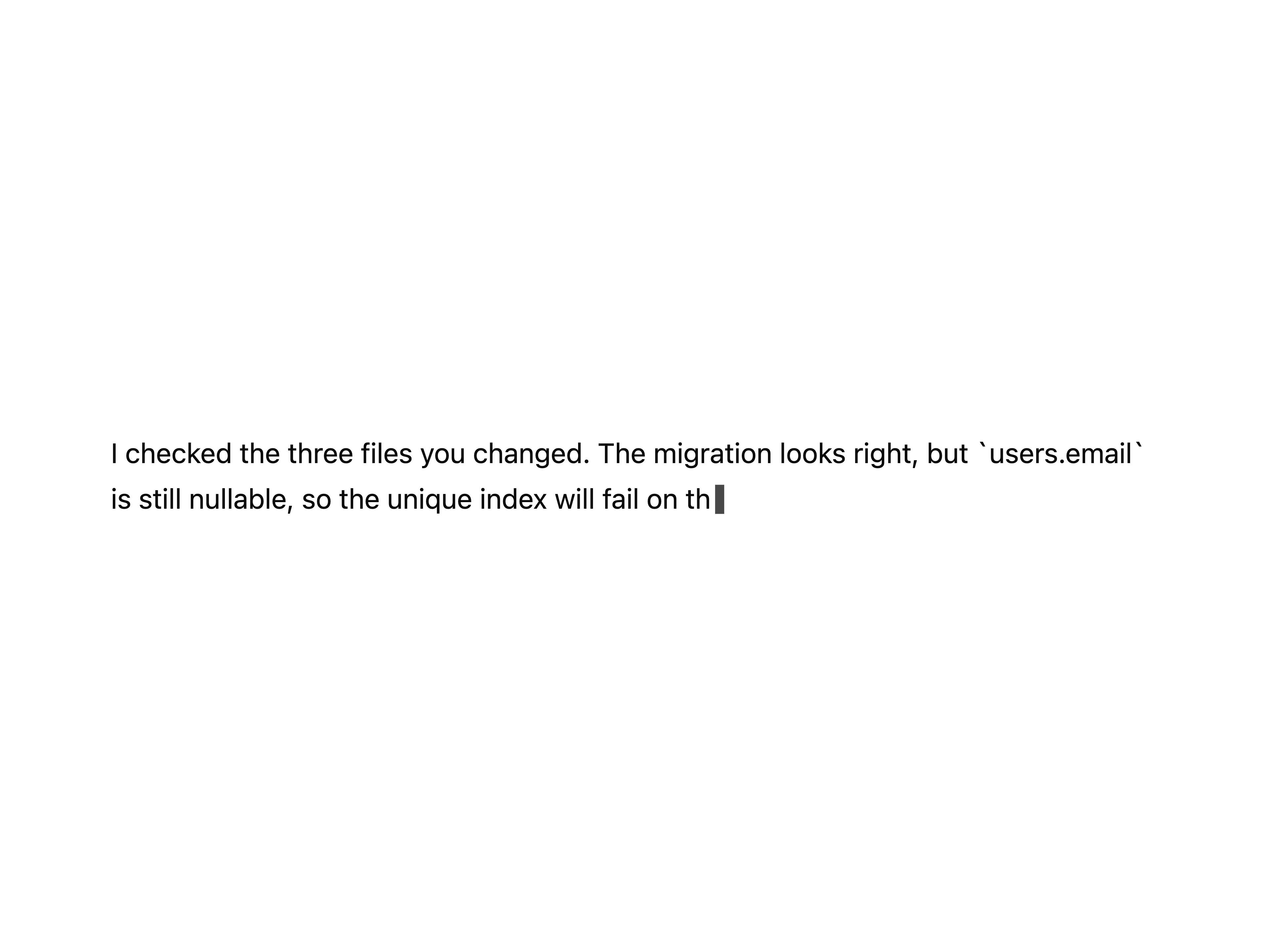
Streaming Text
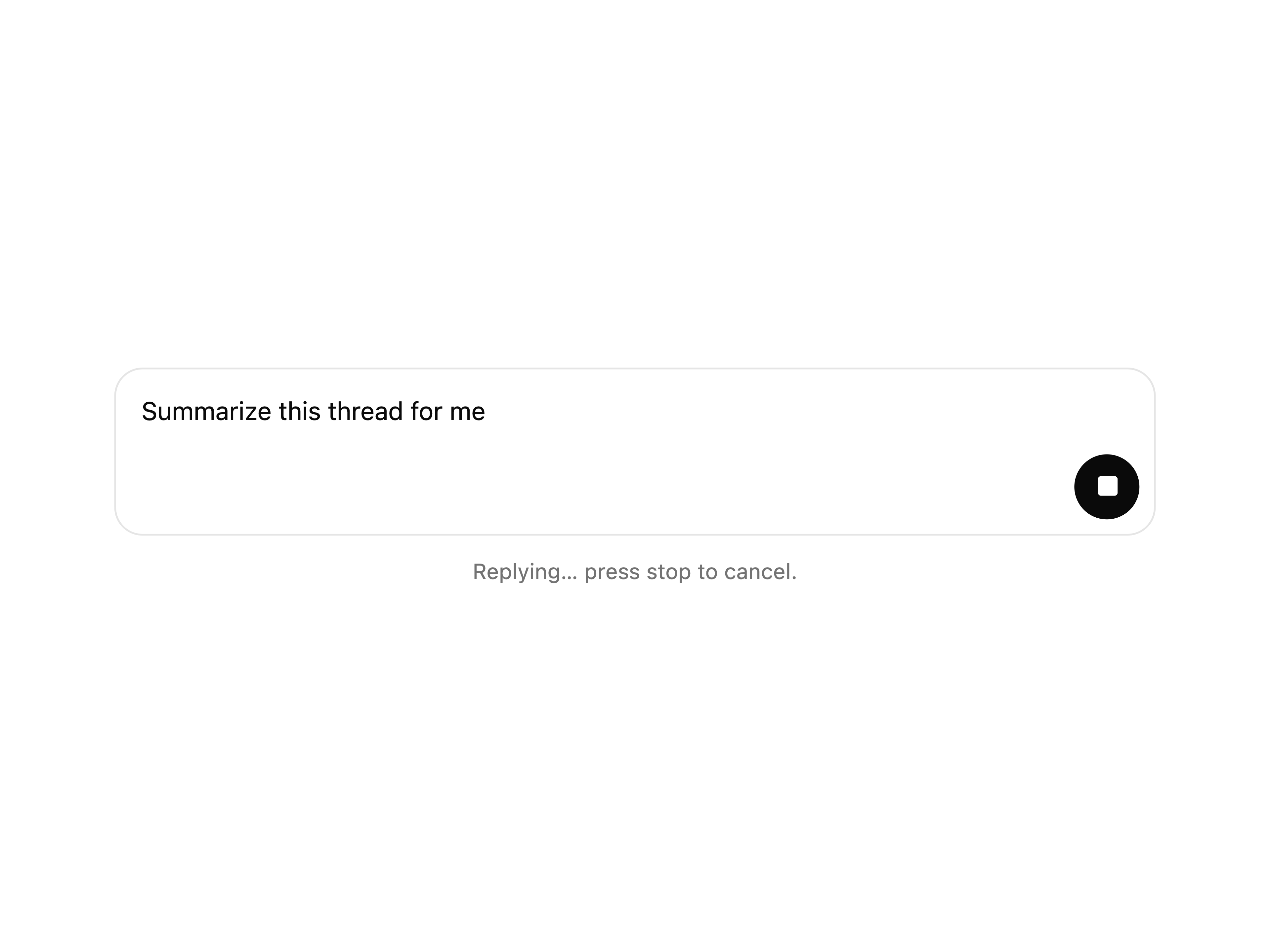
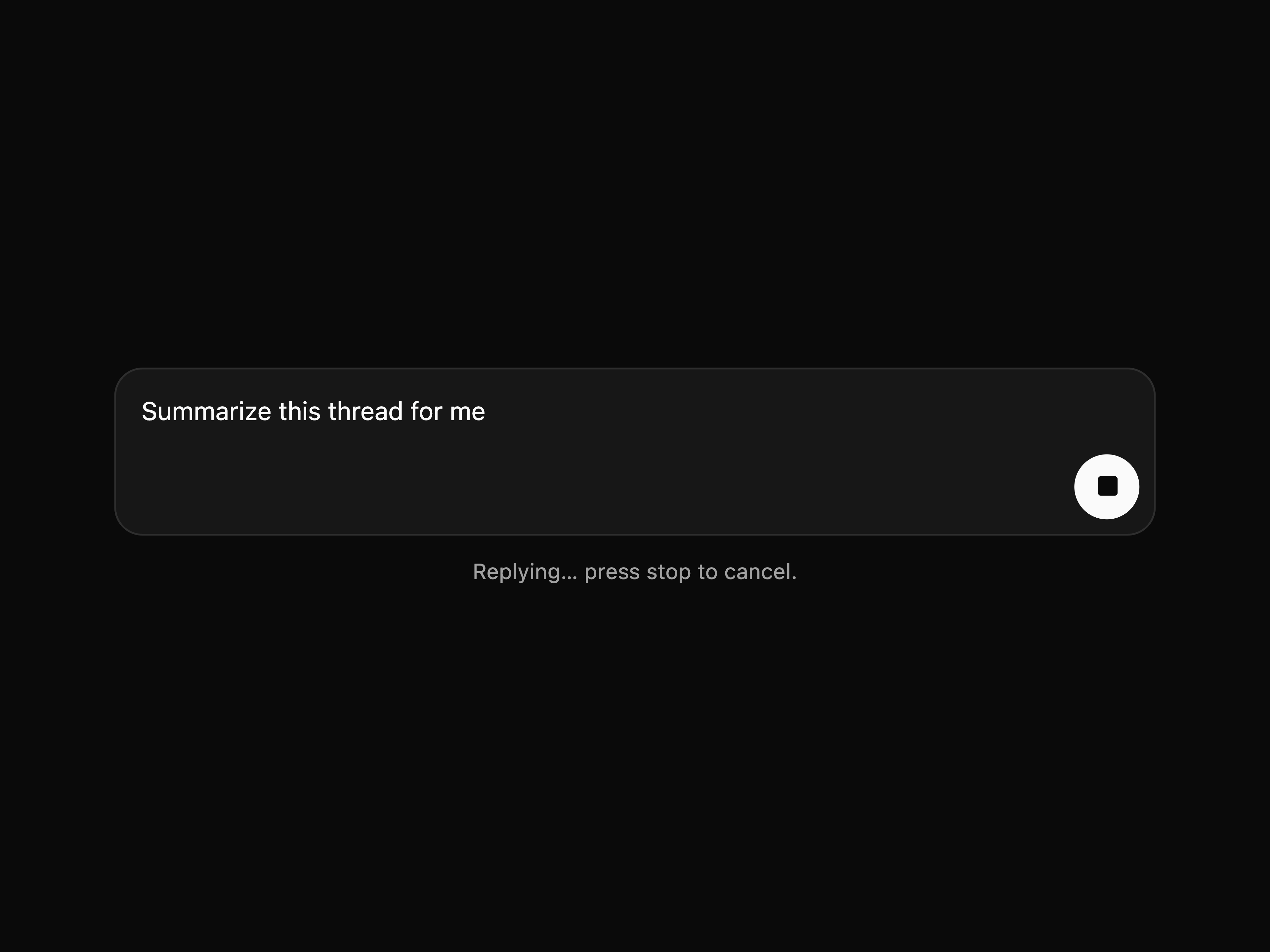
Prompt Input
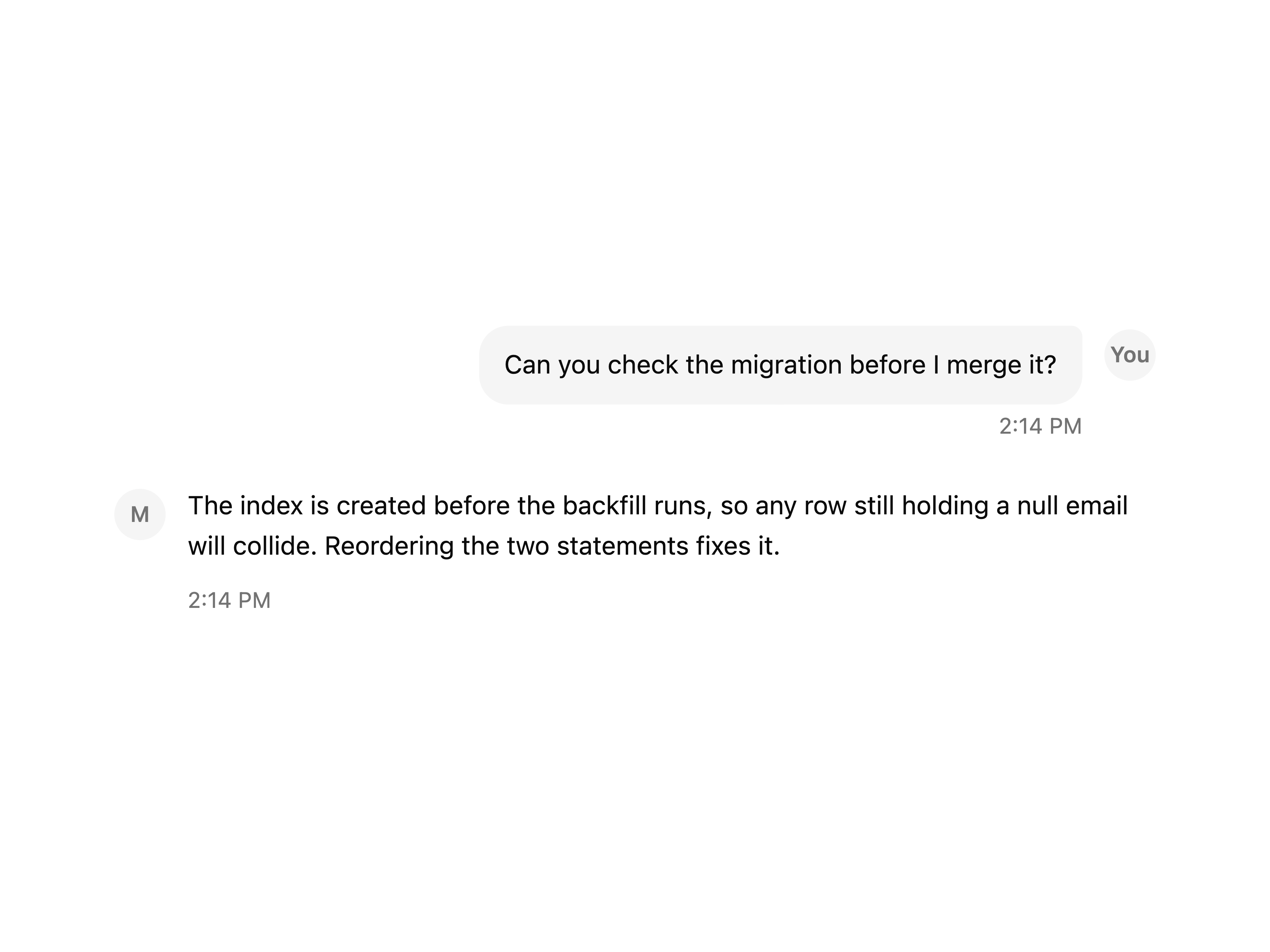
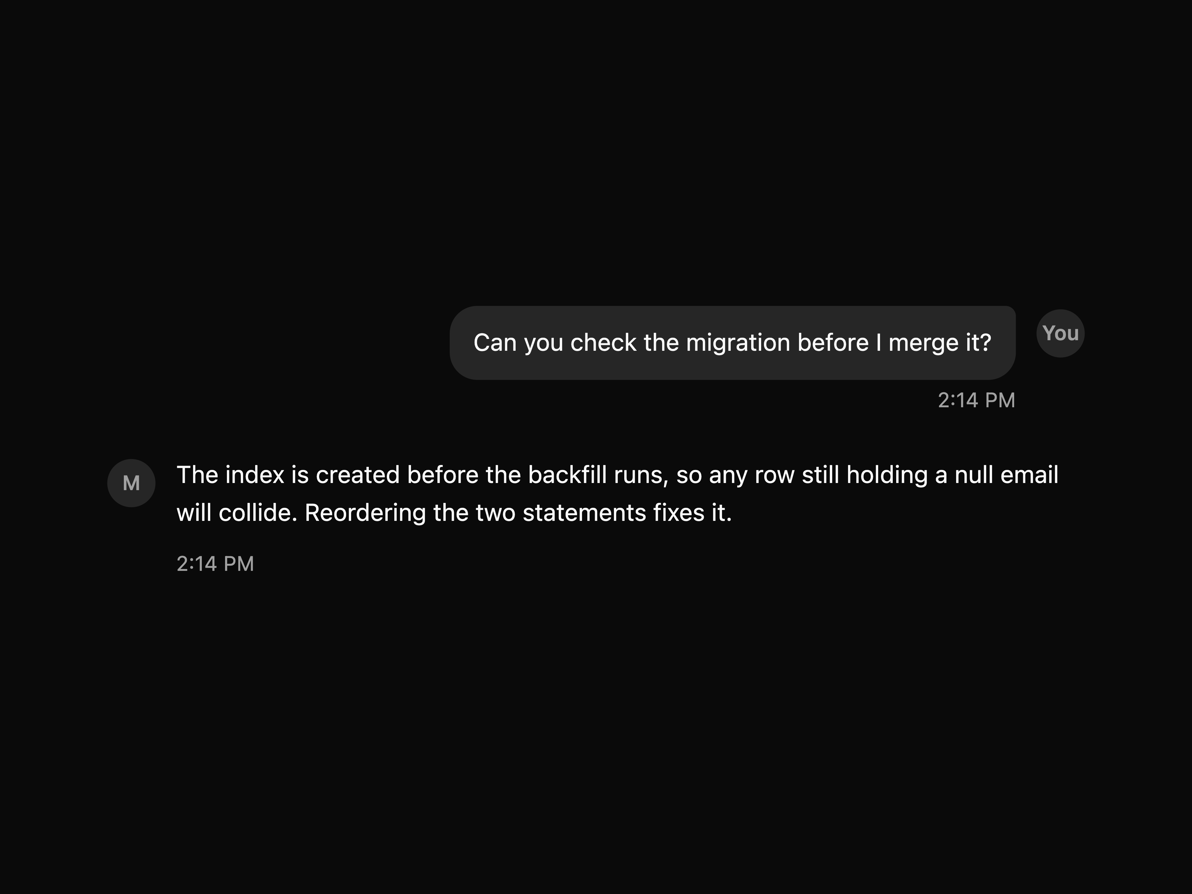
Message
That's all 9 components
About mischief
mischief publishes a shadcn registry at ui.tinkererslabs.com, with 112 components installable through the shadcn CLI.
- Components
- 112
- GitHub stars
- 4
- Last commit
- Sep 3, 2026
- Repository
- Tinkerers-Labs/mischief-ui
Also in the mischief registry
Copy a prompt for your agent, copy the install command, or open the docs that ship it.
agent-checklist
utils1 exampleannotation-layer
utils1 exampleascii-image
utils1 exampleask-ai
utils1 exampleaudio-player
utils1 exampleaurora-field
utils1 exampleavatar-stack
utils1 examplebar-visualizer
utils1 examplebounding-boxes
utils1 examplechain-of-thought
utils1 examplecode-block
utils1 examplecommand-palette
utils1 examplecomponent-preview
utils1 exampleconnection-beam
utils1 exampleconstellation-field
utils1 exampleconversation
utils1 examplecopy-button
utils1 examplecopy-for-ai
utils1 examplecursor-trail
utils1 examplediff-view
utils1 exampledisplacement-image
utils1 exampledither-image
utils1 exampledocument-splits
utils1 exampledocx-viewer
utils1 exampleelastic-slider
utils1 exampleempty-row
utils1 exampleempty-state
utils1 examplefile-thumbnail
utils1 examplefile-upload
utils1 examplefloating-index
utils1 examplefooter-columns
utils1 examplefooter-row
utils1 examplefooter-wordmark
utils1 examplegrain-overlay
utils1 examplehold-button
utils1 exampleimage-gallery
utils1 exampleimpossible-checkbox
utils1 exampleinline-citations
utils1 exampleinstall-command
utils1 examplejson-viewer
utils1 examplekbd
utils1 examplelattice-field
utils1 examplelightbox
utils1 examplemagnetic-tabs
utils1 examplemarkdown-blocks
utils1 examplemarquee
utils1 examplematrix
utils1 examplememory-chips
utils1 examplemetaballs
utils1 examplemic-selector
utils1 examplemodel-picker
utils1 examplenot-found
utils1 examplenumber-ticker
utils1 exampleotp-input
utils1 examplepage-navigator
utils1 examplepdf-viewer
utils1 examplepresence-field
utils1 examplequestionnaire
utils1 exampleredaction
utils1 examplerender-surface
utils1 exampleresizable-panels
utils1 exampleresponse
utils1 exampleresponse-actions
utils1 examplereveal
utils1 examplereviewable-diff
utils1 examplesave-bar
utils1 examplescene-hero
utils1 exampleschema-builder
utils1 examplescroll-scene
utils1 examplescroll-to-top-button
utils1 examplescrub-bar
utils1 examplesecret-field
utils1 exampleshader-surface
utils1 exampleshift-button
utils1 exampleshimmering-text
utils1 exampleside-panel
utils1 examplesignature-footer
utils1 examplesignature-pad
utils1 examplesortable-list
utils1 examplesource-card
utils1 examplespinner
utils1 examplesplit-text
utils1 examplespotlight-card
utils1 examplestatus-pill
utils1 examplestepper
utils1 examplestop-generating
utils1 examplestopped-run
utils1 examplestream-glow
utils1 examplesubagent-tree
utils1 examplesuggestions
utils1 exampletable-of-contents
utils1 exampletag-input
utils1 exampleterminal-output
utils1 exampletheme-toggle
utils1 examplethinking-state
utils1 exampletilt-card
utils1 exampletimeline
utils1 exampletoken-meter
utils1 exampletool-call
utils1 examplevideo-player
utils1 examplevoice-input
utils1 exampleweb-preview
utils1 examplewireframe-globe
utils1 example