Installs all 132 components. Without our CLI, run instead.
Unlumen UI publishes a shadcn registry at ui.unlumen.com, with 132 components installable through the shadcn CLI.
Copy a prompt for your agent, copy the install command, or open the docs that ship it.
A chat component that allows you to chat with an AI.
A real-time push feed where new items animate in from the top with spring physics — Stripe Radar style.
Animated toggle switch with separate track/thumb sizing, spring feedback, optional label text, and tone variants.
Aurora-blur pricing card with a configurable hero area, layout hooks, and customizable shader controls.
Animated card with fluid blob header, animated glow border, and configurable colors.
Animated icon where four square dots reorder in a 2×2 grid via Motion layout animation when active, signaling a card view mode.
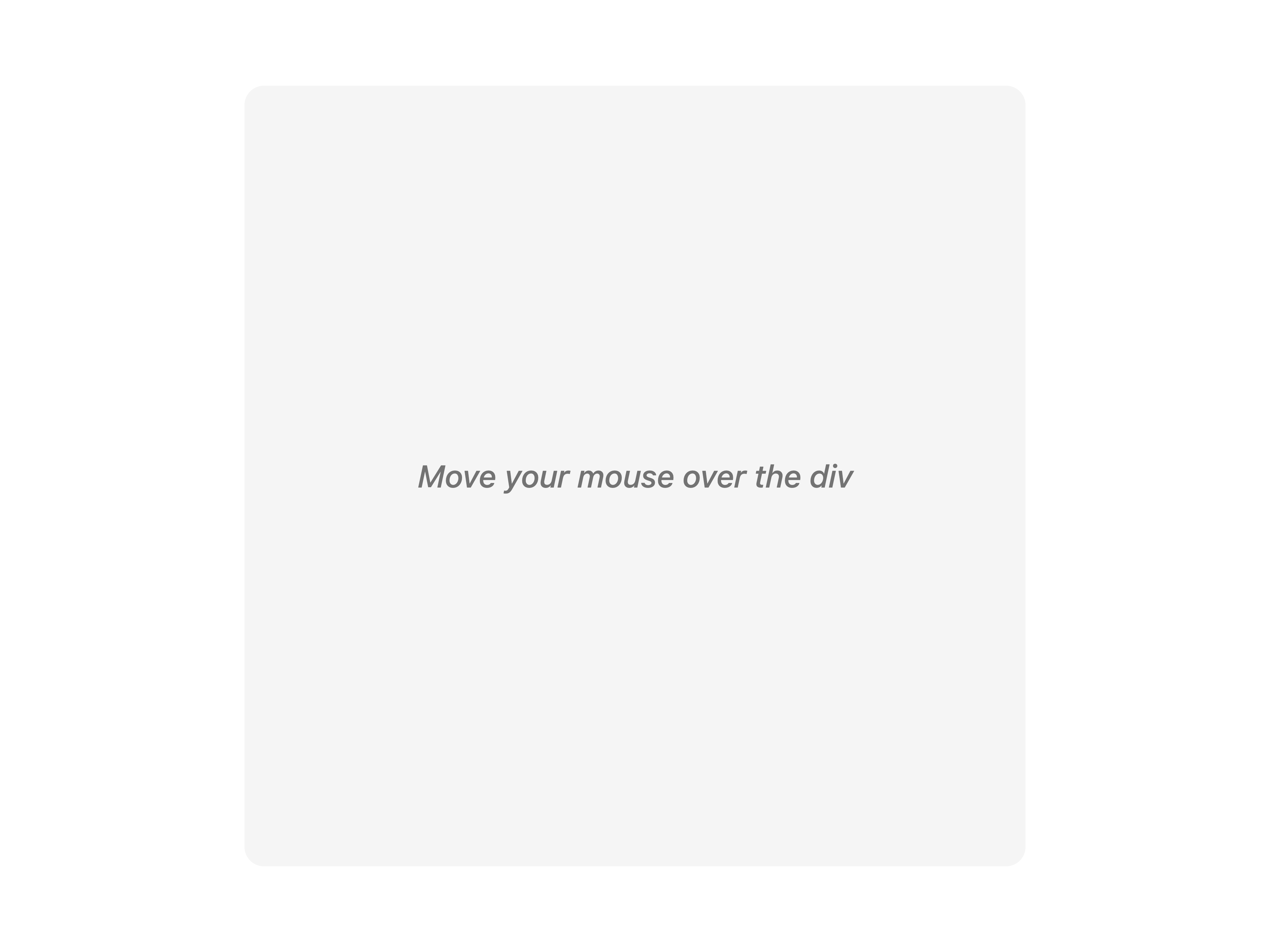
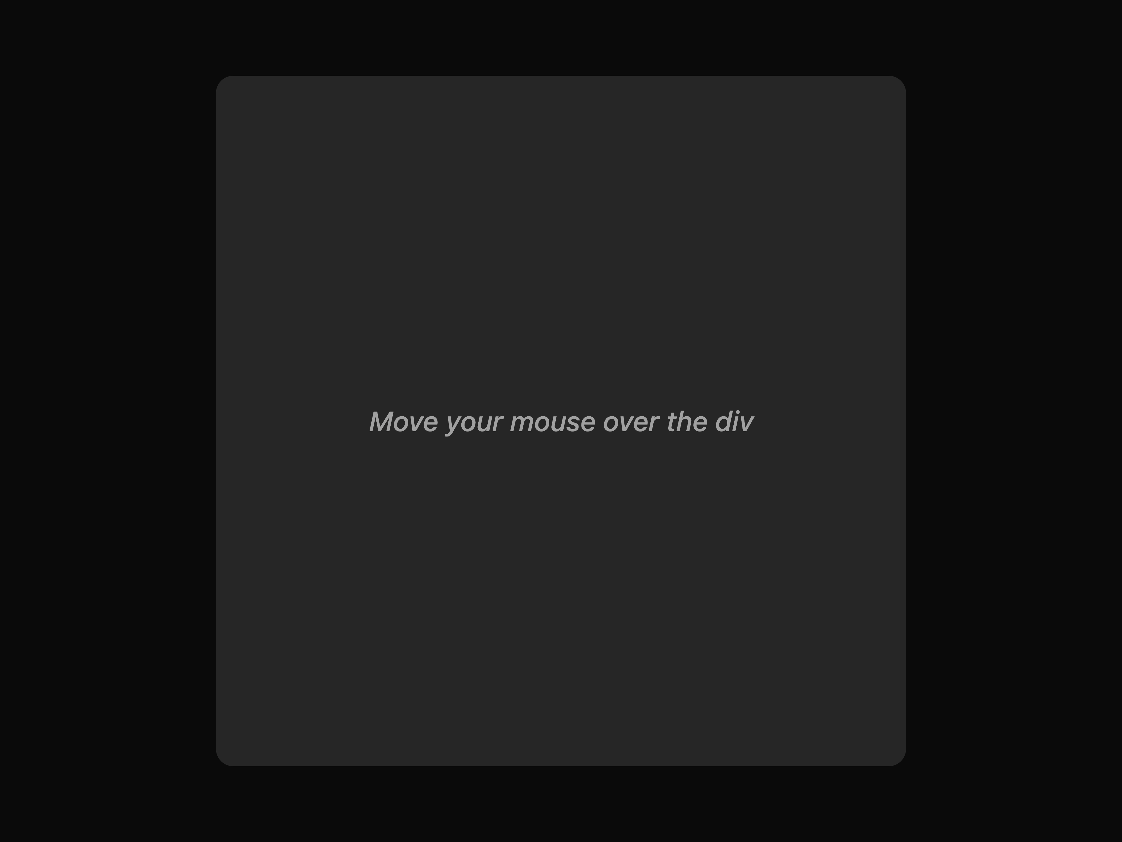
A cursor-following spotlight effect that reveals a soft glowing circle wherever the user moves their mouse inside the container.
A composable ⌘K command palette with fuzzy search, custom groups, built-in theme switcher, and animated content reveal.
Animated icon where a 3×2 grid of dots reorder themselves via Motion layout animation when active.
A copy button component with a variety of styles and animations.
An animated cursor component that allows you to customize both the cursor and cursor follow elements with smooth animations.
Animated text reveal with a colorful gradient sweep effect, inspired by the Dia app.
Animated dock with Gaussian magnification, spring physics, separators, and tooltip carets.
A full-width fixed header with velocity-highlight hover, expanding inline dropdown, scroll hide/show, and a mobile circle-reveal overlay.
A search input that fetches and smoothly animates the site favicon into the search bar as you type a URL.
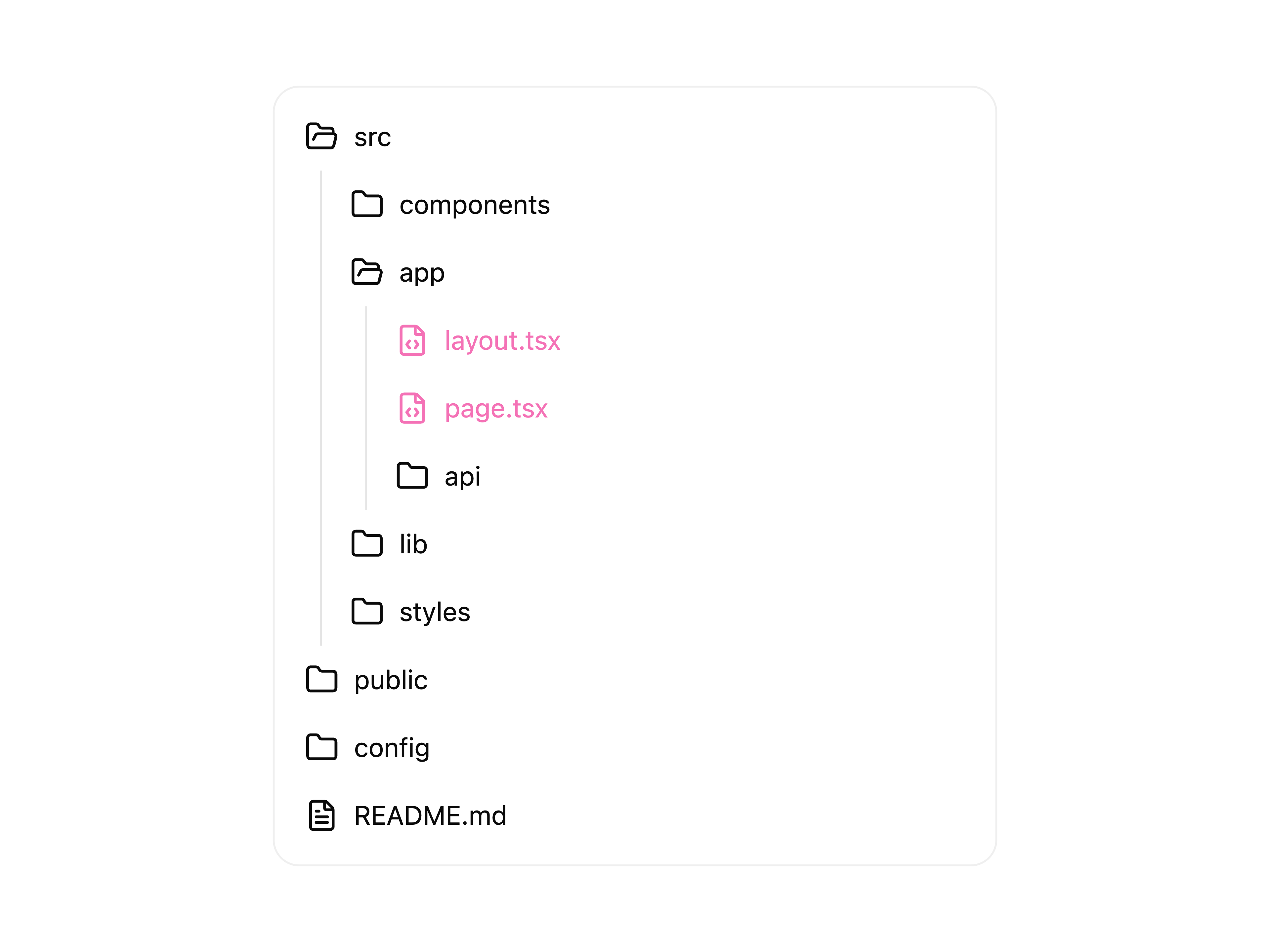
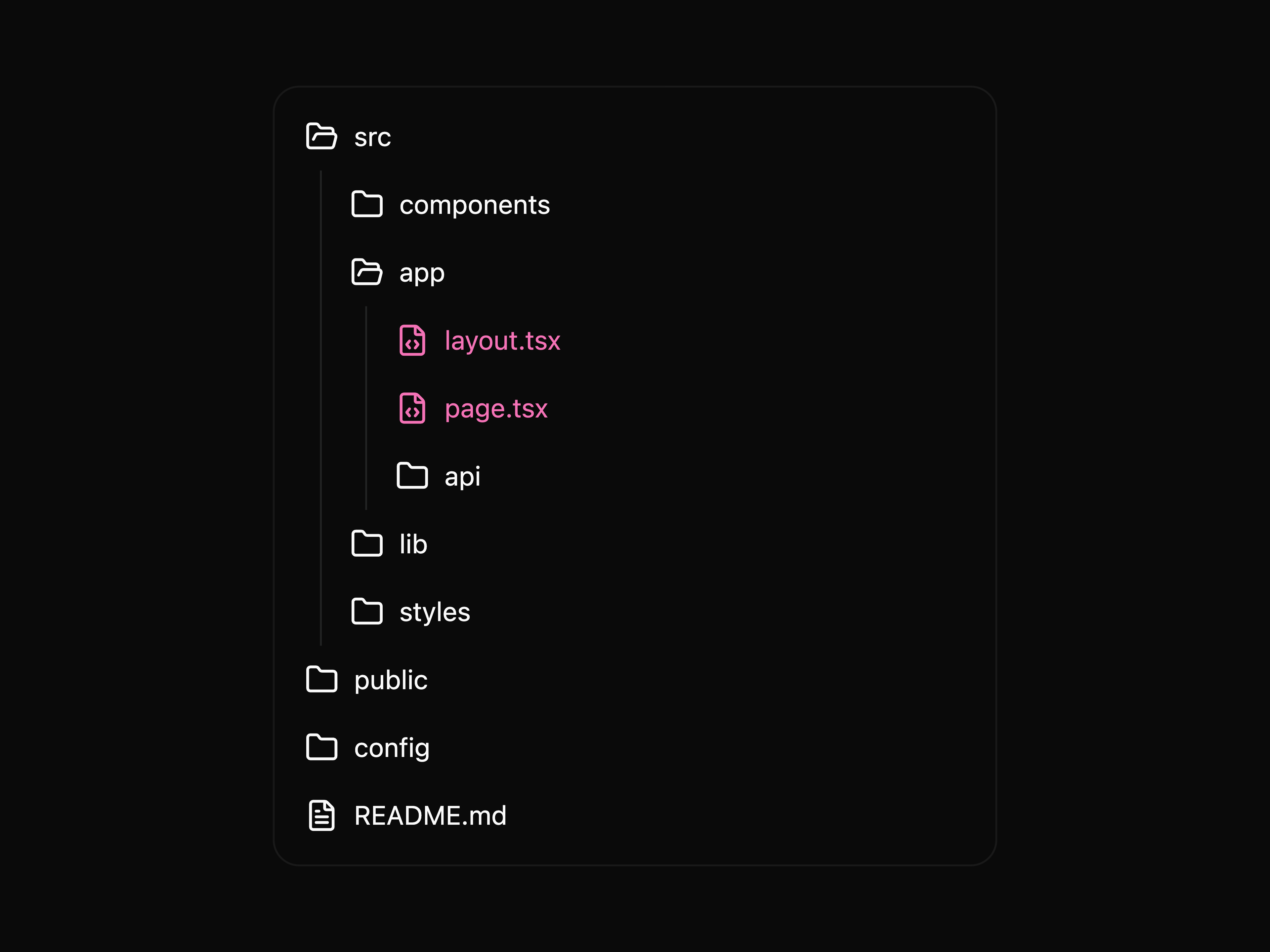
Animated file-tree component with animated hover highlight, spring folder expand/collapse, and automatic file-type icons.
A sticky floating pill navbar with scroll-velocity spring physics, velocity-highlight hover effect, dropdown menus, mobile overlay, and optional theme toggle.
A polished, animated GitHub contribution graph for portfolio sites.
Badge with an animated pulsing glow dot. Supports status variants: default, success, warning, error, info.
A spring-animated navbar menu with a gooey SVG-filtered background that connects the active trigger and dropdown panel.
An SVG filter that creates a gooey, fluid merging effect on adjacent elements using Gaussian blur and alpha-channel color matrix manipulation.
A background component featuring a subtle yet engaging animated gravity stars effect.
A vertical list of rows that expand on hover to reveal a full-width image, animated with Motion springs.
A responsive grid of feature cards where a description panel slides in from below on hover, with spring animation and optional image support.
A list of large headings that reveal an image on the left and shift right on hover, animated with Motion.
Testimonials rendered as inline flowing text with circular avatars. Hover to blur others and reveal the author's name and role.
Keyboard key and shortcut display component with a soft, minimal key style.
Animated icon where three horizontal lines shuffle vertically when active, signaling a list view mode.
A button that magnetically follows cursor proximity with spring physics. Smoothly snaps back when the cursor leaves.
A real-time visual math function builder with animated SVG curves, a pan/zoom canvas, crosshair tooltip, and support for multiple expressions simultaneously.
A clean Motion-powered FAQ accordion with spring-animated content reveal.
An animated React multi-level slide menu with recursive nested navigation, morphing category headers, and direction-aware transitions.
Animated subtitle text with per-character reveal, blur transition, speed control, and top/bottom direction.
A floating bottom tab bar that expands upward with spring animations to reveal tab-specific content, with direction-aware slide transitions.
Animated chip/CPU circuit board visualization with gradient pulse traces traveling along PCB-style paths.
A faithful Notion-inspired quick-create menu with a compact action panel and an animated compose-to-close interaction.
A Notion-inspired rich link mention with a securely fetched preview card on hover.
Scroll-driven half-wheel image layout powered by GSAP ScrollTrigger, with cinematic blur/saturation/brightness focus and centered captions.
Animated skill badges that orbit a center element. On desktop the ring follows the cursor on hover; on mobile the ring is always visible.
GSAP-powered Next.js App Router page transition provider. Wraps your layout to animate between pages with a curtain reveal or slide push — ported from the Codrops async transition demo.
Scroll-driven 3D image grid with perspective rotations, blur, brightness, and inner parallax — supports both GSAP ScrollTrigger and Framer Motion engines.
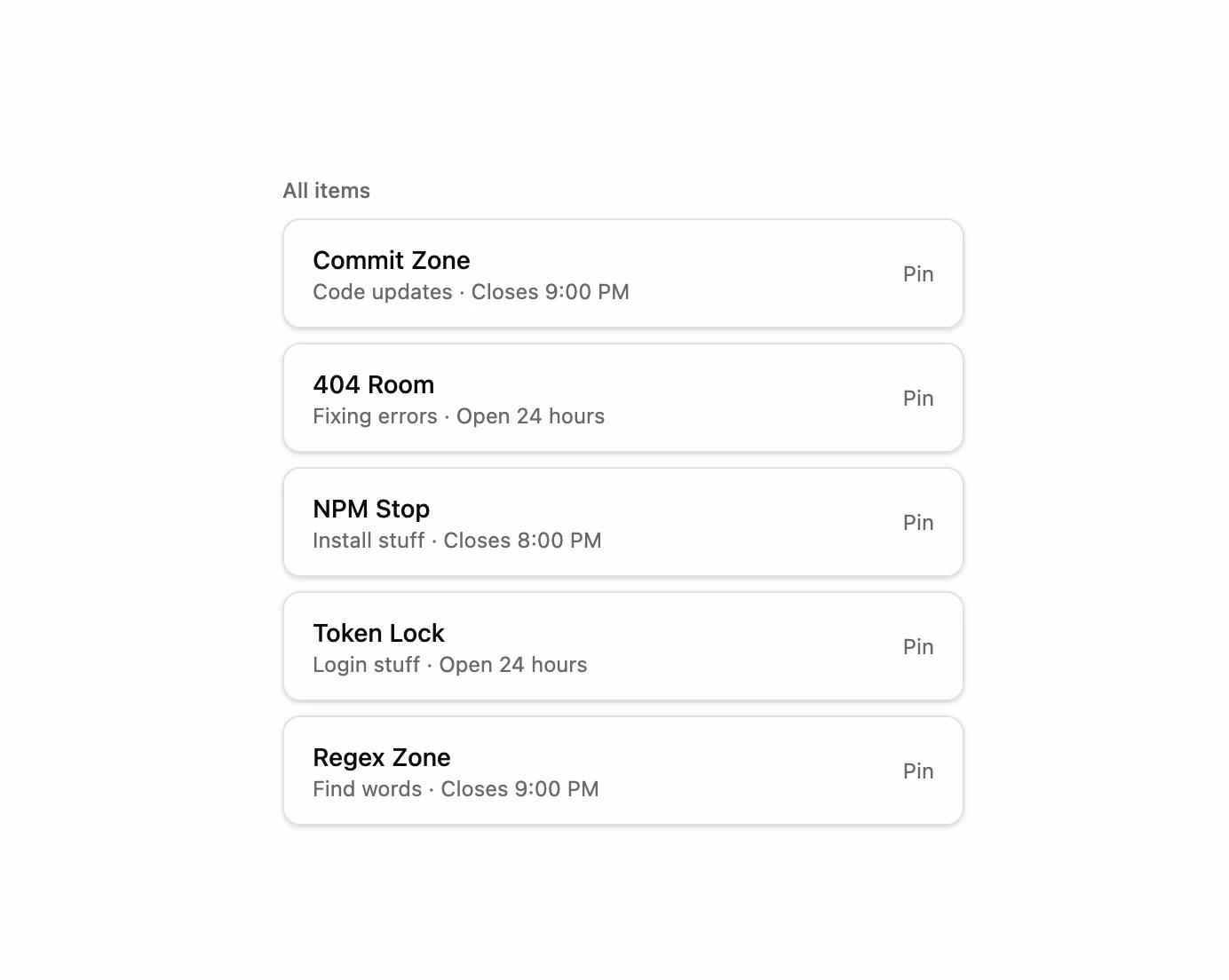
A list of items that animate smoothly to a pinned section using Framer Motion layout animations.
An interactive background featuring tiny pixel particles that ripple outward from the center on hover, then fade away.
Canvas-based scroll transition that wipes between two colors with a configurable pixel grid, directional patterns, easing, and accent-color bands.
An animated avatar group that displays overlapping user images and smoothly shifts each avatar forward on hover to highlight it.
A code block component that animates the code as it is written.
An animated cursor component that allows you to customize both the cursor and cursor follow elements with smooth animations.
A component that animates a number of stars, smoothly animating number transitions using the SlidingNumber component.
A grid that displays animations in a grid.
A pin list component that allows you to pin items to the top of the list.
A slot component that allows you to use motion components with any element.
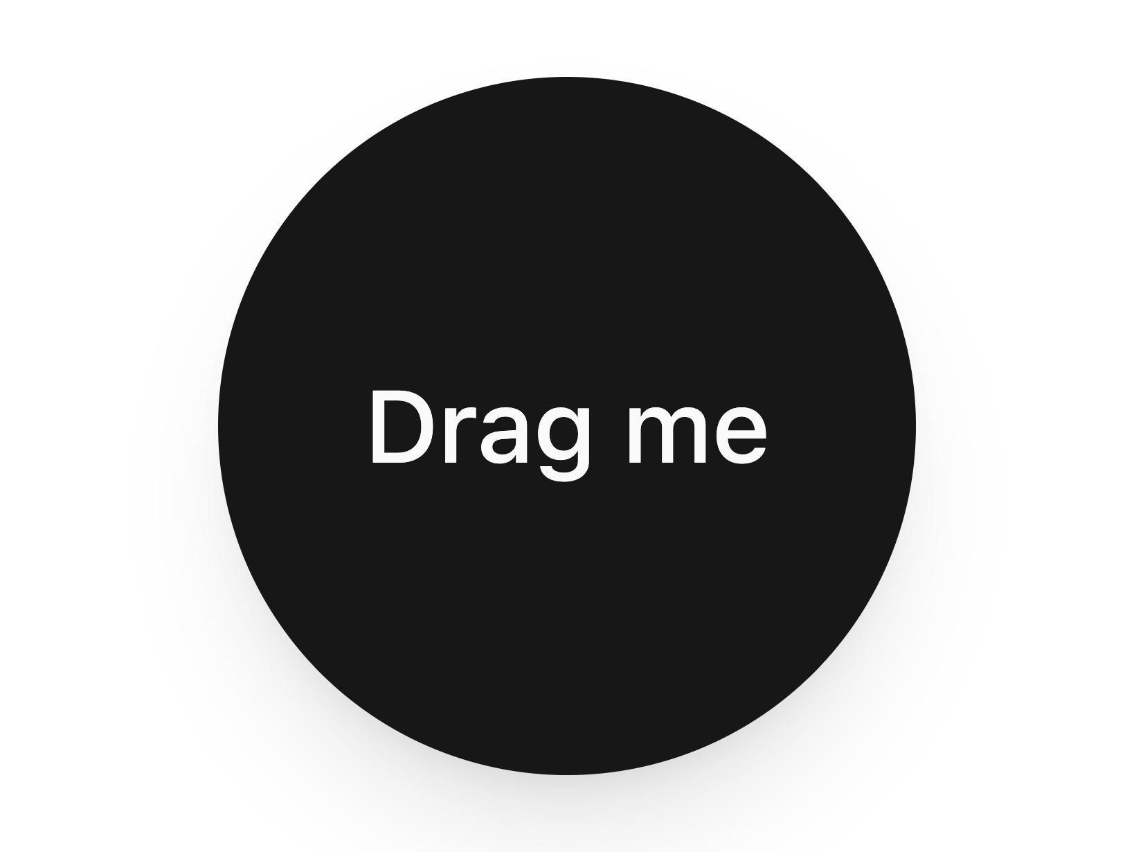
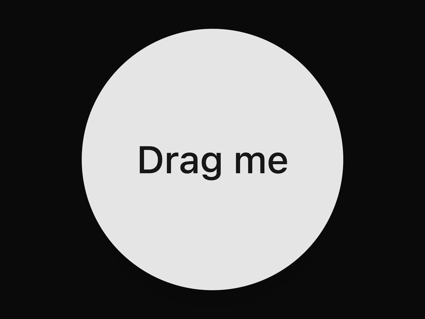
A flexible, animated spring component that attaches a draggable element to its origin with a spring line.
A set of layered sections of content—known as tab panels—that are displayed one at a time.
An animated tooltip that shows contextual info on hover or focus and smoothly glides to the next element without disappearing between transitions.
A simple button that animates on hover and tap.
A button that flips between two states on hover.
A button that fills on hover.
A button that animates on tap with a ripple effect.
An effect that automatically adjusts the height of an element based on its content.
An effect that allows you to animate elements with a blur effect on first view or load.
An effect that creates animated effects at the click position, adding interactive feedback to user actions.
An effect that allows you to animate elements on first view or load.
An effect that allows you to animate elements with a fade effect on first view or load.
A Radix UI NavigationMenu with animated highlight hover effects built in.
An effect that allows you to zoom in on an image on hover.
A magnetic effect that clings to the cursor, creating a magnetic attraction effect.
A particles effect that creates a particle system.
An animated light sweep effect with configurable timing, colors, and triggers (hover, tap, or continuous).
An effect that allows you to animate elements with a slide effect on first view or load.
An effect that allows you to toggle the theme gradually.
An effect that allows you to animate elements with a tilt effect on mouse hover.
An effect that allows you to animate elements with a zoom effect on first view or load.
A counting number animation.
A gradient text animation.
A text component that smoothly morphs characters to transition between strings.
A rolling text animation.
A rotating text animation.
A scrolling number animation.
A shimmering text animation.
A sliding number animation.
A splitting text animation.
A typing text animation.
Top and bottom progressive blur overlays that stack multiple backdrop-filter layers to produce a smooth edge-to-transparent blur effect.
A motion-enhanced multi-step questionnaire with animated checkpoints, direction-aware blur transitions, validation, and keyboard shortcuts.
An icon button that spins on click and supports async refresh callbacks — ideal for reloading component previews or live data.
A text animation component that reveals characters with a scramble/glitch effect, with imperative controls for manual triggering.
Animated gradient shimmer text with viewport-triggered and repeating animation support.
Lightweight loading skeleton with a smooth shimmer sweep animation.
Slide-in overlay sidebar with spring animation, animated dash items, and cursor-following video preview.
Animated SVG icon that morphs between open and closed sidebar panel states using Motion path interpolation.
A slot component that allows you to use motion components with any element.
Per-character blur-slide animation with direct value changes and no animation queue.
A row of social links with a shared morphing preview card and direction-aware content transitions.
An interactive grid background where squares randomly light up with colors and react to hover.
A two-column section with a sticky animated hero card on the left and a stack of rotating feature cards on the right.
A stacked deck of team member cards that fans out on hover (desktop) or tap (mobile), each with an animated CTA pill and spring physics.
Scroll-driven word-by-word or character-by-character text reveal using Motion's useScroll and useTransform.
Animated dark / light mode toggle button with a spring-driven sun ↔ moon icon swap and optional View Transition reveal.
A spring-animated 3D tilt wrapper that tracks the cursor inside the element.
A card with 3D spring tilt, optional floating image, badge and radial shine on hover.
Link tooltip that reveals a website preview card with title, description, image and favicon.
A highlight effect with smooth spring physics that tracks the active element across hover or click interactions.
A scroll-driven text list that snaps exactly to each item. The active item scales up with an optional prefix, others fade and indent — all animated with Motion springs.
A video carousel with animated slide transitions and playback controls.
A morphing SVG wave divider that transitions between sections. Supports scroll-driven morphing and ambient looping animation modes.
I maintain this open-source documentation site and public component registry for unlumen UI. The code and public registry items in this repository are licensed under MIT.
I keep commercial Pro components, license validation, customer data, and private product APIs in a separate private repository.
22.18.0 (see .nvmrc)10.26.0 (enabled through Corepack)corepack enable
pnpm install --frozen-lockfile
pnpm dev
The documentation app uses basePath: "/docs" and runs locally at http://localhost:3001/docs.
app/ contains the Next.js App Router documentation site and search endpoints.content/docs/ contains MDX documentation.registry/ is the source of truth for public shadcn registry components.public/r/ and __registry__/index.tsx are generated registry artifacts.packages/ui/ provides shared UI components used by the docs application.Validate source metadata before generating artifacts:
pnpm registry:validate:sources
pnpm registry:build
pnpm registry:validate:generated
registry:build uses the lockfile-installed shadcn CLI. Commit its generated outputs with the corresponding source changes.
Before opening a pull request or release:

pnpm format:check
pnpm lint
pnpm test:unit
pnpm build
pnpm registry:validate:sources
pnpm registry:validate:generated
GitHub Dependabot monitors production dependencies for published security advisories.
Release from a clean, reviewed branch only. Keep local browser/debug artifacts, credentials, and commercial source code out of commits.
See CONTRIBUTING.md and SECURITY.md.
The packages and primitives its components pull in, counted across the registry.
Every appearance and removal our crawl has seen in the registry index.
Unlumen UI is a component library on 21st.dev by unlumen with 14 public React components. Every component ships with a live interactive preview and full TSX source — copy the code, install it through the shadcn CLI, or pull it into Cursor or Claude Code over MCP.