About
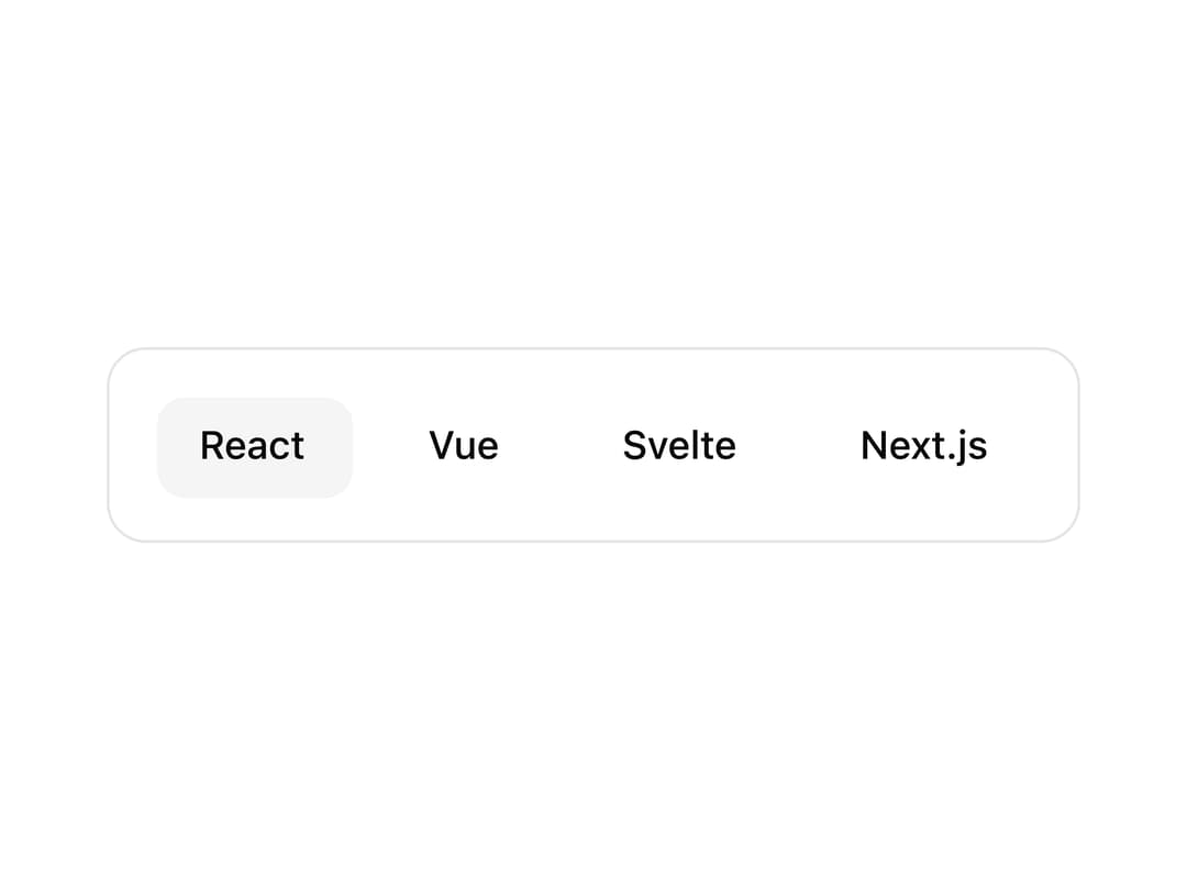
An animated highlight component that tracks active or hovered elements with smooth spring animations, supporting parent and children modes.
Built with React and Tailwind. Copy the prompt and paste it into Claude Code, Cursor or Lovable: your agent adds Highlight to your project and fits it to your theme.
Code
How Highlight is used: the demo's code. The component's own source comes with a free account.
Usage.tsx
"use client";

import {
  Highlight,
  HighlightItem,
} from "@/components/ui/highlight";

const ITEMS = [
  { id: "react", label: "React" },
  { id: "vue", label: "Vue" },
  { id: "svelte", label: "Svelte" },
  { id: "next", label: "Next.js" },
];

export const HighlightDemo = ({ hover = true }: { hover?: boolean }) => {
  return (
    <div className="flex items-center justify-center min-h-[300px] w-full p-8">
      <Highlight
        mode="parent"
        hover={hover}
        defaultValue={hover ? undefined : "react"}
        className="rounded-lg bg-muted"
        containerClassName="flex gap-3 p-4 flex-wrap justify-center"
      >
        {ITEMS.map((item) => (
          <HighlightItem
            key={item.id}
            value={item.id}
            className="px-4 py-2 rounded-md font-medium cursor-pointer"
          >
            <div>{item.label}</div>
          </HighlightItem>
        ))}
      </Highlight>
    </div>
  );
};

export default HighlightDemo;
Dependencies
More by unlumen
View all
Motion Navigation Menu
271
Side By Side Slide
227
Scroll Reveal Image
221
Count Up
145
Pixel Liquid Background
105
Glow Button
97
Animated Sidebar
95
Horizontal Depth Fade
78