Curated UI collection
Time Picker shadcn UI Components
Time picker components are essential UI elements for applications that require users to select specific times. The shadcn ecosystem includes 17 dedicated time picker components designed to integrate seamlessly with shadcn's design system. These components provide various approaches to time selection, from simple input fields to complex time range pickers. Whether you need a basic 12-hour or 24-hour format selector or a more sophisticated time picker with validation and formatting options, the shadcn time picker collection offers multiple solutions. Browse the 60 available results to find the time picker component that best fits your application's requirements.




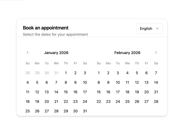


![Calendar [React Day Picker] — time picker shadcn component for React & Tailwind by Origin UI](https://cdn.21st.dev/cdn-cgi/image/fit=scale-down,width=640,quality=75,format=webp/https://cdn.21st.dev/user_originui/calendar/default/preview.1737991576300.png)


