About
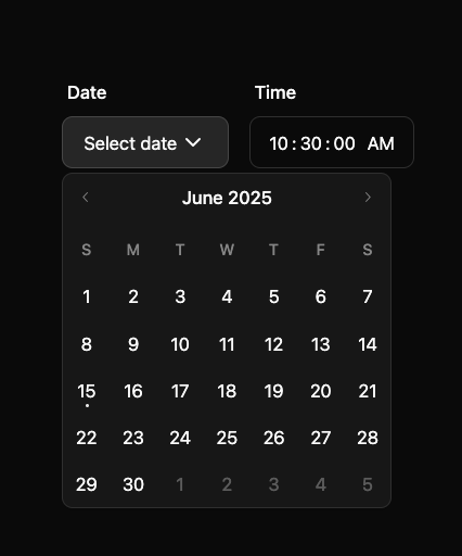
here is calendar by shadcn with date and time picker
Built with React and Tailwind. Copy the prompt and paste it into Claude Code, Cursor or Lovable: your agent adds Calendar date and time picker to your project and fits it to your theme.
Code
How Calendar date and time picker is used: the demo's code. The component's own source comes with a free account.
Usage.tsx
"use client"

import * as React from "react"
import { ChevronDownIcon } from "lucide-react"

import { Button } from "@/components/ui/button"
import { Calendar } from "@/components/ui/calendar-rac"
import { Input } from "@/components/ui/input"
import { Label } from "@/components/ui/label"
import {
  Popover,
  PopoverContent,
  PopoverTrigger,
} from "@/components/ui/popover"

export function Calendar24() {
  const [open, setOpen] = React.useState(false)
  const [date, setDate] = React.useState<Date | undefined>(undefined)

  return (
    <div className="flex gap-4">
      <div className="flex flex-col gap-3">
        <Label htmlFor="date" className="px-1">
          Date
        </Label>
        <Popover open={open} onOpenChange={setOpen}>
          <PopoverTrigger asChild>
            <Button
              variant="outline"
              id="date"
              className="w-32 justify-between font-normal"
            >
              {date ? date.toLocaleDateString() : "Select date"}
              <ChevronDownIcon />
            </Button>
          </PopoverTrigger>
          <PopoverContent className="w-auto overflow-hidden p-0" align="start">
            <Calendar
              mode="single"
              selected={date}
              captionLayout="dropdown"
              onSelect={(date) => {
                setDate(date)
                setOpen(false)
              }}
            />
          </PopoverContent>
        </Popover>
      </div>
      <div className="flex flex-col gap-3">
        <Label htmlFor="time" className="px-1">
          Time
        </Label>
        <Input
          type="time"
          id="time"
          step="1"
          defaultValue="10:30:00"
          className="bg-background appearance-none [&::-webkit-calendar-picker-indicator]:hidden [&::-webkit-calendar-picker-indicator]:appearance-none"
        />
      </div>
    </div>
  )
}
More by shadcn
View all

Navigation menu
802
Calendar with time pressets
526
Sidebar
357
Sonner
247
Chart
227
Icons
206
Dropdown Menu
158
Calendar with event slots
124
More in Forms
View all

Premium Auth
567

Login 2
12

Form
139

Book A Demo 1
90

Contact Card
1.1K
Authentication Card
51

Card Studio
46

Login 1
62
