
About
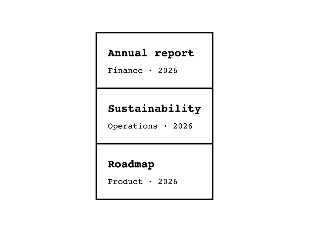
A monochrome list that renders bullet, numbered, or bordered title/description rows for an e-ink-style UI.
Built with React and Tailwind. Copy the prompt and paste it into Claude Code, Cursor or Lovable: your agent adds List to your project and fits it to your theme.
Code
How List is used: the demo's code. The component's own source comes with a free account.
Usage.tsx
import List from "@/components/ui/list";

export default function ListDetailedDemo() {
  return (
    <div
      style={{
        fontFamily: "var(--eink-font-family-main)",
        color: "var(--eink-color-primary)",
        background: "var(--eink-color-background)",
        padding: "var(--eink-size-16)",
      }}
    >
      <List as="detailed">
        <List.Item title="Annual report" description="Finance · 2026" />
        <List.Item title="Sustainability" description="Operations · 2026" />
        <List.Item title="Roadmap" description="Product · 2026" />
      </List>
    </div>
  );
}
More by alexisroe
View all
E-Ink Progress Bar
Navigation
Pill
Notification
Number Stepper
Log
Value Display
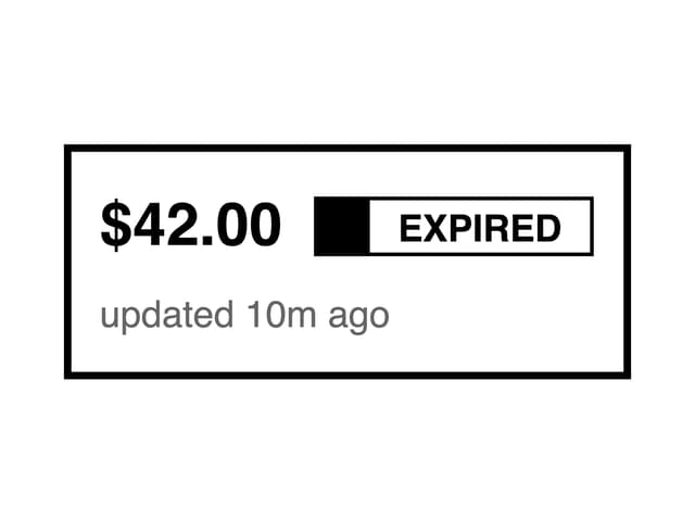
Last Updated