
About
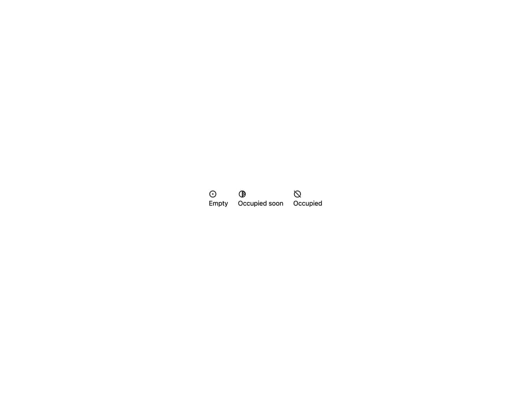
A small uppercase status pill with a solid, double, filled, dashed or dotted border and an optional leading icon, for marking states like OK, warning, critical or offline.
Built with React and Tailwind. Copy the prompt and paste it into Claude Code, Cursor or Lovable: your agent adds Pill to your project and fits it to your theme.
Code
How Pill is used: the demo's code. The component's own source comes with a free account.
Usage.tsx
import { Pill } from "@/components/ui/pill";

export default function PillRoomSignDemo() {
  return (
    <div
      className="flex min-h-[200px] w-full items-center justify-center p-10"
      style={{ background: "#ffffff", color: "#000000" }}
    >
      <div
        style={{
          display: "flex",
          flexWrap: "wrap",
          alignItems: "center",
          gap: 24,
        }}
      >
        <Pill size="xl" icon="circle-dot">
          Empty
        </Pill>
        <Pill.Dashed size="xl" icon="circle-half-2">
          Occupied soon
        </Pill.Dashed>
        <Pill.Filled size="xl" icon="circle-off">
          Occupied
        </Pill.Filled>
      </div>
    </div>
  );
}
More by alexisroe
View all
E-Ink Progress Bar
Navigation
Notification
Number Stepper
Log
Value Display
Last Updated
List