
About
A toast-style notification system that stacks dismissible info, warning, and error cards at the top of the page, fired imperatively via a hook.
Built with React and Tailwind. Copy the prompt and paste it into Claude Code, Cursor or Lovable: your agent adds Notification to your project and fits it to your theme.
Code
How Notification is used: the demo's code. The component's own source comes with a free account.
Usage.tsx
"use client";

import NotificationProvider, {
  useNotifications,
} from "@/components/ui/notification";

function StackedTrigger() {
  const { notify } = useNotifications();
  return (
    <button
      type="button"
      className="border-2 border-black bg-white px-4 py-2 font-mono text-sm font-bold text-black"
      onClick={() => {
        notify("First notification", "Fired first.");
        notify("Check your input", "Fired shortly after.", "warning");
        notify("Something went wrong", "Resets the shared timer.", "error");
      }}
    >
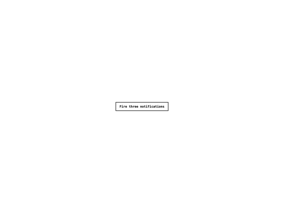
      Fire three notifications
    </button>
  );
}

export default function NotificationStackedDemo() {
  return (
    <NotificationProvider duration={4000}>
      <div className="flex min-h-screen w-full items-center justify-center bg-white p-10">
        <StackedTrigger />
      </div>
    </NotificationProvider>
  );
}
More by alexisroe
View all
E-Ink Progress Bar
Navigation
Pill
Number Stepper
Log
Value Display
Last Updated
List