Components
Curated UI collection
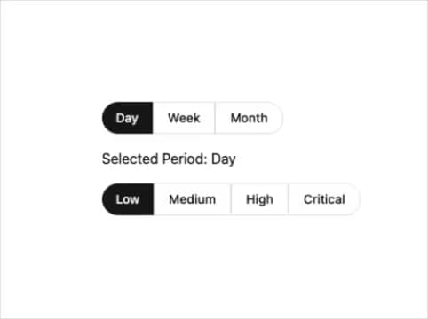
Segmented controls are essential UI components for presenting mutually exclusive options in a compact, organized manner. Our collection features 60 segmented control implementations designed specifically for shadcn, helping developers quickly integrate toggle-style selection interfaces into their React applications. Whether you need basic two-option toggles or complex multi-segment controls, these components provide flexible solutions for modern web interfaces.


A segmented control is a UI component that presents multiple mutually exclusive options in a single, compact interface. Users can select one option at a time, making it ideal for filters, view toggles, and mode switches in applications.
Our collection includes 60 different segmented control component implementations for shadcn, giving you multiple options to choose from based on your specific design and functionality requirements.
Yes, all components in this collection are specifically designed for shadcn, ensuring compatibility with your shadcn-based React projects and design system.
© 2026 21st Labs, Inc.