
About
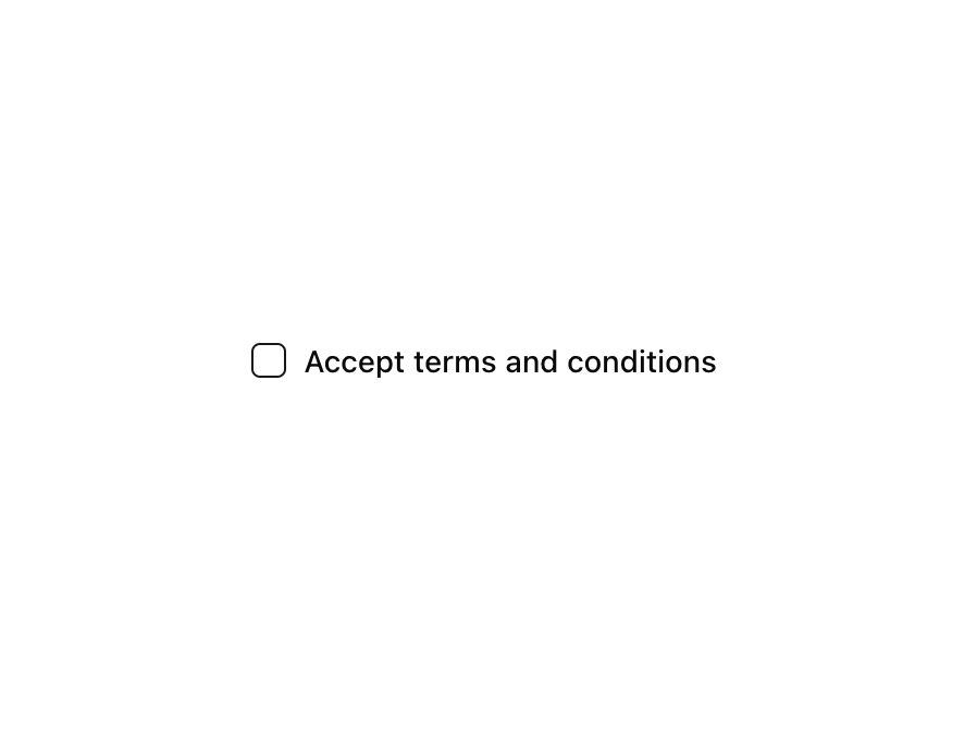
A control that allows the user to toggle between checked and not checked.
Built with React and Tailwind. Copy the prompt and paste it into Claude Code, Cursor or Lovable: your agent adds Checkbox to your project and fits it to your theme.
Code
How Checkbox is used: the demo's code. The component's own source comes with a free account.
Usage.tsx
"use client"

import { Checkbox } from "@/components/ui/checkbox"

export function CheckboxDemo() {
  return (
    <div className="flex items-center space-x-2">
      <Checkbox id="terms" />
      <label
        htmlFor="terms"
        className="text-sm font-medium leading-none peer-disabled:cursor-not-allowed peer-disabled:opacity-70"
      >
        Accept terms and conditions
      </label>
    </div>
  )
}

export function CheckboxWithText() {
  return (
    <div className="items-top flex space-x-2">
      <Checkbox id="terms1" />
      <div className="grid gap-1.5 leading-none">
        <label
          htmlFor="terms1"
          className="text-sm font-medium leading-none peer-disabled:cursor-not-allowed peer-disabled:opacity-70"
        >
          Accept terms and conditions
        </label>
        <p className="text-sm text-muted-foreground">
          You agree to our Terms of Service and Privacy Policy.
        </p>
      </div>
    </div>
  )
}

export function CheckboxDisabled() {
  return (
    <div className="flex items-center space-x-2">
      <Checkbox id="terms2" disabled />
      <label
        htmlFor="terms2"
        className="text-sm font-medium leading-none peer-disabled:cursor-not-allowed peer-disabled:opacity-70"
      >
        Accept terms and conditions
      </label>
    </div>
  )
}

export default {
  CheckboxDemo,
  CheckboxWithText,
  CheckboxDisabled,
}