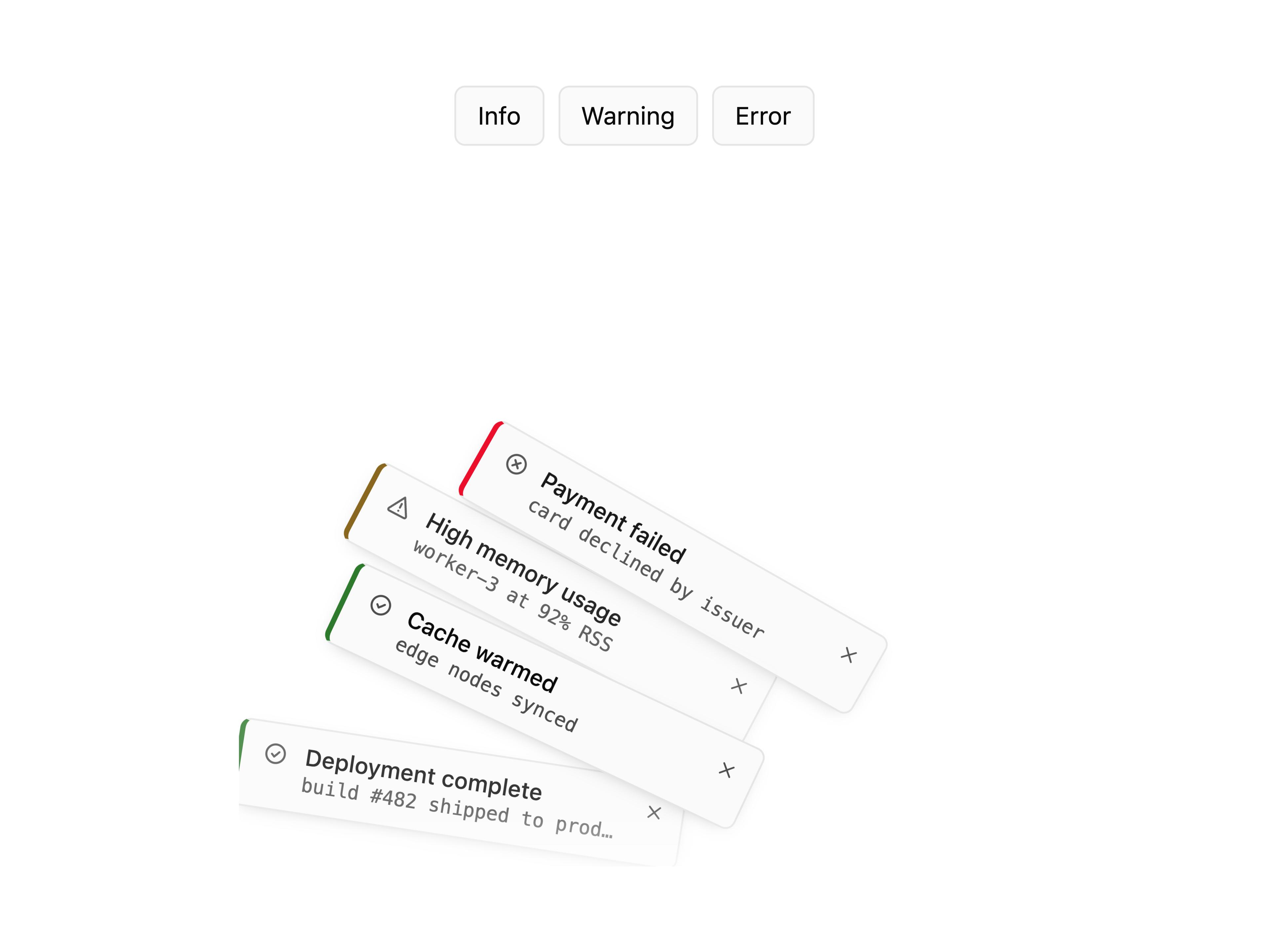
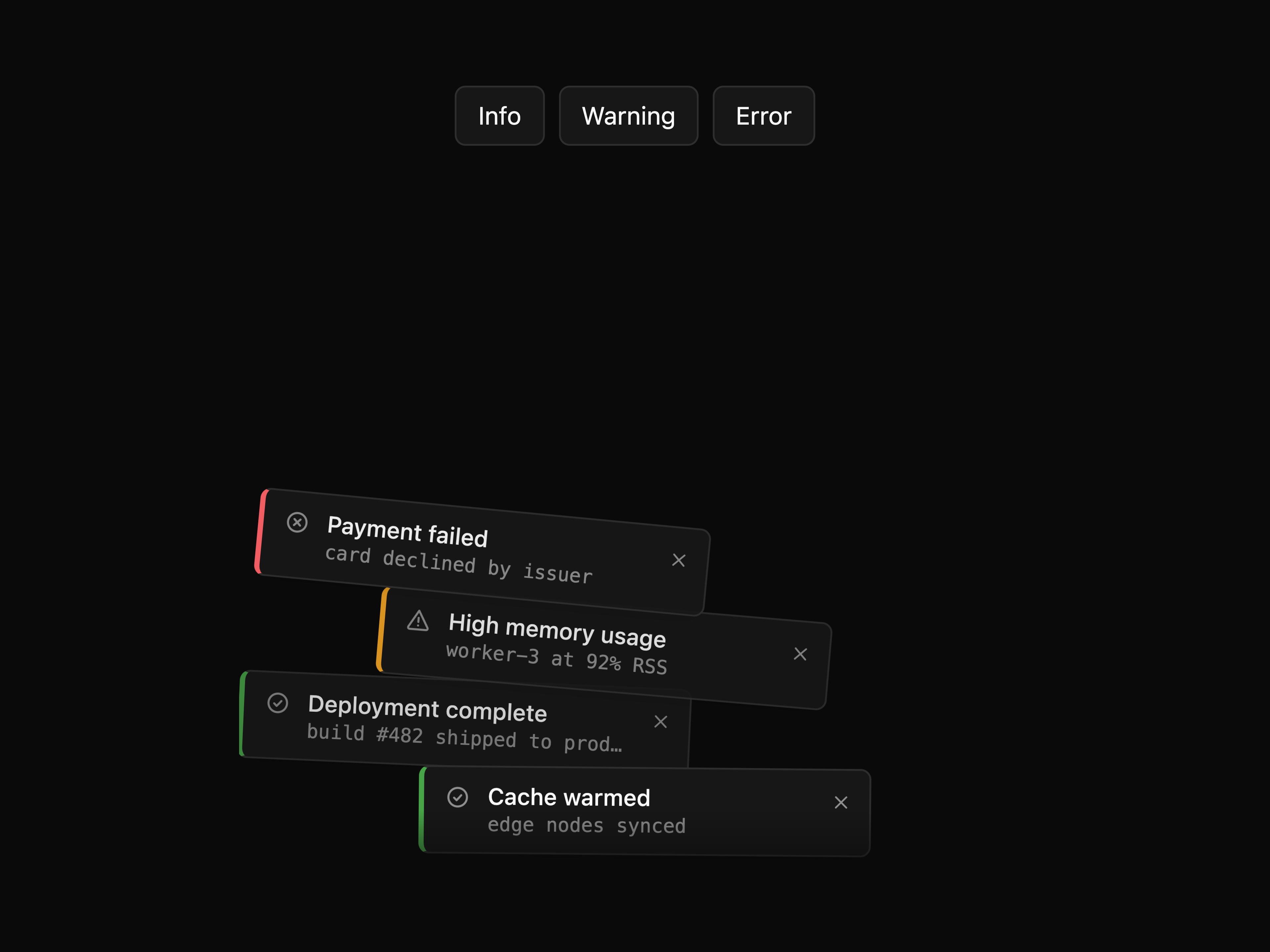
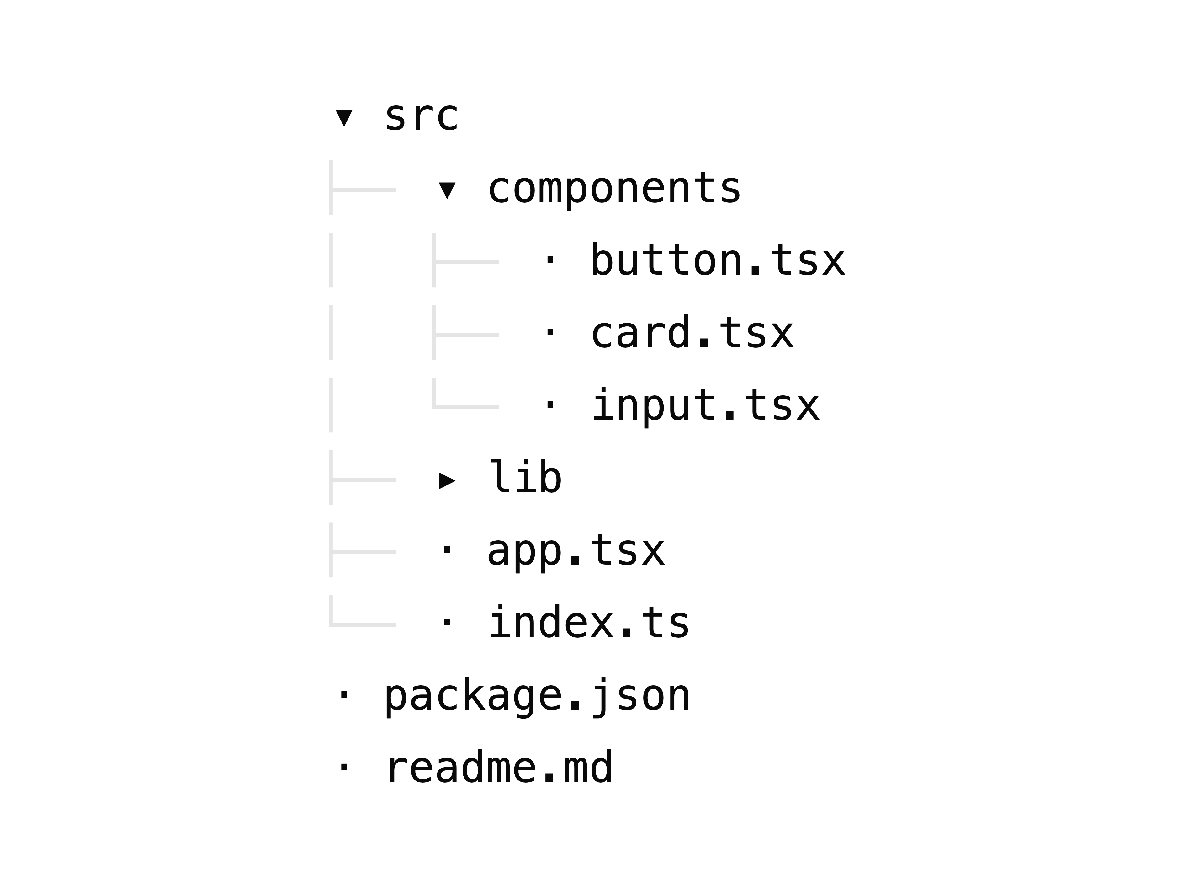
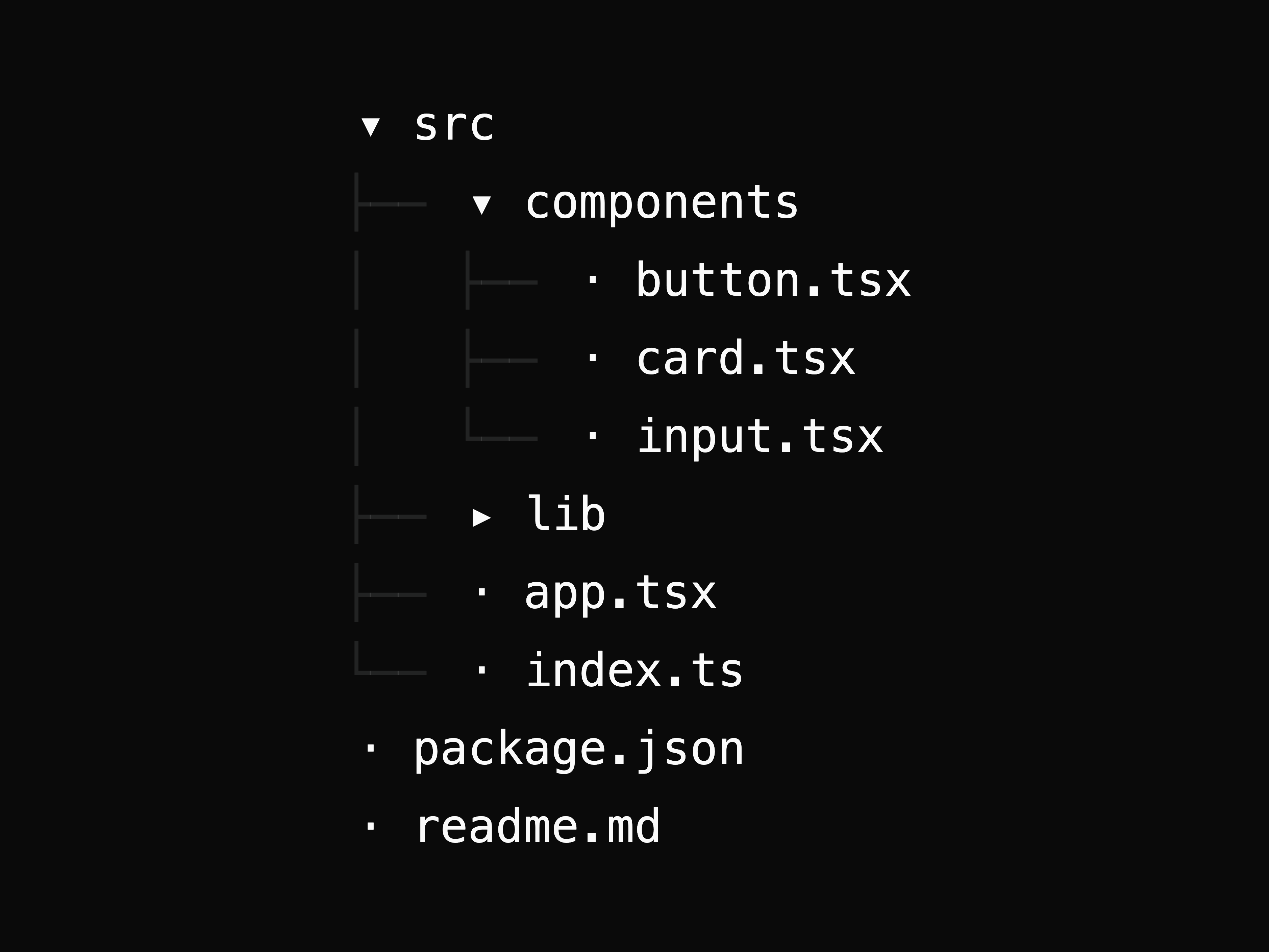
import { CausticCoverflow } from "@/components/ui/gallery-coverflow-caustic";

export default function Page() {
  return ;
}
Two collections. core (<!-- generated:core start -->416<!-- generated:core end -->) is restrained and production-facing, Geist-dark.
loud (<!-- generated:loud start -->126<!-- generated:loud end -->) is a deliberately flashy showcase.
Browse them live at design.helpmarq.com.
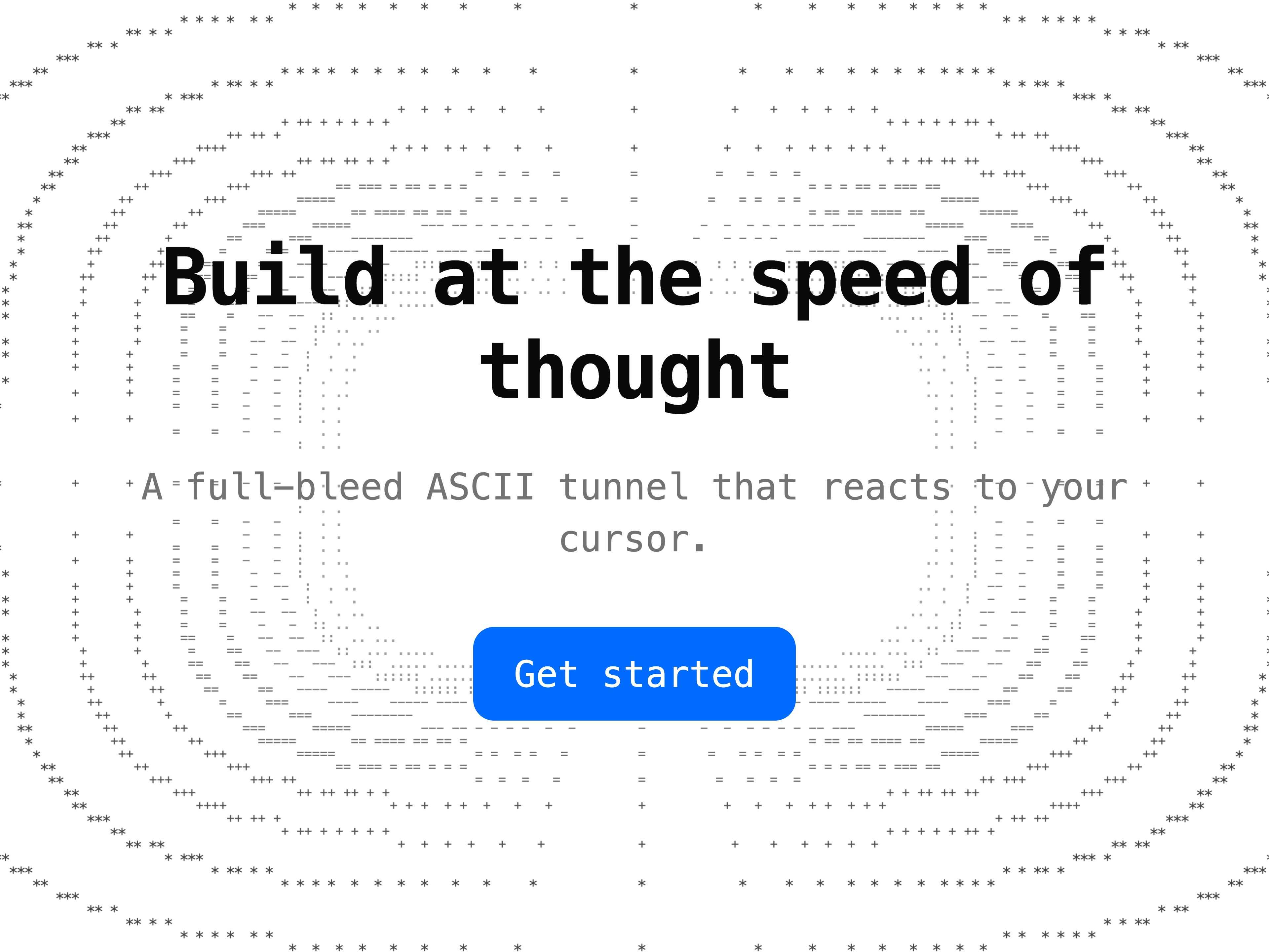
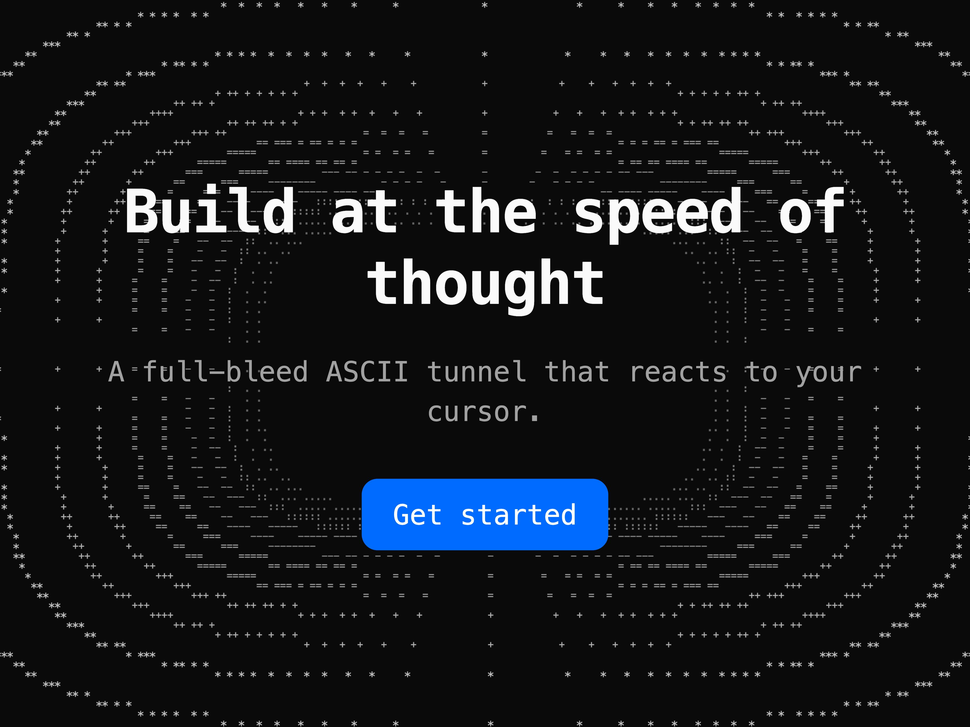
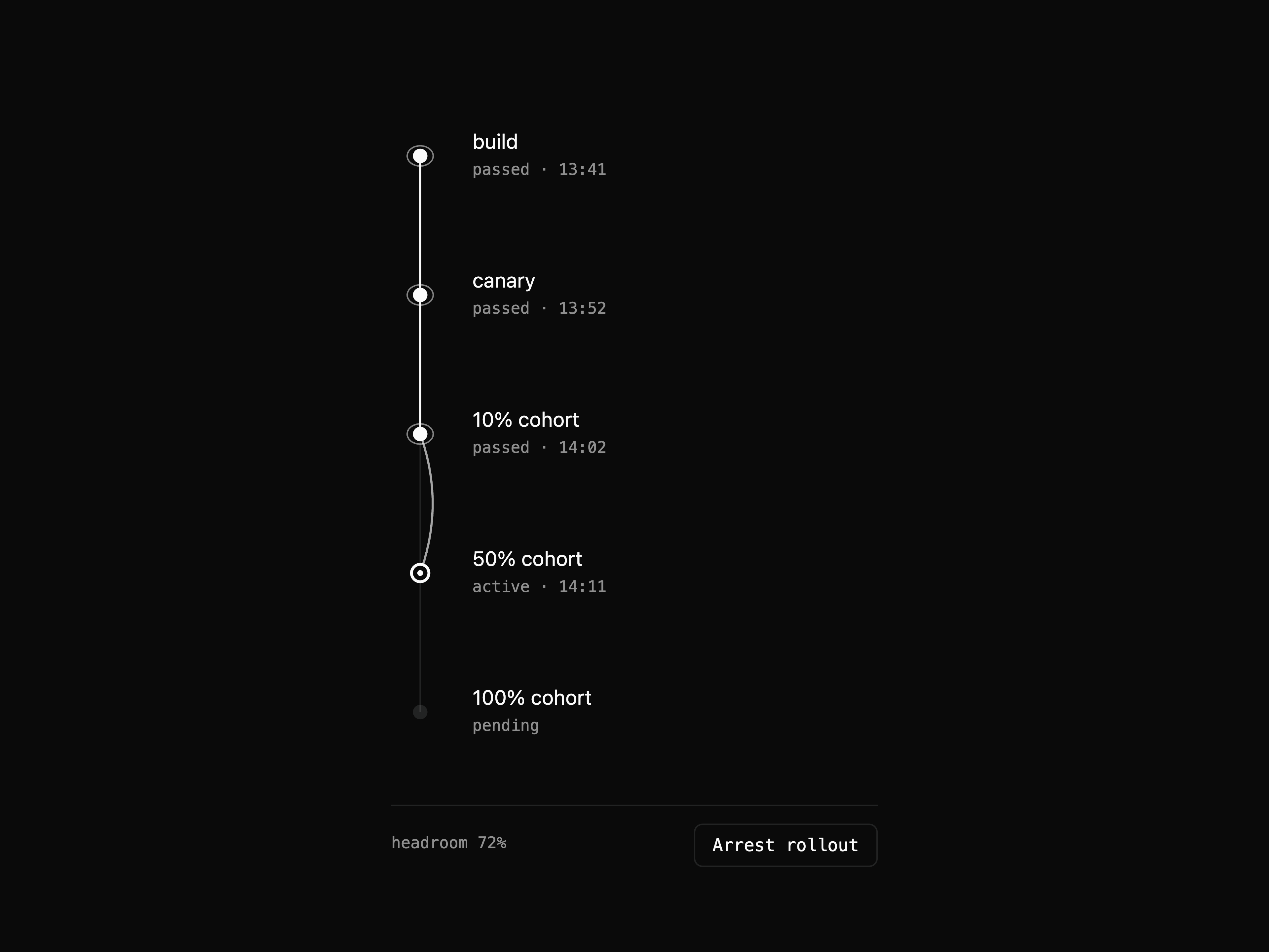
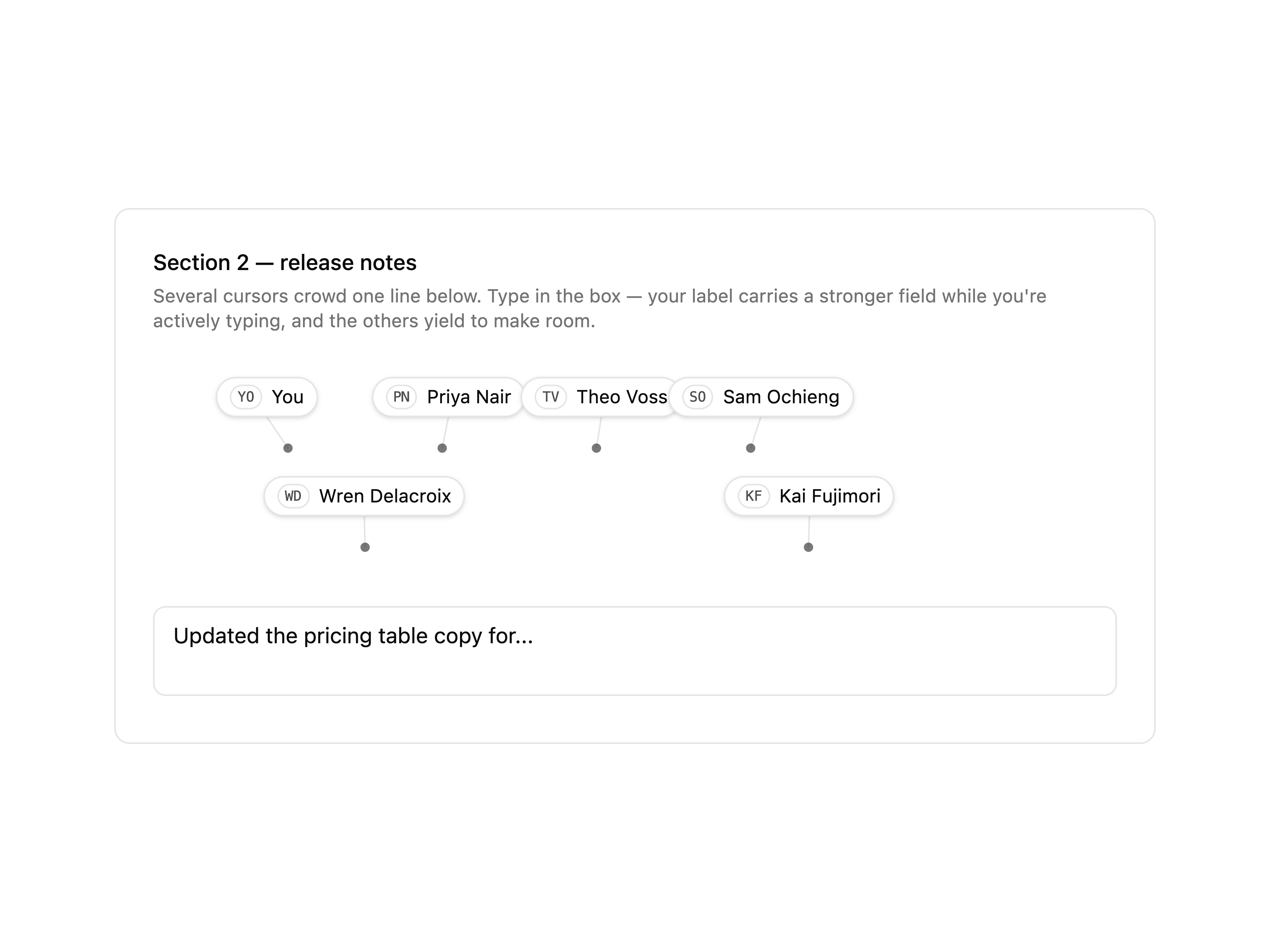
hero-particles-webgl: a field that answers the cursor
hero-isobar-contours: contour lines that bunch toward the CTA
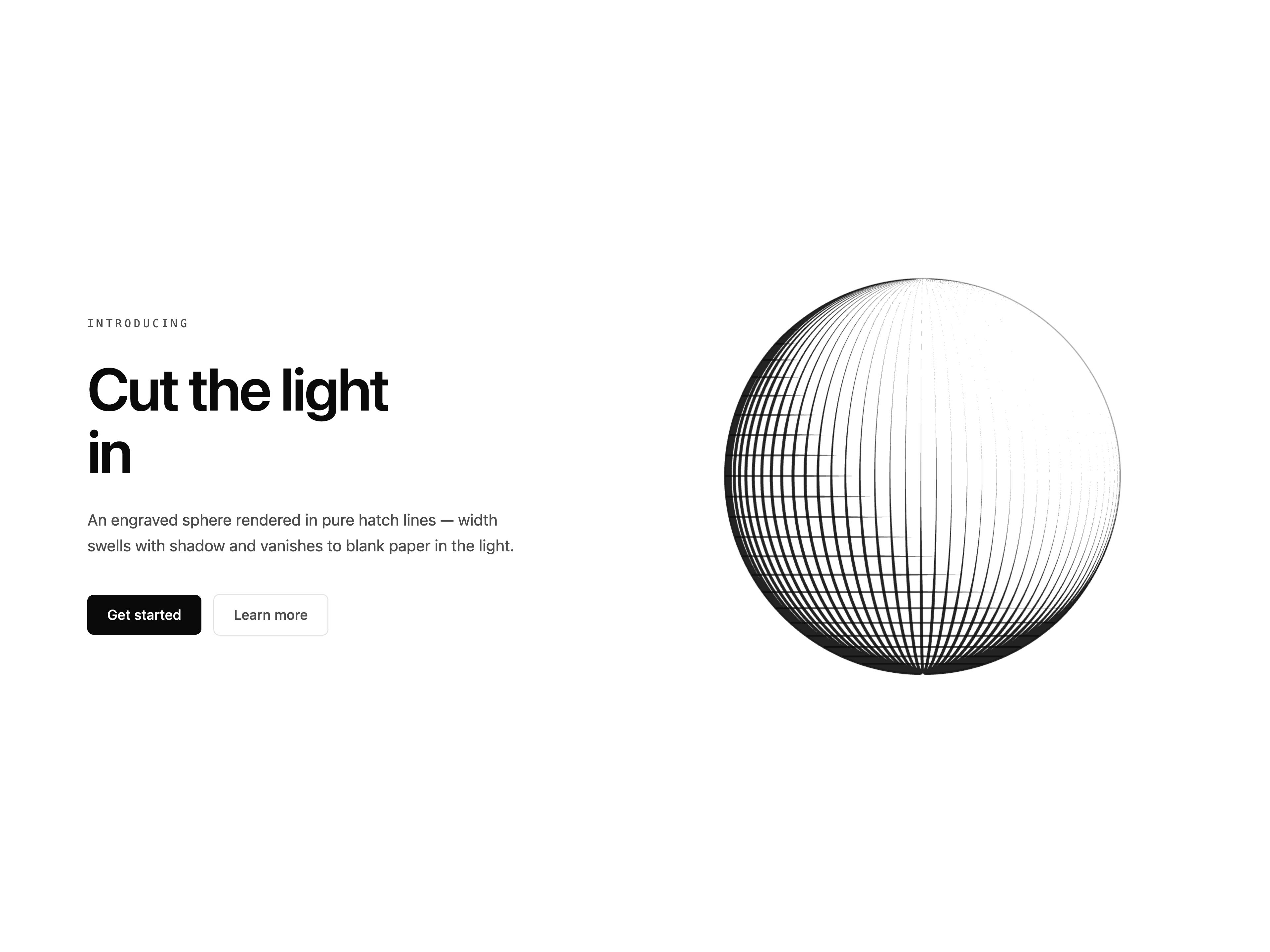
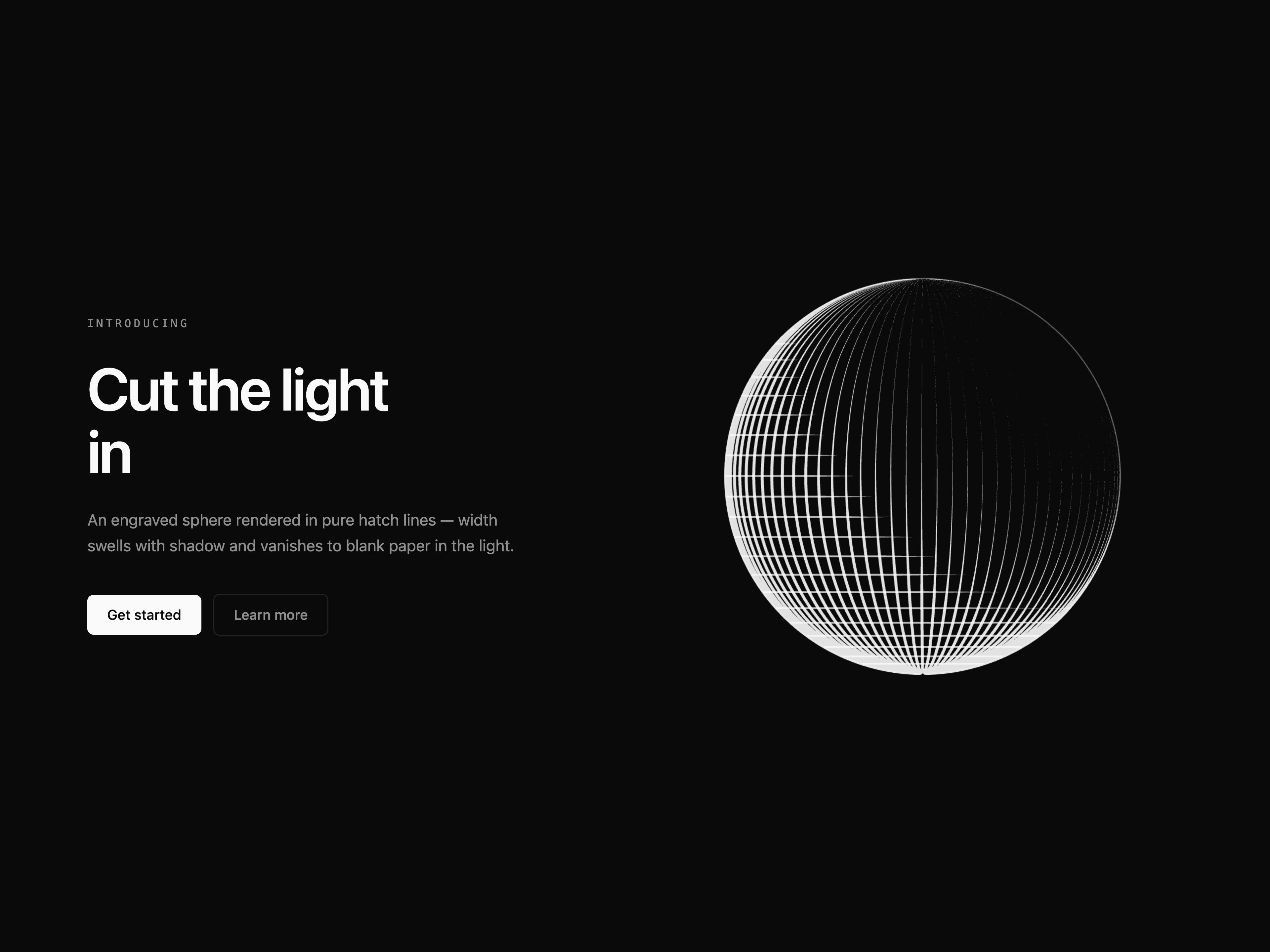
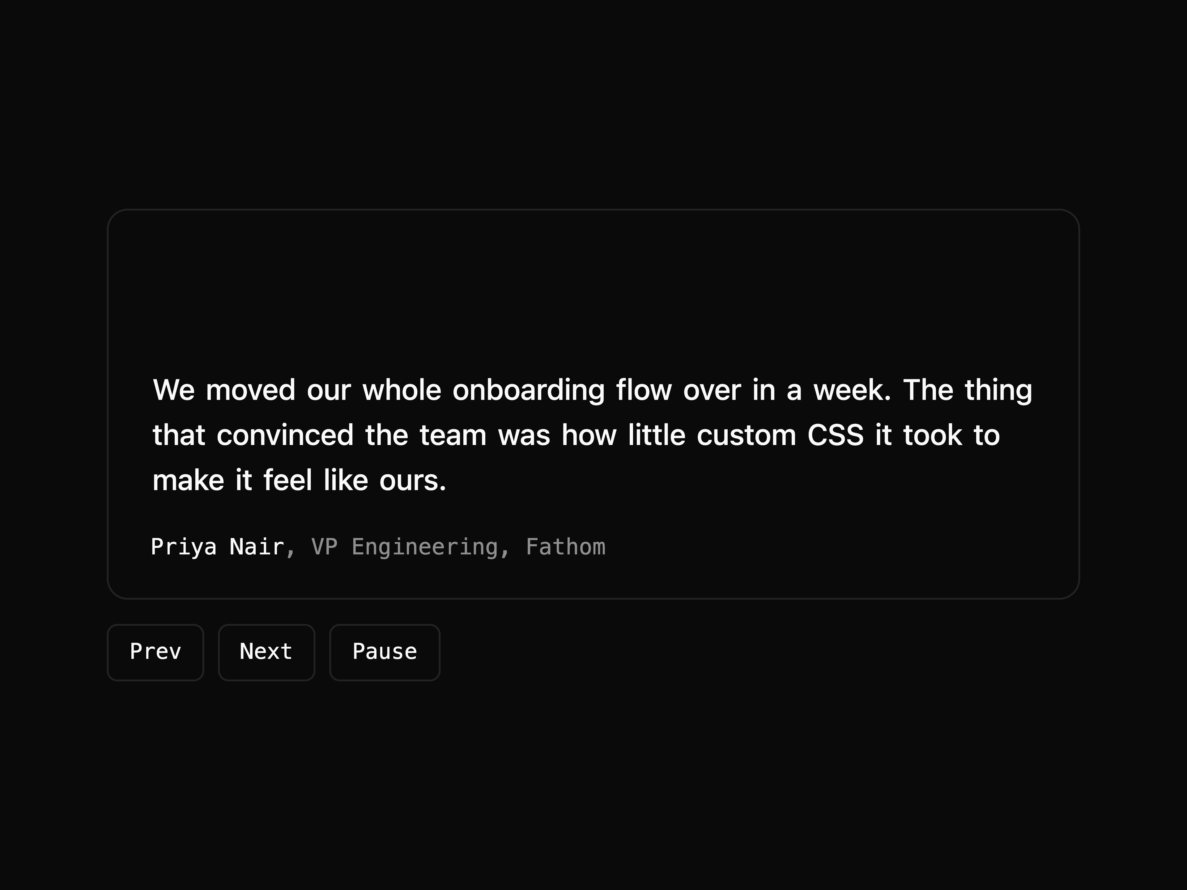
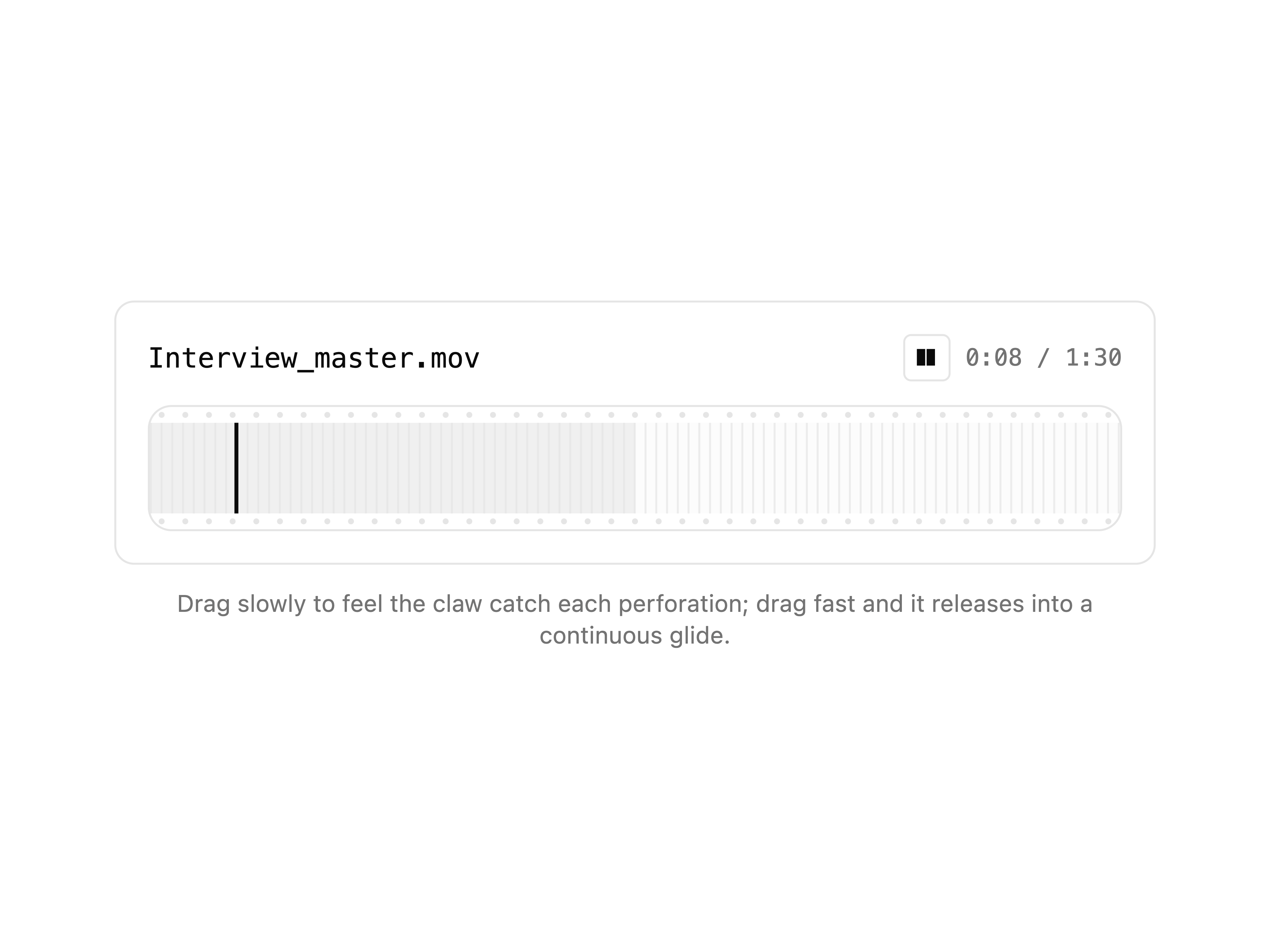
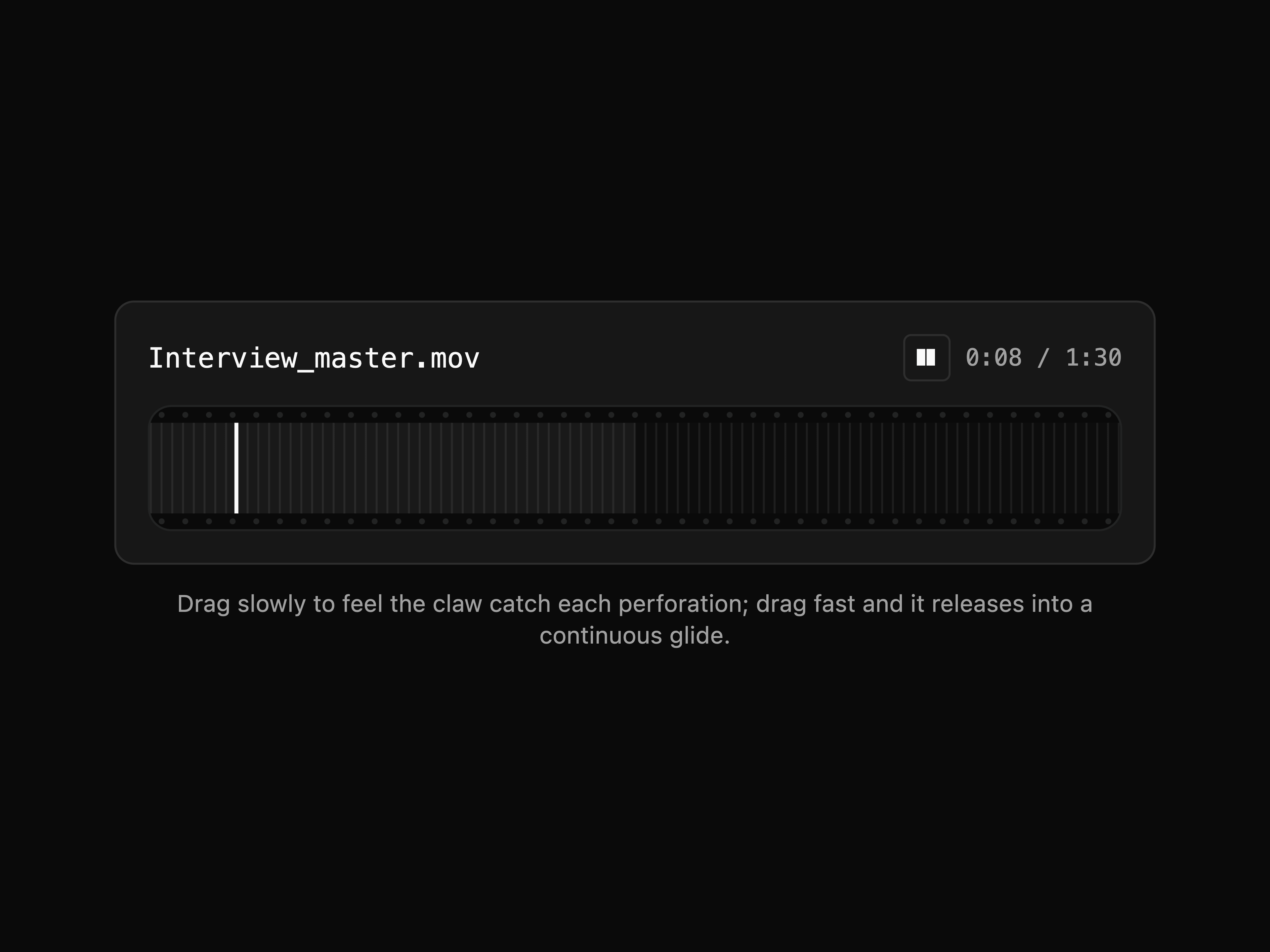
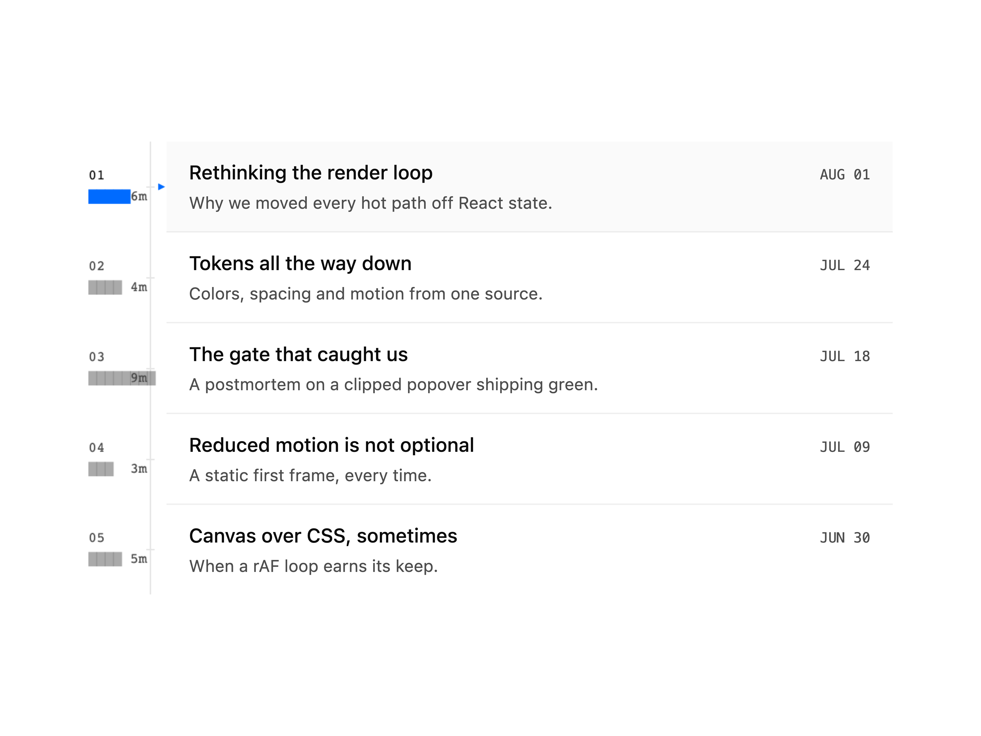
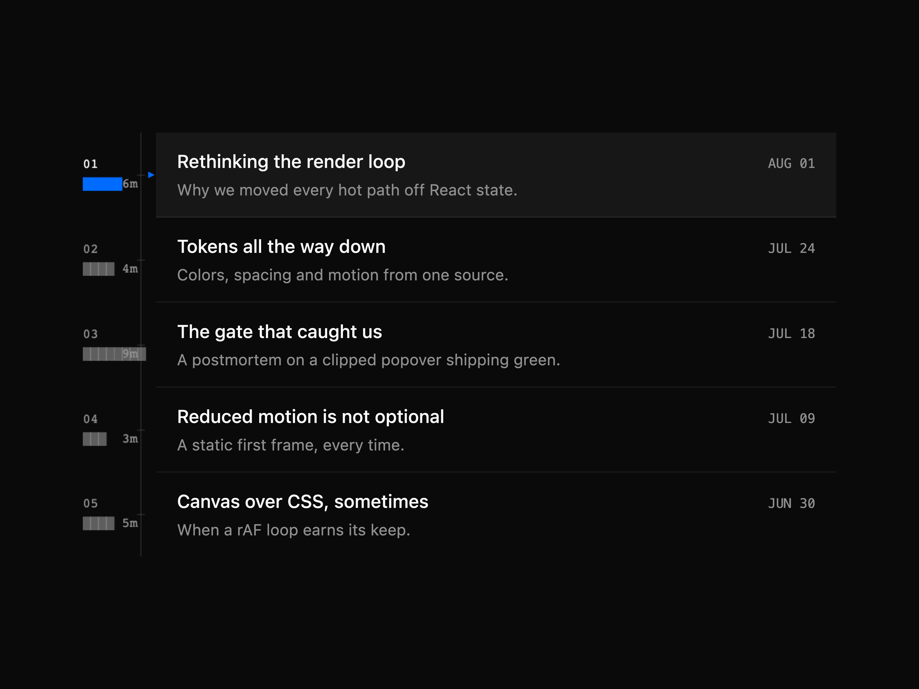
gallery-coverflow-caustic: drag to scrub, flick for momentum
picker-pareto-frontier: pick a point on a pareto frontier
compare-crack-seam: the before/after divider is a fracture
not-found-knockout: type carved out of the surface
Install
Prerequisites: Node and npm, and a project that shadcn has already
configured, meaning it has a components.json at its root. If you do not have
one, use the new-project path below first. Every command in this section was
run end to end on Node v25.8.1 against shadcn@latest.
That drops the source at components/ui/.tsx and installs the
component's npm dependencies. There is no ns-ui package and nothing to keep
in sync. The code is yours to edit.
-n is what makes this non-interactive. Without it, shadcn init has no
project to configure and stops on a "What is your project named?" prompt. The
flag scaffolds a Next.js app into my-app/, so the add runs from inside it.
init also writes components/ui/button.tsx and lib/utils.ts of its own,
which are shadcn's, not this registry's. Already in a configured project? Skip
straight to npx shadcn add.
The exported symbol is not the slug
gallery-coverflow-caustic.tsx exports CausticCoverflow. Importing the
slug-cased name is the first thing that breaks after a copy-paste install.
Open the installed file and read its export lines, or ask the CLI:
npx @nikolas.sapa/ns-ui info gallery-coverflow-caustic
Every prop on that component is optional, so `` with no
props compiles. Checked with tsc --noEmit against a fresh install, clean.
That is the house style, not a promise about every component in the registry:
read the signature before assuming it for a different one.
When install does not work
Three failures, each reproduced by running it:
It prints Select a component library and waits. You are in a directory
that is not a shadcn project. The command does not error, it drops into an
interactive prompt, which looks like a hang in any non-interactive shell or
agent. Run the new-project path instead, or cd into the project that has
components.json.
The item at https://... was not found. It may not exist at the registry.
The slug is wrong, not the registry. Find the real one with
npx @nikolas.sapa/ns-ui search , or check the component's page on the
site. The same error suggests trying an older shadcn, which is a red
herring for this case.
ℹ Skipped 1 file: (files might be identical, use --overwrite to overwrite). You already installed it. This is success, not failure. Pass
--overwrite only if you want your local edits to that file discarded.
npx installs an older version than the one published. If your npm has
minimum-release-age set, a recent publish is filtered out and npx quietly
resolves an older version rather than failing. Measured on this machine:
npx @nikolas.sapa/ns-ui@latest --version printed 0.8.1 while 0.10.0 was
the newest published version. Wait out the window or override the policy
locally.
For agents
GET https://design.helpmarq.com/llms.txt
One fetch returns the whole catalog as plain text: every component, its props,
the situation it suits, and its exact install command. No tool definitions, no
pagination. An agent that can make an HTTP request can pick the right
component and install it in two steps.
llms-full.txt at the same origin adds the full behavioral description per
component, hand-written rather than derived from tags, for the cases where
several components share a UI role and a model has to tell them apart.
/registry.json serves the standard shadcn registry index for tools that
expect it.
Prefer tools over a one-time fetch (an agent working across a whole session,
not just picking one component up front)? mcp/ is an MCP server
over the same catalog: search_components, get_component (full prop
signature + real source), list_categories, install_command, and
get_conventions (the token/theming contract). npx -y @nikolas.sapa/ns-ui-mcp,
stdio transport, per-client config at
design.helpmarq.com/connect or
mcp/README.md.
There's also a thin CLI, cli/ (@nikolas.sapa/ns-ui): npx @nikolas.sapa/ns-ui add installs a component, search/list/info/
categories cover the rest of the catalog from a terminal. See
cli/README.md.
The gate
scripts/verify.ts is why the registry stays small. It drives every component
through headless Chromium, screenshots each state against each theme, and
hard-fails on:
a console error, or a blank render
hover byte-identical to default, or focus identical to an unfocused baseline
(an interaction that does not actually interact)
dark and light byte-identical (a component that ignored the theme)
an interactive control with no accessible name, role=switch|checkbox|radio
without aria-checked, a visible dialog with no accessible name, or controls
Tab cannot reach
a popover or menu that opens but lands clipped invisible behind an ancestor's
overflow: hidden, caught by hit-testing the opened element rather than
measuring its box
The screenshots it produces are committed, so the claims above are auditable in
the repo rather than asserted here.
Run it locally
npm install
npm run dev            # / lists components, /components/ renders one
Node 22.18 or newer (engines in package.json).
The gate is a separate step and does not run against npm run dev. Turbopack
serves corrupted chunks under the gate's parallel load, measured at 15 to 50
percent false failures against dev versus 0 of 12 against a production build.
Build first, serve the build, then point verify at it:
npm run build
BASE_URL=http://localhost:3400 npm run verify           # every component
BASE_URL=http://localhost:3400 npm run verify     # one component
npm run verify runs node scripts/verify.ts. Run it that way, not with
npx tsx scripts/verify.ts, which fails with __name is not defined. Full
recipe, including the pm2 process that serves port 3400, is in
docs/review-workflow.md.
Environment variables
Copy .env.example to .env and fill in what you need. Everything is
optional locally. The app still runs and the email form still renders, it
just returns an error on submit if the EmailOctopus vars are unset.
Variable
Purpose
NEXT_PUBLIC_REGISTRY_ORIGIN
Overrides the public origin install commands and llms.txt resolve against. Defaults to https://design.helpmarq.com.
EMAILOCTOPUS_API_KEY
Bearer key for the EmailOctopus v2 API, used by the email capture form (lib/actions/subscribe.ts). Server-only, never exposed to the client.
EMAILOCTOPUS_LIST_ID
The EmailOctopus list contacts are added to.
Adding a component means creating a folder with
component.tsx, demo.tsx and meta.json; registration is automatic. See
CONTRIBUTING.md, and AGENTS.md if you are an
agent working inside this repo.
Saved library
Signed-in users can bookmark components from the catalog. The account's Saved
view shows working interactive previews, copyable install commands, and private
folders for organizing saves. See docs/saved-library.md.
ns-ui is a component library on 21st.dev by nikolas-sapa with 76 public React components. Every component ships with a live interactive preview and full TSX source — copy the code, install it through the shadcn CLI, or pull it into Cursor or Claude Code over MCP.