
About
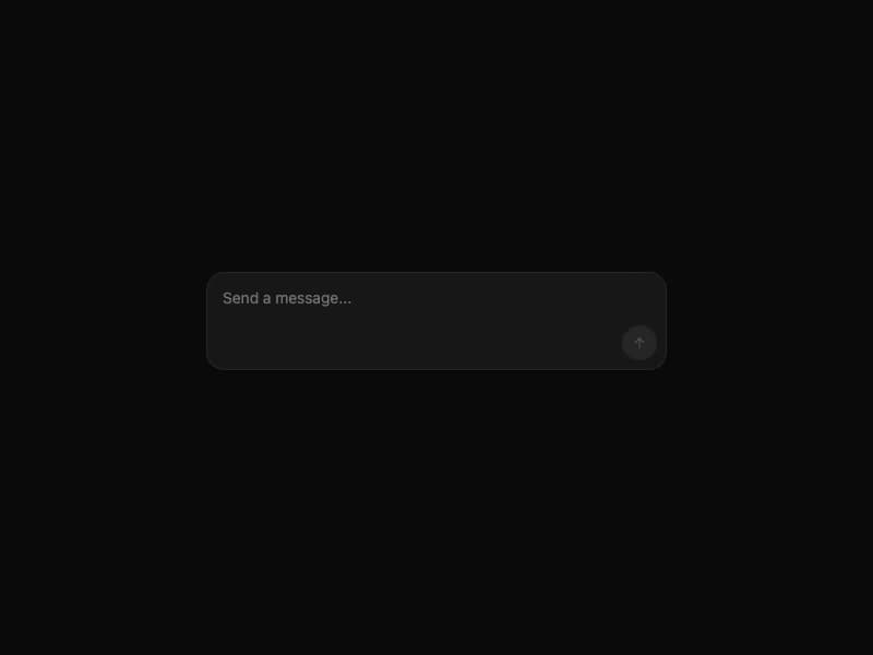
Chat composer with auto-resizing textarea, attachment chips for staged images/files, send/stop button, and slot-based left/right toolbar actions for mode pickers, model selectors, etc. Self-contained port from 21st.dev Agent Elements.
Built with React and Tailwind. Copy the prompt and paste it into Claude Code, Cursor or Lovable: your agent adds Input Bar to your project and fits it to your theme.
Code
How Input Bar is used: the demo's code. The component's own source comes with a free account.
Usage.tsx
import { InputBar } from "@/components/ui/input-bar";

export default function BasicInputDemo() {
  return (
    <div className="min-h-screen w-full flex items-center justify-center p-6 bg-white dark:bg-neutral-950">
      <div className="w-full max-w-md">
        <InputBar
          onSend={(m) => console.log("send:", m)}
          onStop={() => {}}
          status="ready"
        />
      </div>
    </div>
  );
}
Dependencies
More by 21st
View all
Spline Scene
9.4K
Testimonials with Marquee
2.3K
Gradient Button
1.9K
Pixel Canvas
898
Animated Blur Number
830
Empty State
772
Balloons
752
Status Badge
639
