Button Components for React & Next.js
Upgrade your UI with 250 stylish button components for React, fully compatible with Tailwind CSS and Next.js frameworks.
Browse components

Button
12

Notification Button
115
Texture Button
105

HeroUI Button Group
2

App Store Button
481
Button
78
Split Button
16

Base Button
1
Button
5
Button Group
14

Button Group
6

Eclipse Button
8

Astryx Button Group
26
Native Button
28
Button Save
49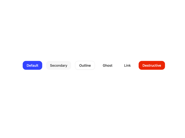

Button
35


Keep browsing with a free account
See all 12,000+ components, 416 templates, 998 themes and 138 apps, save favourites and copy two prompts a day for free. No card needed
More button components
- Split Button by tigran tumasov
- HeroUI Button Group by Hero Ui
- Button by Sean Hello
- Native Button by Moumen Soliman
- Button Group by Clevision
- Base Button by Sean Hello
- Button Group by shadcn
- Button by shadcn
- One Button by felipemenezes098
- HeroUI Toggle Button by Hero Ui
- Button by James Shopland
- Button by Cnippet
- Button by Bar
- Eclipse Button by iamsatish4564
- HeroUI Button Group by Hero Ui
- Button by Sean Hello
- Base Button by Sean Hello
- Native Button by Moumen Soliman
- Button Group by Clevision
- Button Group by shadcn
- Button by shadcn
- HeroUI Toggle Button by Hero Ui
- Button by James Shopland
- Button by Cnippet
- Eclipse Button by iamsatish4564
- FloatButton by antdesign
- One Button by felipemenezes098
- Button by Bar
- Button by tigran tumasov
- HeroUI Button Group by Hero Ui
- Button by Sean Hello
- Button Group by Clevision
- Base Button by Sean Hello
- Native Button by Moumen Soliman
- Button Group by shadcn
- Button by shadcn
- Button by Cnippet
- Button by James Shopland
- HeroUI Toggle Button by Hero Ui
- One Button by felipemenezes098
- Button by tigran tumasov
- FloatButton by antdesign
- One Clipboard by felipemenezes098
- Buttons by Clevision
- The Item one by felipemenezes098
- Sonner by shadcn
- Liquid Glass Button by Ali Imam
- Button Ui by prebuiltui
- HeroUI Button Group by Hero Ui
- Button by Sean Hello
- Button Group by Clevision
- Base Button by Sean Hello
- Native Button by Moumen Soliman
- Button by Cnippet
- Button by James Shopland
- HeroUI Toggle Button by Hero Ui
- One Button by felipemenezes098
- FloatButton by antdesign
- Toolbar by Cnippet
- Empty by Cnippet
- Buttons by Clevision
- Cookies by prebuiltui
- Icon Label Subtext Button by Ruixen
- Newsletter by Ayushmaan Singh
- Button by tigran tumasov
- Hero Button by Sanjay Kumar
- One Clipboard by felipemenezes098
- Button Breadcrumb by Cnippet
- Origin Button by Edwin Vakayil
- 404 page not found by Shailendra Kumar
- Button Ui by prebuiltui
- Liquid Metal Button by johuniq
- HeroUI Button Group by Hero Ui
- Button by Sean Hello
- Button Group by Clevision
- Base Button by Sean Hello
- Button by James Shopland
- Button by Cnippet
- One Button by felipemenezes098
- FloatButton by antdesign
- Toolbar by Cnippet
- Empty by Cnippet
- One Clipboard by felipemenezes098
- Aero Hero-3 by Cnippet
- Error 404 Page by Ankit Verma
- Button by tigran tumasov
- Button by Bar
- Glassmorphism Profile Card by Berat Berkay Gökdemir
- Buttons by Clevision
- Promt Input with Actions by Julien Thibeaut
- Button Ui by prebuiltui
- Shimmer Button by Shatlyk1011
- Badge Tag by prebuiltui
- Button by Berat Berkay Gökdemir
- Empty by shadcn
- Form by prebuiltui
- HeroUI Button Group by Hero Ui
- Button by Sean Hello
- Button Group by Clevision
- Base Button by Sean Hello
- Button by Cnippet
- Button by James Shopland
- One Button by felipemenezes098
- Toolbar by Cnippet
- Button by tigran tumasov
- Button by Bar
- One Clipboard by felipemenezes098
- Buttons by Clevision
- FloatButton by antdesign
- Field Components by Abraham
- Empty by Jesus Lopez
- Pagination by Abraham
- File Trigger 13 by Intent UI
- Astryx Button by Astryx
- Card Studio by Clevision
- HeroUI Calendar by Hero Ui
- Pagination Button Group by Cnippet
- News letter Form by Ruixen
- Split Action Button by Ruixen
- Sketch Button by kanchanasw
- HeroUI Button Group by Hero Ui
- Button by Sean Hello
- Button Group by Clevision
- Base Button by Sean Hello
- Button by Cnippet
- One Button by felipemenezes098
- Button by James Shopland
- One Clipboard by felipemenezes098
- Toolbar by Cnippet
- Buttons by Clevision
- File Trigger 13 by Intent UI
- Button by tigran tumasov
- Button by Abishekaraj Immanuel
- Empty by Jesus Lopez
- Interactive Hover Button by Dillion Verma
- Call to Action 01 by Ali Imam
- Input by shadcn
- Modal Card by Berat Berkay Gökdemir
- CTA Section by shadcndesign
- Cookies by prebuiltui
- Empty by Cnippet
- Button by ui layout
- Anti Metal Button by SMAmmar
- Astryx Button by Astryx
- Button by Sean Hello
- Button Group by Clevision
- Base Button by Sean Hello
- Button by Cnippet
- One Button by felipemenezes098
- Buttons by Clevision
- Button by James Shopland
- Toolbar by Cnippet
About button components
This collection gathers 764 React button components, from plain shadcn-style buttons to spotlight and floating action variants. You get primary, secondary, ghost, outline, and destructive states, plus icon buttons, loading buttons, and animated hover treatments. Many follow shadcn/ui conventions, so variants and sizes map to the props you already expect. Whether you need a simple form submit or a glowing call to action, there is a version here to start from.
Reach for a basic shadcn button when you want a neutral base you can theme; pick a spotlight or animated one when the click target needs to pull focus. Every button ships as full TSX with a live preview, so you can copy the code straight in, run npx shadcn@latest add with the registry URL, or pull it through the Magic MCP from Cursor or Claude Code. They are Tailwind-based and drop into any Next.js or React app.