
About
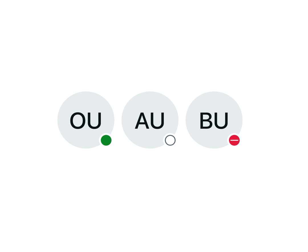
A size-aware Astryx avatar presence indicator with distinct success, neutral, and error shapes.
Built with React and Tailwind. Copy the prompt and paste it into Claude Code, Cursor or Lovable: your agent adds Astryx Avatar Status Dot to your project and fits it to your theme.
Code
How Astryx Avatar Status Dot is used: the demo's code. The component's own source comes with a free account.
Usage.tsx
"use client"

import AvatarStatusDot from "@/components/ui/astryx-avatar-status-dot"
import { Avatar } from "@astryxdesign/core/Avatar"
import { HStack } from "@astryxdesign/core/Layout"

export default function AvatarStatusDotDemo() {
  return (
    <HStack gap={4} vAlign="center">
      <Avatar name="Online User" size="xl" status={<AvatarStatusDot variant="success" label="Online" />} />
      <Avatar name="Away User" size="xl" status={<AvatarStatusDot variant="neutral" label="Away" />} />
      <Avatar name="Busy User" size="xl" status={<AvatarStatusDot variant="error" label="Busy" />} />
    </HStack>
  )
}
Dependencies
More by Astryx
View all

Astryx Banner
56
Astryx Avatar
27
Astryx Aspect Ratio
27
Astryx Badge
25
Astryx Button Group
23
Astryx Toggle Button
16
Astryx Avatar Group
8
Astryx Button
4