
About
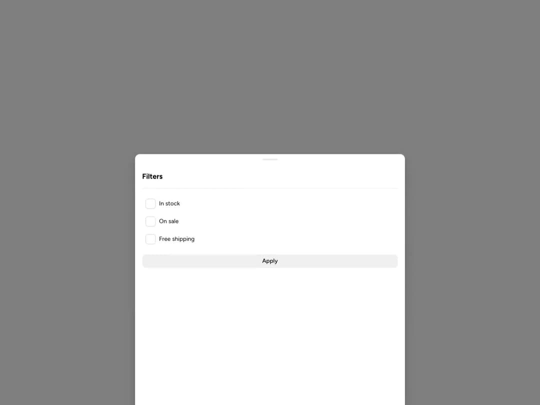
A mobile Astryx surface for filters, actions, forms, and detail views that rises from the bottom of the viewport.
Built with React and Tailwind. Copy the prompt and paste it into Claude Code, Cursor or Lovable: your agent adds Astryx Bottom Sheet to your project and fits it to your theme.
Code
How Astryx Bottom Sheet is used: the demo's code. The component's own source comes with a free account.
Usage.tsx
'use client';

import {useState} from 'react';
import {BottomSheet} from '@/components/ui/astryx-bottom-sheet';
import {Button} from '@astryxdesign/core/Button';
import {CheckboxList, CheckboxListItem} from '@astryxdesign/core/CheckboxList';
import {Divider} from '@astryxdesign/core/Divider';
import {Heading} from '@astryxdesign/core/Heading';
import {Section} from '@astryxdesign/core/Section';
import {VStack} from '@astryxdesign/core/Stack';

export default function BottomSheetShowcase() {
  const [isOpen, setIsOpen] = useState(false);
  const [inStock, setInStock] = useState(false);
  const [onSale, setOnSale] = useState(false);
  const [freeShipping, setFreeShipping] = useState(false);

  return (
    <div
      data-astryx-theme="neutral"
      data-theme="light"
      style={{colorScheme: 'light', display: 'contents'}}>
      <Button label="Open sheet" onClick={() => setIsOpen(true)} />
      <BottomSheet isOpen={isOpen} onOpenChange={setIsOpen} label="Filters">
        <Section padding={4}>
          <VStack gap={4}>
            <Heading level={3}>Filters</Heading>
            <Divider />
            <CheckboxList label="Filters" isLabelHidden>
              <CheckboxListItem
                label="In stock"
                isChecked={inStock}
                onCheck={setInStock}
              />
              <CheckboxListItem
                label="On sale"
                isChecked={onSale}
                onCheck={setOnSale}
              />
              <CheckboxListItem
                label="Free shipping"
                isChecked={freeShipping}
                onCheck={setFreeShipping}
              />
            </CheckboxList>
            <Button label="Apply" onClick={() => setIsOpen(false)} />
          </VStack>
        </Section>
      </BottomSheet>
    </div>
  );
}
Dependencies
More by Astryx
View all

Astryx Banner
56
Astryx Avatar
28
Astryx Aspect Ratio
28
Astryx Badge
25
Astryx Button Group
23
Astryx Toggle Button
16
Astryx Avatar Group
8
Astryx Chat Composer Drawer
6