
About
A bordered and elevated Astryx container for discrete, self-contained content and independently interactive items.
Built with React and Tailwind. Copy the prompt and paste it into Claude Code, Cursor or Lovable: your agent adds Astryx Card to your project and fits it to your theme.
Code
How Astryx Card is used: the demo's code. The component's own source comes with a free account.
Usage.tsx
'use client';

import {Card} from '@/components/ui/astryx-card';
import {Stack} from '@astryxdesign/core/Layout';
import {Heading, Text} from '@astryxdesign/core/Text';

function CardCallout() {
  return (
    <Stack direction="horizontal" gap={4}>
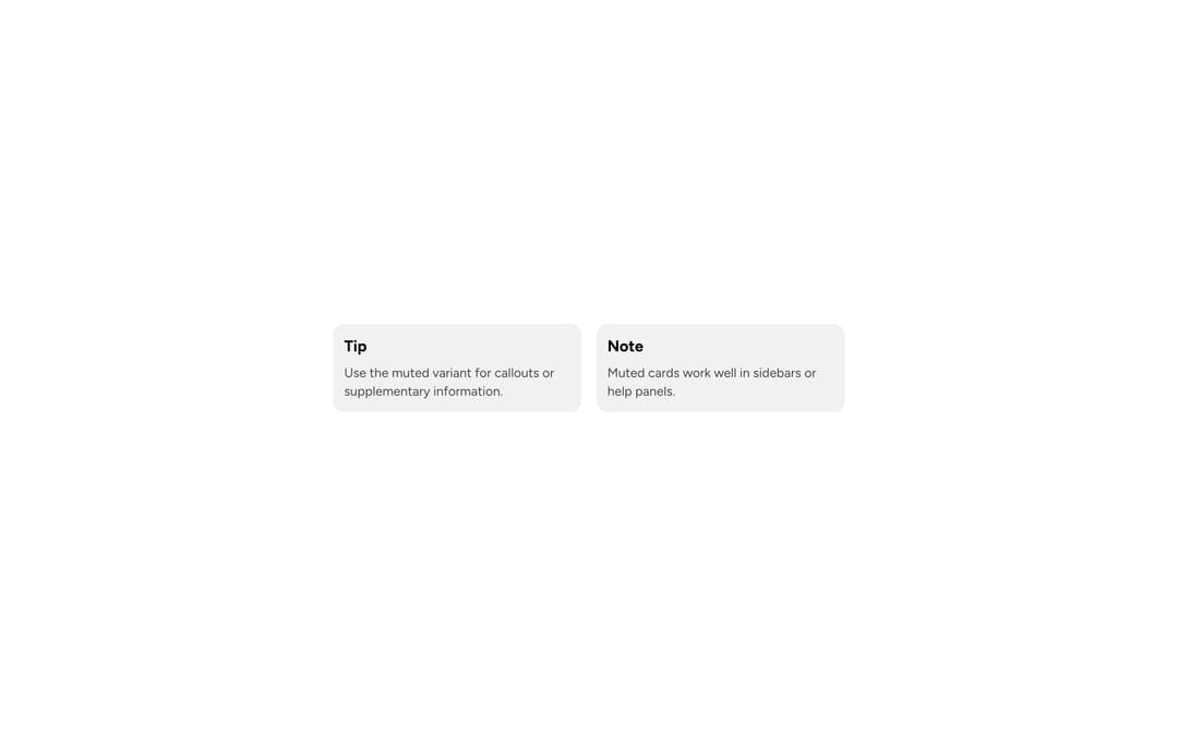
      <Card width={270} variant="muted">
        <Stack direction="vertical" gap={2}>
          <Heading level={3}>Tip</Heading>
          <Text type="body" color="secondary">
            Use the muted variant for callouts or supplementary information.
          </Text>
        </Stack>
      </Card>
      <Card width={270} variant="muted">
        <Stack direction="vertical" gap={2}>
          <Heading level={3}>Note</Heading>
          <Text type="body" color="secondary">
            Muted cards work well in sidebars or help panels.
          </Text>
        </Stack>
      </Card>
    </Stack>
  );
}

export default function CardCalloutDemo() {
  return (
    <div
      data-astryx-theme="neutral"
      data-theme="light"
      style={{colorScheme: 'light', display: 'contents'}}>
      <CardCallout />
    </div>
  );
}
Dependencies
More by Astryx
View all

Astryx Banner
56
Astryx Avatar
28
Astryx Aspect Ratio
28
Astryx Badge
25
Astryx Button Group
23
Astryx Toggle Button
16
Astryx Avatar Group
8
Astryx Chat Composer Drawer
6
More in Cards
View all
Stats cards with links
92

Course Design Cards
1.2K

Statistics Card 7
316
Statistics Card 2
295

Interactive Tech Stack Bento Grid with Hover Effects
503
Card
57

Item
10

Card Studio
8
